Ascui & Co. Architects by Grosz Co. Lab
Opinion by Richard Baird Posted 19 November 2014
Ascui & Co. Architects is an Melbourne-based studio with a rich history, depth of experience and a vision they describe as being a true perspective rather than one founded on intuition. Their projects are considered smart and environmentally sustainable, unexpected yet grounded by purpose, and range from residential additions to multimillion-dollar commercial developments.
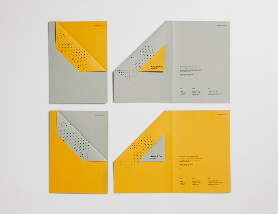
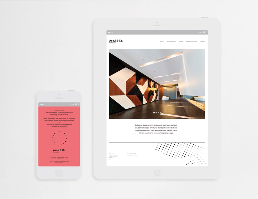
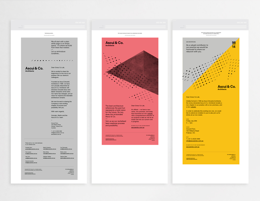
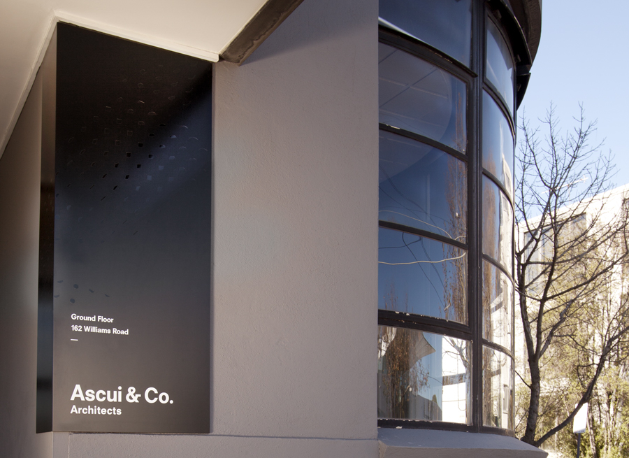
Anchored in the concept of Process & Possibility — a maxim that refers to the rhythm and harmony, beauty and functionality of Ascui & Co.’s work — Grosz Co. Lab designed a flexible brand identity system that celebrates the studio’s creative and progressive nature through a visual language of morphing patterns and an ever-changing ‘temperature’ based colour palette.
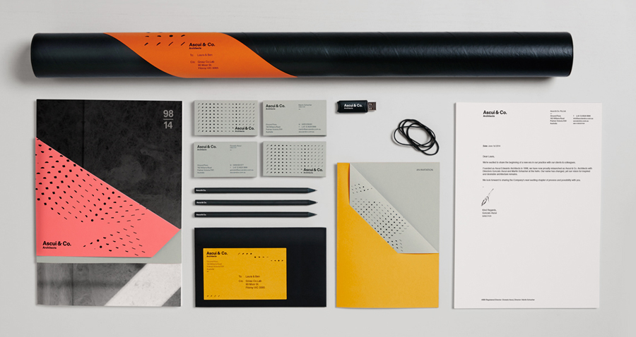
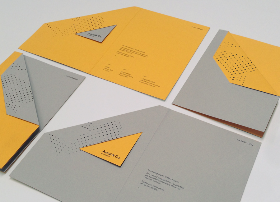
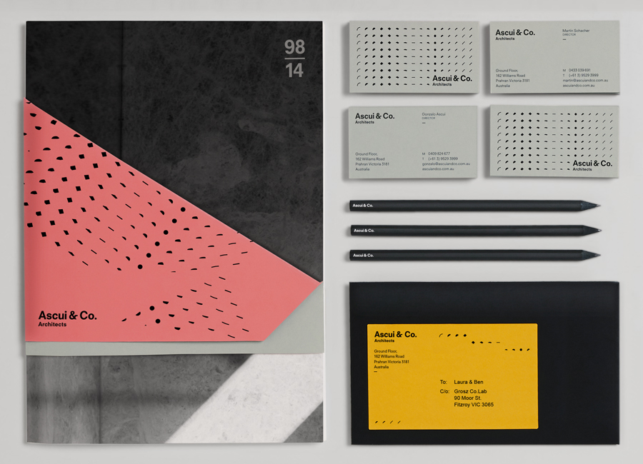
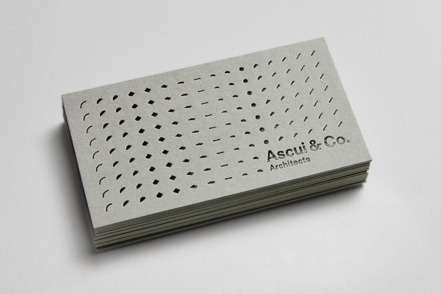
Although there are a number of familiar architectural details wrapped up within this identity project the concept of Process & Possibility, split between pattern and colour respectively, layers these with a distinctive and informed duality. The sequential and grid-based nature of the patterns — a mix of plains, arcs, lines and circles — for a static image have a strong sense of fluidity and motion, while their mix of weight and space introduces a subtle sense of dimensionality. These also make for a detailed aesthetic treatment when convention often encourages reduction, and effectively punctuates panels of flat colour with visual texture. Their repetition and structure is very much in keeping with the Process side of the concept.
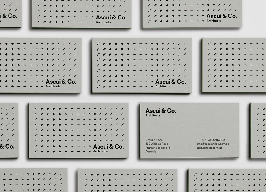
Following the publication of this article Grosz Co. Lab Creative Director Laura Camilleri expanded upon the studio’s intentions by explaining to BP&O that they initially created 5 forms found architecturally and morphed stages between each to create a series of 16 shapes with varying weights, volumes and an intentional organic and imperfect quality. This was done to develop a sense of static movement within the composition and reflect the idea of exploration & process, while the repetition and wrapping of the pattern around 2D planes created a greater sense of dimensionality. Laura went on to explain that their intention was that they, and the Ascui & Co. team, would continue to experiment and develop new executions as the brand evolves.
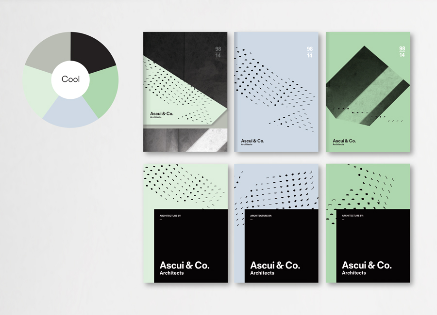
The changing “Temperature” of the collateral, designed to foster creative contribution and experimentation from the client, is a simple idea, if a little optimistic, that significantly changes the tone of the collateral and is a fair reflection of the Possibility aspect of the concept. The disparate qualities of a warm yellow and pink, and cool green and blue hint at seasonality yet it is unclear as to whether these changes are grounded by a communicative intention beyond the concept, be that informed by time of year, used to divide commercial or private sector work, a reference to the context of the document, or just an aesthetic variation. Either way, these introduce a sharp contrast to, and sense of creativity alongside, the restraint of the white, black and greys associated with urban planning, architectural materials and representations of light and shade.
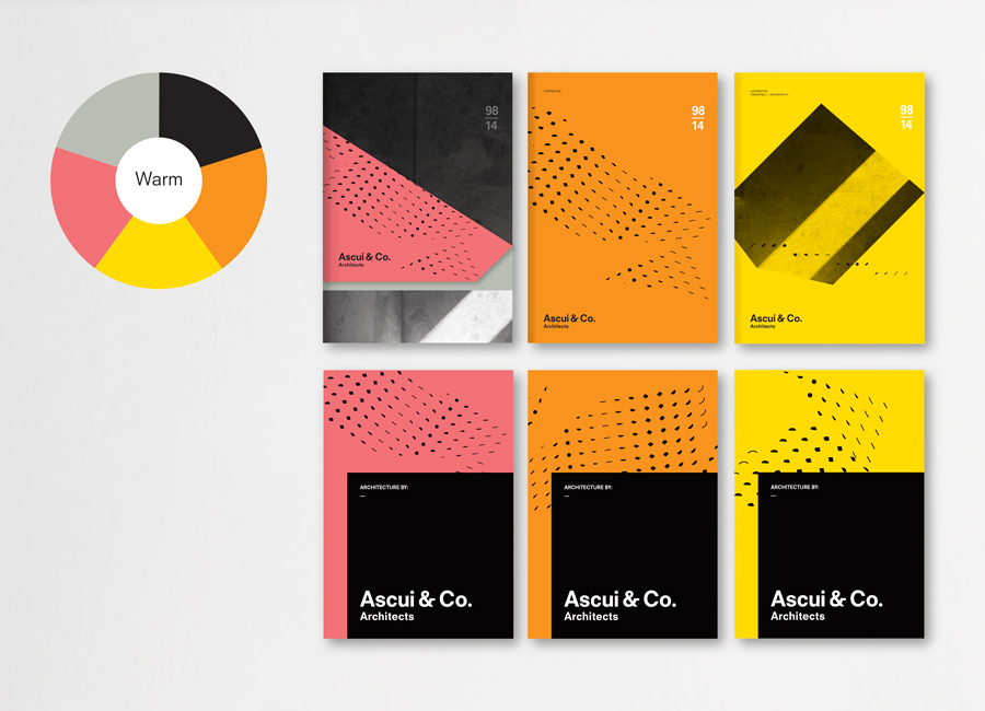
The high quality of coloured papers rather than expanses of ink, creases and then folds, die cuts and a black block foil print finish give the collateral a crafted sensibility that draw out bold geometric forms through physical construction. The use of grid-based layouts, warm grey boards, plenty of unprinted areas, panels of black, white text and a bold well-spaced sans-serif, collectively leverage the architectural themes of functionality, robust structure, space, light, shade and pragmatism while the images of concrete are unapologetically literal. The result effectively mixes the familiar with the unexpected, and extract new aesthetic detail from well-established rationales without undermining their communicative value.
Design: Grosz Co. Lab
Opinion: Richard Baird
Fonts Used: Neuzeit S
