Korshags by Kurppa Hosk
Opinion by Richard Baird Posted 21 November 2014
Korshags is a family-owned seafood company located in Falkenberg on the Swedish west coast. Previously named Falkenbergs Lax (Falkenberg’s Salmon), Korshags has grown from a small local company specialising in smoked salmon, into an international player with a variety of products. With this in mind the company commissioned Stockholm-based Kurppa Hosk to establish a new name and brand identity that would better position them for continued global growth. The studio went on to design packaging concepts and both physical and digital communication options.
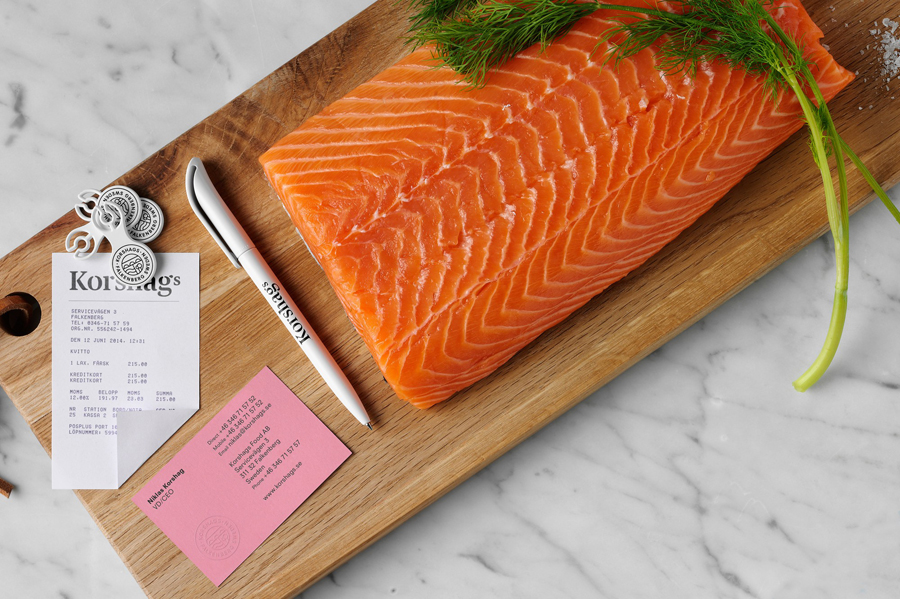
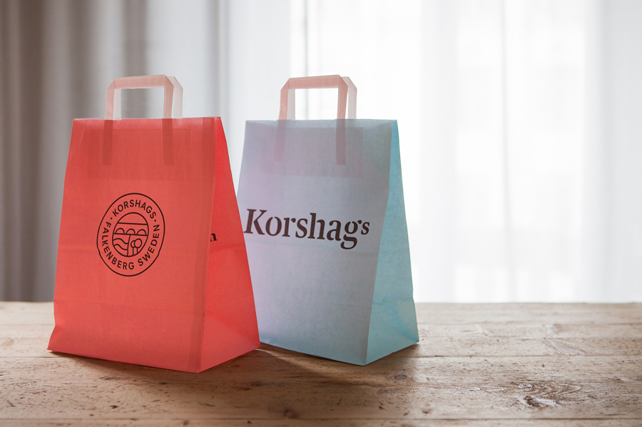
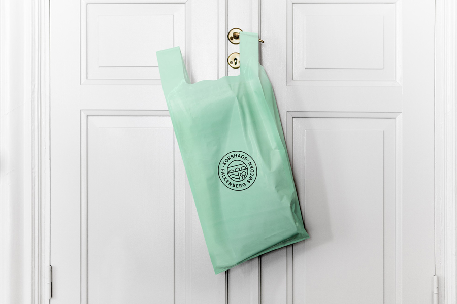
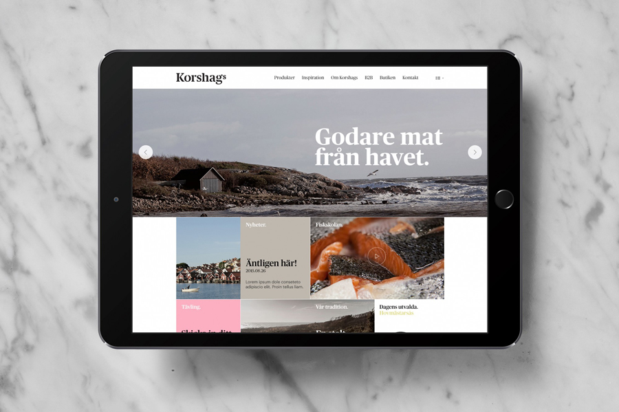
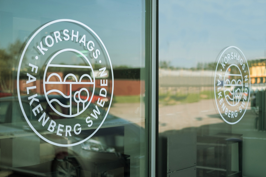
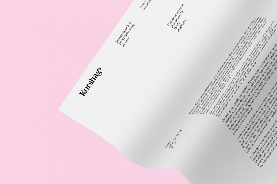
The old name presented a number of problems. It felt too local, was limited to salmon and struggled to really convey the company’s international ambitions. Kurppa Hosk recommend a change to Korshags – a family name – with the intention of being less product specific, retaining a genuine and personal quality and reflecting the generational nature of the business. This was complemented by a visual identity that consists of a serif word mark built from a bespoke version of Commercial Type’s Publico, a sigil that features Tullbron, a famous bridge from the city of Falkenberg, sans-serif type and contextual photography.
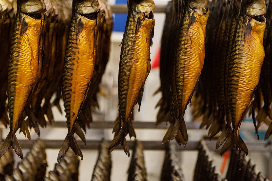
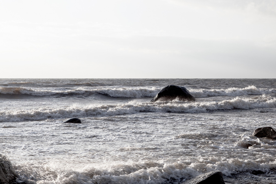
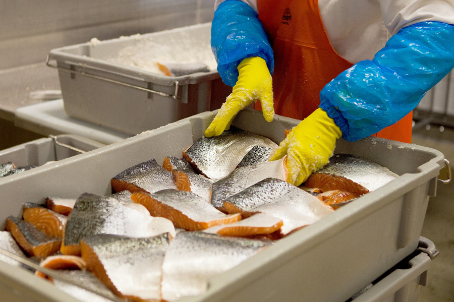
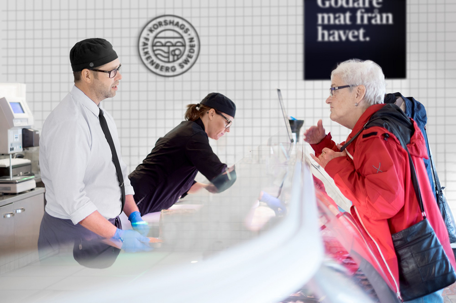
The combination of serif and stencil cut detail — a well worn but effective trope that mixes dockside authenticity with artisanal food crates — monolinear symbol, sans-serif functionality and pastel papers work well to reflect a brand firmly rooted in its history and origins but with a current and forward thinking approach. The images, a combination of markets, fish smoking and the sea, are well shot, offer contrast to the reduction of the sigil and are familiar but effective way of reinforcing authenticity and quality.
Design: Kurppa Hosk
Opinion: Robert Holmkvist
Fonts Used: Publico & Neuzeit
