Hemslöjden by Snask
Opinion by Richard Baird Posted 16 December 2014

Hemslöjden is a non-profit organisation promoting craft across Sweden through courses, talks and activities. Set up as a response to the advance of industrialisation, Hemslöjden has a significant 100 year history, fostering strong relationships between culture and industry to ensure the survival and development of handicraft. It is also a publisher, events organiser and acts as an umbrella for Sweden’s handicraft societies with the understanding that these, and their activities, contribute to a more sustainable way of life.
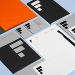
Design studio Snask worked with Hemslöjden to develop a new visual identity that would help unify a membership of over 17,000 individuals, 60 societies, 22 regional offices and 8 shops under one system, and broaden the perception of handicrafts from what the studio describe as old butter knifes and knitting to include everything made by hand.

Snask’s approach, often anchored in physical rather than digital processes, is well-suited to an organisation that has handicraft at its heart. Much like their work for Attention: Craft, Snask’s visual identity solution for Hemslöjden has plenty of individual character, is refreshingly literal in its appropriation of familiar imagery and physical detail, is definitively current, aesthetically impactful and communicatively straightforward.
The broadening of perceptions from what could be the described as the stereotypical to something more representative of the actual diversity of the handicraft industry is sensibly conveyed using an icon set. The bright colours and soft forms take the mechanical, sharp and heavy tools such as clamps, plains and anvils and give theses a modern accessibility and an equality alongside those that might be seen as easier to get involved with. These are well drawn, individually identifiable and share similar proportions, cohesively binding disparate tools, intensive physical activity and fine delicate detailing, from the rough cut of an axe, to the precision of a needle.


The union of activities, skills and tools of the iconography continues across the logotype and symbol. However, rather than a continued resonance, these effectively leverage dissonance and contrast. This acute disparity clearly references the original intentions of Hemslöjden to unite industry and handicraft by setting the bold and robust physicality of a H symbol — rendered with dimensionality and given a physicality through build, fabric, basket weave and knitted detail, then photographed for print — alongside the lighter, classic detail of a serif logotype.
The logotype’s high stroke contrast, its serifs and the pronounced flourish across the J, works well to ground the conviviality of the iconography with something more closely associated with high quality, borrowing a little from high fashion. Its length, fine detail and black ink provide a good counterbalance to the bold weight, colour and depth of the symbol. Together type and symbol appear aesthetically impactful and well founded, neatly reflective of heavier processes, robust materials and industry, and those that require a finer, detail orientated and steady handed approach. Its less explicit and more sophisticated than the iconography, and in this way adds variety to a simple communicative agenda.
Design: Snask
Opinion: Richard Baird
Fonts Used: Toledo Serial & Narziss Text