Torrefacto by Fork
Opinion by Richard Baird Posted 19 January 2015
Torrefacto is a Russian coffee roasting business founded in 2011 in response to what they describe as the difficulty of sourcing freshly roasted coffee beans in Moscow, and the time and trouble associated with importing it. Torrefacto prides itself on batch production and hand roasting processes, good consumer relations – which sees its owners personally answering letters and addressing website comments – and a combined roasting and delivery service that reduces the time between roasting, which takes place each Saturday, and receipt.
Created by design studio Fork, Torrefacto’s new brand identity, which included logotype, packaging and stationery, reflects some of the convenience of door-to-door service, individual consumer-focused values and the craft associated with selecting and roasting coffee beans, through typography, structural design, paper choice, colour and finish, in a way that introduces character to, and increases the perceived value of, what has become an everyday experience.
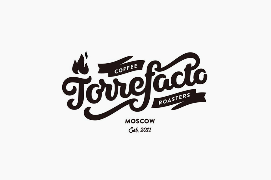
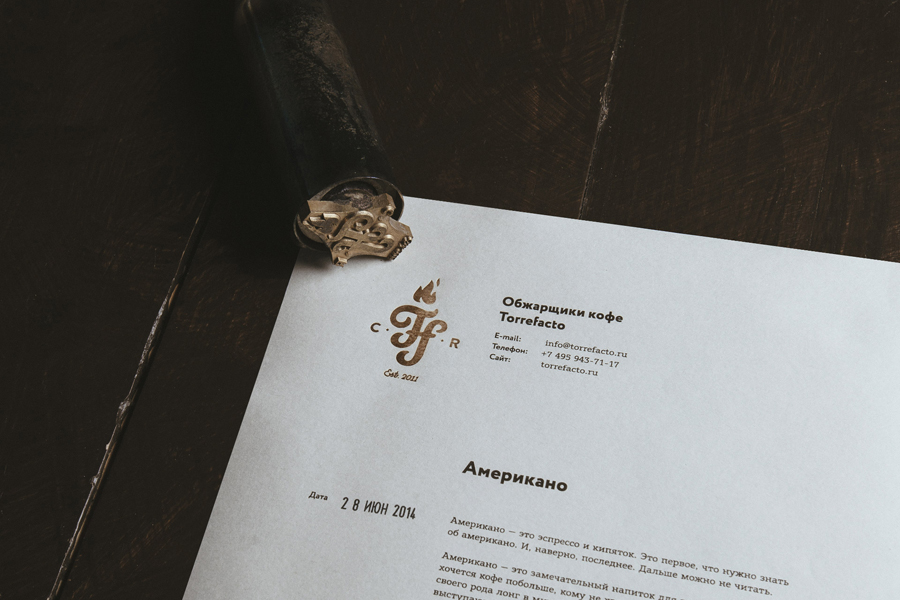
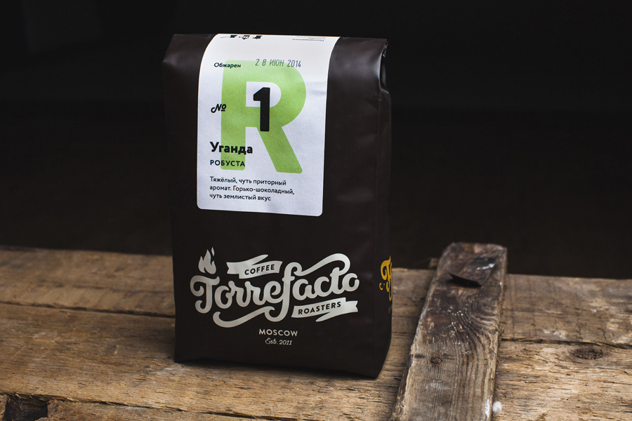
The logotype is well drawn and balanced with some great loops and ligatures, each of which appear natural and unforced. Its hand drawn origins, stroke widths, flourishes, rounded terminals, open counters and ribbon show an appreciation for current trends but also draws on the past, the manufacturers plates of agricultural machinery immediately come to mind. This mix leverages the well-established, familiar and understandable craft conventions and retro appreciation that have infiltrated a variety of categories, however, feel appropriate for a product that is made using mechanical means, batch production methods and by hand processes.
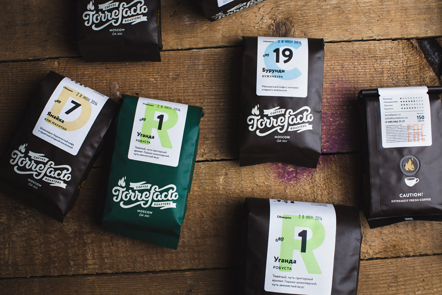
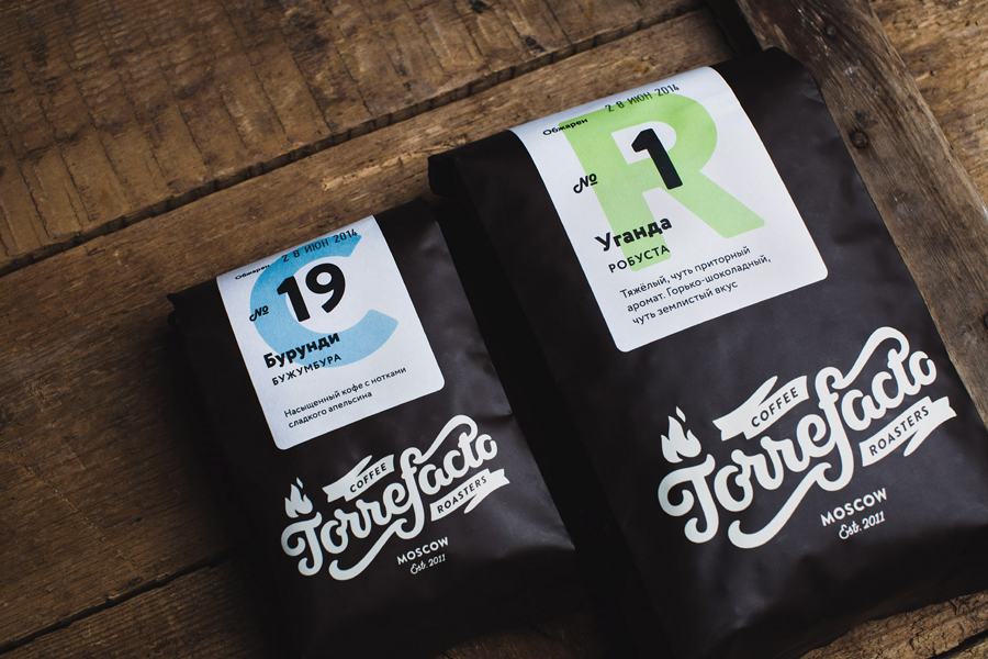
The convenience of delivery, the commoditised nature of coffee and the added value of individual product curation, process and quality comes through a branded structural choice and plain white label. The expense of printing custom coated bags alongside the hand drawn consideration of the logotype is tempered slightly by the economy and practicality of an uncoated sticker. This works well to balance high quality (careful selection and hand production) alongside the immediacy of on-site printed labels (speed and freshness), and is in service of both consumer perception and the practicalities of running a batch based business.
Product numbers, simple flavour profile guide and simple sticker layout alongside the white of the labels reduces the complexities of flavour profile and product variety down in a way that is inclusive and accessible. The copywriting on the reverse looks to draw in a bit of personality from the freshness of the beans, however and unfortunately, does not extend much further than the one statement.

The colour palette uses contrast well and complements the themes established by the logotype and structural choices, bringing together the utility of a bright white label, the modernity and craft associated with pastels and the rich earthy quuality of dark brown and deep green bags.
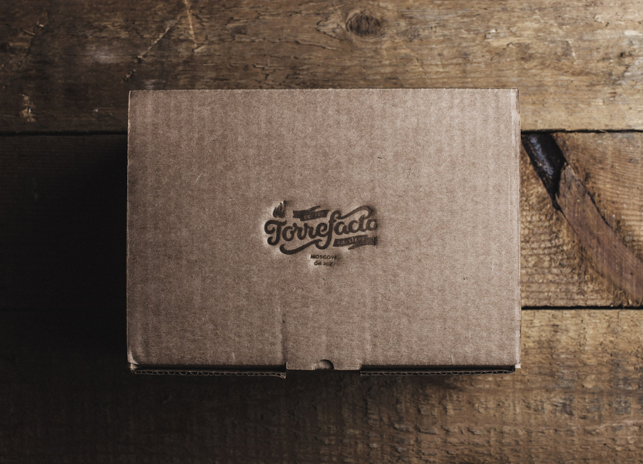
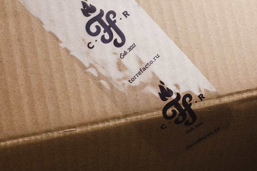
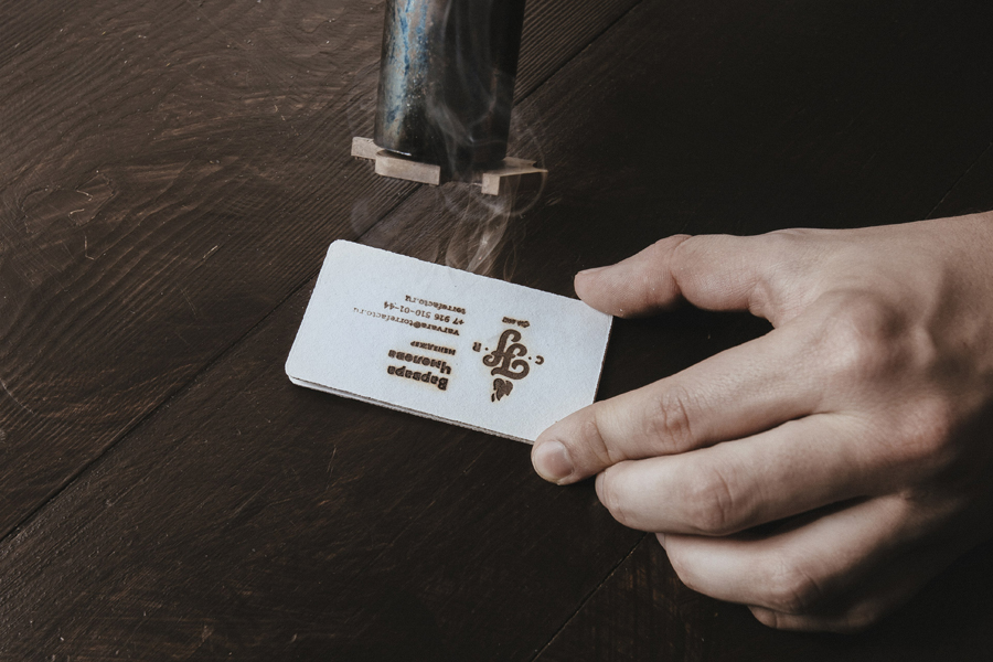
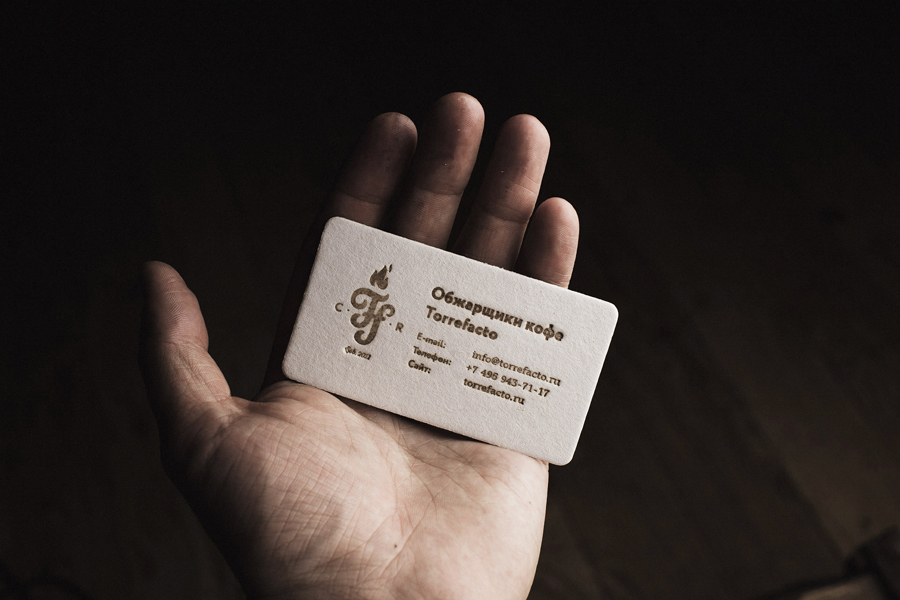
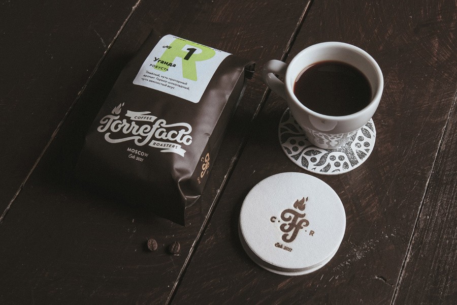
The heavy uncoated white board of the coasters and business cards, the use of manual process such hand lettering, stickers, stamps and heat treated finishes – a literal but communicatively compelling reference to roasting – and unbleached corrugated board boxes are familiar but well founded, mixing mechanical elements and craft, individuality and utility, the rough and the immediate alongside the well polished.
Design: Fork
Opinion: Richard Baird
