El Semillero by Anagrama
Opinion by Richard Baird Posted 21 January 2015

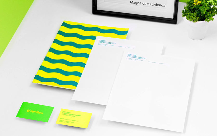
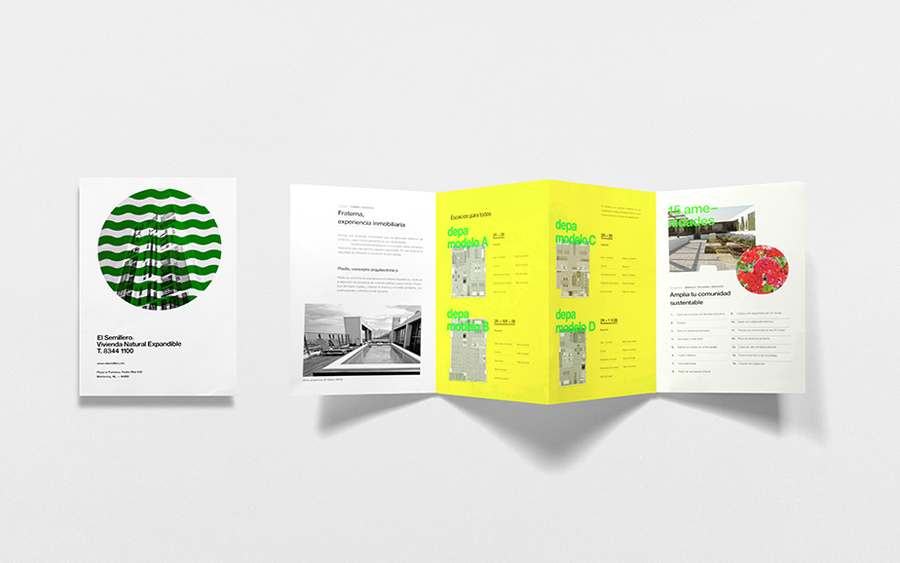
El Semillero is a large residential development program, managed by Fraterna, that intends to create a sustainable environment with expandable housing solutions based around basic needs and “economic flexibility” – presumably spaces that keep pace with current economic changes, improved social mobility and are accessible to a variety of income groups. Set at the heart of the Mexican city of Monterrey, the project is said to be predominantly aimed at young couples and hopes to revive local culture which is said to be on the decline. El Semillero’s brand identity, which included logotype, a variety of printed assets and extensive illustration work, was recently created by design studio Anagrama.

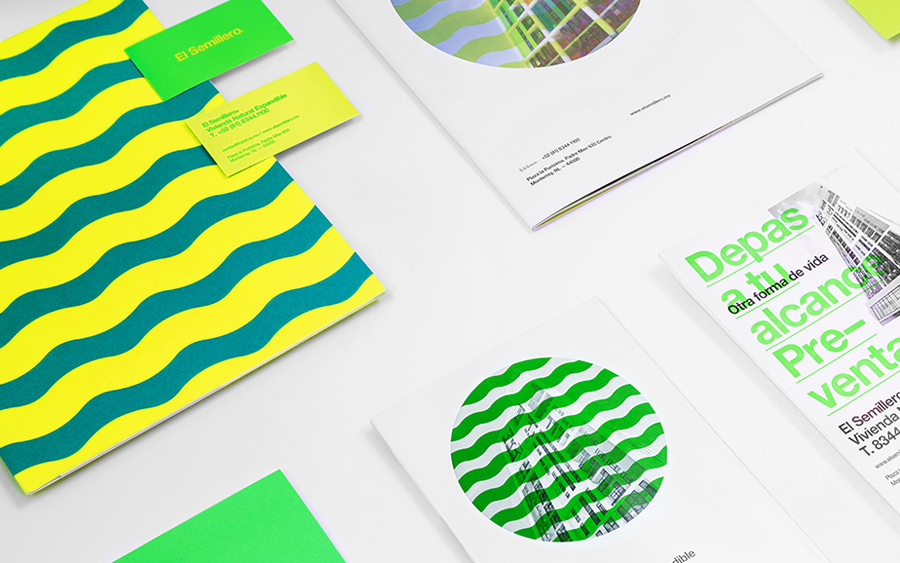
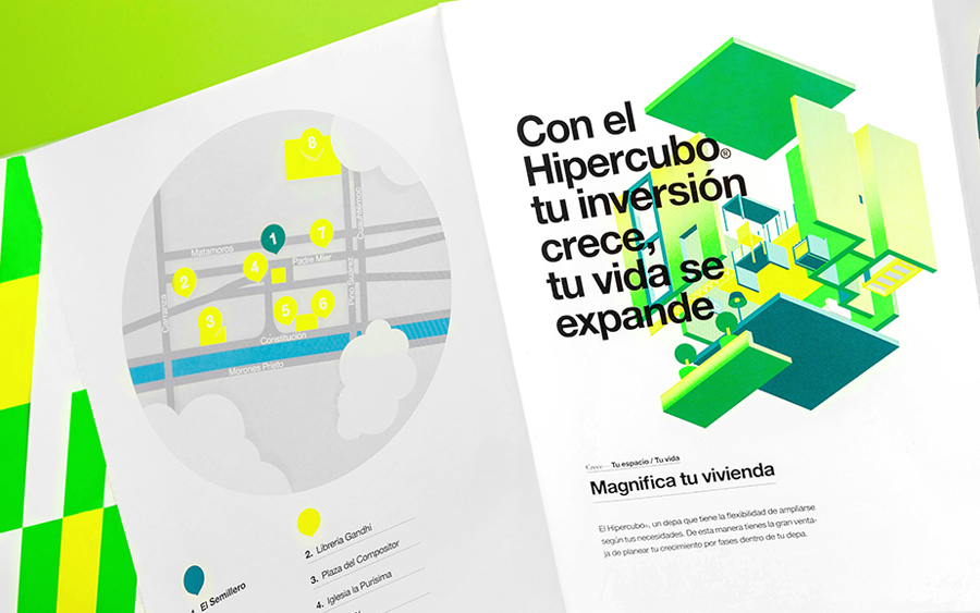
“Our branding proposal evokes nature and open spaces; it portrays the dynamic details found within “El Semillero”. The use of a ‘citric’ color palette can be compared to that of Fraterna’s former project “El Vivero’s”, whose palette was monochromatic for the most part. The brand complements itself with isometric illustrations showing key landmarks and representative areas that demonstrate the advantages of living in these apartments. “El Semillero” is the much-needed initiative to revive local cultural areas that are on the edge of oblivion.” – Anagrama
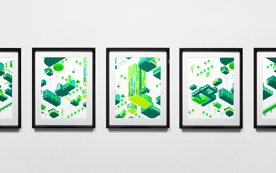
The solution has the trademark aesthetic impact many have come to associate with Anagrama, yet this is also underpinned by some neat illustrative detail and colour choices clearly drawn from the basic intentions of the El Semillero development project.
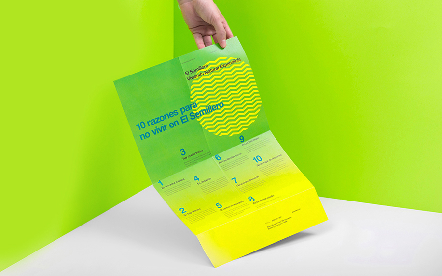
The isometric and modular qualities of the illustrative work, bold sans-serif typography and some interesting folds across the site plan, effectively convey a modern urban vitality and flexibility, and blends a sense of playful creativity and expanse you might associate with lego with a more formal but accessible architectural reliability.
Drawn from below rather than above, using a contrast of detail and reduction, expanded views also animated online, and benefiting from some interesting building shapes, the illustrations draw proprietary value, in conjunction with the limited colour palette, from a familiar style. The change in context, moving from might be more associated with editorial embellishment to a commercial development, lend the project an element of surprise.
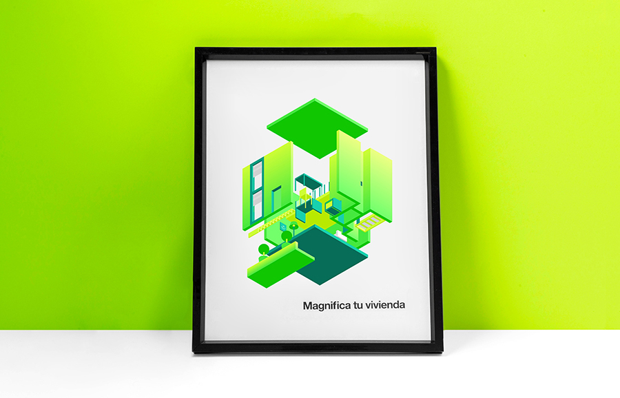
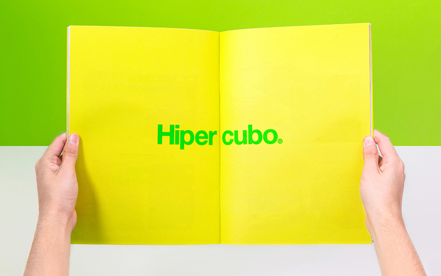
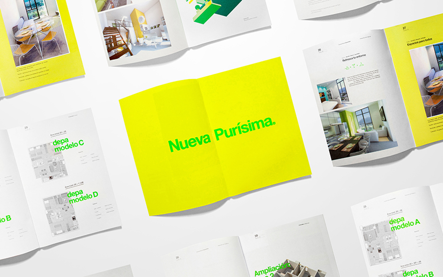
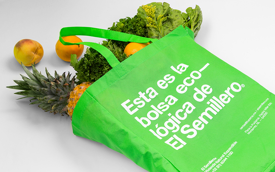
The heavy use of yellow and green, hindered slightly by the way the project has been shot, and delivered as fluorescent spot colours in print, does a good job of setting a sustainable and environmental conscientious tone. If it were applied to food packaging I would have described it as synthetic but within urban development, where grey can dominate, it appears bright and optimistic and avoids the conventions of earthy shades and sky blue.
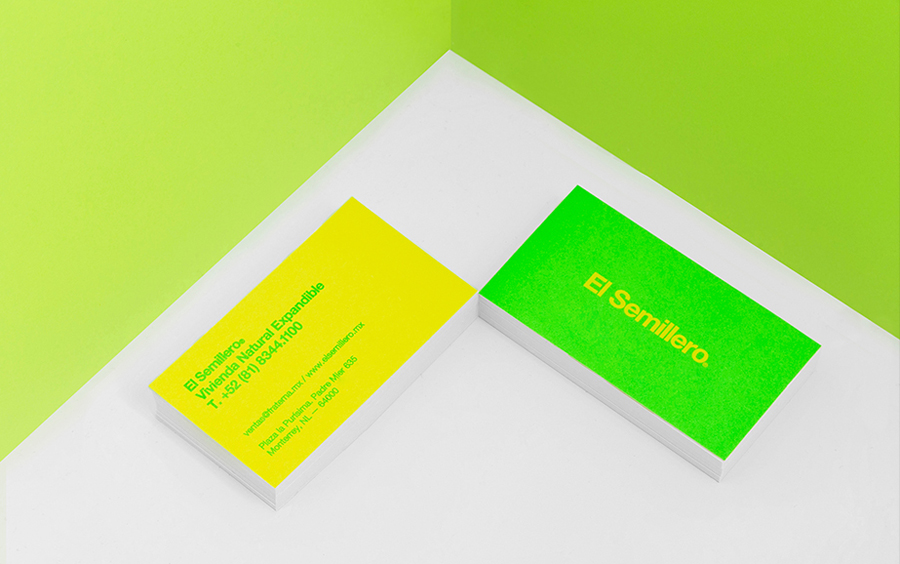
Where Anagrama often break with convention and push to introduce new aesthetics into traditional industries their approach to El Semillero appears largely well founded and, surprisingly, beyond the colour choice, fairly conservative. The print layouts and stationery do fall a little short, the sans-serif choice is disappointing but reflective of the “basic needs”, the waves a touch random and the illustrations under-utilised online. However and overall, the identity is distinctive, youthful and dynamic, and captures some of the optimism of large residential projects of the past yet appears thoroughly current.
Design: Anagrama
Opinion: Richard Baird
