Bryan Pearson by Strategy
Opinion by Richard Baird Posted 28 January 2015
Drawing on his extensive experience as a successful CEO, one that spans 20 years in the corporate, private and public sectors of New Zealand and Australia, Bryan Pearson has developed a niche business that provides strategic leadership and support to CEOs. His brand identity, created by design and advertising studio Strategy, is informed by the personal skills and experience that defines his business, and reflects professionalism and integrity, through a typographical and material restraint and the tactical flourish and contrast of matt surfaces and a glossy print finish.
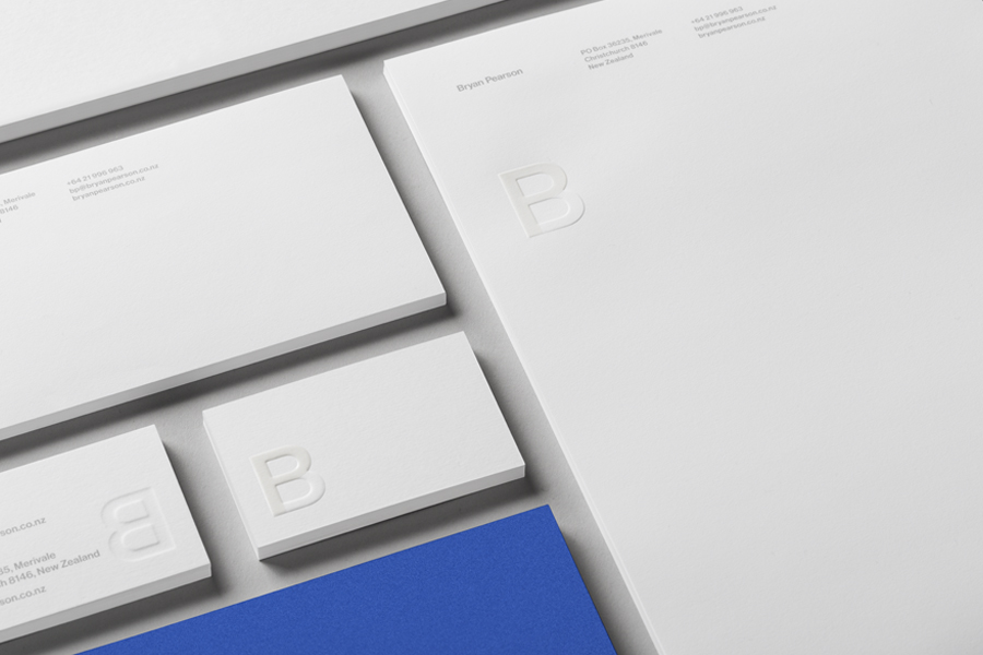
Although a small project with a logo-centricity there are a couple of neat ideas mixed in with those that are familiar yet still effective. The monogram is an appropriate choice for a business that is defined by the experience of an individual and who provides clients with personal direction, while Neue Haas Grotesk, a precursor to corporate darling Helvetica, effectively leverages a well-established sense of business formality, practicality and professionalism. This continues through to typesetting, layout and the unprinted space of the stationery. A bright blue spot colour adds contrast, vibrancy and impact, and the photograph a smart but approachable personality conveyed through the a big smile, eyes forward, suit jacket, shirt but no tie.
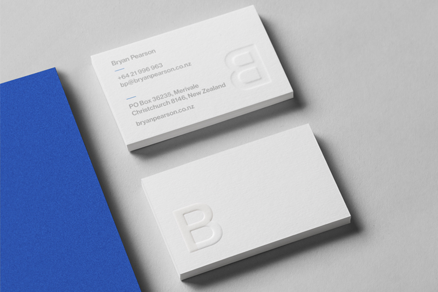
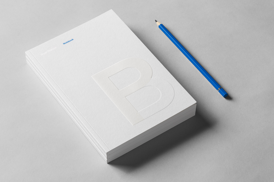
Where this project really gets its distinction, albeit through some serious subtlety, is print finish. Where you might have expected some clever graphical combination of a B and P, one that has undoubtably played itself out, Strategy has opted to draw these characters out through a contrast of a blind emboss, which takes on the matt surface of an uncoated board, and the gloss of a UV varnish. The neutrality, corporate uniformity and proliferation of the monogram’s character and the type of the stationery is given a more proprietary, tactile and high quality layer through the expense and infrequency of dual print treatments, as well as the blue and silver spot colours, a necessity when choosing to pursue such a reductive brand identity treatment.

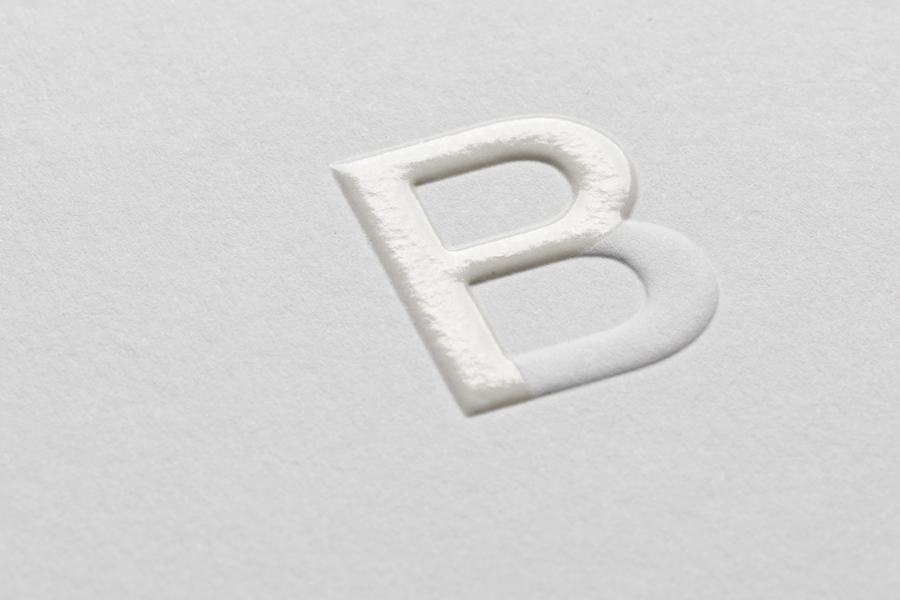

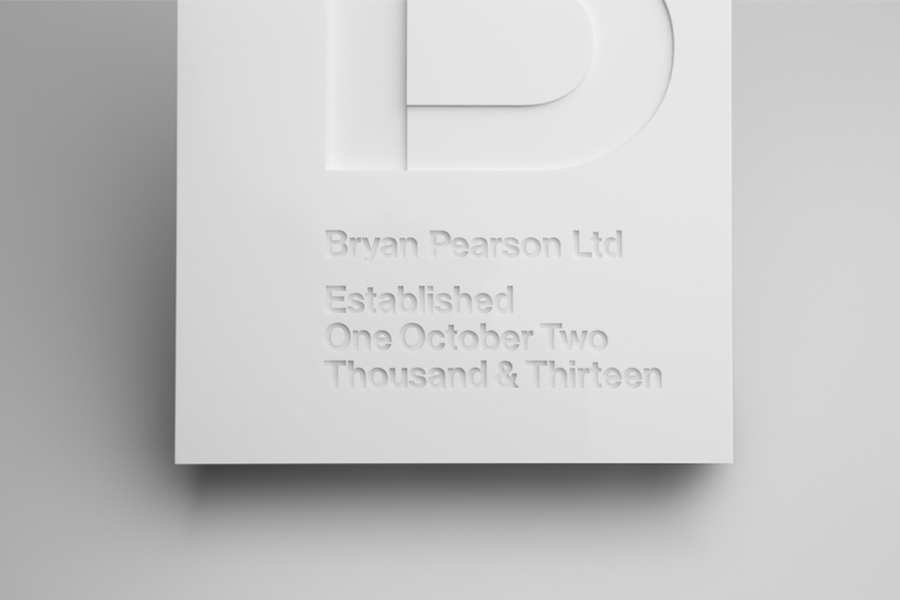
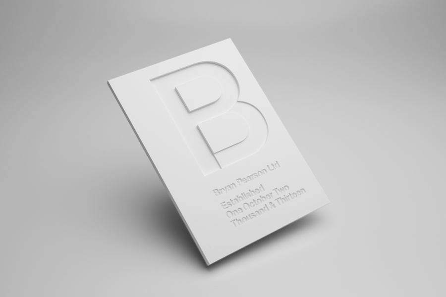
The laser cut panel, shot for the website, finds further ways to pick out the two characters of the monogram using the depth, light, shadow and perspective of three-dimensional space, something I would imagine working well as signage. Again, it is a small detail but one that thinks to tackle a common asset such as monogram in a different and creative way. Strategy describe their brand identity solution as highly polished yet understated, and it certainly is that, but it also benefits from a couple of creative ideas drawn out of a small project brief.
Design: Strategy
Opinion: Richard Baird
Fonts Used: Neue Haas Grotesk
