Eden Project – Big Lunch Extras by Believe In
Opinion by Richard Baird Posted 13 February 2015

Eden Project is visitor attraction set within in a former mineral pit in the county of Cornwall, England. It houses a diverse collection of plant and flower species collected from around the world, cared for under two large geodesic biodomes that maintain artificial Mediterranean and tropical climates. The bigger of the two domes is home to the largest indoor rainforest in the world. Eden Project hosts a variety of seasonal events throughout the year and is involved in the development of community programmes.
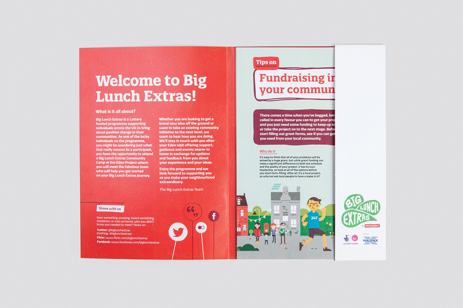
Design studio Believe In worked with the attraction to create the brand identity for Big Lunch Extras, a series of events designed to help individuals across the UK create positive change within their communities, and builds on The Big Lunch, a 3 year Lottery Fund and Halifax supported initiative that looks to bring people and their neighbours together in a simple act of community, friendship and fun.
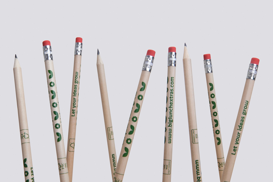
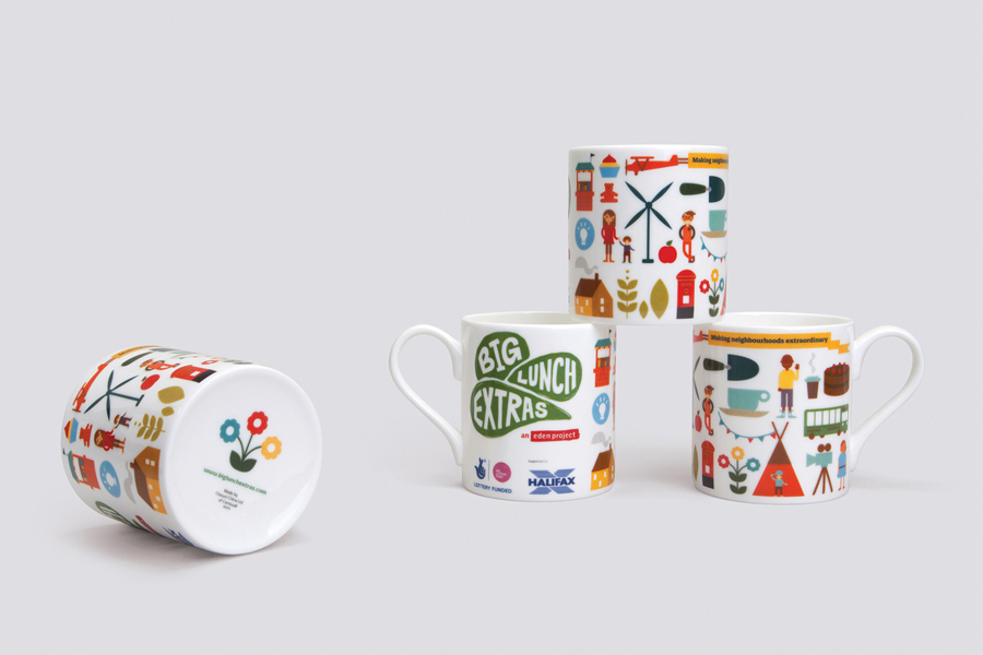
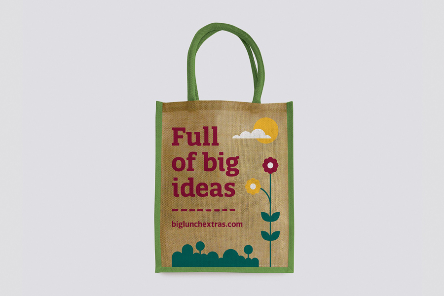
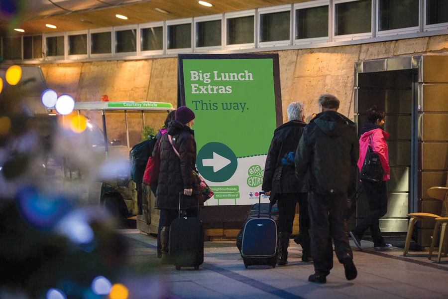
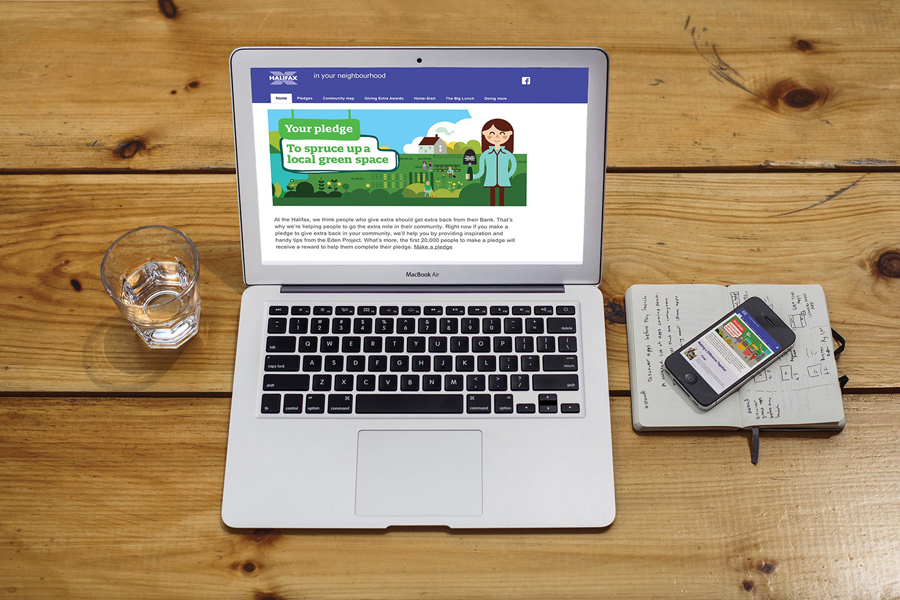
Working with illustrator Parko Polo, Believe In’s solution connects to the idea of places and conversations through a rich and convivial illustrative approach, one that also subtly references the Eden Project’s famous structures, and extends across print communication, promotional merchandise, wayfinding, display materials and online experience.
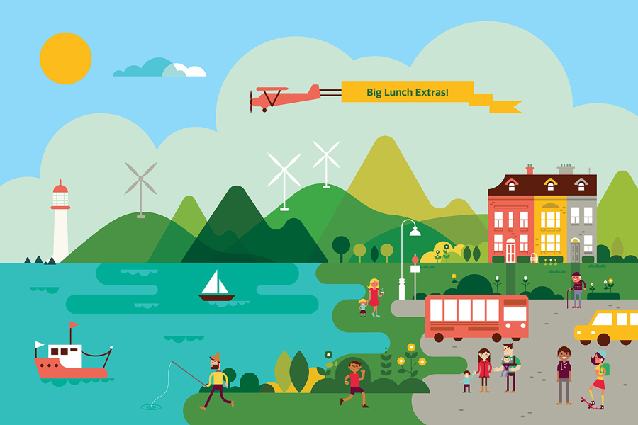
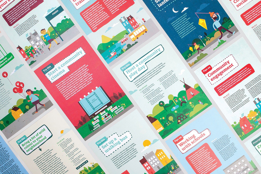
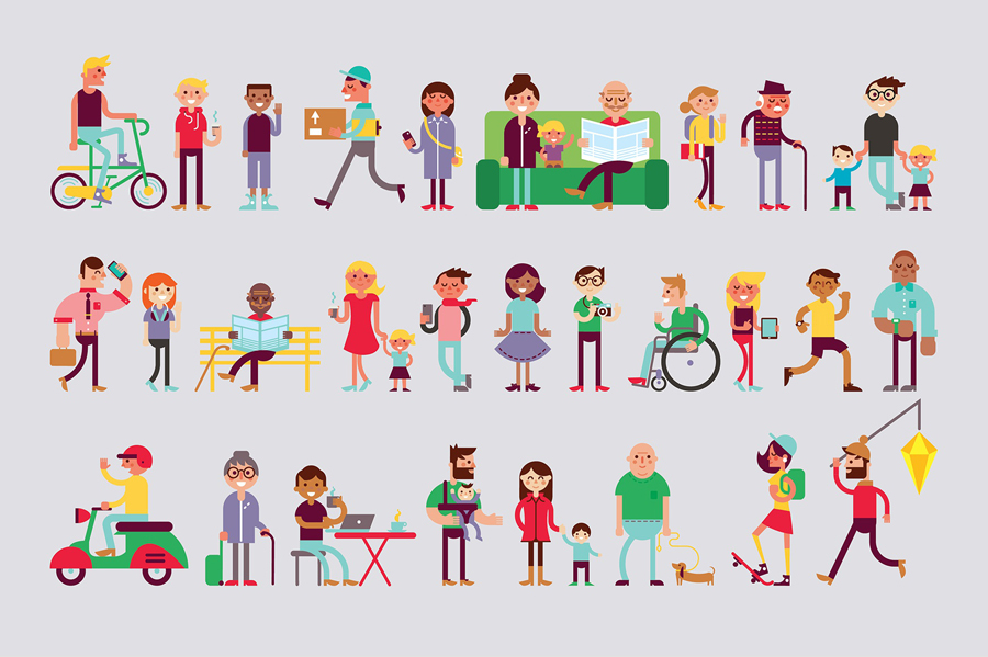
Parko Polo’s character style is playful and optimistic, and most importantly, inclusive and distinctive, likely to resonate with a broad mix of people. It finds a balance between the childish, youthful and design sophisticated, appearing intricate in some areas and simplified in others. This can be seen in the geometric reduction of the sail boat, the detail drawn into each character, and the differences between some of the buildings.
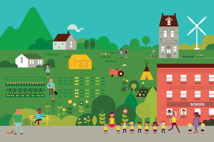
Each of the panels is well-rendered and filled with a variety of activity, story, motion and imagery with thought given to community ideals. They successfully blend the themes of family, growing up, environment, inclusivity, learning, industry and agriculture amongst many others in a rich and engaging way. These are explicit, rather than subtle in their presentation, in a way that could be described as on-the-nose and perhaps a touch heavy on idealism, however, I am sure the sentiment and optimism will be well received by those already sold on positive community engagement. It is unclear as to whether these will find their way in front of children, but there is plenty of small detail to look at and find, if indeed they do.
Check out the wind farms, “hipsters”, families, pets, cultural diversity, a full range of ages, interactions between groups, various agricultural activities, health related imagery, self-sustainability in the plots of land, smiles, public services, local markets, technology (look out for the iPad and MacBooks), disability and child safety, plus a lot more.
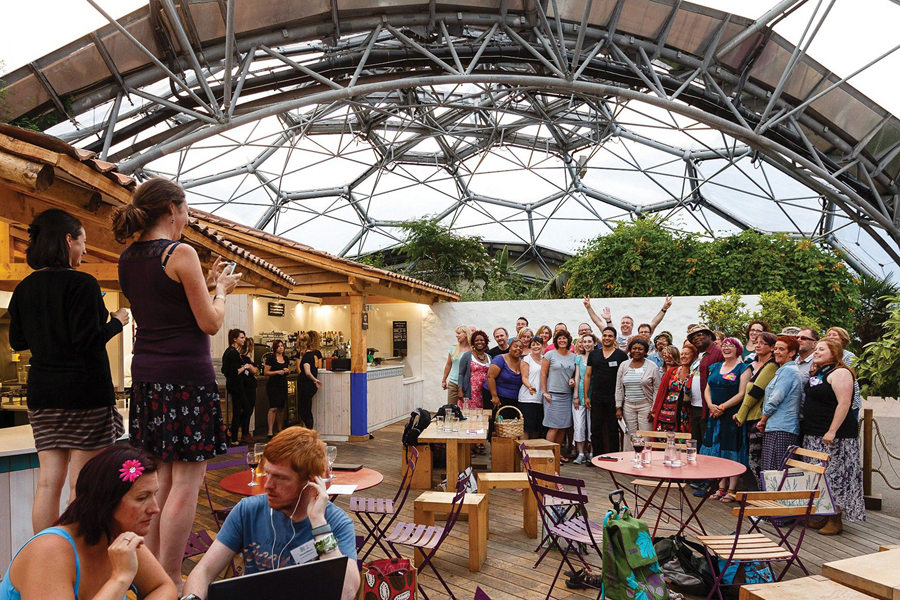
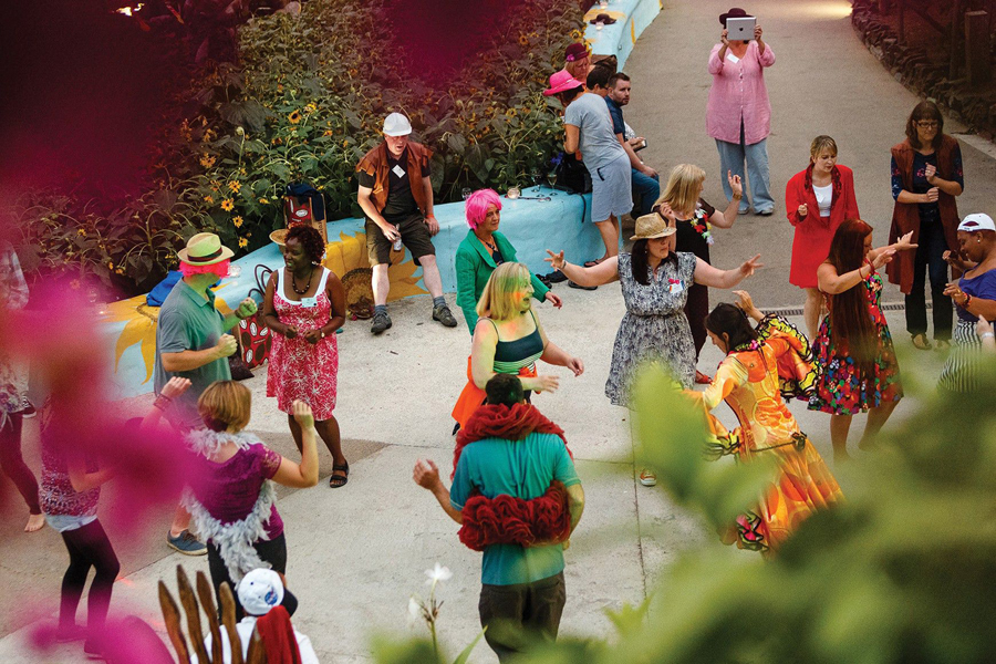
This illustrative approach and the values it conveys are not particularly unusual but it is rare to see it so extensively and comprehensively executed. There is very much a spirit captured within these that also plays out well within event photography.
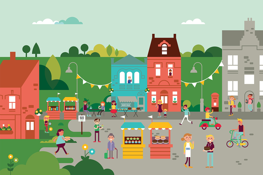
The modularity of the characters, buildings and the consistent perspective of the backgrounds establishes a large kit of parts, much like Fuzzy Felt, that can be remixed whilst retaining an aesthetic and conceptual consistency, one easily expanded upon by someone with a fair sense of space and layout. For me, a connection is made between the microcosm of neighbourhoods, larger regional communities and the environments they live within, and the managed and sustainable climates of Eden Project’s biodomes that allow the plants and flowers to flourish.
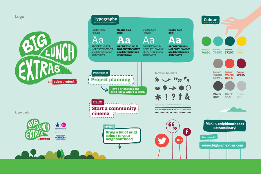
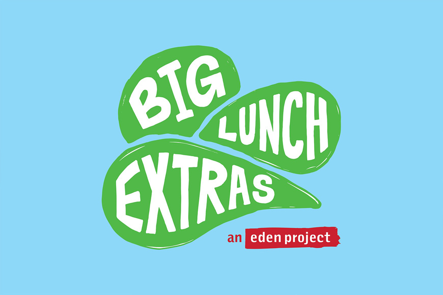
The logo, when isolated, leverages an intentional ambiguity, appearing as rolling hills, leaves or the biodomes of Eden Project. Aesthetically it is a little awkward but the enthusiasm of large condensed uppercase characters and the organic nature of the forms that contain them comes through and has a hand drawn human touch. Its relationship with other programs undermines a real opportunity to either stand out from or resonate with the imagery, but strategically it is understandable.
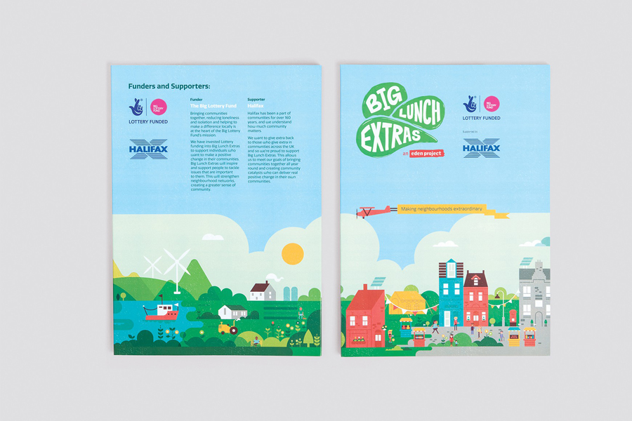
The images have been executed well in print, from the simple use of key iconography across the mugs to the edge-to-edge colour and narrative nature of some of the booklets tied to specific events. This further contributes to the diverse and microcosmic-nature of the identity but one that can be adjusted and applied to many communities across the country. There are small elements of the corporate creeping in through some of the layouts, sponsorship and typography but the illustrations do a good job to temper this keep it appearing fun and community focused.
Design: Believe In
Illustration: Parko Polo
Opinion: Richard Baird
