Urbanna by Forma & Co
Opinion by Richard Baird Posted 23 March 2015

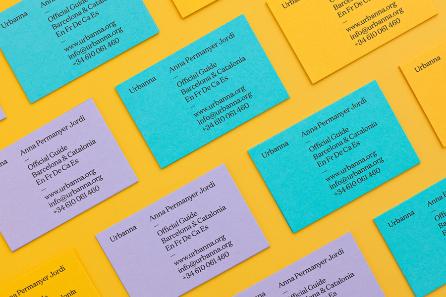
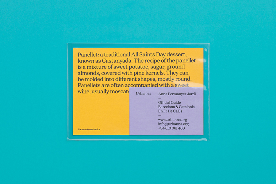
Urbanna is a small Spanish tourist business, led by Anna Permanyer Jordi, that provides experienced guides who can speak Spanish, Catalan, German, French and English, to those visiting the city of Barcelona. Design studio Forma & Co worked with Urbanna to develop a visual identity solution that, rather than rely on ubiquitous images of the city, favours a convivial colour palette of dyed paper, the typographical flourishes of Domaine and a copywriting component that draws on some of the familiar and unfamiliar culture and history of the city. The project also included post cards and business cards.
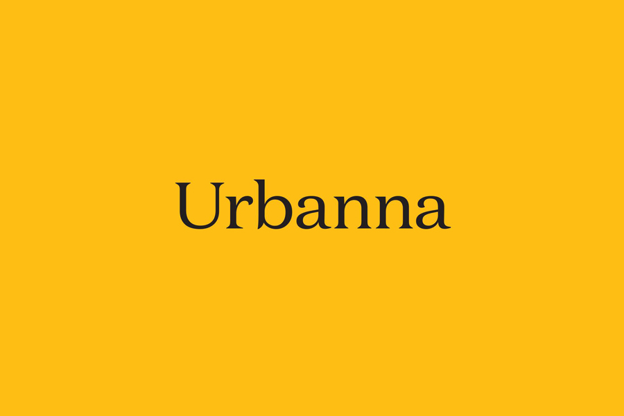
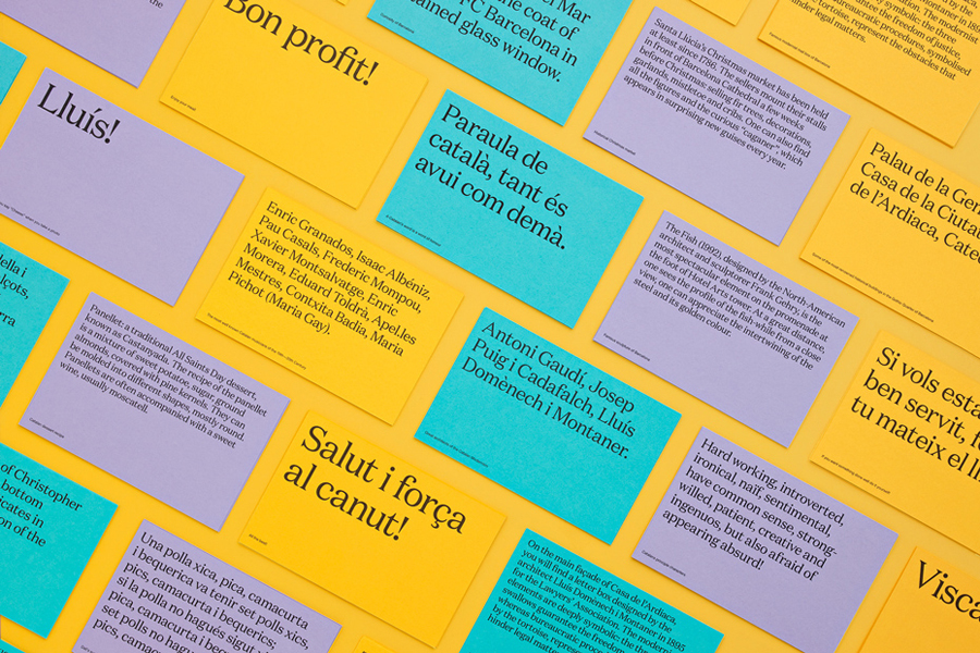
Chosen to subtly evoke some of the architecture, modernist design and Catalonian Art Nouveau present in Barcelona, Domaine makes for a distinctive and well-crafted choice. As the only font throughout the project, its stroke contrast, letter shapes and serifs, function effectively as both display, in moments of expression, and as dense but well-spaced and legible body copy. This mix of classic typographical detail and simple but bold contemporary application, appears as a suitable vessel for, and embodiment of, the significant historical and cultural information contained within the copy whilst also having an aesthetic impact.
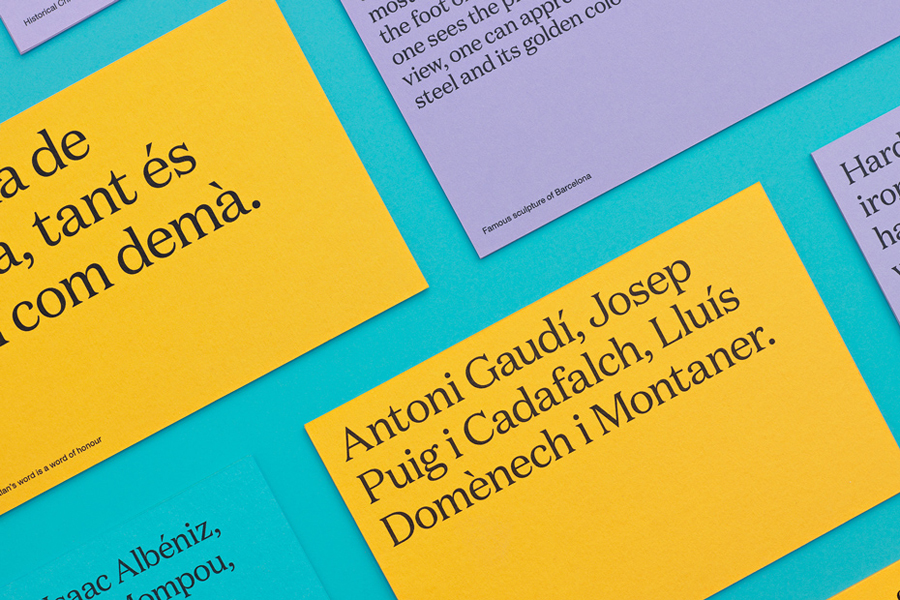
The copy’s broad mix of regional recipes, location descriptions, Dali speeches, architects, art history and sayings of the region, plus many more, all drawn from the Urbanna staff, highlights the variety and extensive nature of the information you would expect to be gleaned from experienced and well-informed guides. Each layering the architecture and visible life of the city with an unseen detail and richness.
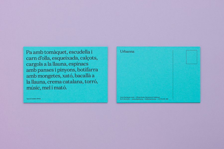
With the absence of images copy is free to play with expectation without distraction, effectively conveying insight and avoiding the familiar, while its informal tone, an intentional direction emerging from staff contributions, reflects the personable nature of the Urbanna team. Although, as a bilingual piece, some of the English could have perhaps been refined a touch more, the tone of the copy, like the colour palette and use of postcards, offers a lighter balance and conviviality to an information rich concept and type heavy aesthetic.
Design: Forma & Co
Opinion: Richard Baird
Fonts Used: Domaine
