Enea by Clase bcn
Opinion by Richard Baird Posted 27 April 2015

Enea is a contemporary furniture manufacturer with a site in the Basque Country. Collaborating with designers Josep Lluscá, Gabriel Teixidó and the trio Lievore Alhterr Molina, Enea has developed a catalogue of versatile, comfortable, durable and functional products for the private and commercial markets.
Seeking to differentiate itself from its competitors and with a desire to avoid cliches of the industry, Barcelona based graphic design studio Clase bcn developed a distinctive brand identity treatment for Enea that reflects the company’s Basque origin in a distinctive and contemporary fashion and, using a striking spartan style, references industrial manufacturing. This was visualised through type, colour, image contrast and print, and launched alongside Enea’s latest range which coincided with the Milan Furniture Fair. The project extended to business cards, brand guidelines and brochure.

Clase bcn’s treatment is a well-balanced mix of tradition and craft, modernity, industry and locality. These are clearly communicated in the cut of the logotype, the construction of the brochure, colour palette, in the contrast of outdoor and industrial image, and the use of concrete and brightly painted frames across Enea’s exhibition stand.

The wedge serifs, stroke-contrast, broad stems, full bowls, sharp terminals and engraved qualities of the logotype, drawn from Schick Toikka’s font Noe Display, set a bold, robust and traditional tone—one of quality build and resilience—while its lowercase and tightly kerned typesetting softens it slightly with an informal, accessible and more recent quality. Its large size in print firmly places craft at the forefront where you might expect the modernistic and reductive to be favourable, securing differentiation and reflecting some of the traditional values that underpin the modern aesthetic of Enea’s range.

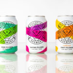
The blue board, white ink and the bright edge painted detail of the business cards appear distinctive and current, offering contrast to the retrospective qualities of the logotype, drawing on Enea’s contemporary catalogue and the colourful pipes that run through the factory. The bright edges also make it into the manufacturer’s exhibition stand, cutting through cool concrete surfaces with a contemporary conviviality.

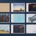
Ena’s catalogue avoids convention and is largely in opposition to the polish of other manufacturers. The low-fi binding is a small detail but in many ways make Enea appear smaller, more industrious and personable. The full bleed images, contrast of paper size, large type size, variety of layouts and coloured paper make for an visually interesting piece of print work that touches upon manufacture, locality and values.


Contrast is used to good effect throughout the photography, juxtaposing the local, earthy colour and texture of Basque Country scenery alongside the geometry, steel, wear and tear of manufacture, as well as moments where furniture and environment also intersect. The crops to the images, their tone and the clear use of contrast is unexpected, well-executed and like the binding, an interesting alternative to the conventions of the industry and a particular project highlight.

For a large manufacturer with a technologically advanced manufacturing plant the identity doubles down on craft and the small-scale. While this is slightly in opposition to its more corporate website, hidden behind a current front page intro, it is a reminder that while mass-manufactured and modernistic in form, each piece has crafted origins, and influenced by tradition and locality.
Design: Clase bcn
Photography: Salva López
Opinion: Richard Baird
Fonts Used: Noe