Arco by Raw Color
Opinion by Richard Baird Posted 9 June 2016
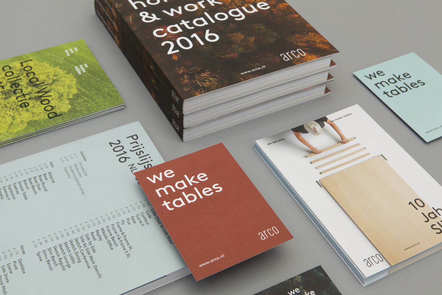
Arco is a family run contemporary furniture design and manufacturing company that currently rests in the hands of fourth generation family members, and has a respectable 110 year history. Arco has tables and chairs at the heart of its collection and specialises in woodwork, a reflection of its location in Winterswijk, an area of dense natural woodland in East Netherlands.
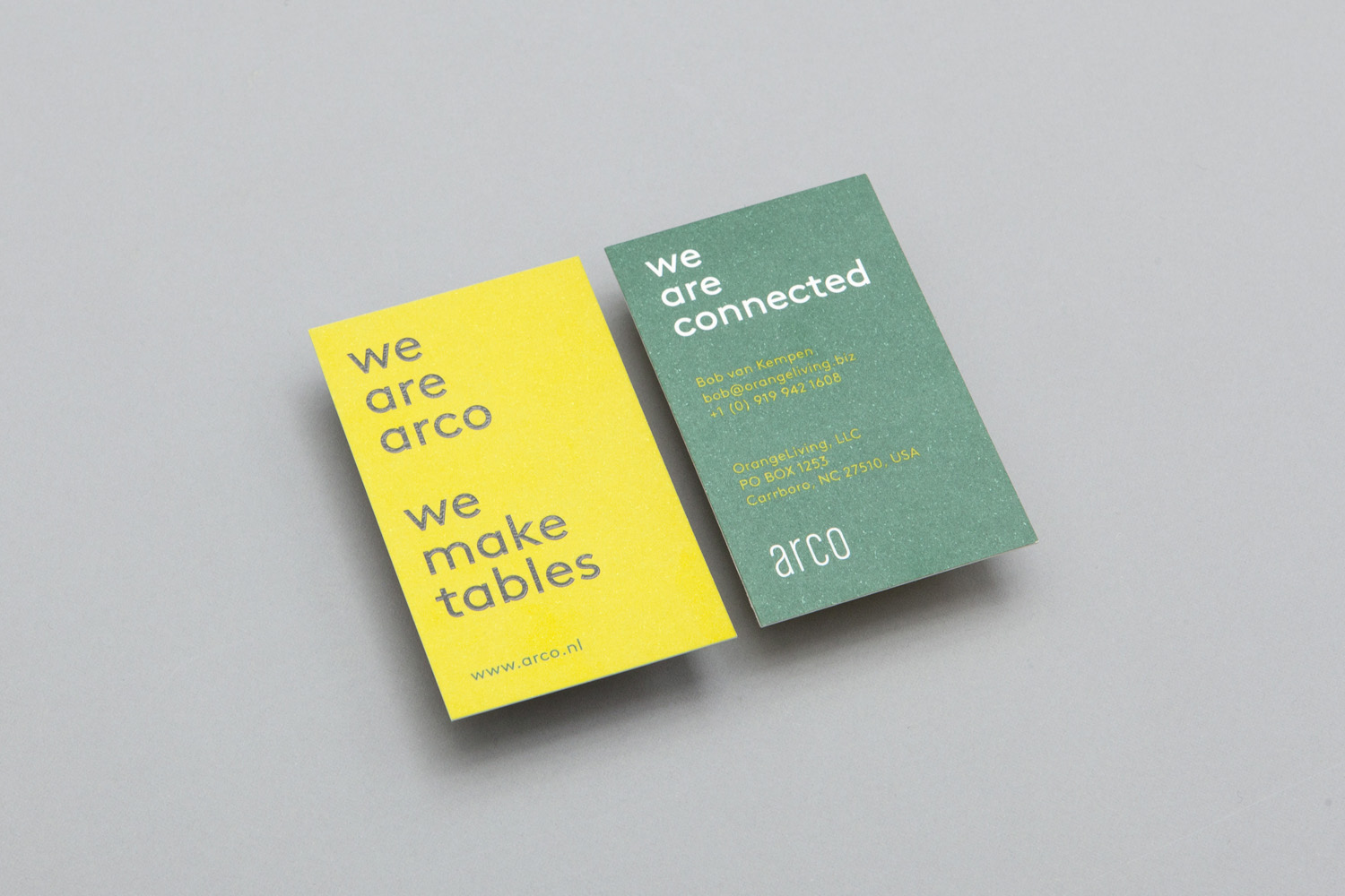
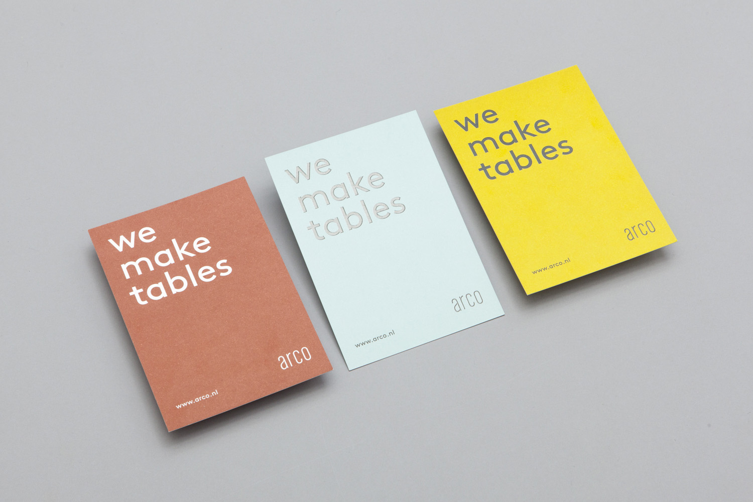
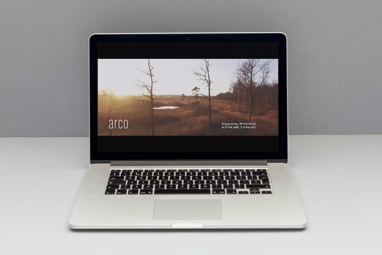
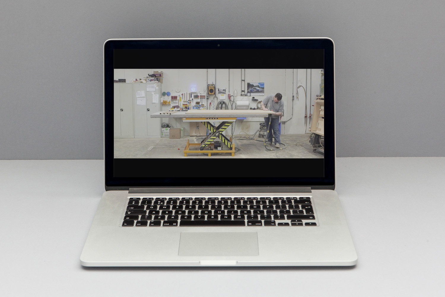
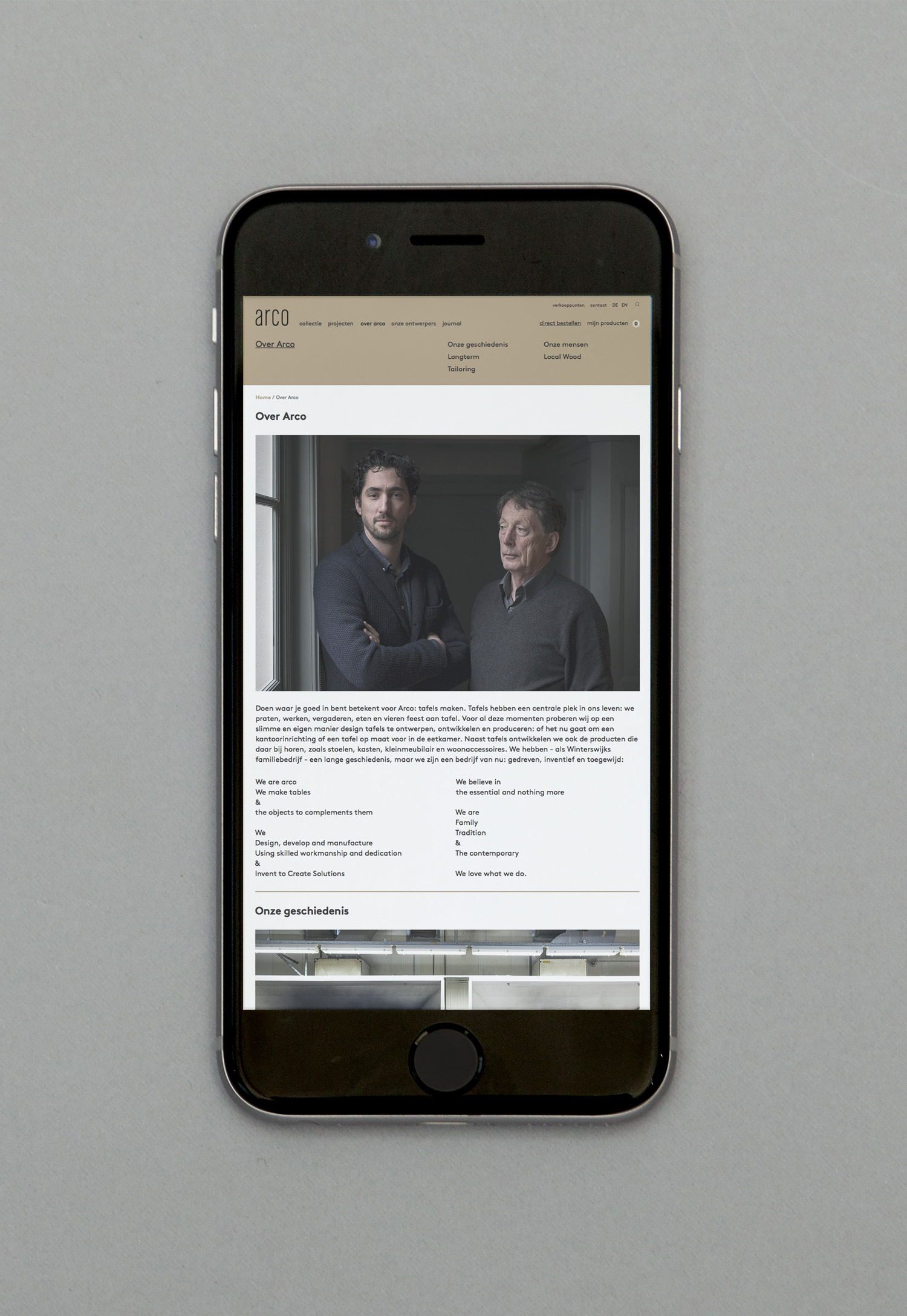
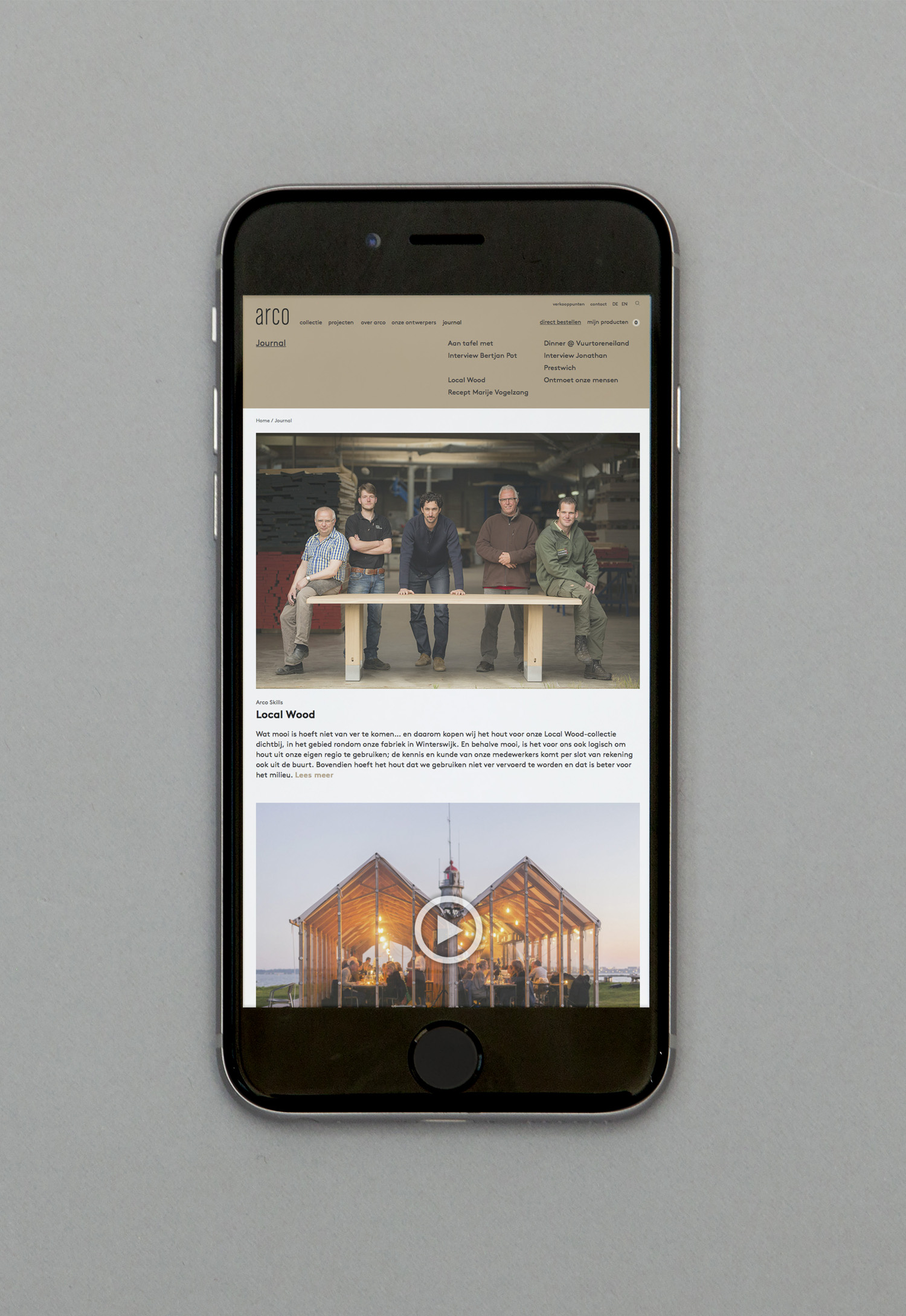
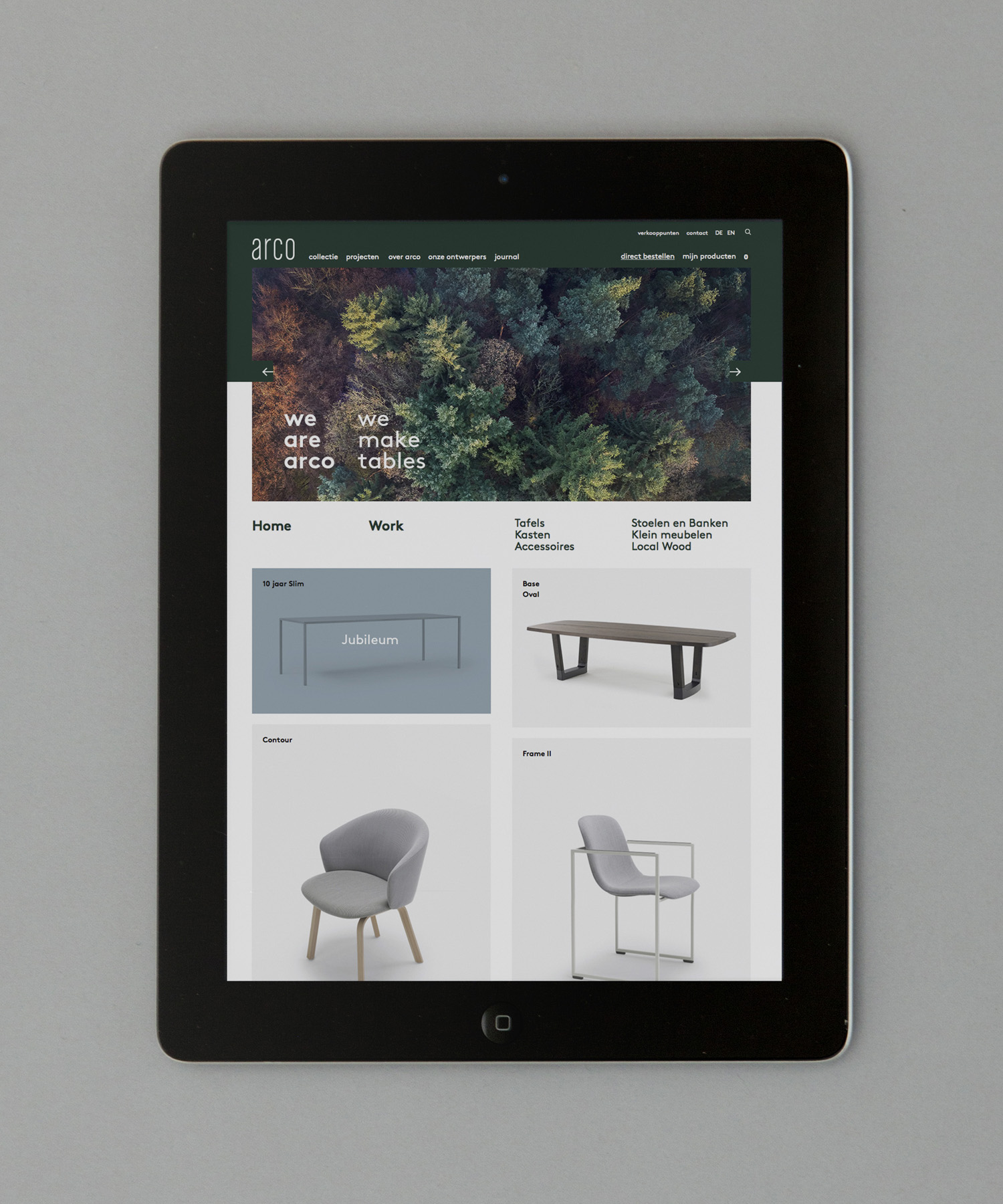
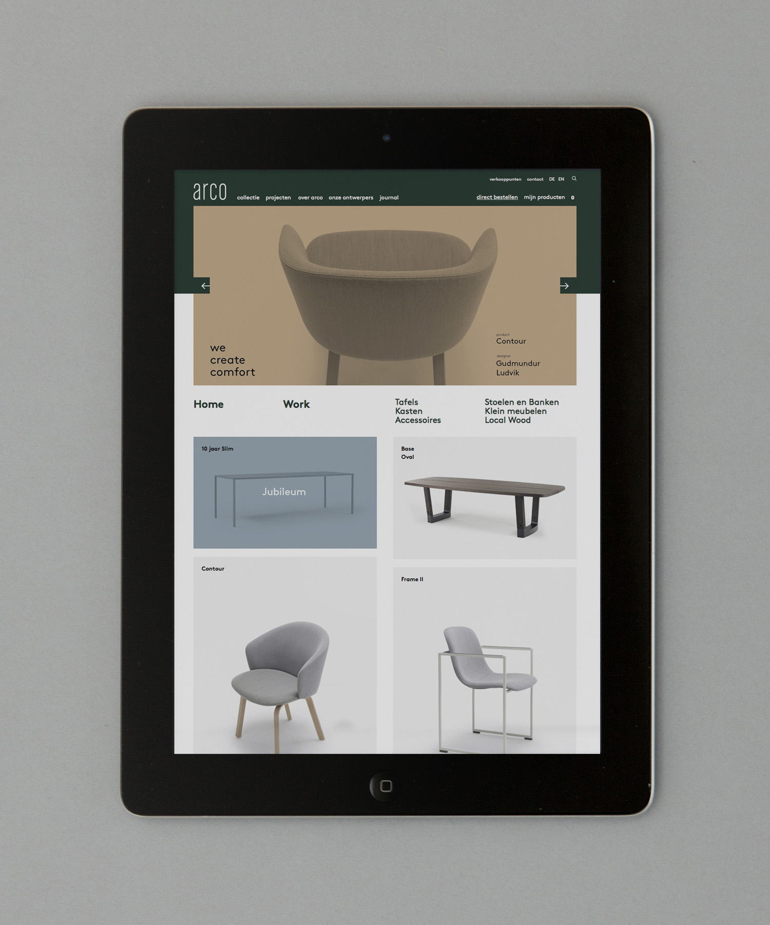
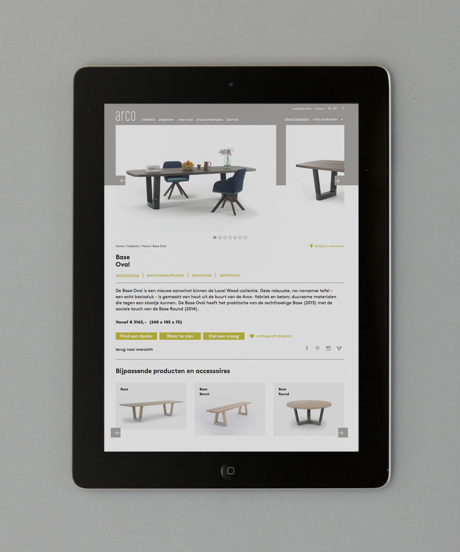
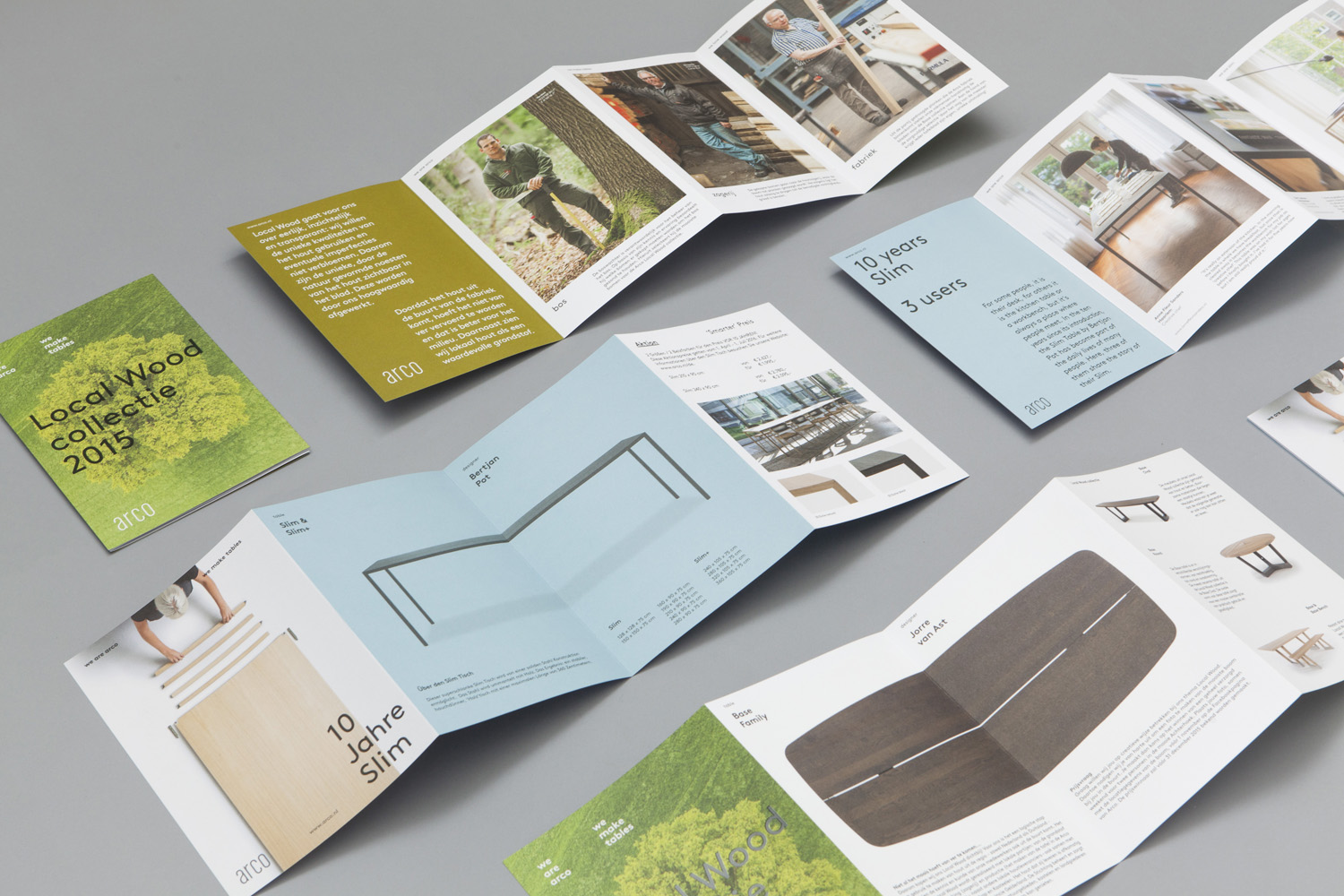
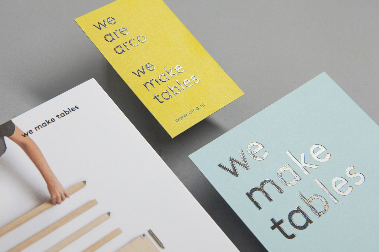
Eindhoven-based graphic design studio Raw Color worked with Arco Creative Director Jorre van Ast to revise the company’s brand identity, with a focus on its unique location and local production. This is expressed through the documentation of the surrounding area, the factory and its craftsmen. While the logotype remains the same, Raw Color delivered a compelling visual identity that juxtaposes solid colour and seasonal image, and uses contemporary type to deliver a collective tone of voice. This extends across and links a variety of print communication that includes business cards, leaflets, brochures, catalogues and postcards.
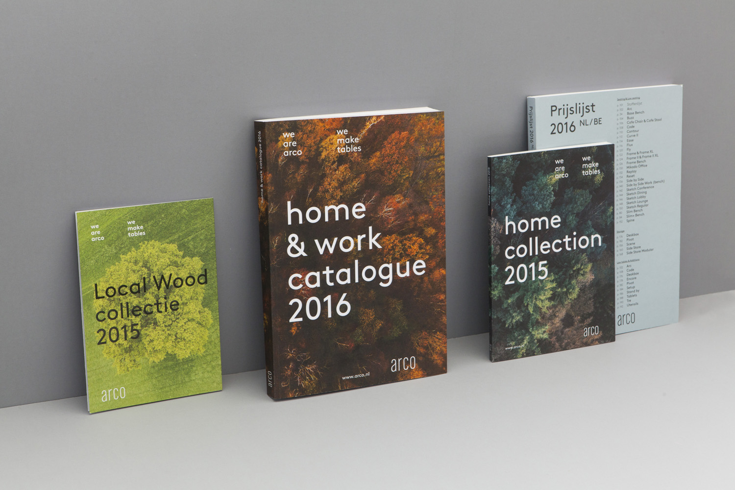
Although logotype remains unchanged it holds up well, secures a moment of continuity amongst the new, more emotive and prominent use of image and colour, and stands out from the shapes, weight and typesetting of Brown, in print and online.
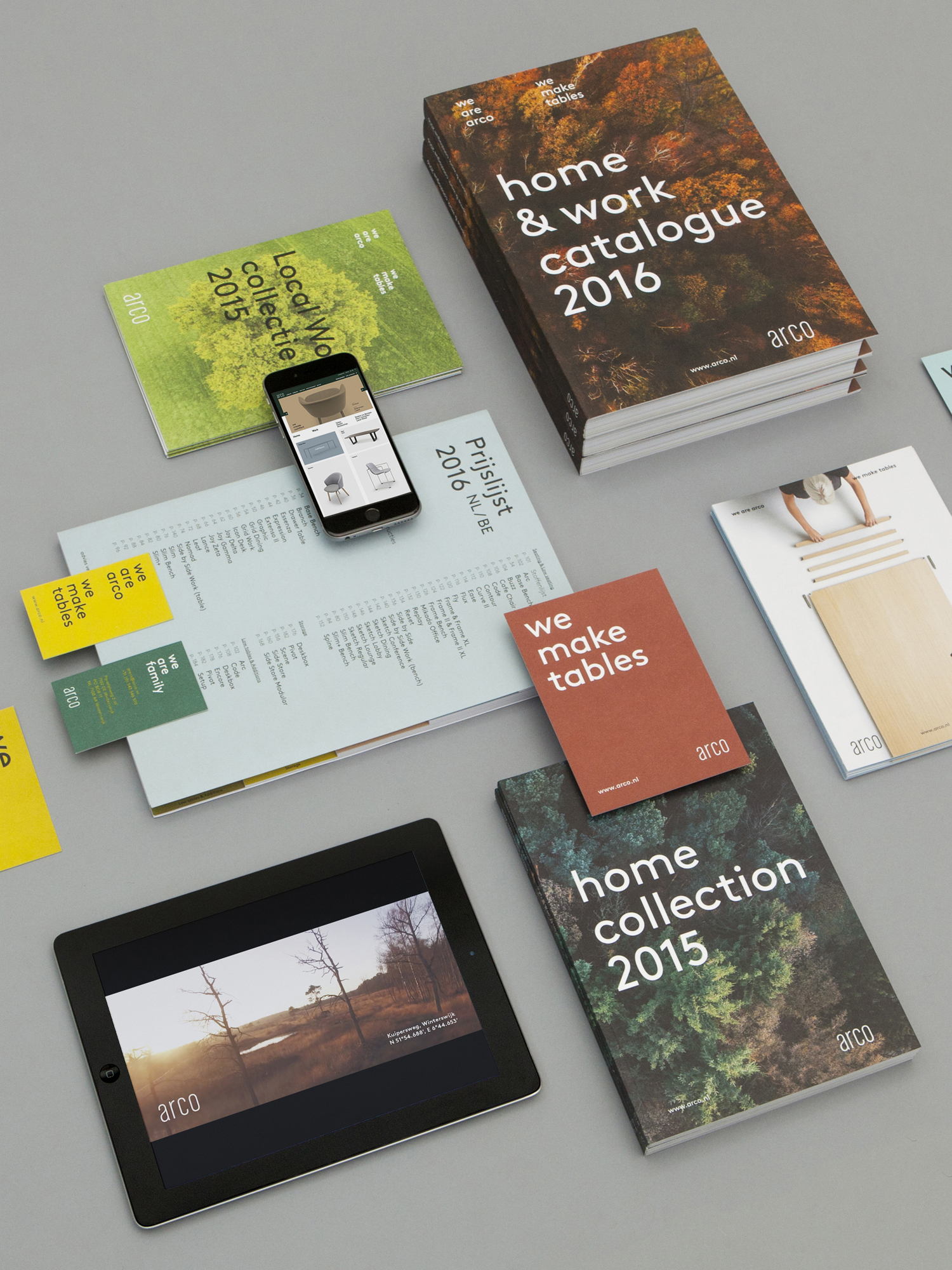
Solid colour effectively and distinctively plays with contemporary craft in the choice of pastels and seasonality in the mix of green, orange, yellow and brown. These function not only to establish visual identity and to divide content in print (which it does well), but to also make a connection with Arco’s local area, its materials and their life cycle.
Raw Color, working with Mike Roelofs, manage to convey seasonality more explicitly using photography with some impressive natural lighting, and links shots, separated by time, with a consistent use of ariel and panoramic views and a lovely sense of depth and detail, light and shadow. The way that furniture has been shot in a similar top down and in-profile way, is particularly neat.
This combination of solid colour and image, woodland and furniture, and the contrast between the two, lends Arco its most distinctive visual quality, yet is grounded by clear communicative intention and concept.
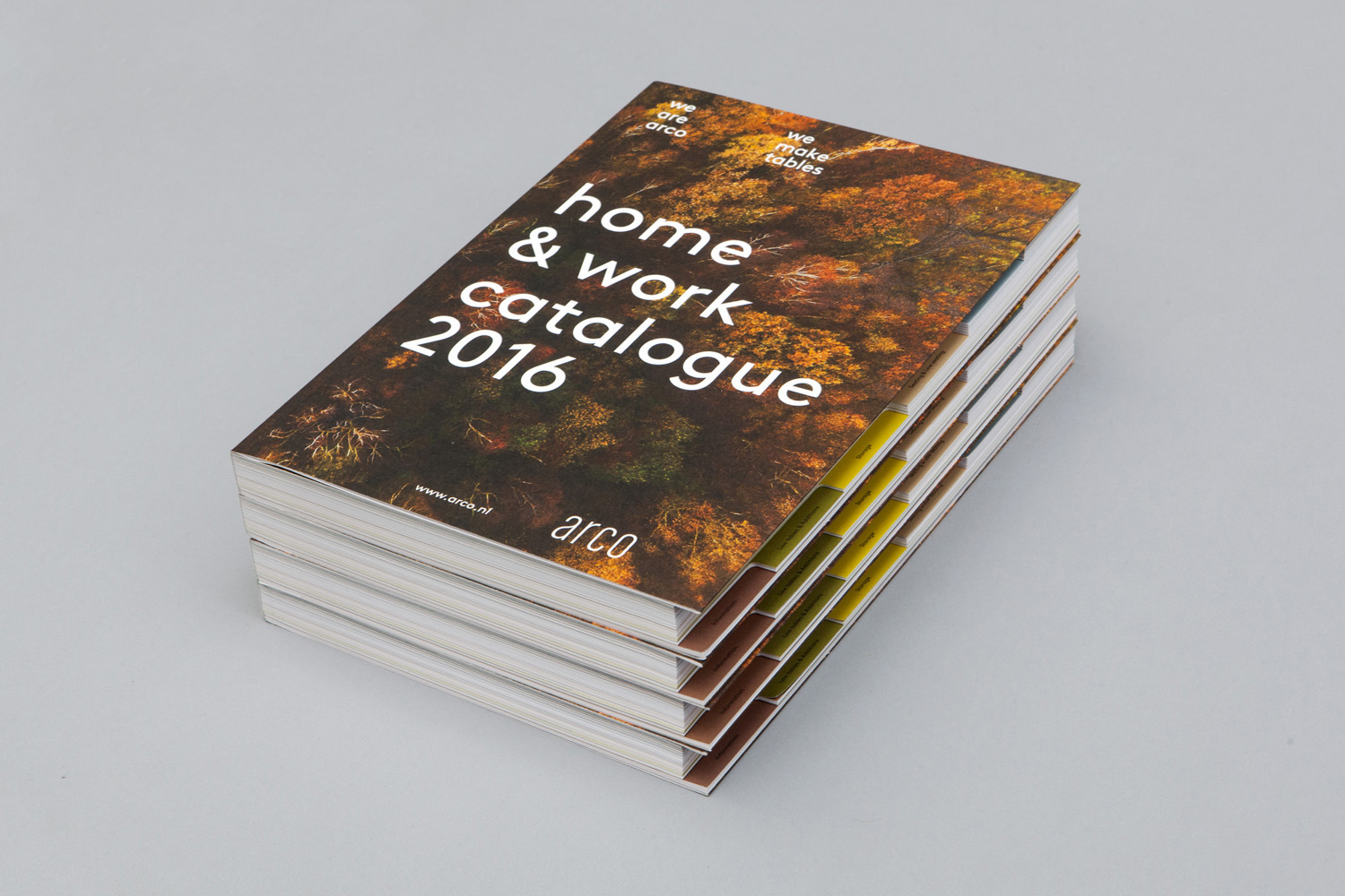
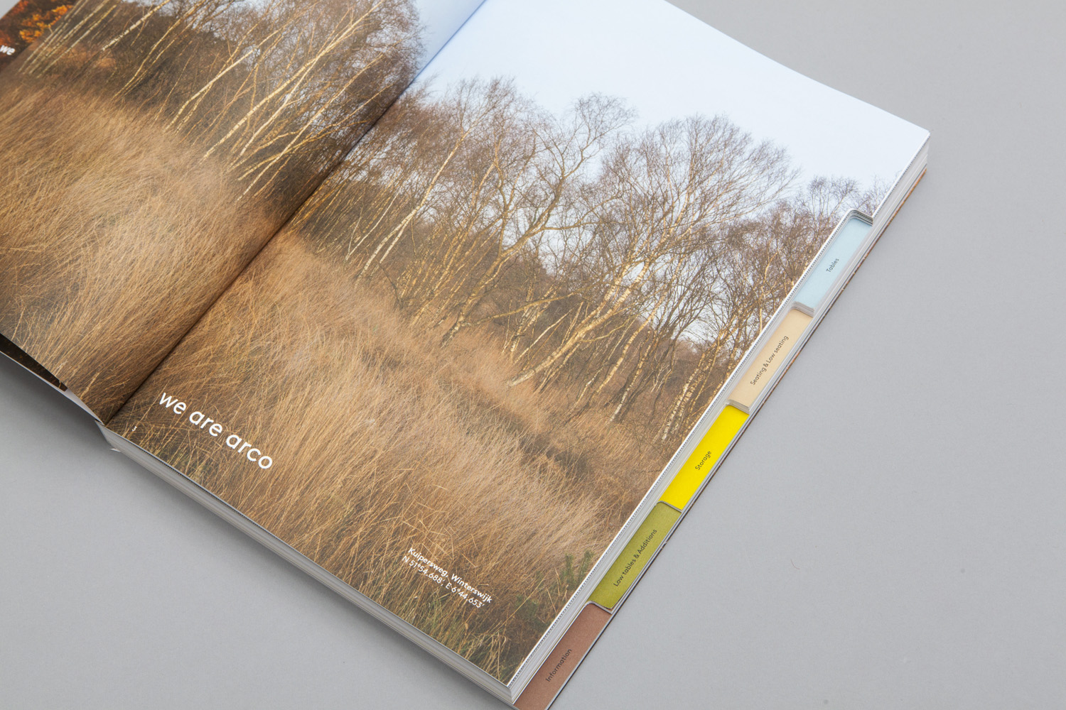
Lineto’s Brown, its typesetting and the grid-based structure of the print appears current and offers something of a reductionist and structured quality, in contrast to the natural forms and detail of photography, that ties in well with the practical and modernist aspects of Arco’s furniture. The disparity between image and type works to emphasise both, deliver visual contrast, and a depth of expression.
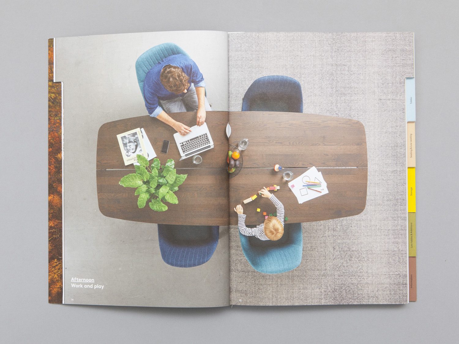
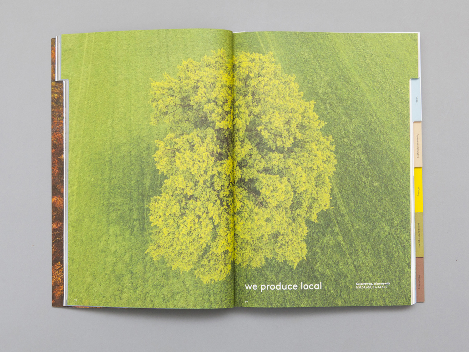
Although colour, image and typesetting is visually impactful and communicatively well-intentioned, Raw Color, working with Corinne Genestay and Ronnie Besseling, then weave in a personable narrative through tone of voice, a consistent use of “We”, and the introduction to the workshop and craftsmen. Although this is not unusual, check out Made Thought’s work for G . F Smith, it is in the way that this has been worked in alongside what is already a compelling and thoughtful set of ideas.
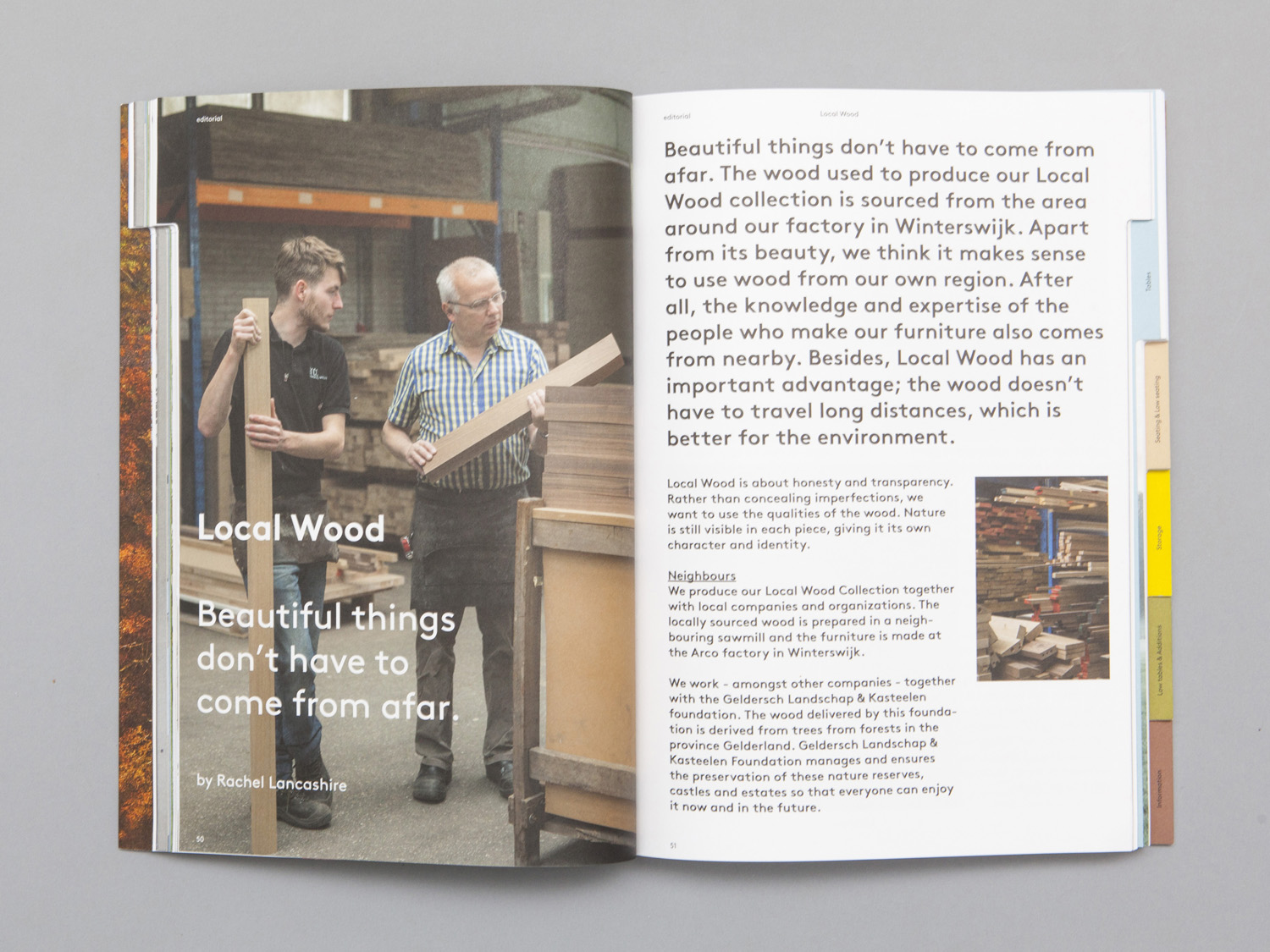
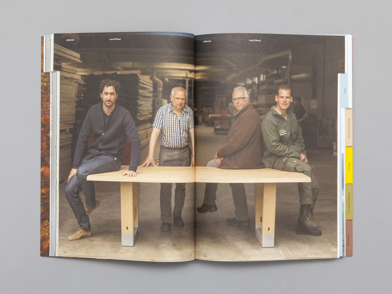
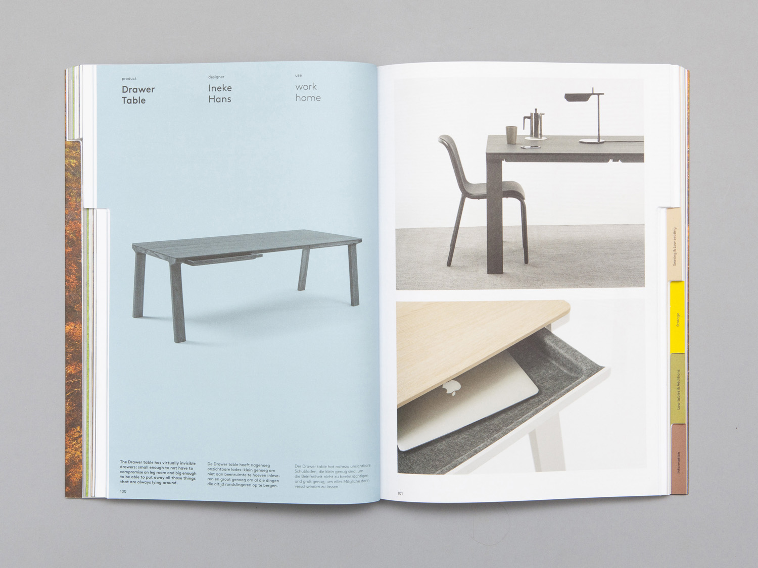
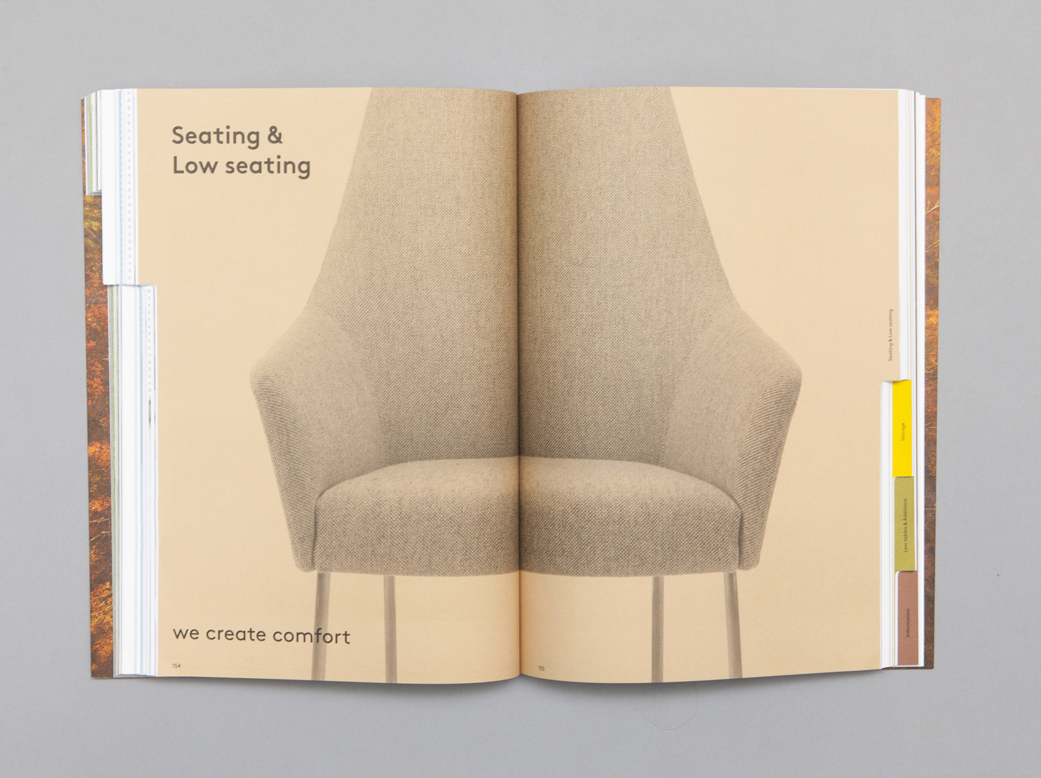
As you would expect from a furniture company, there is an element of materiality in print. This comes through in the uncoated surfaces of papers and boards, their dyed rather than printed colour, the robust weight and die cuts of the catalogue and what looks like the raised and glossy finish of a black thermographic print finish.
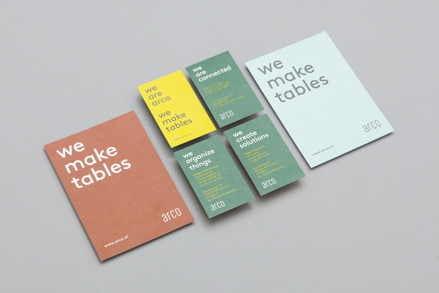
It is interesting and pleasant to see a company with a significant family heritage favour a completely contemporary positioning and go all in on its connection to local materials and community as well as touching on the aesthetic and functionality of its products.
Where often you get a logo-centricity, Raw Color are broad and thorough in their communicative approach, effectively utilising image, colour, type, layout and language to build up layers of detail and insight, and establish a well-balanced and engaging brand expression whilst remaining clear and well-composed.
Design: Raw Color. Opinion: Richard Baird. Fonts Used: Brown.
