Boreal Network, Itasca Road Trip by Bedow
Opinion by Richard Baird Posted 30 June 2016

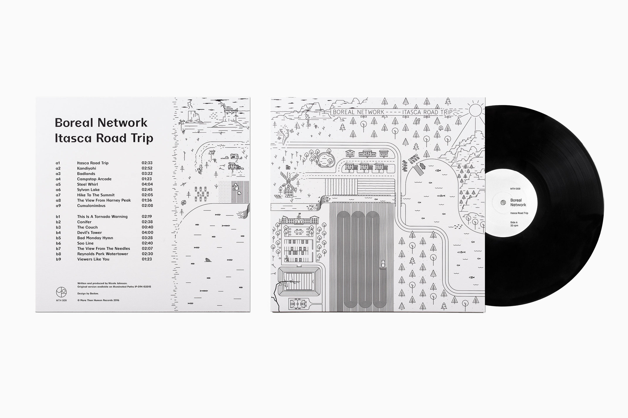
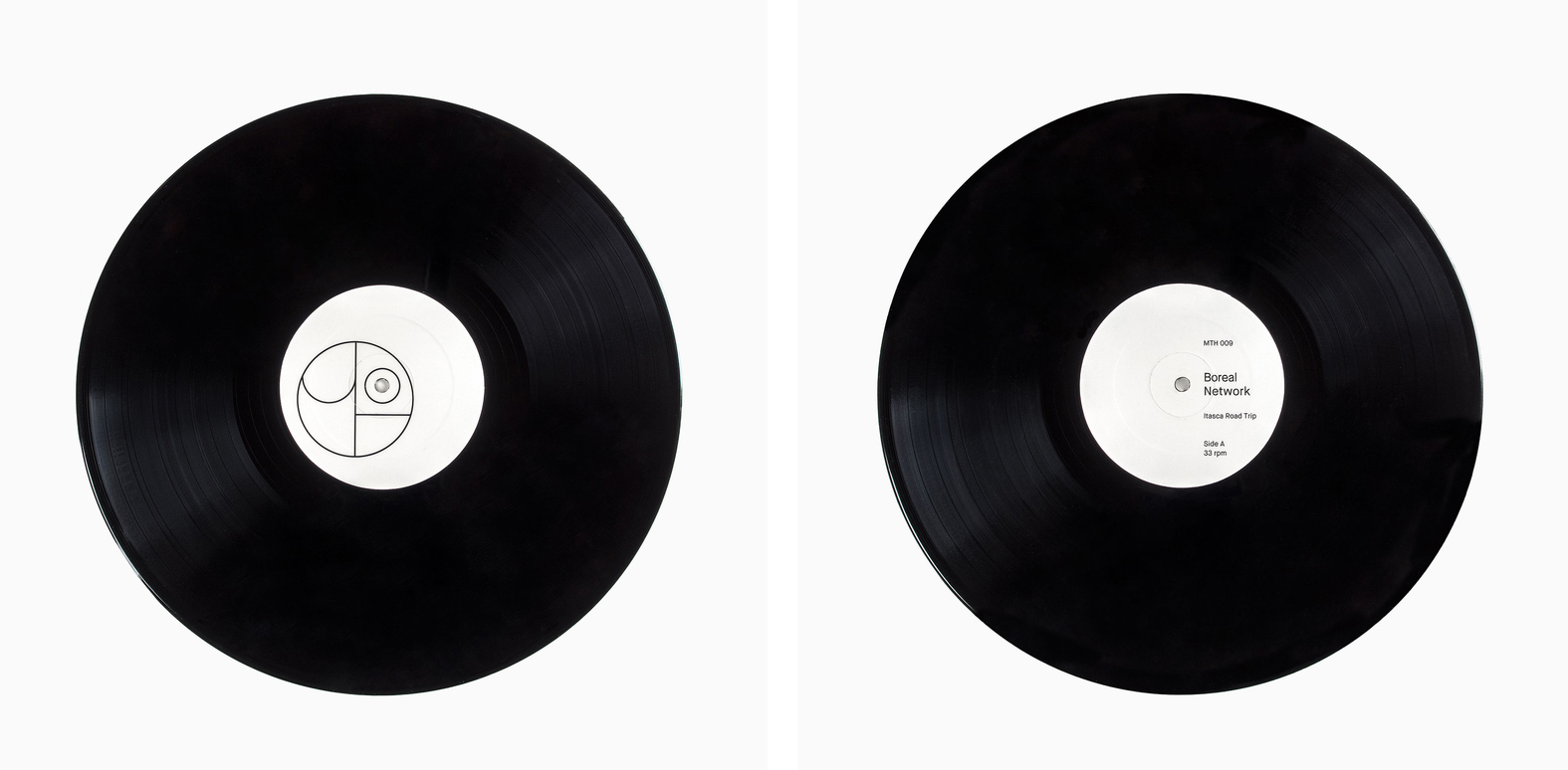
Nicole Johnson is a Seattle-based Minnesotan creating what Miles Bowe of Fact Magazine describes as “sun-drenched, foggily nostalgic electronica” under the name Boreal Network. Itasca Road Trip is a limited edition vinyl rerelease and trimmed down version of an earlier album by Boreal Network, distributed by More Than Human Records and featuring artwork by Swedish graphic design studio Bedow. Where the album takes an aural tour through the Itasca national park from Nicole’s home in Minnesota, the artwork visualises this through monolinear illustration with plenty of detail and a subtle storytelling component. You can listen to the album here.
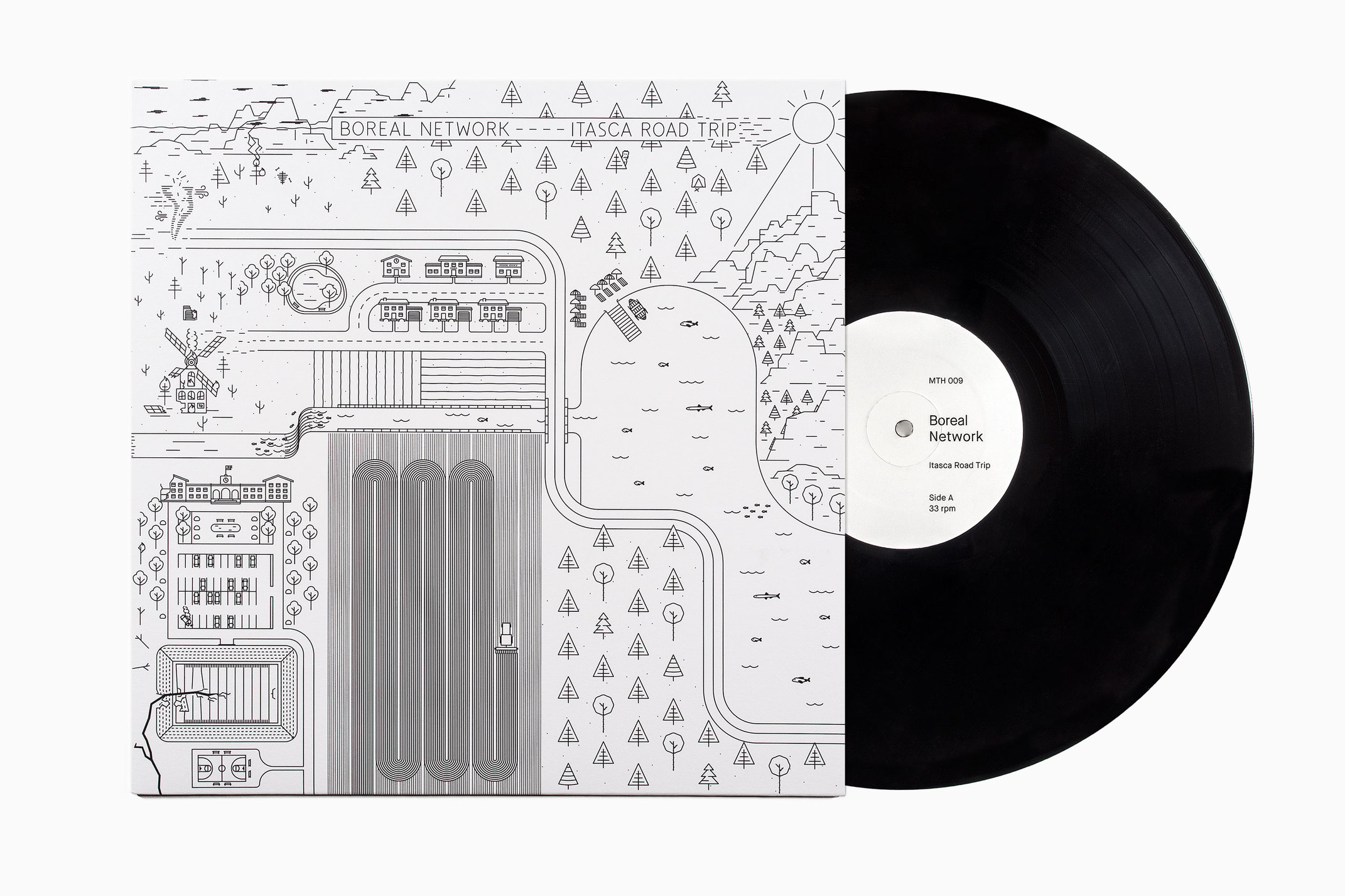
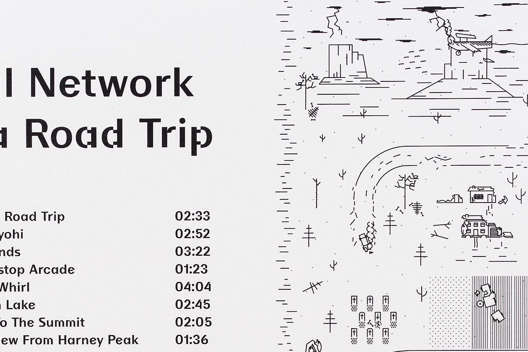
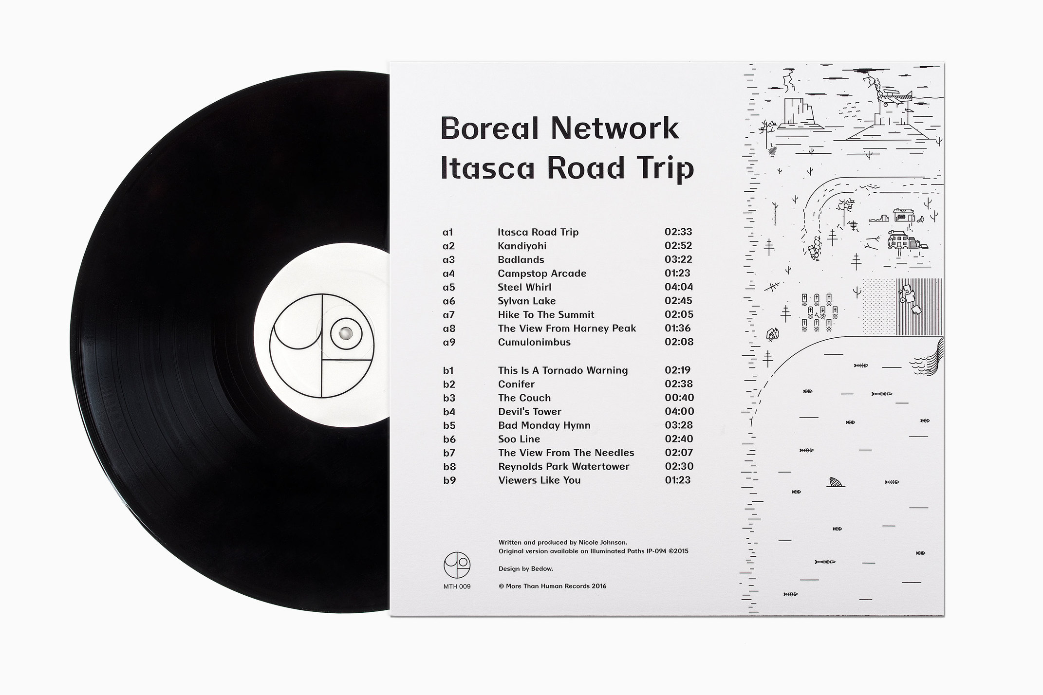
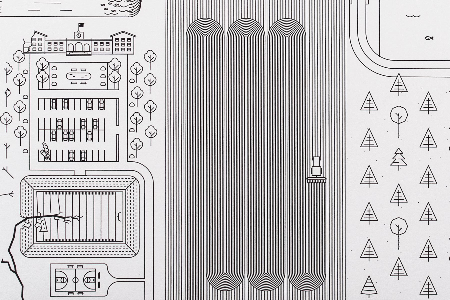
Bedow’s work is a neat, distinctive and contemporary interpretation of album. The relationship between album name, track titles, sound and artwork feels both visceral and clearly evident, with unusual and small details that demand a closer look and working well within the context of both a limited edition and large format release. Where elements such as burning trees, bones, cracks through the earth and a broken windmill appear initially strange, the tracklist on the reverse, functioning as a legend, is revelatory and satisfying.
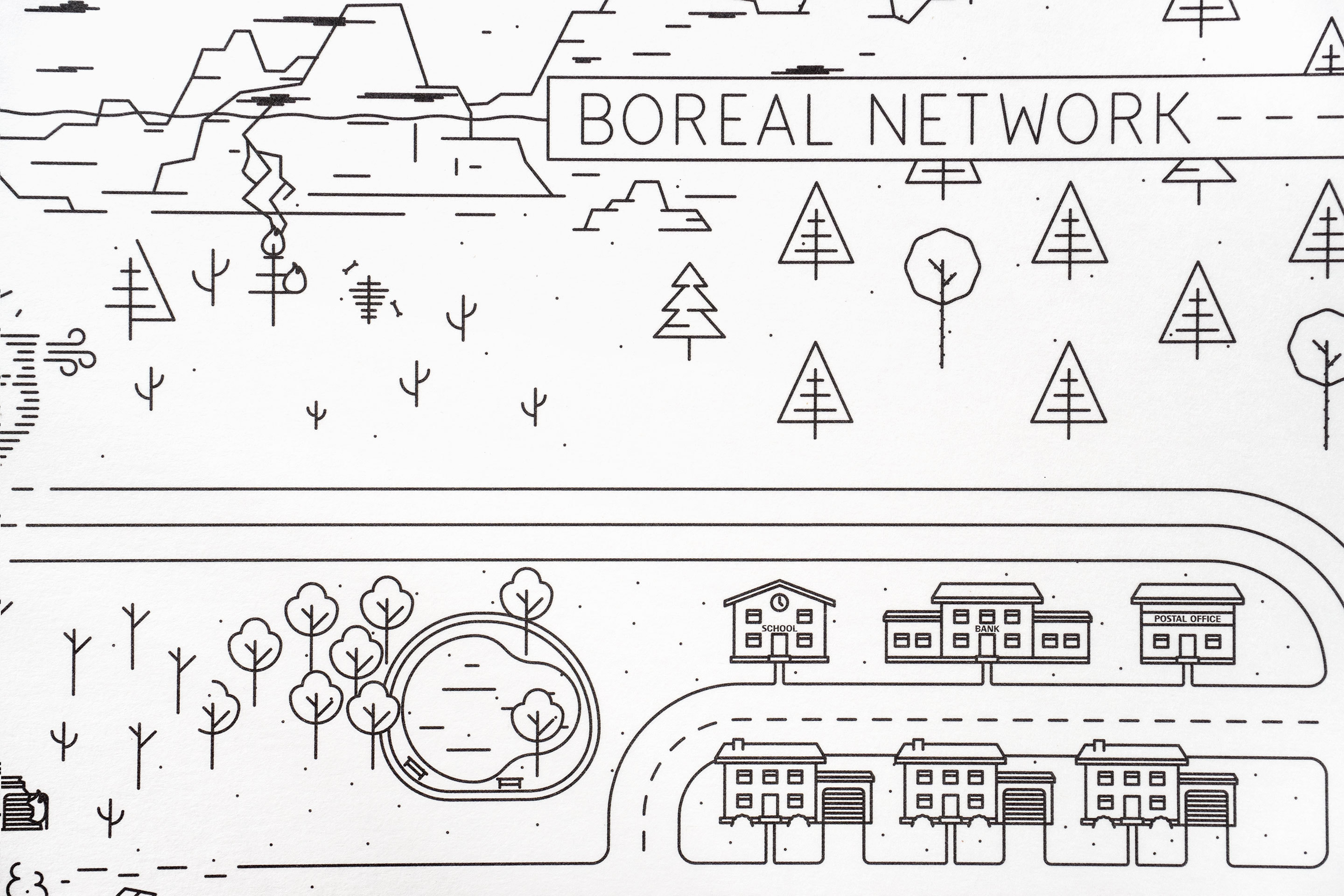
Aesthetically, consistency of line appears current, with a good use of space, light and shade created by line density and a pleasant continuity between front and back as artwork reaches over the sides. There is some nice variation in trees, rocks and buildings, with plenty to discover, and a flow that links many of these details, not only in the winding road but also more subtly in the direction of fish and shapes of the clouds. While a static piece, the harvester and tornado work in a bit motion.
Other neat details include an element of the historical in the crack caused by an earthquake through the stadium, the depiction of a diverse natural landscape, particularly in the depiction of red pines and other tree varieties of the Itasca park, and the move from the idyllic right and disastrous left which fits the album sound really well. Although the right to left composition defies storytelling convention and is less intuitive, the favour for correct geography is sensible.
There is clearly plenty more if your interested in learning more about the park and state. which gives a rich visual a thoughtful and referential quality that compliments the album. A The bold and unusual type choice of BC Liguria from Briefcase Type Foundry, adds a moment of contrast alongside artwork, and plays well to the electronic nature of the album with a glitch-like digital quality. More from Bedow on BP&O.
Design: Bedow. Opinion: Richard Baird. Fonts Used: BC Liguria.
