Terri Timely by Bedow
Opinion by Richard Baird Posted 31 August 2016

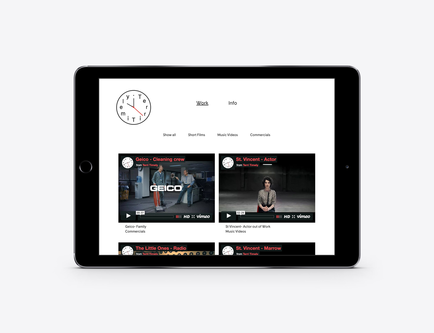
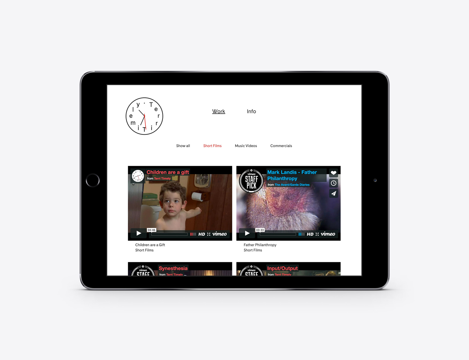
Terri Timely is a Californian directing duo creating short films, music videos and commercials. Although they collaborate with a variety of clients; these include Mitsubishi, Amazon and Comcast, much of the duo’s work share a quirky and humorous visual style. This is expressed by their new brand identity, developed by Swedish graphic design studio Bedow, through a simple but playful visual style and animation that extends across stationery, business cards and website.
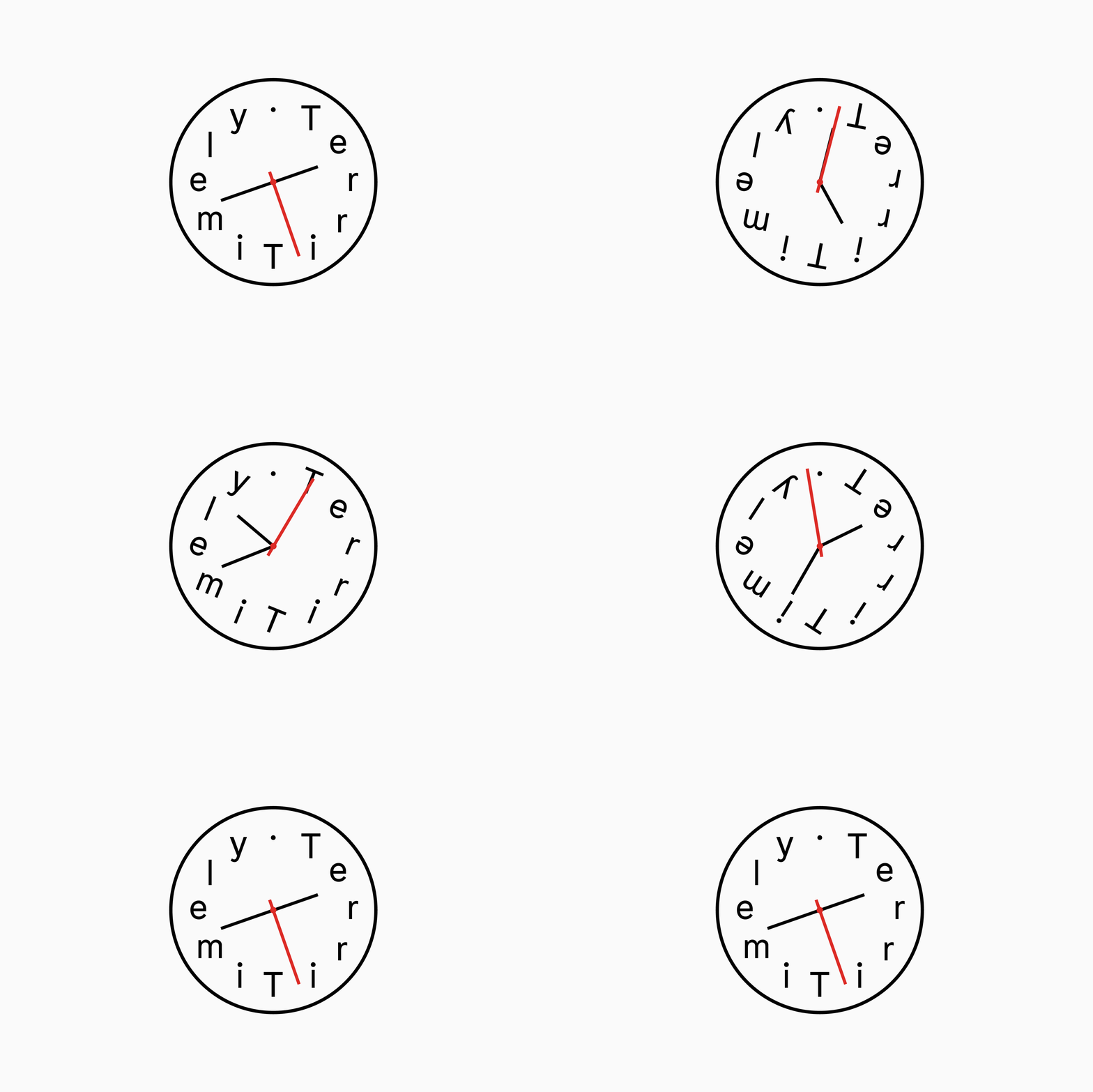
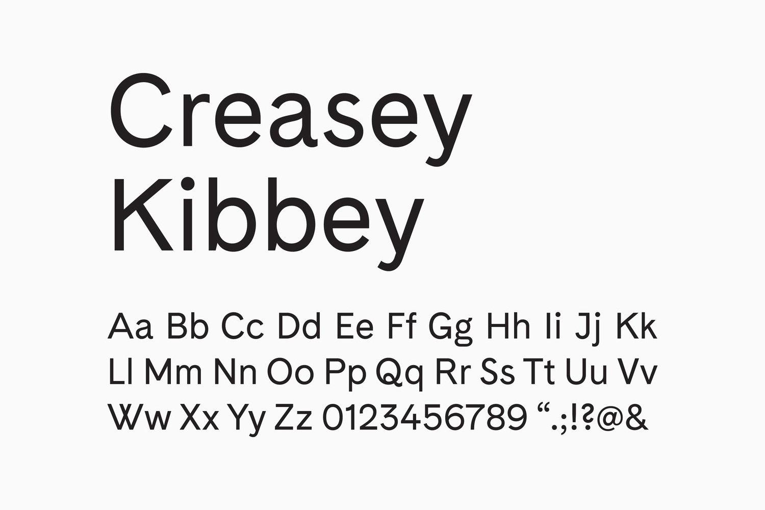
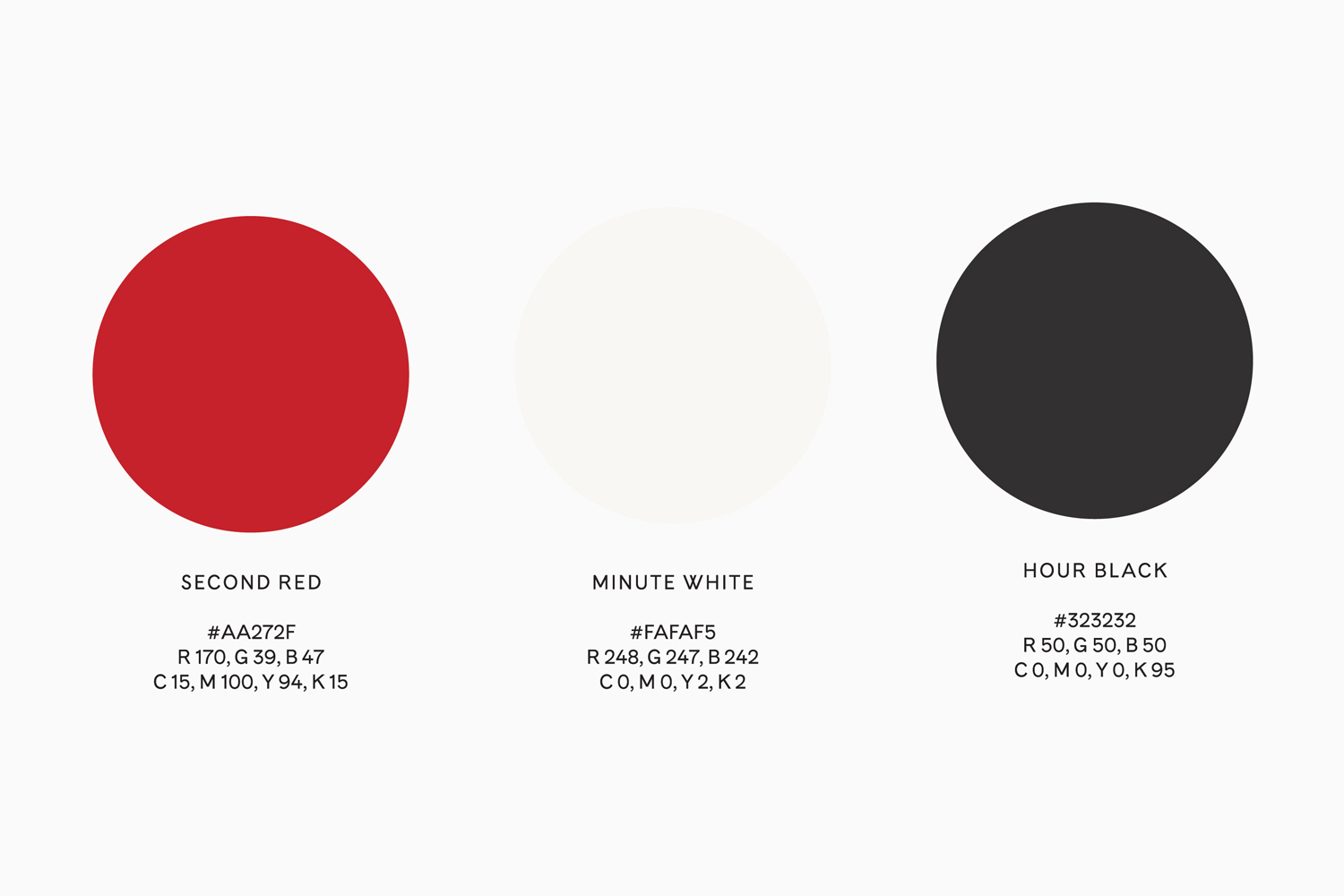
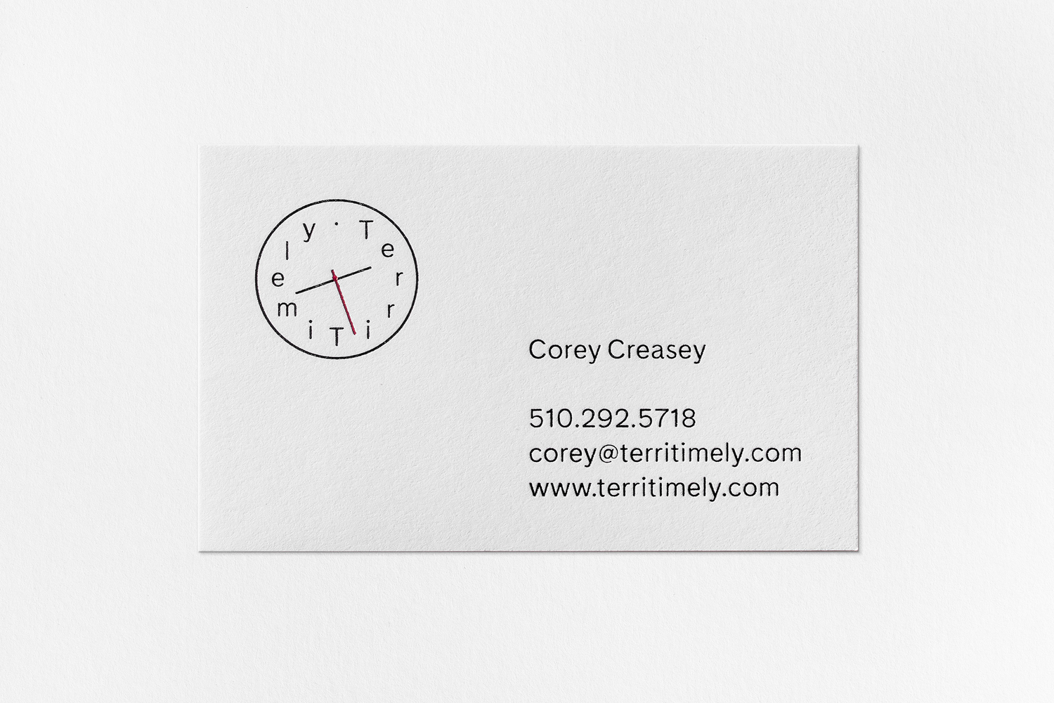
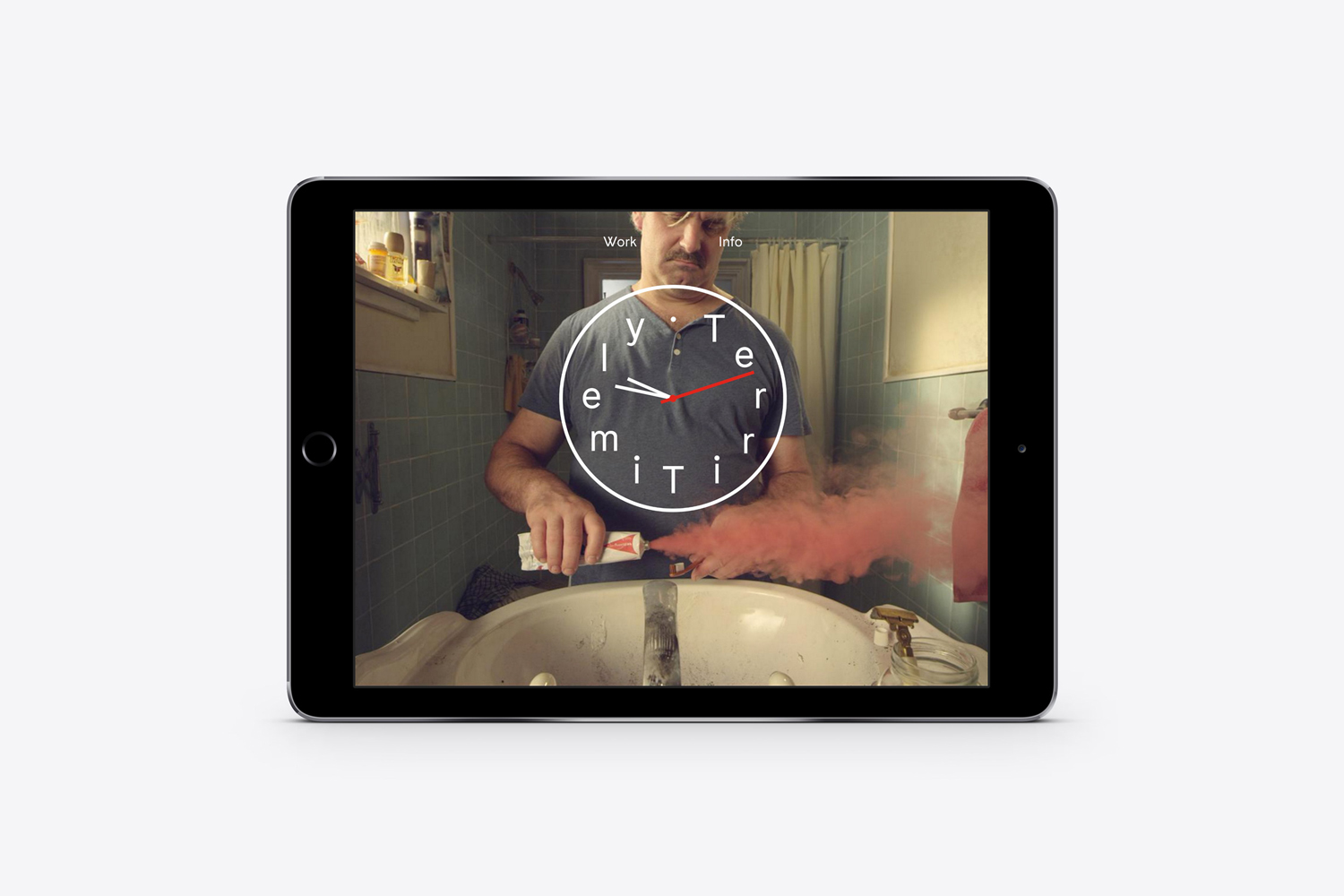
Bedow have managed to draw unique character from few assets, and further more, from a very simple combination of monolinear lines and typography, plenty of space and only two colours. The quirky character of Terri Timely’s work (be sure to check out their portfolio here) comes through well in the animation of logotype, but also in typesetting; lowercase characters rarely sit comfortably around the inside edges of a circle and give the work a visually awkward but distinctive quality. The proportion and spacing of letters allows the logotype to sit well over screen grabs of the duo’s work online.

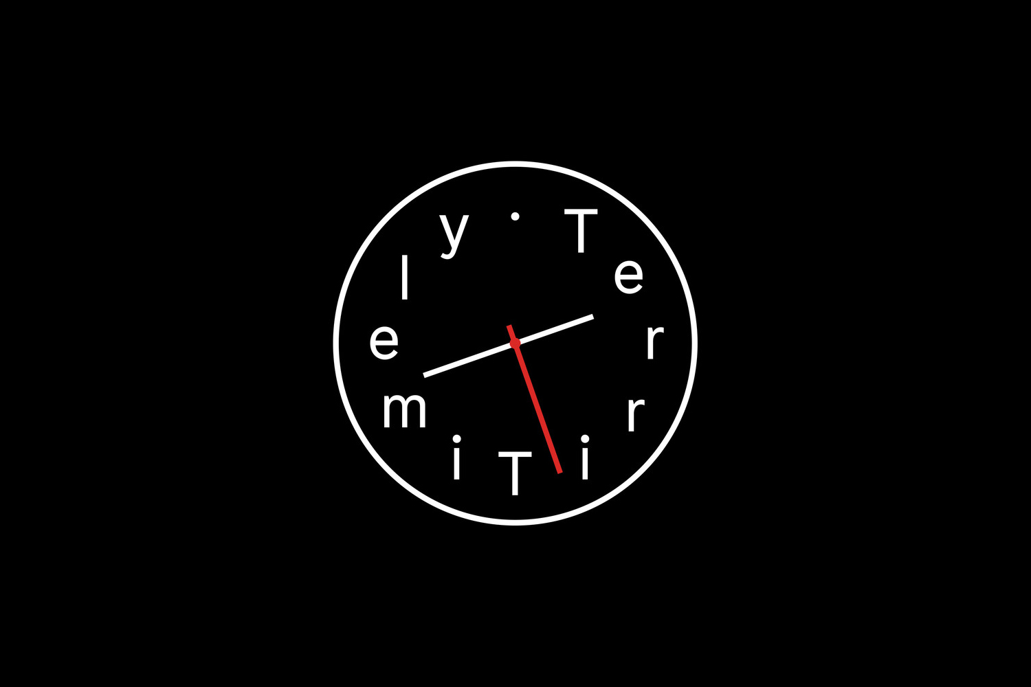
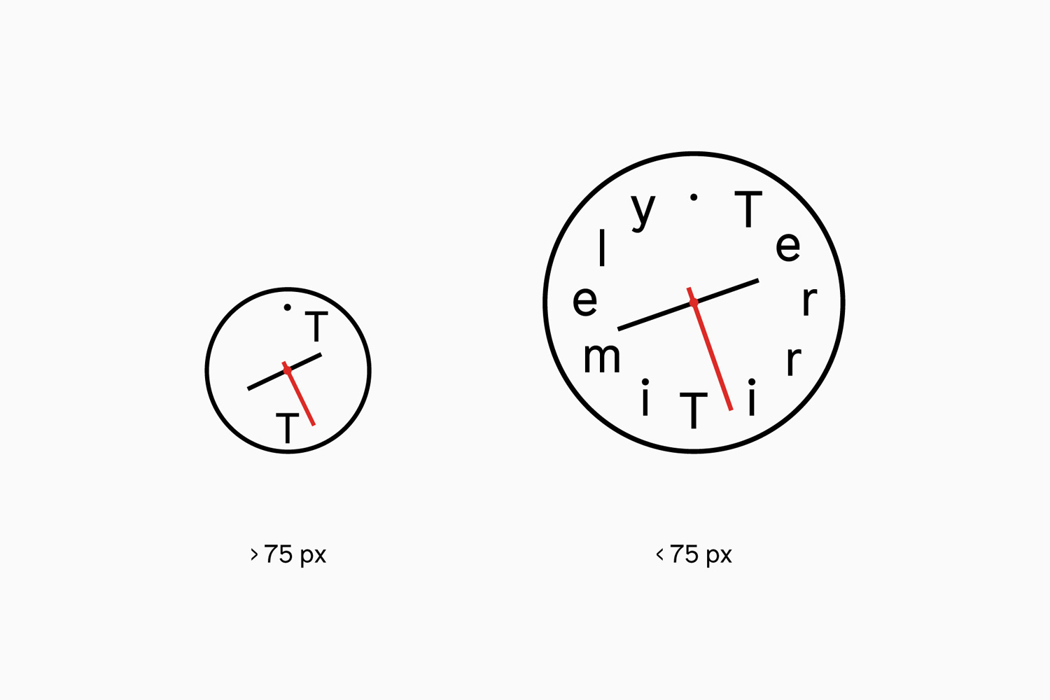
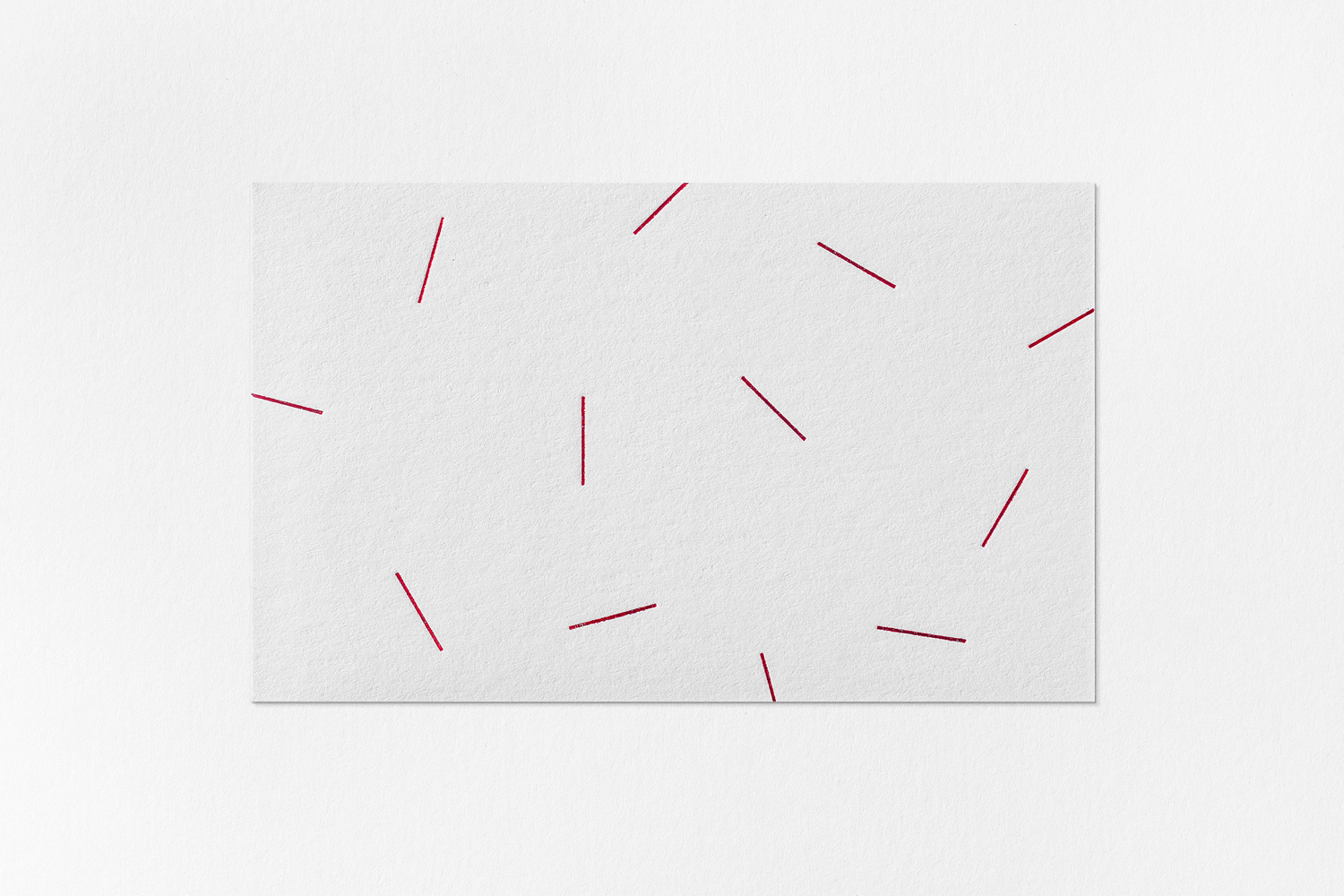
Although there is a clear reductive quality to the work, there are a few nice flourishes. These include the logotype as a working clock online, and three at the foot picking out the world time of Terri Timely’s representation, a smaller alternative logo for favicon and avatars, and clock hands as animated patterns and a simple pattern detail across the backs of the business cards. Also, at “Terri O’Clock”, somewhere around 2.45, the minimal and restrained becomes the quirky with some alternative graphic assets and a spinning logotype taking over the site. It is a playful touch that dials into the tone of Terri Timley’s work, and brings contrast to the more reductive aspects of identity. More from Bedow on BP&O.
Design: Bedow. Opinion: Richard Baird. Fonts In Use: Cádiz.
