Hidraulik by Hey
Opinion by Richard Baird Posted 15 September 2016
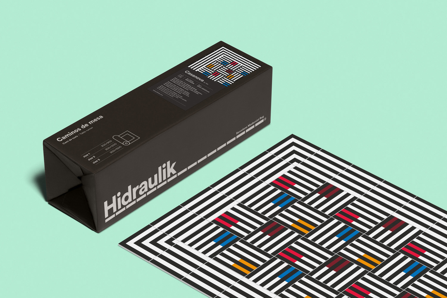
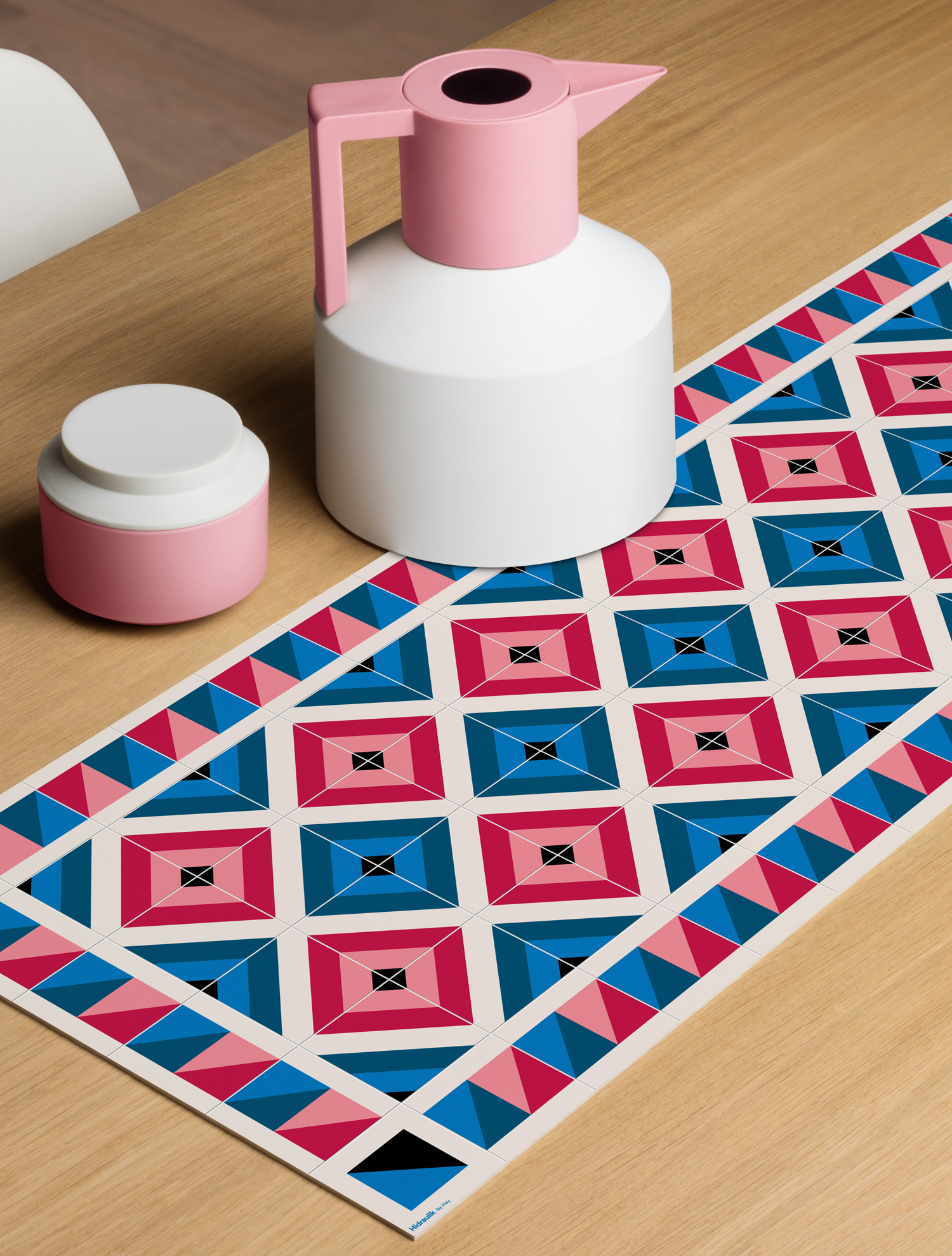
Hidraulik is a Barcelona-based business producing floor mats, table mats and runners for contemporary spaces. These are inspired by cement panels hydraulically pressed, rather than fired, with a layer of coloured pigment.
Hydraulic panels originated in the 1850’s and experienced a resurgence in the mid 20th century. At that time they would often feature brightly coloured and detailed patterns, and were popular during an era of personalisation and interior self-expression. Hidraulik brings these right up to date, applying a similar aesthetic quality to a thin, flexible and moveable PVC surface.
The first range was made up of Art Nouveau-inspired prints designed in house, and was followed up by modernist-inspired prints created by Huaman, the graphic design studio also responsible for Hidraulik’s brand identity and packaging.
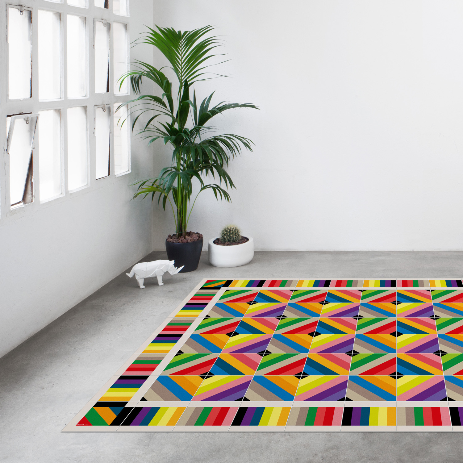
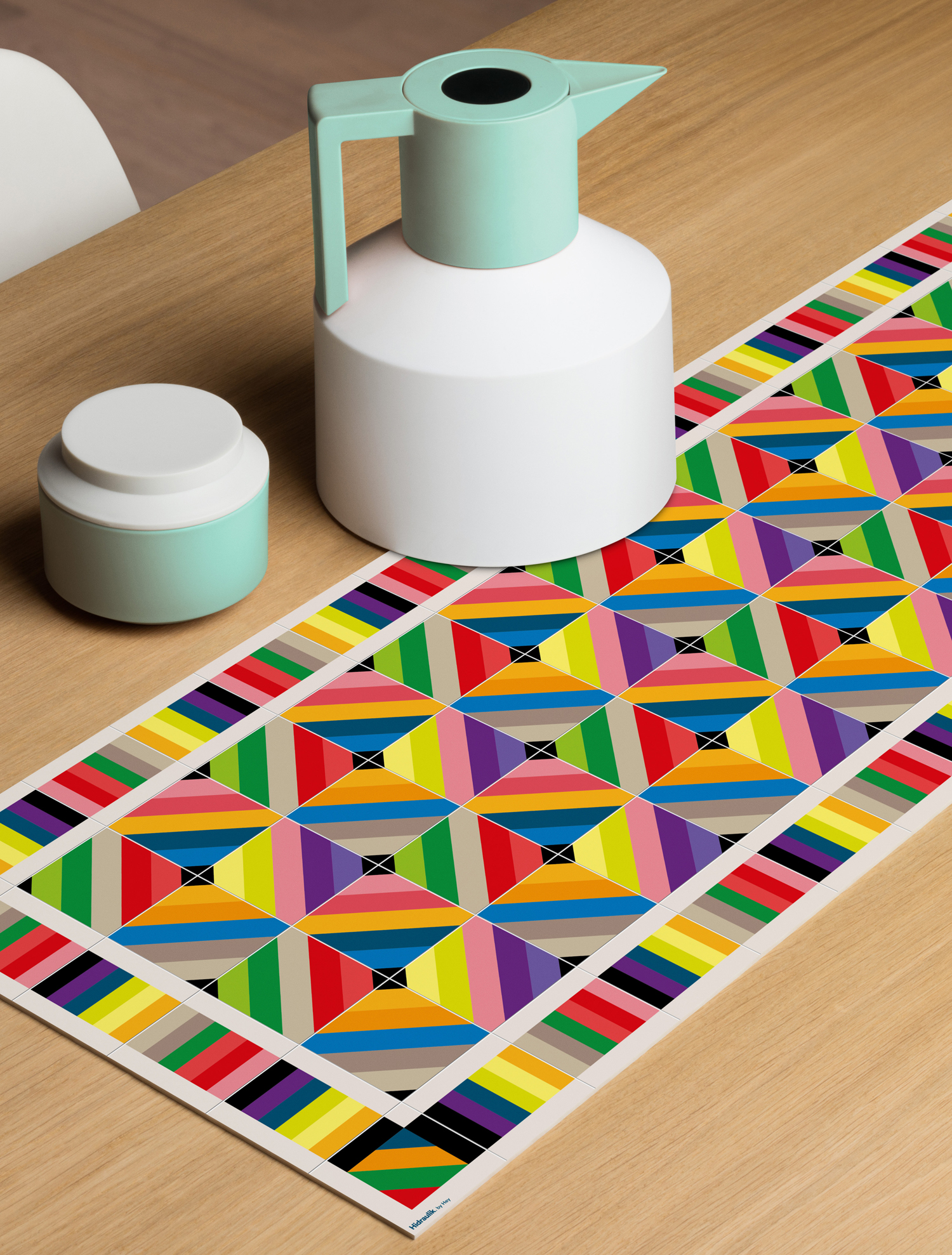
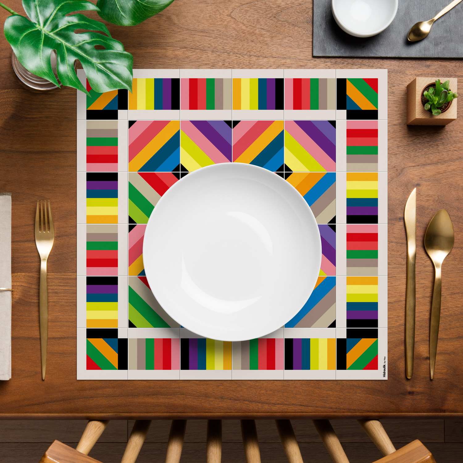
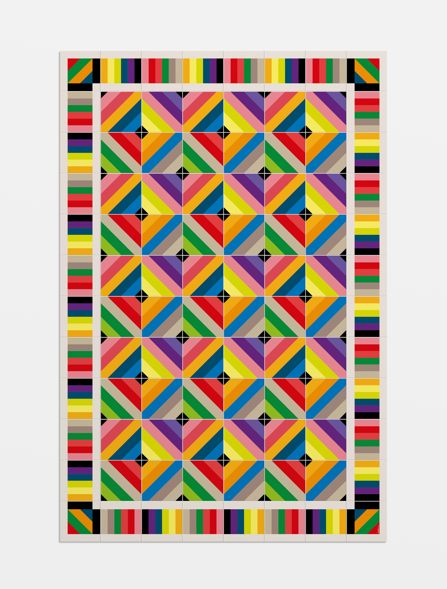
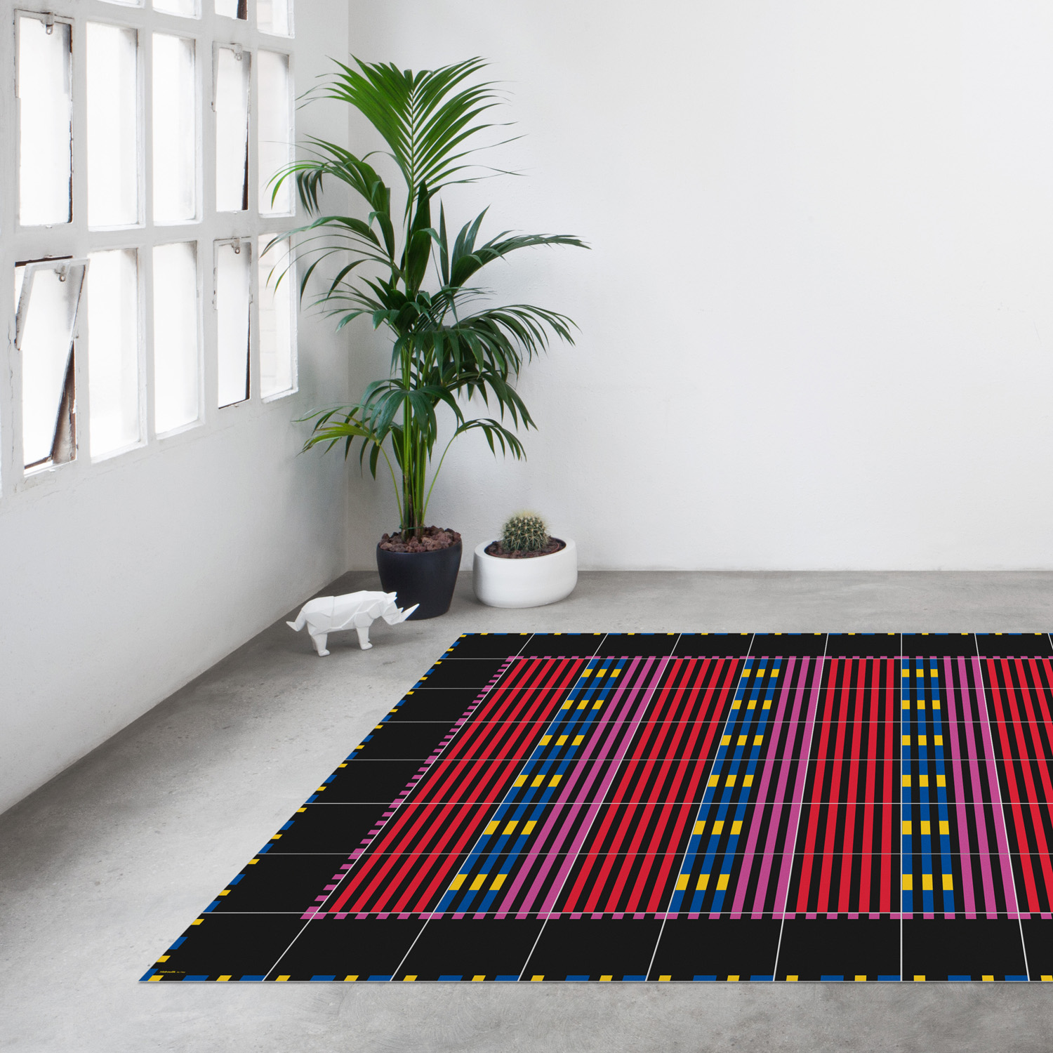
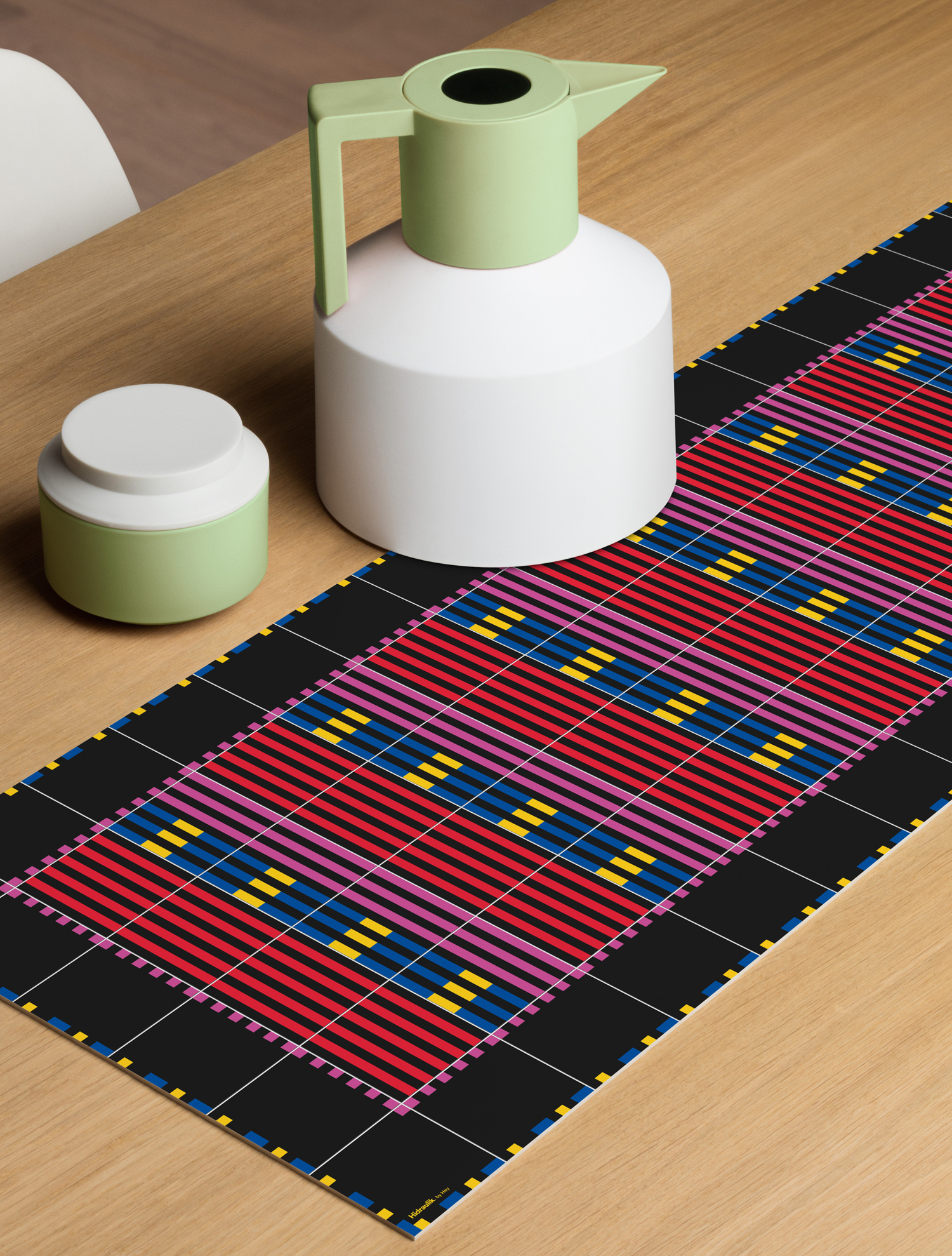
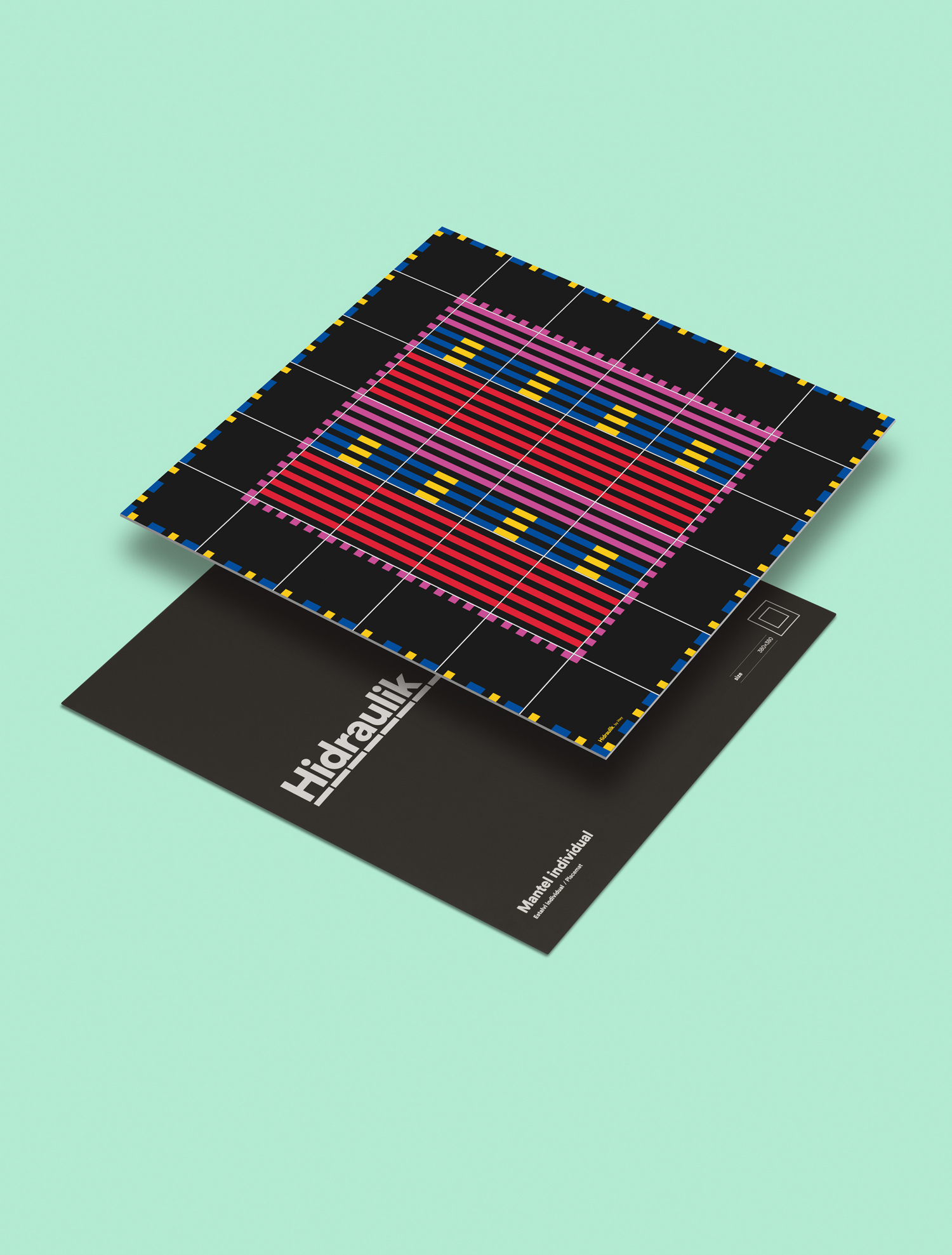
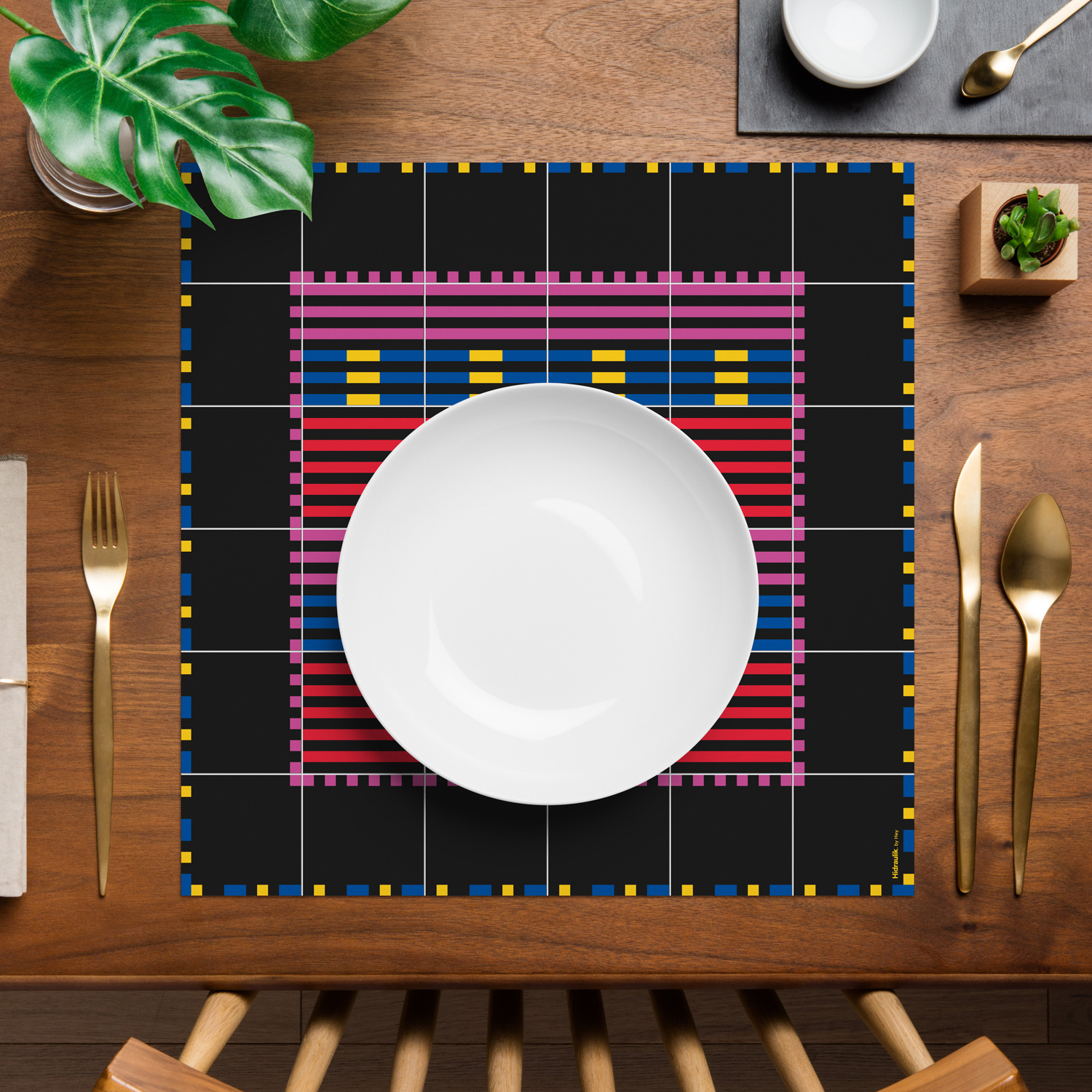
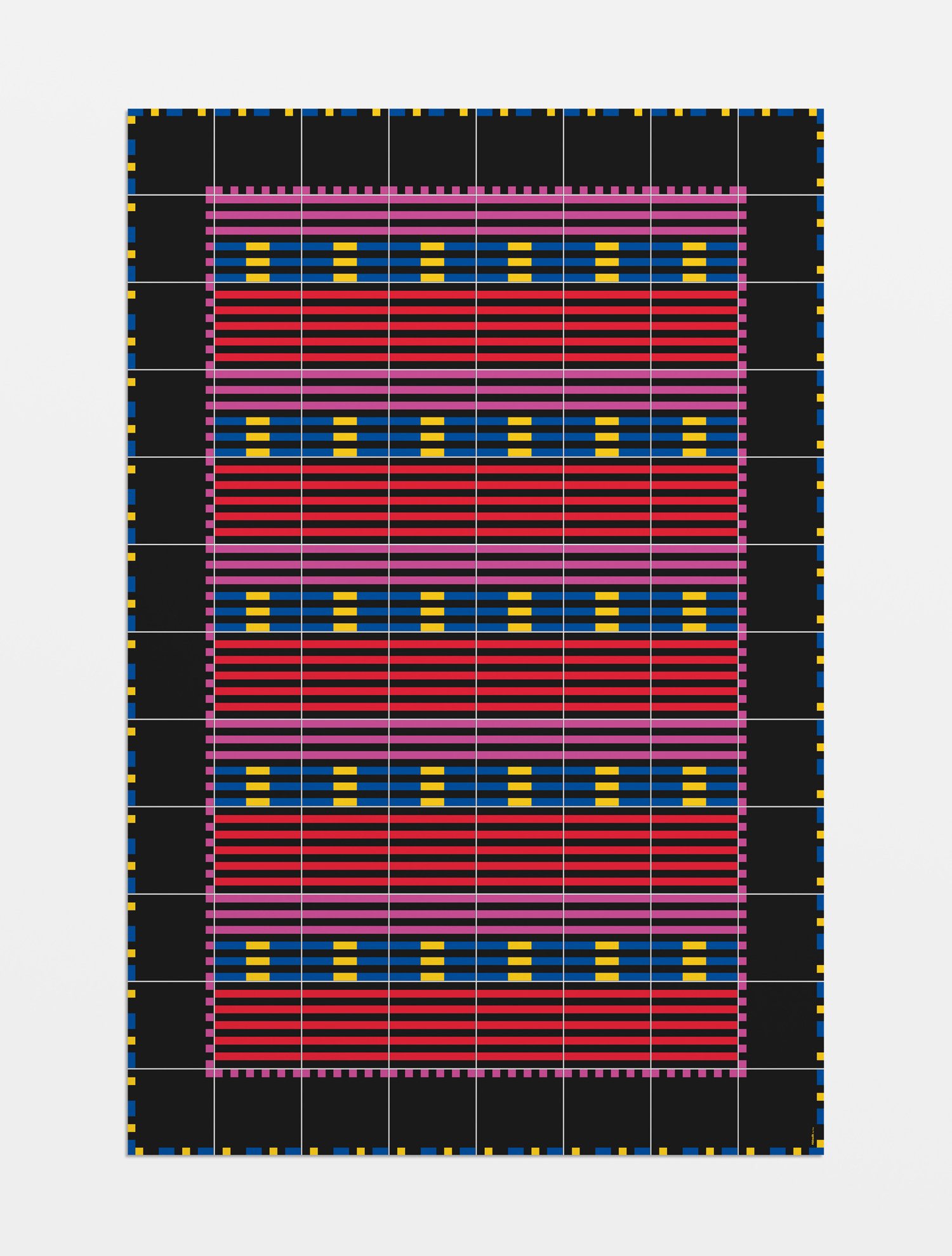
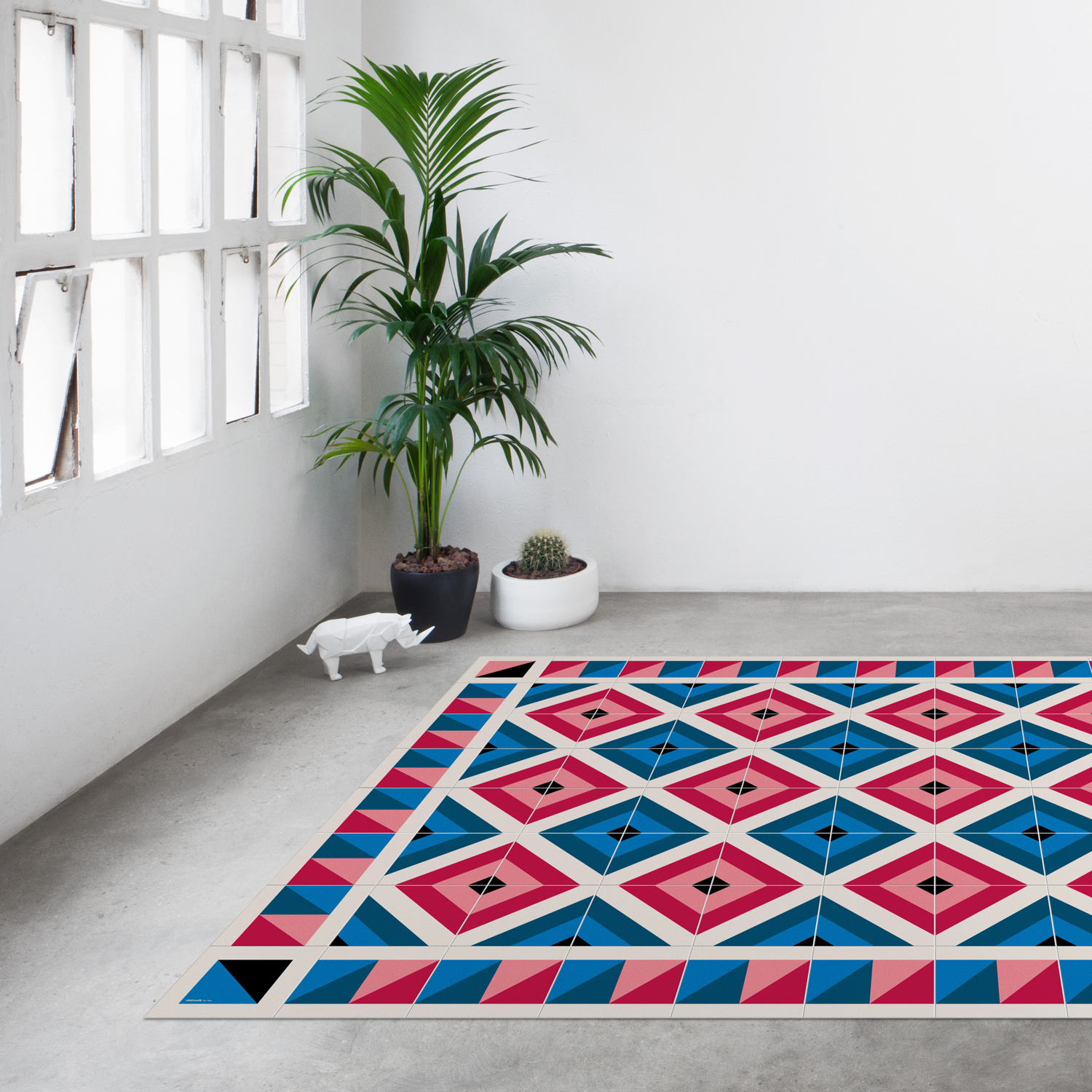
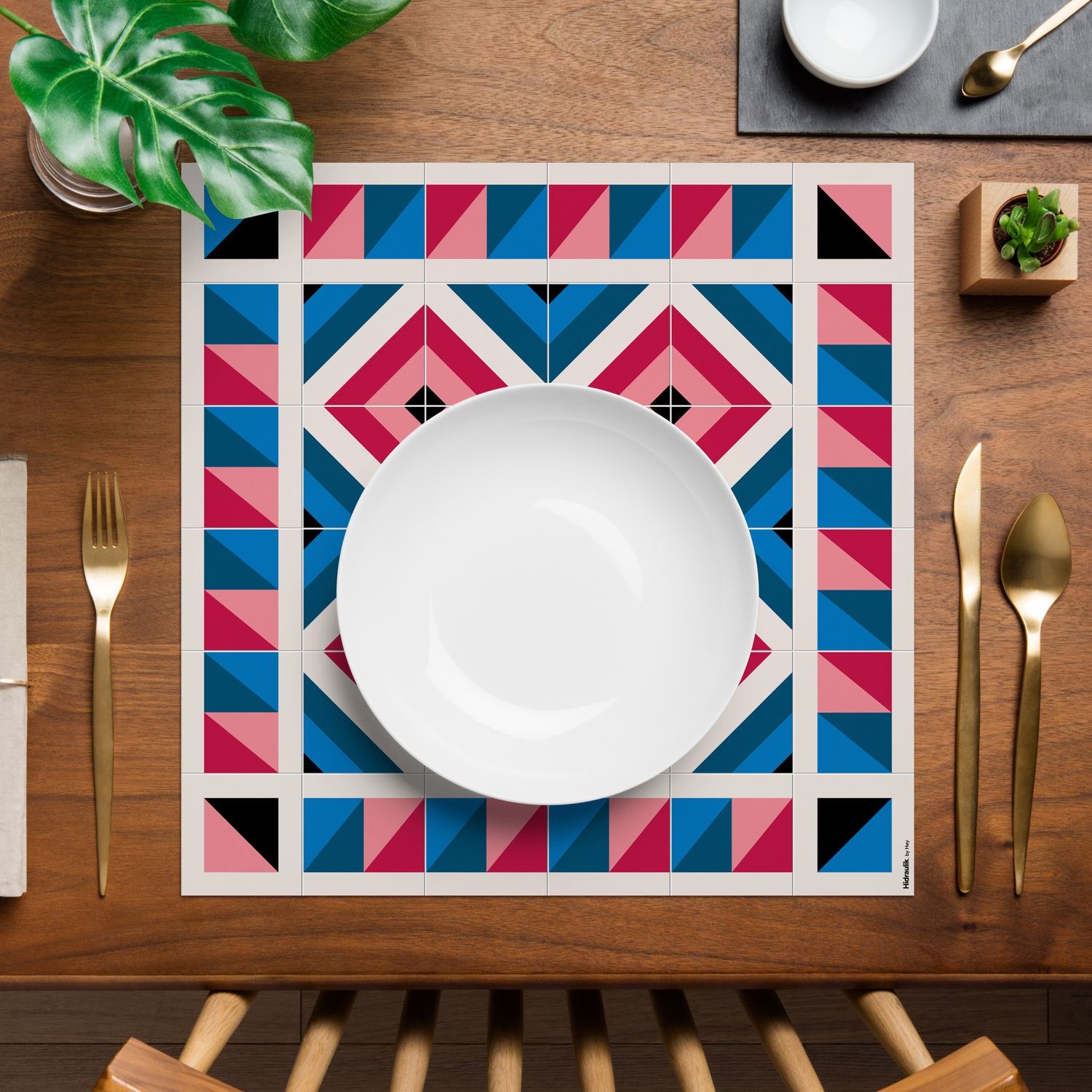
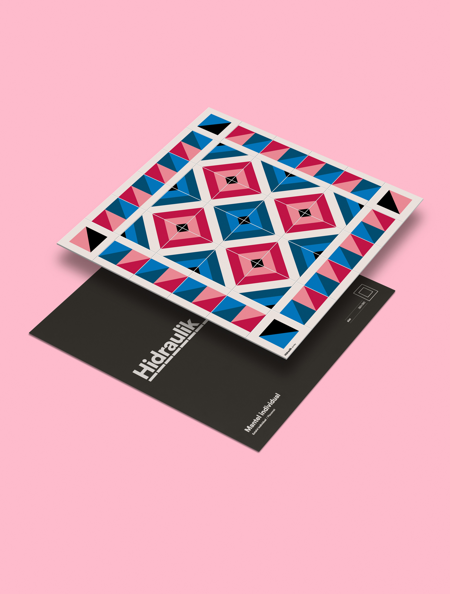
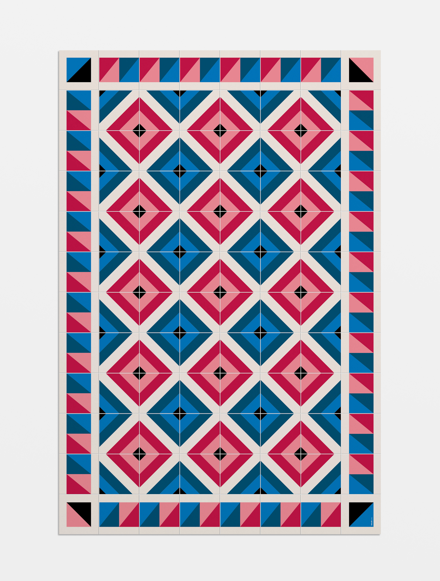
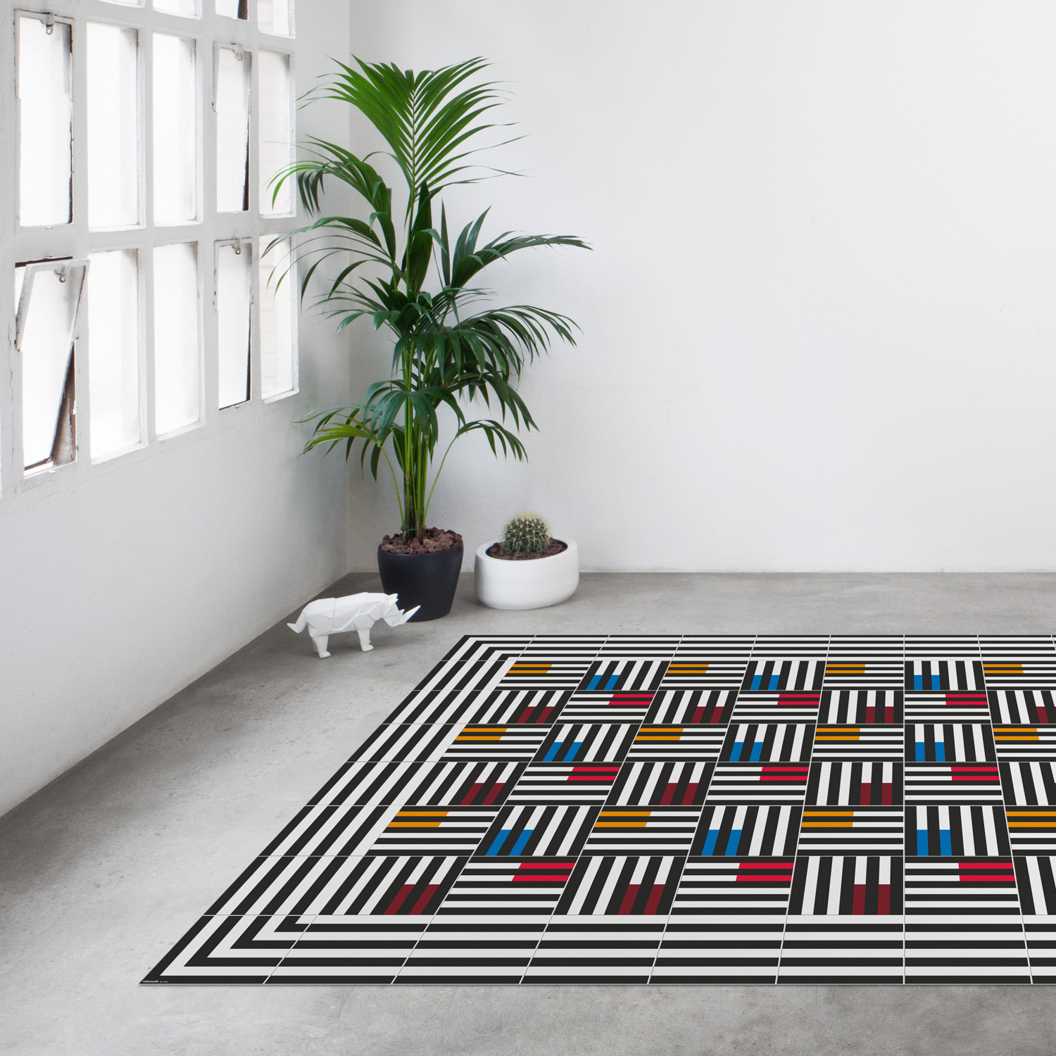
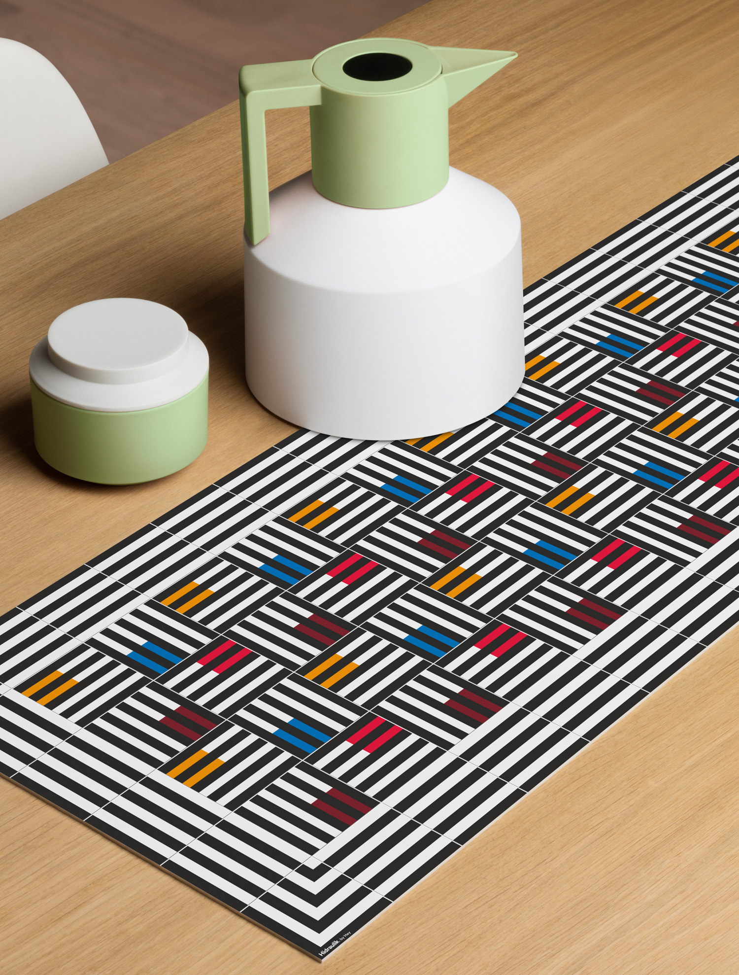
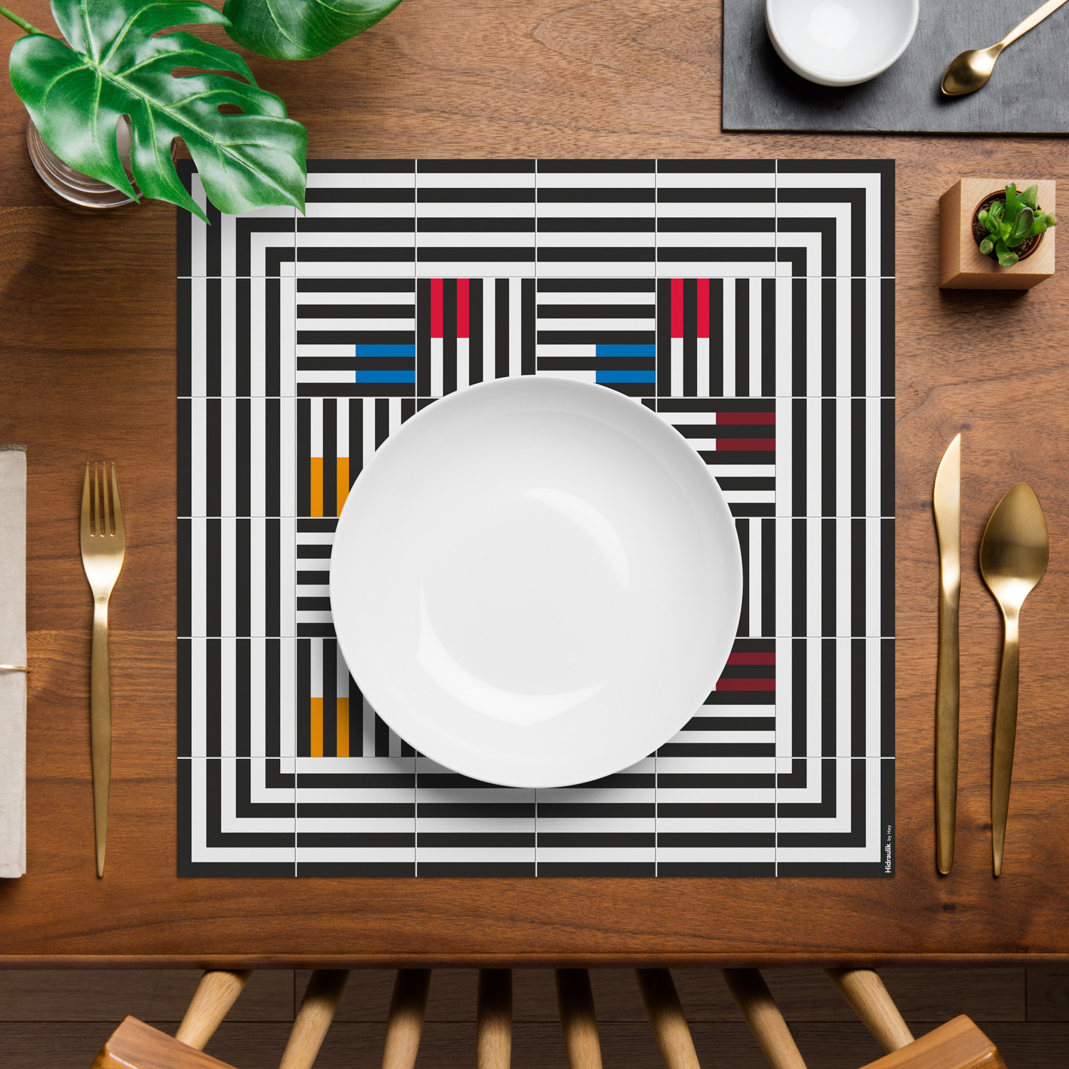
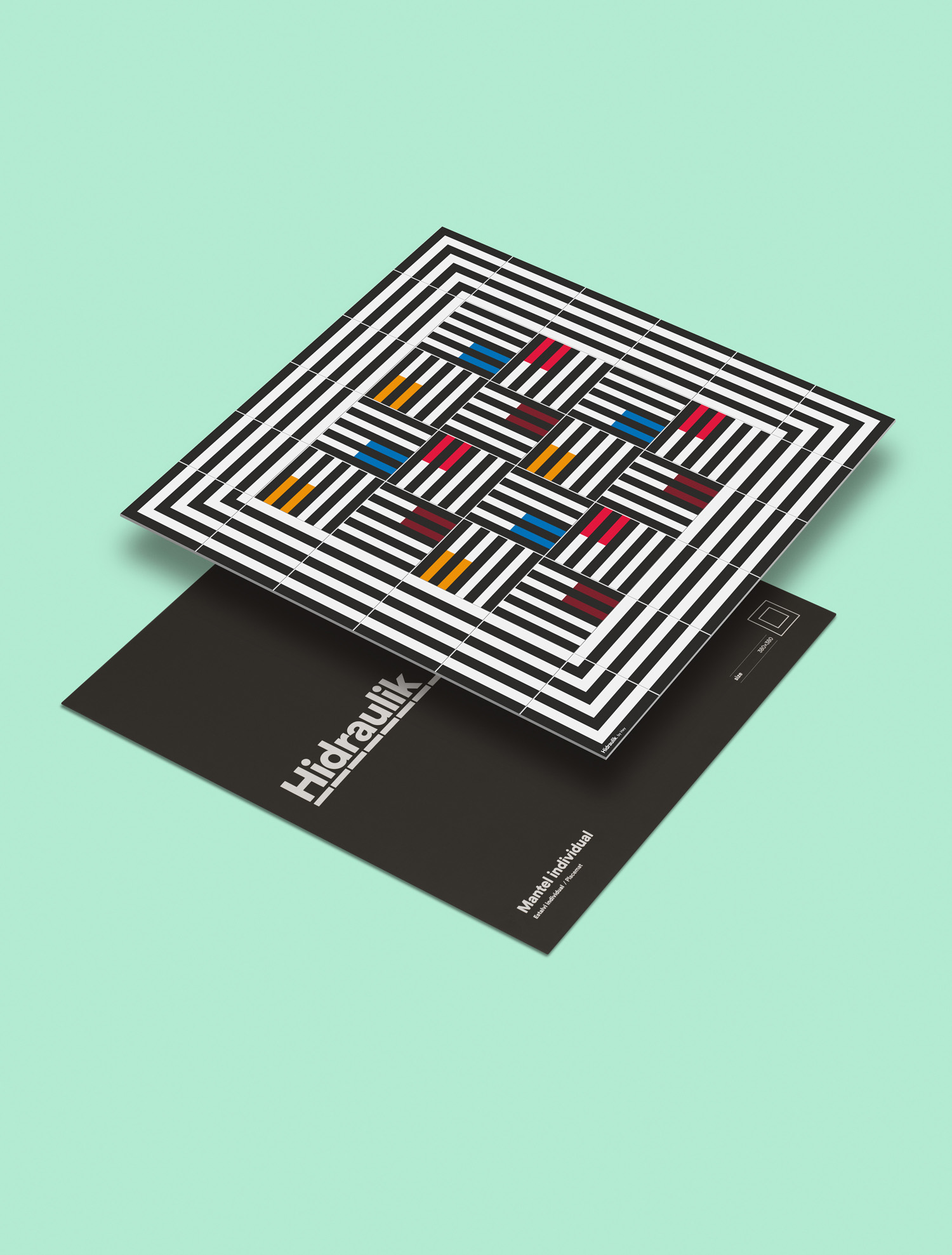
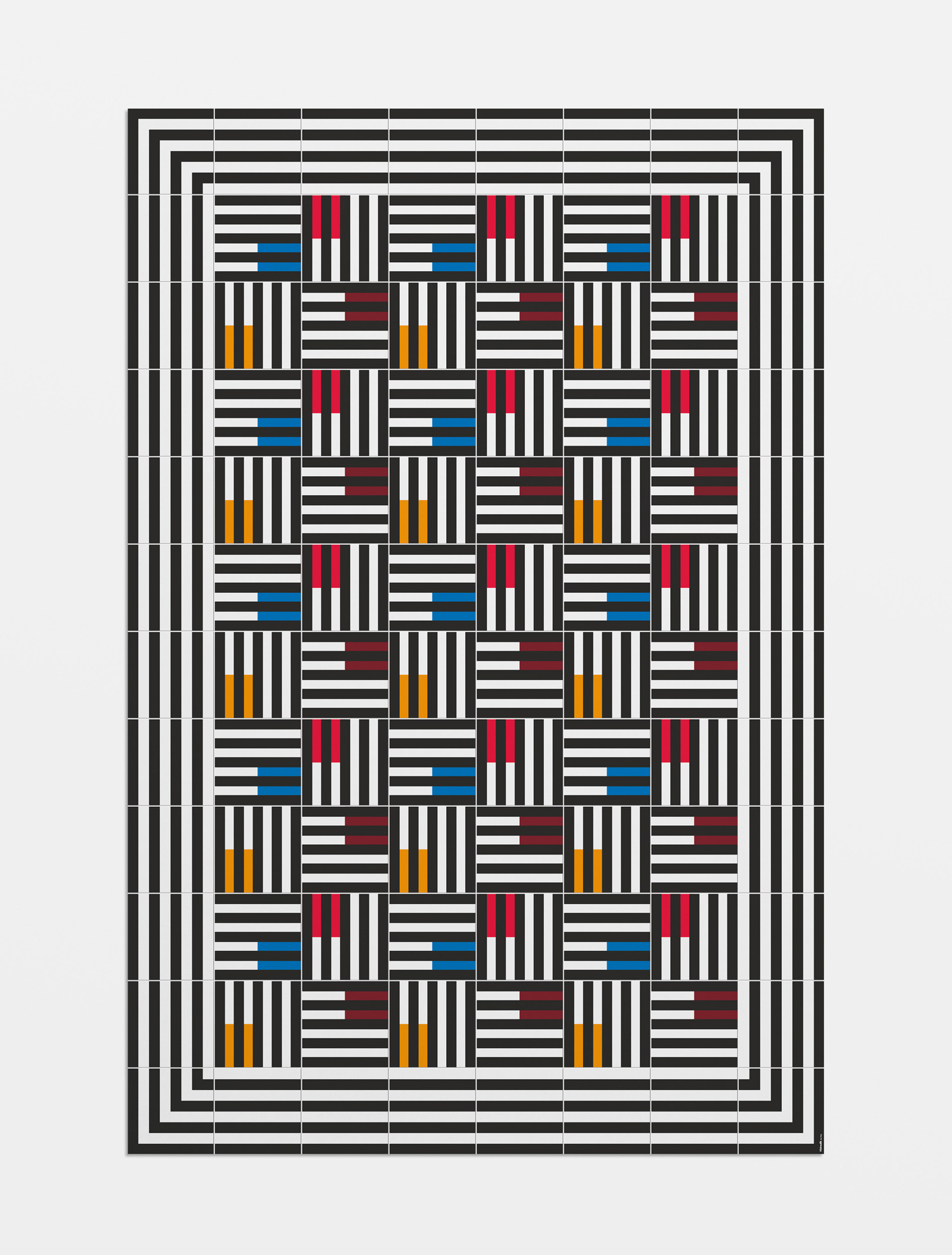
This week sees the launch of Hidrualik’s latest range, created by Barcelona-based graphic design studio Hey. These build on the retrospective references of Huaman’s designs but with some of the idiosyncrasies of Hey’s own work, often convivial in colour, form and composition. Hydraulic describe this new range as diverging from but still honouring something of the modernist traditions that inspires the brand.
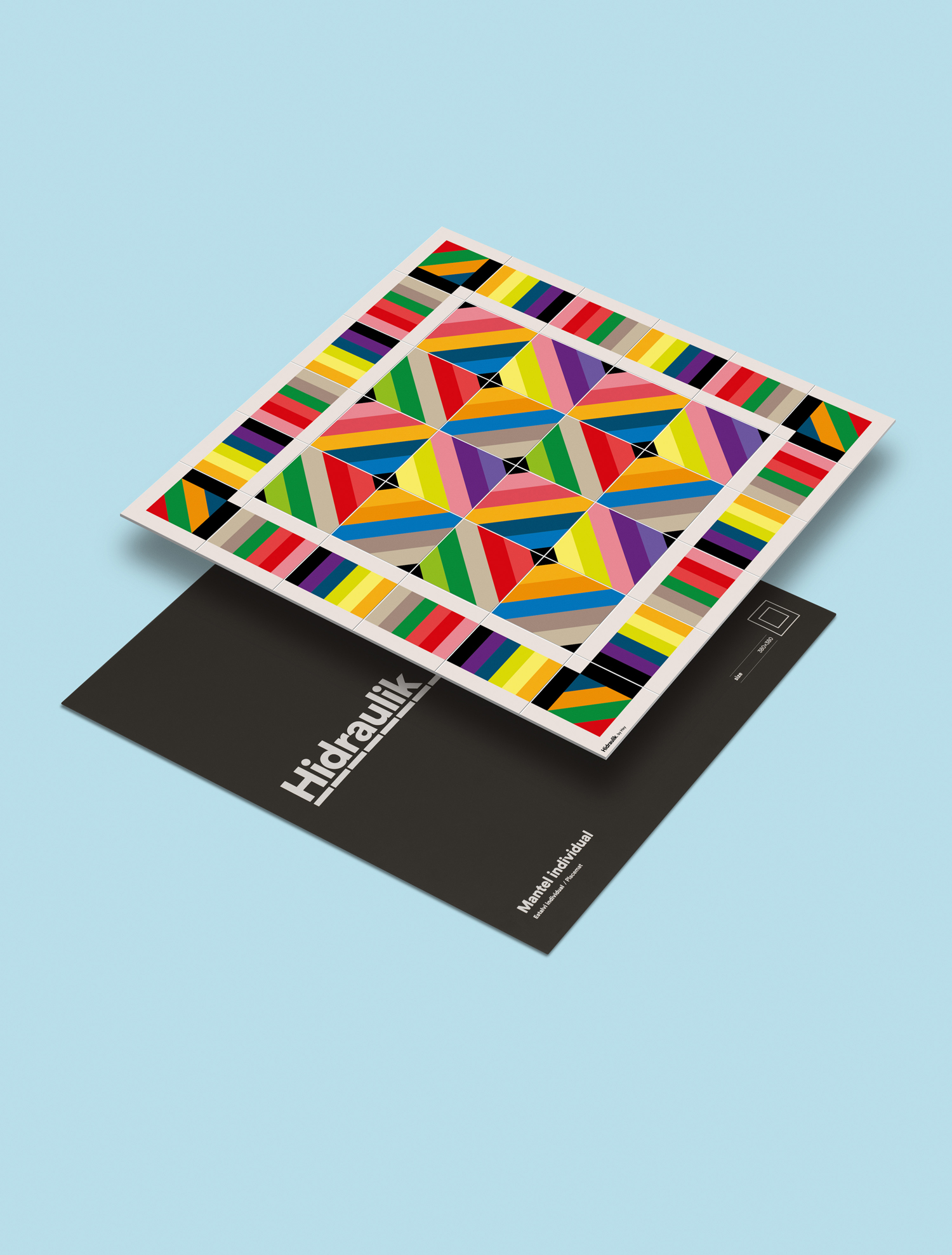
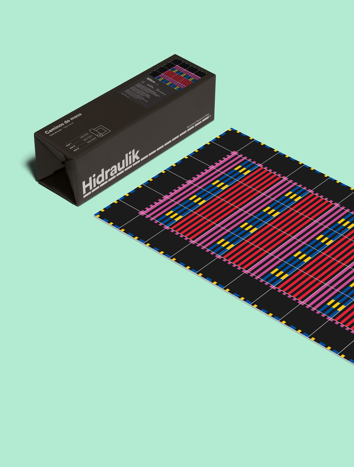
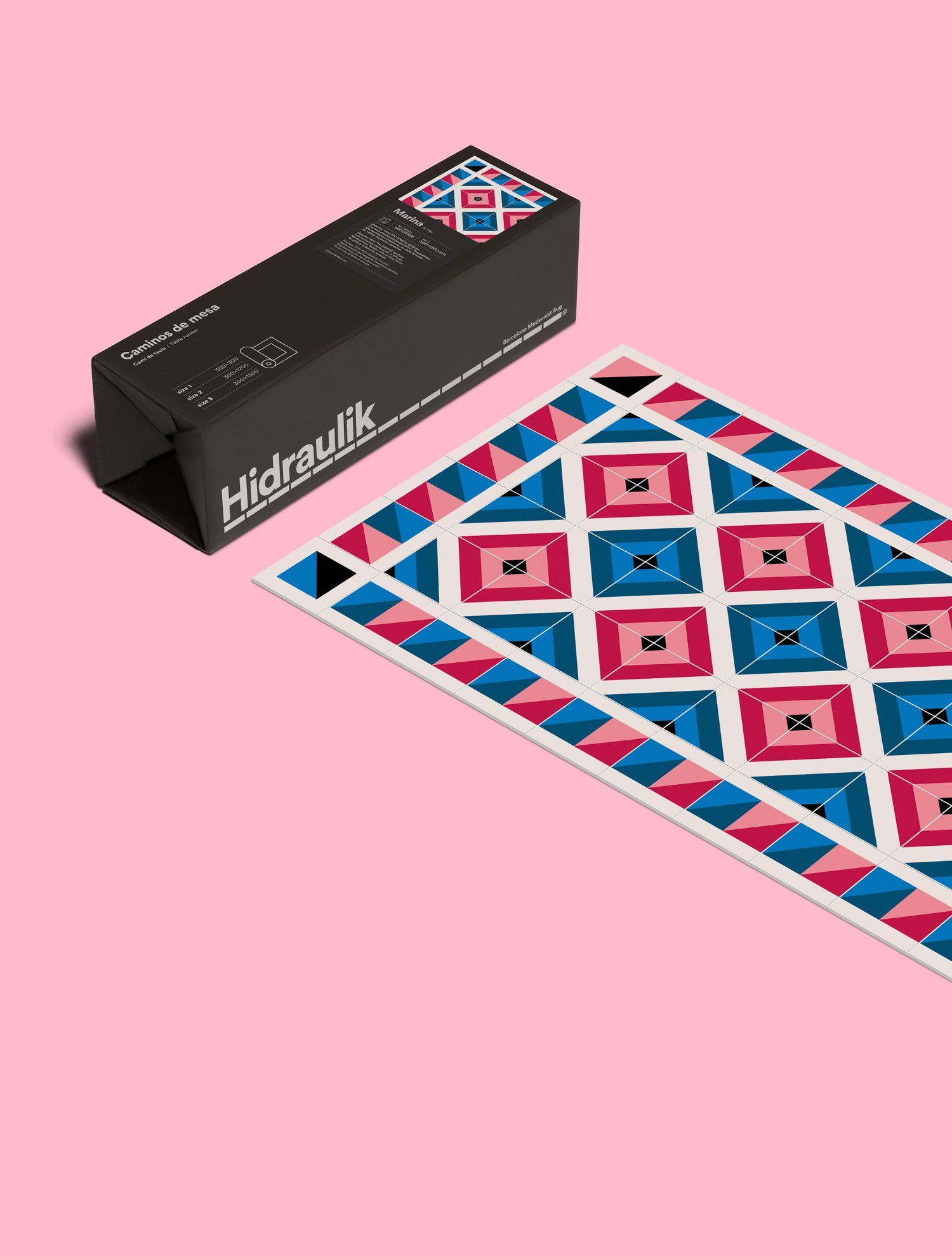
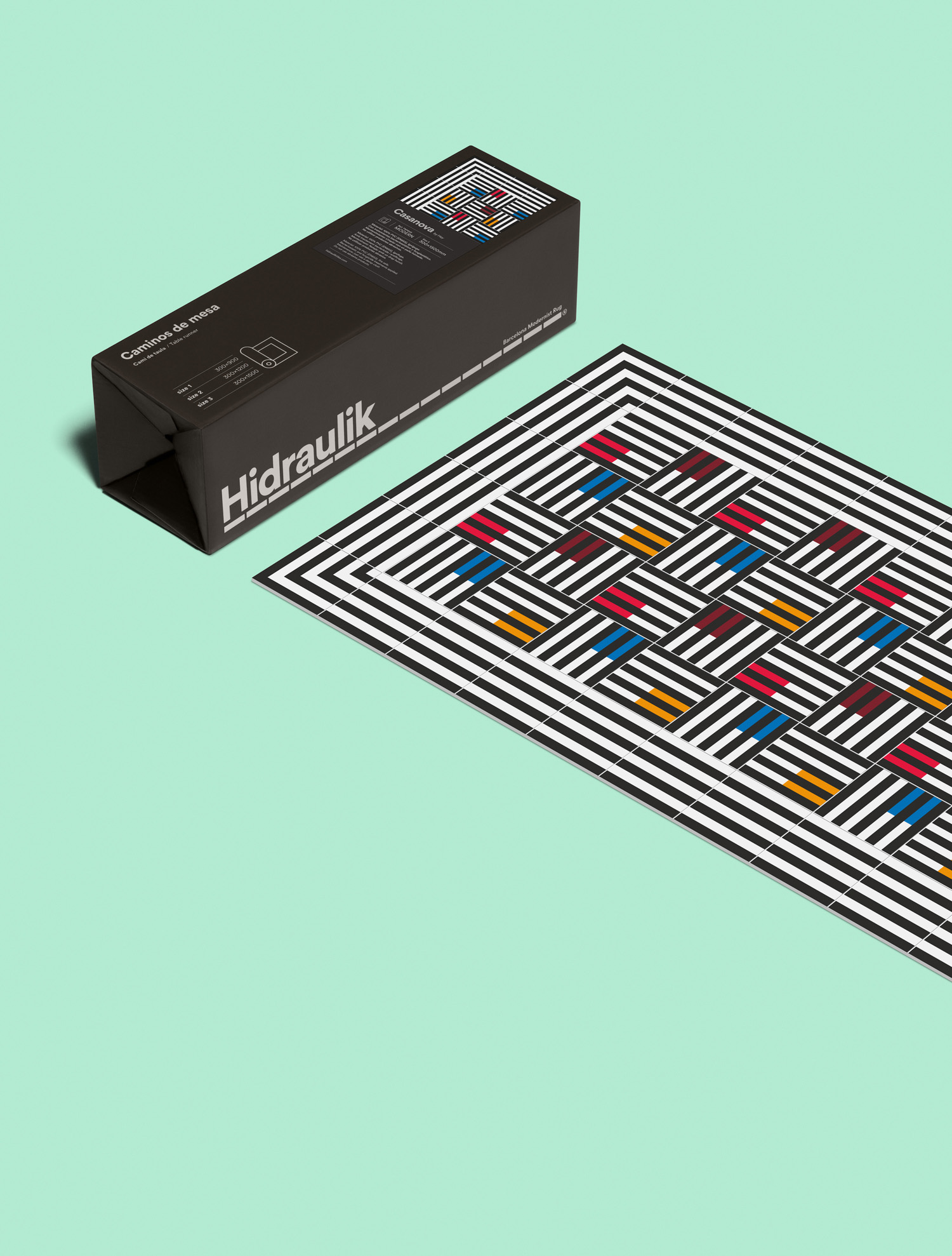
BP&O reviewed Huaman’s brand identity and packaging mid-2015, and described the studio’s desire for a neutral solution as being largely well-expressed by simple sans-serif characters, a black and concrete grey colour palette, plenty of space, grid-based layouts and a telescoping, one design fits all, packaging solution for different floor mat sizes, a neat idea that ties in well with the Hidraulik name.
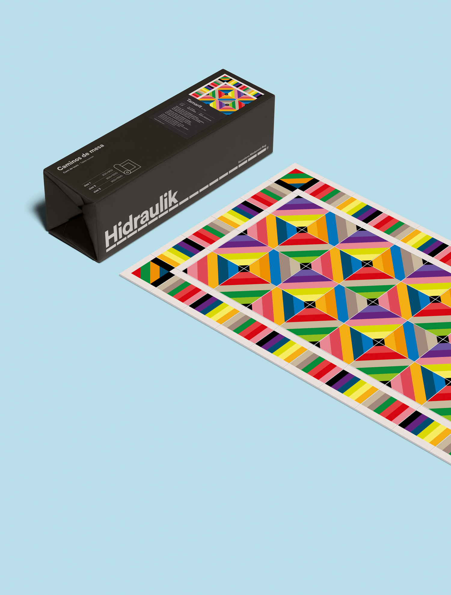
Human’s approach to identity and packaging works well to draw out and frame the original collection, their own contribution, and the increase in complexity and brightness of colour that characterises Hidraulik’s latest range designed by Hey. There is a lot of personality in much of Hey’s client and self-initiated work, and this translates well into PVC mats, offering something new to the range yet still grounded in Hidraulik’s own inspirations. There are six designs in total, the four BP&O favourites here plus two more, with floor mats available in four different sizes, as well as place mats and table runners. Check out the range here.
Branding: Huaman Prints: Hey. Opinion: Richard Baird. Fonts Used: Circular
