Barro de Cobre by Savvy
Opinion by Richard Baird Posted 27 September 2016

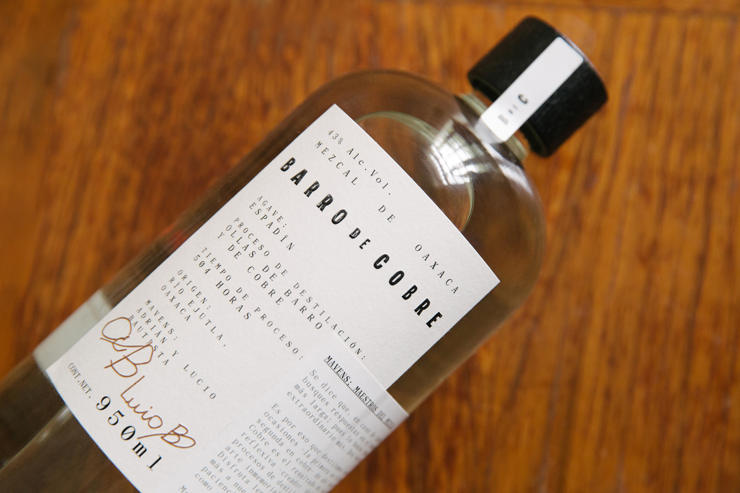
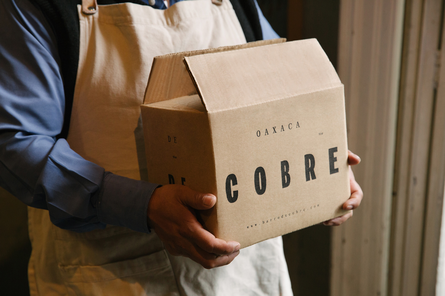
Barro de Cobre is a mezcal from Oaxaca, Southern Mexico, distilled twice; once using a clay pot and the second in copper. It is a unique process that takes time, but produces a strong yet smooth, clear but earthy character. The name Barro de Cobre, Copper Clay roughly translated, is an expression of this process, which also goes on to inform brand identity and packaging, created by graphic design studio Savvy.
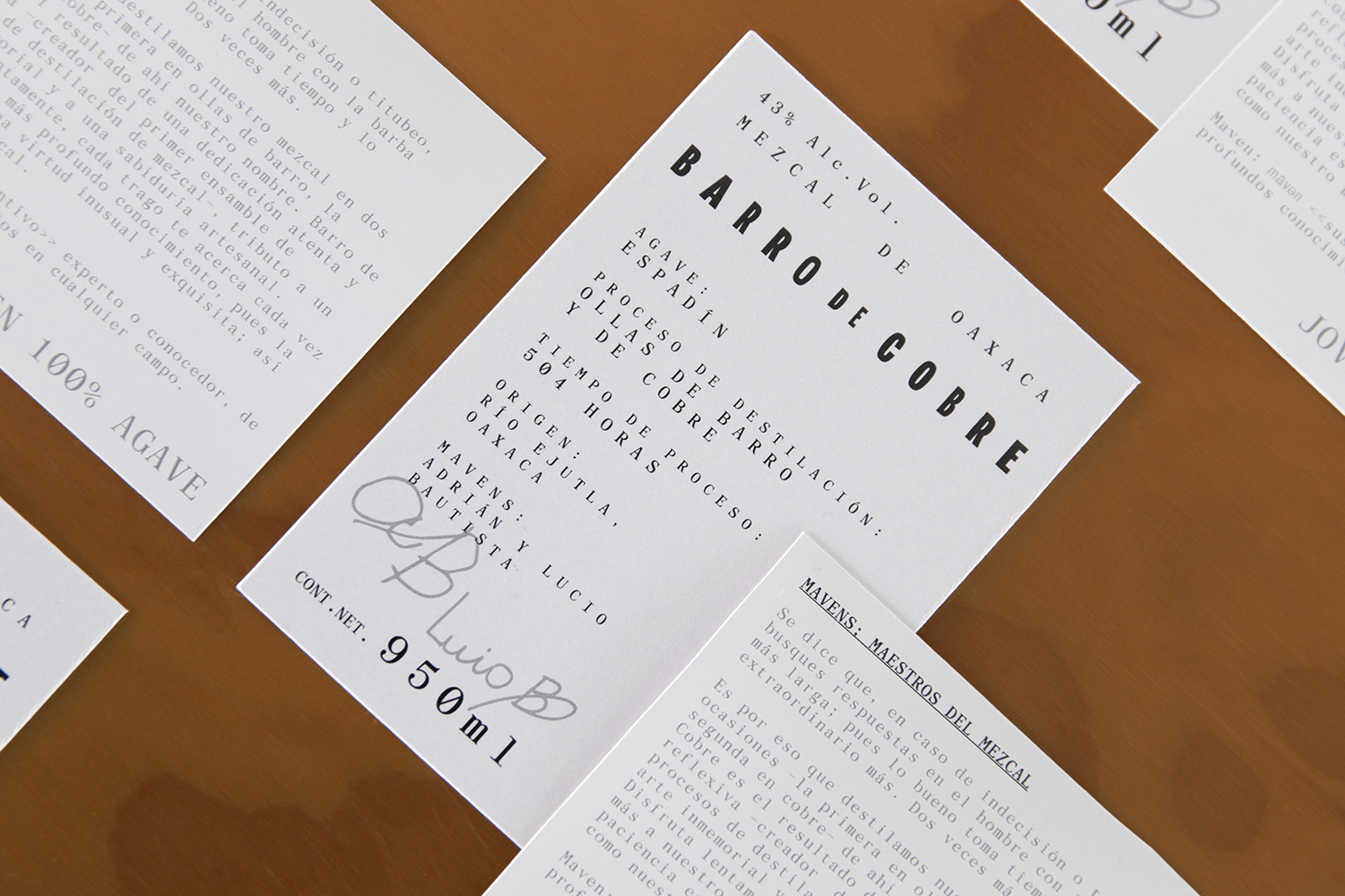
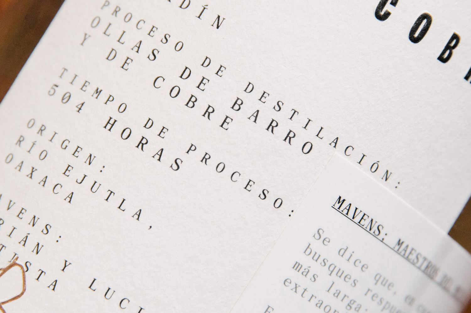
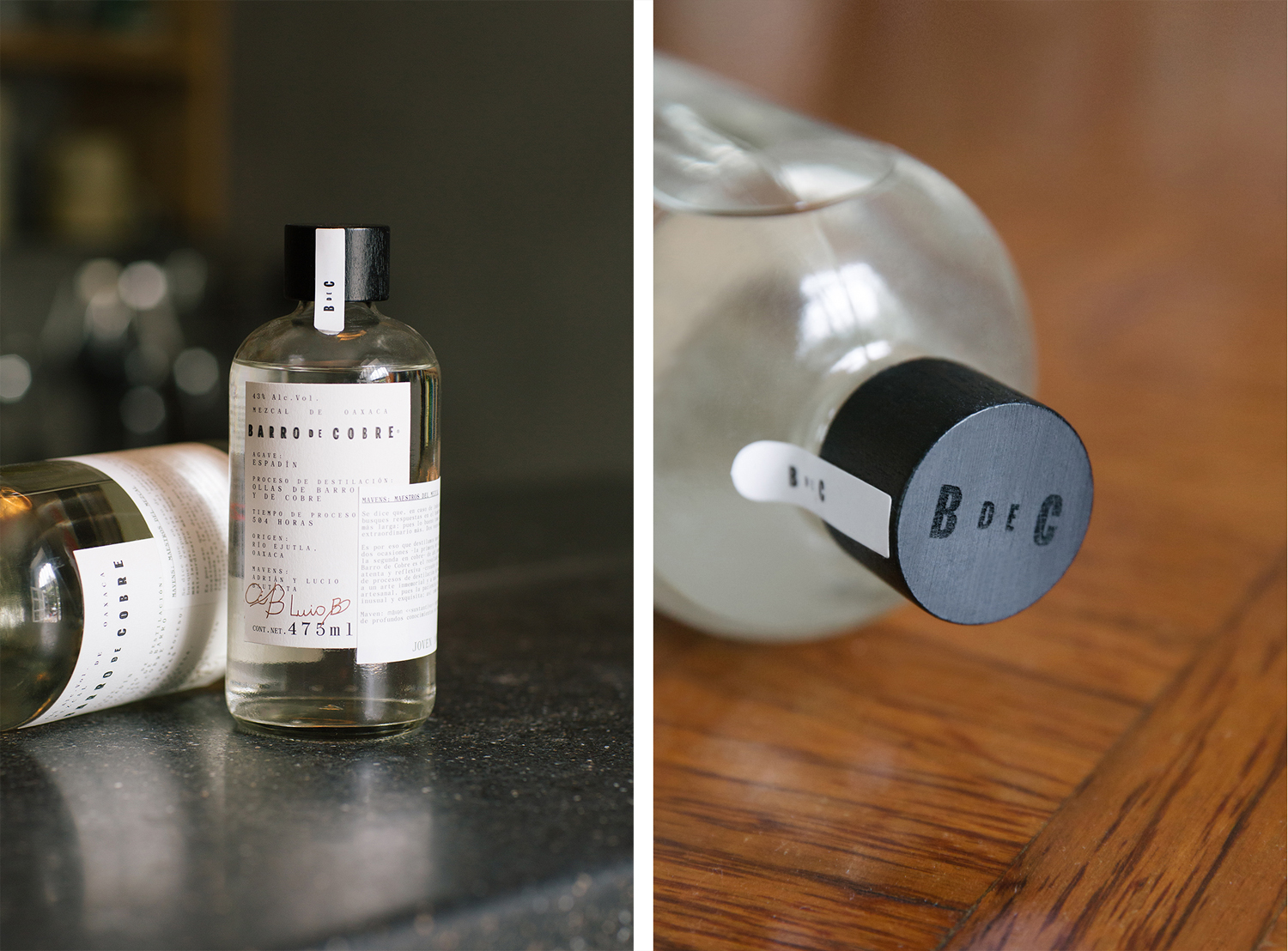
The duality and almost oppositional nature of process; from clay to copper pot, the move from the rudimentary to the refined, the crafted to the industrial, is at the core of Barro de Cobre’s brand identity and packaging. This manifests itself firstly in the mix of loose, hand-rendered and bold sans-serif letterforms of the wordmark, juxtaposed alongside the more refined character and flourishes of a serif, and secondly, in the industrial quality of structural design, white paper, black ink and monospacing, in contrast to the warmer crafted qualities of uncoated paper, embossing and wooden cap.
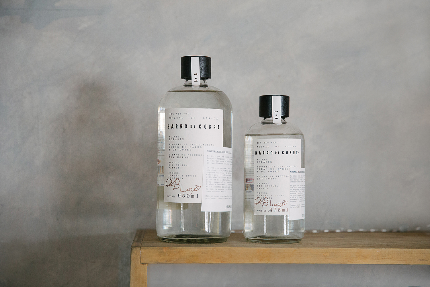
Although concept is considered, well-founded and discernible in its execution, much of Barro de Cobre’s visual character and unexpected quality comes, not from its juxtaposition of type style and materiality, but from the generous letterspacing across labels, existing somewhere between the impersonal utility of industry and as expression of a lengthy process. This holds together disparate wordmark and label, offers contrast to finishes, materials and the personable nature of a signature. More from Savvy on BP&O.
Design: Savvy. Opinion: Richard Baird. Fonts Used: Archive Mono.
