Natasha Alphonse Ceramics by Shore
Opinion by Richard Baird Posted 28 October 2016
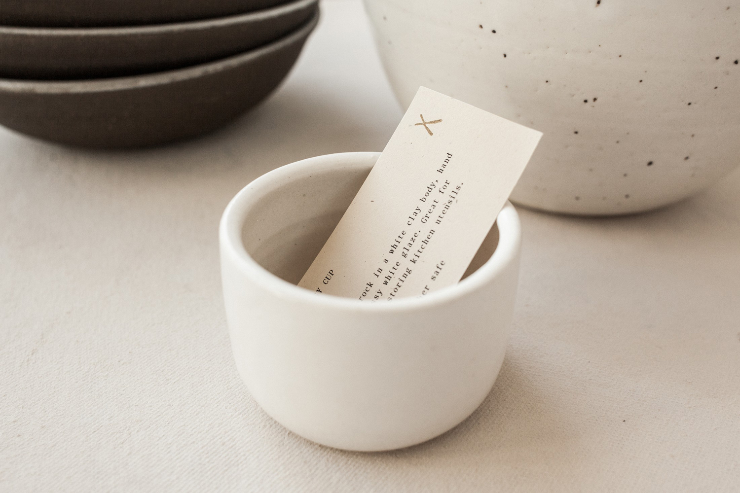
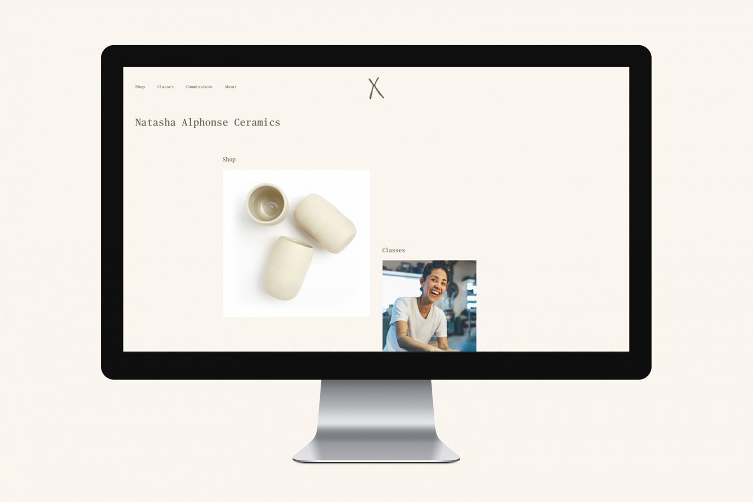
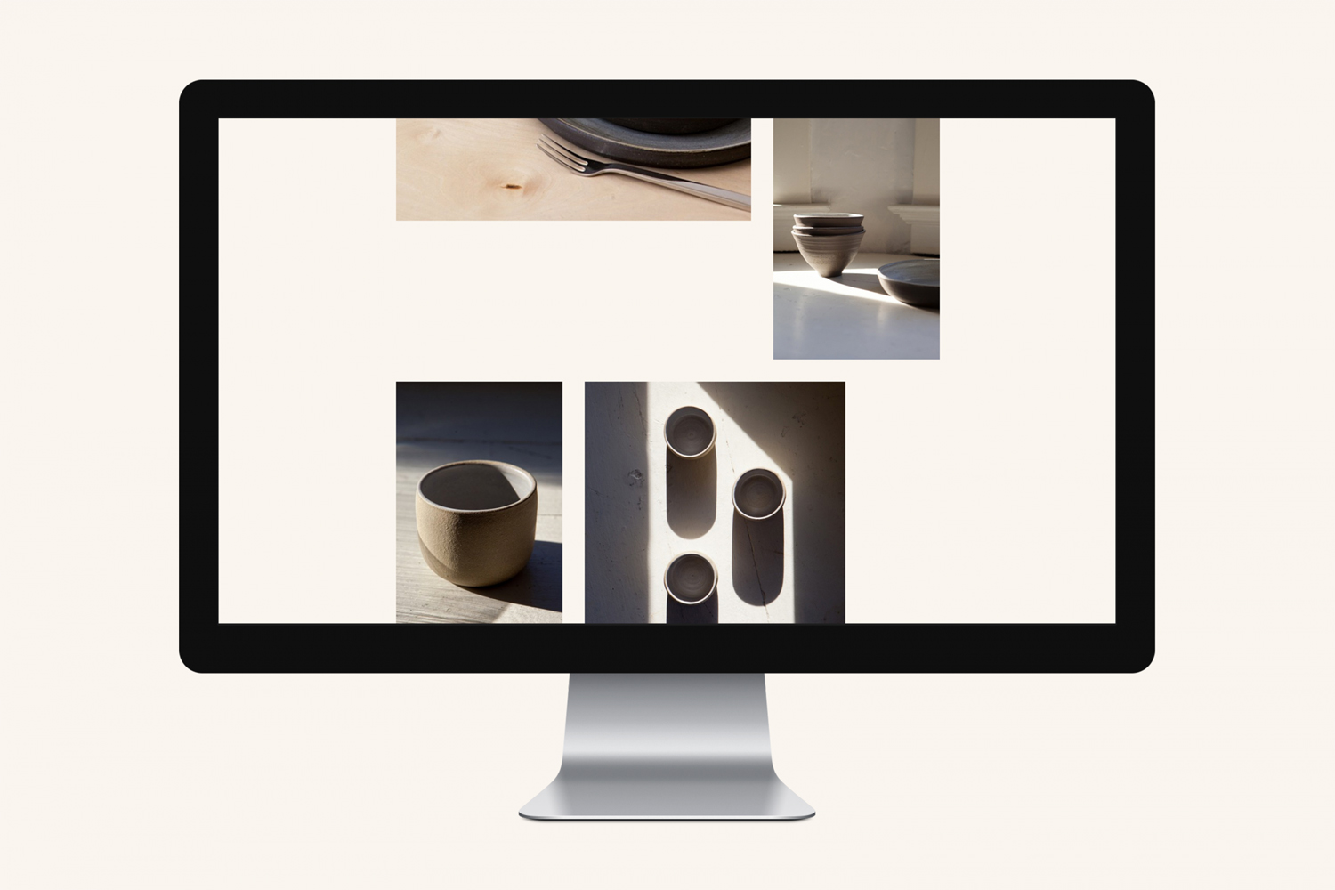
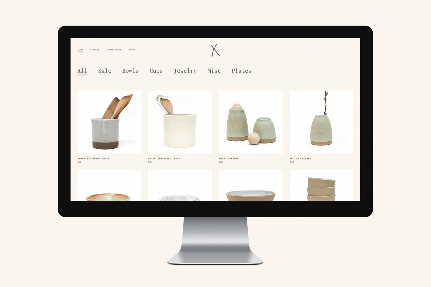
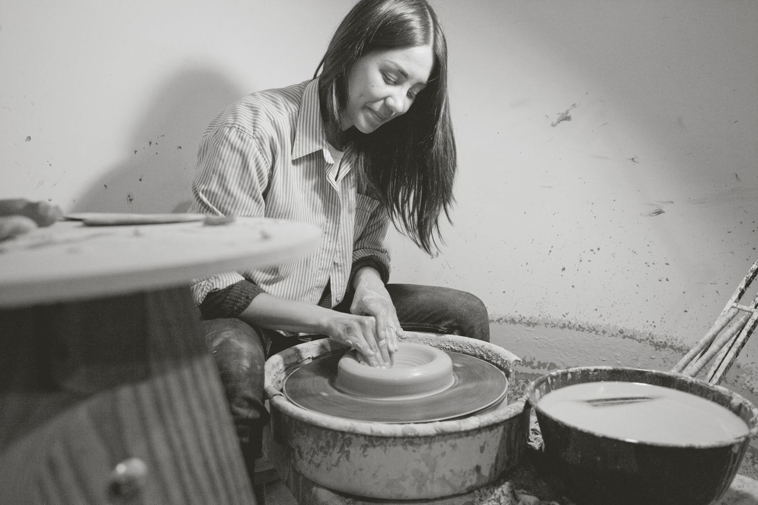
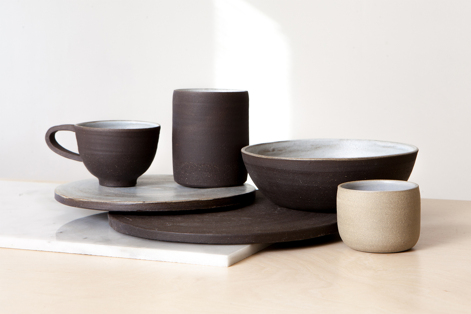
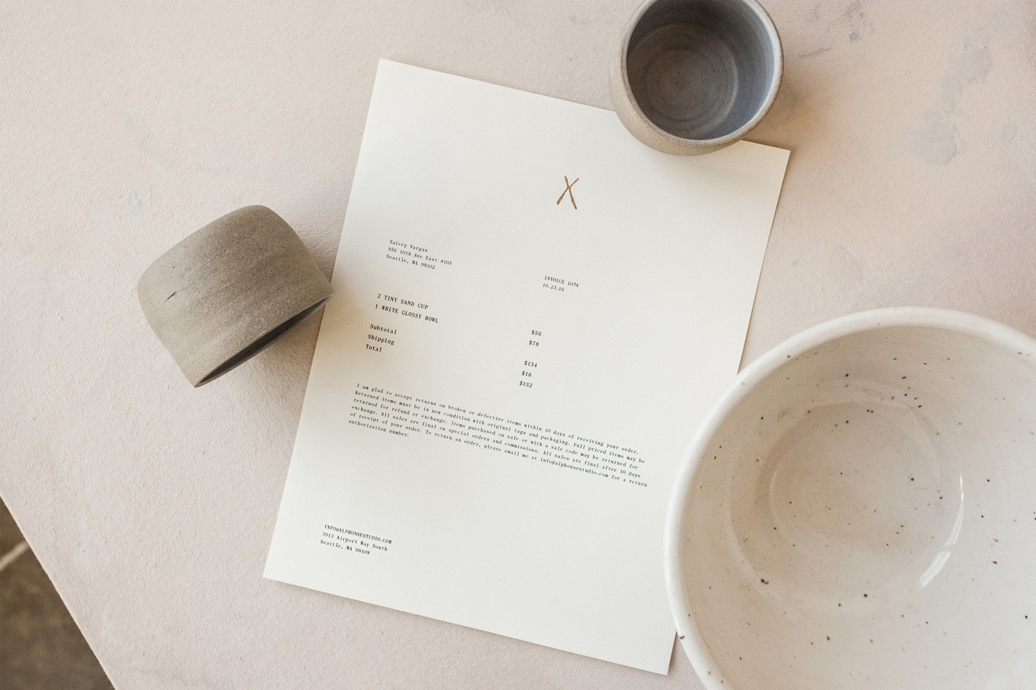
Natasha Alphonse is a ceramic artist raised in the Saskatchewan province of Canada who now works from a studio in the US city of Seattle. Her ceramics are characterised by a mix of simple forms, irregular surfaces and an earthiness in colour and texture. With a desire to scale her brand into a viable business Natasha worked with American graphic design studio Shore to develop a new visual identity and retail platform. This included business cards, headed paper, product cards, art direction and e-commerce website.
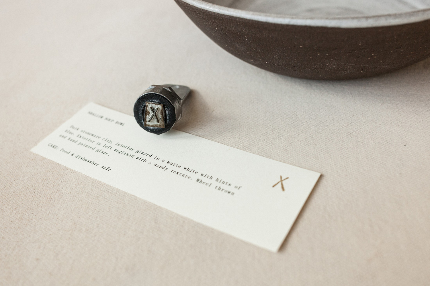
Shore, through form, colour, image and type, wanted to highlight the virtues of simplicity and earthiness, amplify a sense of harmonious imperfection and warmth, and, inspired by Natasha’s Canadian heritage, make a connection with nature and the elements.
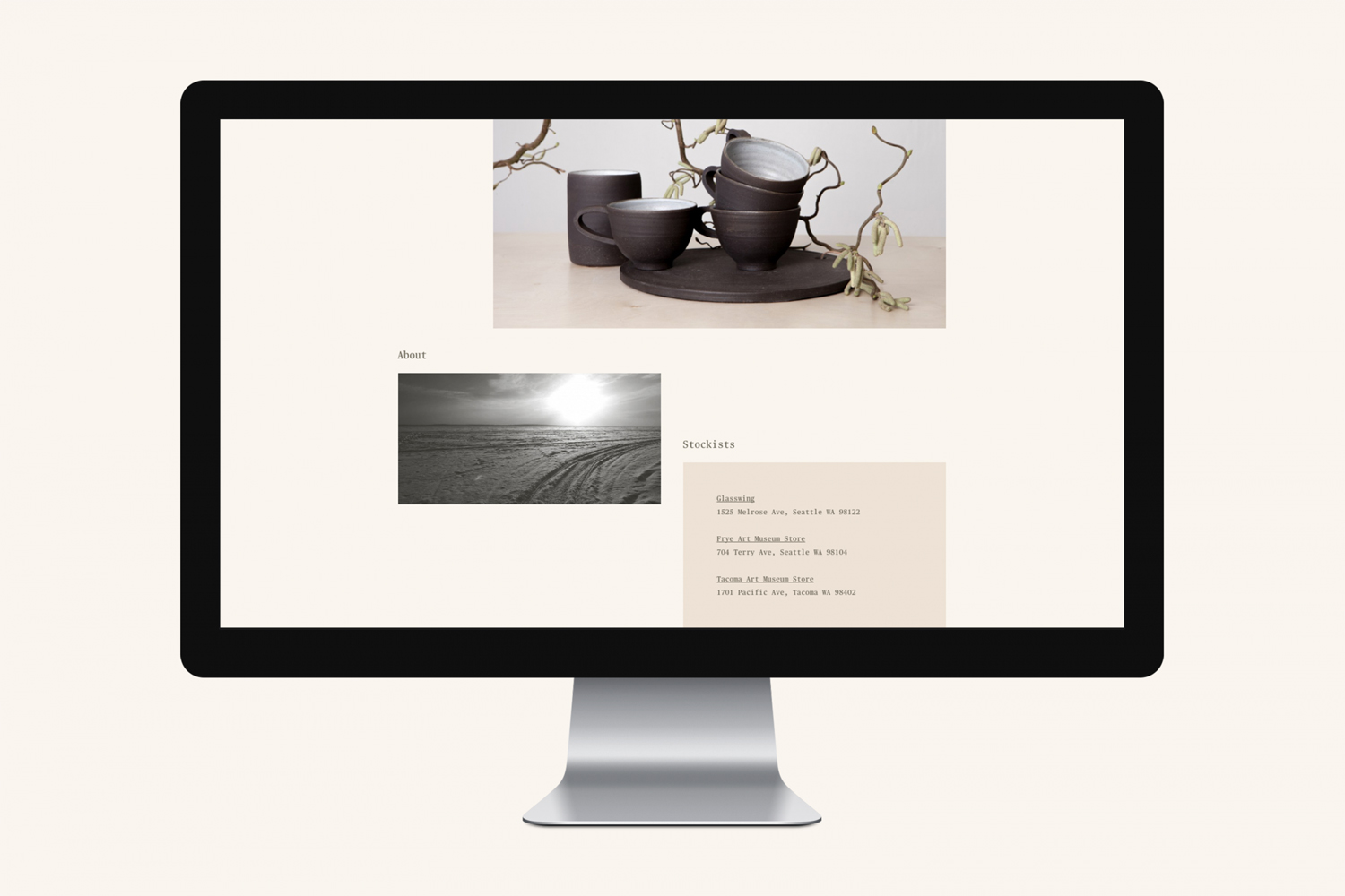
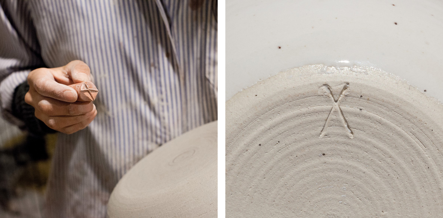
This begins in the simple and organic forms of Natasha’s maker’s mark, stamped across products and stationery, and continues through to the photography of wide open and unspoiled landscapes, in the choice of natural, crafted mixed-fibre paper, sepia ink and the finish of a hand stamp.


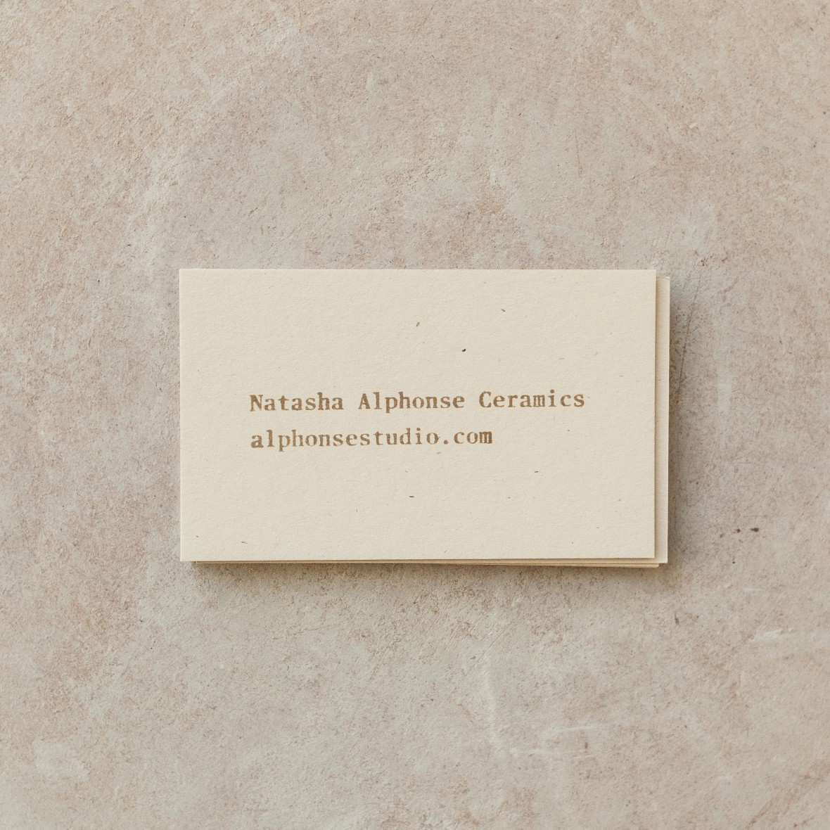
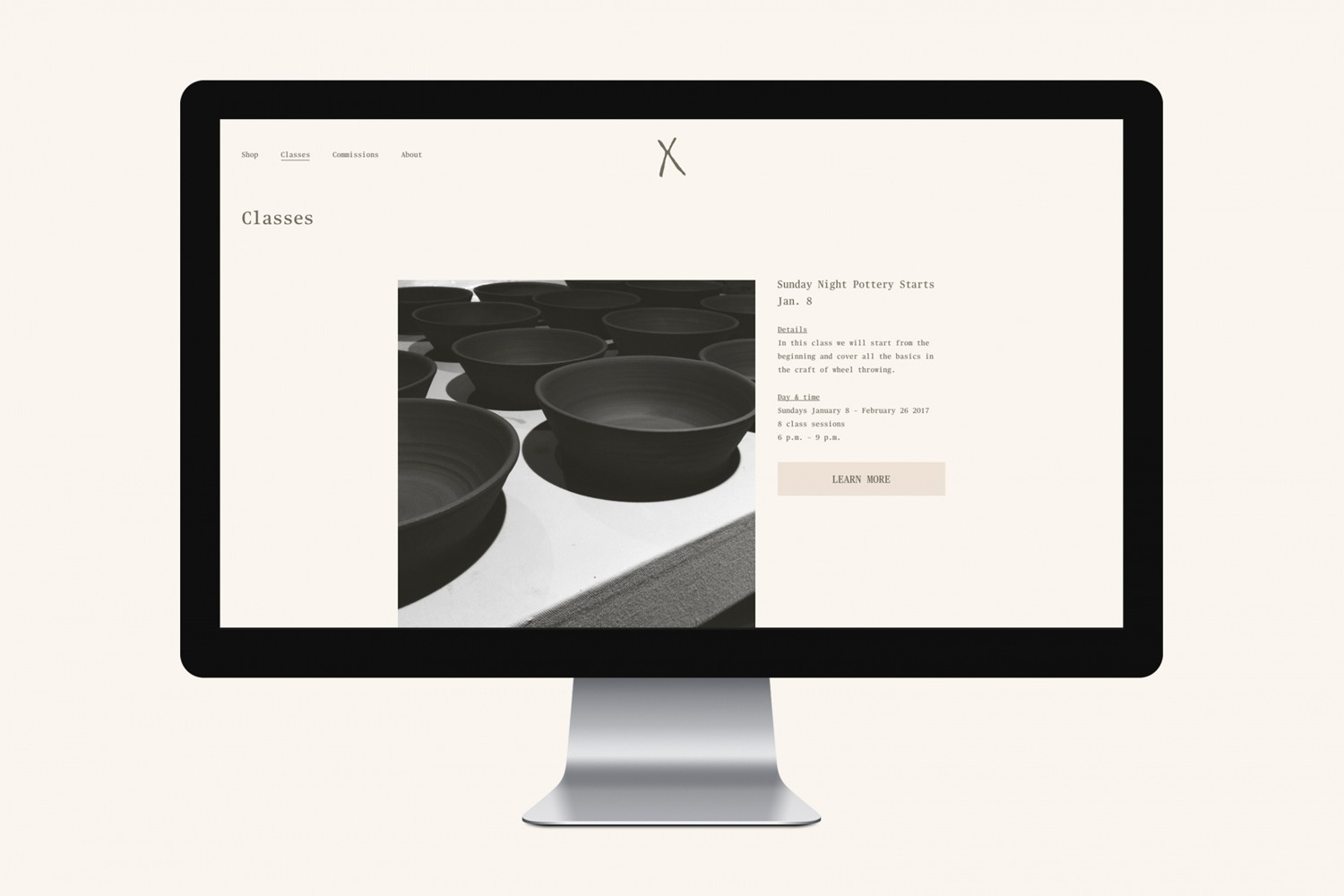
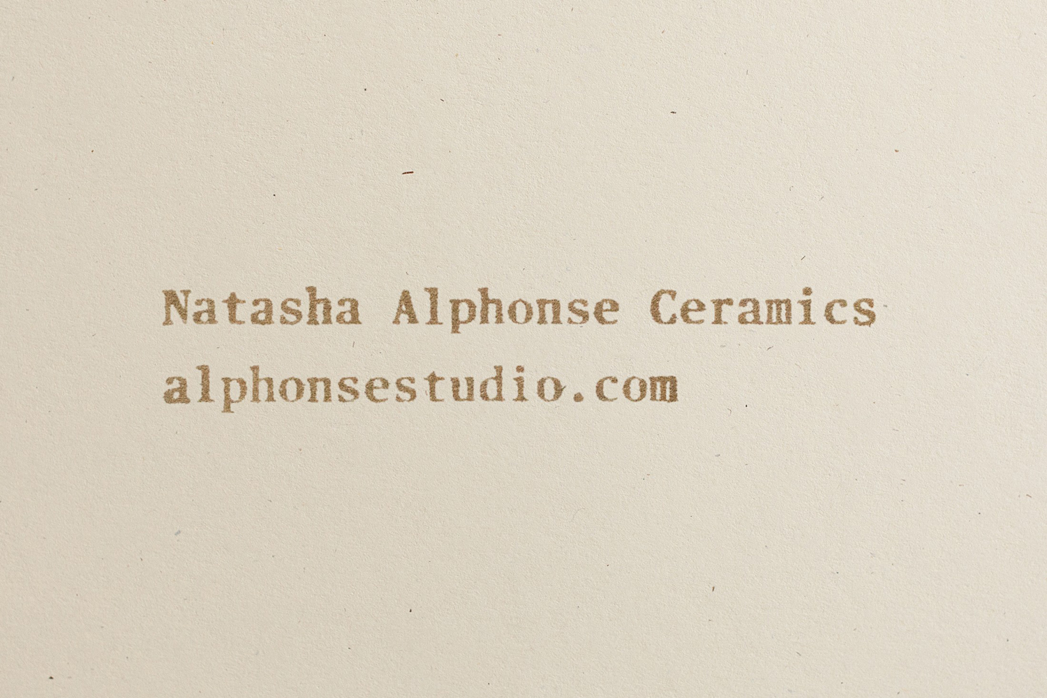
The use of Commercial Type’s Publico Text Mono, a typeface inspired by the awkward un-designed forms of Chinatown signage and originally designed with Businessweek to show data, offers something of the quirky and unexpected. Where monospacing is rooted in the early digital era, here, in this context, it appears, in its imperfect optical spacing, implemented by hand while still leveraging some of the qualities associated with a serif.

Website is contemporary and professional in aesthetic, functionality and build, seamlessly integrating Shopify into Shore’s custom CSS, and establishes, through colour and type, a clear continuity between site and print work. Check out more work from Shore on BP&O.
Design: Shore. Photography & Styling: Lauren Colton. Opinion: Richard Baird. Fonts Used: Publico Text Mono.
