Capt by Bunch
Opinion by Richard Baird Posted 2 December 2016
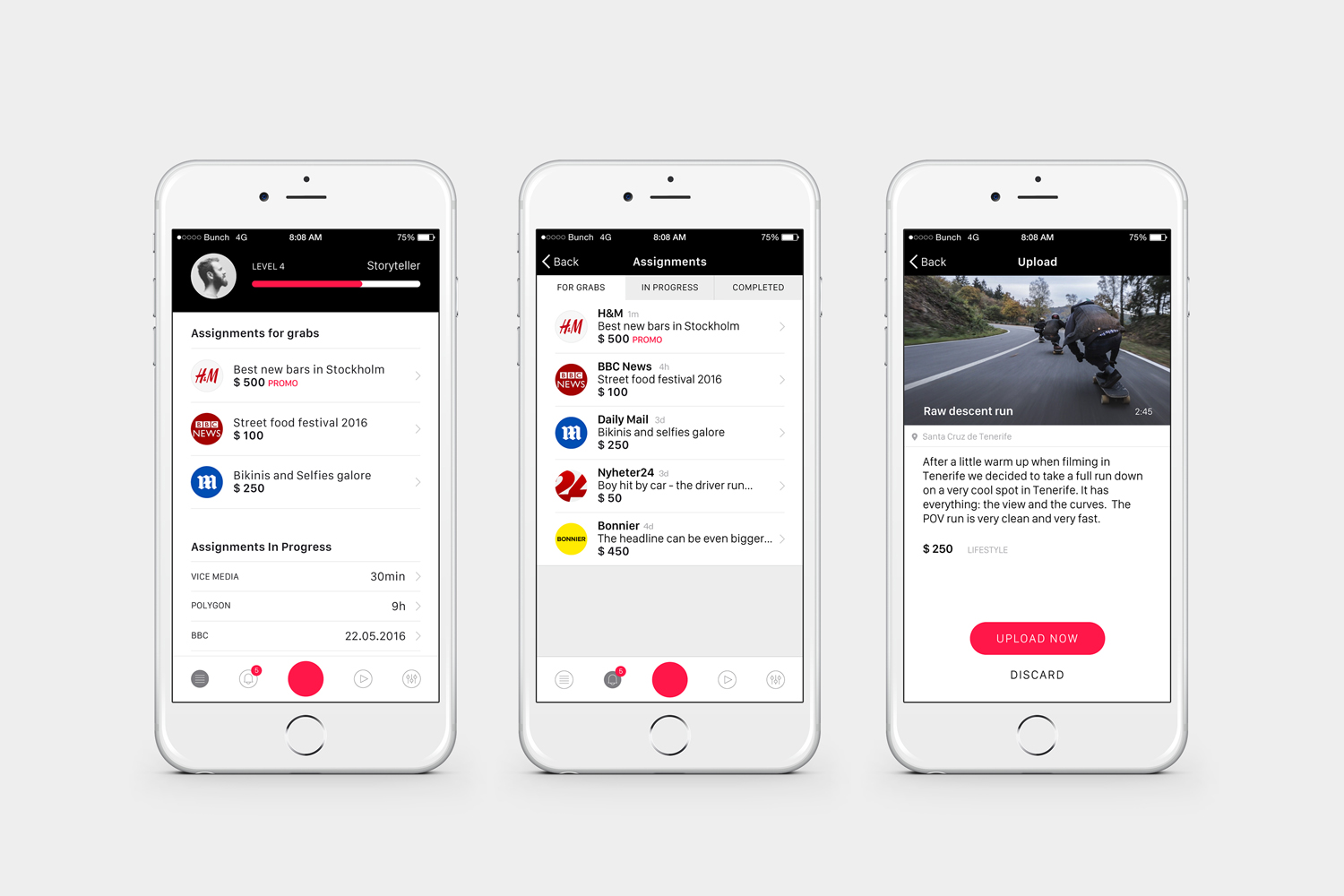
Capt is a San Francisco-based start-up that connects creators wanting to monetize their videos with brands looking for new content and talent. The platform is made up of an app that allows creators to shoot, upload and license their videos, and a website that acts as a market place for buyers. This website also serves as a place to connect creatives with those who want to develop specific video content, as a tool to push assignments to qualified Capt creators by location and creator level, and provide access to and licenses for both global and hyperlocal video content.
Bunch worked with Capt on developing brand identity, mobile app and website. This takes the universal visual language of mobile recording and the lexicon of social media, and draws these into a simple but effective visual expression. This links folders, headed paper, business cards and branded hoodie, and runs across app and website.
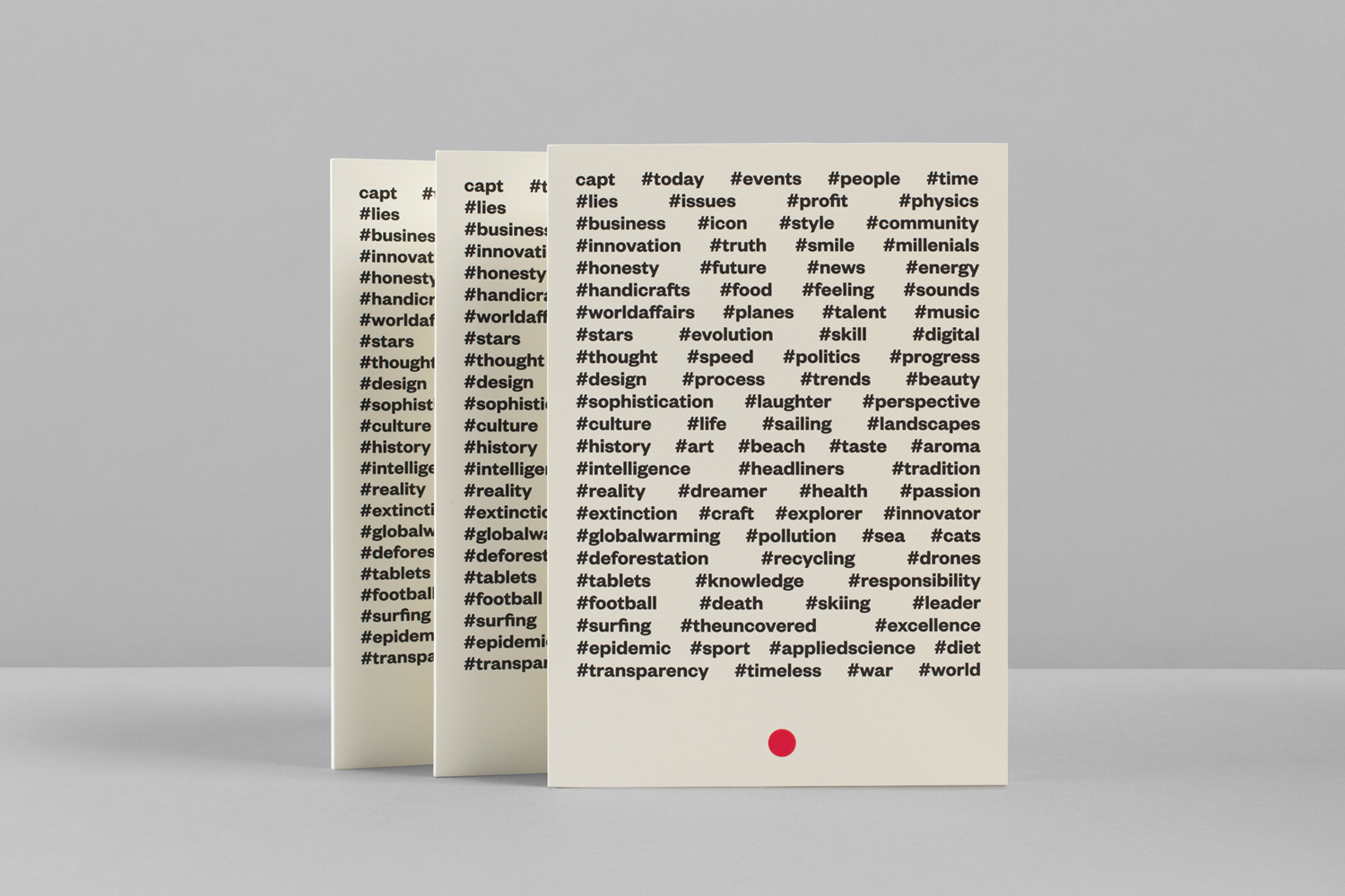
Bunch confidently appropriate and leverage the familiarity and universality of the record button of mobile apps. Form language is absent, however, the choice of colour and placement, alongside type-as-screen, makes a clear connection with video making and, in print, begins to draw something proprietary from digital ubiquity.
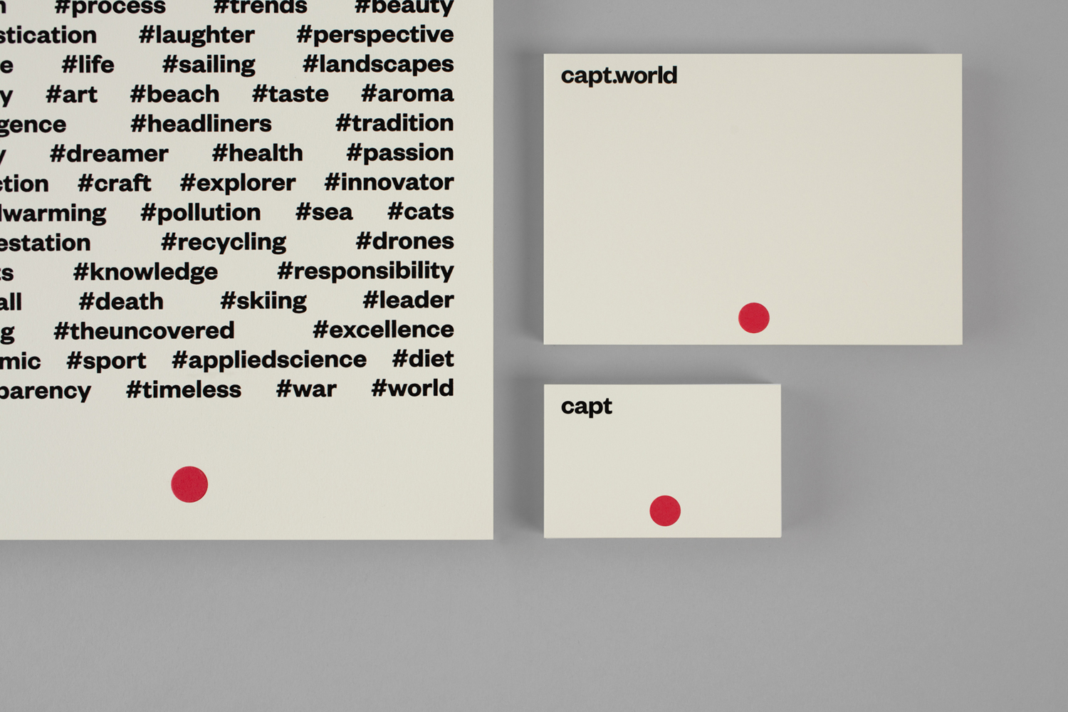
Hashtags drive home the relationship between video content and the value of social media platforms, the linking of ideas, messages and their potential virality. The negative and positive space of type makes for something visually interesting, communicatively relevant, and functions as a reminder of the discourse taking place online.
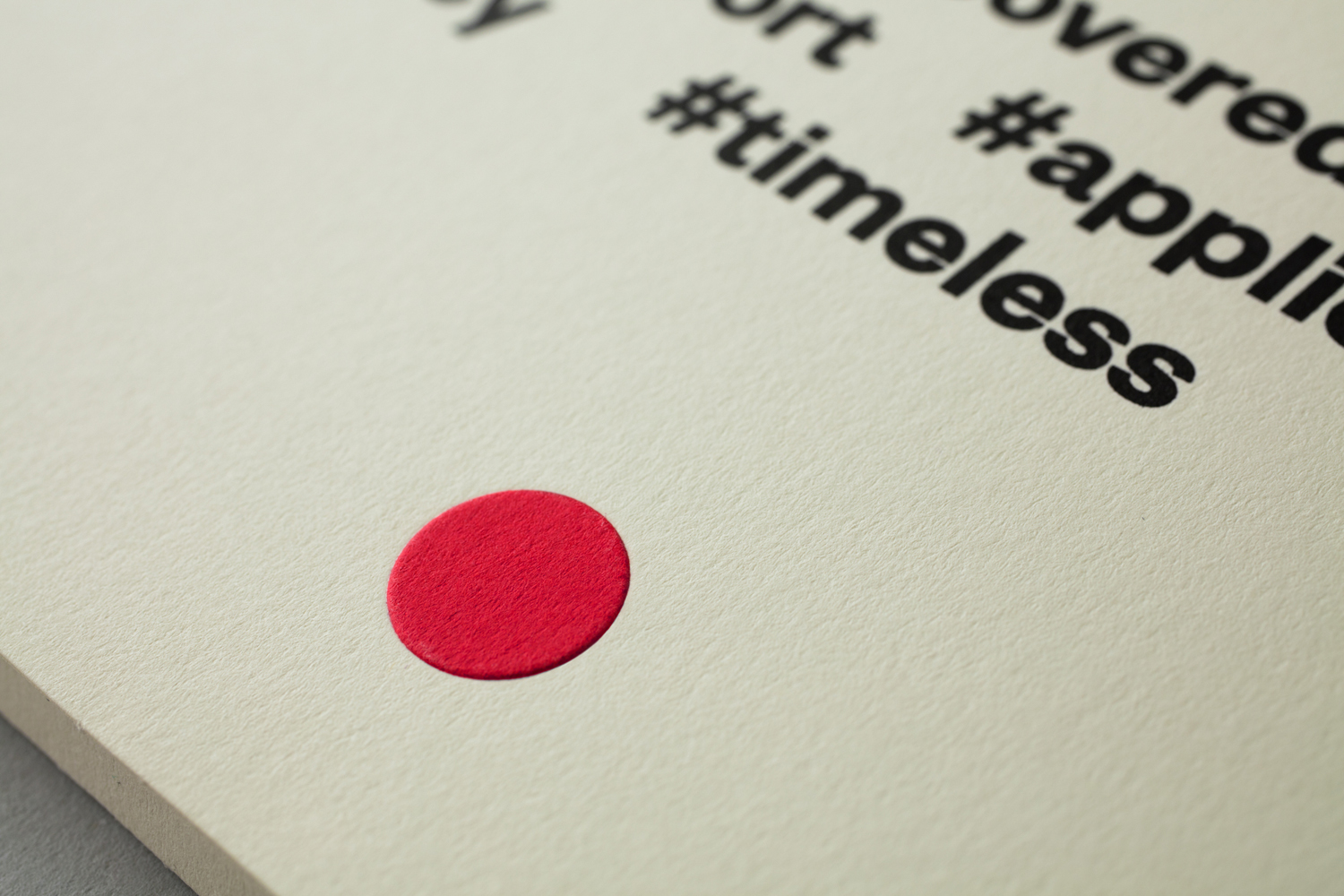
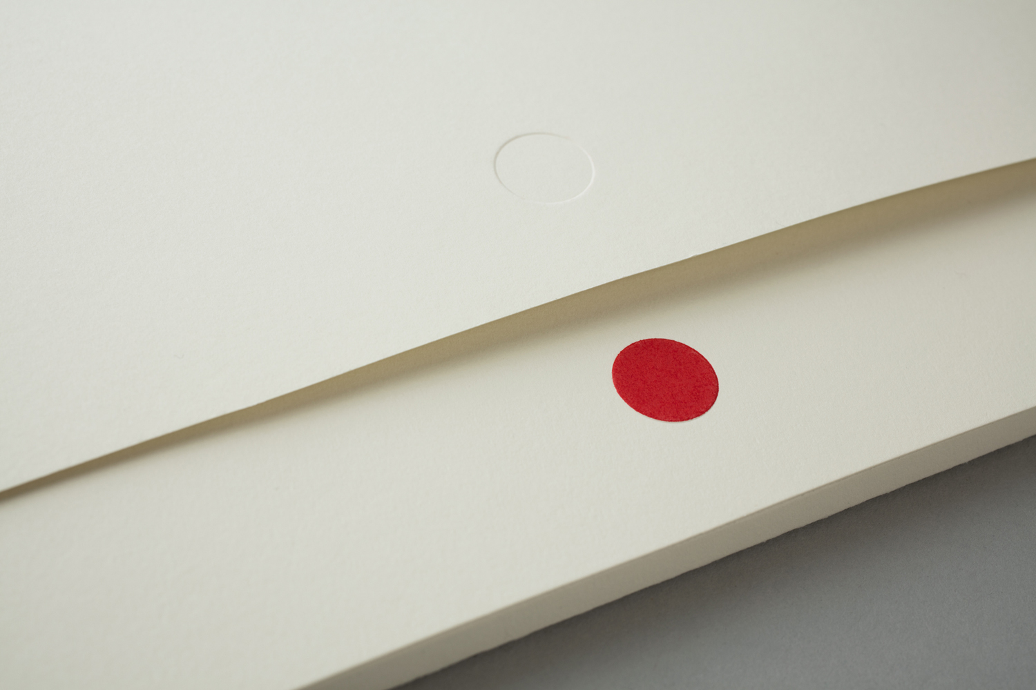
An off-white uncoated board, a bright red ink and button-like emboss add detail and texture to a neat but economical visual expression. It is pleasant and unexpected to see a tech company embrace an off-white. In conjunction with motif, hashtag and a type choice influenced by classic grotesques from the early twentieth century, Capt’s identity, in print, delivers on a subtle sense of communications legacy, an intersection of old and new media, with few assets. Online it reassuringly leans into the start-up tech quality with plenty of white space and large front page images.
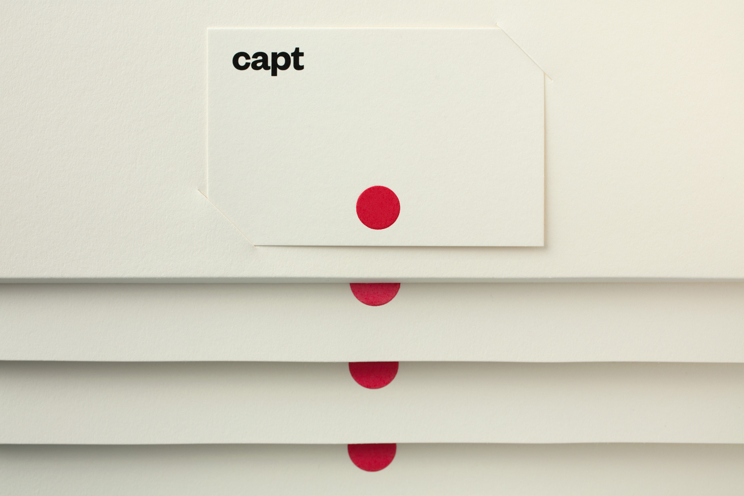
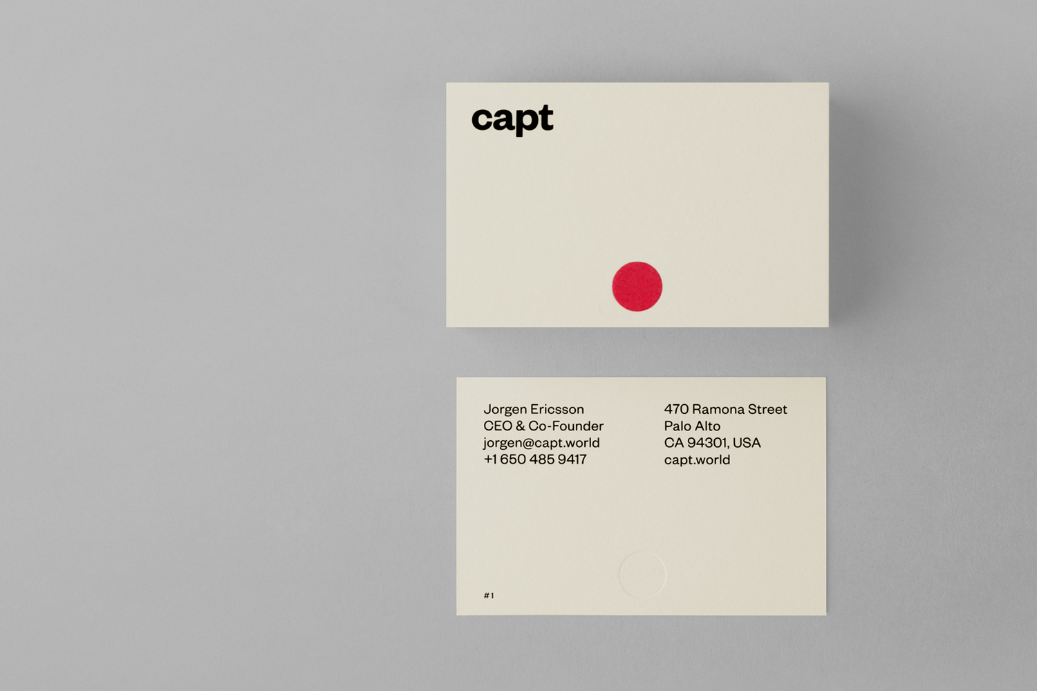

Logotype is simple, compact and with character, not only in the lettershapes of Founders Grotesk, which features tight apertures, spur across the a and curved intersection of the t, but also in its all-lowercase typesetting, bold weight (where tech often favours the light), and tight spacing.

It would be difficult not to acknowledge the association between a red circle and Japan. For the most part this is negligible because of its size, placement and context, however, across the hoodie, this does seem a little more prominent.

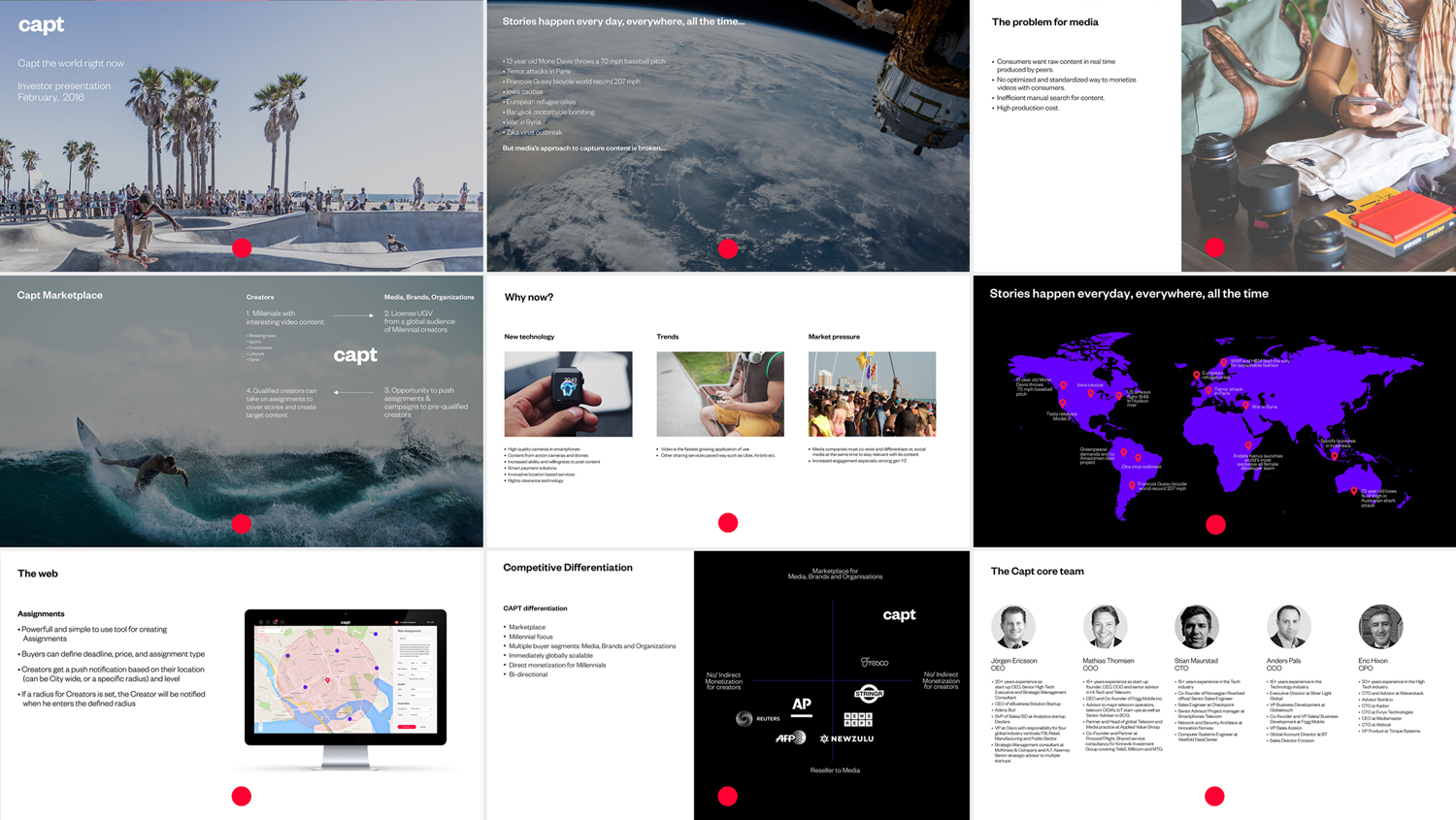
A ubiquitous mark gains value from its continuity across print, web platform and app, and the ways it has been used to connect the visual language of social media and mobile video making in some neat ways. These include anchoring presentation slides, the circle of a social media or message notifications, the dot of a location, and as an actual record button.
Branding is simple but referential, builds something distinctive from the commonplace, and comfortably utilises some more conventional but effective layouts online to make a new service feel intuitive and familiar.
Design: Bunch. Opinion: Richard Baird. Fonts Used: Founders Grotesk.
