Víspera Coffee by Stockholm Design Lab
Opinion by Richard Baird Posted 16 December 2016
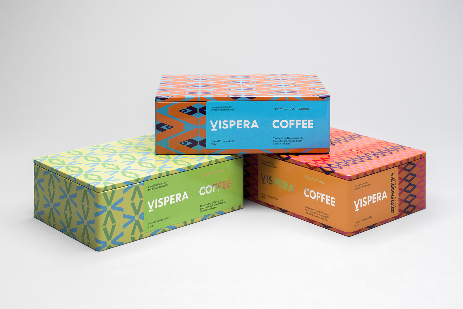
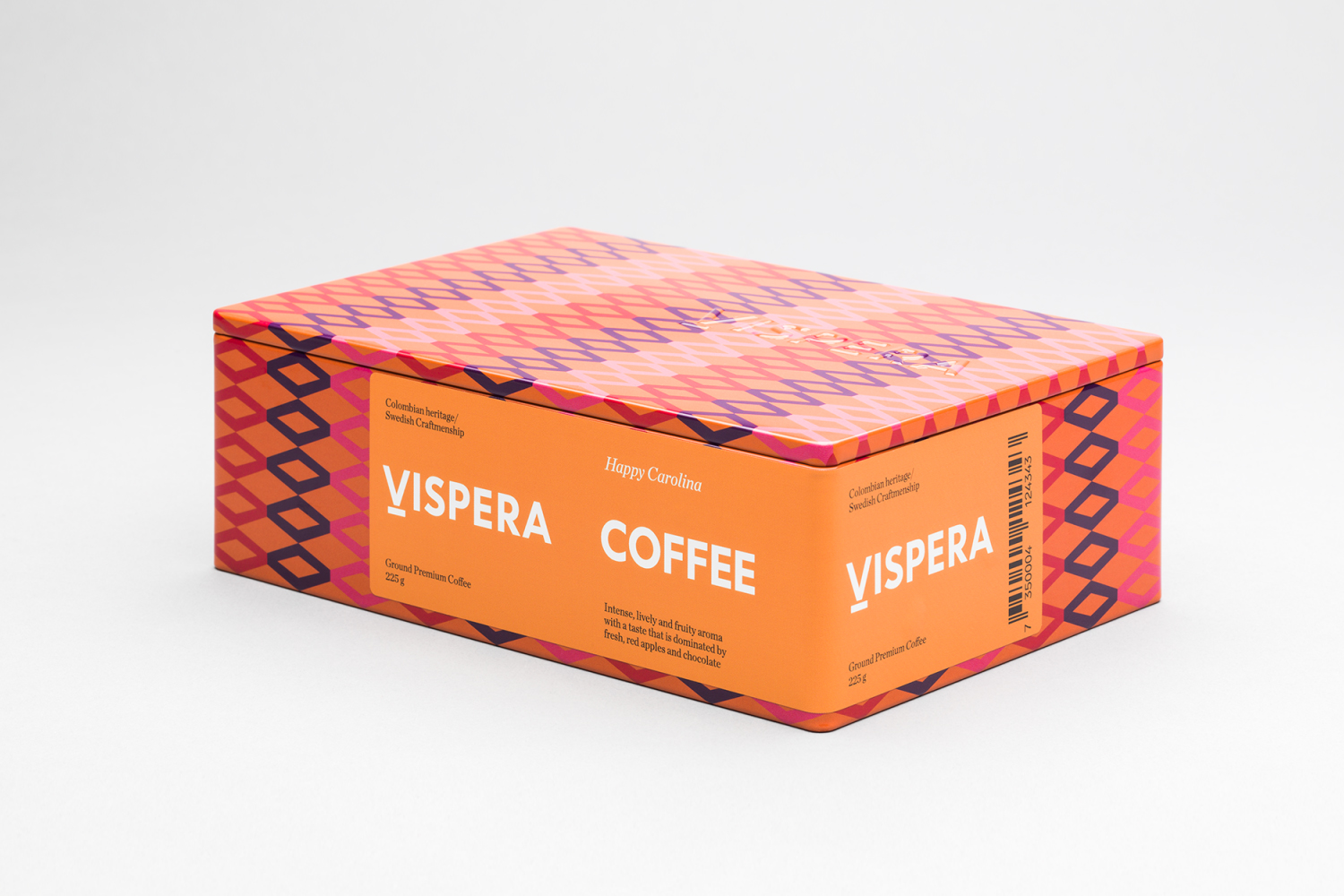
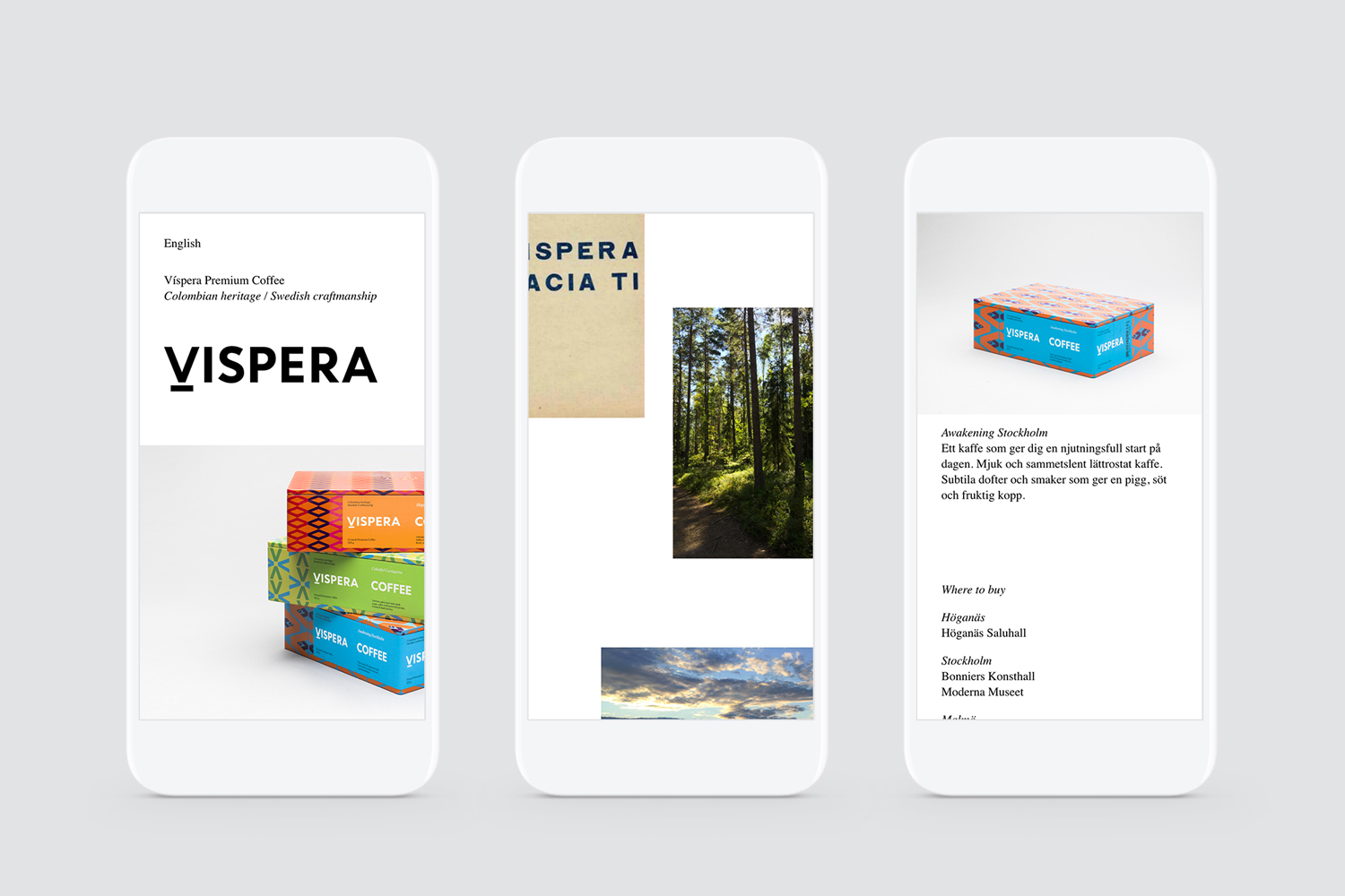
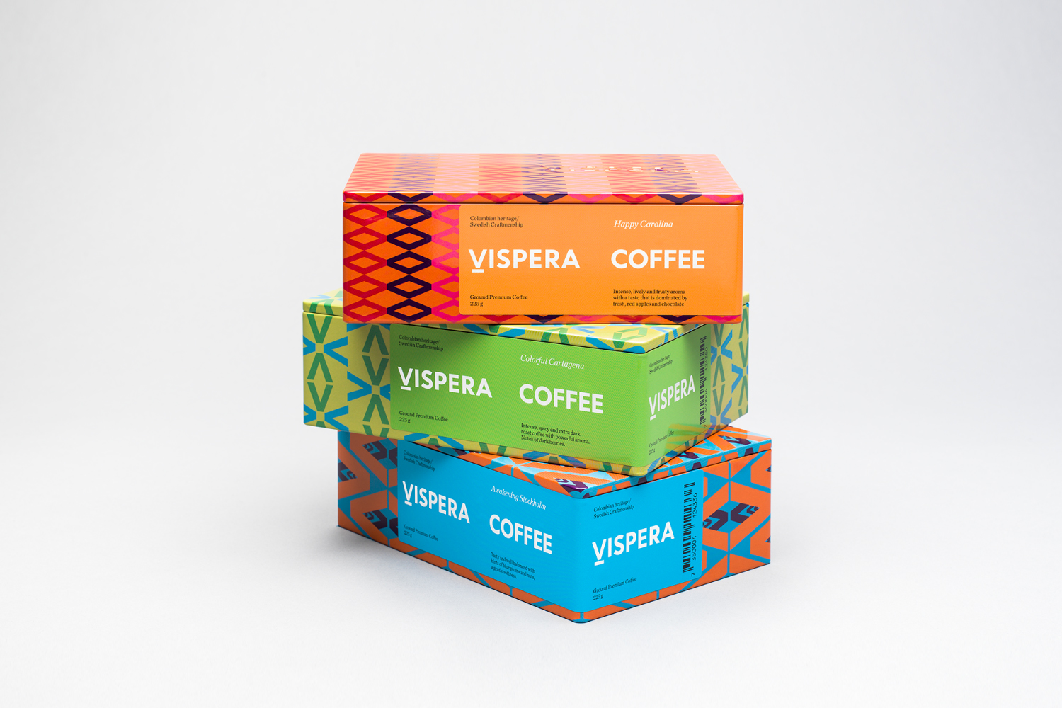
Víspera is premium coffee brand that intends to bring together the best of two worlds, a blend of 100% Arabica coffee beans sourced from the high altitude plantations of Colombia and a Swedish eye for quality and craftsmanship in its roasting. This meeting is visually articulated through type contrast, colour and pattern across Víspera’s packaging, developed by Stockholm Design Lab.
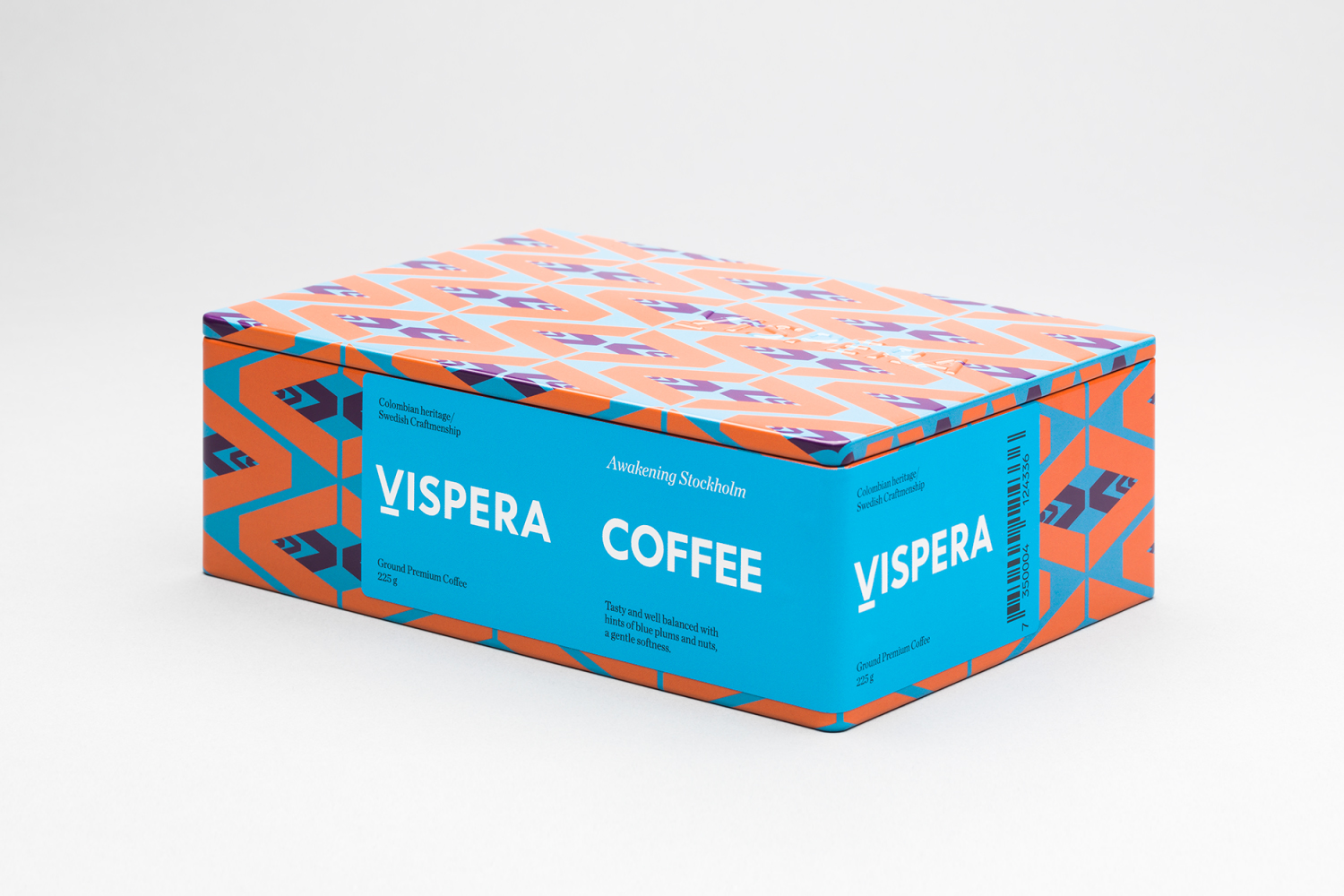
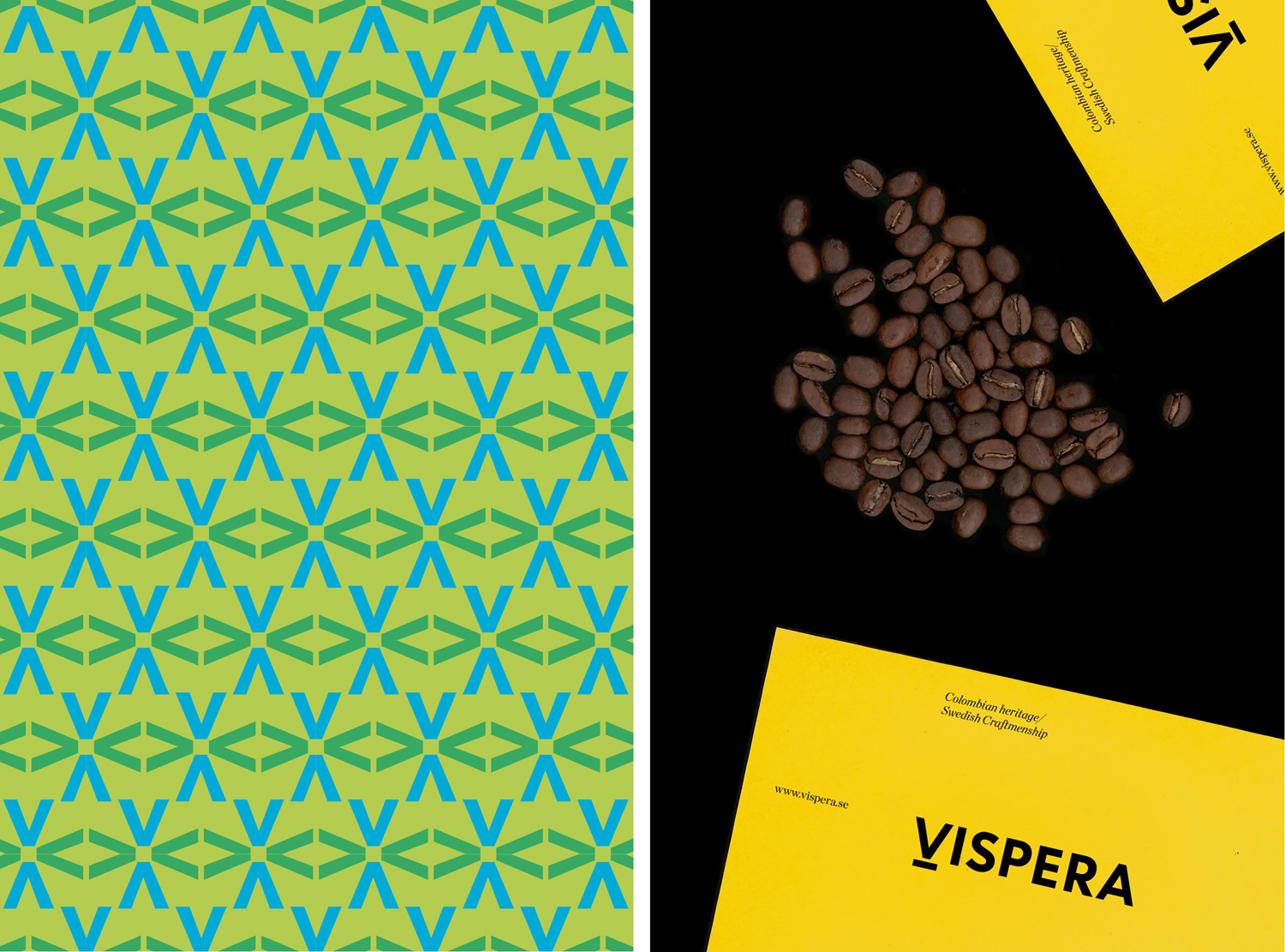
Víspera offers unique variations in taste and smell through the complimentary combination of beans, of equal quality, sourced from different locations. So, while pattern makes for an eye catching visual impression, the mix of colour and form goes some way to effectively articulating the blending of beans and the different flavour profiles across the range, as well as offering a more reductive and contemporary take on the busy geometric patterns of South American rugs.
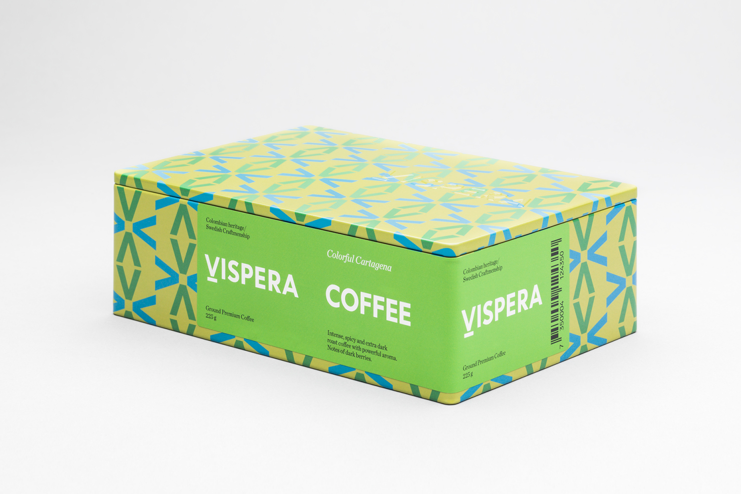
A typographical contrast of small and large, the fine and bold, traditional flourish and contemporary reduction effectively leverages associations with Scandinavian style, but also something of heritage, a detail that is appropriately rooted in the heritage of the roastery, one that dates back to 1891 and includes the prestige of being Royal Purveyors to His Majesty since Gustav V’s time.

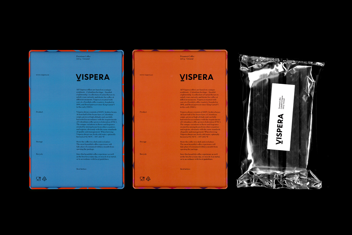
Highlights include an embossed 225gram structural design, the colour and form of patterns, and the solid background, typesetting, structure and placement of label. Together these feel communicatively well-intentioned and, through contrast, emphasise the duality of brand, one of genuine history and modernity, South American provenance and Scandinavian preparation. It is also visually distinctive and with impact, particularly when there is often an abundance of bags and a preference for either the overly-crafty or the far too reductive. More from Stockholm Design Lab on BP&O.
Design: Stockholm Design Lab. Opinion: Richard Baird. Fonts Used: Chronicle Display.
