St. ERHARD by Bedow
Opinion by Richard Baird Posted 24 January 2018

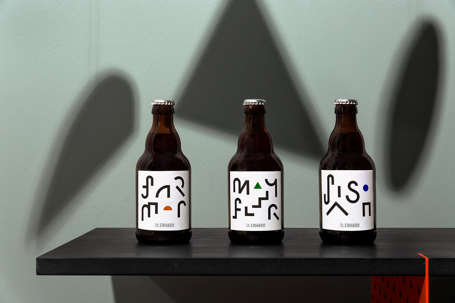
With a desire to stand out, and in response to the extensive saturation of heritage-related visual cues throughout the German beer market, brewery St. ERHARD worked outside of the country with Swedish studio Bedow to develop a modern graphic identity for three of its brews. Farmer, Mayflower and Saison are premium beers, each of which are crafted, brewed and bottled by St. Erhard in the Bamberg area of Northern Bavaria.
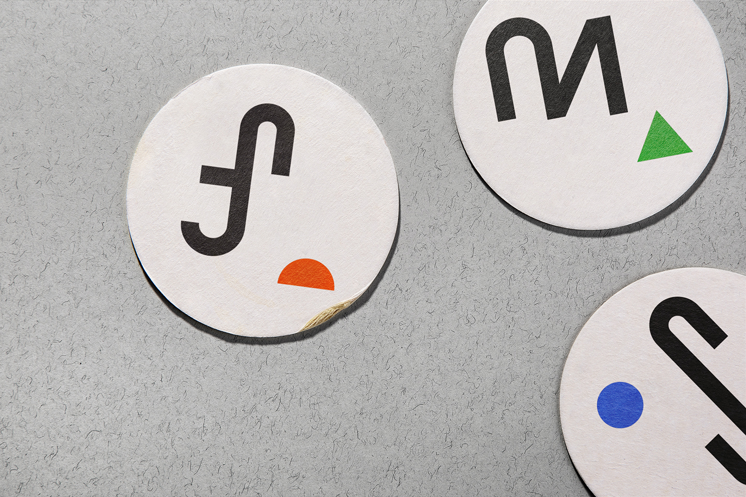
Bedow’s work is characterised by a strong use of contrast, a graphic simplicity and immediacy. This can be seen in the meeting of curvy traditional structure and rectilinear labelling, in the mix of black ink, white substrate and colourful foiling, in the reductive typographical form of the range and the more conventional logotype of St. ERHARD, and finally, the systematic nature of the collection yet the irregularity and playful character of each label.
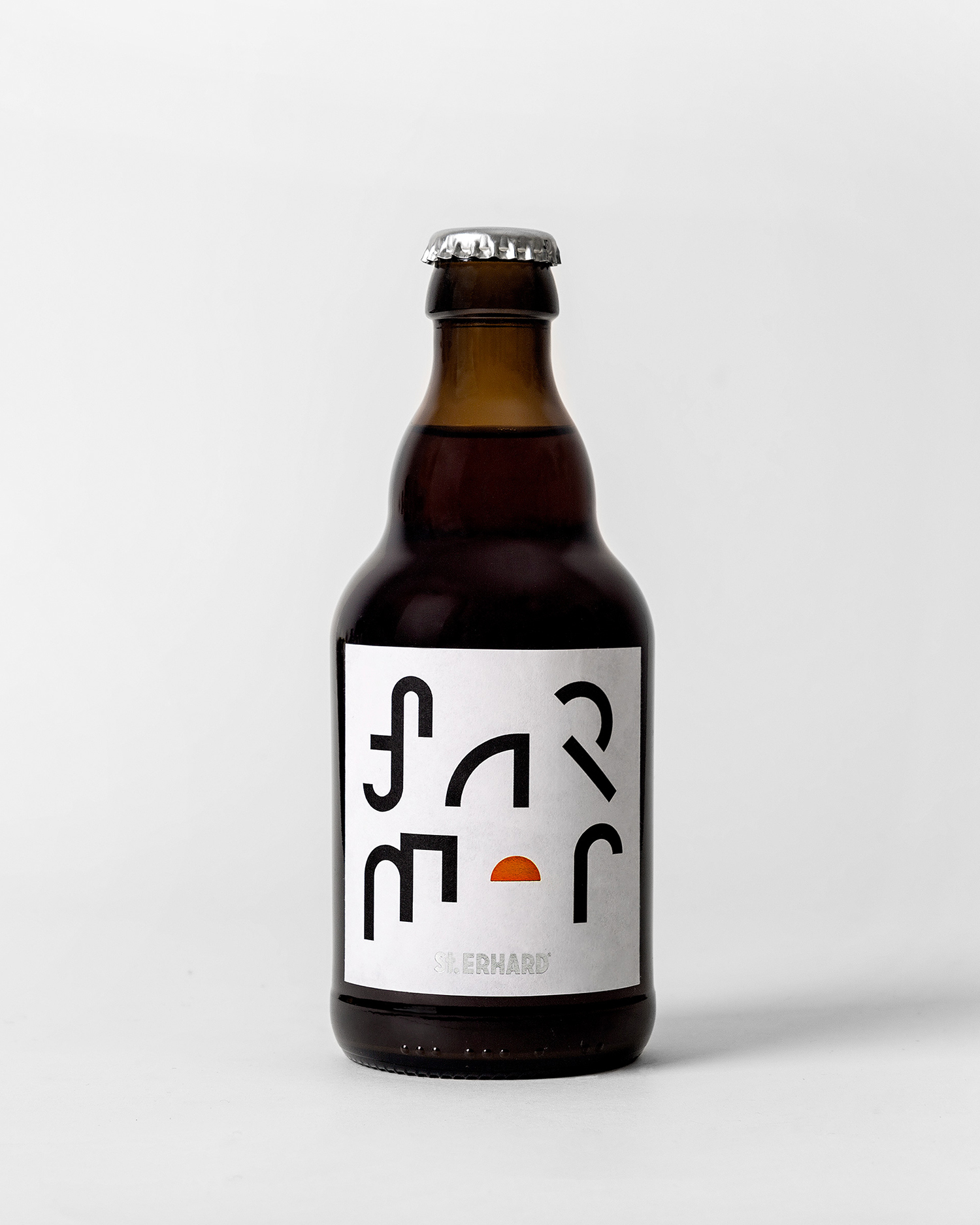
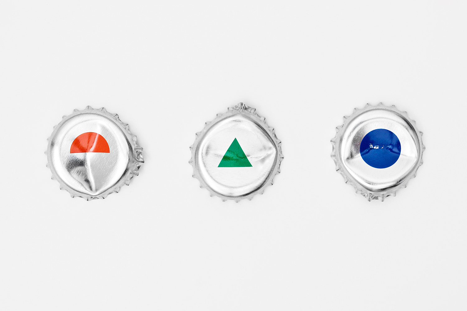
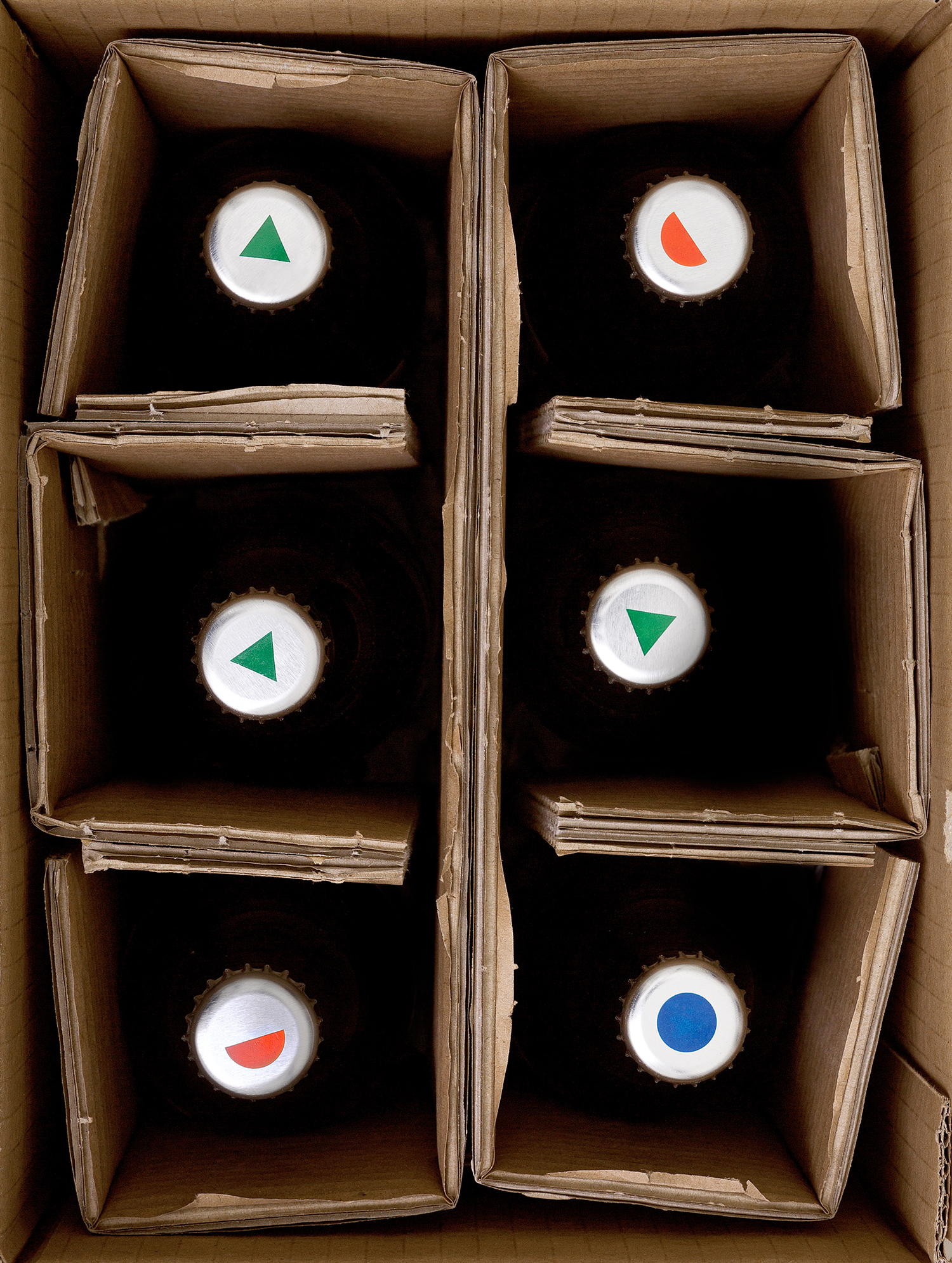
Drawing on the graphic language of the Bauhaus era Bedow find a comfortable and interesting meeting point between modernity and tradition, visual impact and a subtle material quality. This is achieved in the intersection of graphic treatment, block foiling, the traditional form and amber glass of the bottle and its silver cap with geometric print. The work draws its distinction primarily through its concise and disparate visual and structural language, yet there is an interesting legacy component that weaves together two eras.
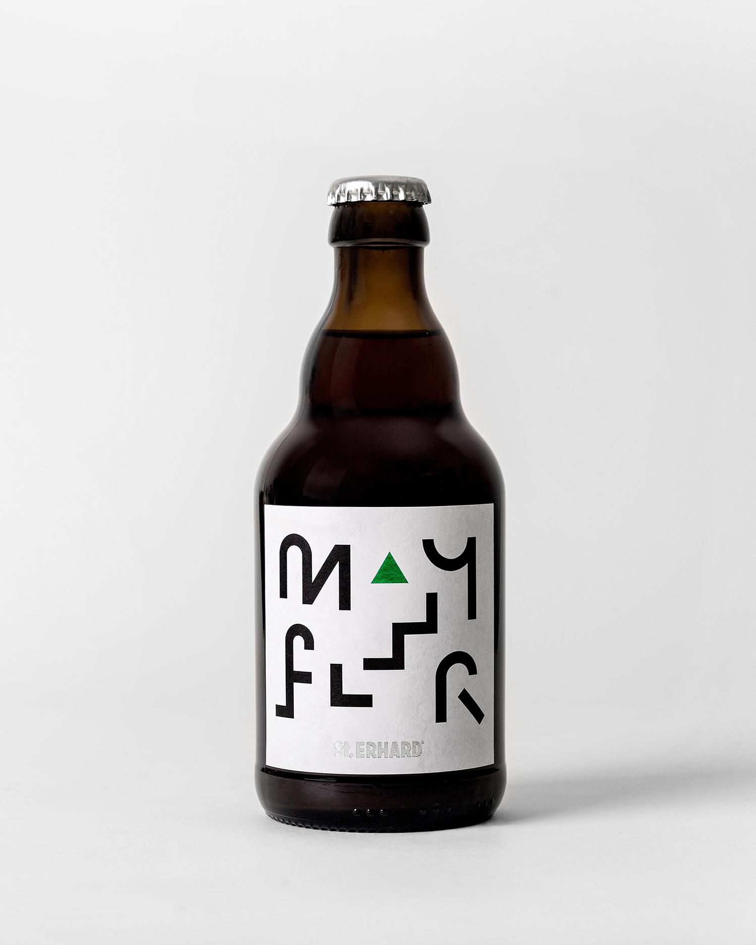
Shape and colour, space and arrangement, proximity and distance are all touched upon and build to a striking and distinctive image, effectively leveraging the fundamental principles of the period reference. Name is secondary, with letters reduced down to elemental forms. While these are irregular and individually expressive in their composition, alongside the other two varieties these began to feel systematic, open to an expanding range.
Practical considerations such as quick and clear identifiable naming, the nuance of flavour profile, and the reassurance of a stylistic familiarity, give way to a distinctive and challenging image. A chance to catch the eye and ask for consideration.
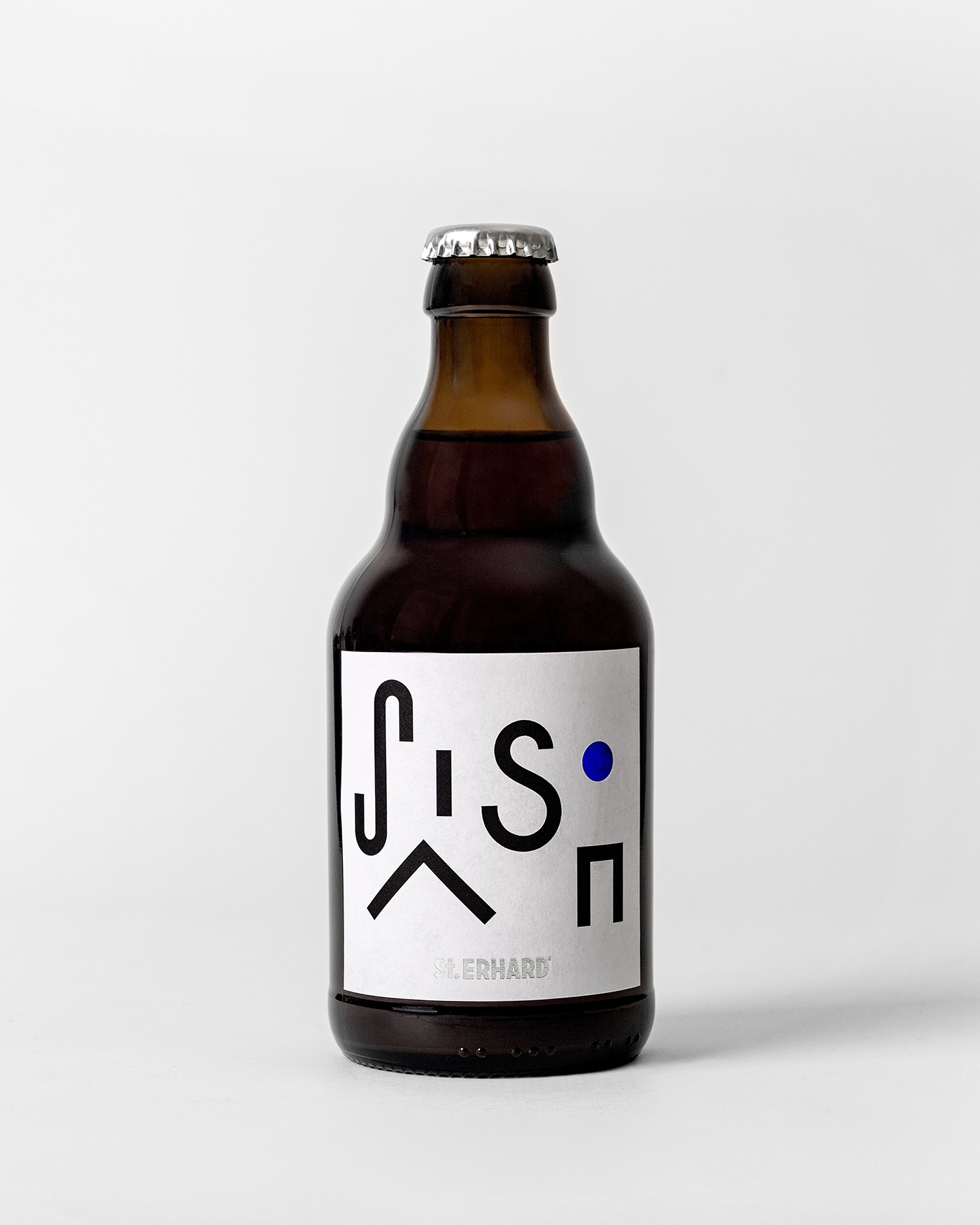
There is a strong graphic language at play that shuns convention and taps into a different national legacy, one that brought together art, design and craft, and feels fitting for a contemporary craft brewery. More work by Bedow on BP&O.
Design: Bedow. Opinion: Richard Baird.
