A.N Other by Socio Design
Opinion by Richard Baird Posted 29 January 2018
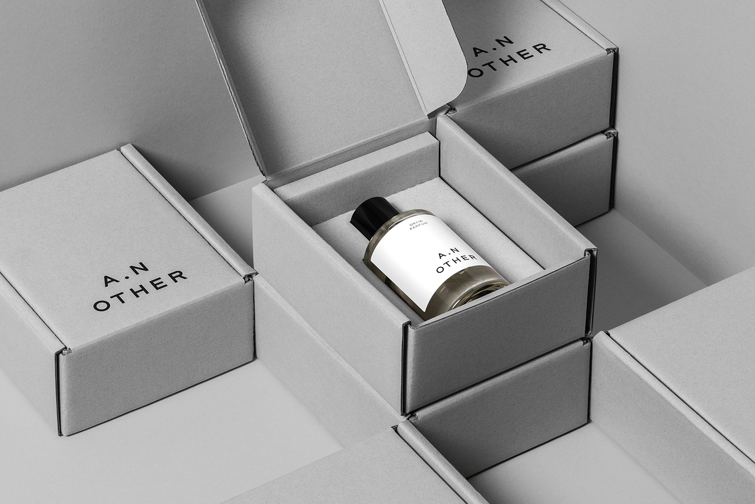
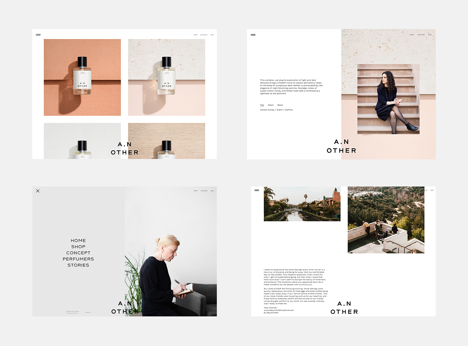
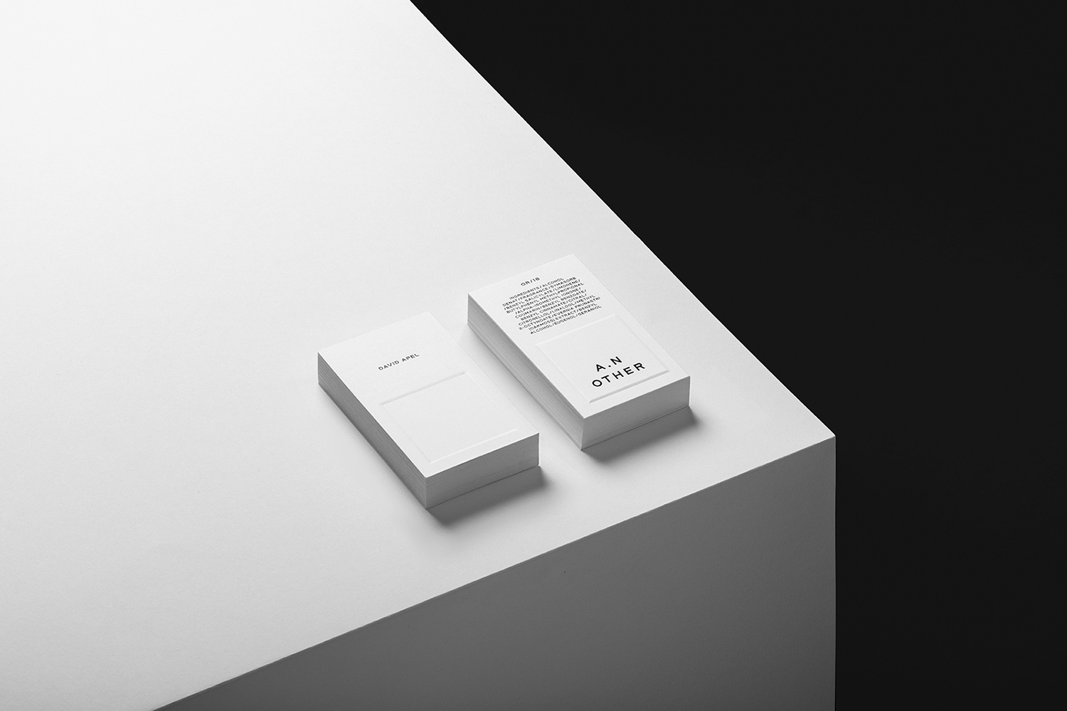
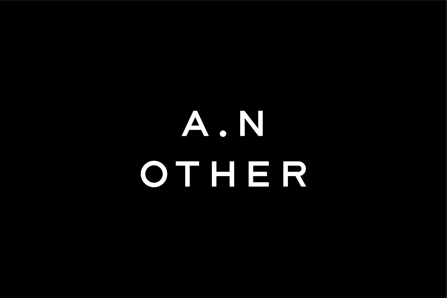
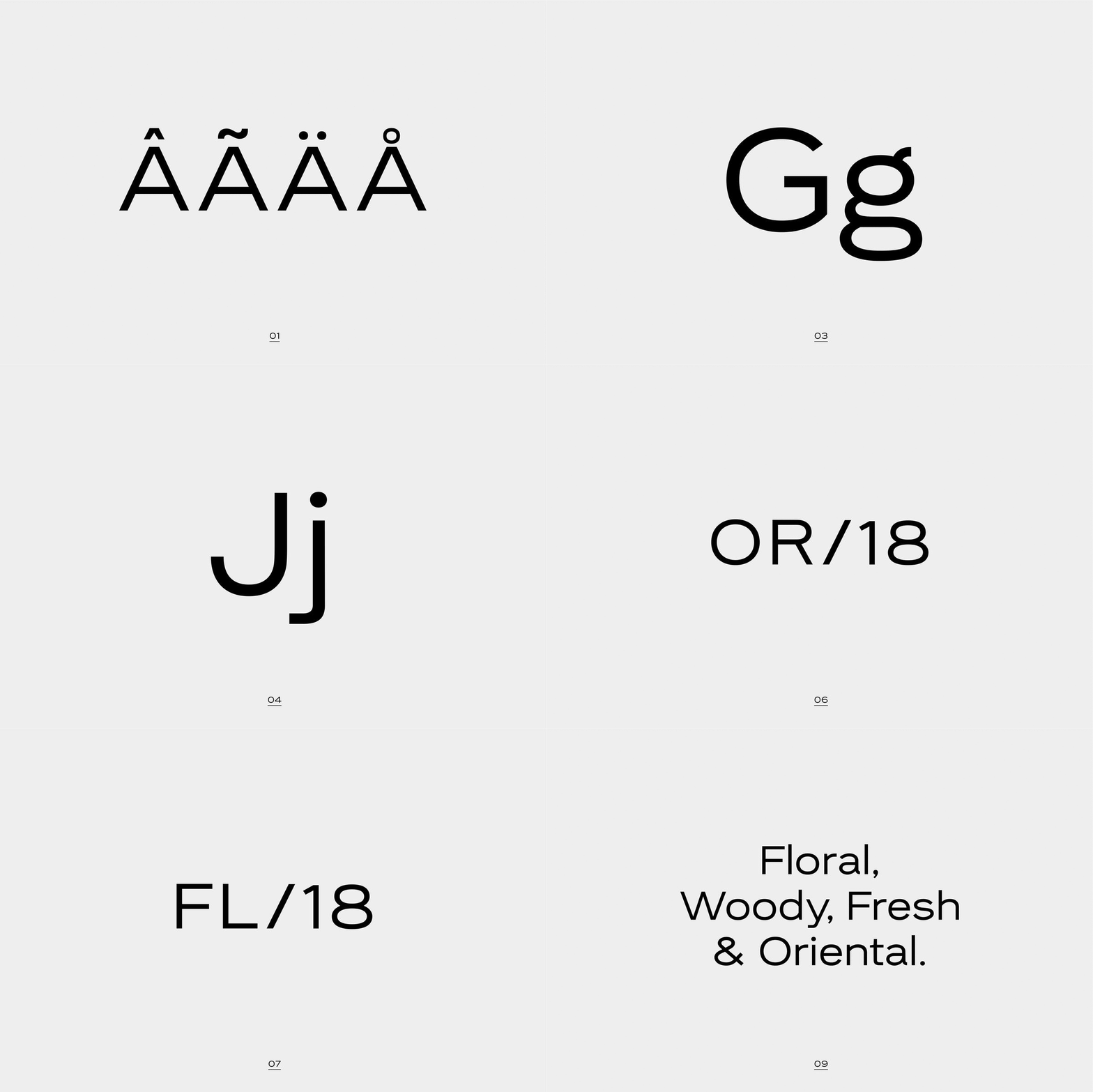
A. N Other gives its perfumers the creative room to craft limited edition, luxury and high concentration fragrances free from the pressures of consumer trends, market segmentation and budgetary constraints. These are then sold direct-to-consumer through its website. A.N Other places greater value on the internal composition of each of its fragrances, and the inspirations and aspirations of its creators, than the outward expression and associated expense of boutique spaces, lavish adverts, glossy magazine coverage and celebrity endorsements. This direct to consumer approach and a focus on ingredient quality, concentration and sustainability, as well as perfumer and fragrance story, is distilled down and projected by graphic identity, developed by Socio Design, initially online through website, and continuing into packaging. These are linked by naming and strategy, and by details that include bespoke typeface and logotype, brand imagery and copywriting, also created by Socio Design.
A.N Other is the antithesis of high fashion glamour and the marketing that surrounds it, but similarly functions as a lifestyle brand, responding to evolving consumer interests. Environmental conscientiousness, product craft and artisan insight, limited editions, digital-first experience and an element of storytelling capture the zeitgeist.
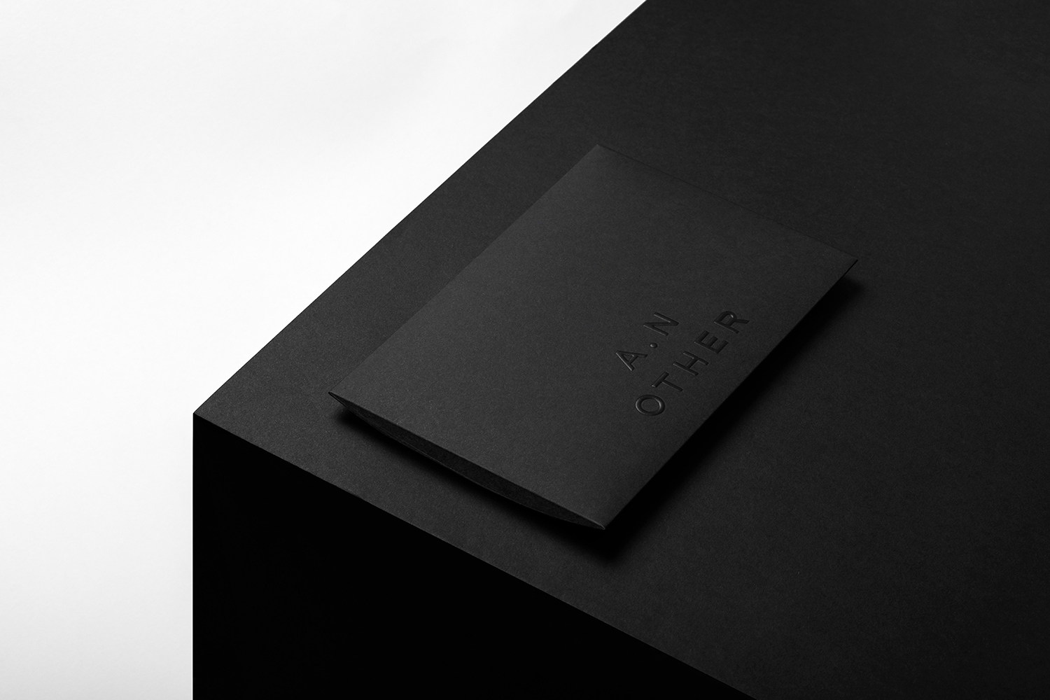
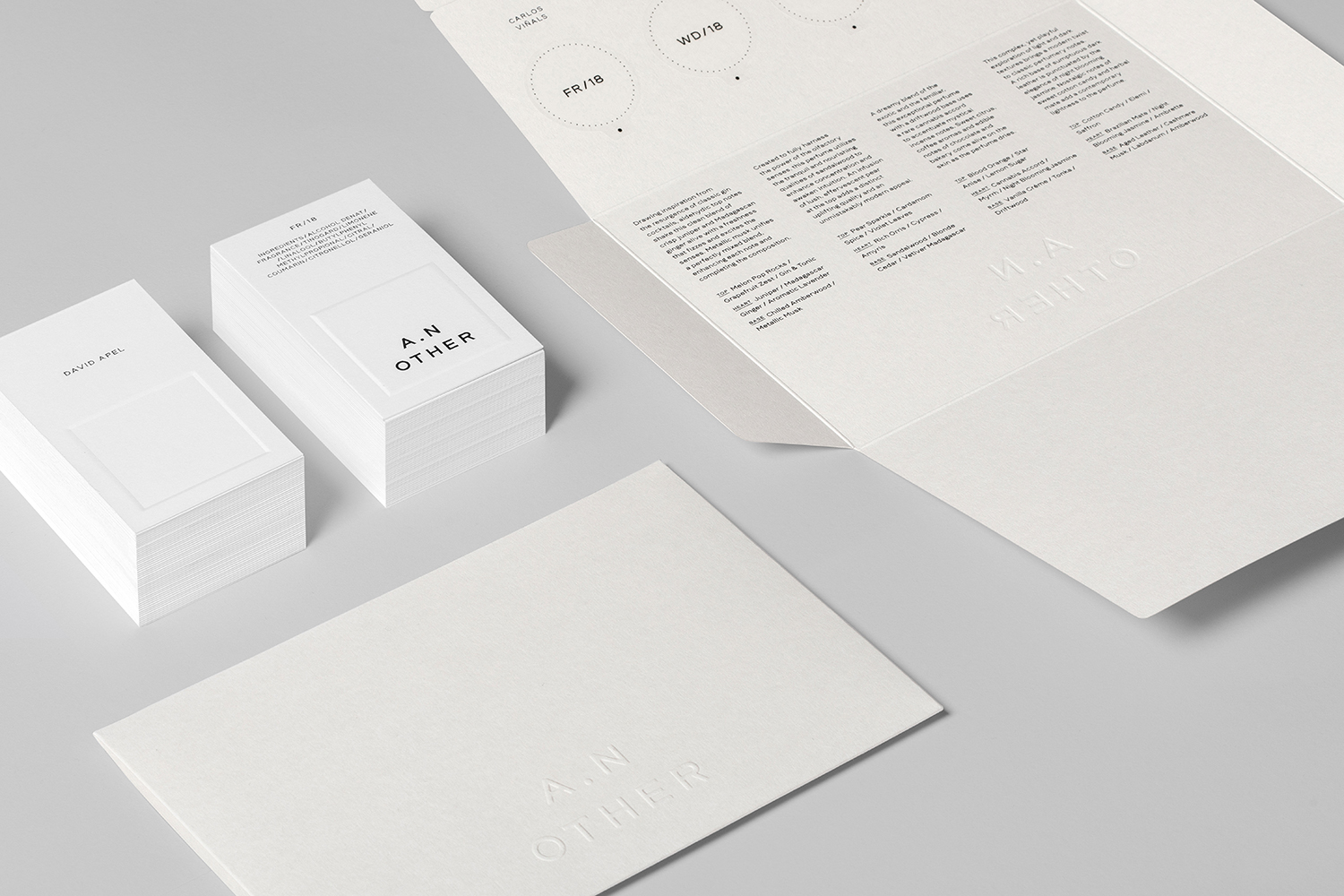
The challenges of an online fragrance business is mediated by a Try At Home pack of concentrated gels, delivered by a compact yet materially interesting envelope, and a website dedicated to expressing the mindful and timely ideology of brand, its challenger status, and the stories of its perfumers and their fragrances.
Graphic identity leverages some familiar modern luxury cues in type and colour. In arrangement and use of space. Essentially, utility as modern luxury, simplicity as an expression of concentration, quality and confidence. Much like D&G’s Fragrance Anthology, it lowers the perceived distance between the perfumer’s workshop and consumer in the absence of artifice, but Socio Design develops this beyond just a one-off collection and makes it a central and integral part of brand experience.
A.N Other benefits from a focused consumer experience. A clear structure and management of engagement, absent the variables of different retail situations, the continuum of campaigns, and the multitude of touchpoints. Socio Design make the most of this.
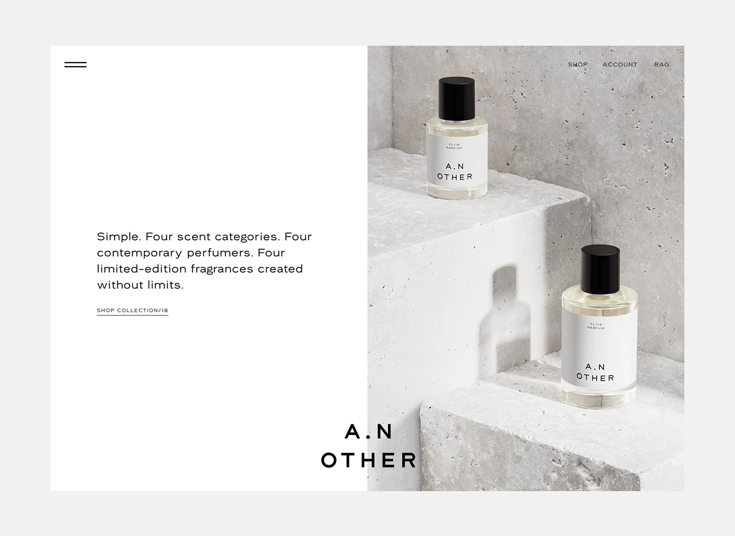
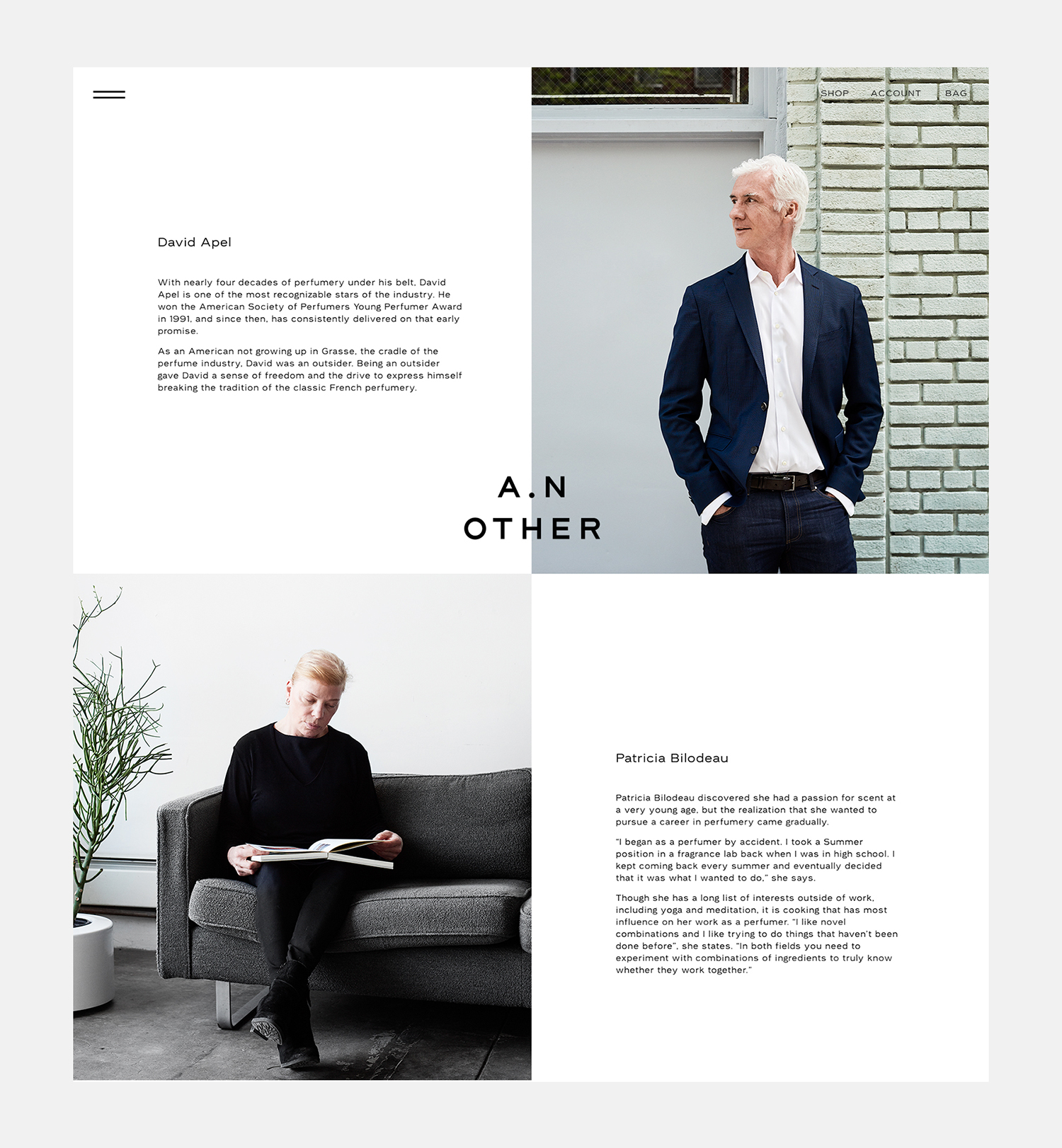
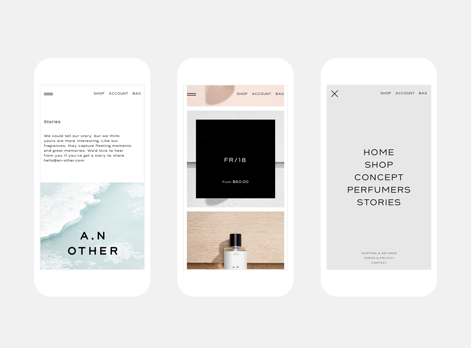
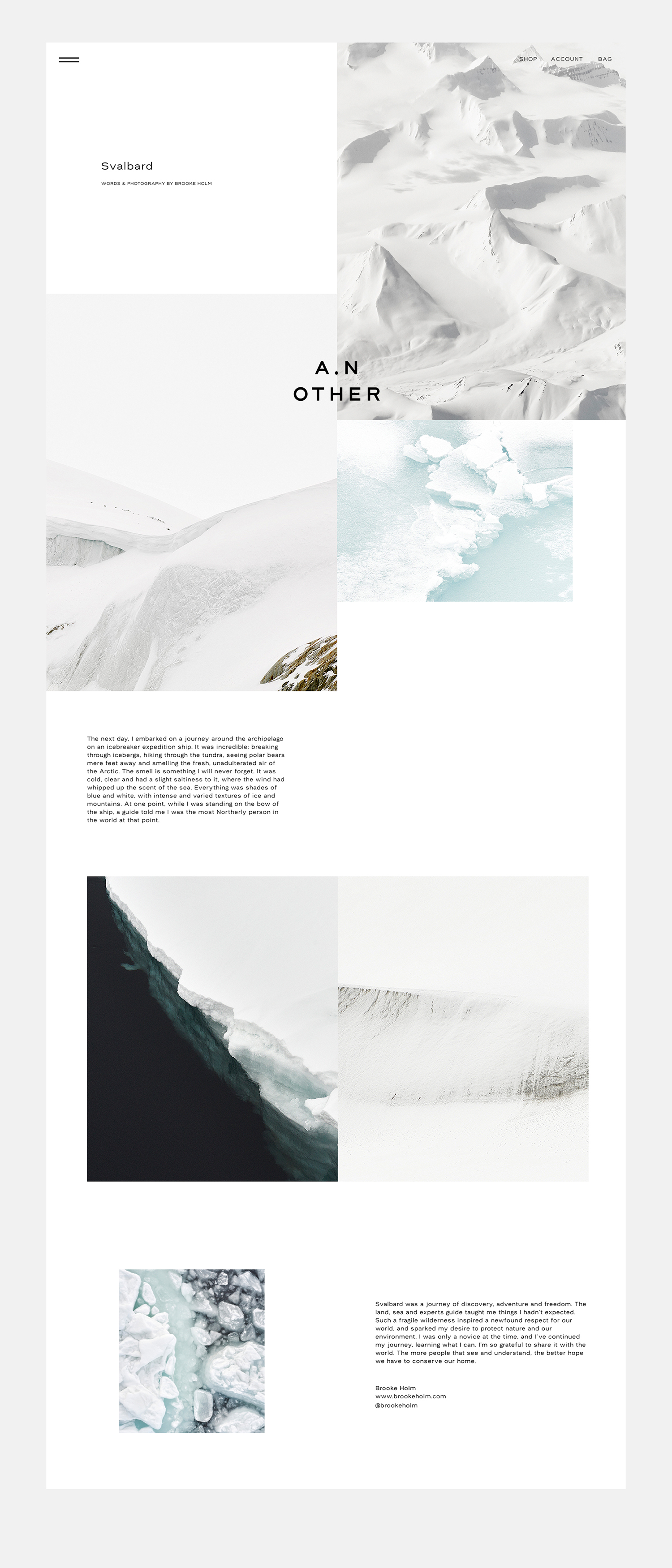
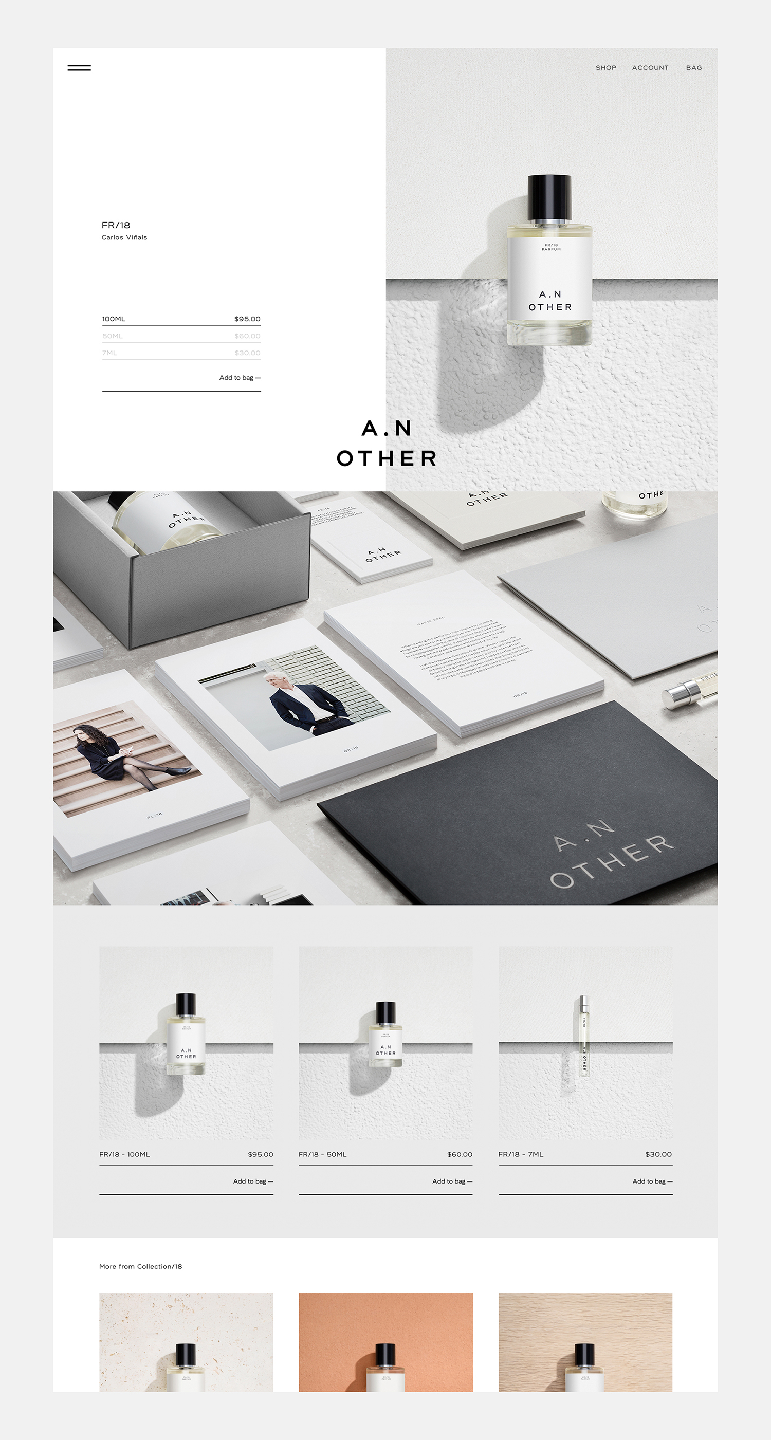
Absent the distraction of competing brands, and with a singular platform and intent, the website has a chance to clearly articulate ideology, to build up product, rather than rely on the visual language and immediacy of form and colour, to establish an enduring intellectual connection, as well as following up with and fulfilling a material desire. Words and images effectively deliver the intentions of brand in a thorough and relatable way, it avoids anything too sanctimonious, merely offering a different perspective, an alternative.
While concise in its structure, there is plenty to read, and a crafted individuality in custom typeface. As a new brand, without a fashion house legacy or celebrity creator, but with a distinctive position to start from, name, bottle and labelling function as near-blank slates in which to project a thoughtful concept and ideology onto, as well as the individual stories behind each fragrance. Videos, which were not directed by Socio Design, fall a little short in creative detail, a tight version of Chef’s Table would have been neat, but these are personable and are complimented by copywriting.
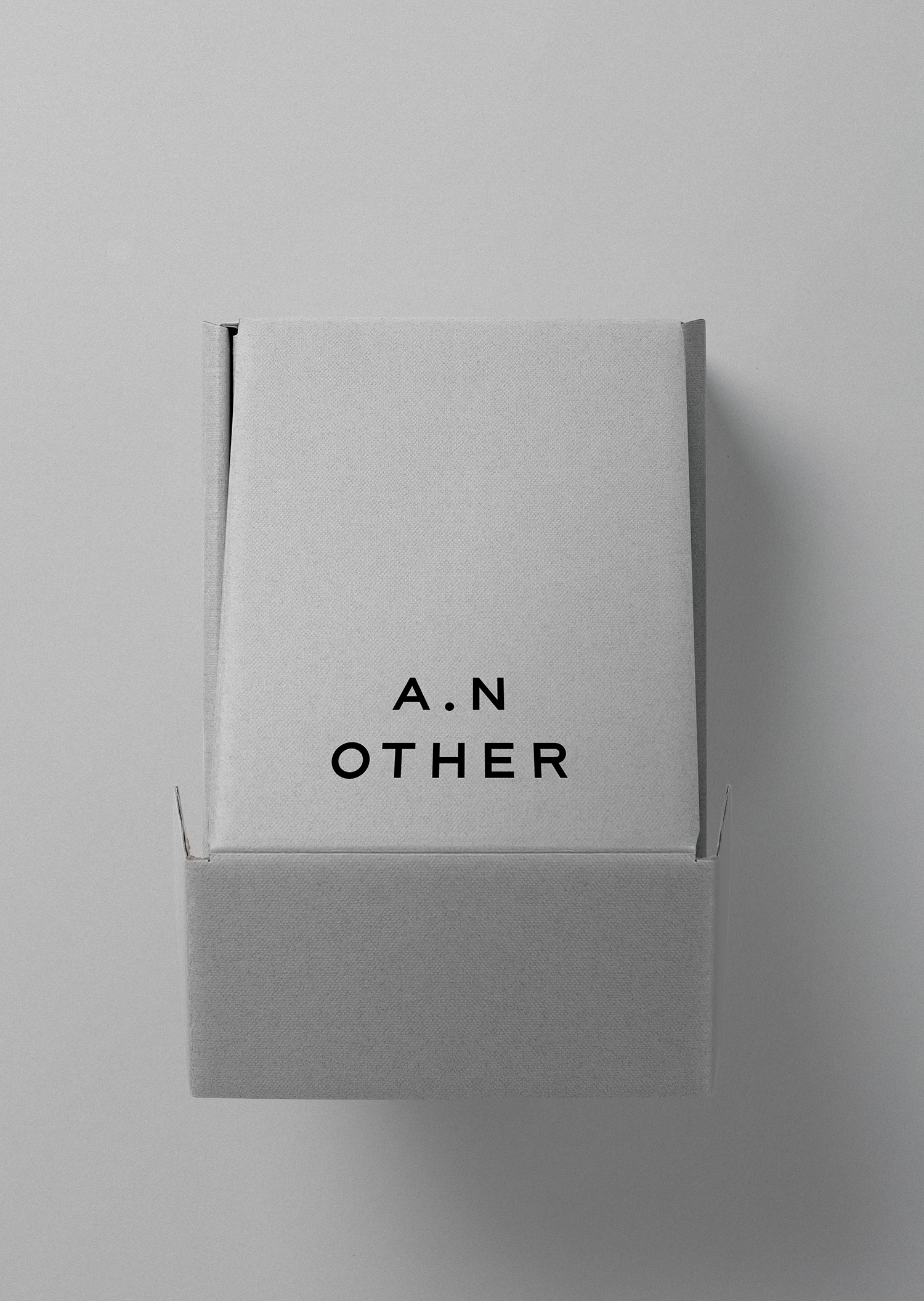
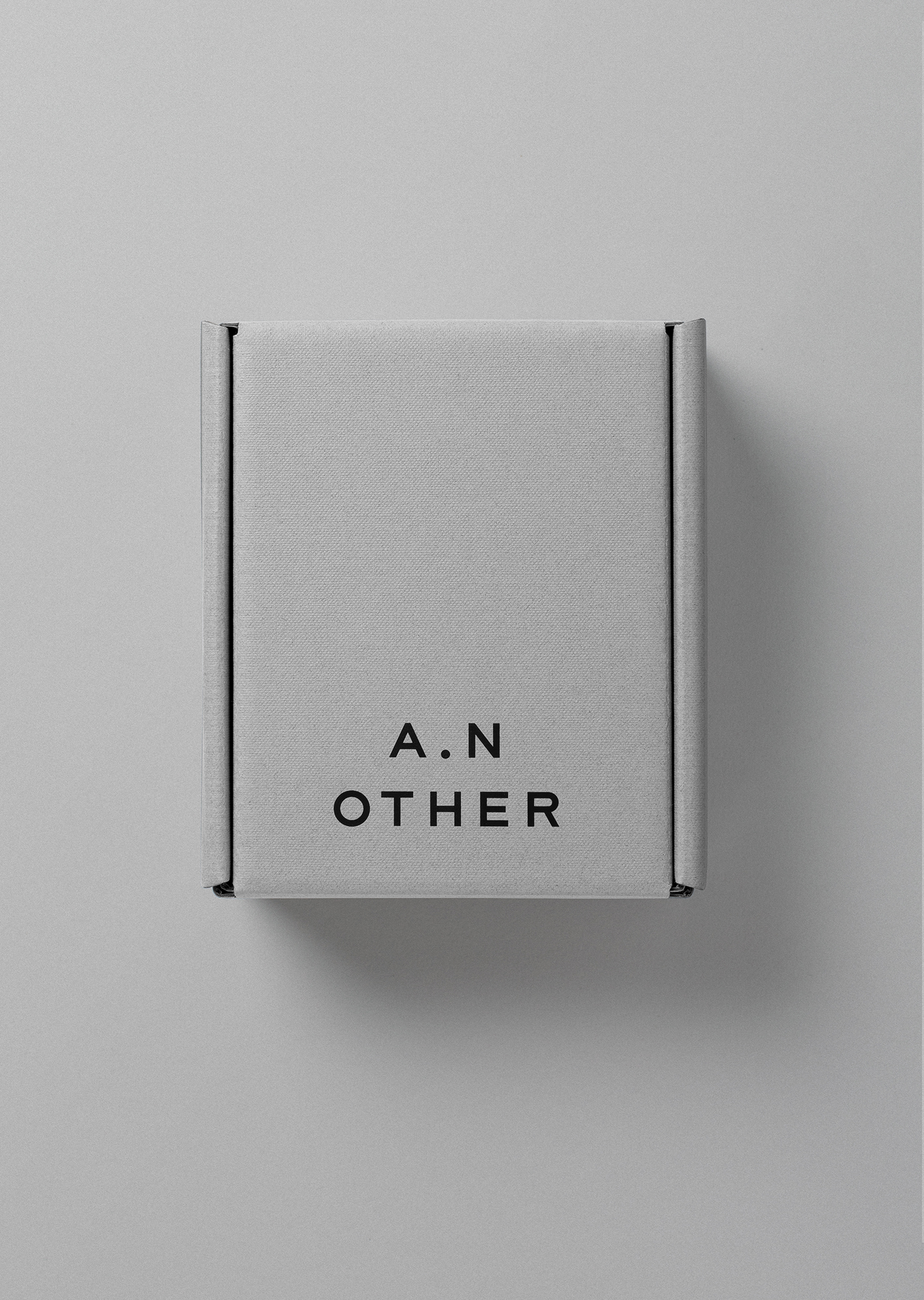
The packaging of online product purchases can vary hugely. Typically, these favour a hard utility to protect the packaging of packaging, to maintain the integrity of soft, designed-for-the-shelf boxes. These can exist anywhere between the materially economical and sensible, to complete idiocy and a material excess.
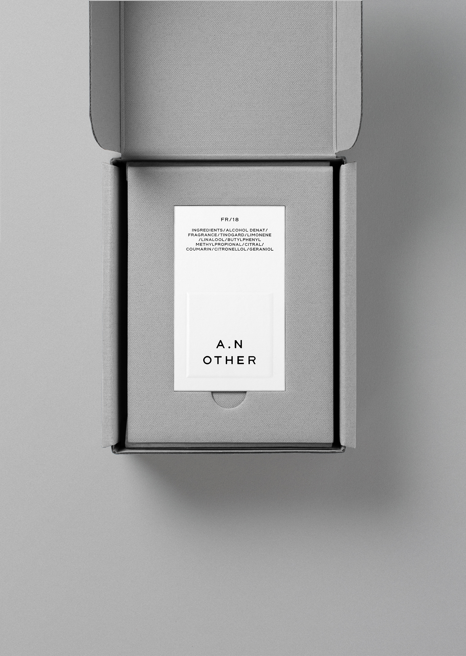
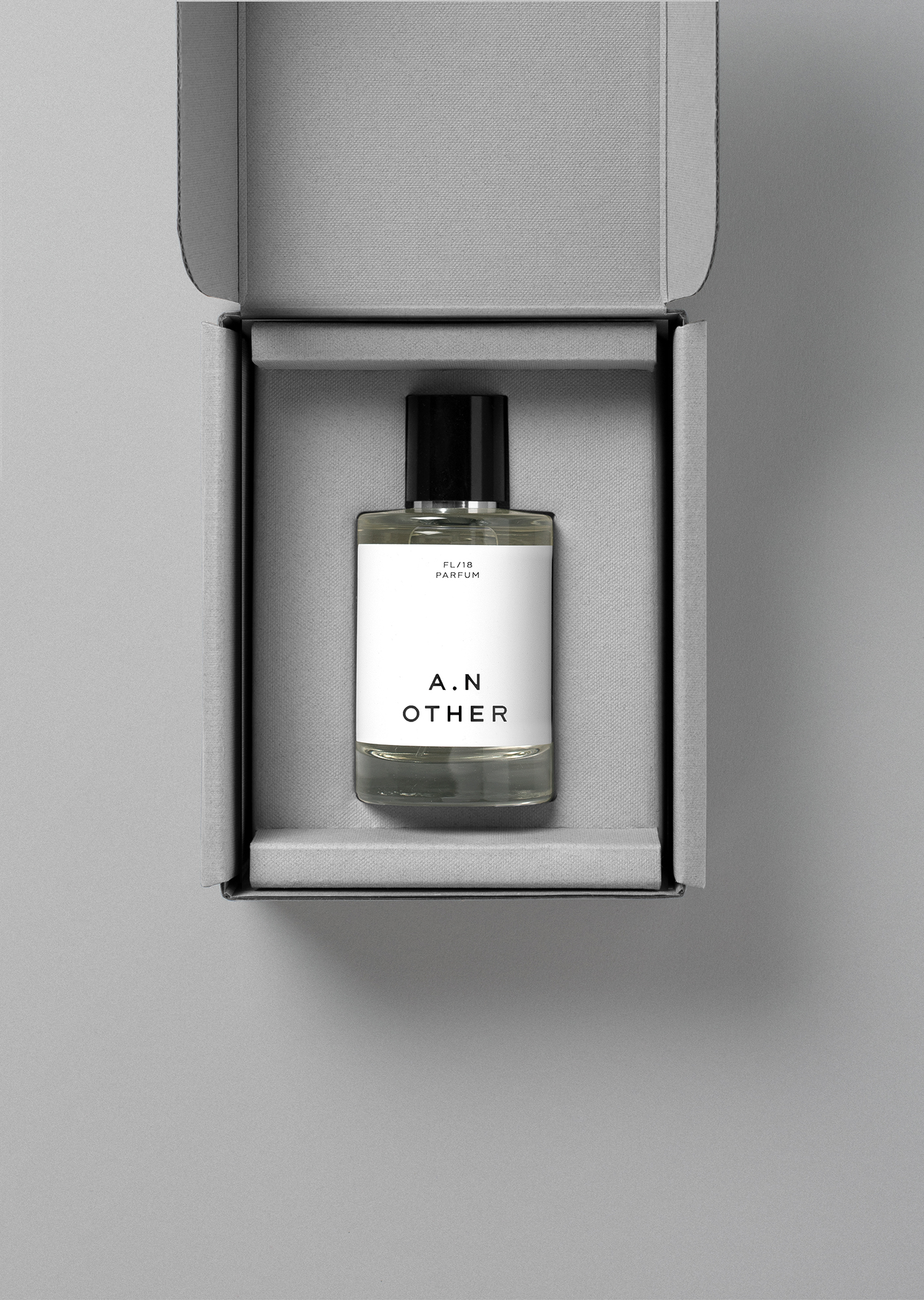
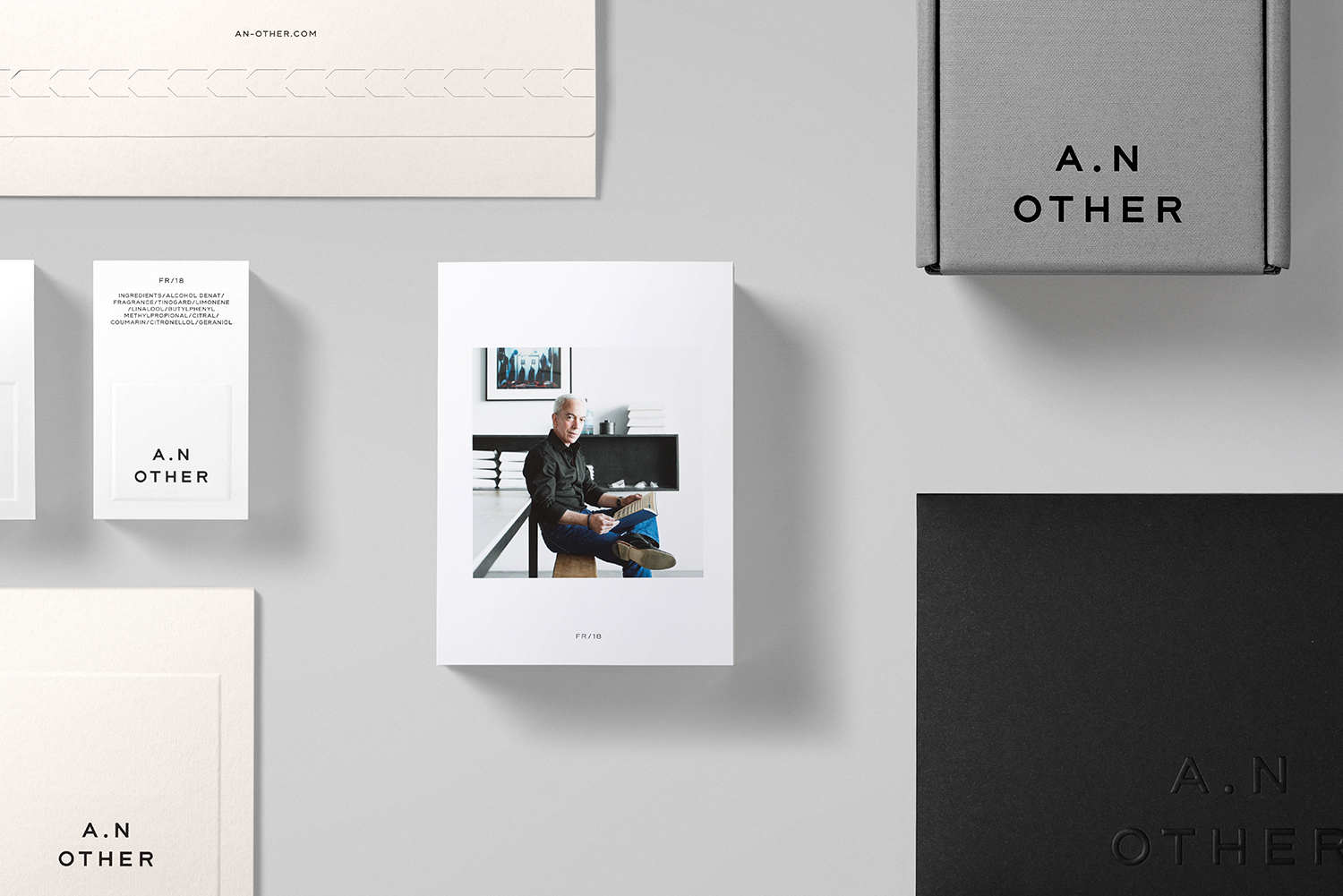
Here, Socio Design embrace the mail-order context, lean into a necessary robustness of corrugated board yet layer this with a fine and high quality surface of dyed paper, embossing and block foiling. There is subtle but smart material language at play. The robust implying a value and delicateness within. There is an immediacy to this. A weight and a rigidity, but also an unexpected aesthetic pleasure. Also check out Marx Design’s work for The True Honey Co. and Socio Design’s work for Chaos.
In avoiding the double boxing, and designing for a singular purpose; in size, structure and the mechanism for closing, as well as its ability to be recycled, this feels both environmentally mindful and materially and stylistically surprising. The mail-order context of a luxury product gets an appropriate design response, one of literal intersection.
Although not impervious to complete carelessness, having felt these boxes first hand, their construction is impressive, and likely to handle some pretty tough postal conditions.
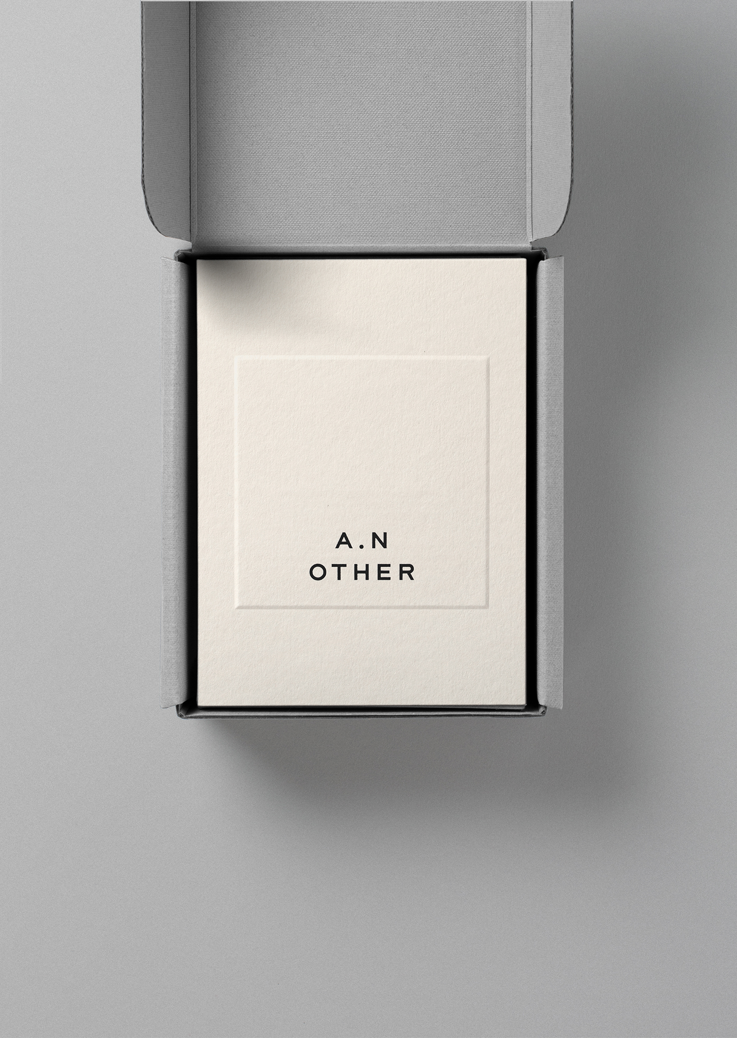
The structure and management of a end-to-end experience continues in the composition of packaging. In the way box opens and in the stacking of inserts to create a sequential experience, an intuitive language of layers. Logotype, shape, proportionality, words and images form a continuity between digital and material experience, a connection to the more detailed stories and insight into fragrance and perfumer.
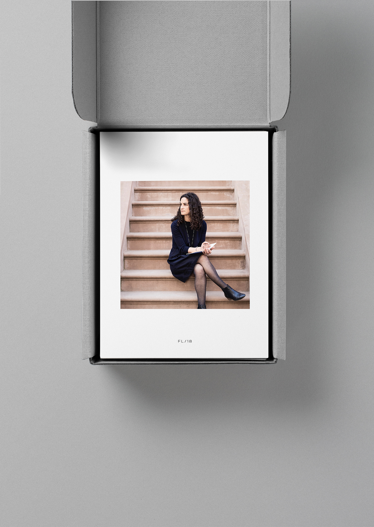
There is a clear and satisfying design craft at play in the construction of boxes, the inlaying of bottle, the continuity of material inside and out, in the paper choice and finish of inserts, and their collective assembly. These all fit neatly together. They build towards product, adding layers of detail, materially and texturally, and through image and words. The digital component brings a vital contextual richness to a pleasant material and graphic expression. There is a temptation to view a project like this from a purely aesthetic standpoint, it is compelling and beautifully crafted, yet this would be to misunderstand and misrepresent the project, to omit its end-to-end consideration, the importance of initial engagement through digital presence. It is the prominence of story and an evident ideology that facilitates a material and graphic simplicity, without this, the canvas would empty. More work by Socio Design on BP&O.
Design: Socio Design. Opinion: Richard Baird. Papers: G.F. Smith Ebony, Real Grey, Ice White & Mist.
