Mitsulift Elevators by Base Design
Opinion by Richard Baird Posted 3 April 2018
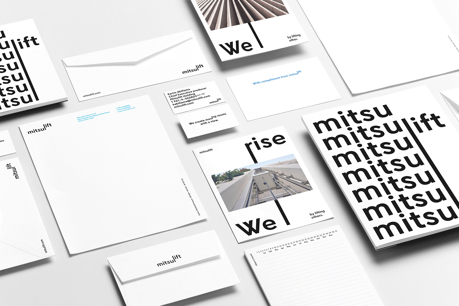
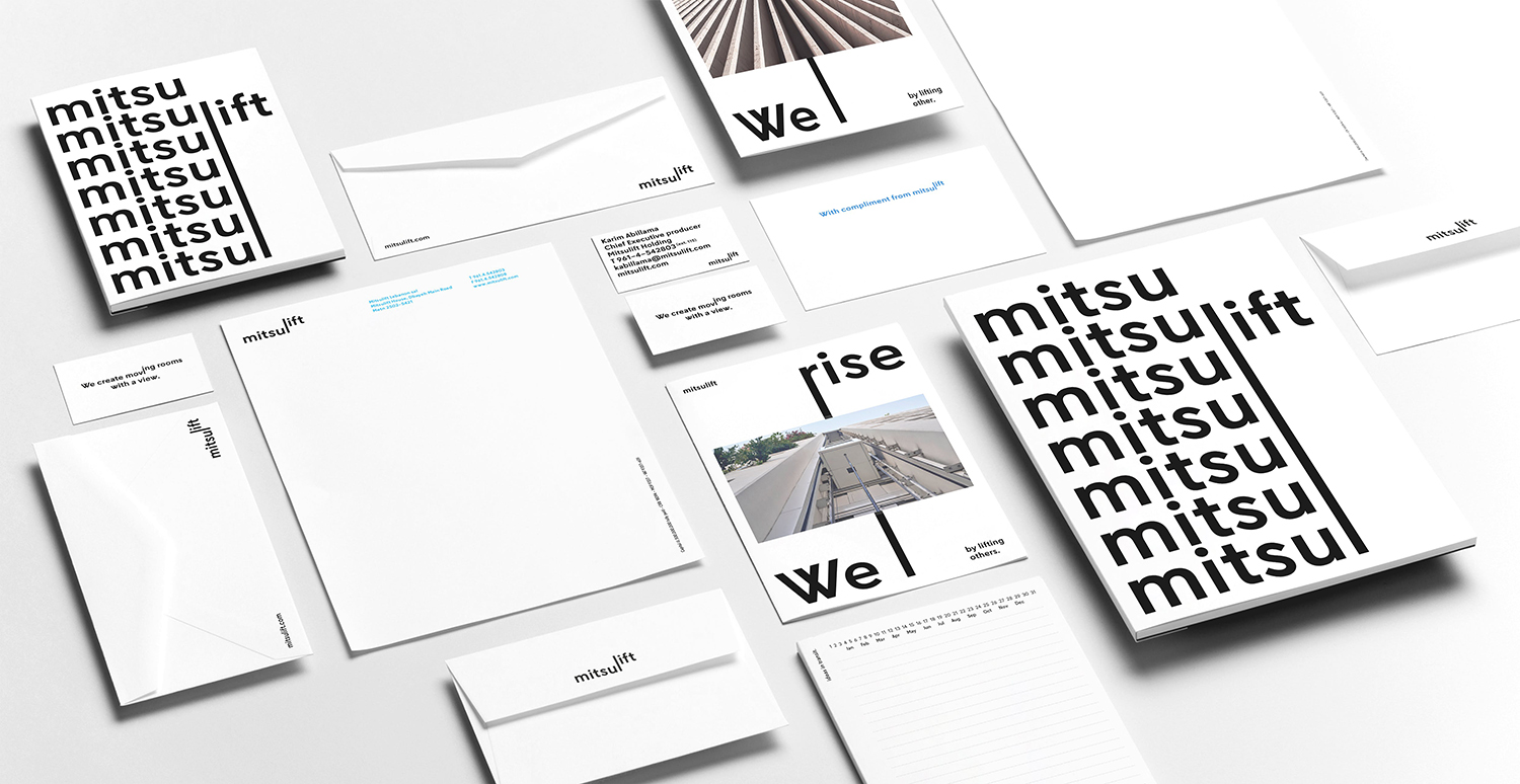
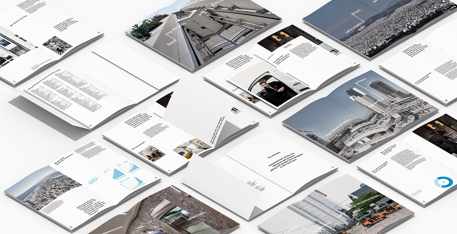
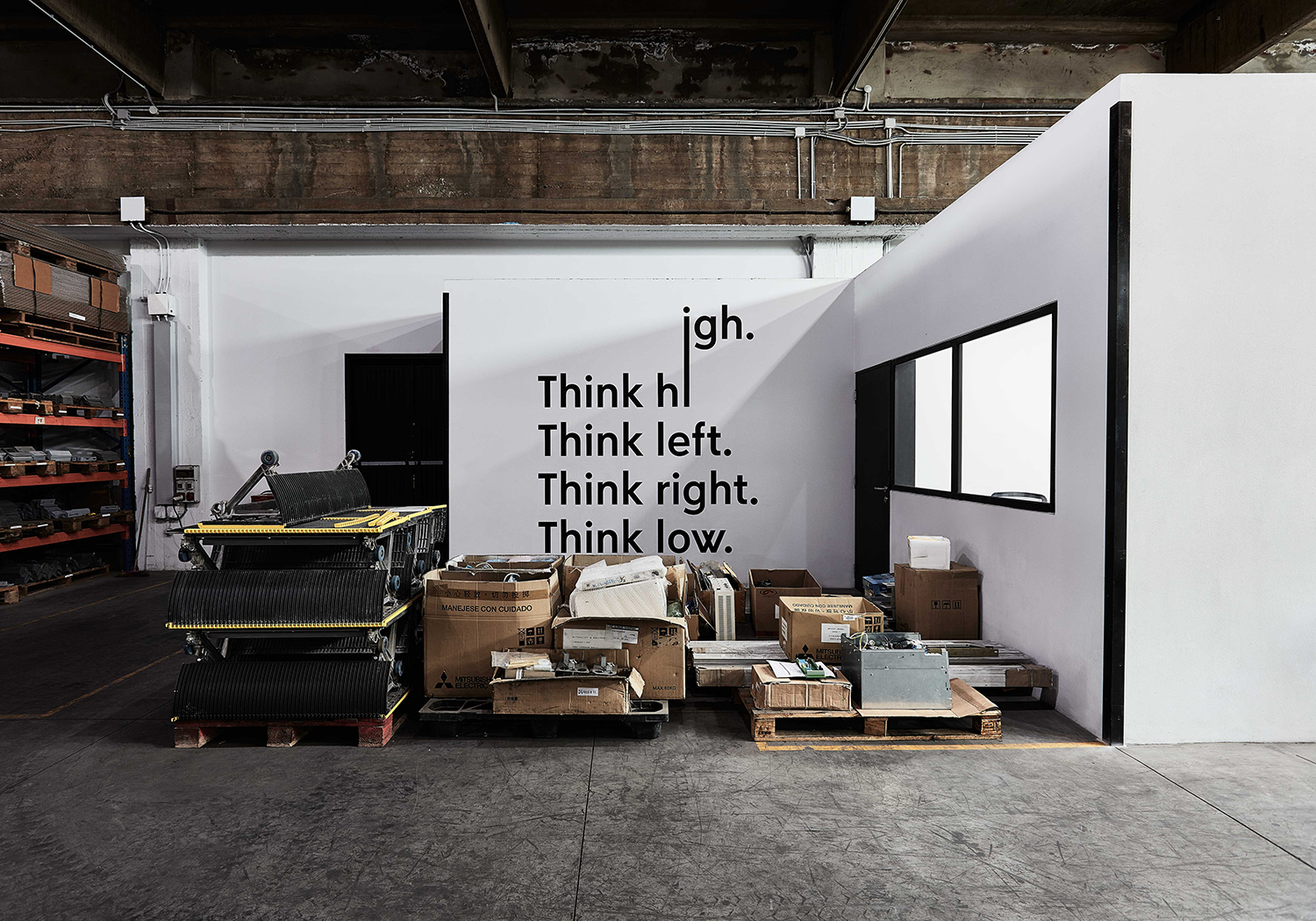
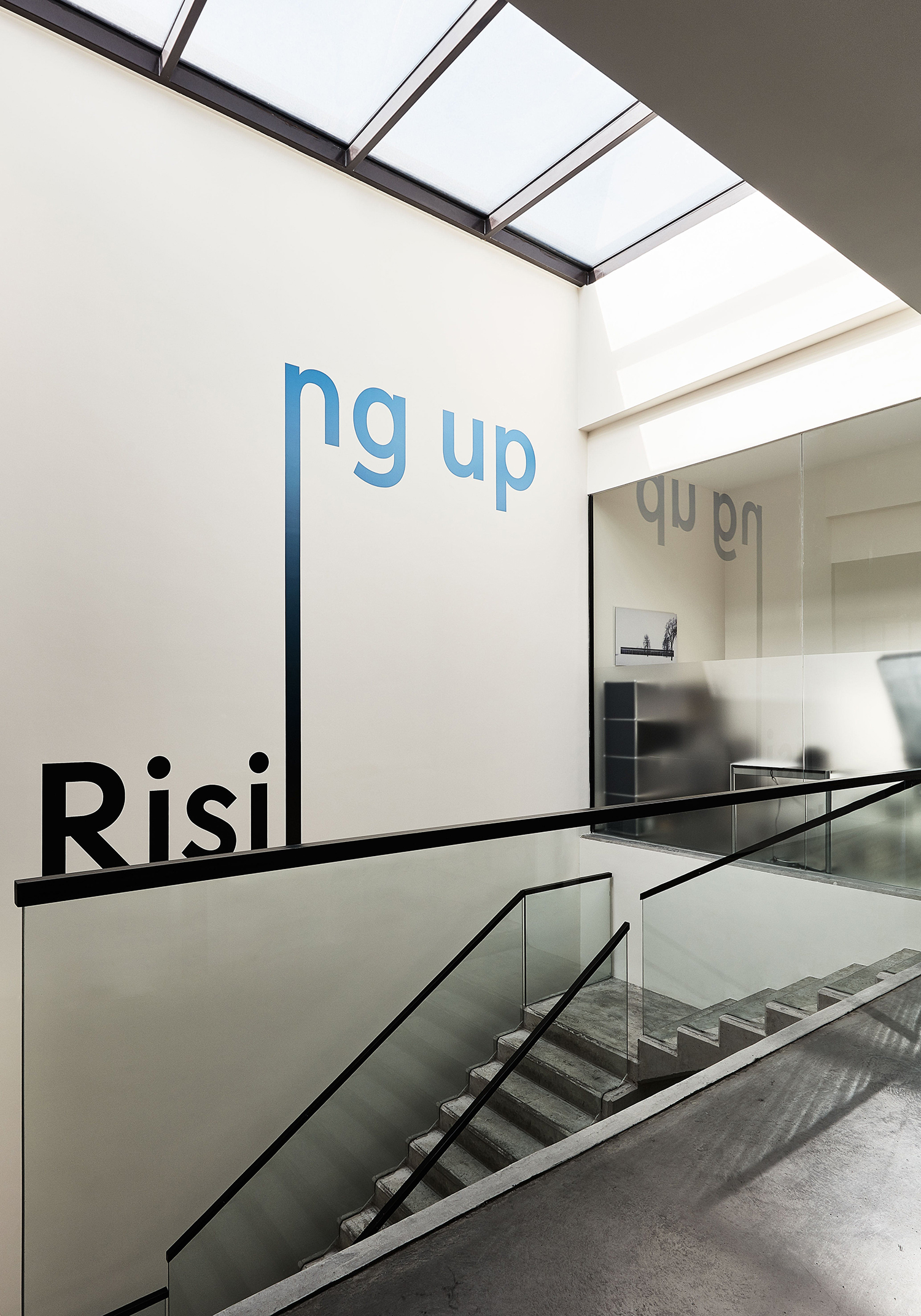
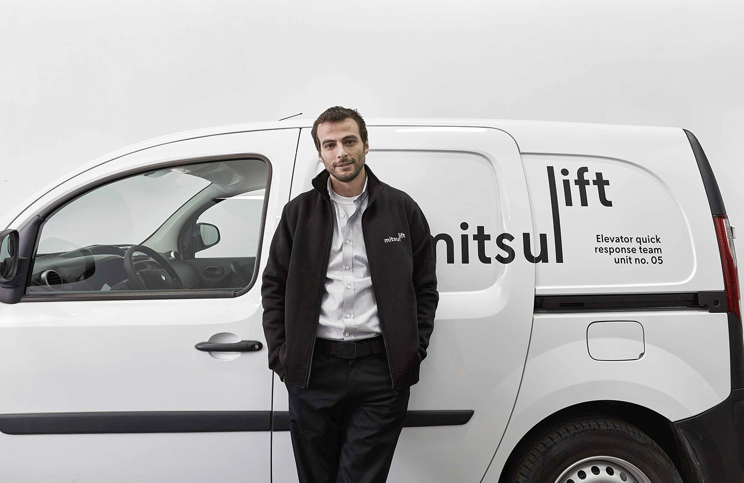
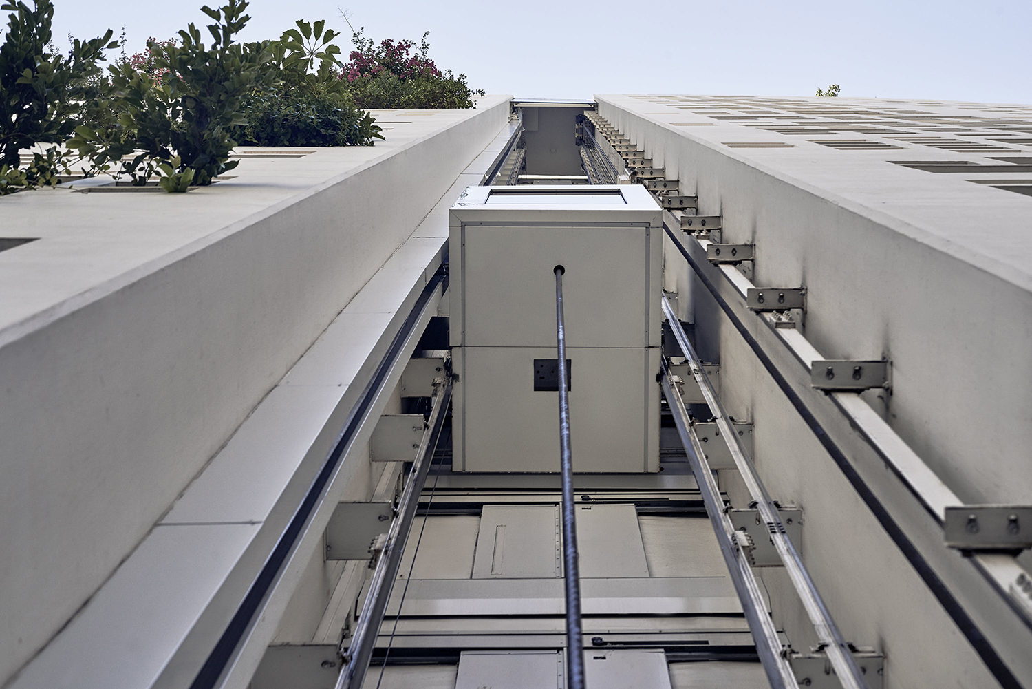
As the built environment expands, as it seeks new places to fill and accommodate a growing populace, time spent in and our reliance on modern conveyance systems develop in tandem. Reliability is central to this experience. Mitsulift is an elevator specialist tackling this need, balancing what is described as a Japanese technical expertise with exceptional Middle-Eastern service. Its graphic identity, however, failed to communicate this. Base Design worked with Mitsulift to bring this up to date, to better reflect the ambitions of the company, its insight and support, to move it from a product-vendor to a service-driven company. Base built an identity that maintains something of a utility yet manages to establish a distinct visual and verbal expression of connections. This links a variety of printed and digital assets. These included brochures, stationery, business cards and supergraphics, as well as website and mobile app.
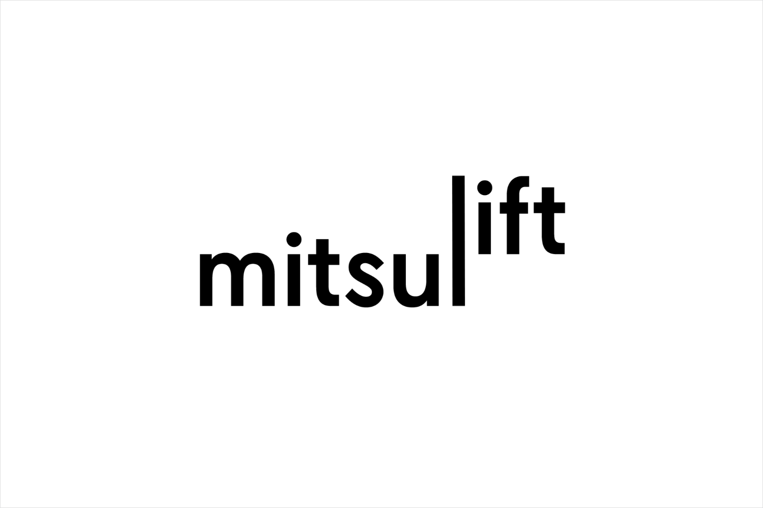
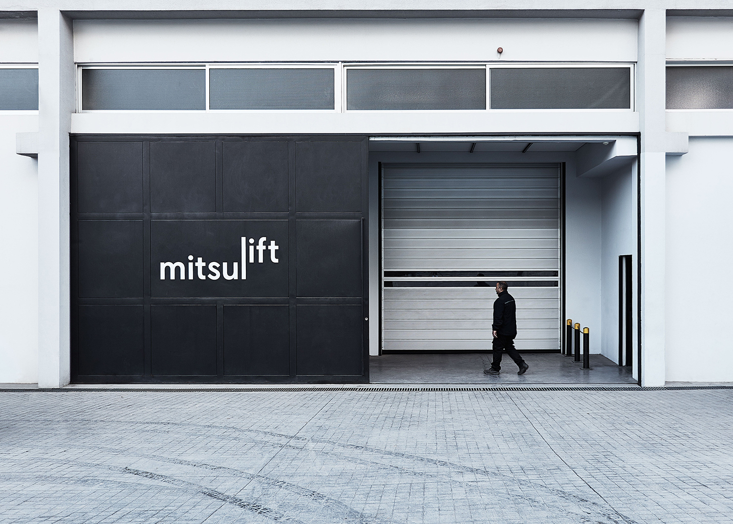
As a business built around utility; a singular reliable functionality with unique technical challenges as buildings reach higher, and a critical support infrastructure needed to maintain these, the impact and essential relationship between a bold and intelligible graphic gesture of connections and the personality and relationship formed by words feels rather fitting.
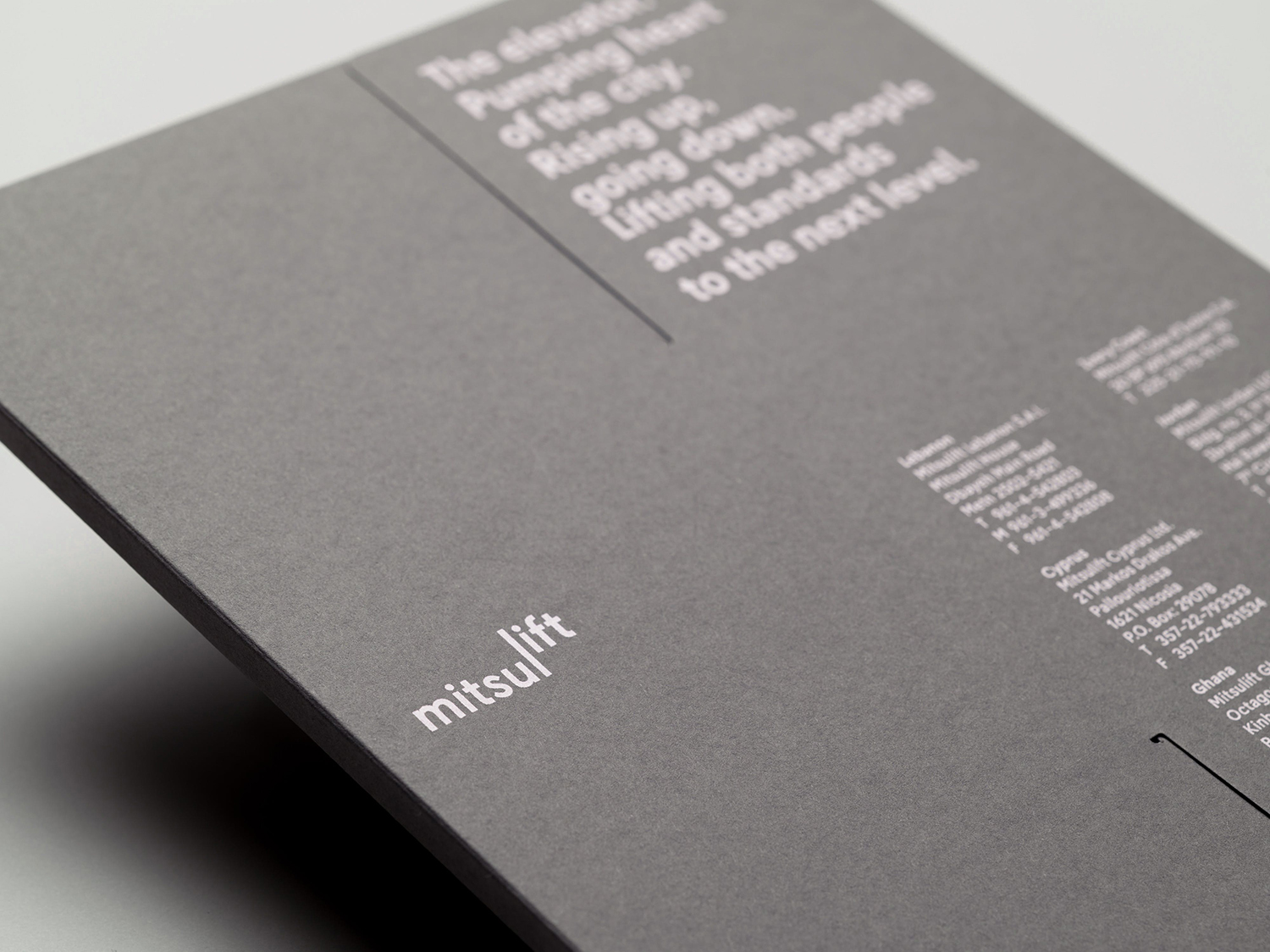
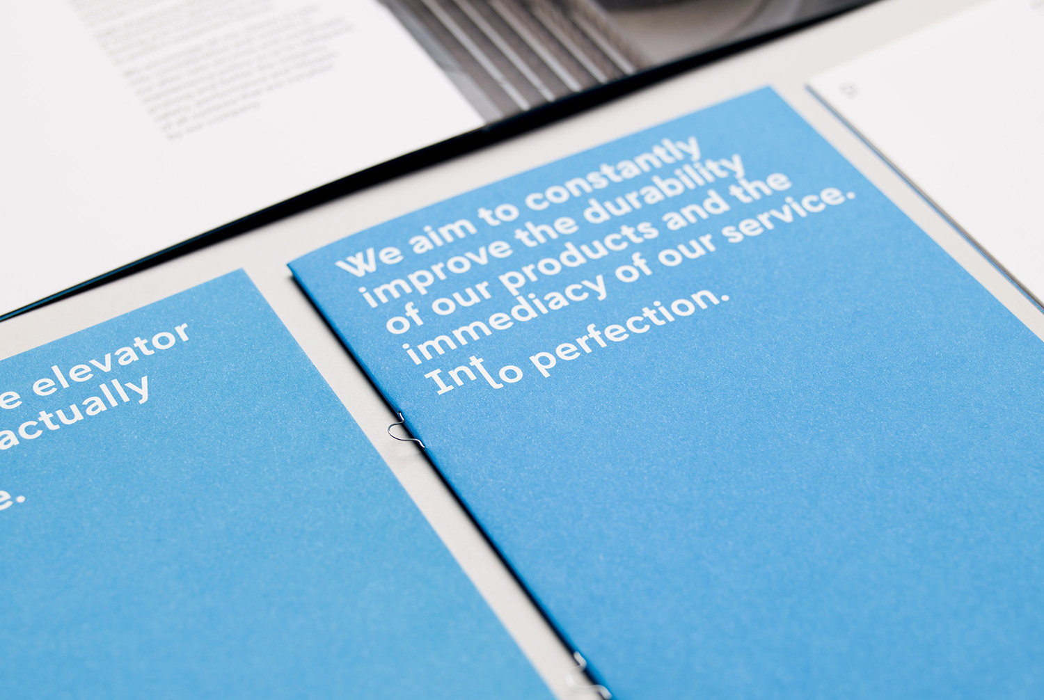
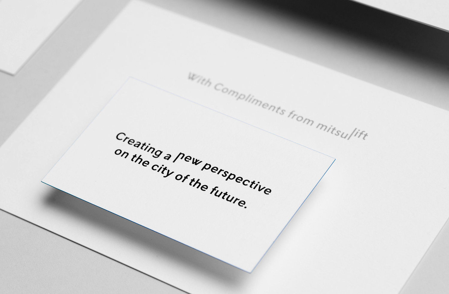
There is an element of play in here that is unusual for B2B which lends the work a distinction but not at the expense of core messaging and market. Colour palette, material choices and print finish effectively borrow from contemporary architectural identity vernacular while layouts, stacked type, from the ground up art direction, motion and a shot of sky blue reinforce the themes of height, lateral movement and growing ambitions.
Other neat details include the build of the website which slides between urban panoramas, blocks of text and panels of white, subtly replicating something of the elevator experience. There is an evident continuity between print and digital communications, not just in colour, type and art direction, but in their arrangement and intersection.
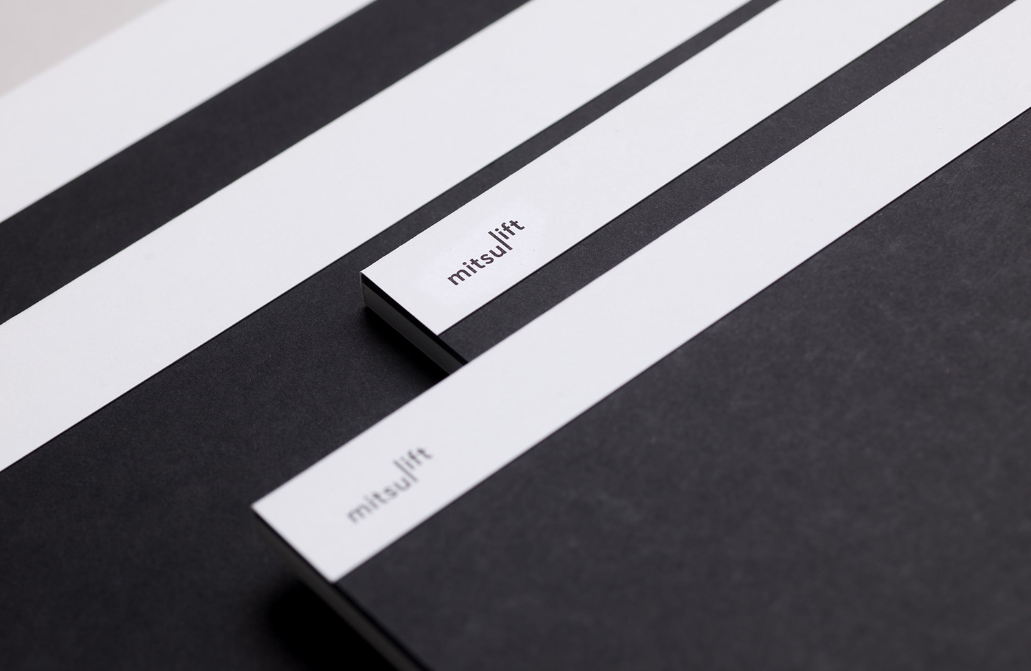
The relationship between bold graphic expression and clear verbal positioning is a highlight, with words often favouring the accessible rather than the technical, which also emerges in the humanist idiosyncratic qualities and geometric build of Or Type’s L10. This feels smart in its acknowledgement of the human experience and service-led nature of the business rather than leaning too far into a mechanical practicality and product-focus. More work by Base Design on BP&O.
Design: Base Design. Opinion: Richard Baird. Fonts: L10.
