REVOLT by Paul Belford Ltd.
Opinion by Richard Baird Posted 31 May 2018

REVOLT is described as an instruction manual, tool-kit and practical guide for any business seeking to do more with their brand, or for individuals looking to get more out of life. The central premise is that having people on your side, and that the ability to form and activate a group is the secret to success, and essentially leverages and intends to help channel any feeling of disenfranchisement and anger into affirmative action and movements of change. Content feels very much of its time, although the visual and form language of action and disruption, revolution and dissent employed by Paul Belford Ltd. is an enduring and fairly universal one. Conflating political and societal struggles with corporate (or charitable) interest or self-help is bold and provocative, as is its visual expression.

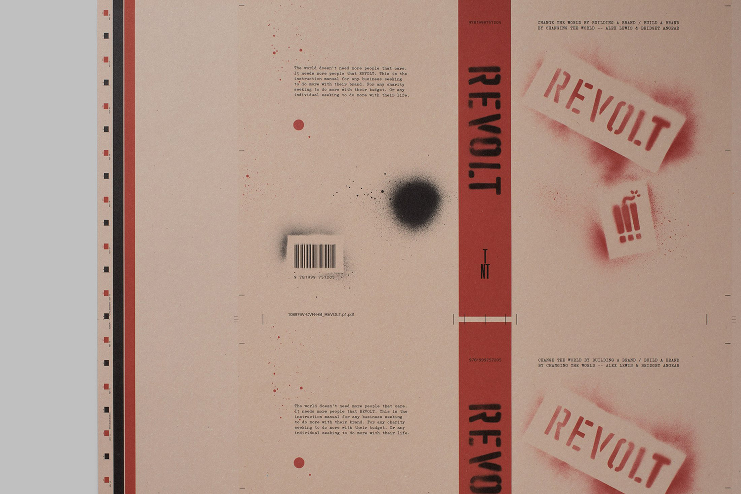
Content is likely to be divisive and its audience specific, however, its visual and material language does a good job of expressing its position in an immediate way. Its spine and bookmark, the spray paint and graffiti are blunt symbols of energy, disruption and intervention, and falls quite comfortably within the appealing smile-in-the-mind genre of visual communications.
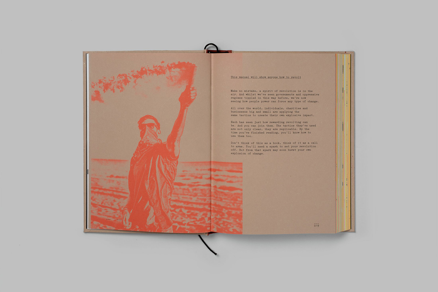
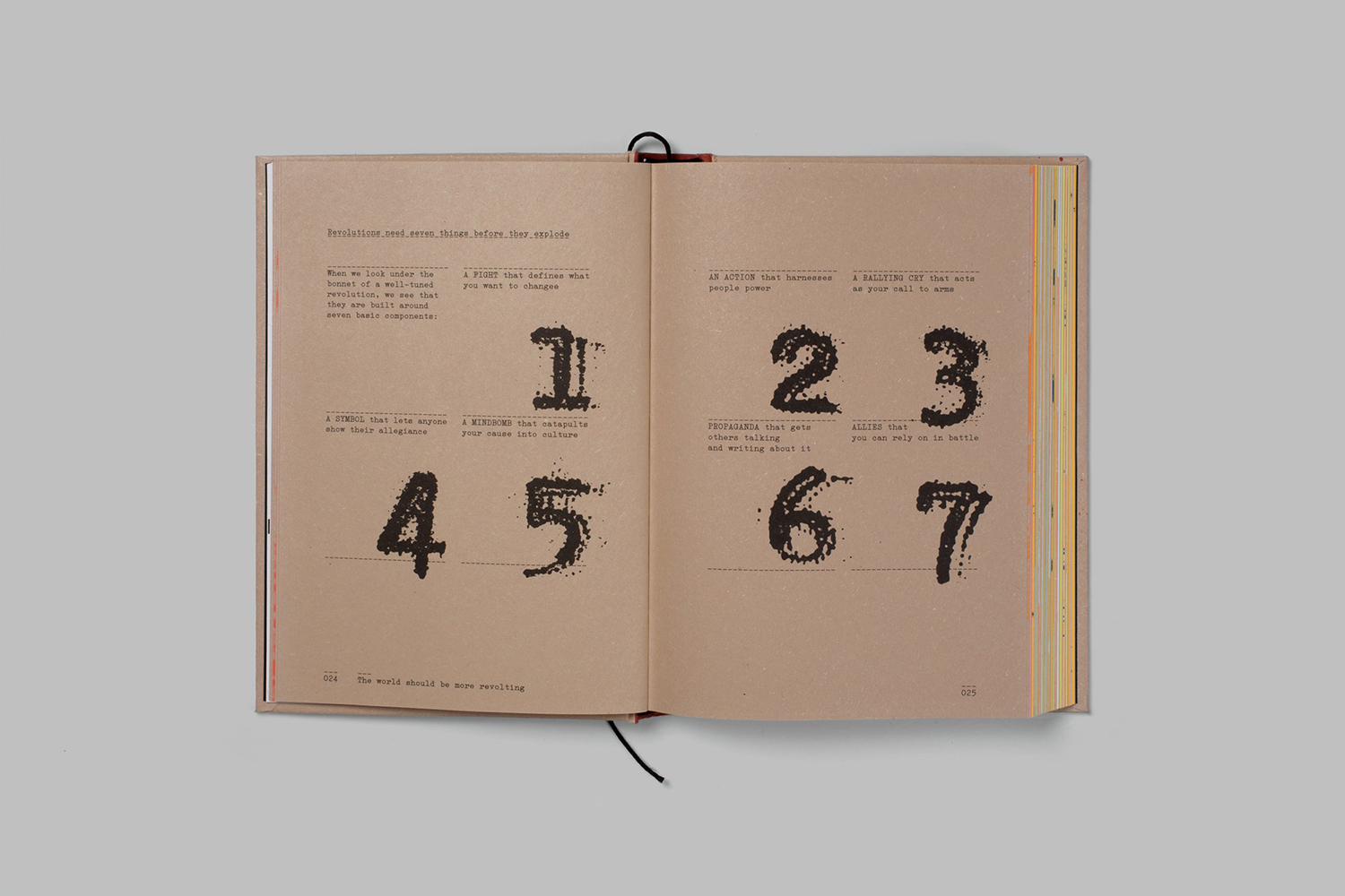
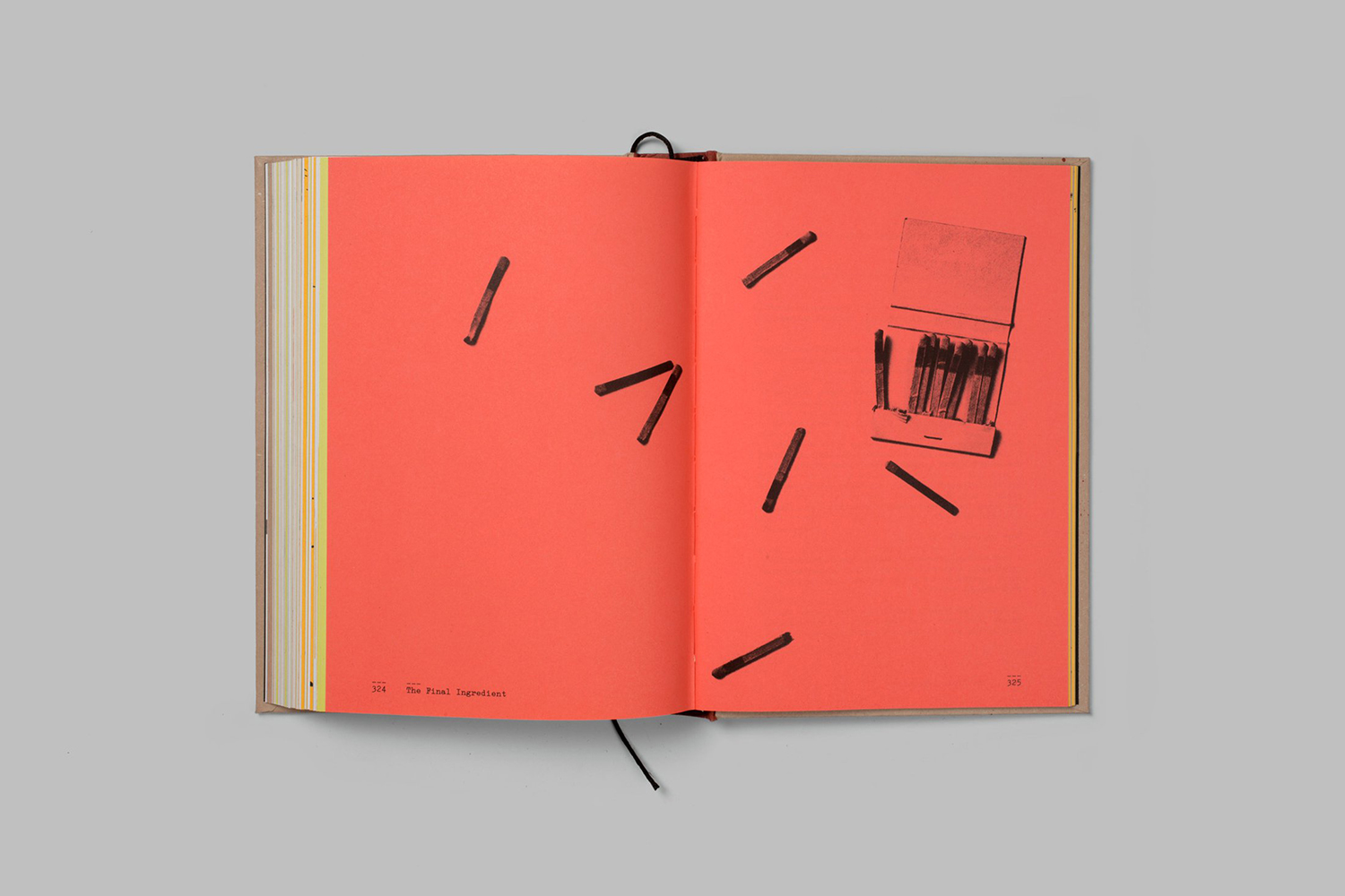
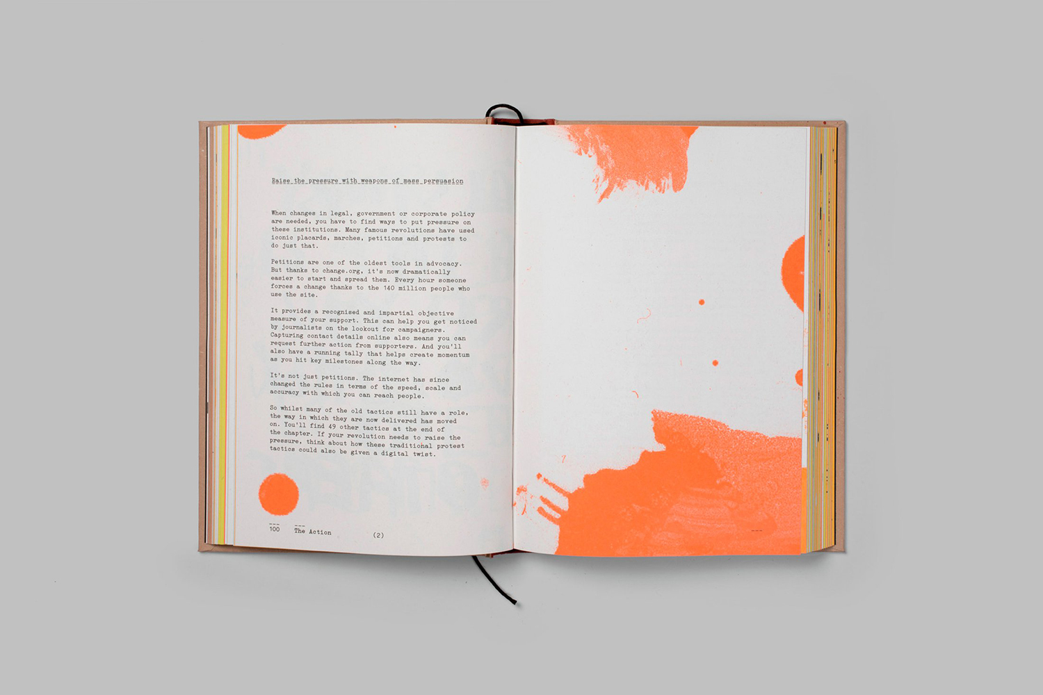
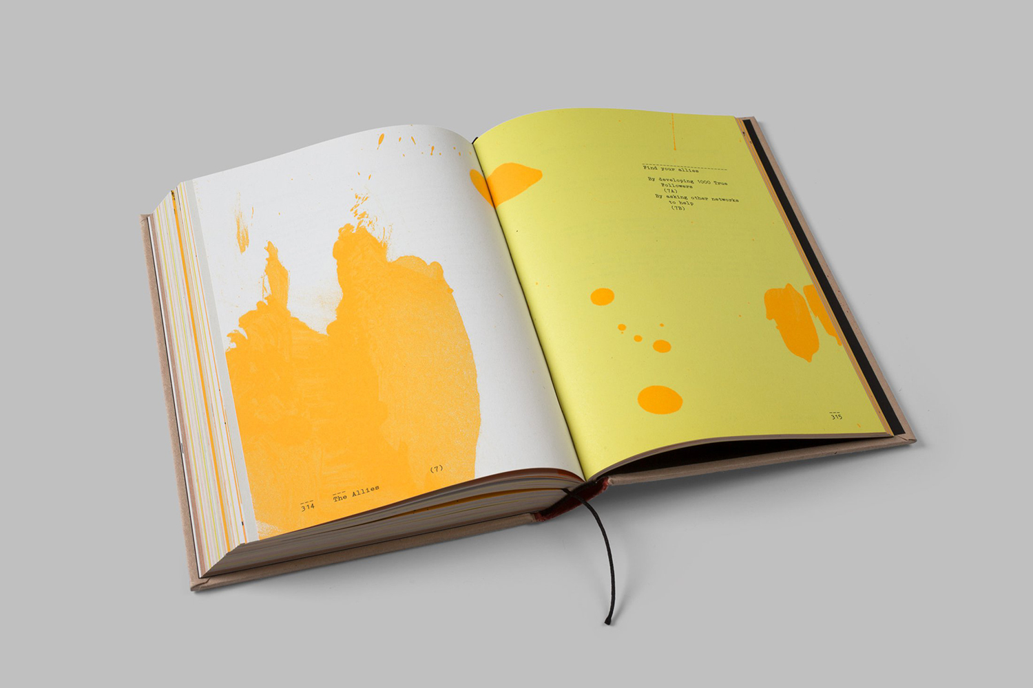
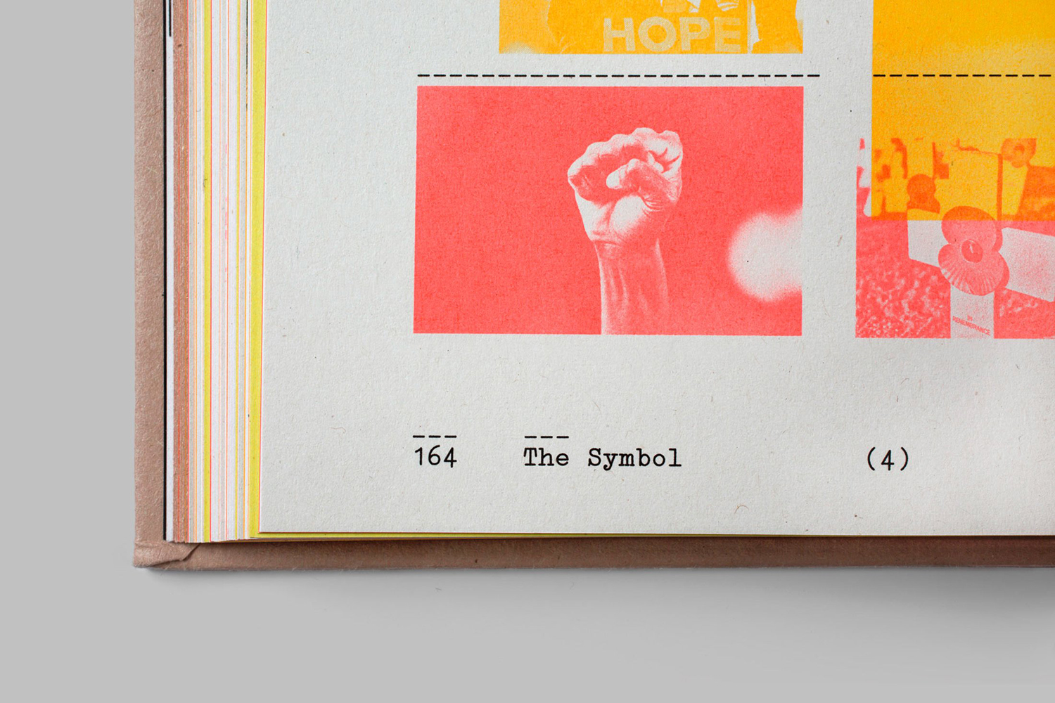
Inside, the studio builds out this language using provocative imagery (expressive faces, fists, symbols of remembrance etcetera), the brush strokes and paint of grassroots campaign signage, the reclamation of materials for protest as conveyed by undyed paper and board, the bright fluorescent colour of spray paint and the utility of type. These are effectively woven into a single piece that feels practical in tone following its initial impression, its information easy to deploy yet also being visually and materially pleasurable. The TNT imprint is a nice touch.
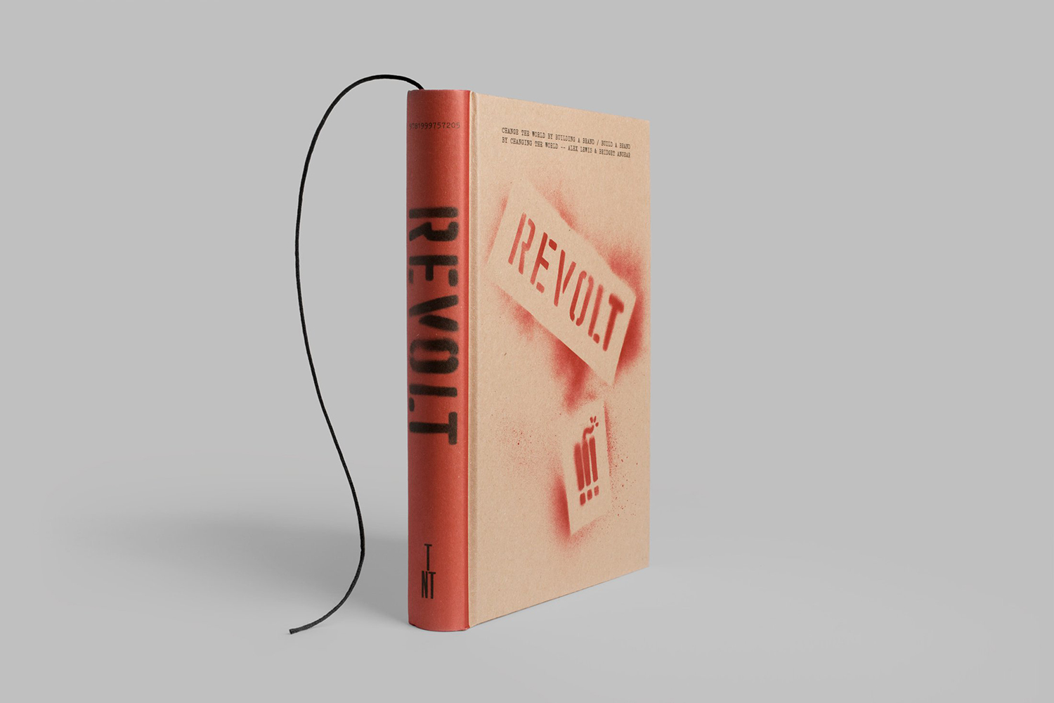
Diving a little deeper. The material value of the book feels like it may supersede its written content. Digital ubiquity, the abundance of information online, demands an enhanced materiality, that book provide some intangible value, the opportunity for, in its conspicuousness, the materialisation and expression of inner-self, the desire to challenge or disrupt in business or enact more widespread change. This is where the design approach becomes really interesting and responsive to shifts in the publishing landscape and our relationship with printed materials.
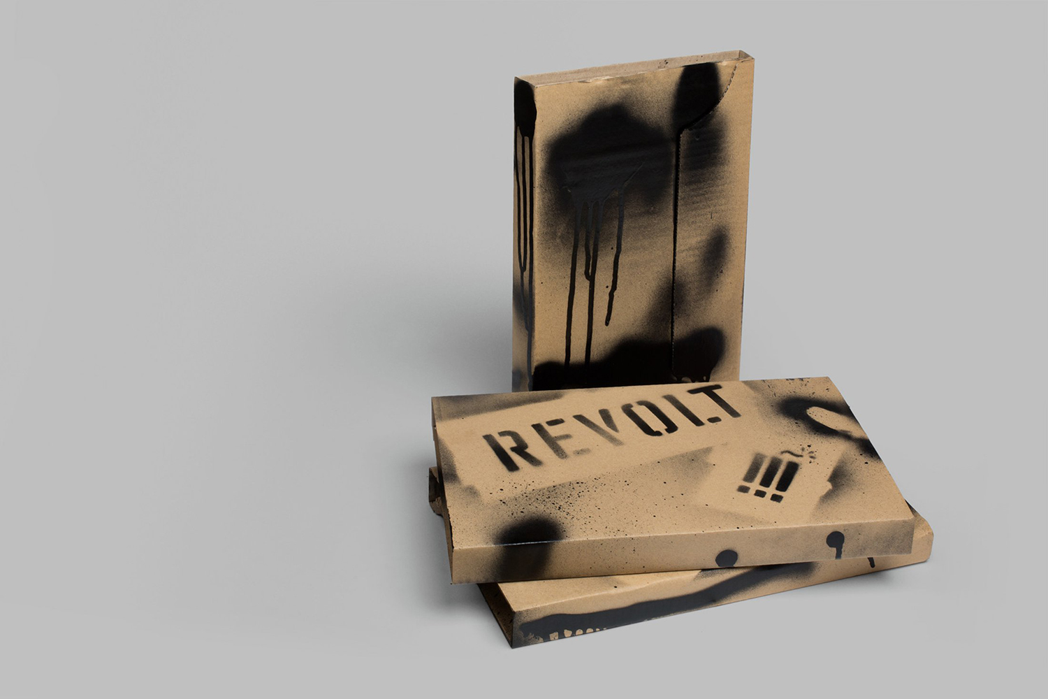
The quality of the work lies in its multi-faceted self-awareness, the book as a mode for materialising a particular feeling or mind-set as well as aesthetic pleasure. The leveraging of the spirit and desire for change packaged up in a universal, familiar and easily consumable way. The need for shelf impact, to deliver some form of disruption within the business genre but also function as something close to sculpture (the co-opting of the taste and intent of an artist) at home or in the office. More from Paul Belford Ltd. on BP&O.

