Maison De Greef 1848 by Base Design
Opinion by Richard Baird Posted 13 July 2018
Maison De Greef 1848 is a high-end luxury jewellery brand, expert watchmaker and retailer that opened its first shop in 1848 at 24 Rue au Beurr, Brussels. Shortly after De Greef became the official clockmaker for the Belgian National Railway Company and then the supplier of pocket watches for the Belgian Navy.
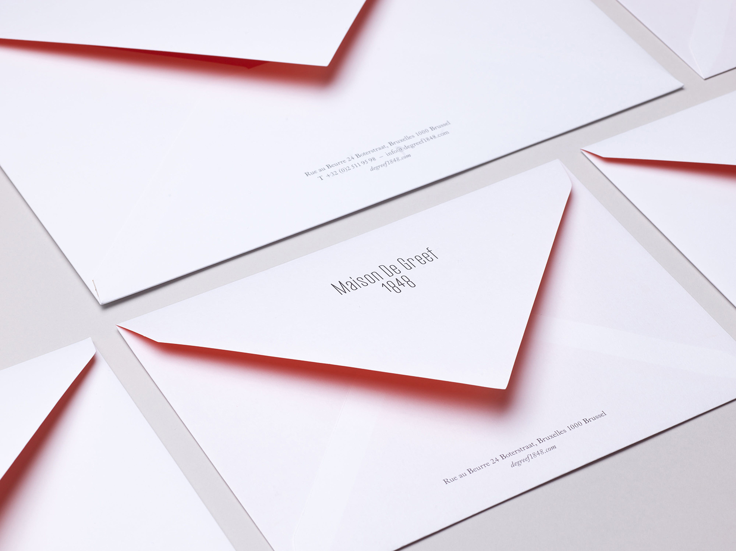
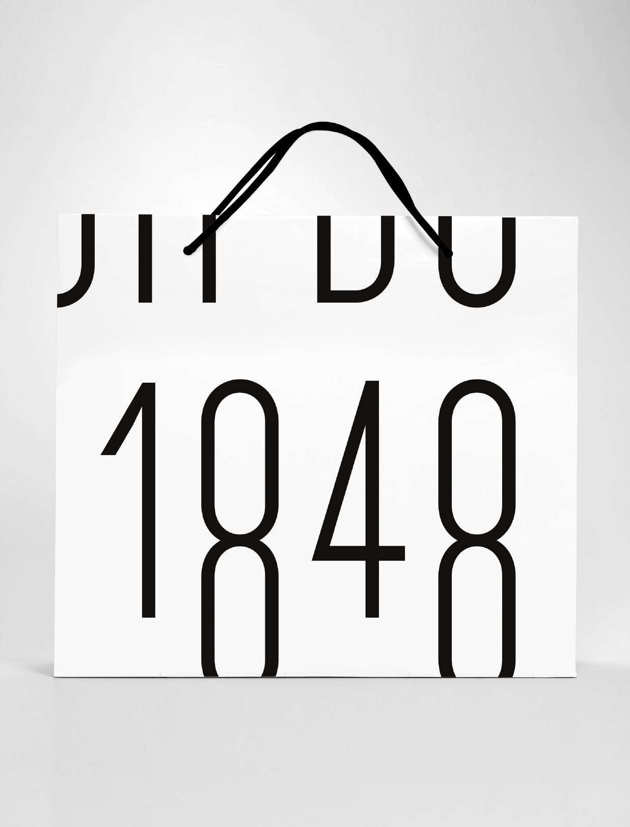
The brand has built an enduring legacy and weathered many changes over its 170-year life. It remains a family business and is in the hands of its seventh generation. This new generation worked with Base Design to rethink the clichés of the market and develop a new graphic identity. This is characterised by a bold simplicity of type and in words, a contrast of colour and a conviviality of image, and included stationery, packaging, bags and website design.
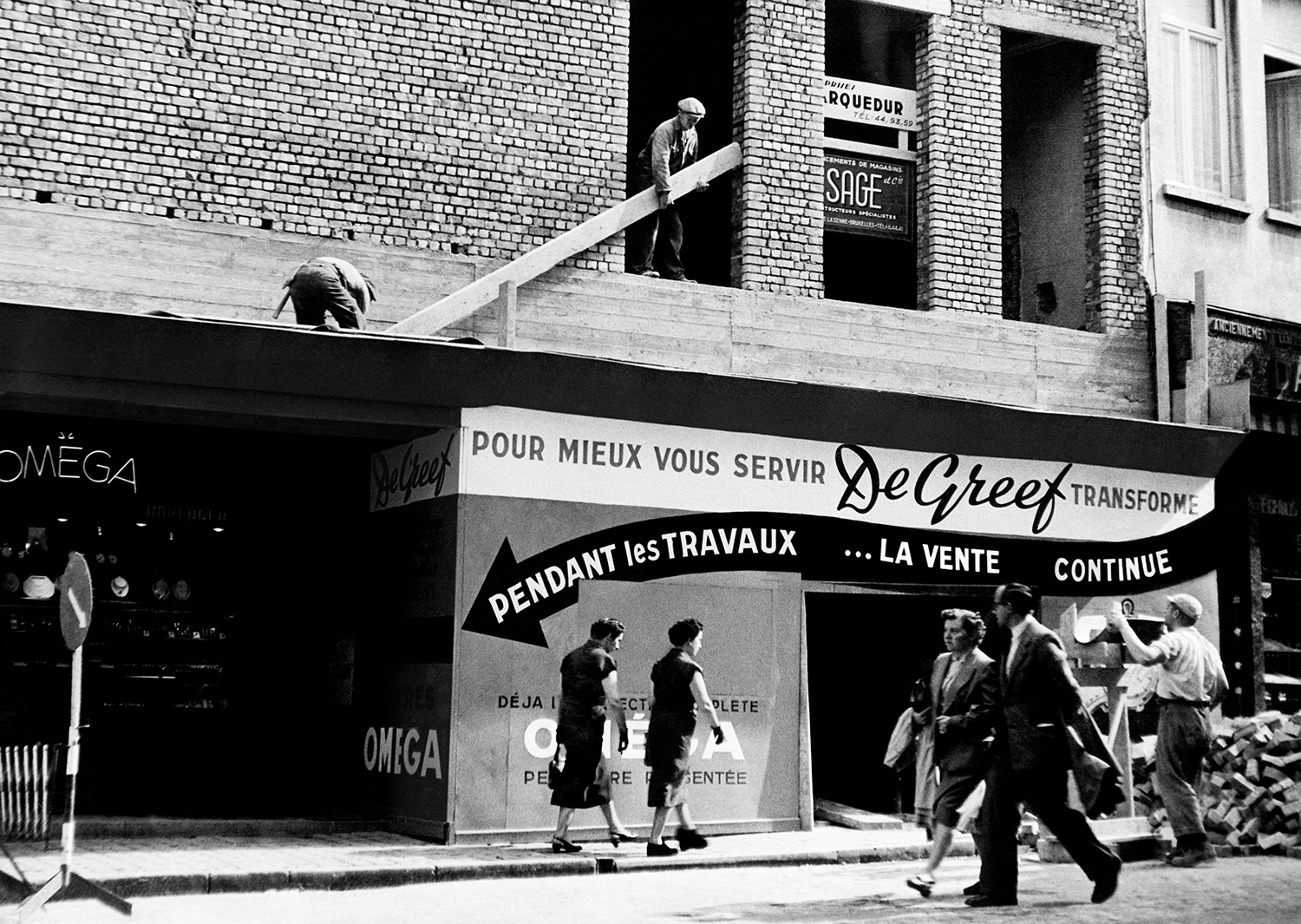
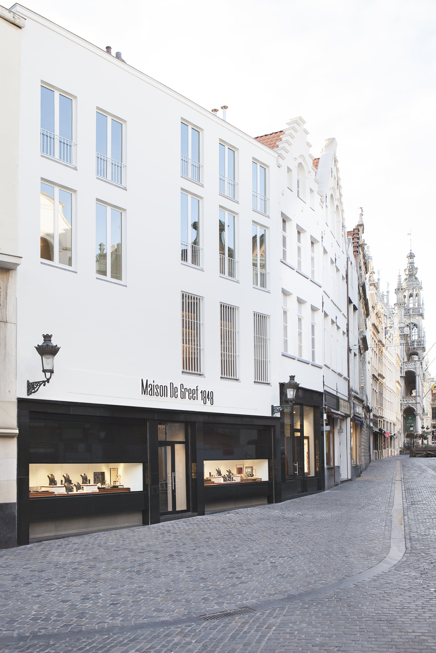
Meta–Maison De Greef 1848 has remained in the same place for nearly two centuries. In 1953 it was remodelled by the modernist architect Jacques Dupuis and in 2017 expanded, taking over 28 rue au Beurre. Its graphic identity has also undergone numerous revisions. These moved from hand-painted blackletter and then script wordmarks to those that were printed as small caps sans-serif, built as sentence case serif, and more recently as an extended sans-serif.
Its capacity to reinvent itself physically and graphically is a critical part of its rich and well-documented history, as is its capacity to serve different markets well, from the reliability and utility offered to the Belgian National Railway and Navy to the glamour and ornament of high-end luxury jewellery. This potential for change and dichotomy also emerges in its mid-19th origins, contemporary relevance and positioning for the future. It is these juxtapositions; function and ornament, past and present that emerge as the essential qualities of Maison De Greef 1848’s new graphic identity.

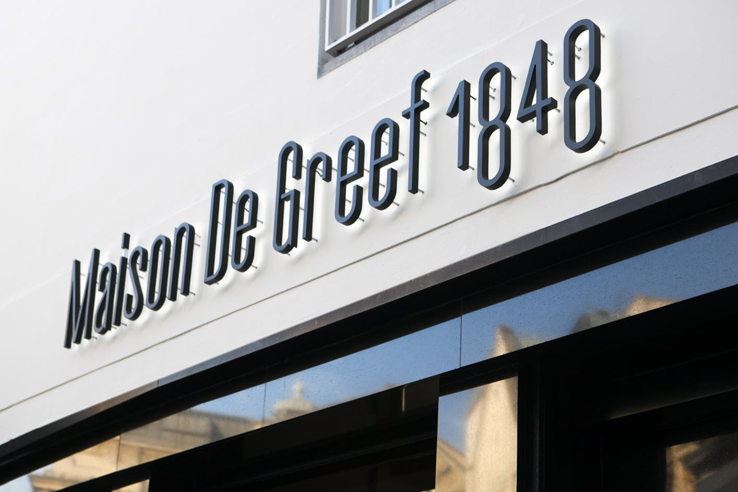
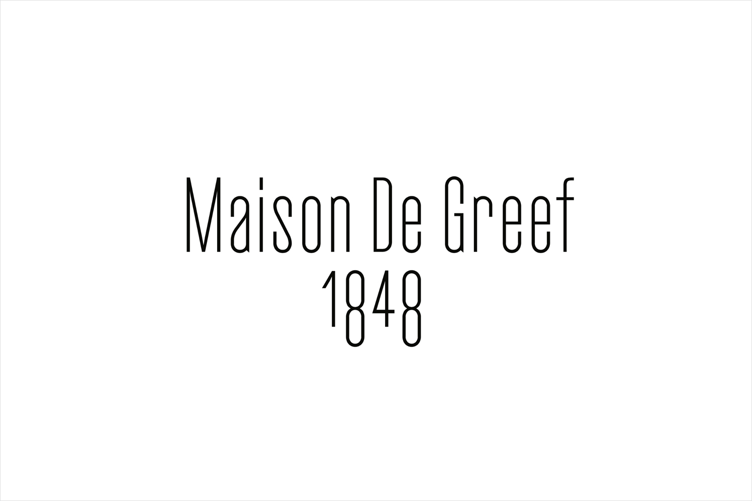
Type serves as an immediate and consistent visual gesture, above the door, top of the website and across packaging. It marks a significant change from the extended letters of its previous wordmark and the many others that preceded it. It is sensitive to present and future intention, yet also acknowledges its role within a continuum, an ongoing story.
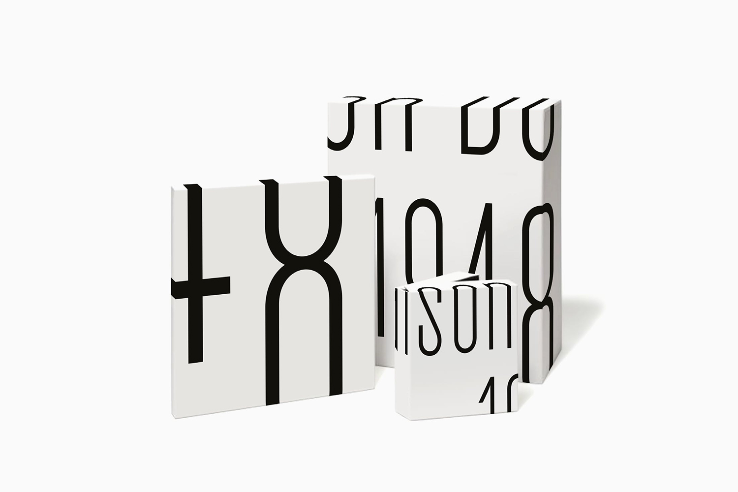
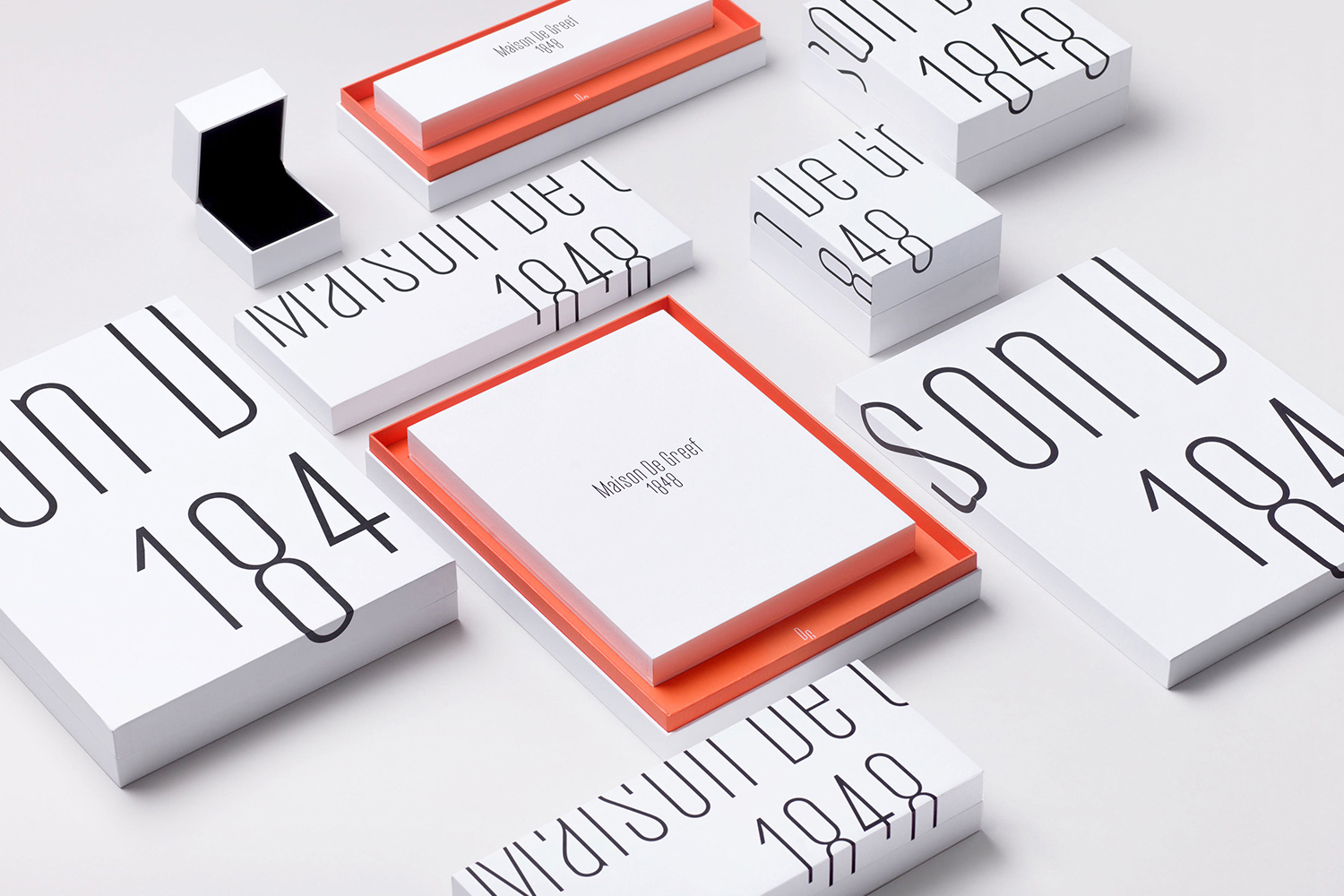
The light and consistent weighting of lines, condensed forms and character of Gareth Hague’s Cactus finds a neat and intelligible balance between the need to differentiate from what has come before and an expression of tradition and modernity. Modernity is really emphasised in the technique of reproducing the wordmark over the various surfaces of the packaging consistently and in its animation.
The potential of proportionality to appear playful and expressive when type is light is explored to its maximum, running off and over edges, wrapped around boxes and bags, and zooming in and out. In this, it draws the eye to details and relationships between letters as well as the negative space in and between these whilst maintaining a degree of elegance.
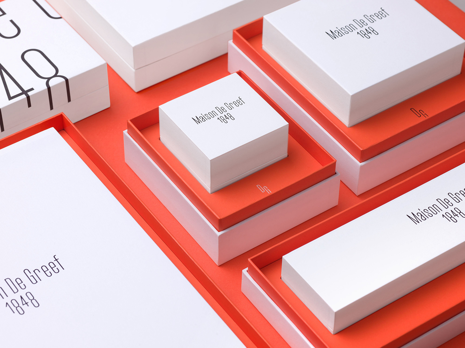
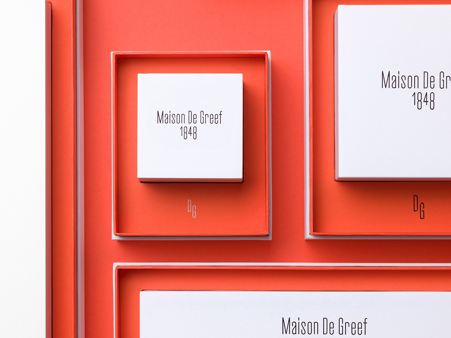
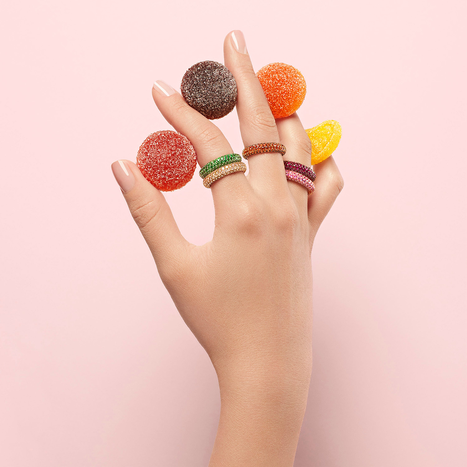
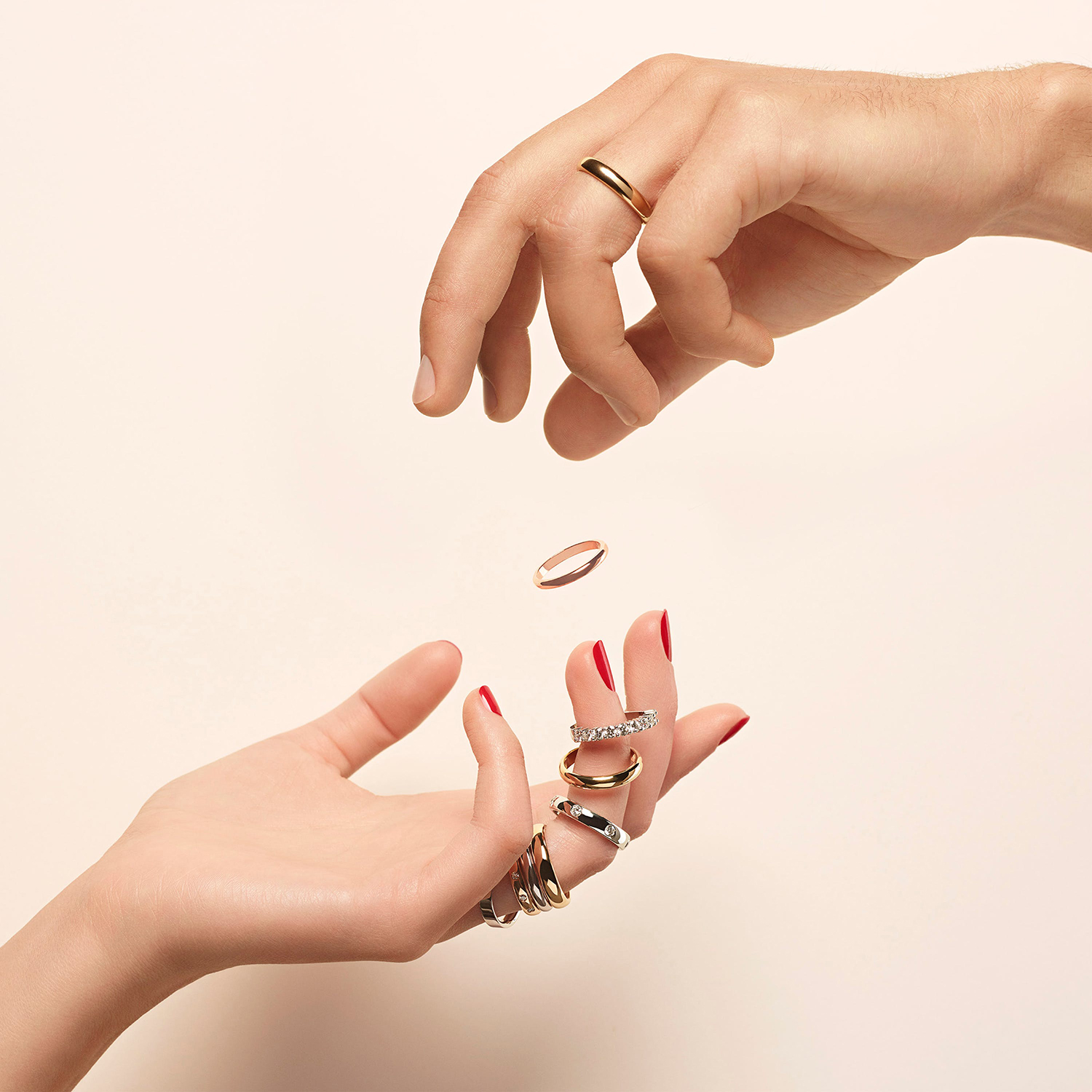
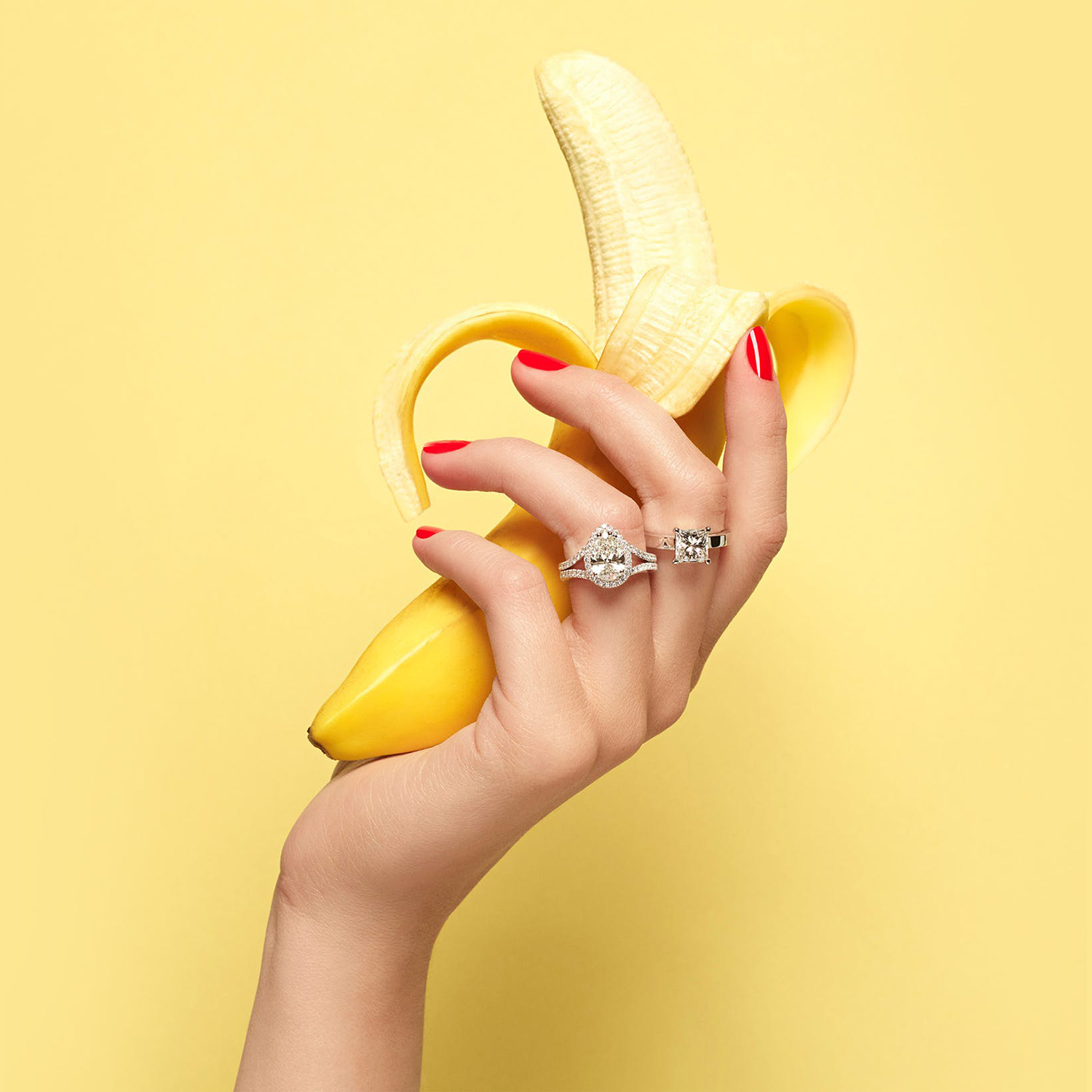
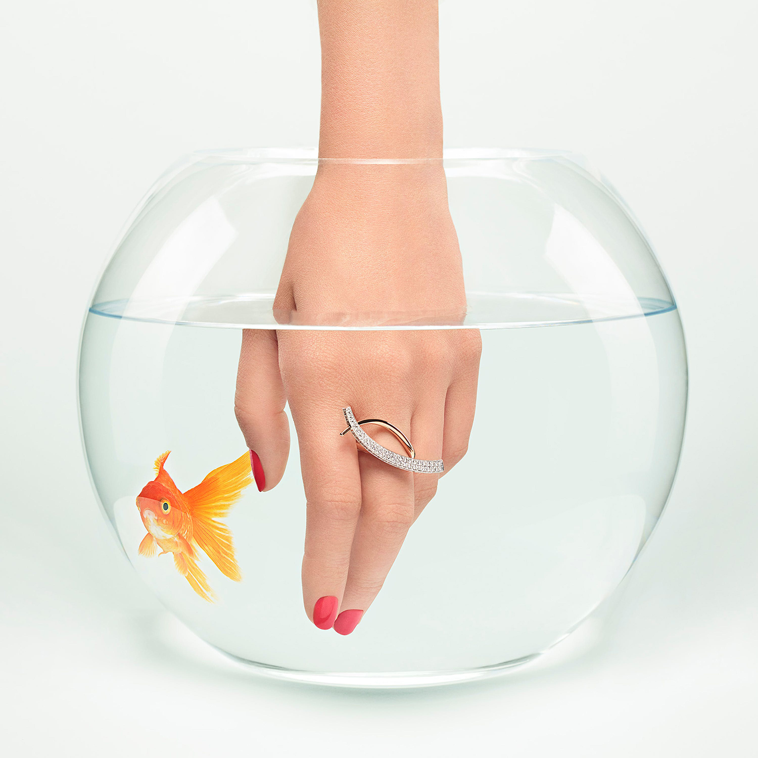
Past and present; classical restraint and a modern statement is effectively expressed in the use of colour; restrained black and white exteriors and full coverage bright red interiors. It is a pleasant and surprising stylistic flourish but one rooted in the search for range, two polarised points. The way colour frames and is reflected by surfaces is a particular highlight. This is built on further with campaign imagery thoroughly situated in the moment. This really pushes the communicative potential of the work, by pairing a simple graphic identity with something really quite different campaign-wise in colour, tone and positioning. These do share a simplicity with type and packaging in their ideation and composition, but a disparity in the rather odd juxtaposition of jewellery and object. Art direction is convivial, although it perhaps lacks a cohesive narrative arc, functioning more as an eye-catching and pinnable use of gesture and colour blocking, which is likely the point.
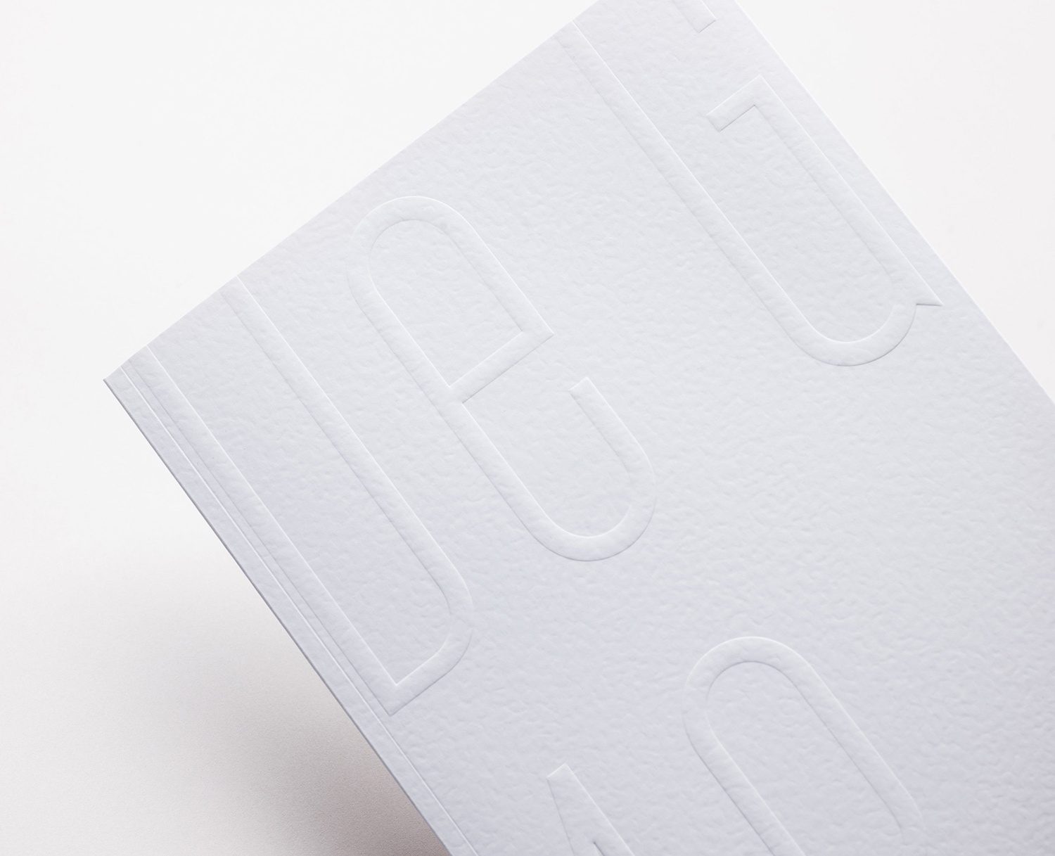
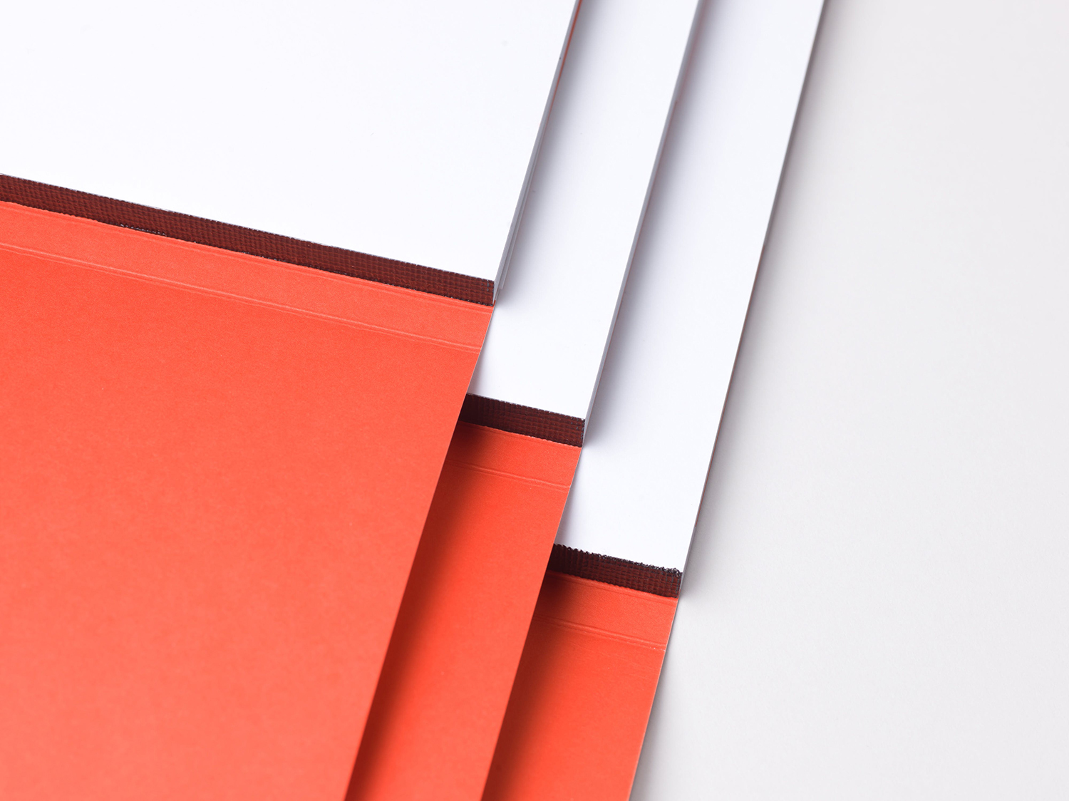
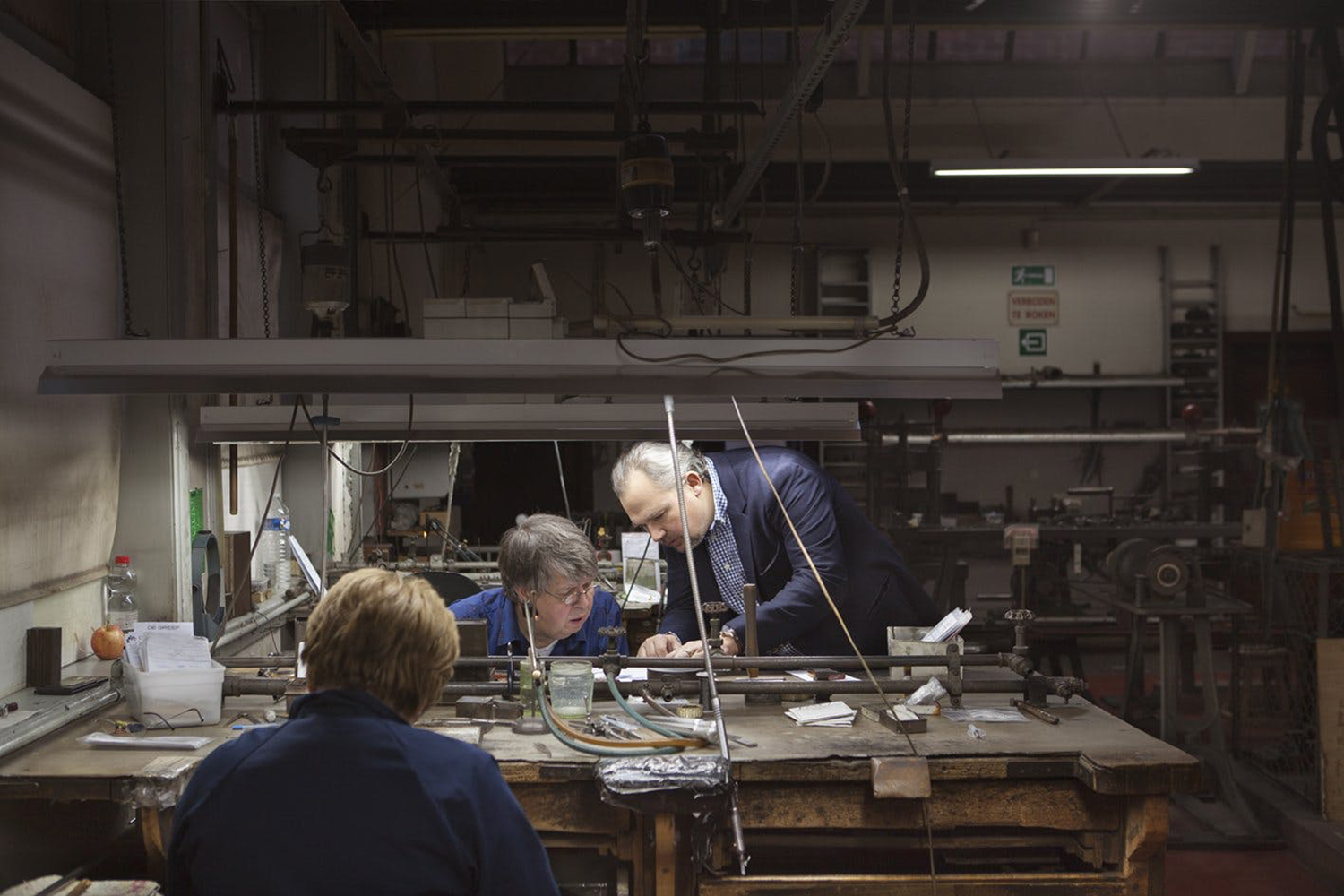
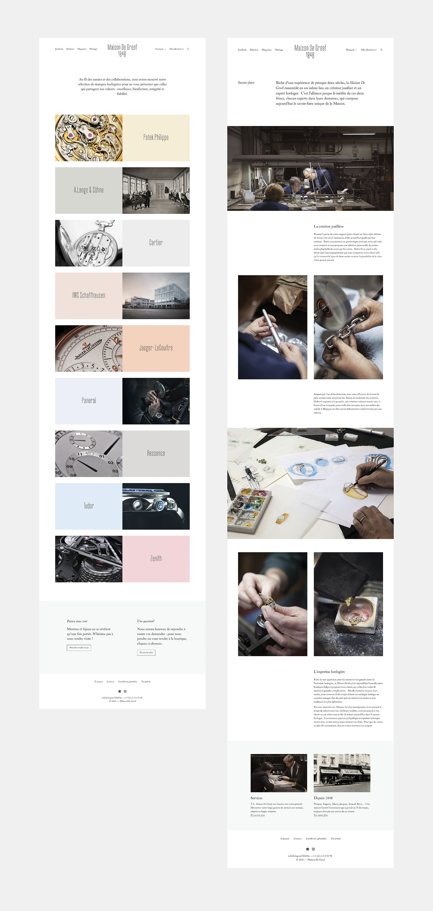
It is, of course, hard to measure packaging without a hands-on experience, a sense of weight and volume. From a visual standpoint, the precision of the packaging, its construction; clean intersections and junctions, the meeting of white and dyed papers and blind embossing of uncoated surfaces appears well-handled and an essential high-quality material finish when employed alongside a simplicity of form and graphic gesture. Legacy and experience, continued relevance and an ongoing story are critical intangible ornamentation of material object. Website serves this well, balancing story with a product showcase and a behind the scenes look at Maison De Greef 1848’s workshops. More work by Base Design on BP&O.
Design: Base Design. Website Photography: Lydie Nesvadba. Campaign Photography: Régis Golay. Opinion: Richard Baird. Fonts: Cactus.
