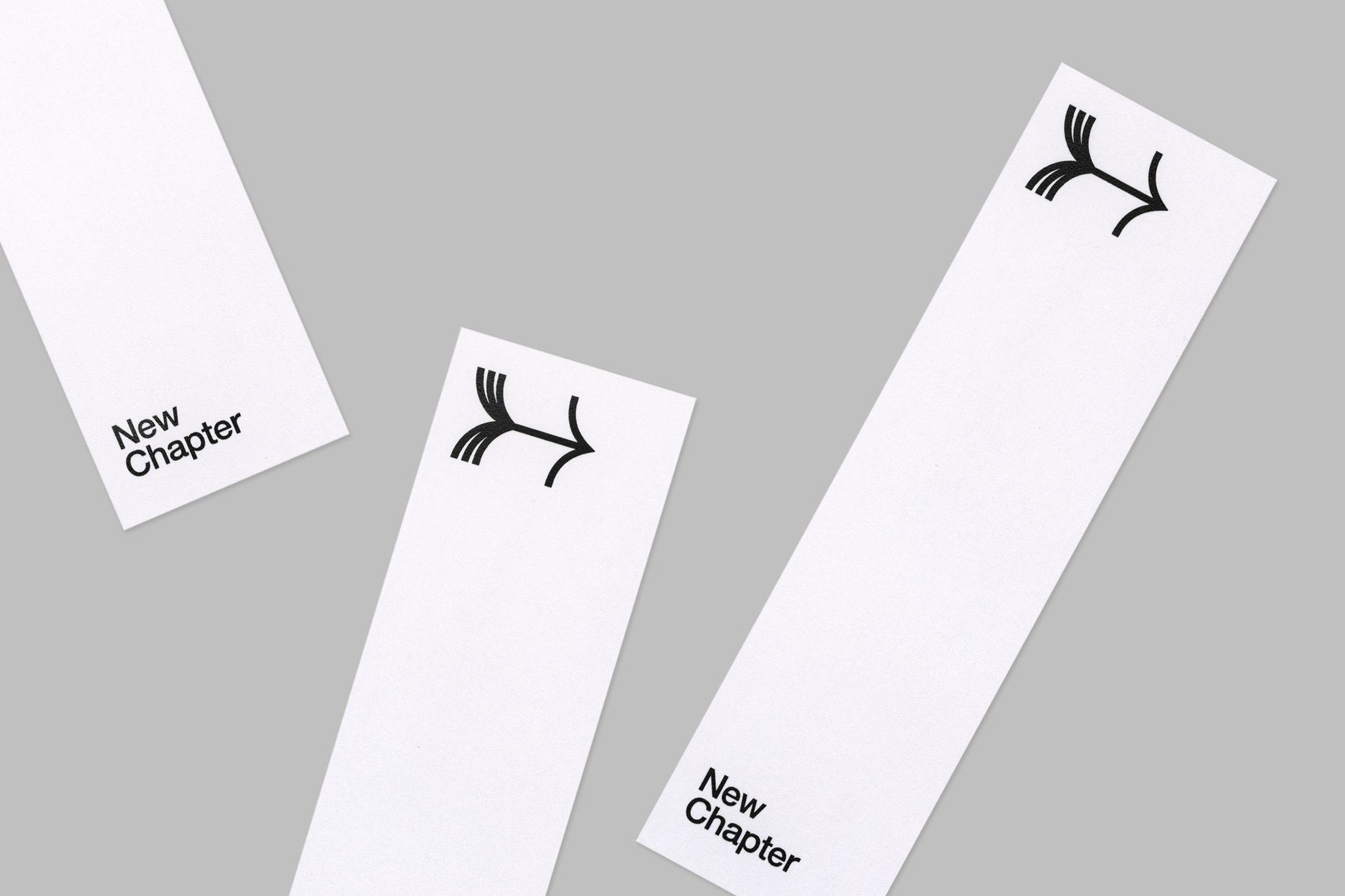
New Chapter by Paul Belford Ltd
Opinion by Richard Baird Posted 3 August 2018

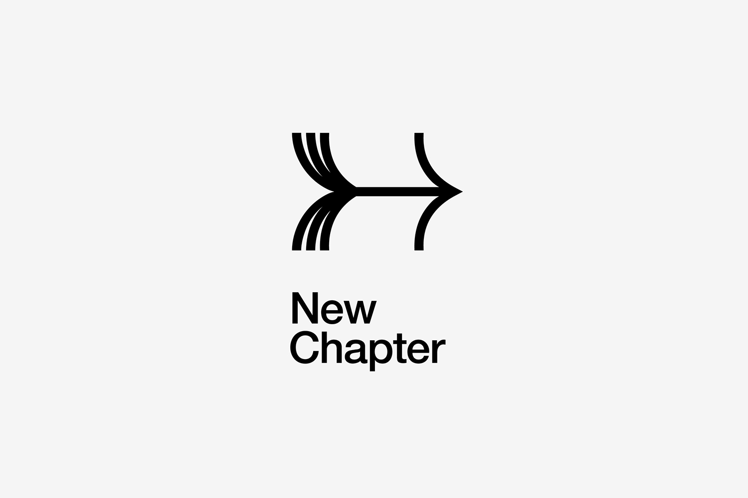
New Chapter is a UK-based word therapy start-up that offers a unique approach to counselling. This involves participants being invited to express themselves through the written word. The synergy between personal development, a forward momentum and the written word as a mode to achieving this forms the basis of New Chapter’s clever logo design created by Paul Belford Ltd. This appears on signage and bookmarks, and is complemented by a similarly weighted grotesque wordmark.

The logo for New Chapter is a simple but smart graphic gesture. One that neatly works together the implication of a forward momentum, progress and a new chapter in life in the form of an arrow and the pages of a book. There are a conviviality and distinction to the duality of expression. Something of a smart observational quality as it calls to mind, and could have been easily pulled from, a book of printer’s ornaments. There is also a modernity in the singular and concise manner of its execution, in the immediacy of its form language and its pairing with a similarly weighted Neue Helvetica, but also its directional role within the context of signage. In an environment that is increasingly visually busy, a simple service with a clear proposition is given an equally simple (and useful) symbol and plenty of space to allow it to be clearly seen and recognised. More from Paul Belford Ltd. on BP&O.
Design: Paul Belford Ltd. Opinion: Richard Baird. Fonts Used: Neue Helvetica


