XVIth All Sokol Slet 2018 by Studio Najbrt
Opinion by Richard Baird Posted 24 September 2018

Slet is a mass gymnastics event and union of schools that has its roots in the latter half of 19th century Prague with the intention of providing physical, moral and intellectual training for the nation. Slet takes its name from the Czech word for flocking of birds. This can be understood in the sight of a stadium field filled with participants exercising in union. Slet became Skol clubs and spread across the country, establishing strong relationships with gymnastic bodies internationally, particularly with those in France, a relationship that endures today.
Slet, which took place every six years, were also characterised by their strong visual identities. This was a critical part of the unifying nature of the occasion. This was often put in the hands of prominent artists of the time.
From its beginnings in the second half of the 19th century to the present, Slet has found itself caught amongst political agendas; suppressed or repurposed for propaganda, only to reclaimed. The event was revived during the Prague Spring of 1968, only to fade out and remerge again for the fourth time in 1990 and then in 1994 when 23,000 Skols participated.
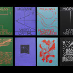
In 2018 Slet once again returned for its 16th event. In the same spirit of its earliest events, visual identity was an essential component. Inspired by the complex movements and the diagrams of dots, lines and arrows that guided the gymnasts, Prague-based Studio Najbrt draws a sense of fun, energy and character from complexity. This runs across and links a variety of printed materials, these included posters, billboards, badges, t-shirts, stamps, bags, badges and a variety of merchandise.

The visual language of organised movement, be it in the sports arena or guiding artistic performance, is a familiar and recurring reference point and device in graphic and identity design. However, the approach here is not defined by its stylistic uniqueness; but by its historical and cultural context and relevance, in the way it exists between its formal socialist beginnings; the health and intellectual well-being of the nation and an expression of referential joyfulness today.
Slet, in its origins, in its suppression, appropriation and resurgence at very specific moments (1968 and 1990), sees it very much tied to time and cultural sentiment. That these events also had a strong relationship with the visual arts, a tool for tapping into and elevating a feeling, as well as its role within a sequence, is critical and essential to understanding the relevance of the concept.


The complexity and difficulty of recording and then communicating movement, which is then expected to happen in union, is amplified, beyond practicality, into a visual cacophony. There is a spirit here that, as someone who spent an extended period in the Czech Republic, sees as timely. That Studio Narbjt, who have found themselves in a unique spot; their work is very much part of Prague’s visual landscape, often imposing moments of modernity and simplicity amongst the Gothic, Renaissance and Baroque ornament of the urban topography, is not a surprise and very much in keeping with the symbolic and visceral nature of the event.

Stylistically the work clearly has its roots in the mid-century modern. Studio Najbrt mention Bauhaus and the legendary Czech designer Ladislav Sutnar. This can be seen in colour, spatial sensitivity, typographic modernity and diagrammatical play. There are some lovely moments where posters are presented together within the city, a wall of arrows, lines and dots, that amplify this theme of fun from function. While the essential components and foundation of the graphic work may not be unique, the quality of its execution, its balance and movement, the elevation of pragmatism into a convivial absurdity, a clear continuity across all assets, as well as the sequential component and historical legacy marks this out.
Design: Studio Najbrt. Opinion: Richard Baird.