Rimowa by Commission
Opinion by Richard Baird Posted 27 September 2018
Rimowa is a Cologne-based manufacturer of luxury luggage. It has a significant history, beginning in 1898 as a travel and leather goods maker known for its innovative approach, and growing to become an international brand with a line of polycarbonate and aluminium products with a distincive ribbed relief.
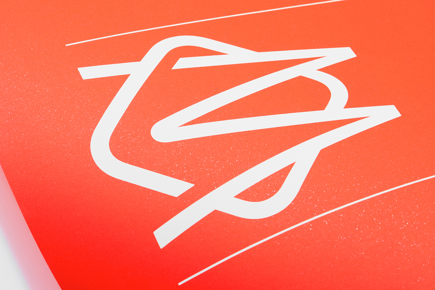
Commission worked with Chief Executive Alexandre Arnault and Chief Brand Officer Hector Muelas to create a timeless and stylish graphic identity to help support the company’s future activities and deliver a considered and cohesive brand experience for Rimowa customers. Commission introduce a monogram, new typographic style, colour palette and pattern motif alongside a wordmark designed by Munich-based Bureau Borsche. And through graphic identity, material language and mechanism link a variety of touch points. These include packaging, retail experience and in-luggage items, as well as giftboxes, retail bags, owner manuals, guarantee cards, luggage tags, dust bags and liquids bags.
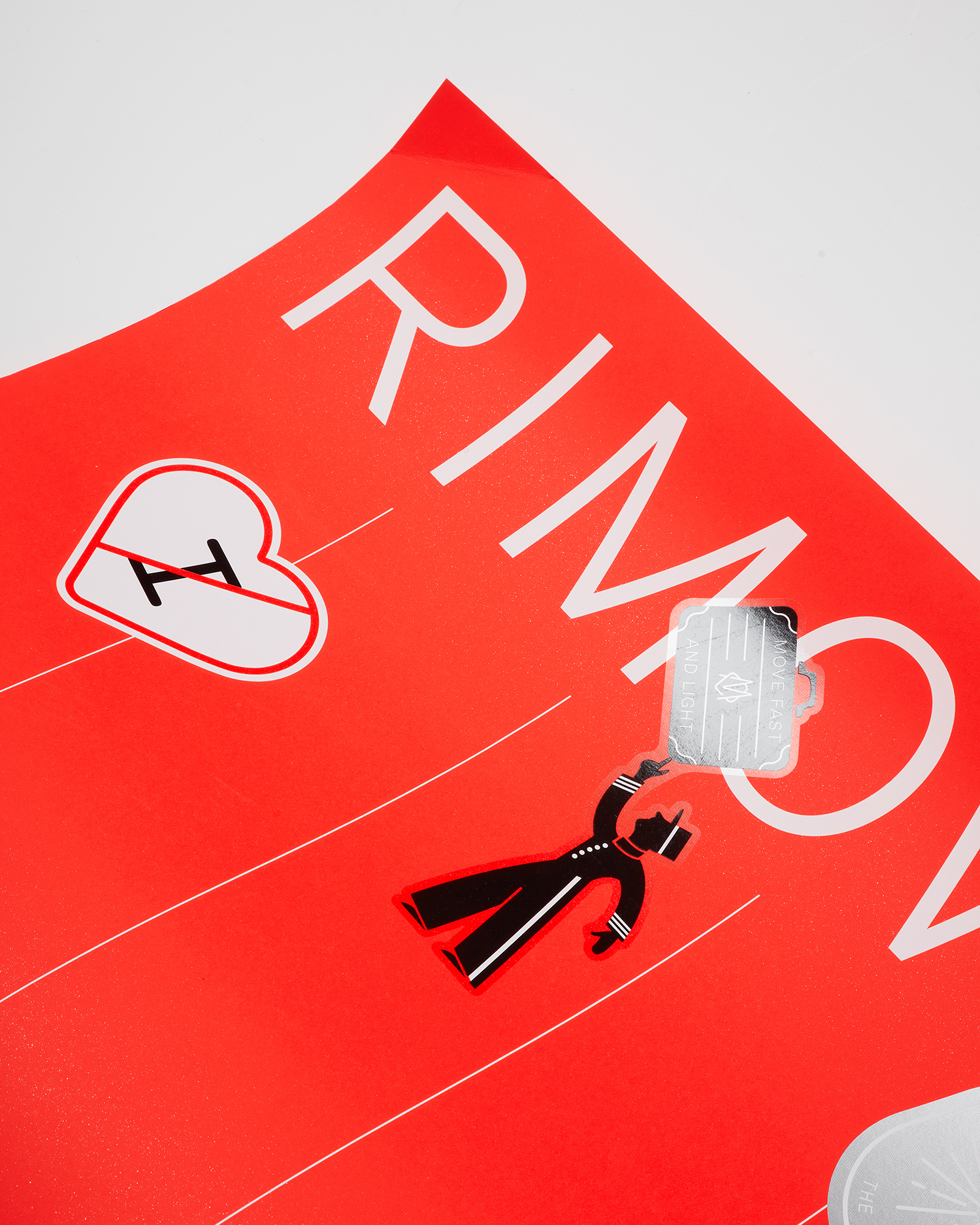
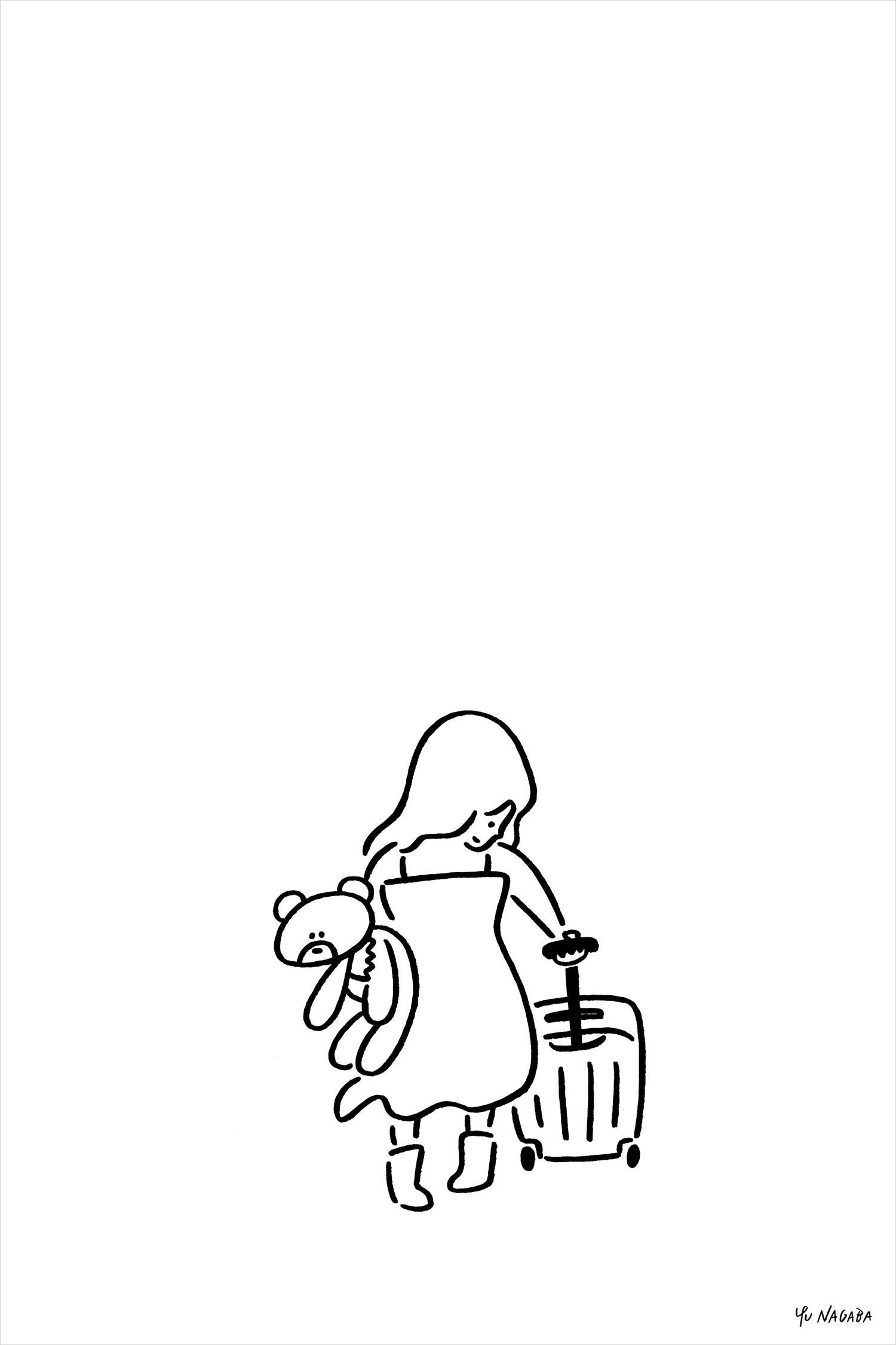
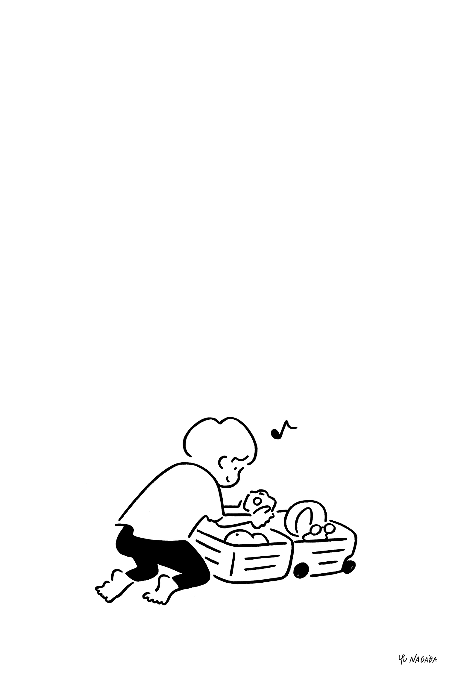
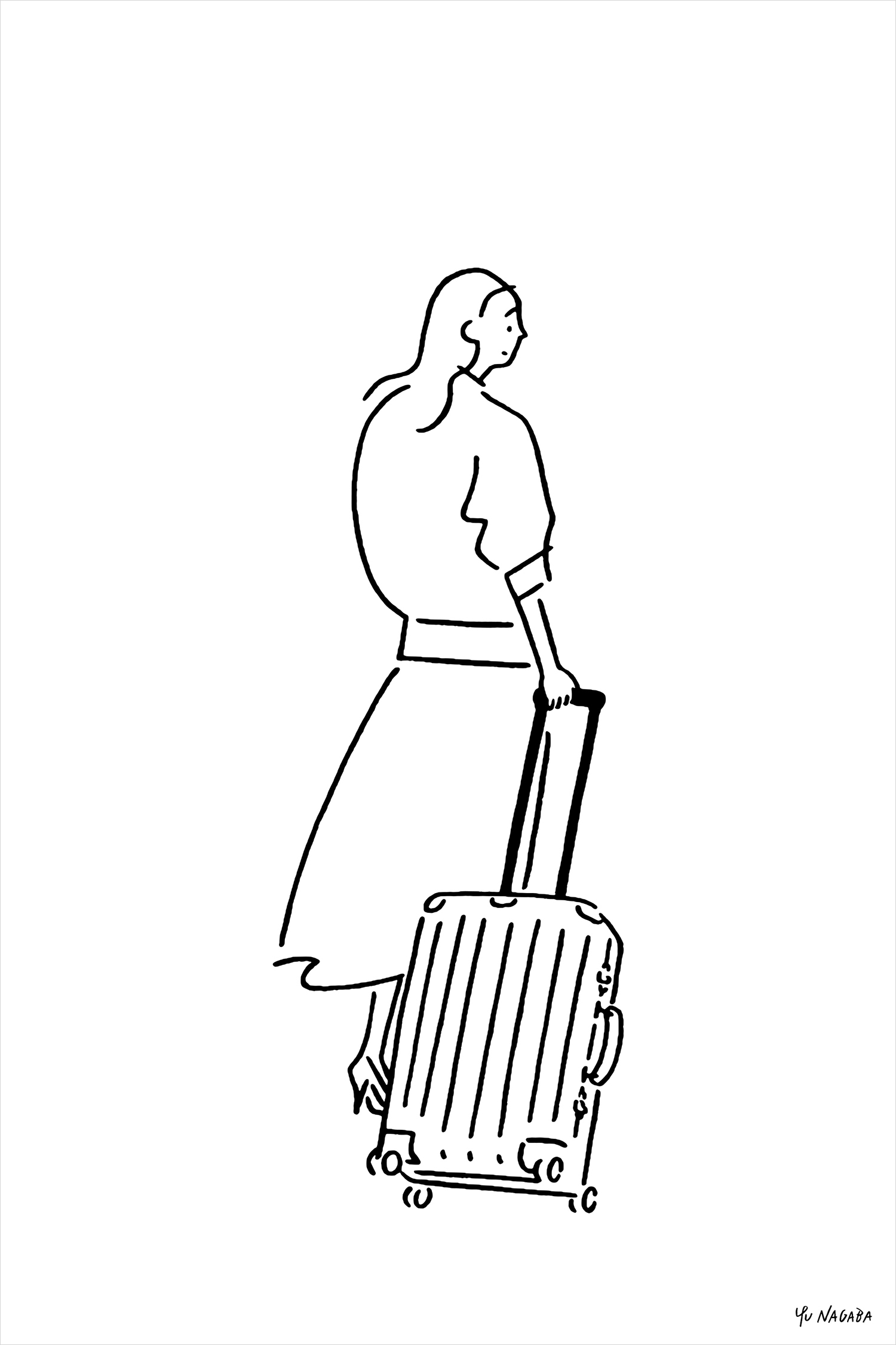
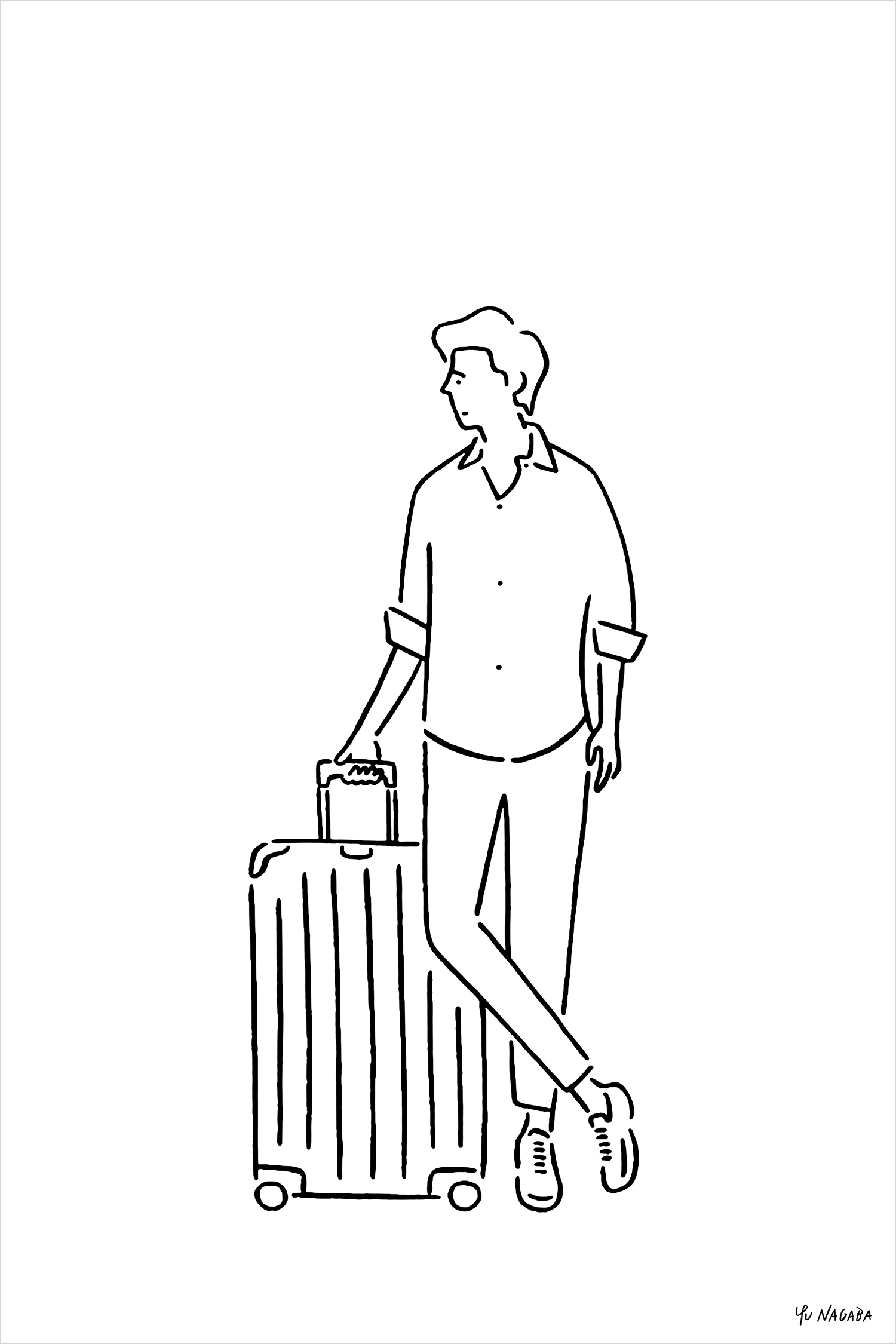
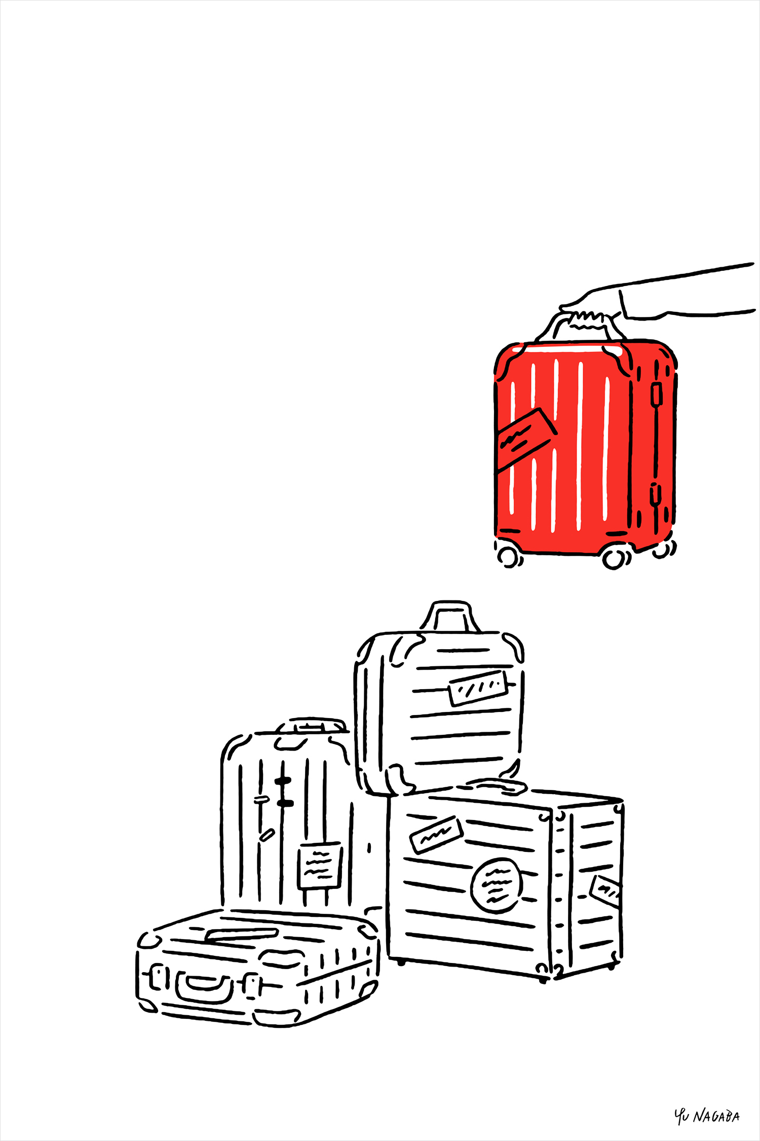
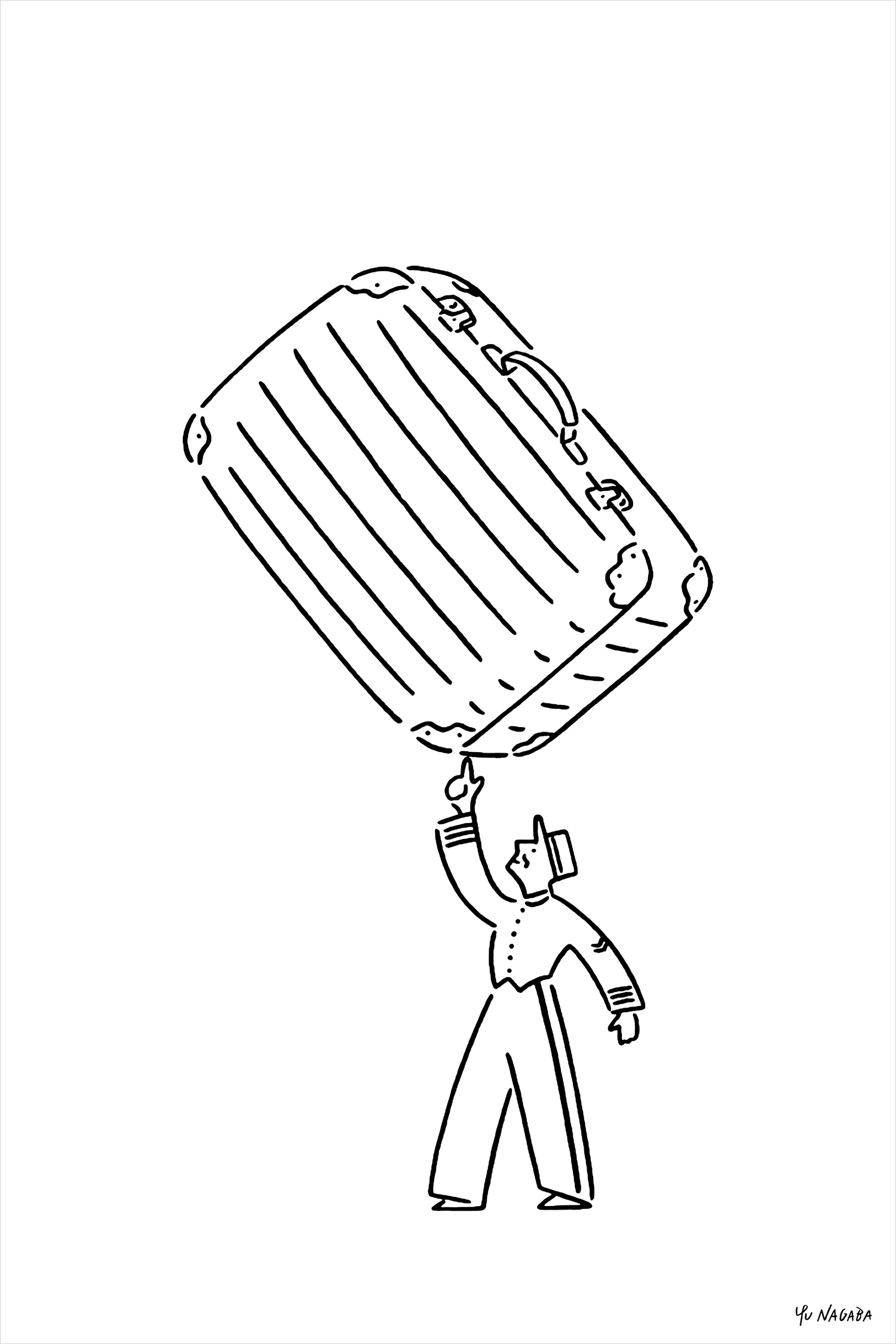
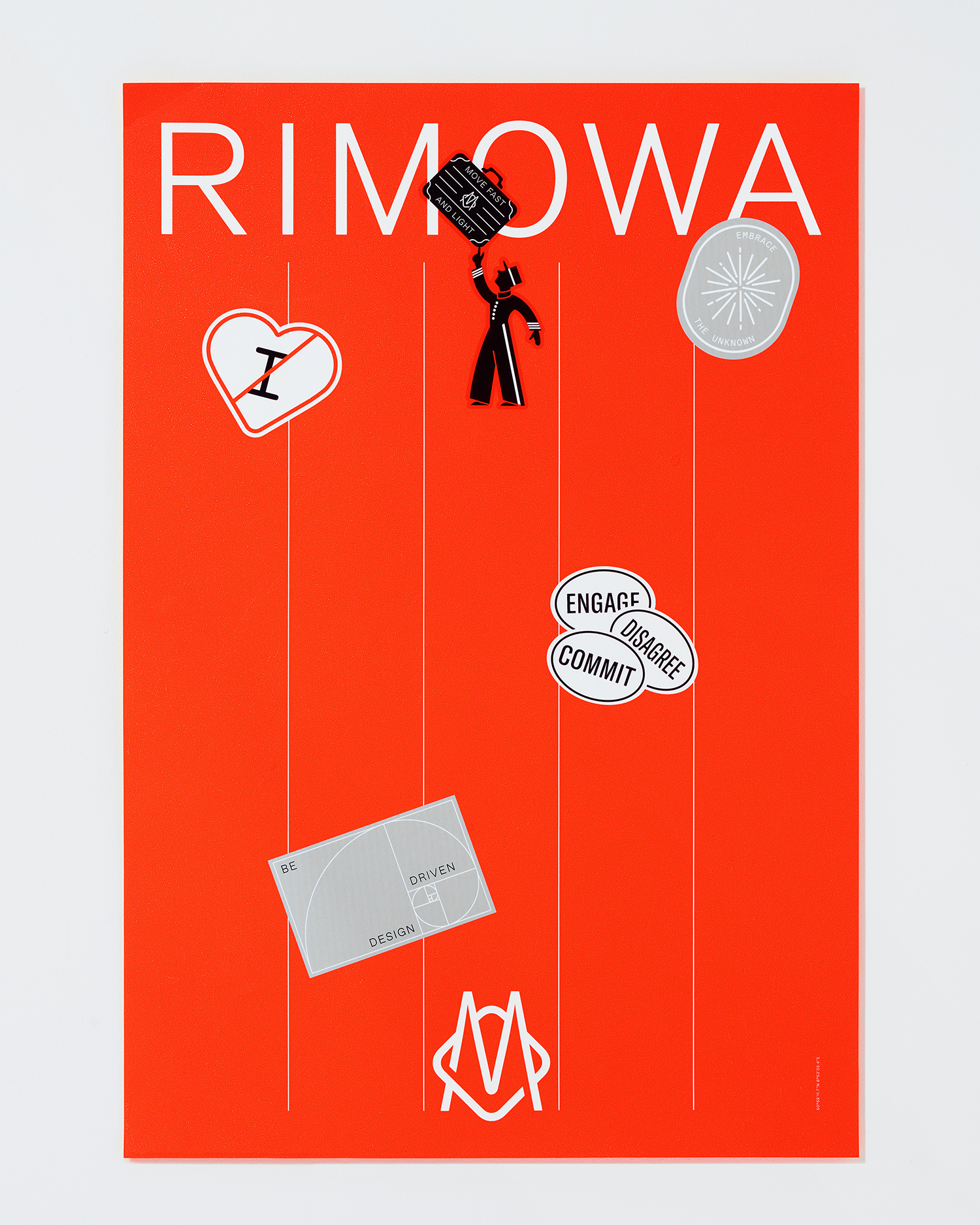
Rimowa’s new graphic identity was launched at the beginning of 2018. Since then, Commission has continued to work with the company, integrating the graphic identity across its ranges but also in the introduction of posters, stickers and illustration by Japenese illustrator Yu Nagaba. These begin to layer in a playful component, to create an interesting dialogue between tangible craftsmanship and utility and the more intangible and visceral components of travel, family and lifestyle.
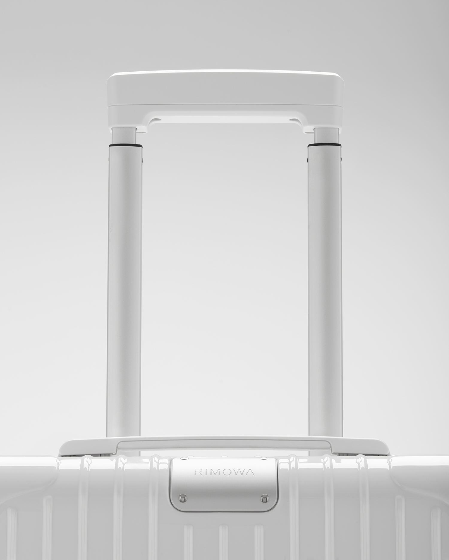
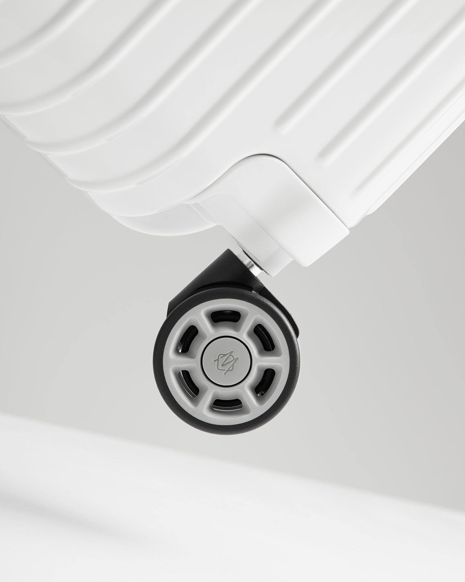
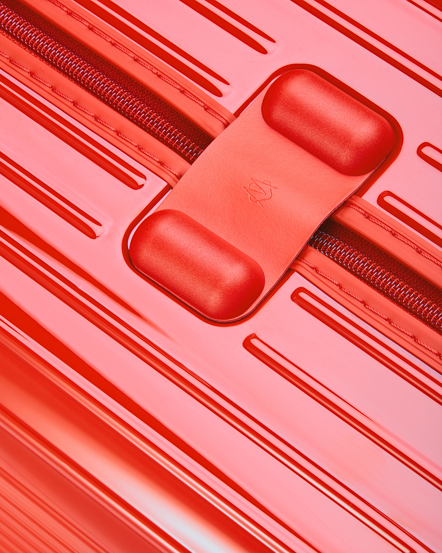
Rimowa is an innovative company with a modern and high-quality product range. It blends material quality and detail-orientated craftsmanship with durability and functionality. They express this outwardly through an intelligible and tangible design language; in colour, shape and the ribbed relief across both aluminium and polycarbonate ranges. Commission take these qualities—legacy and craftsmanship, modernity and utility—and convey them through a concise combination of graphic expression, materiality and mechanism. This is explored further in the positioning of graphic assets, often at the intersection of or integrated into a mechanism or structural detail, be that for opening, locking or rolling, either points at which connections are made between product and owner or something to be admired. Art direction really emphasises these signatures throughout.
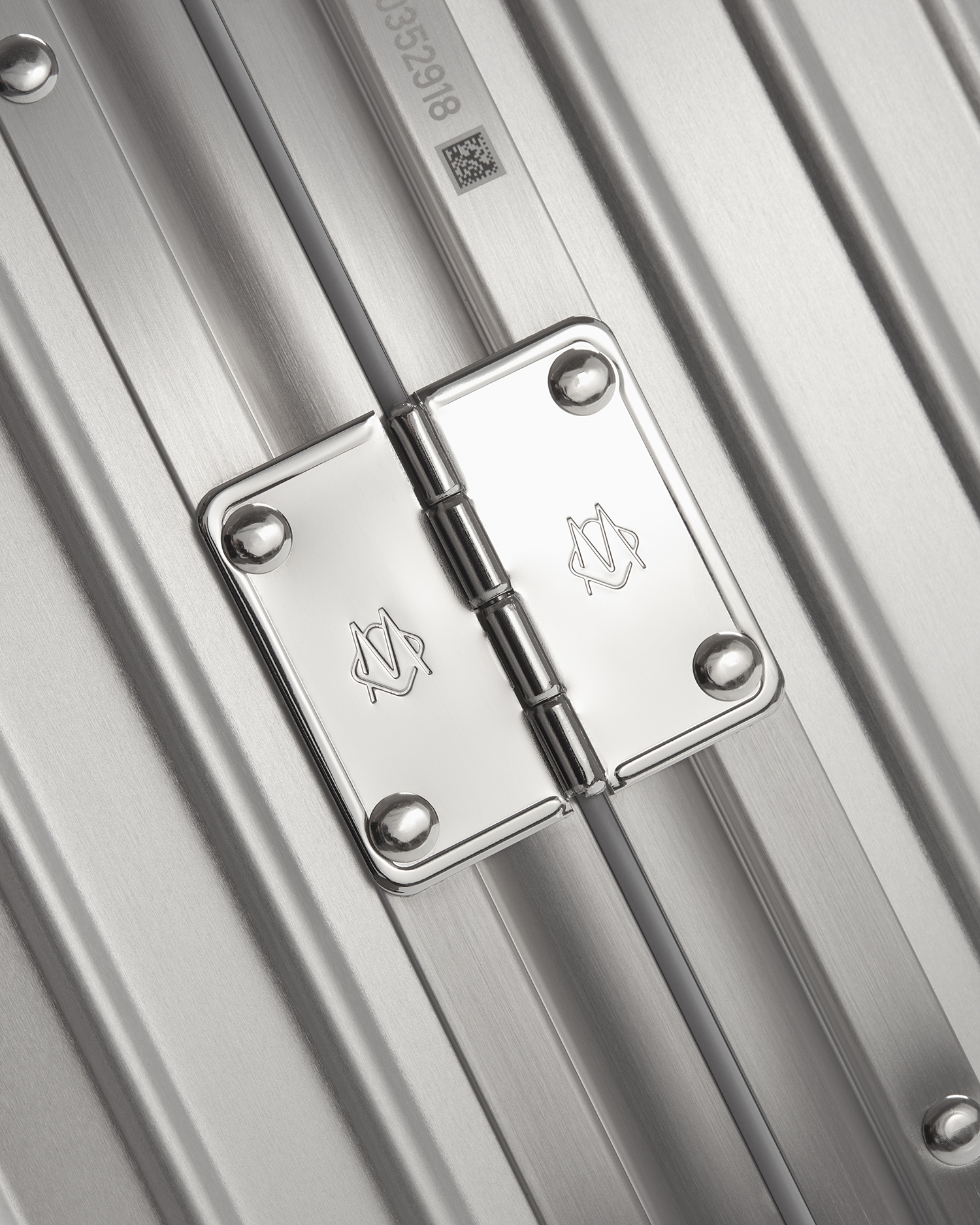
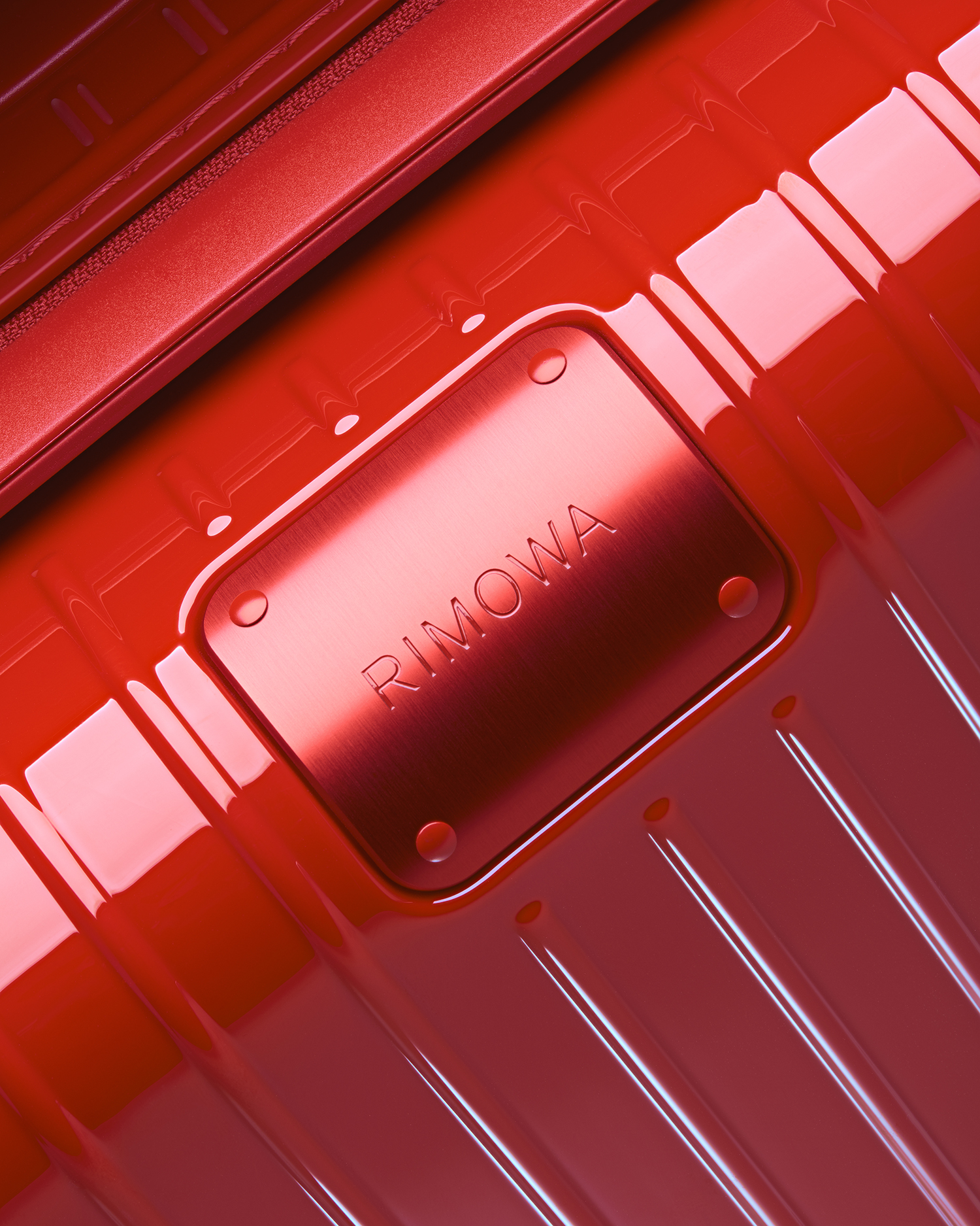
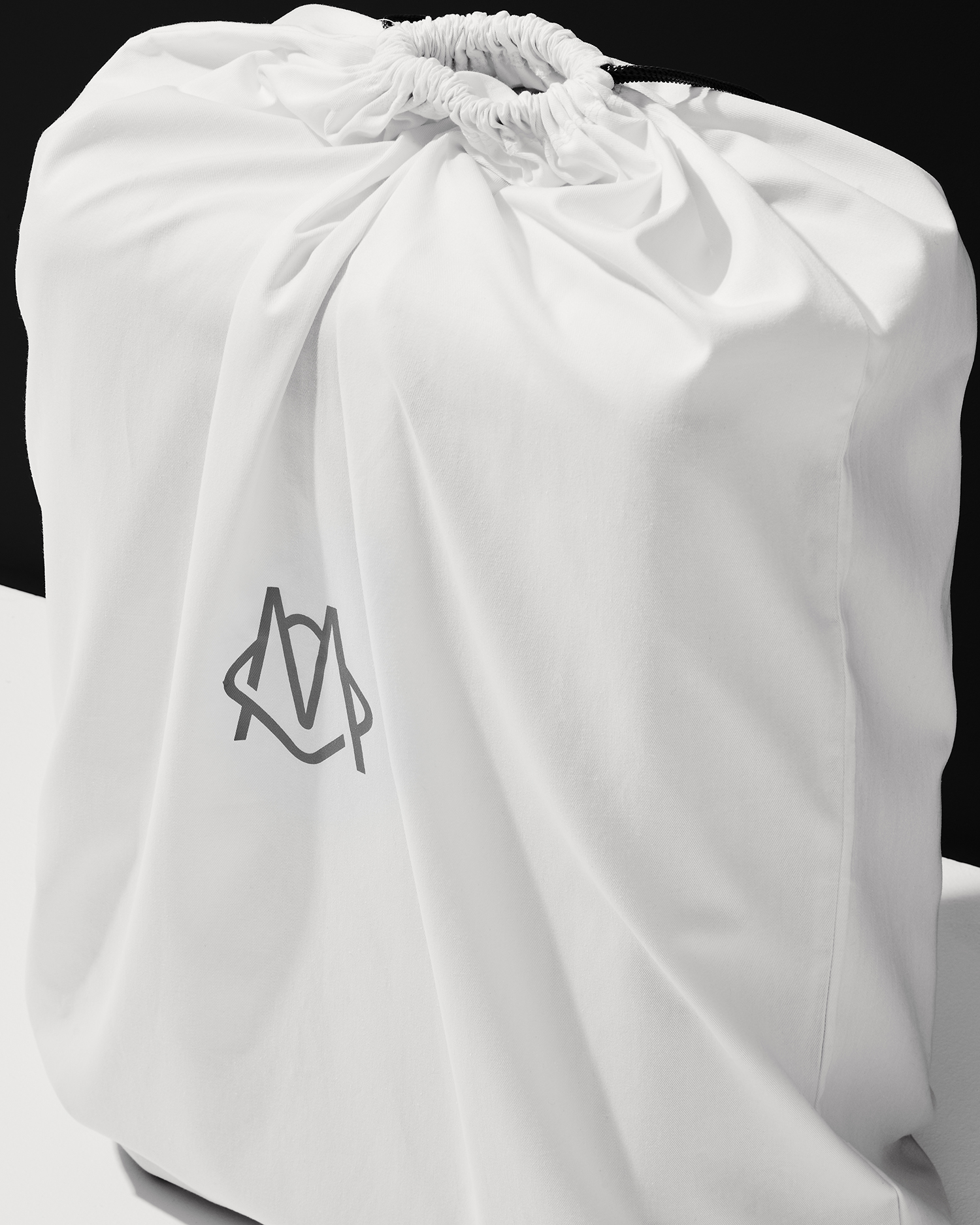
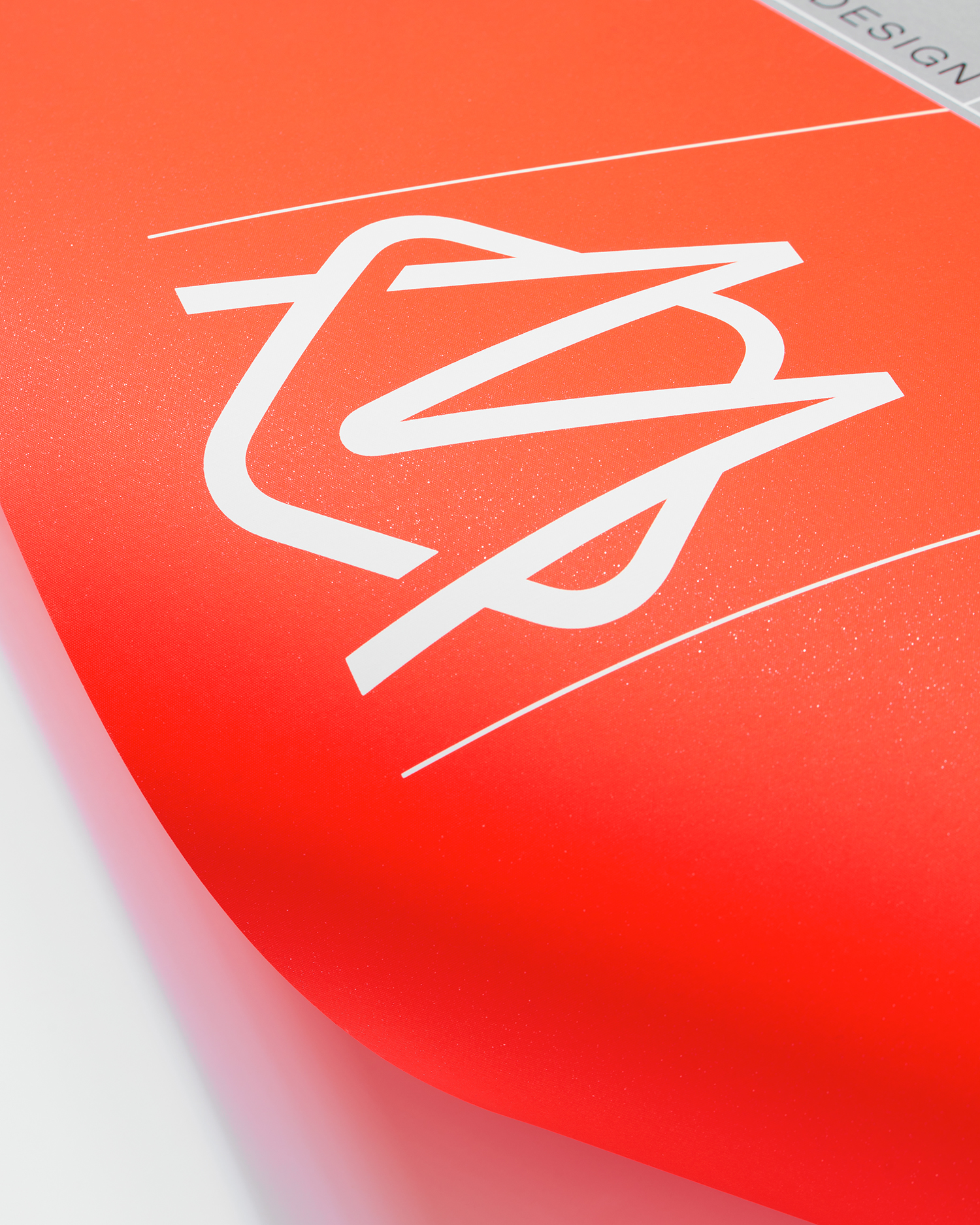
The new typographic language of Rimowa forms a useful and timeless anchor, a centre point at which past (20th Century German type design) and present (luxury through restraint) meet, and touch upon the company’s provenance, enduring legacy and the utility and quality of its products. The new monogram, inspired by Rimowa’s earliest branding and still present outside their Cologne store, applies a similar mode of thinking in shape, reference and application. Read more about this here.
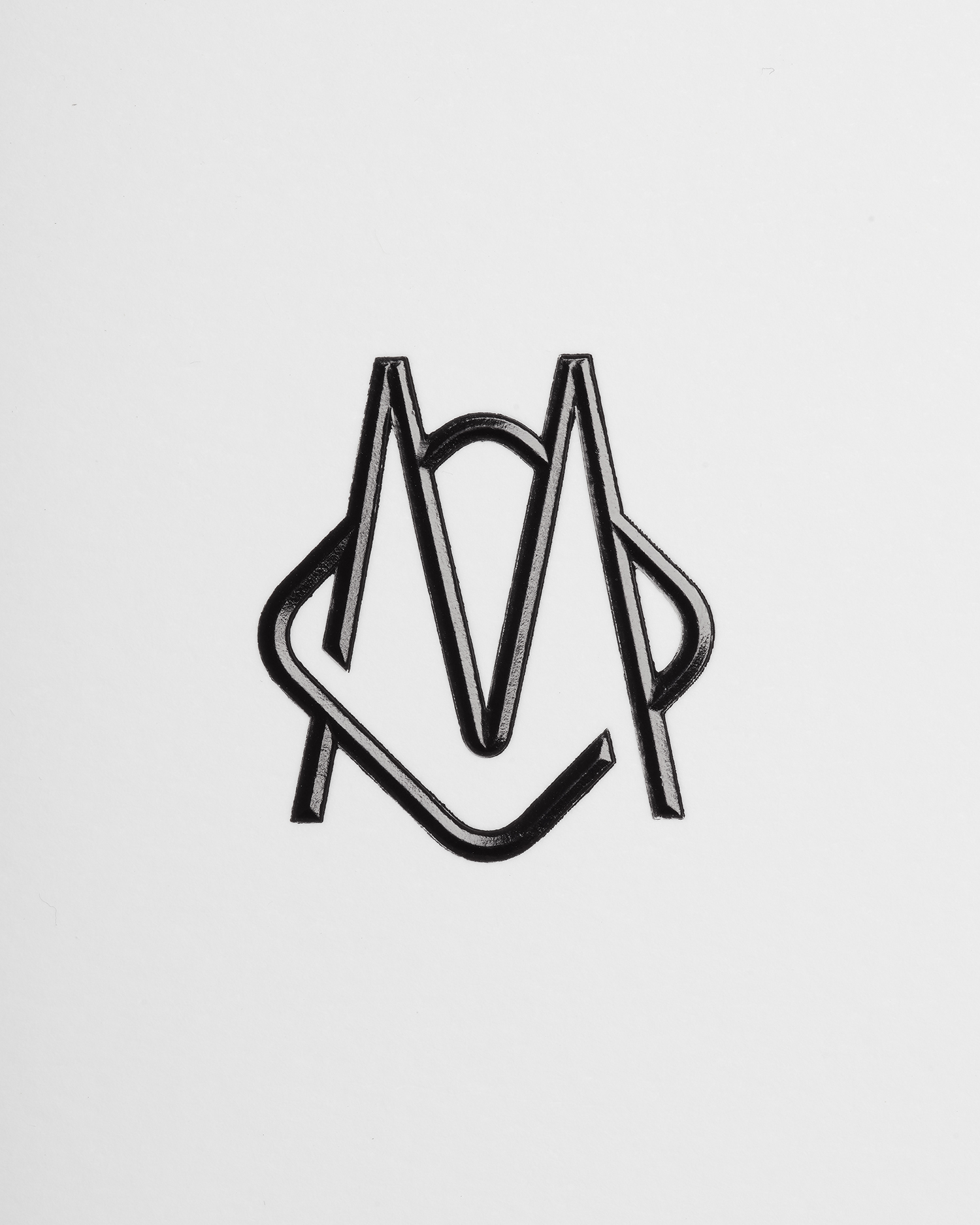
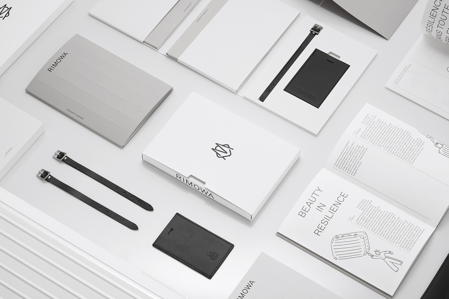
The material qualities of tags, brochures, invitations and posters form an essential part of identity. Graphic design, while referential, is visually simple and used sparingly. Papers and print finish layer these assets with a tactile material language. There are the familiar intersection of the graphic and the material in the use of blind embossing, block foiling and sculpted emboss, however, it is details such as the tags with ribbon loops secured by a rivet, and the common proportionality and relief of ribbing—forming a continuity across luggage, print and packaging—that are the real highlights. These neatly play with luxury, heritage and an industriousness in a subtle and inferred way.
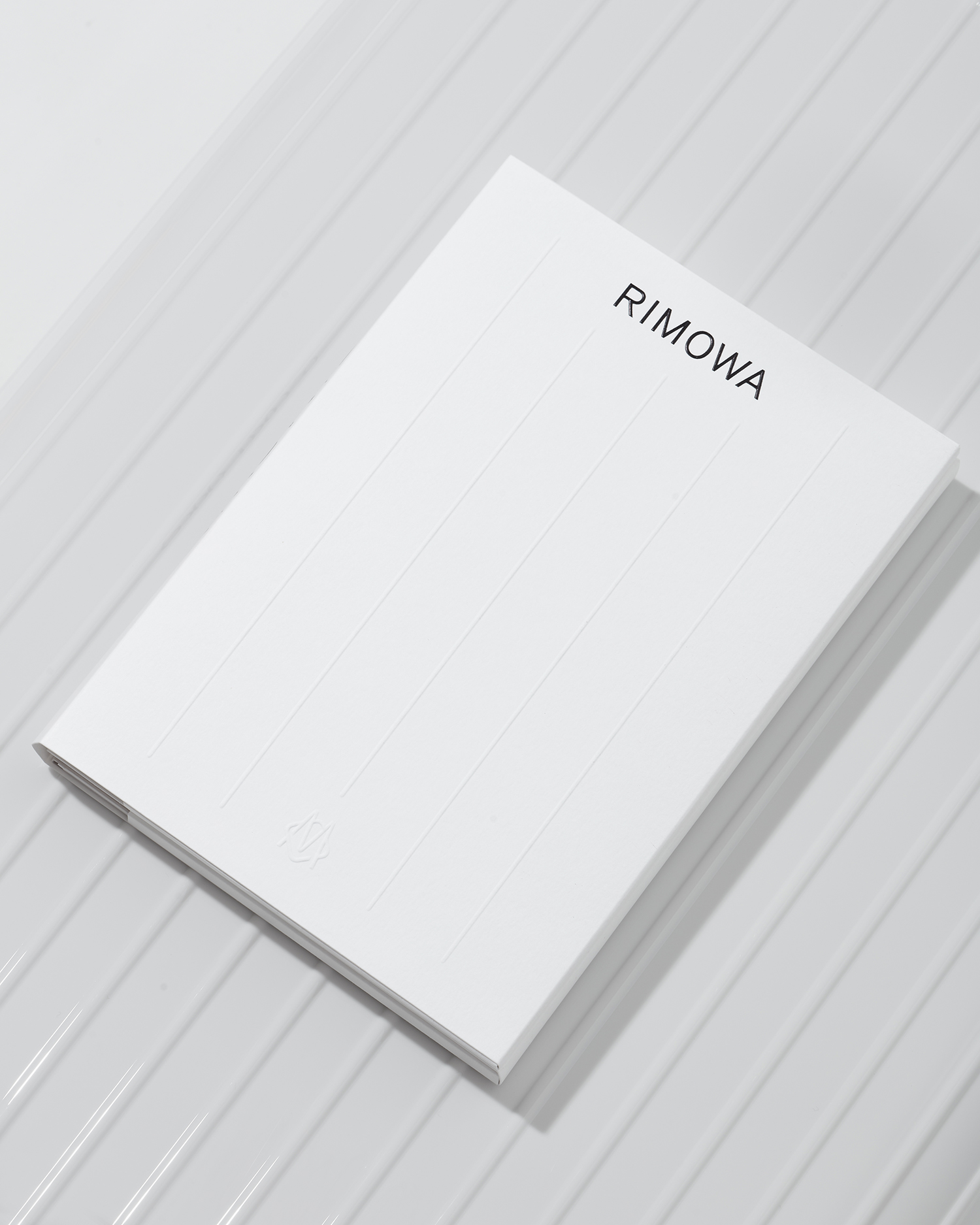
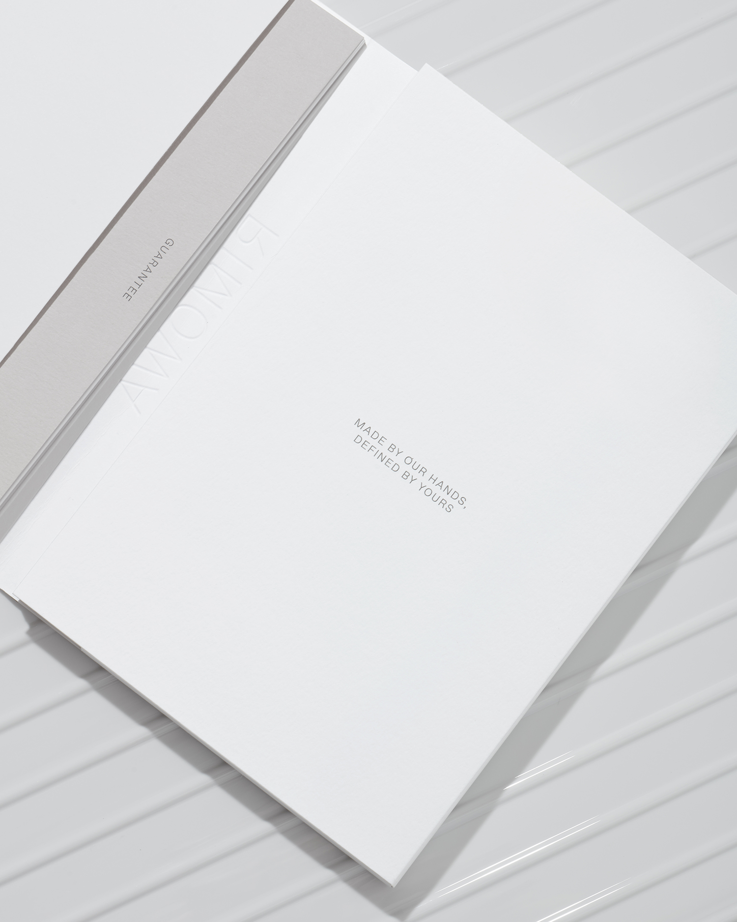
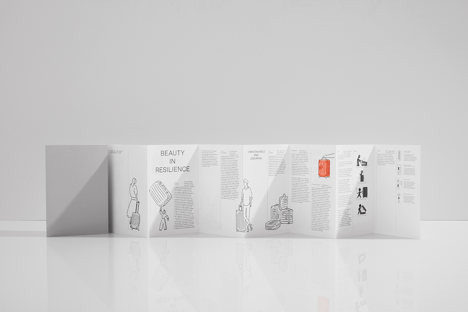
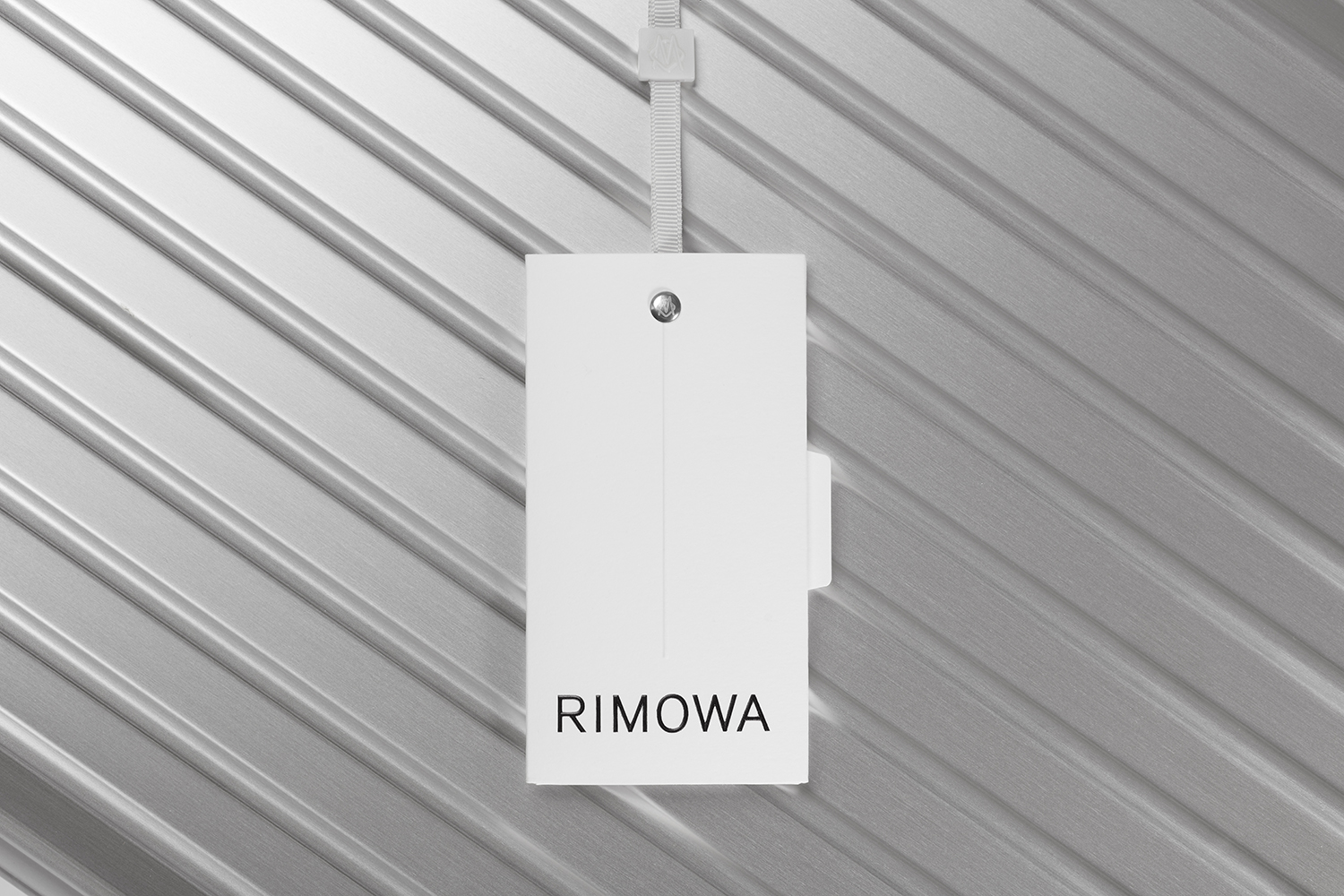
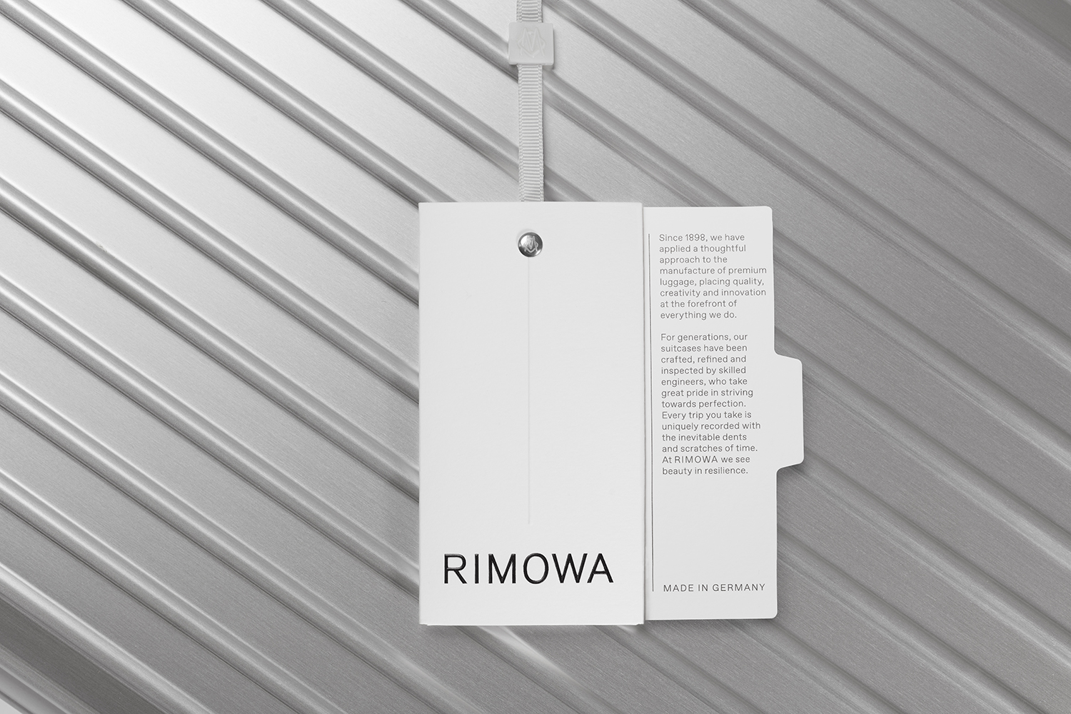
While creating a visual lightness through colour and an absence of a graphic abundance or communicative excess, materials are well-weighted in thickness and in the mechanism of their construction. These all have a feeling of robustness in the hand and a satisfaction in a mechanism for opening like the tags. Much like the pairing of a cool light grey and white boards, or the ribbed motif, these materials and finishes employ a similar design language of the luggage itself, a utility and quality, ideas and implementation, qualities that speak of modern luxury.
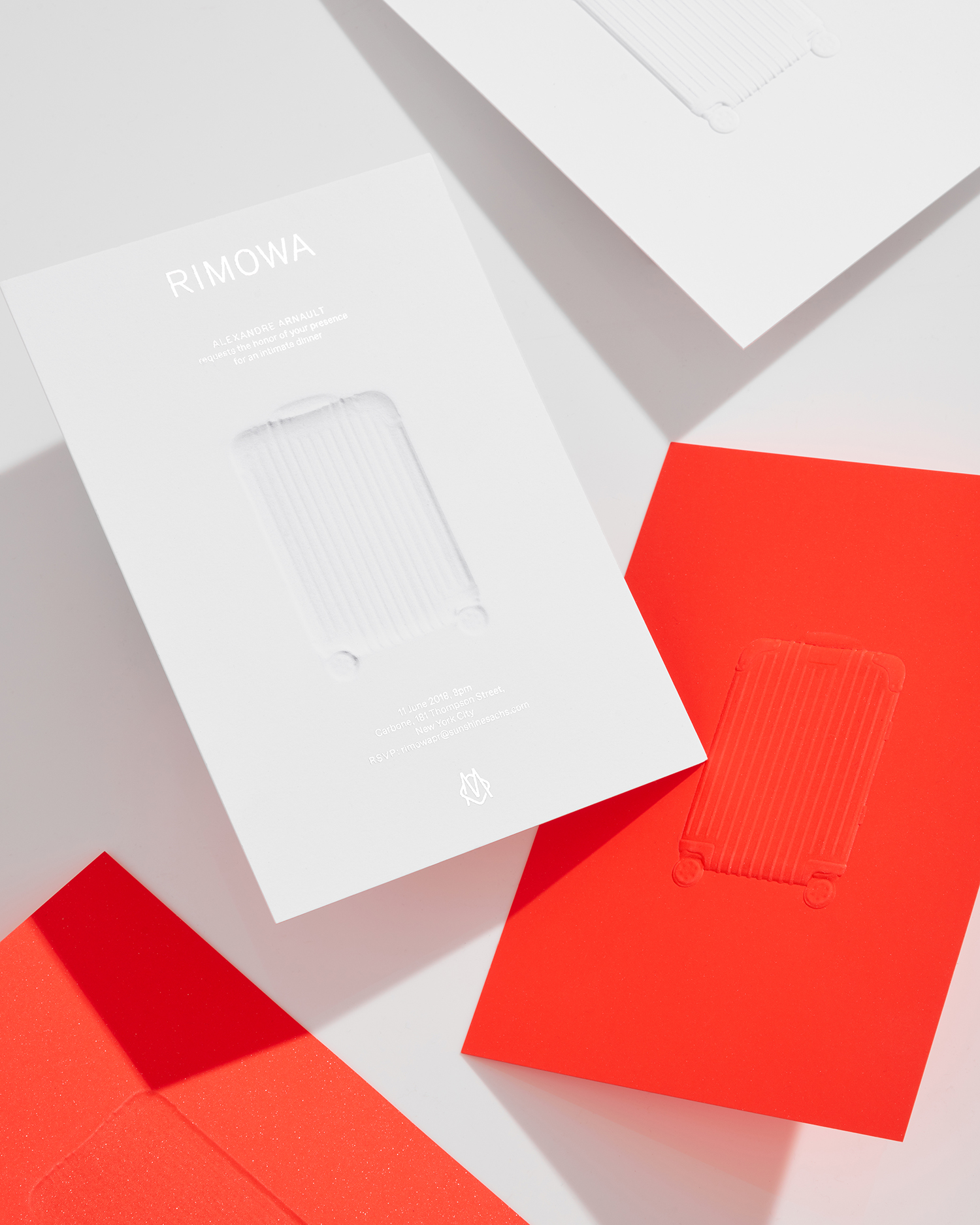
Commission begin to work in a more intagiable and contrasting declaration alongside the tangiable material language and visual lightness of print communication. This emerges through new assets that include brochure, posters and invitations. While these are marked by their high-quality materiality; the sparkling flecks within the paper of the poster and further use of a sculpted embossing are lovely details, the introduction of a fluorescent red, illustration by Japanese artist Yu Nagaba and travel stickers, build in a more emotional layer, a warmth through colour and moments captured by illustration.
While much of Rimowa’s key identity assets have a restraint and lightness, a timelessness and craftsmanship, these new elements speak of fashion, modernity, customisation and of travel and stories. These emphasise the capacity of core identity to be a canvas that can hold a second and transient surface layer that can be reconfigured, can tell an ongoing story. Just as people encode their luggage with stickers and scrapes, these new details introduce a very human element and counterpoint to the inanimate utility (but luxury) of Rimowa’s products.
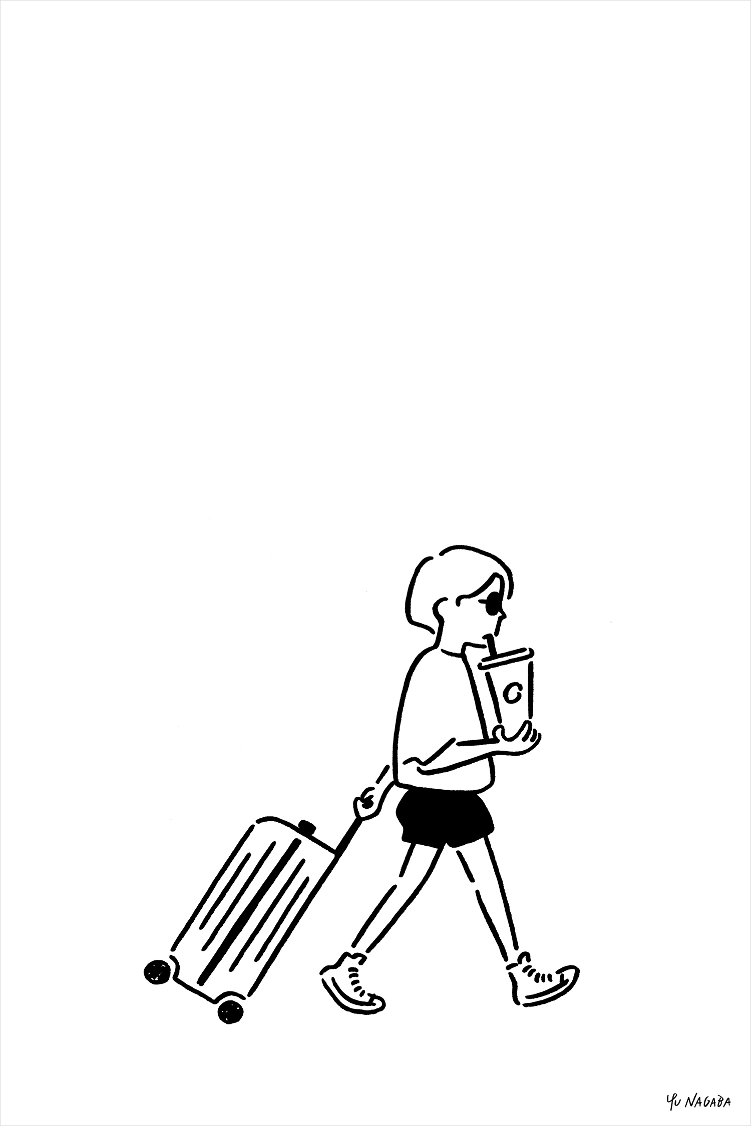
The work of illustrator Yu Nagaba offers a significant contrast to the precise lines and engineering of Rimowa’s products, as expressed in type, form and material language. There is an immediate lightness and conviviality of tone in the pen work and very clear themes of travel and family in content and motion. This appears both a stylistic and strategic decision. There is an evident communicative sentiment at play that is endearing and wholesome.
The result is a sophisticated and well-weighted material and visual language, brought into sharp focus through precise asset production a concise communicative intention. Commission blend both literal and subtle references and amplify their intent, detail and thoughtfulness through an abundance of space. These then serve as a framework to explore other modes of communication, the opportunity to be striking and emotive, to convey their design legacy through other tools and techniques. More work by Commission Studio on BP&O.
Design: Commission. Wordmark: Bureau Borsche. Illustration: Yu Nagaba. Opinion: Richard Baird.
