Rare Harvest by Marx Design
Opinion by Richard Baird Posted 8 May 2019
The True Honey Company (TTHC) dedicates itself to the production of mānuka honey, a monofloral variety produced in Australia and New Zealand from the nectar of the mānuka tree. It has a unique colour and texture and a high level of dietary Methyglyoxal, an organic compound with antibacterial and antiviral properties.
With a price range starting at 60.00AUD and rising to 230.00AUD per jar, and working in a market flooded with sub-standard honey and dishonest marketing, communicating the value of the product and the commitment of TTHC to quality and ethical production through an impactful and engaging brand identity and packaging design was paramount. This task was given to Auckland-based graphic design studio and packaging specialists Marx Design who played with a material and structural language to express the rarity and value of such a product.
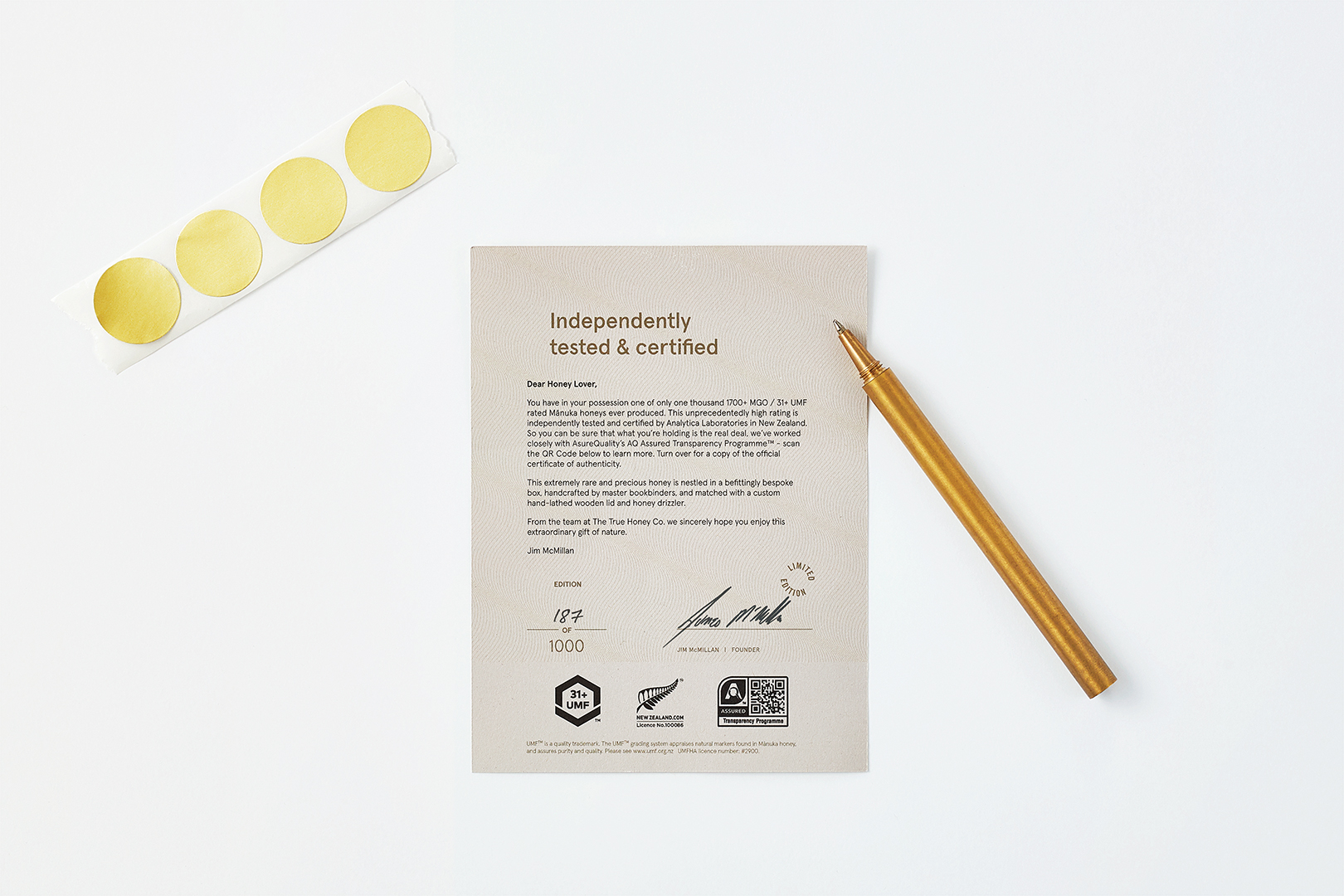
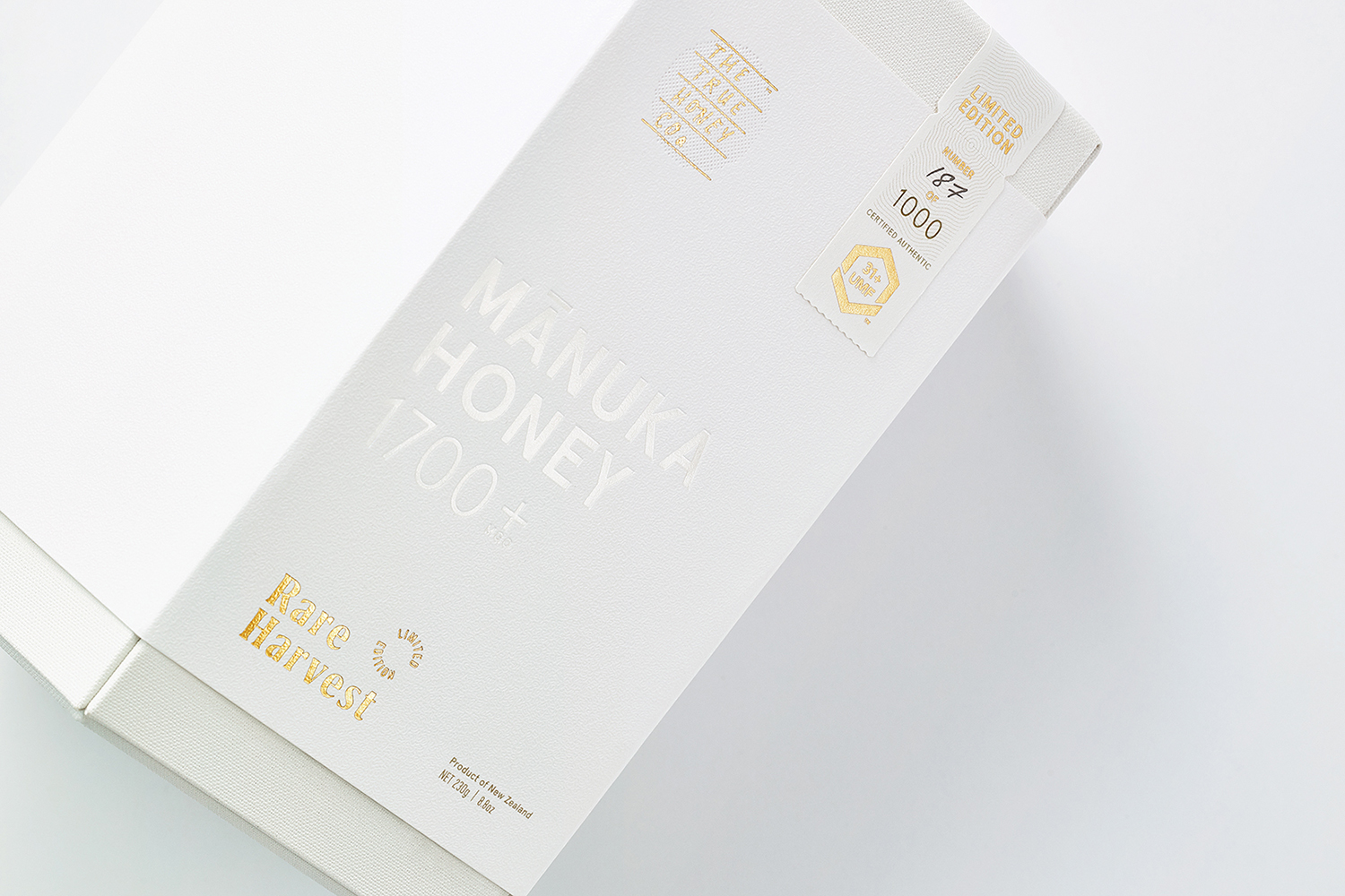
Marx Design returned to the project in 2019 to develop packaging for Rare Harvest, a limited edition mānuka honey from TTHC certified at an unprecedented 1,700+ MGO (31+UMF), the highest ever recorded. Marx Design, working in collaboration with Think Packaging, further the material language of value and rarity that characterised the first range, and fold in the theme of Mānuka blossoms.
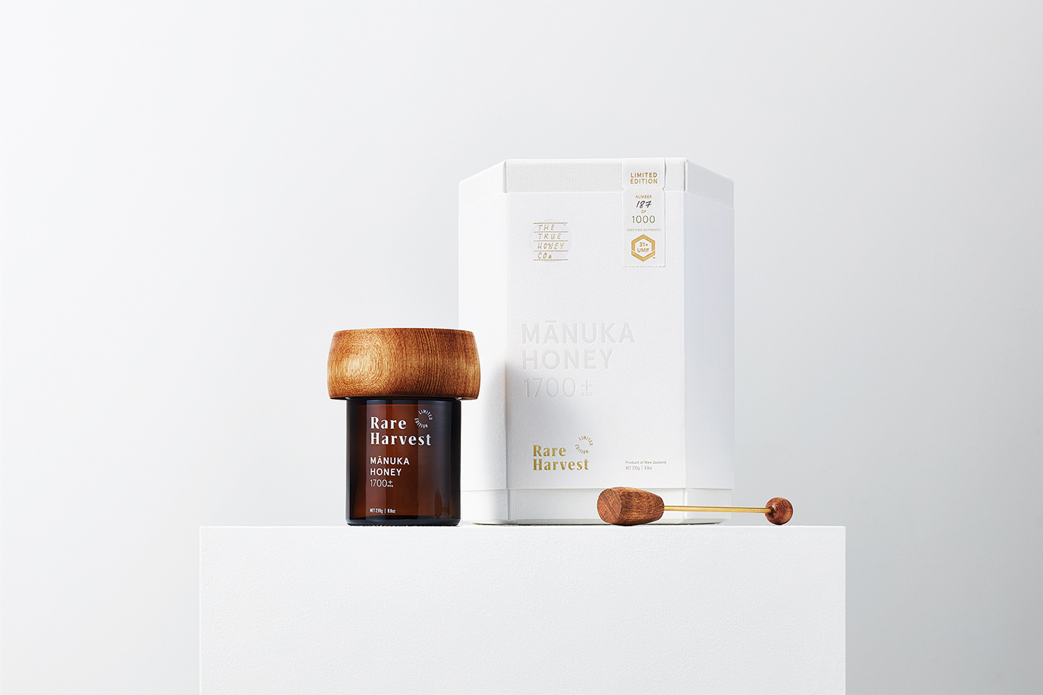
“The Mānuka tree is notoriously fickle when it blooms, needing just the right combination of sunshine, warmth, gentle breeze and rainfall. Given New Zealand’s equally fickle climate, you’d expect a perfect harvest to be a rare event.” – Marx Design
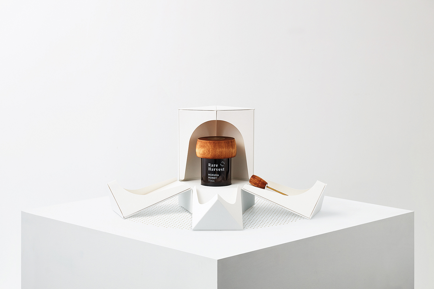
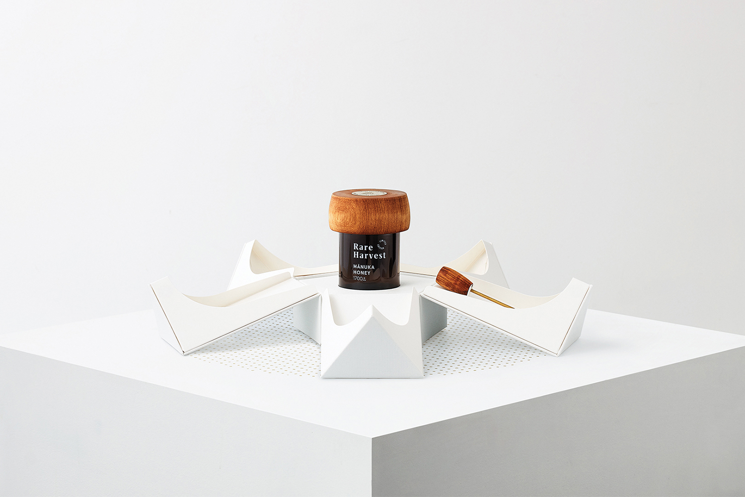
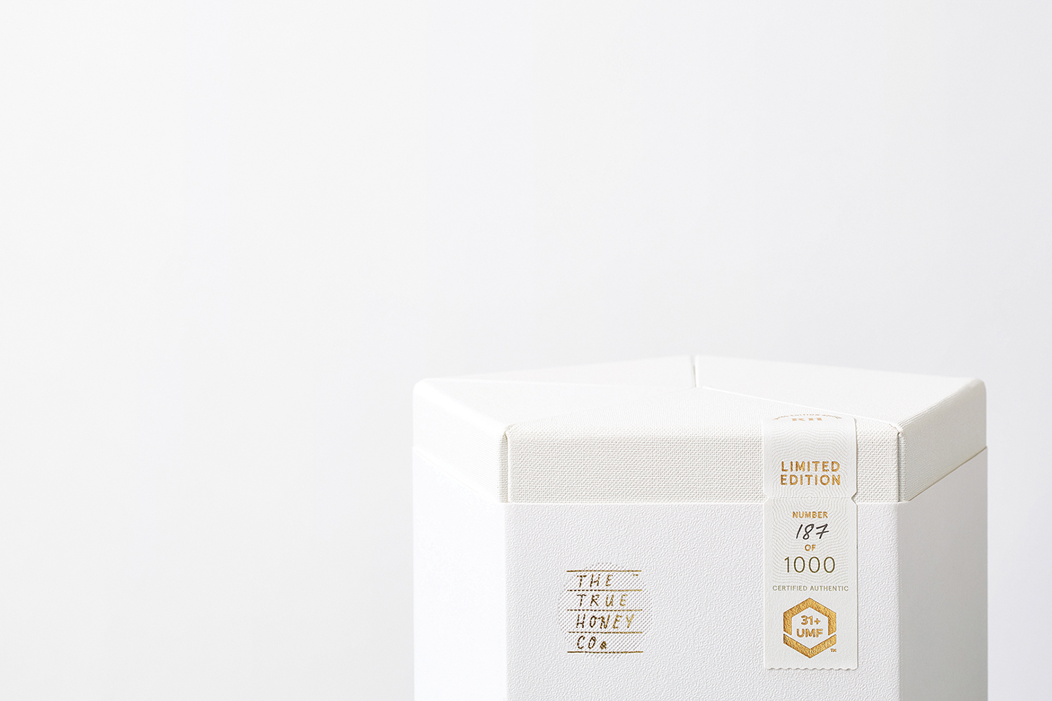
Inspired by the Mānuka tree’s five petal white blossom, and working with Think Packaging, Marx Design developed a new structure that furthers the material language of previous ranges. This holds a unique honey jar that features a hand-turned lid made from sustainably sourced heart rimu, and a bespoke honey drizzler.
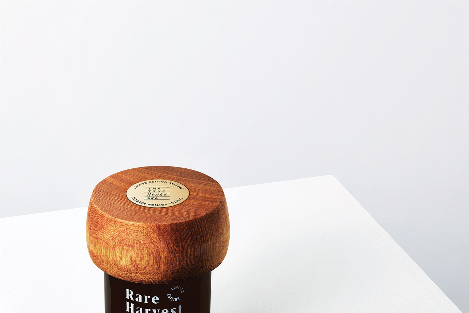
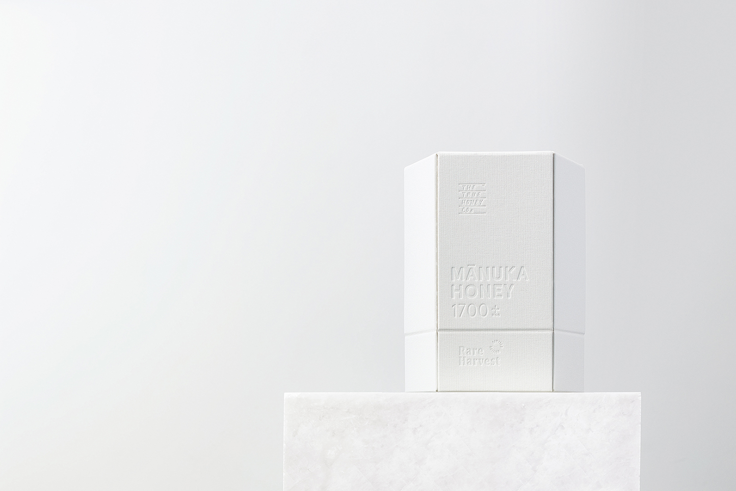
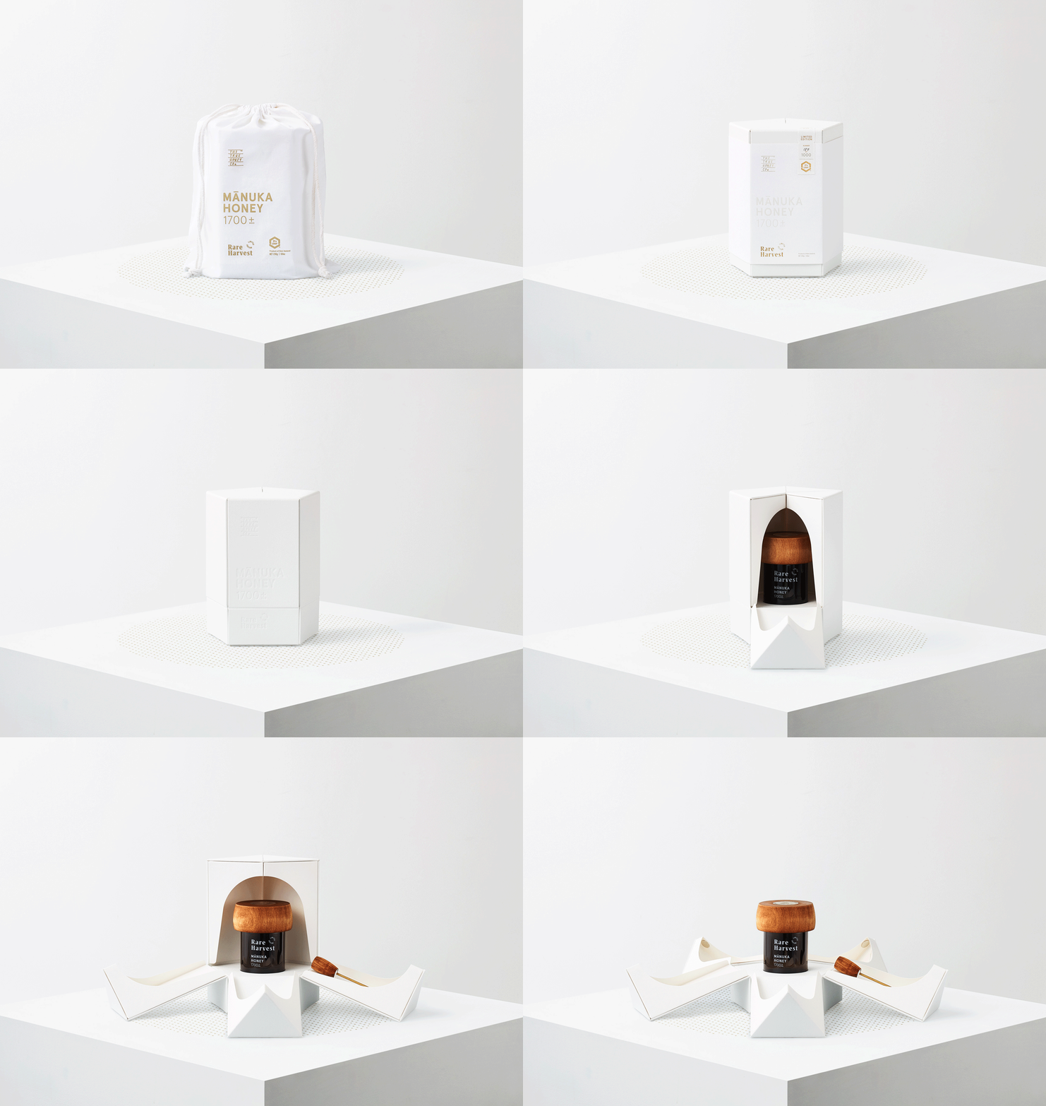
As explored in BP&O’s review of The True Honey Company’s first range, the approach to packaging not only functions to protect during shipping but also avoids the ubiquity and not so eco-friendly nature of bubble wrap or polystyrene pellets. It emphasised the value of the product and ethical integrity through design by way of a structure that is robust and ecologically lower impact. These boxes also developed and introduced an unexpected performative component with a fold-out presentation, drawing sophistication from a conventional material through form and creative thinking. That Marx Design was then to further this here, with Rare Harvest, is impressive, now engineering the box to mimic the shape and colour of the Mānuka blossom, making a more immediate connection to nature whilst also just being a beautiful aesthetic gesture.

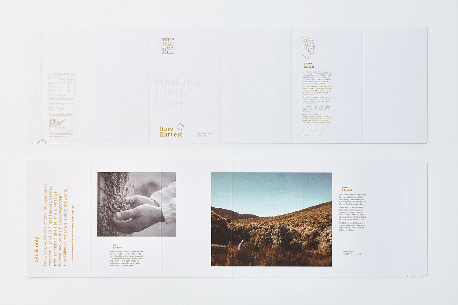
As with the early range, form and material preside over the graphic. Both the black surface of the first range and the blossom white of this later release, in junction with the craft of its production (even surfaces and intersections), serve to distinguish the products and provide a shelf-presence. These all fold neatly within the evolving super-premium market where shape and structure, texture and finish are becoming essential elements of the story, and not just surfaces in which to present the story.
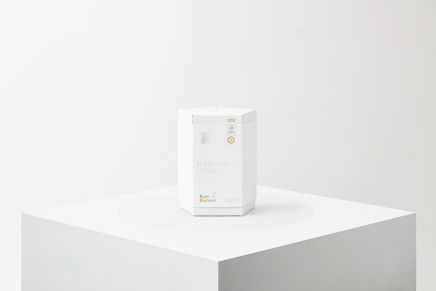
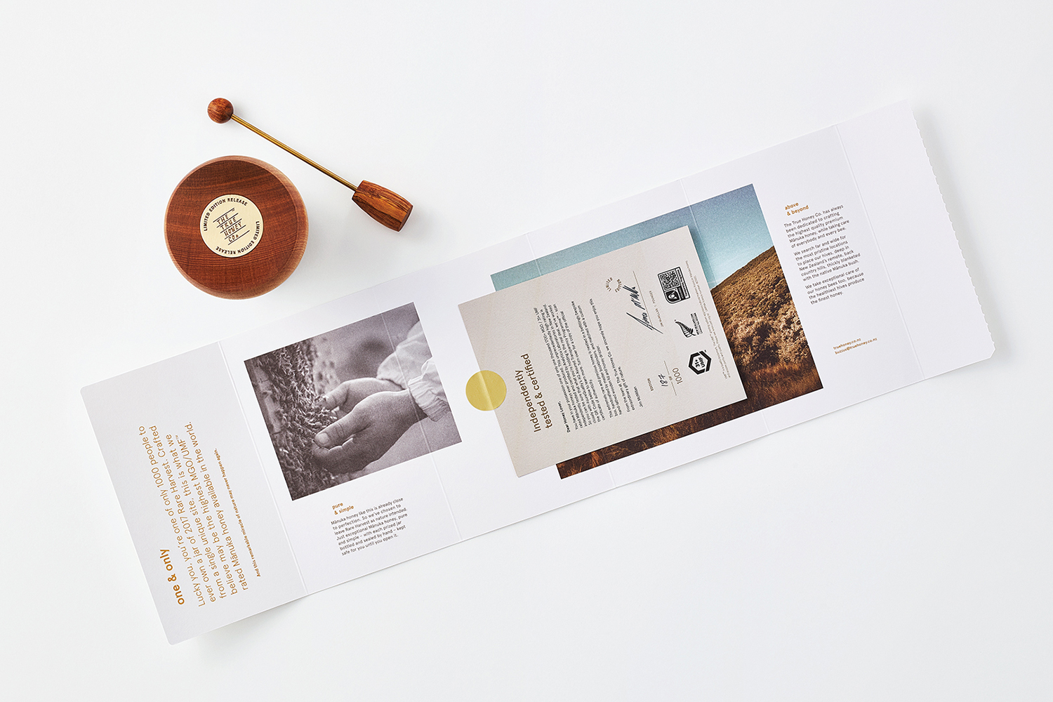
The result is one that is immediate in colour and form and follows up with fine material detail. Insight is presented on the inside surfaces of the sleeve, sequencing information and managing the experience over time. In this way, in relation to the opening experience, packaging becomes performative and likely more memorable. It develops story in tandem with practical considerations, with value being inferred in multiple ways and not just through the familiar and increasingly ubiquitous foiling. There are moments where the graphic falls a little short, the TTHC logo now feels a touch dislodged from a far more sophisticated packaging experience, and this also extends to the tracking of Rare Harvest on the jar. These a small details where brand is very much becoming an elegant total experience, rather than leaning on the graphic. More by Marx Design on BP&O.
Design: Marx Design. Structural Design: Think Packaging. Opinion: Richard Baird. Fonts In Use: Aperçu.
