LogoArchive Issue 5
Opinion by Richard Baird Posted 8 October 2019
The technical limitations of the mid-century—the need for a steady hand and a precise mind for mechanical reproduction—demanded that an exceptional level of care and creativity be given over to shape and space, association and perception. These considerations created a rich corporate and consumer form language and range of graphic techniques. These have been partly marginalised, usurped by modern print and display technologies. They do remain as useful reference points in which to help create an effective symbol today, one that works well in a black or white, can be used with vibrant inks, seductive materials and eye-catching finishes as well as being displayed in motion on ever more diverse screens types. With this in mind, LogoArchive returns with an issue dedicated to some of the techniques of mid-century symbol-making.
Order LogoArchive zines here.
And subscribe to Logo Histories here.
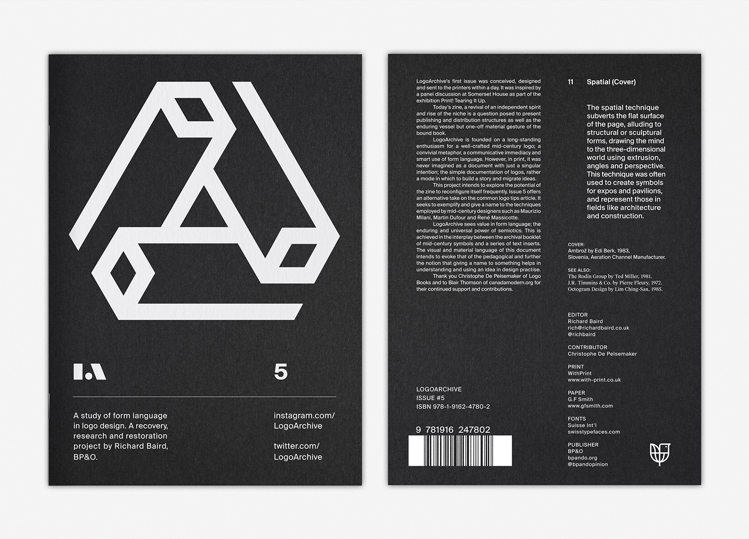
LogoArchive Issue 5 focuses on eleven simple techniques, naming them, exemplifying them and offering short commentaries. It serves as an archival and pedagogical document, offering an alternative take on the ubiquitous logo tips article. In this way it looks at things another way around. This alternate viewpoint manifests itself materially in the dual modes of reading the zine, either portrait and symbol first, or landscape and text first. The first technique, “rotation”, was selected as a way to introduce readers to the format of this new issue. By presenting these texts landscape, the zine encourages its readers to embrace the full materiality of what began as a digital Instagram project, and view the symbols documented in different ways, to see how their form language is diminished or enhanced.

The design of the inserts, their shape and materiality, type choice and layout seek to evoke the pedagogical. Details such as further references, set in Suisse Works, intend to draw the mind to footnotes and citations, and is a provocation for the reader to seek out further examples of each technique.

LogoArchive is interested in the relationship and tensions between the digital and the analog. With this in mind, alongside the printed publication, LogoArchive is also running a social media campaign that will present the techniques as a series of 24hr stories. These are be supported by three tile posts that encourage further research, tying into the pedagogical theme. Just as the zine turned a digital Instagram account material, the materiality of the zine then informs the design of the digital.
Issue 5 has been printed by WithPrint on G.F Smith Colorplan Ebony 135gsm with multiple passes of white ink on an HP Indigo press. It features 3x 4pp Colorplan Vellum White inserts printed with black and threaded between the pages of the booklet. These are bound with black staples. Discover more about logo design at LogoArchive’s Logo Histories.