LogoArchive ExtraIssue – Letters As Symbols
Opinion by Richard Baird Posted 19 November 2019
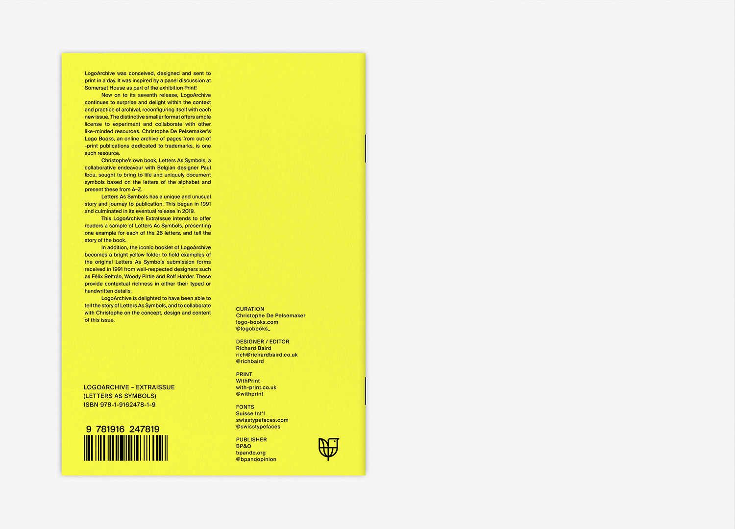
LogoArchive in print was conceived, designed and sent to print in a day. It was inspired by a panel discussion at Somerset House as part of the exhibition Print! Now on to its seventh release, LogoArchive continues to reconfigure itself with each new issue with the intention of surprising, graphically and materially, within the context of archival.
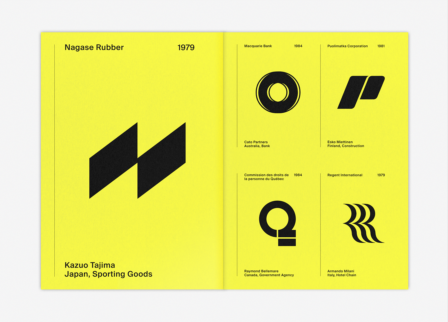
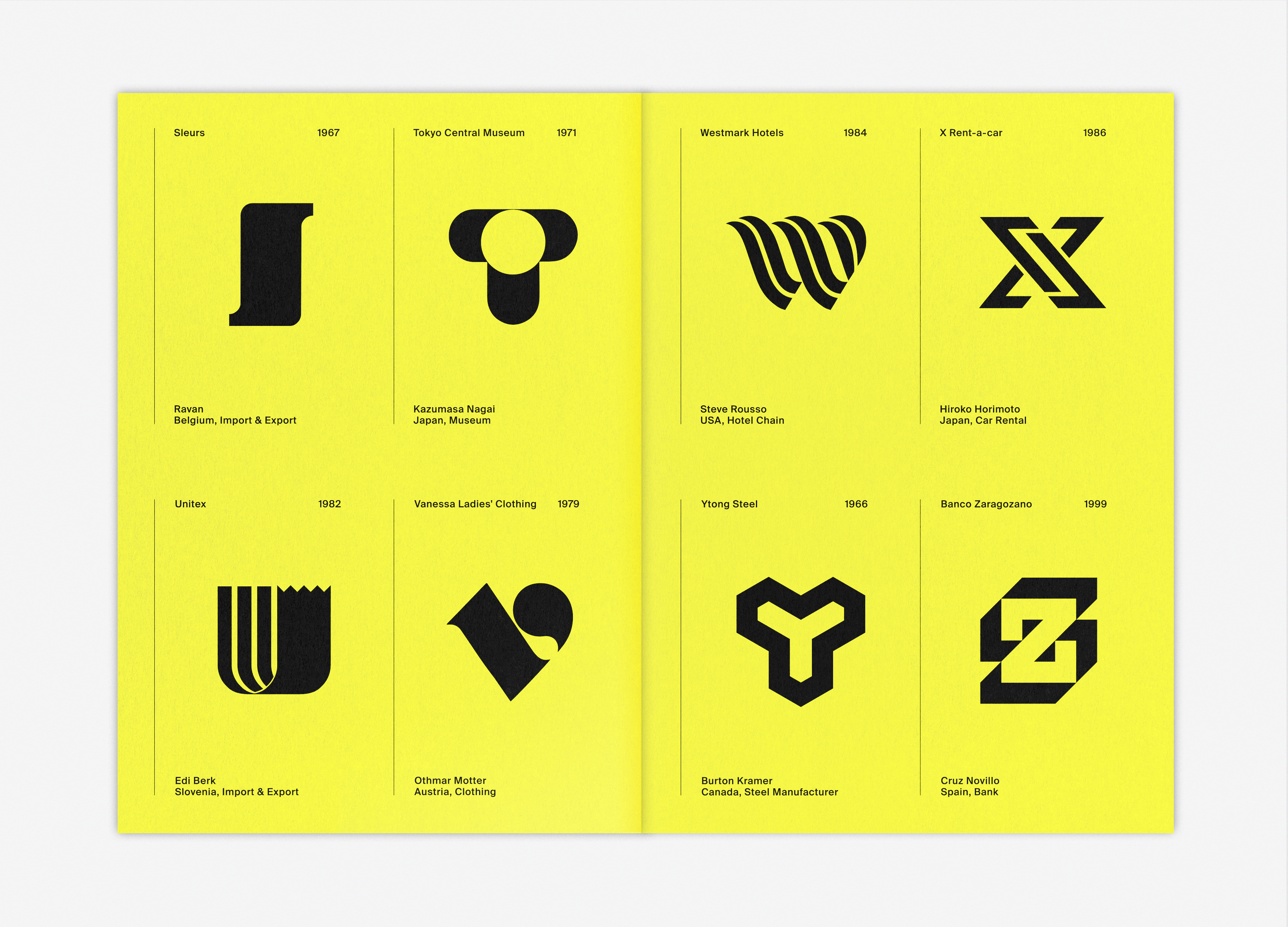
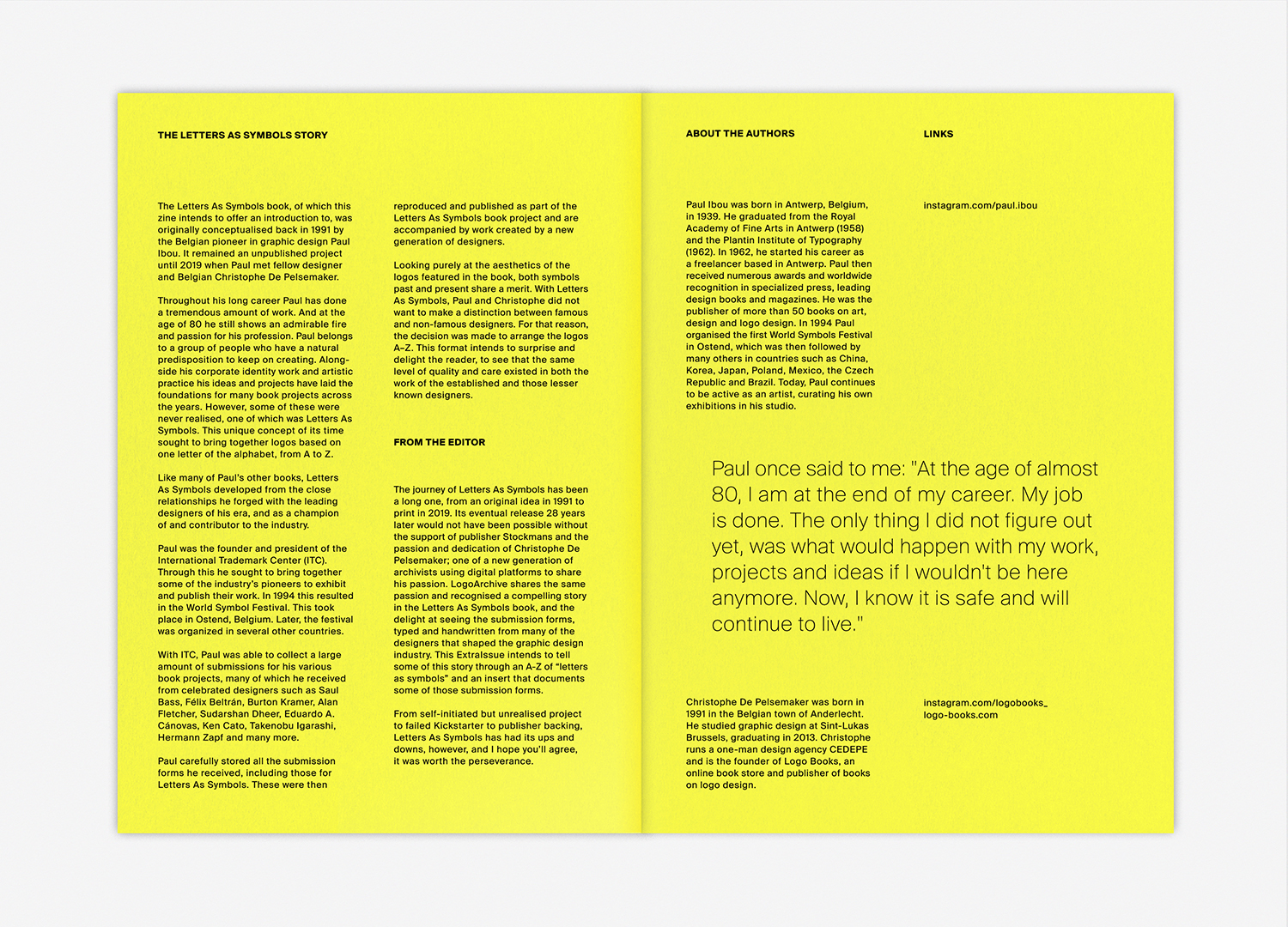
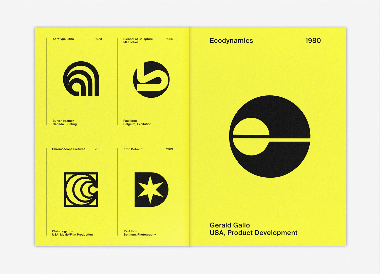
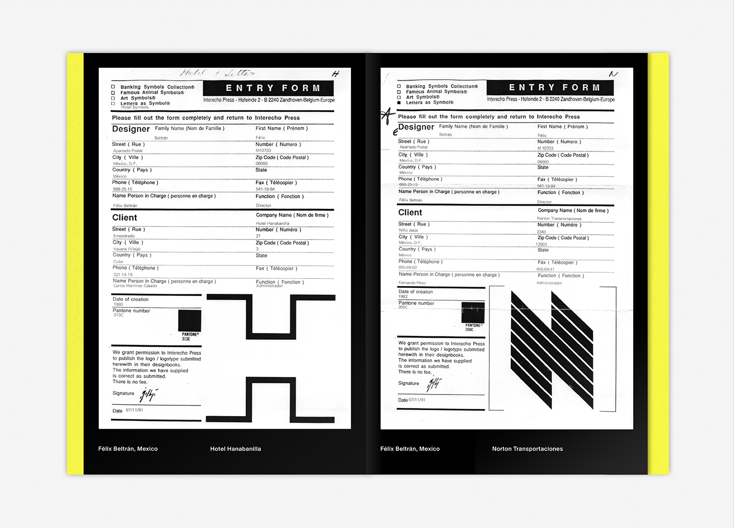
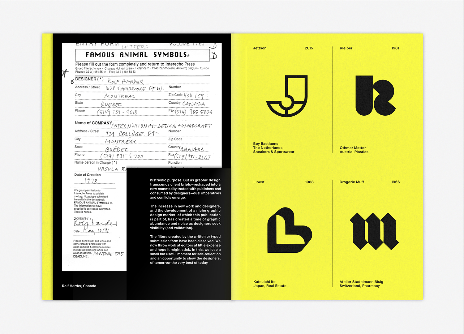
The distinctive smaller format offers ample license to experiment and collaborate with other like-minded resources. Christophe De Pelsemaker’s Logo Books, an online archive of pages from out-of-print publications dedicated to trademarks, is one such resource. Christophe’s own book, Letters As Symbols, a collaborative endeavour with renowned Belgian designer Paul Ibou, sought to bring to life and uniquely document symbols solely based on the letters of the alphabet. It has an compelling story and an interesting journey to publication which began in 1991. This LogoArchive ExtraIssue offers readers a sample of Letters As Symbols and tells its story through selected logos and archival documents.
Order LogoArchive zines here.
And subscribe to Logo Histories here.
LogoArchive explores the potential of the zine to be reconfigured regularly, yet retain its agency and develop a story. Further, it explores the potential of the low-cost zine format to function as a sample of a more expensive book, and interrogates the nature of cultural transmission and the capitalist programme. It questions the productisation and premiumisation of things with a wider cultural significance, and the restrictions and filters these create. Can the zine be used as a format in which to give an foundational insight to more people, in conjunction with more expensive publications?

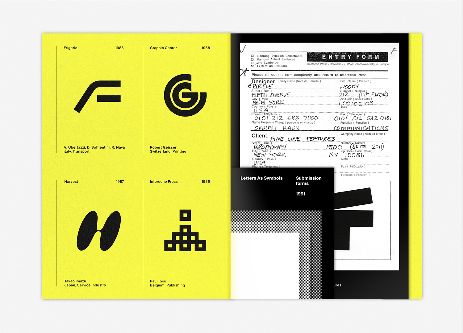
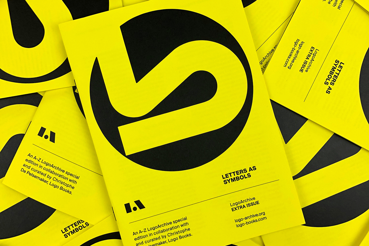
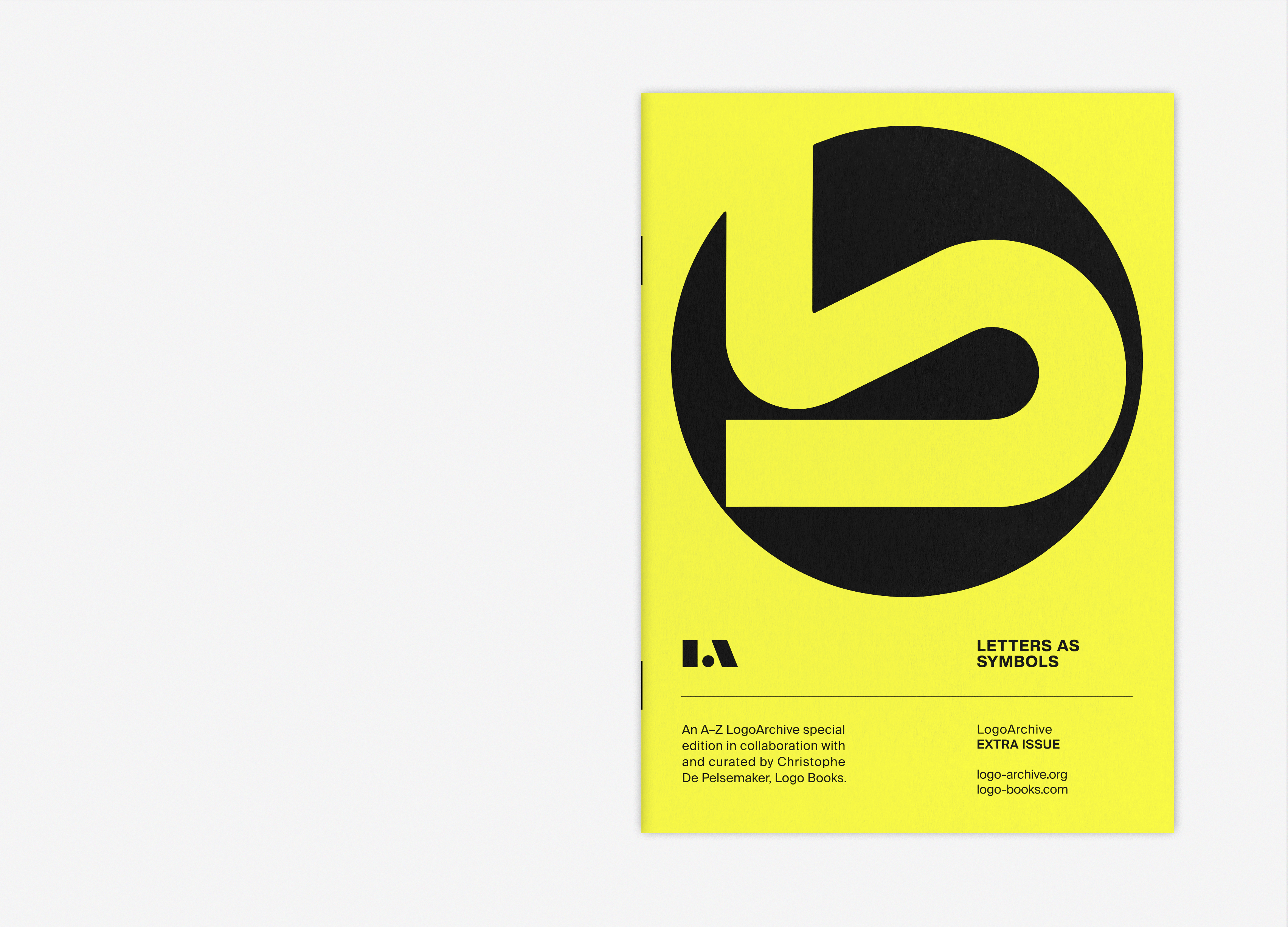
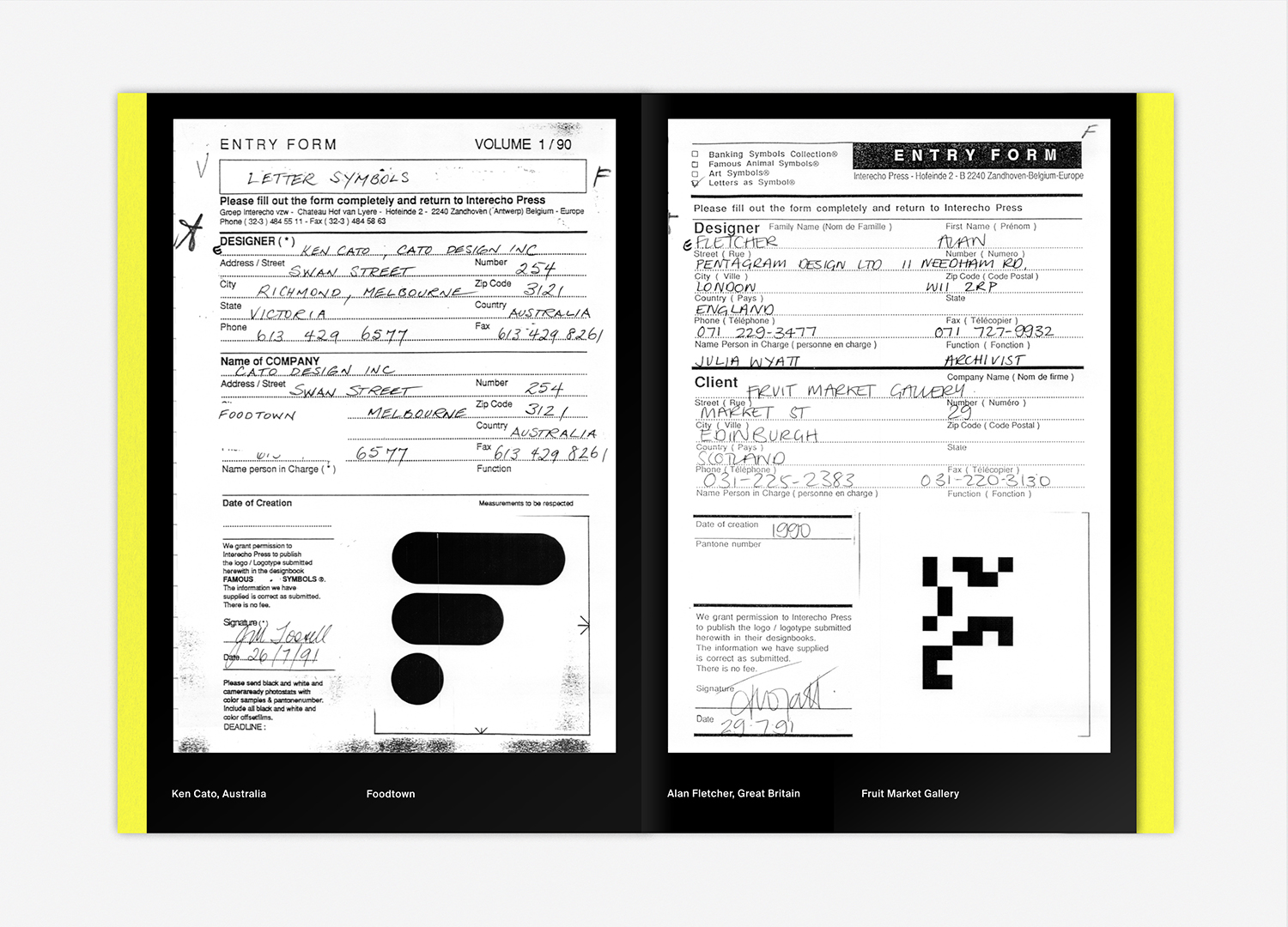
The iconic booklet of LogoArchive is reimagined as a bright yellow folder in which to hold examples of the original Letters As Symbols submission forms received in 1991 from designers such as Félix Beltrán, Woody Pirtle and Rolf Harder. These provide a contextual richness. Small details include the repurposing of the “Famous Animal Logos” form by Rolf Harder for his submission to Letters As Symbols, the provocation to discover the colour values provided by Félix Beltrán and the idiosyncrasies of each designer’s handwriting. These are printed on a glossy stock, standing out from the uncoated surface of the LogoArchive booklet. These are collated by a quarter size sheet that, in its graphic language, alludes to the material nature of the submission forms of the past, now replaced by the online form. This transition from print to digital, and its implications, are then considered in a short text at the back of the insert.![]()
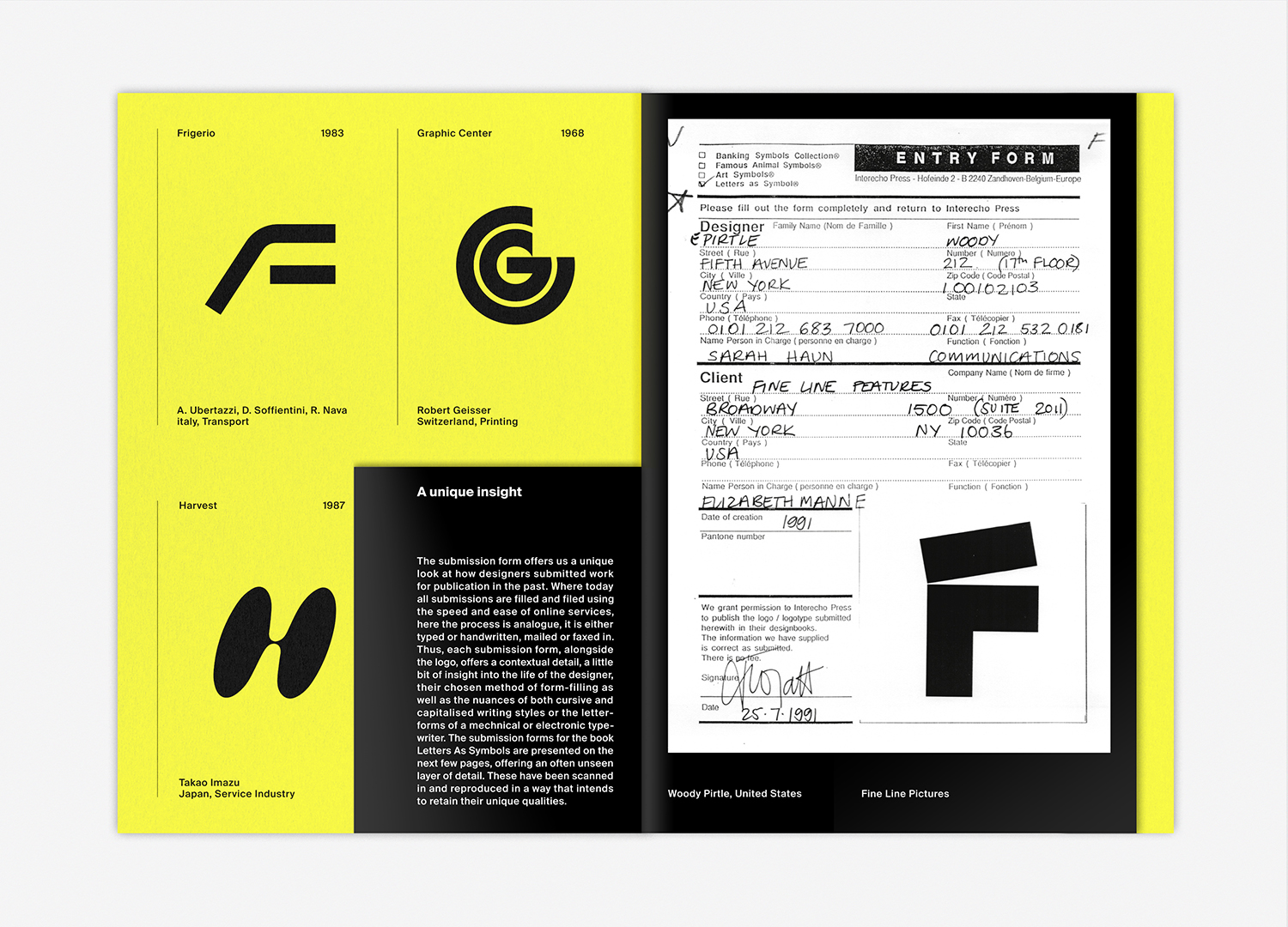
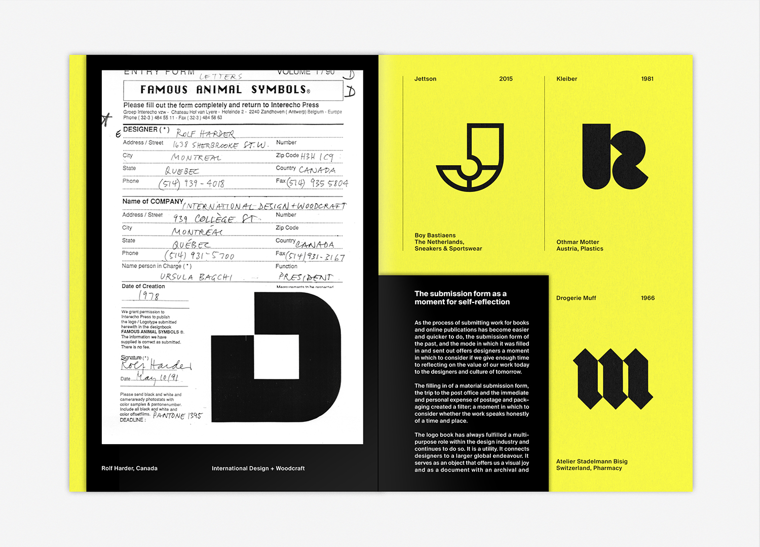
LogoArchive uses the appeal of mid-century symbols to migrate texts on visual culture. These are often short pieces; never complete proposals or those that seek the dogmatic, but intend to provoke thought. Here, the paper submission forms of the past provide a counterpoint to the speed and ease at which designers can now send work to publishers, and questions whether the absence of a filter (filling in and sending out a material form and the expense of postage), and the subsequent increase in the volume of work being sent drowns can out that that may have more value to the designers of tomorrow. Put differently, if we had to fill out a form, if there was an expense in time and postage, would we be more considerate of what we might send in for publication (and archival) for the the future. As a zine of mid-century symbols the notions of cultural transmission and legacy are central themes.![]()
Designer / Editor: Richard Baird, Curated by: Christophe De Pelsemaker, Publisher: BP&O, Size: 148x210mm. Specifications: Booklet: Pages: 10pp + Cover, Finish: Black (x2), Paper: Colorplan Factory Yellow 135gsm. Insert: Pages: 12pp, Finish: Black (x2)
Paper: Fedrigoni Freelife Gloss 115gsm, Recycled Content: 25%. Binding: Black Staples, Print: WithPrint.
Discover more about logo design at LogoArchive’s Logo Histories.