LogoArchive Issue 7
Opinion by Richard Baird Posted 6 July 2020
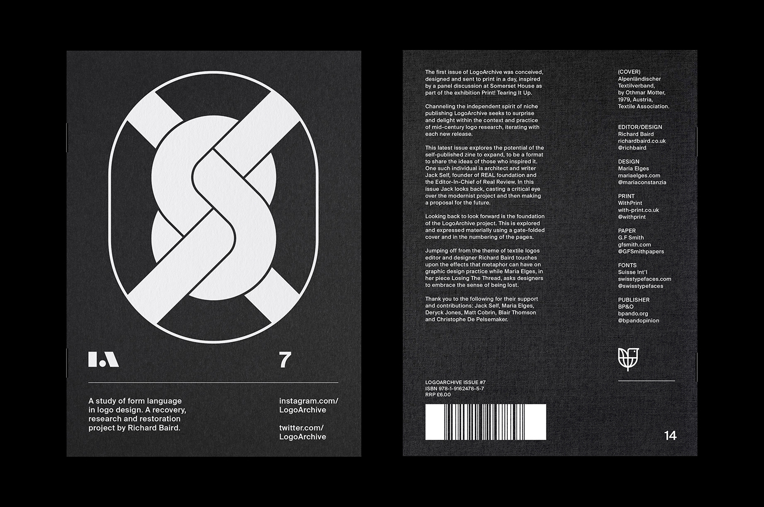
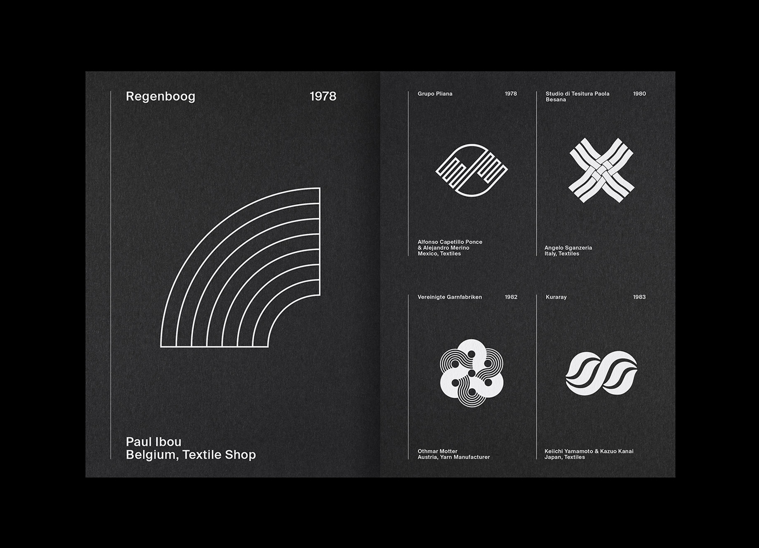
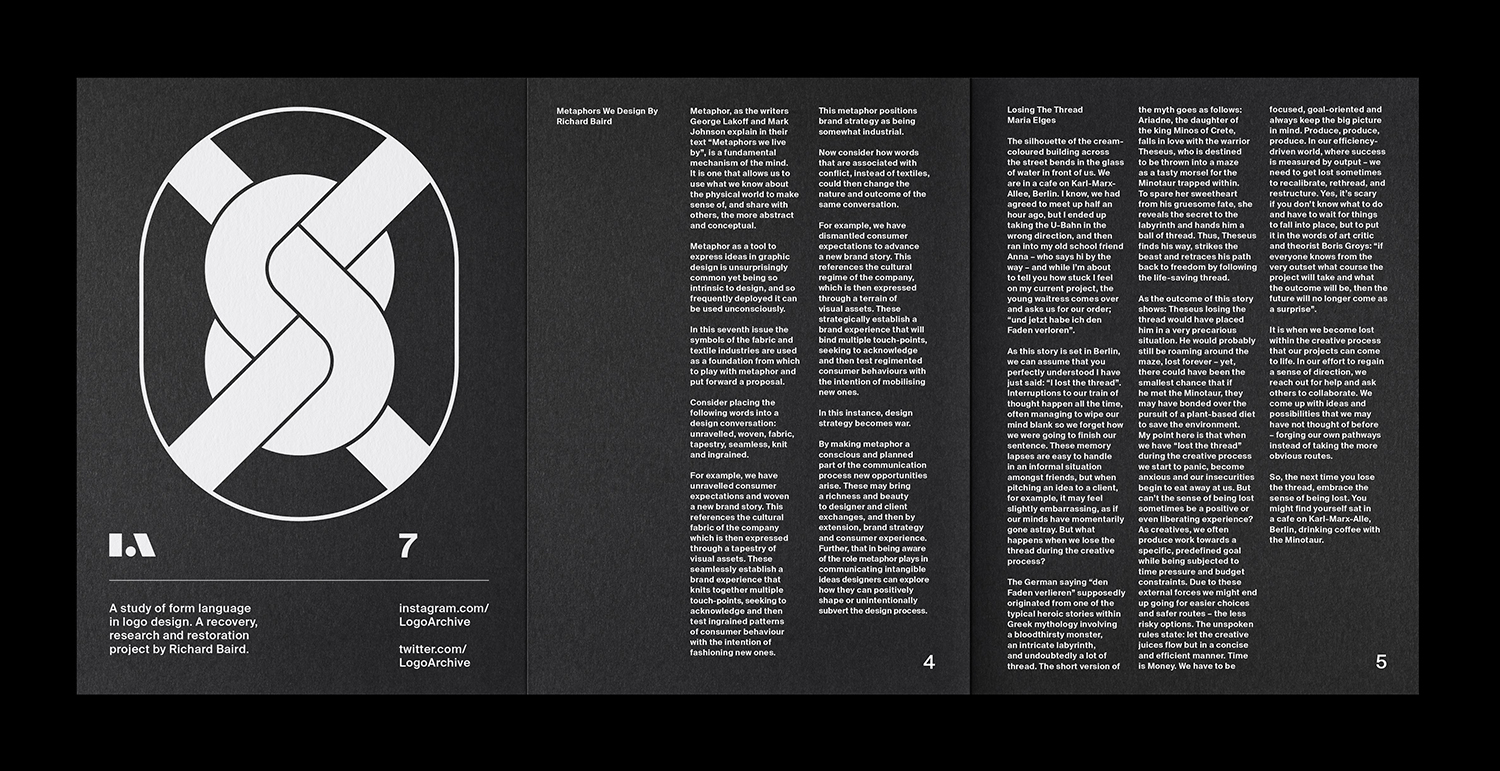
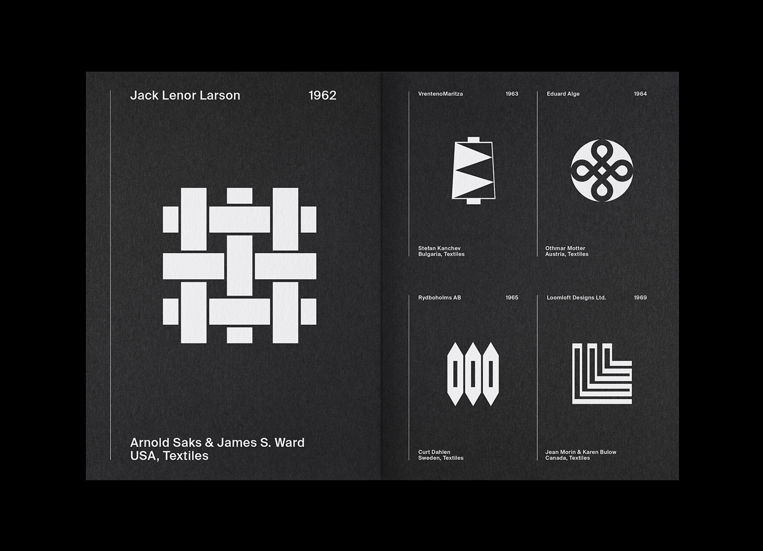
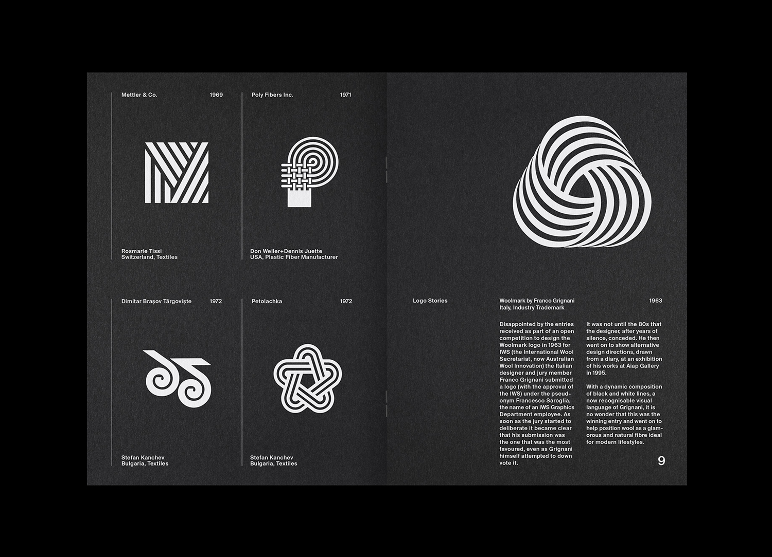
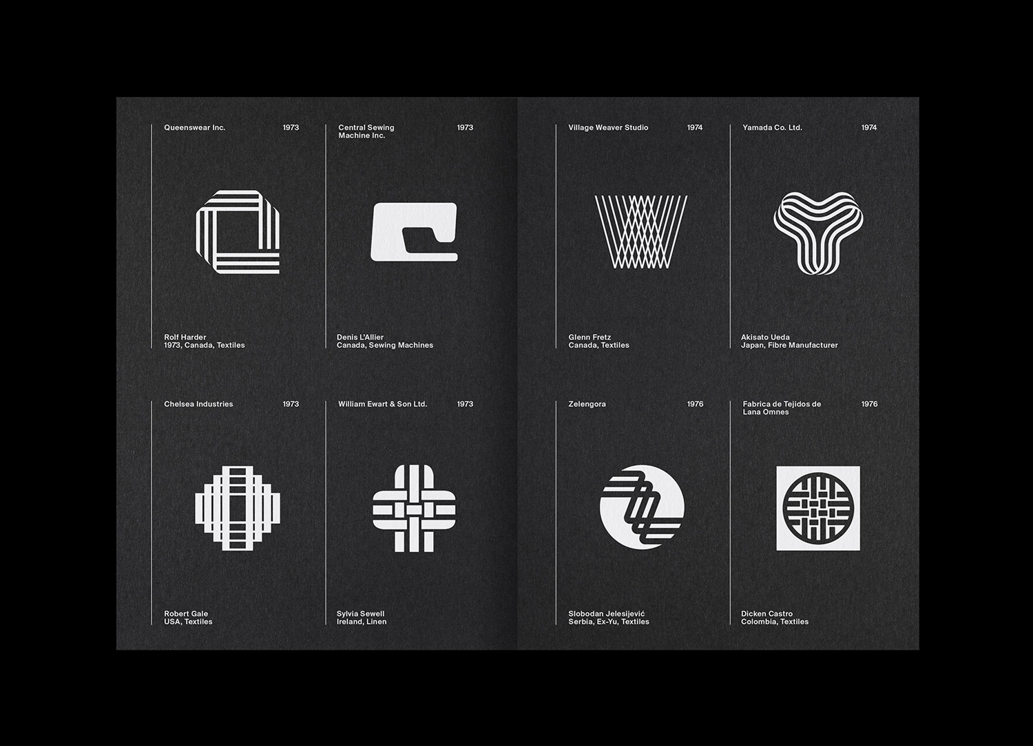
LogoArchive Issue 1 was conceived, designed and sent to print in a day. It was inspired by a panel discussion at Somerset House as part of the exhibition Print! Now on to its seventh numbered release (and the tenth in the series), LogoArchive continues to reconfigure itself with each new issue with the intention of surprising and delighting. This issue celebrates the symbols of the textiles industry and features texts by Jack Self, Editor-in-chief of Real Review, Maria Elges of Midge Press and Richard Baird, BP&O.![]() As with each previous release, this is issue is marked by its own materiality with a gate-folded cover and a silkweave emboss that evokes the surfaces of textiles.
As with each previous release, this is issue is marked by its own materiality with a gate-folded cover and a silkweave emboss that evokes the surfaces of textiles.
Order LogoArchive zines here.
And subscribe to Logo Histories here.
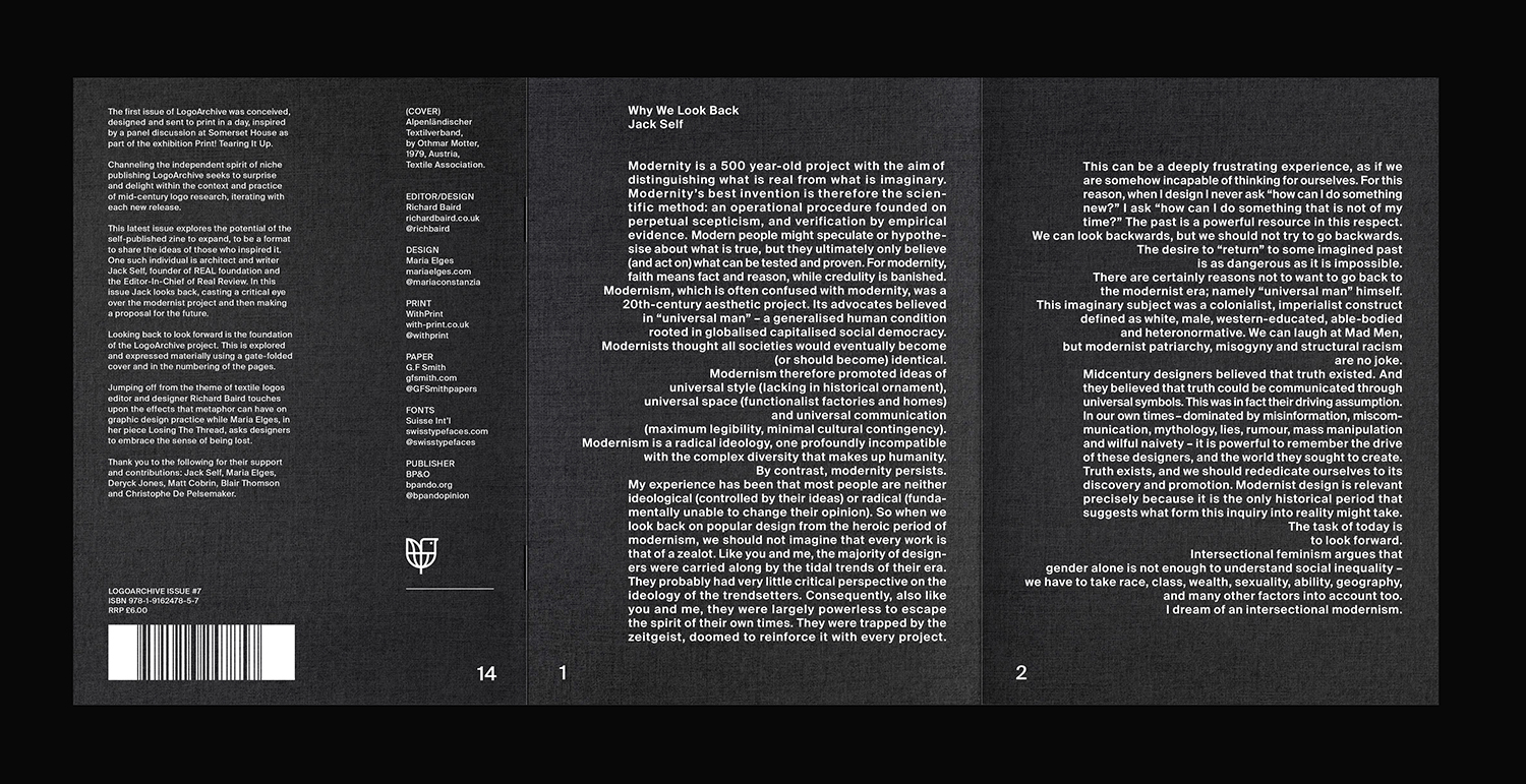
This latest issue explores the potential of the self-published zine to expand, to be a format to share the ideas of those who inspired it. One such individual is architect and writer Jack Self, founder of REAL foundation and the Editor-In-Chief of Real Review. In this issue Jack looks back, casting a critical eye over the modernist project and then making a proposal for the future. Looking back to look forward is the foundation of the LogoArchive project. This is explored and expressed materially in Issue 7 using a gate-folded cover and in the numbering of the pages. Readers have to flick back to move forward through the zine.
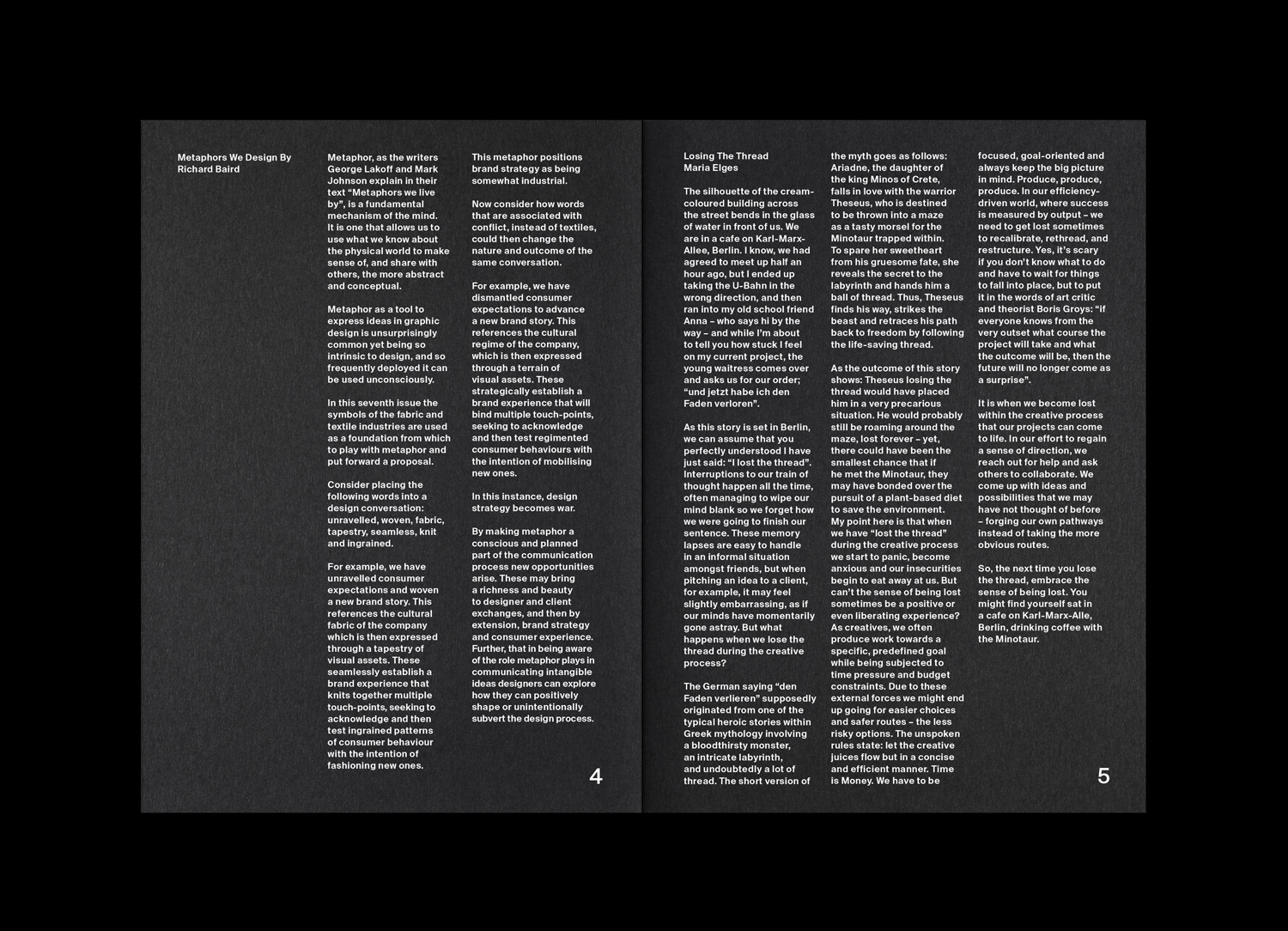
Jumping off from the theme of textile logos editor and designer Richard Baird, BP&O & LogoArchive, touches upon the effects that metaphor can have on graphic design practice in his piece “Metaphors We Design By” while Maria Elges, in her piece “Losing The Thread”, asks designers to embrace the sense of being lost. Thank you to the following for their support and contributions: Jack Self, Maria Elges, Deryck Jones, Matt Cobrin, Blair Thomson and Christophe De Pelsemaker.
Specifications: 14pp Booklet, Gate-folded Cover, Colorplan Ebony 135gsm, Single-side Silkweave Emboss, HP Indigo White (5x), Black Staples.
Elliott Moody kindly asked the following questions for a piece on his site The Brand Identity. You can view that post here. These answers intend to augment Issue 7, where the total project is understood across multiple platforms; the blog, the social media account and in print.
EM–What drew you to Jack’s writing for this issue in particular?
RB–The Real Review, of which Jack Self is Editor-in-chief, has been instrumental in reshaping the way I write about design. Its materiality and content seemed to perfectly synergise, thanks to a collaboration with design studio OK-RM. It manifested, with great ease, its central enquiry “What does it mean to live today” through an exquisite corpse of type and image facilitated by a vertical fold. It also changed the way I understood the potential of the review to say something more than what was apparent on the surface, and drawing me towards the notion of a “total project”, that is to say, designer as author, designer as producer, publisher and distributer.
LogoArchive is not just logos, but an active surface for enquiry. It is a self-initiated, post-University pedagogical project to see what design writing could be. The introduction of other writers, voices and styles is a natural evolution of that. Having met Jack, I was fascinated by the way he articulated his ideas. There was a precision, an intentionality and elegance to his proposals. I had published an interview with him in LogoArchive Issue 4 but wanted to take that a further with a commissioned piece. This is one of the joys of publishing, you get to take a voice from the field of architecture and share it with graphic designers, there’s a always an applicability at its core. LogoArchive as a zine always intended to use the joy and allure of mid-century logos as a vehicle to migrate ideas, and Jack’s ideas and way of expressing these were interesting to me. When I find something that is insightful and beautifully put, I have a strong inner-will to share it.
EM–What is the relationship between the editorial and the logos on show, if any?
RB–My article “Metaphors We Design By” puts fourth a proposal. That metaphor can be a tool to positively shape or inadvertently subvert outcome, and thus, designers should consider making metaphor a more intentioned part of design practice. I use juxtaposing metaphors–those related to the textiles industry and of conflict–as a mode in which to express this proposal. Maria’s text uses the idiom of “losing the thread” to urge designers to get lost in the creative process as this can lead to unexpected ideas. These two articles have obvious textile-related foundations, however, Jack’s piece relates more broadly to the LogoArchive project, that of look backing. In his piece “Why We Look Back” he casts a critical eye over the Modernistic project, of which many of this issue’s logos find their origins. As this does not relate directly to the theme, collaborator and designer Maria Elges, who also wrote “Losing The Thread”, came up with the idea of typesetting this like frayed fabric. It was such a beautiful gesture for three reasons. Firstly, it has an abstract reading, that of the modernist project being unravelled, particularly the rather dated notion of the “universal man”. Secondly, the shortness of some lines serve to emphasise key words or statements, so this unusual typesetting creates multiple hierarchies with one type size. And finally, it provides something of a visual delight that works as an image online, and hopefully, delivers an aha moment within the context of textiles. I introduced the material element of a single-sided silkweave surface emboss to augment the typesetting, as though the paper was a single sheet of fabric exiting a loom.![]()
Discover more about logo design at LogoArchive’s Logo Histories.
