LogoArchive Issue 8
Opinion by Richard Baird Posted 21 October 2020
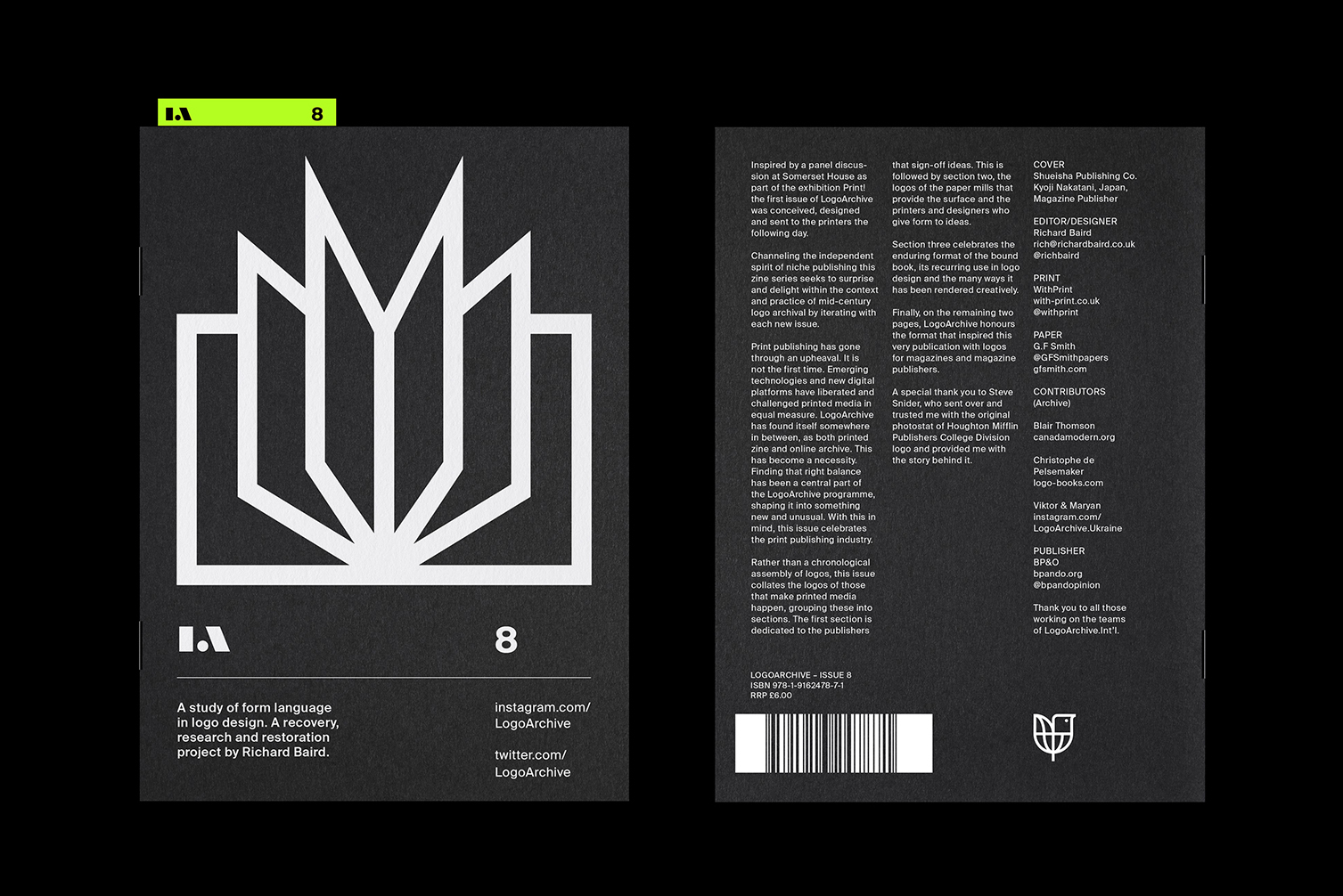
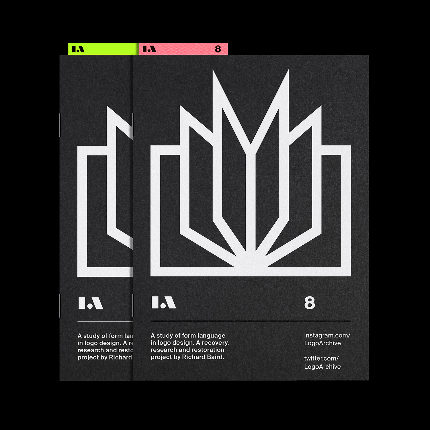
Inspired by a panel discussion that took place at London’s Somerset House in 2018 as part of the exhibition Print! the first issue of LogoArchive was conceived, designed and sent to print the following day. Channeling the independent spirit of niche publishing the LogoArchive zine series seeks to surprise and delight within the context and practice of mid-century logo archival by iterating with each new issue.
Print publishing has gone through an upheaval. And it is not the first time. Emerging technologies and new digital platforms have liberated and challenged printed media in equal measure. LogoArchive has found itself somewhere in between, as both printed zine and online archive. This has become a necessity. Finding that right balance has been a central part of the LogoArchive programme, shaping it into something new and unusual. With this in mind, this issue celebrates the print publishing industry as it evolves to face these new challenges.
Order LogoArchive zines here.
And subscribe to Logo Histories here.
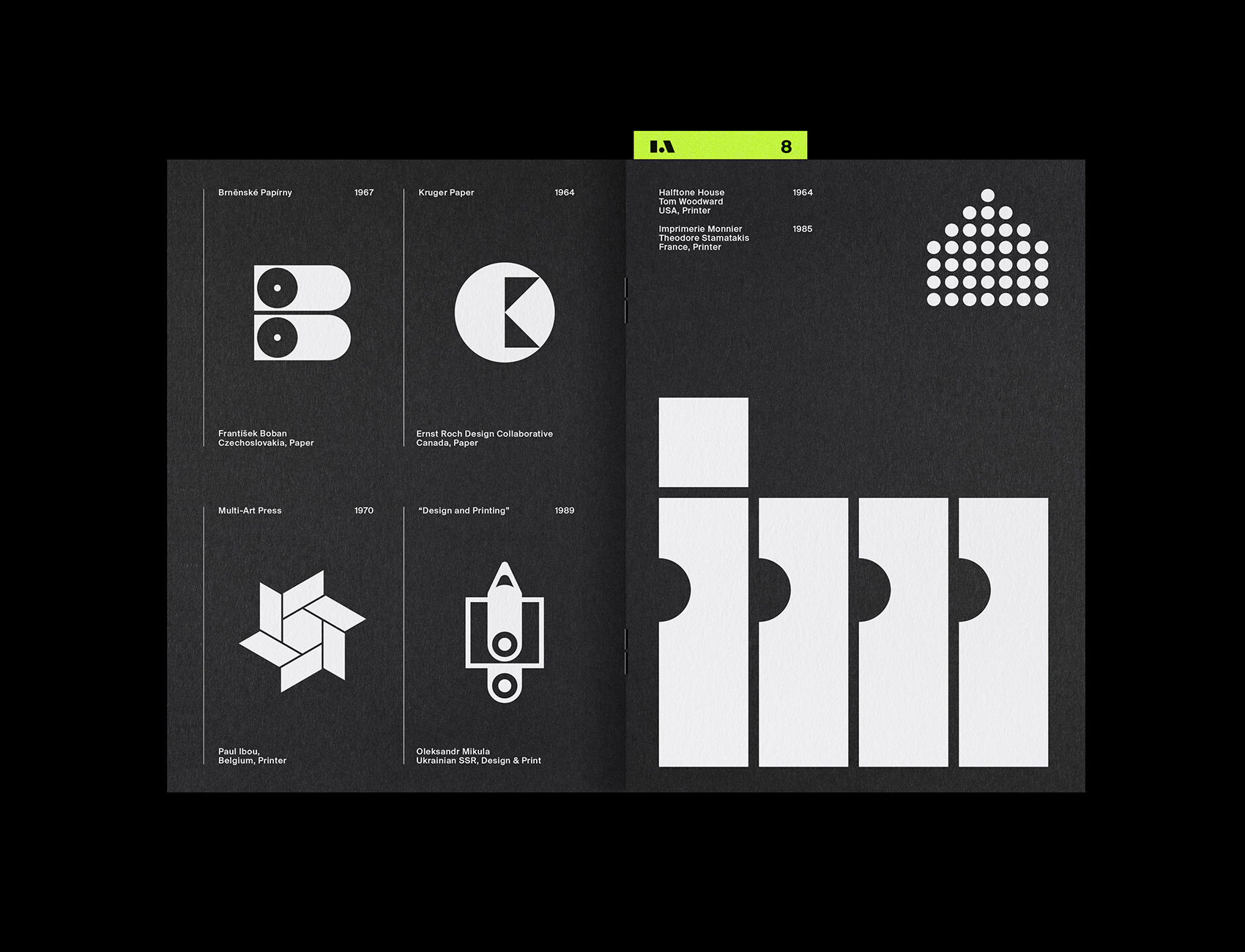
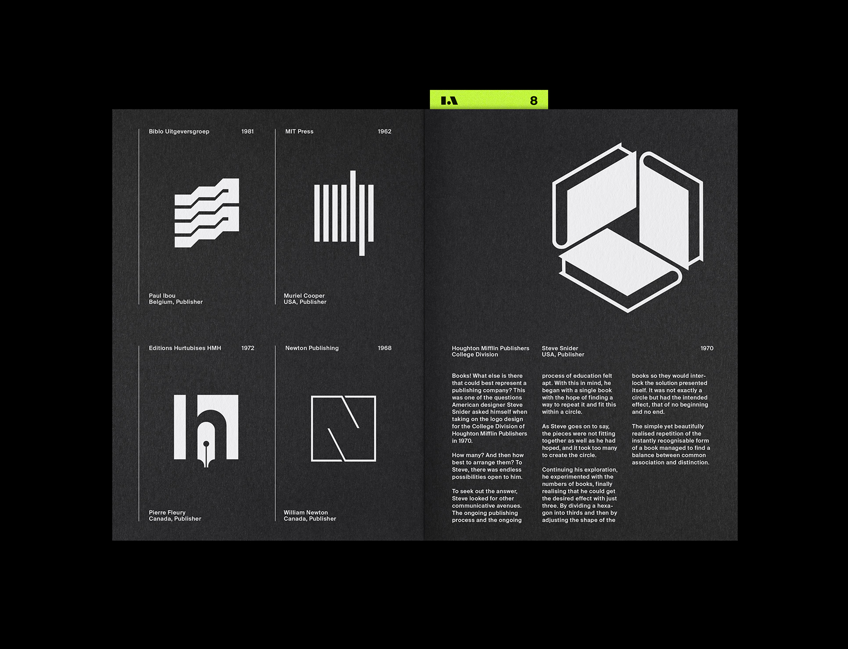
Rather than a chronological assembly of logos, this issue collates the logos of those that make printed media happen, grouping these into sections. The first section is dedicated to the publishers that sign-off ideas. This is followed by section two, the logos of the paper mills that provide the surface and the printers and designers who give form to ideas. Section three celebrates the enduring format of the bound book, its recurring use in logo design and the many ways it has been rendered creatively. Finally, on the remaining two pages, LogoArchive honours the format that inspired this very publication with logos for magazines and magazine publishers. A special thank you to Steve Snider, who sent over and trusted me with the original photostat of Houghton Mifflin Publishers College Division logo and provided me with the story behind it.![]()
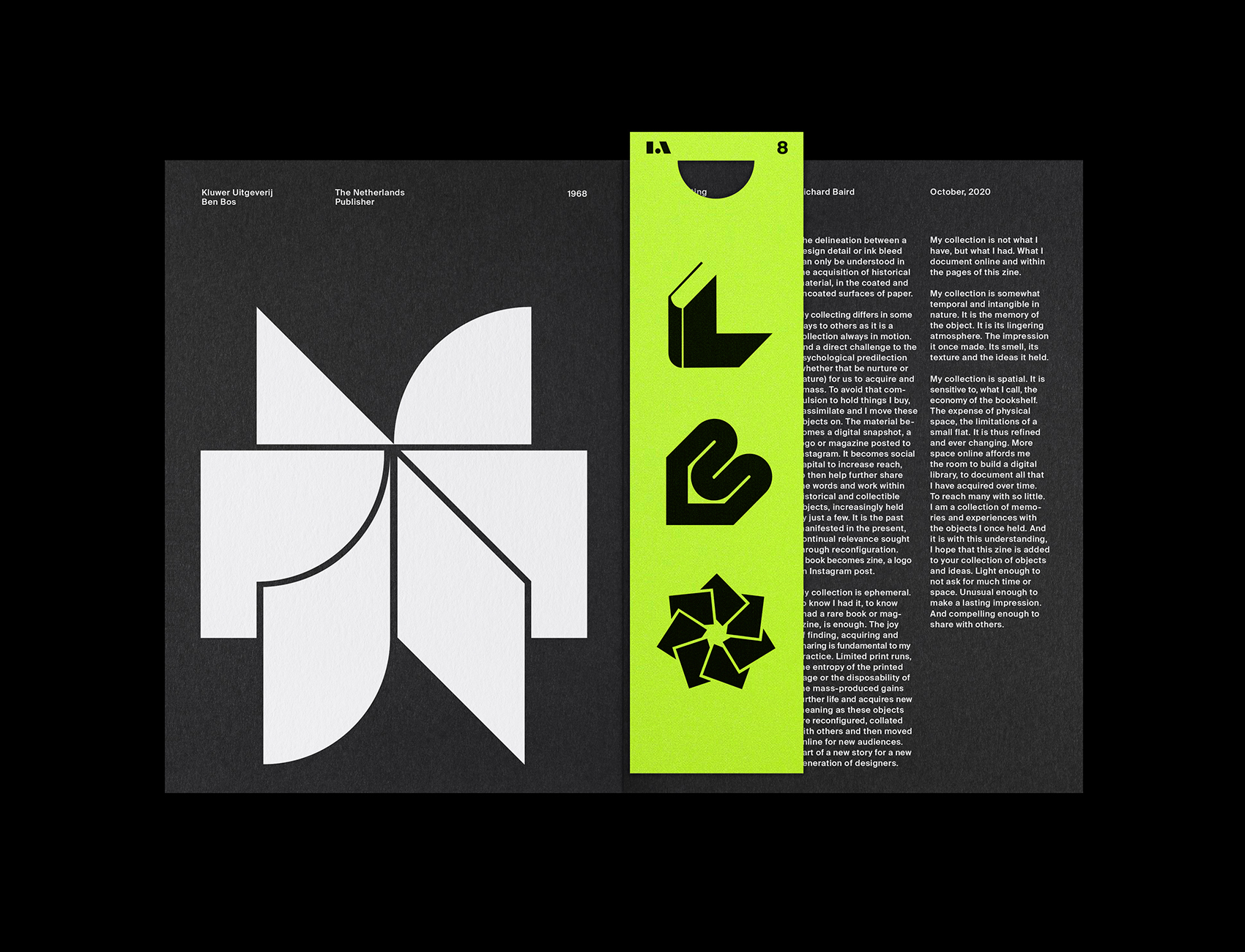
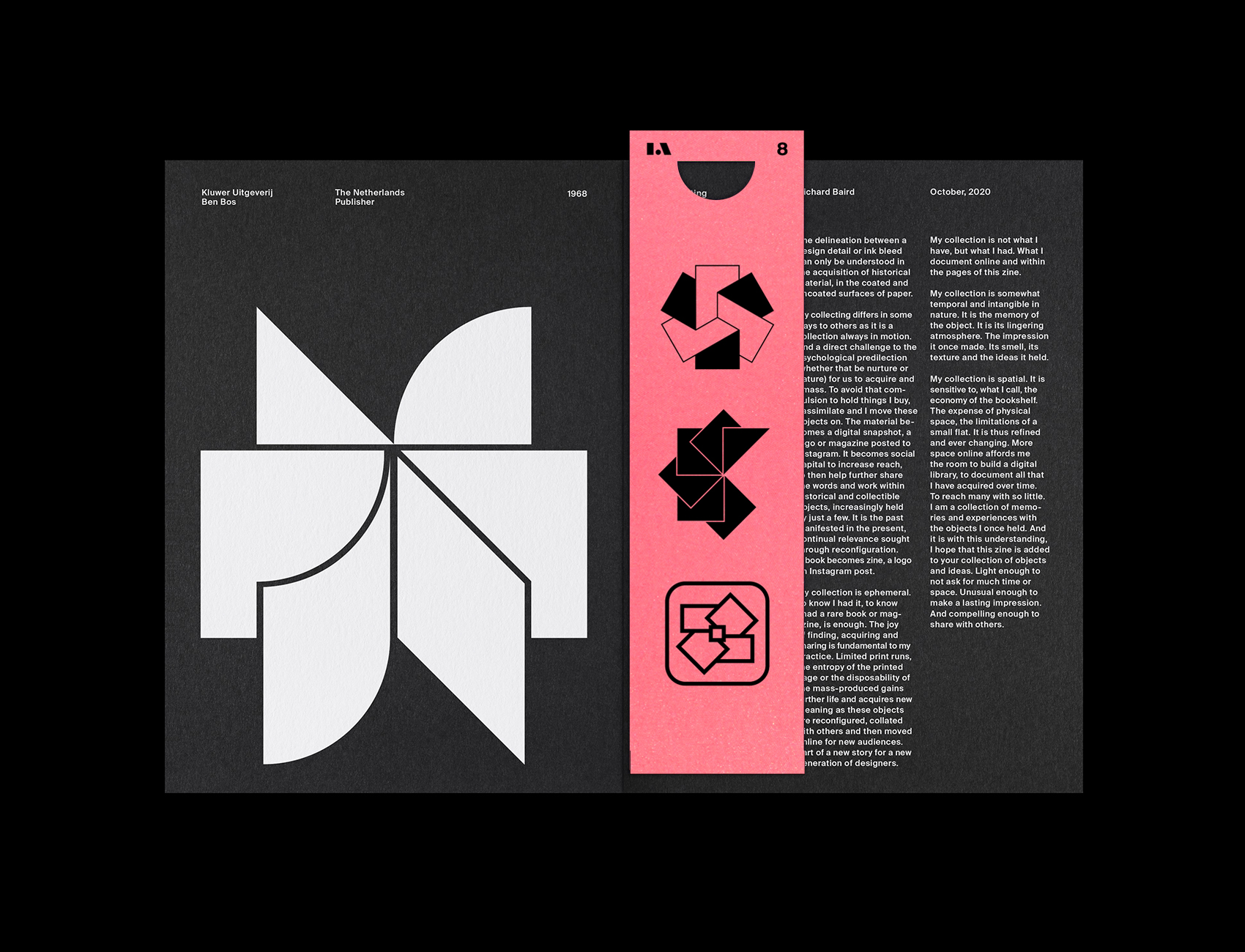
When designing the LogoArchive zines, as part of an enquiry into cultural transmission and continual relevance through new format, I am usually thinking 20 years ahead. How might someone react to these if they found one of zines at the bottom of a box? Would they want to seek out the other issues? Previously, I have bound a second element in, alongside the archival portion, often an insert with related texts and thoughts on design, however, with this issue, having had a few old design magazines infuriatingly missing parts, I thought it might be interesting to play with the notion of value attributed to “incomplete” and “complete” items in collecting. The potential of finding a copy of Issue 8, but missing the bookmark was an intriguing thought! Thus, collecting becomes the secondary theme of this issue with a supporting text.
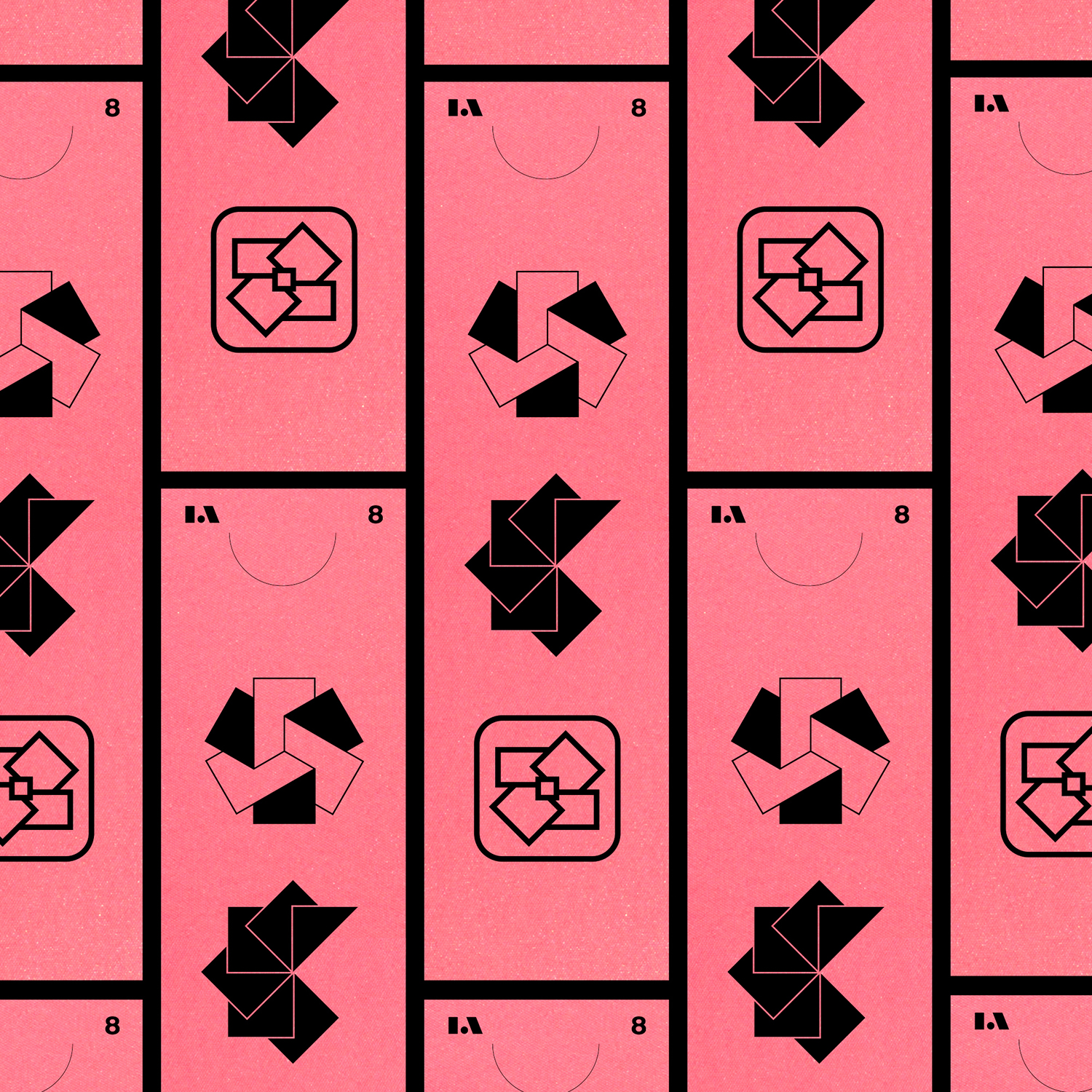
The bookmarks serve a further purpose, and reflect the tensions between material objects and photos of objects posted online. The bright colours of Gmund Action Pastel Heart Attack & Nuclear Acid serve to catch the eye, and draw people in. It is also a reflection the productisation of the design history, but tempered by a very practical purpose, to help readers highlight your favourite logos across the zines, and ties in with the theme of research (I usually use post-its) and, of course more directly, publishing.
This issue is printed by WithPrint on a HP Indigo, with five passes of white ink on G.F Smith’s Colorplan Ebony 135gsm, and bound with black staples. Each issue features one of two bookmarks, these are both diecut with black ink on either Gmund Action Pastel Heart Attack or Nuclear Acid, both 310gsm. To order a copy of this issue, and pick up the remaining back issues, please head over to LogoArchive.Shop.![]()
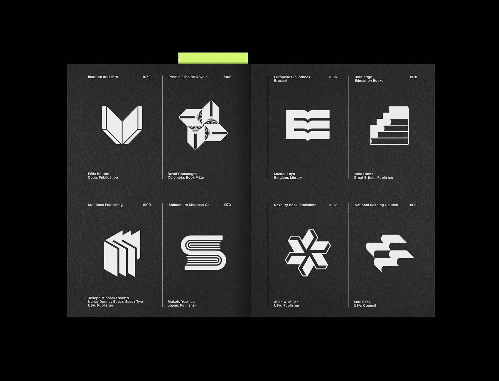
Print: WithPrint. Paper: G.F Smith. Specifications: 12pp Booklet, Colorplan Ebony 135gsm, HP Indigo White (5x), Black Staples. Bookmark: Gmund Action Pastel Heart Attack, Nuclear Acid, 310gsm, HP Indigo Black, Diecut. Discover more about logo design at LogoArchive’s Logo Histories.
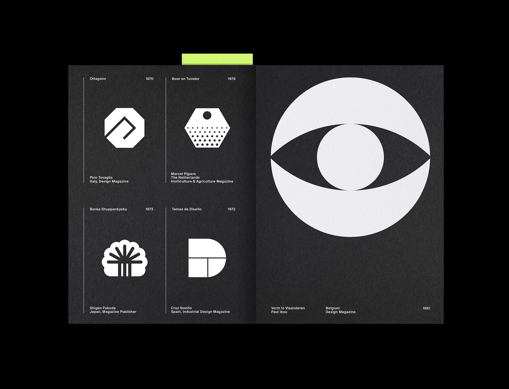
LogoArchive exists in a liminal space between digital experience and material object, as both an Instagram account and print zine. Working with Bryson Sellers in New York, we have made visible that liminal space with an Augmented Reality experience on the Aria Platform app. This continues LogoArchive’s exploration into the Digital/Material hybrid project and looks at different ways to engage young designers with historical work. The “logo book as zine” is one aspect of that and the AR potential of mobile devices, and the appealing nature of moving image is now part of that.
1. Install Aria Platform app
2. Launch
3. Point device camera at the zine
4. Watch it come to life
5. Record and share!
