Metamorphoses by A Practice For Everyday Life
Opinion by Richard Baird Posted 22 March 2022
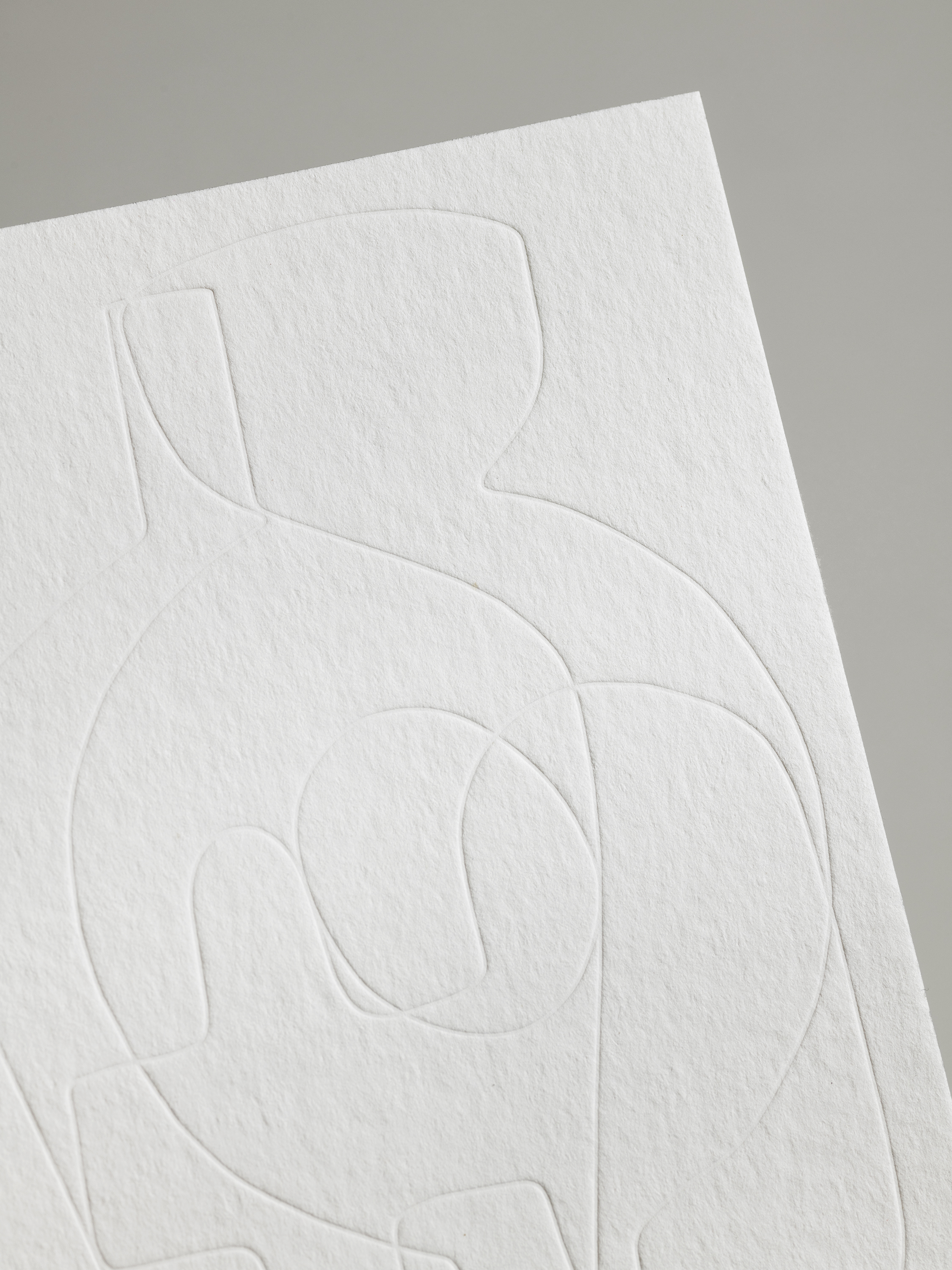
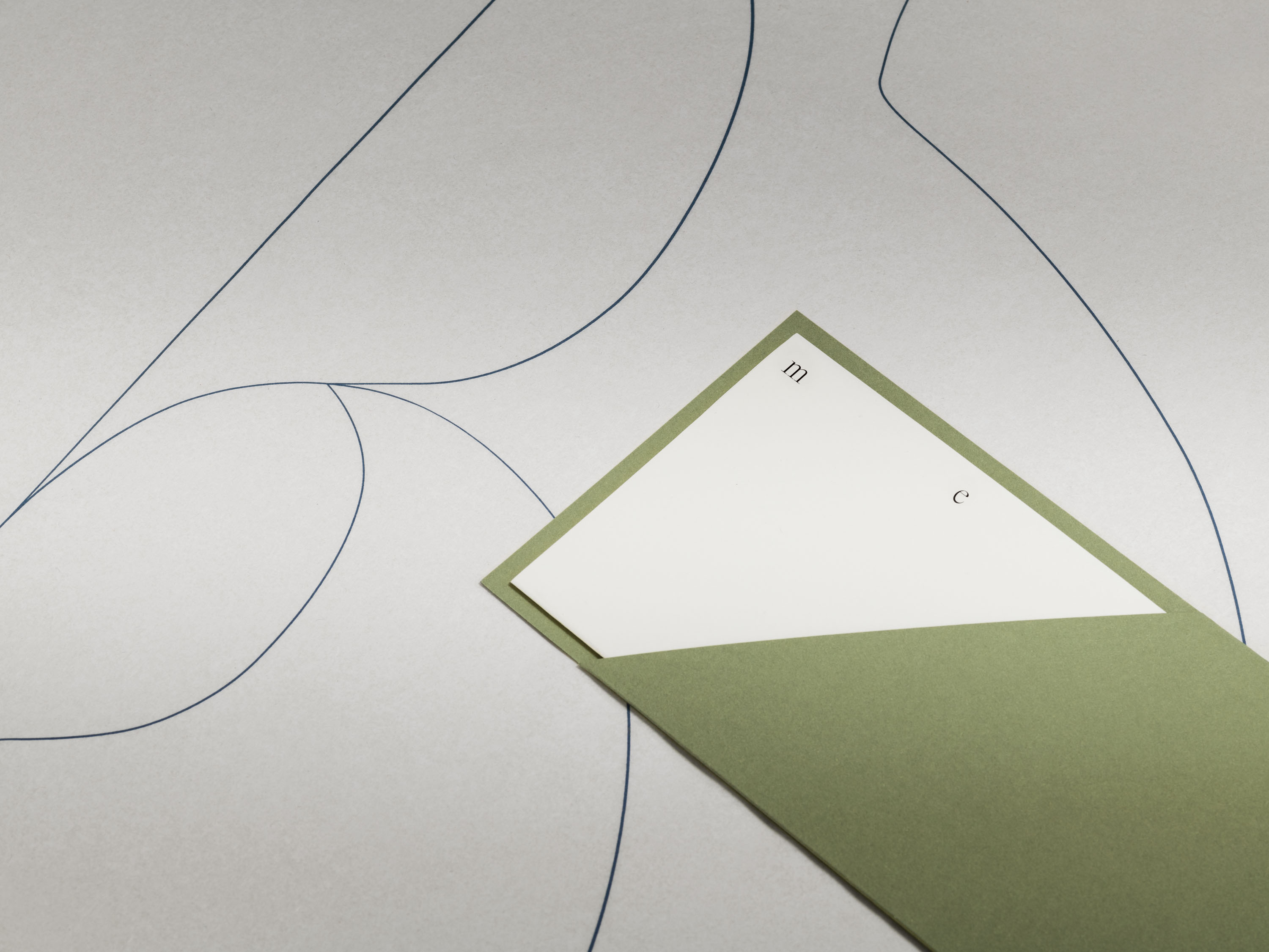
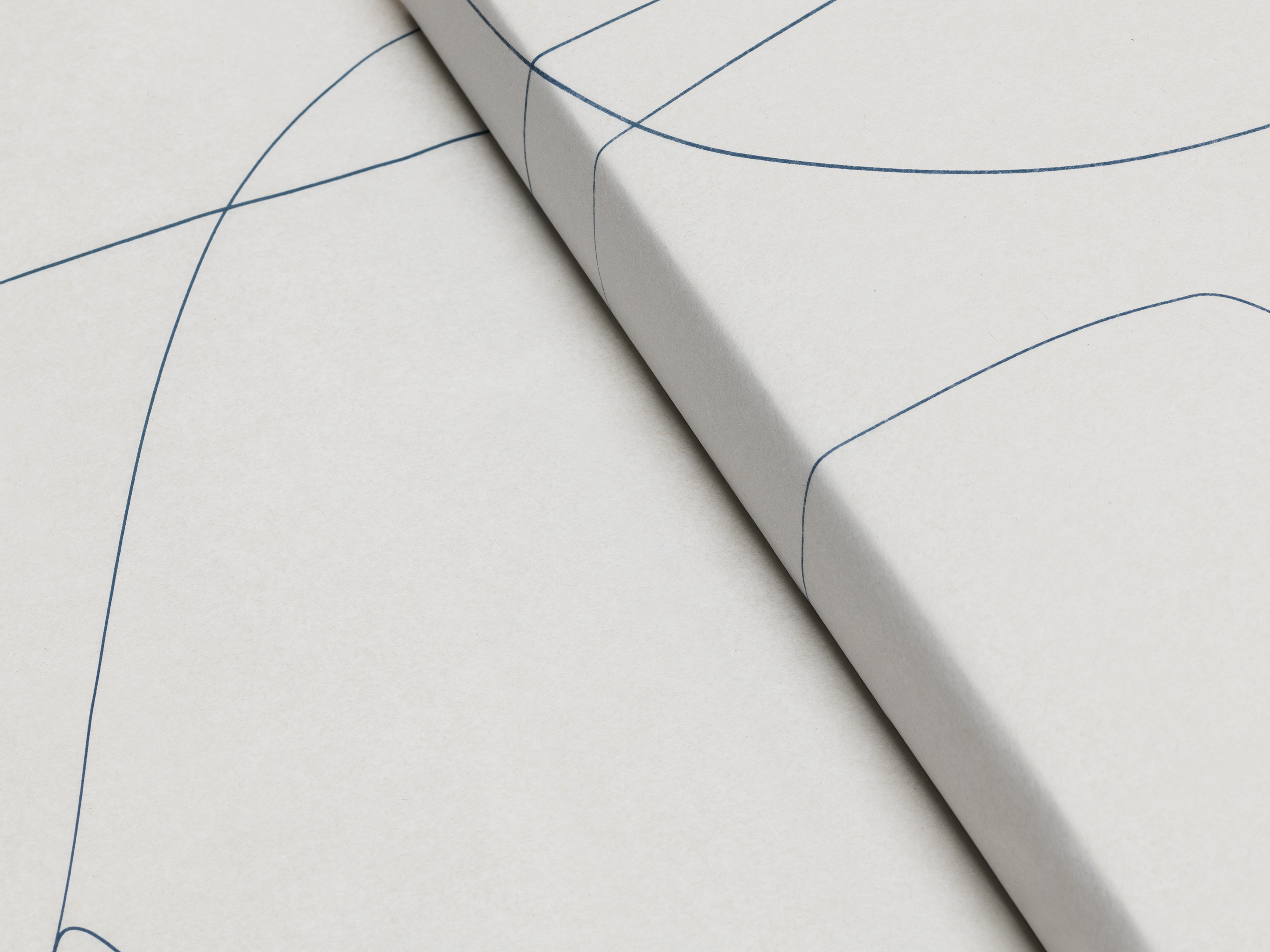
Metamorphoses is a contemporary art gallery that curates unique pieces by makers who turn one thing into another. It takes a special interest in works that are inspired by the past while displaying keen attention to present issues. These pieces, selected by the gallery, are often drawn from a body of work by artists who reflect on aspects of cultural heritage, mythological tales and collective memory. This approach to curation informed the design of the gallery’s visual identity, developed by A Practice for Everyday Life. This explores change and then, by extension, the layering of narratives; the story of one thing being folded into another.
‘Each featured artisan proffers a unique approach to the study of transformation, generating new visual languages for extant forms, materials, ideas and traditions. The trajectory of individual pieces – and of their maker’s own thinking – is further unpacked via in-depth conversations on the platform.’
In recent years transition has taken on a powerful new dimension, and it is difficult not to now write about new work without taking into account the global upheavals and changes that have taken place. For Metamorphoses, transition is not only explored through the works of the artists, but also through the spatial configurations in which they’re displayed. With public spaces subject to restrictions, digital contexts take on an urgency and new-found agency, becoming more than containers or frames for art. The interactive online experience is critical, telling the curatorial story through page and typographic layouts on screen, and using interactions and transitions to guide people through the site.
Virtual reality has sought to recreate physical environments (a white cube with pictures, explanatory texts mounted to the wall), however, perhaps where the web experience – for now – offers advantages, is a vernacular of image roll overs and scrolls. APFEL, in this case have created a nuanced digital narrative. Different shots of products are layered and activated on rollovers creating a dialogue. Some go from black-and-white to colour, others from detail to full object, and vice versa.
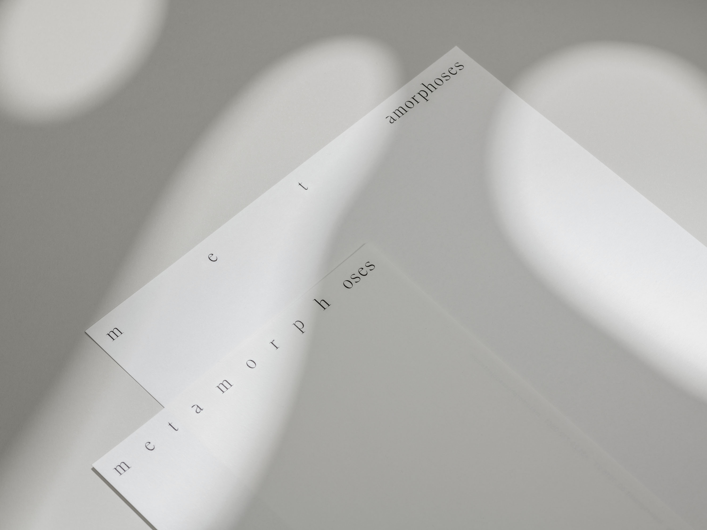
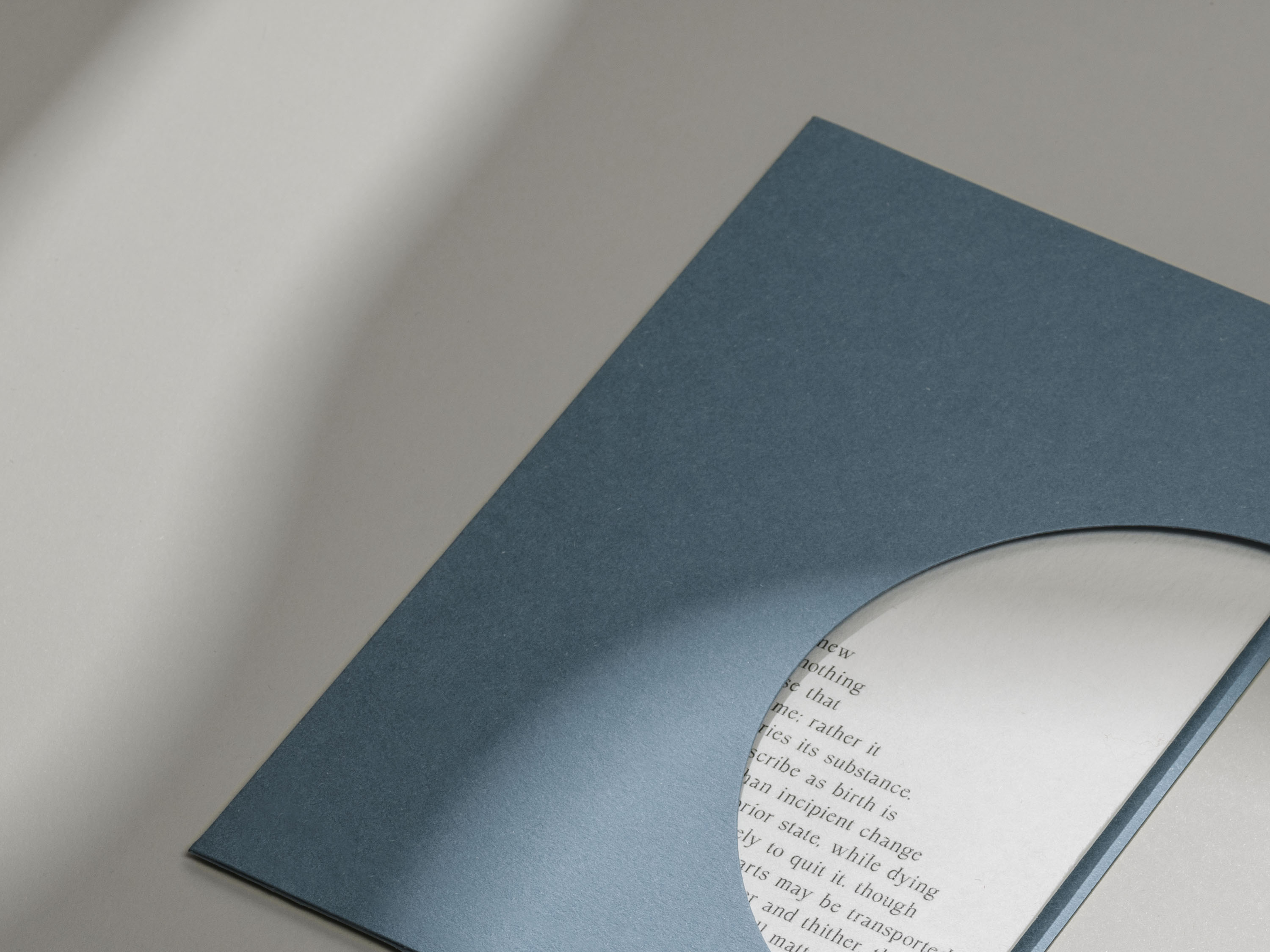
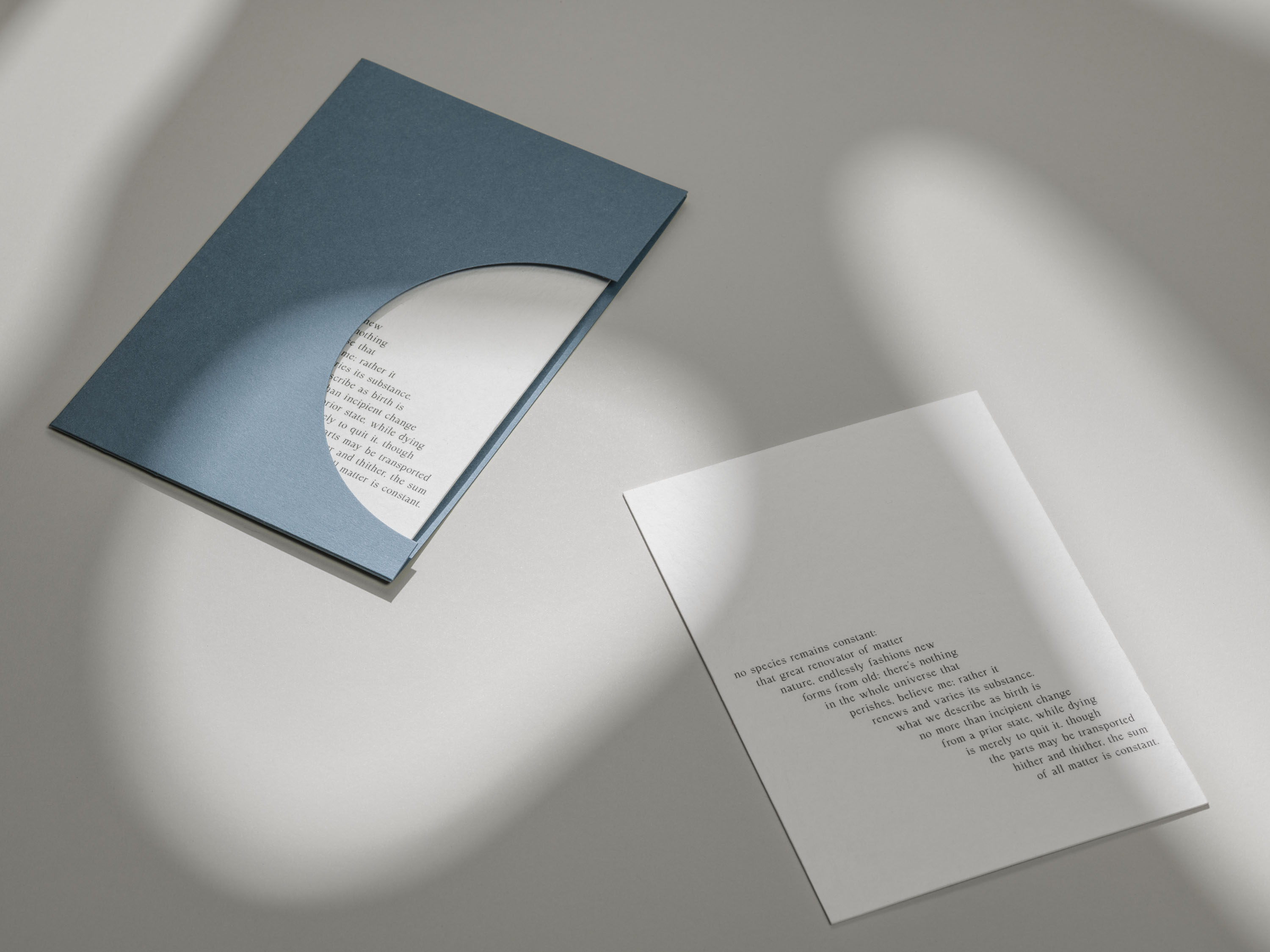
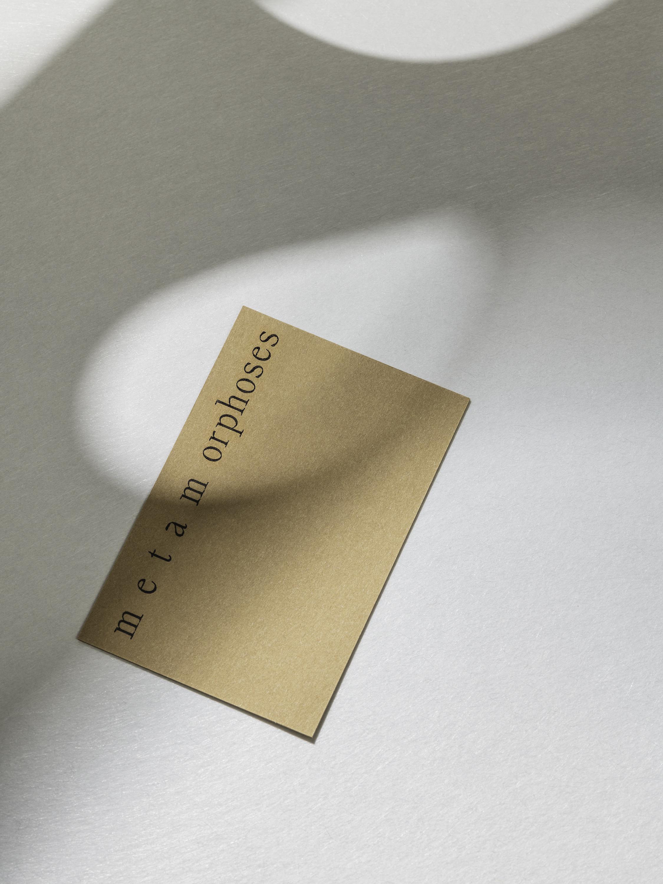
The graphic language of transition is elegantly articulated through a dynamic wordmark that extends and contracts depending on how it is situated on a page, a piece of paper or folder. Online this is in motion. Blocks of text offer a dynamic and transitory nature that calls to mind concrete poetry, becoming steps or curves and adding a visual language of form alongside words. Styrene B is a humble humanist sans-serif. BL Artic is, in contrast, a more formal and elegant calligraphic serif but with some contemporary transformations such as a flat bar of the lowercase double story ‘a’, square tittles and converging serifs on the ‘W’ and ‘w’. Again, a series of changes of state are layered in.
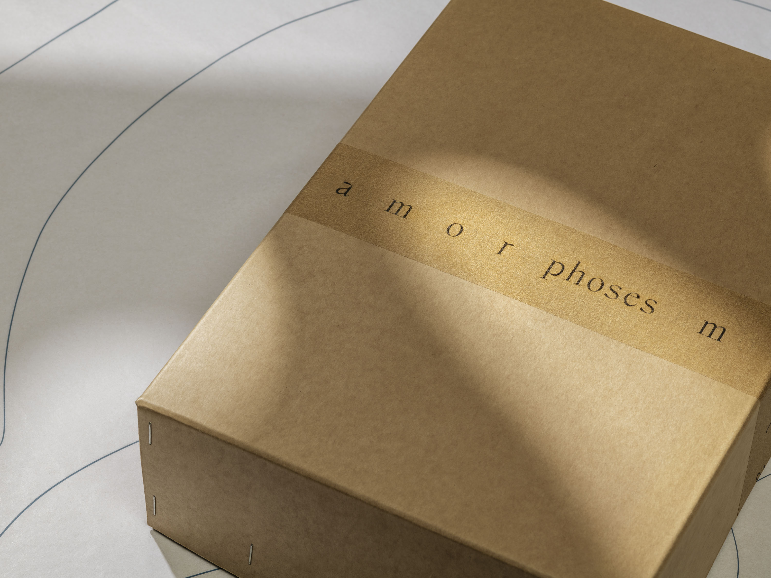
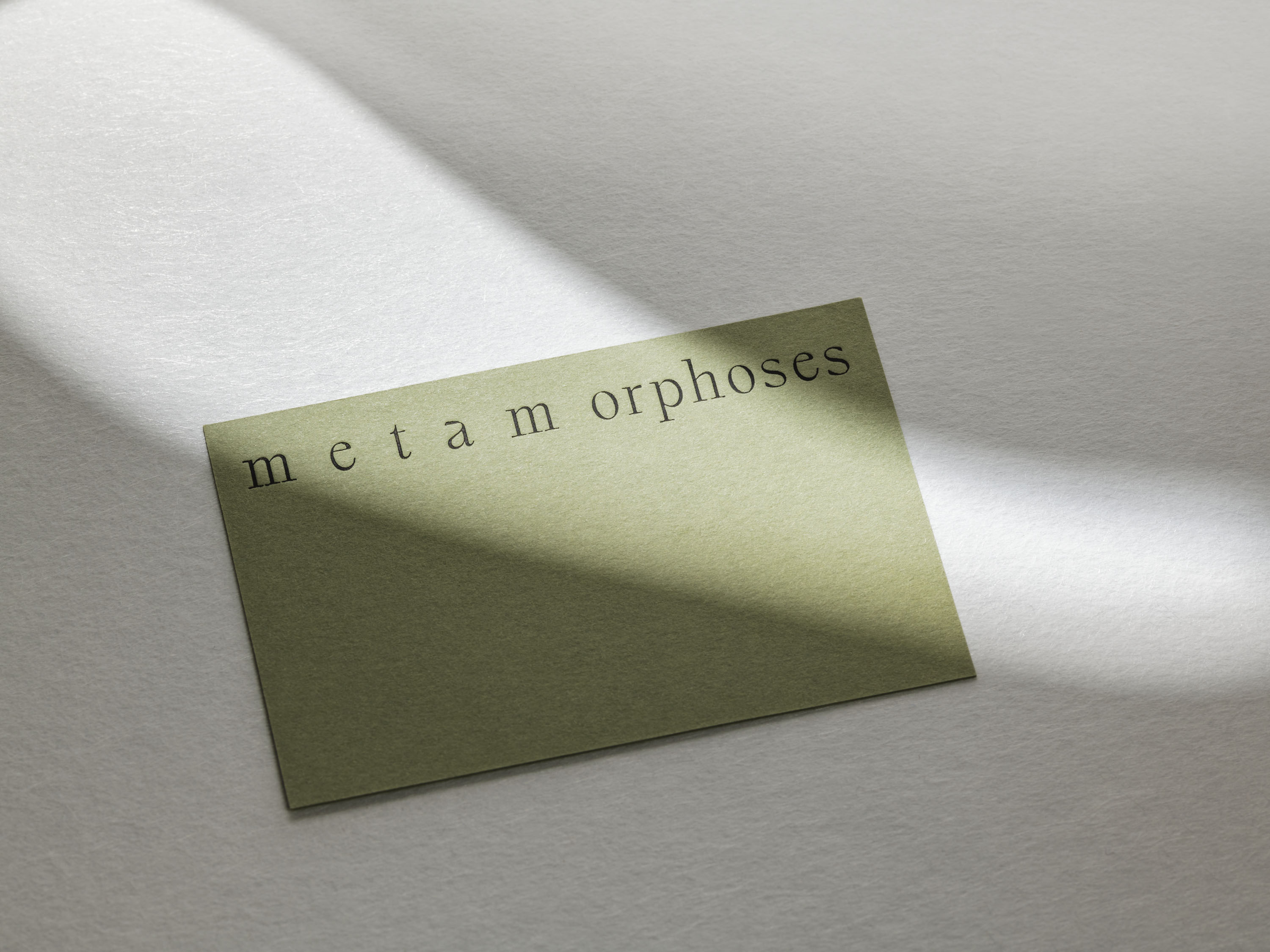
Each detail is carefully modulated, and beautifully crafted, as you would expect from APFEL. The studio manages to draw a visual range from the concept of the gallery, while keeping it tonally modest and supportive, rather than overbearing. The tension between brand character and gallery as a volume to hold the works of others is effectively resolved.
