The Art Gallery of New South Wales by Mucho
Opinion by Richard Baird Posted 7 April 2022
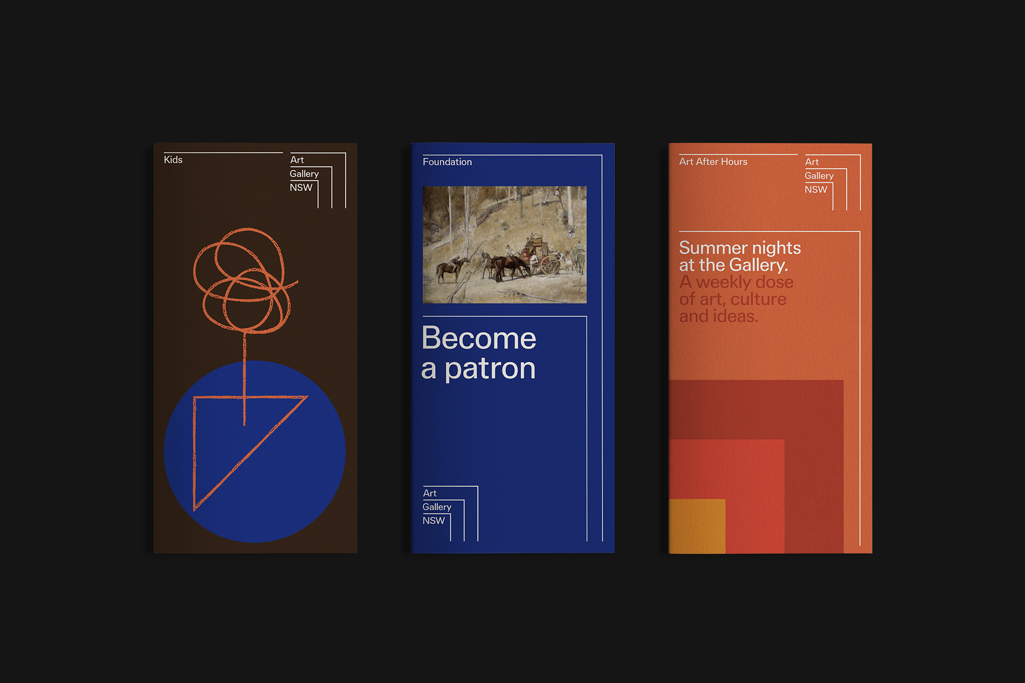
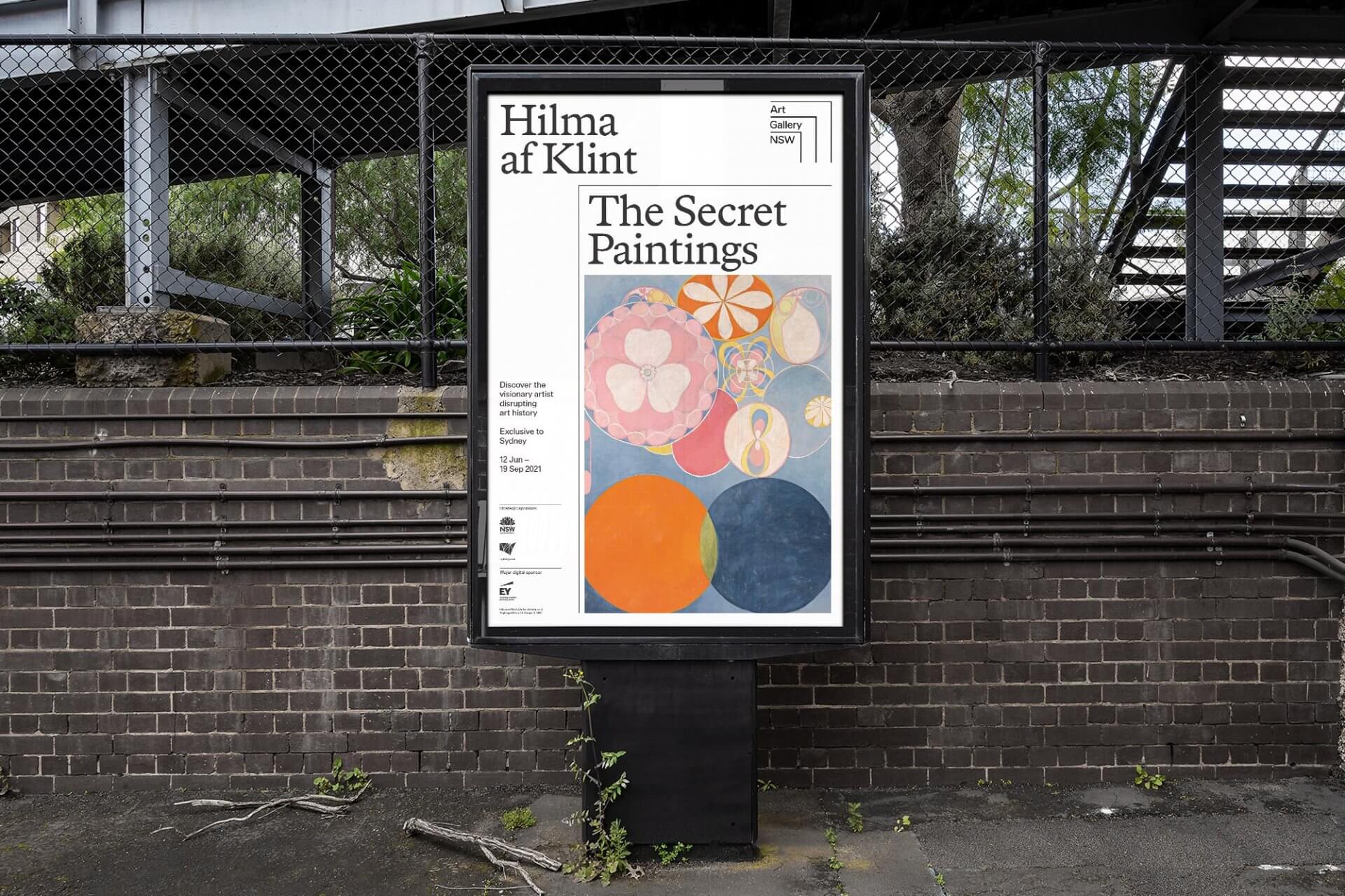
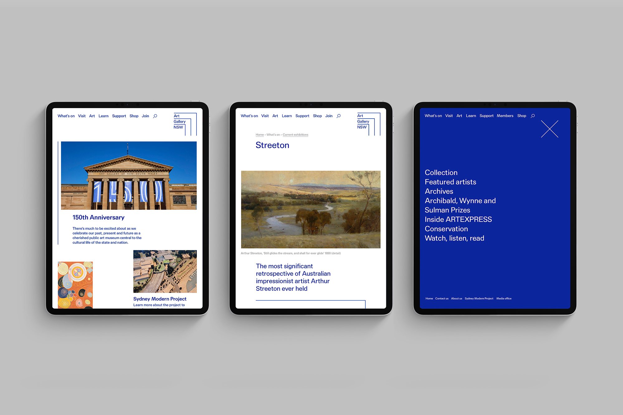
The Art Gallery of New South Wales, founded in 1872 as the New South Wales Academy of Art, suffered from a fragmented brand architecture. Addressing this through a rationalised and simplified system, and reinforcing the master brand across all Gallery collateral became a central part of developing of a new brand identity which would support a repositioning strategy that moved the gallery towards a meeting point and cultural hub. Created by Mucho, the introduction of strict type and colour palette, and a dynamic graphic device function as a frame in which to hold a large of collection artworks, an ongoing series of events and exhibitions, and operate as a gesture of framed space in which to inhabit and interact with artworks and ideas.
This post includes Extended Insights for BP&O Plus members.
Find out more and sign-up here.
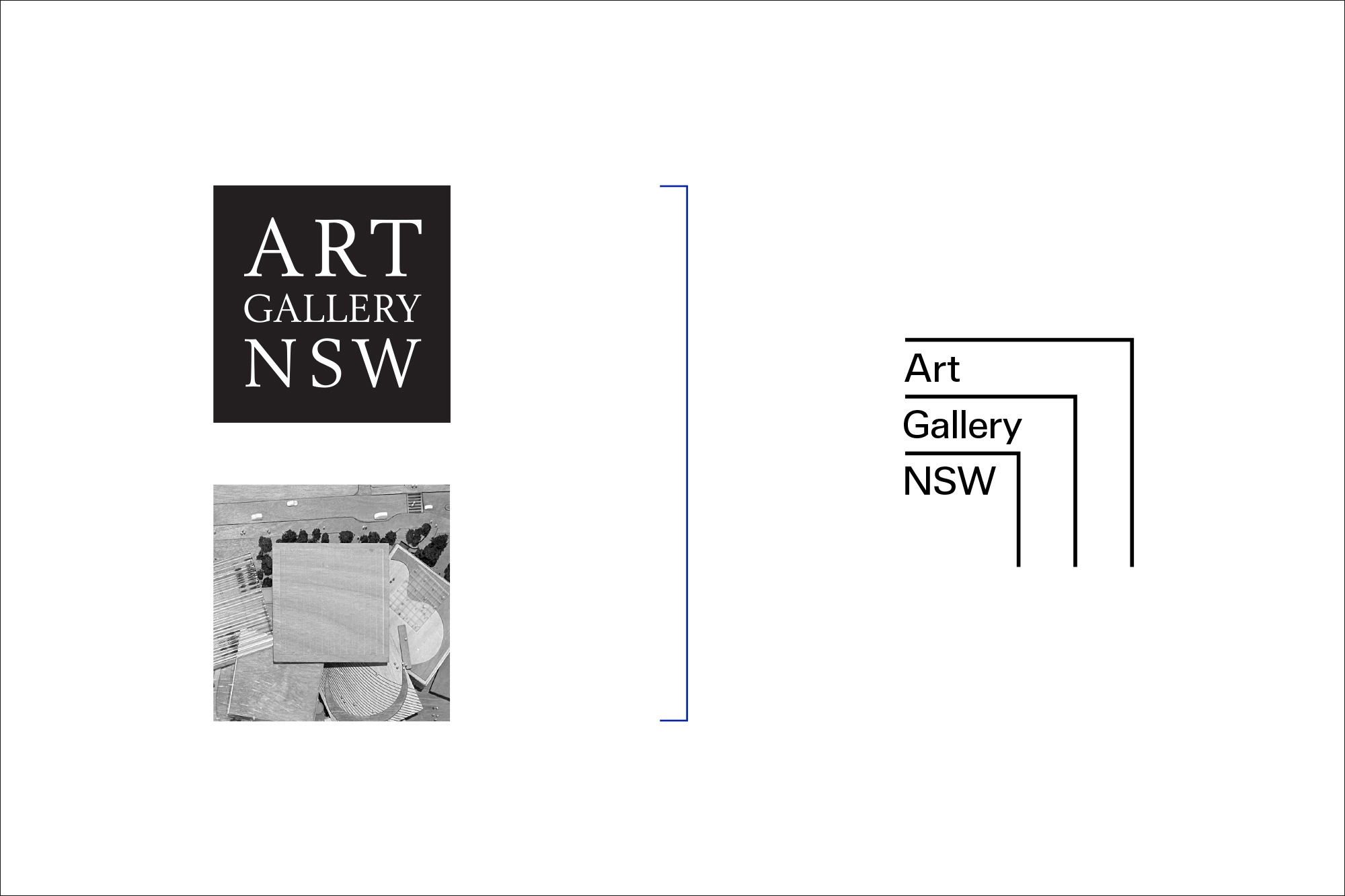
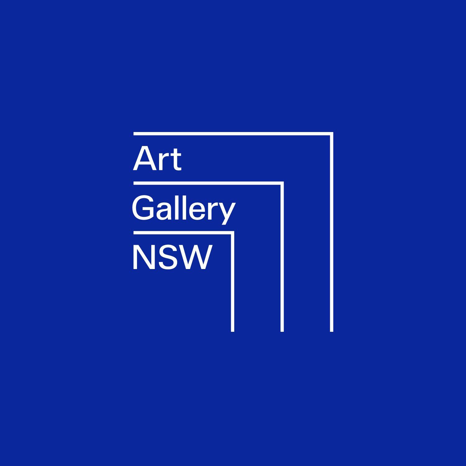
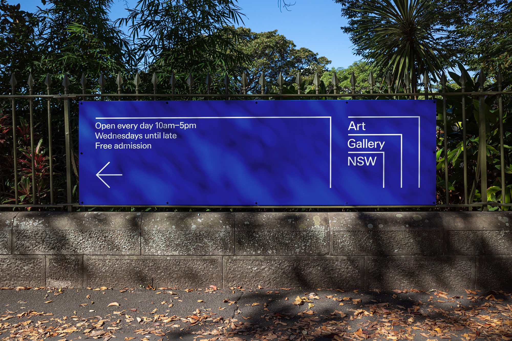
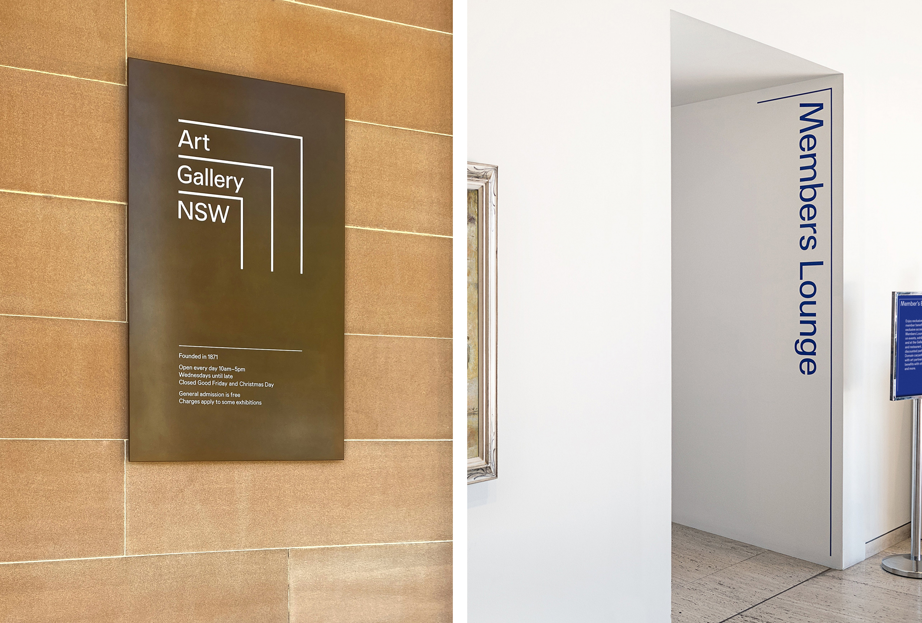
As part of a revised vision and purpose that sought to repositioning the Gallery as a key contributor to the cultural life of Sydney and Australia, Mucho’s work draws on the gallery’s layered history. A dynamic device, both operating as three open frames and a subtle allusion to layering, serves a practical purpose, an outline in which to corral together words and images across a variety of communicative use cases. The lines hold together the three parts of the name and develops into a new dynamic visual language of possibilities and spatial interactions.
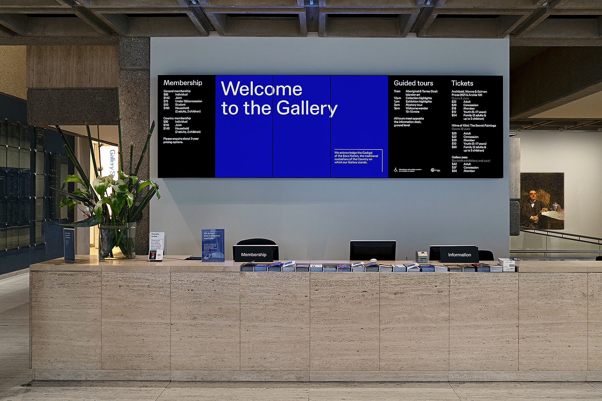
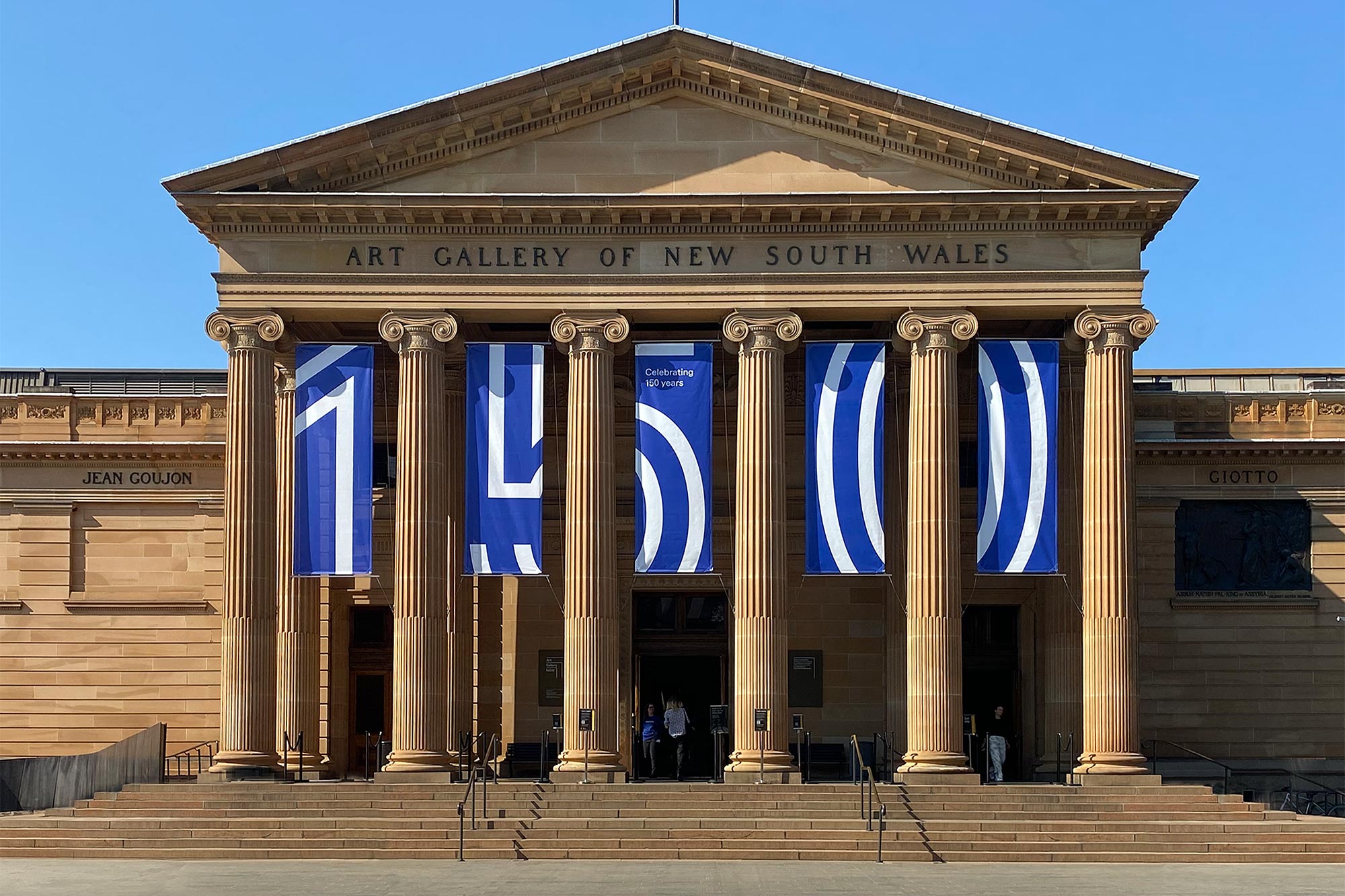
Although this visual device is familiar, the use of motion, the definition of space across printed materials through lines, text blocks and space form a distinctive solution tied to aspects of the gallery’s existing and future architectural details. The work takes on a resonant quality when seeing the modernist interior aspects of the gallery, in particular, the waffle slab precast ceiling, part of an extension opened in 1972, that intentionally sought to utilise contrast within the context of the building’s classical architecture.
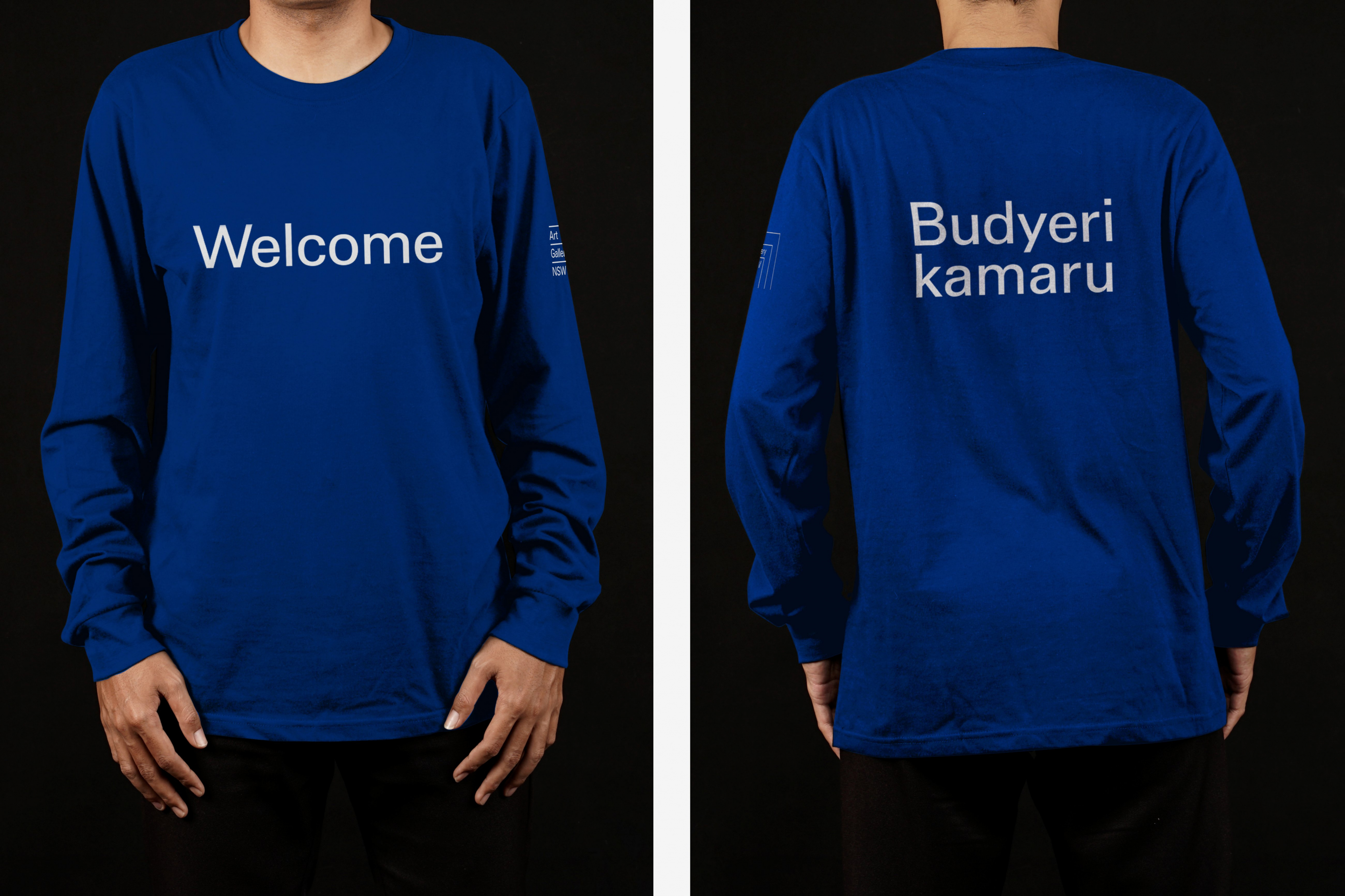
Type style, line weights and grid system appear rigorous. There is a technicality in service of communicative clarity that also extends to the typeface. An ultramarine blue, taking inspiration from iconic paintings of Sydney Harbour by renowned Australian artist Brett Whiteley, together with type and system, form an unwavering continuity throughout.
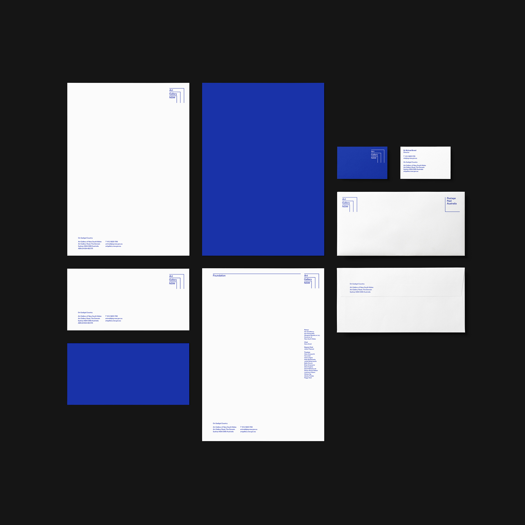
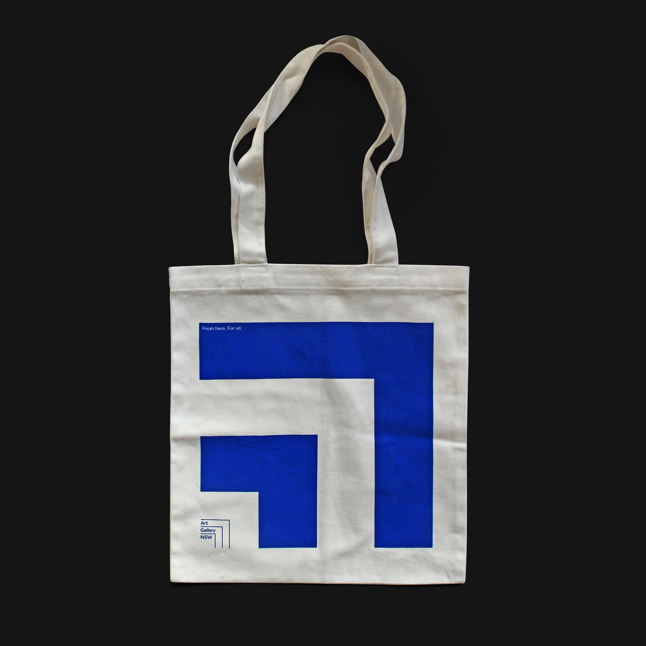
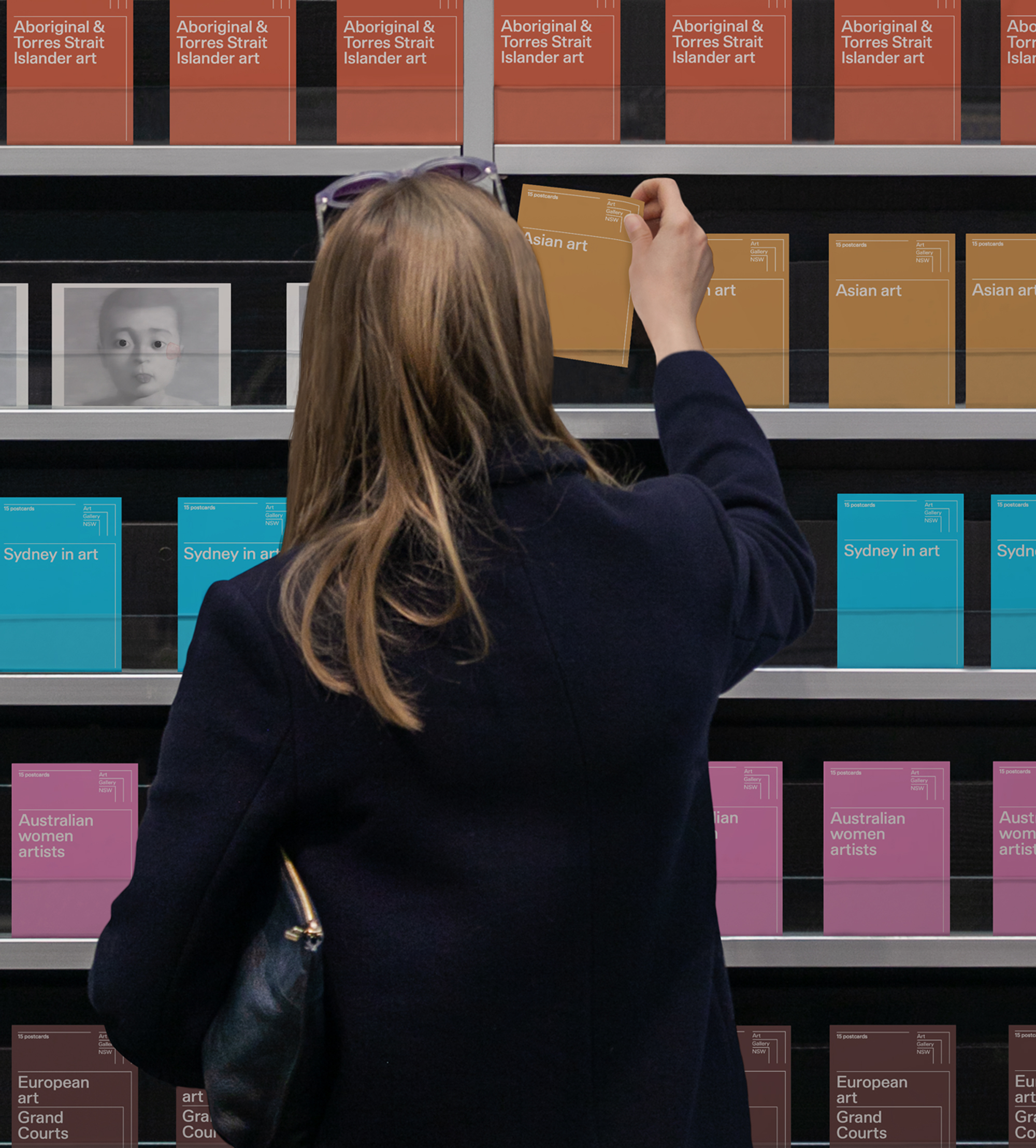
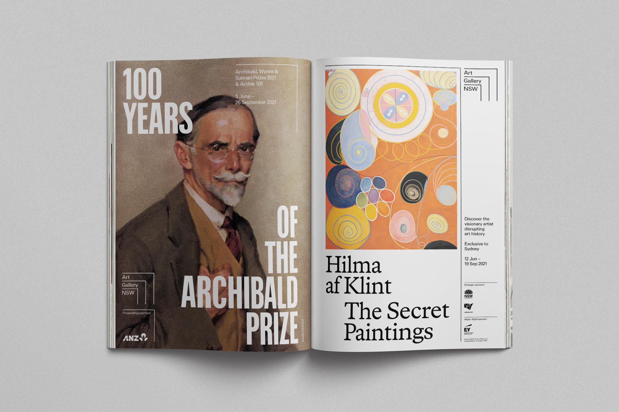
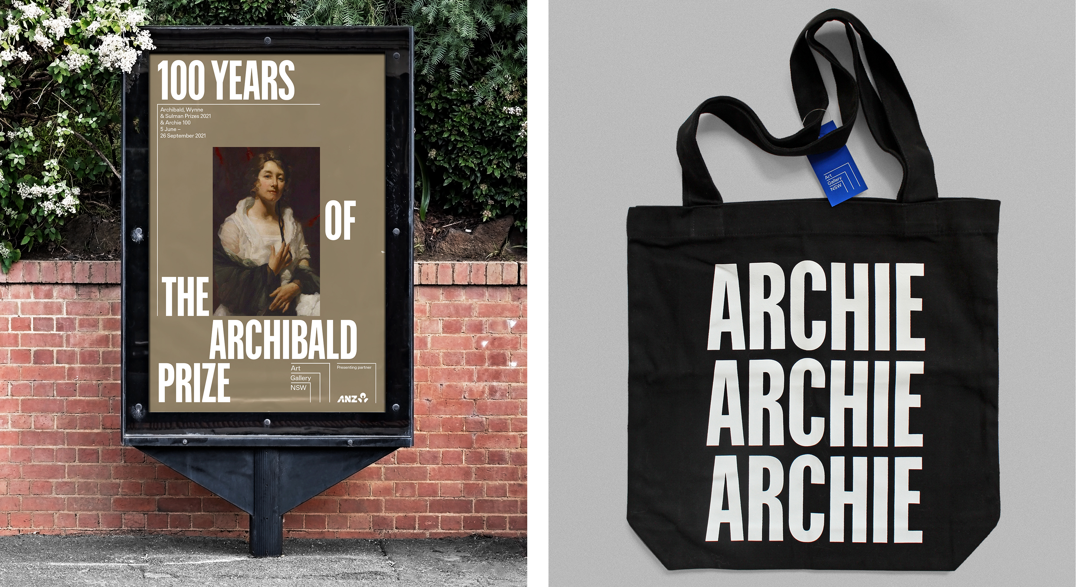
The flexibility of the system also extends to a form of ‘visual volume’, with opportunities to dial up and down the graphic language. The line weights of the logo increase to create a bold form across simple screen printed contexts such as tote bags, and type becomes heavier and condensed for outdoor and print campaigns for gallery exhibitions.
In some aspects the system is somewhat inconspicuous, and in other cases, demands attention. This channels the framing of artwork, sometimes invisible and other times appearing as dramatic and as beautifully crafted as the artwork it holds.
The grid system effectively holds type and image together in a way that is as technically elegant as it is practical, and benefits from an approach to colour that favours blocking. This offers a consistent framework to hold diverse works and images that can be irregular and loose, and exhibition specific type choices that are different from the gallery’s primary typeface Preston.

The theme of bringing things together, creating spaces for things to happen, for people from all walks to meet, is embedded in the typography. Drawing on historical aspects of Australian graphic design history, and the languages of the Indigenous people’s of Australia, it weaves together characters from First Nations languages, the Modernist vision of universality, and the technical rigour of present day type design requirements for digital devices. This is where the work succeeds the most, not just in the practical outcome of the project; the need to strategically resolve fragmented brand architecture in a way that can be employed by an in house team, but in its potential to create spaces for things to happen, and to invite all without imposing itself.
