Petit Planet by Studio fnt
Opinion by Eleanor Robertson Posted 26 April 2022
The Hyundai is one of the three major department stores in South Korea, with its 15 branches across the regions of Seoul, Yeongnam and Hoseo accruing more than $6 billion in annual sales. Petit Planet is the Hyundai’s new specialised children’s division, presenting premium brands in an environment designed to stimulate young imaginations.
This post includes Extended Insights for BP&O Plus members.
Find out more and sign-up here.
Around two thirds of the family-friendly space are devoted to indoor and outdoor concept play, with architectural structures created by the Japanese furniture designer Mikiya Kobayashi. There are also colourful seesaws, slides and tunnels based on the abstracted shapes of mountains, clouds and plants.
Orbiting these experiential zones, there is plenty to tempt style-conscious parents. Clothing concessions include leading South Korean labels (such as I LOVE J and Bebe de Pino) alongside imported international children’s lines – think Tommy Hilfiger, Stella McCartney, Balmain, Moschino, Versace.
The toy store offers an equally well-curated selection of world-leading brands and there’s a substantial bookshop, which visitors are encouraged to treat as a drop-in library, where ‘play becomes learning and education becomes play’ (in the spirit of creative endeavour, it’s called a ‘studio’). There are juice counters, balloon shows, live bands, complimentary strollers and abundant changing facilities.
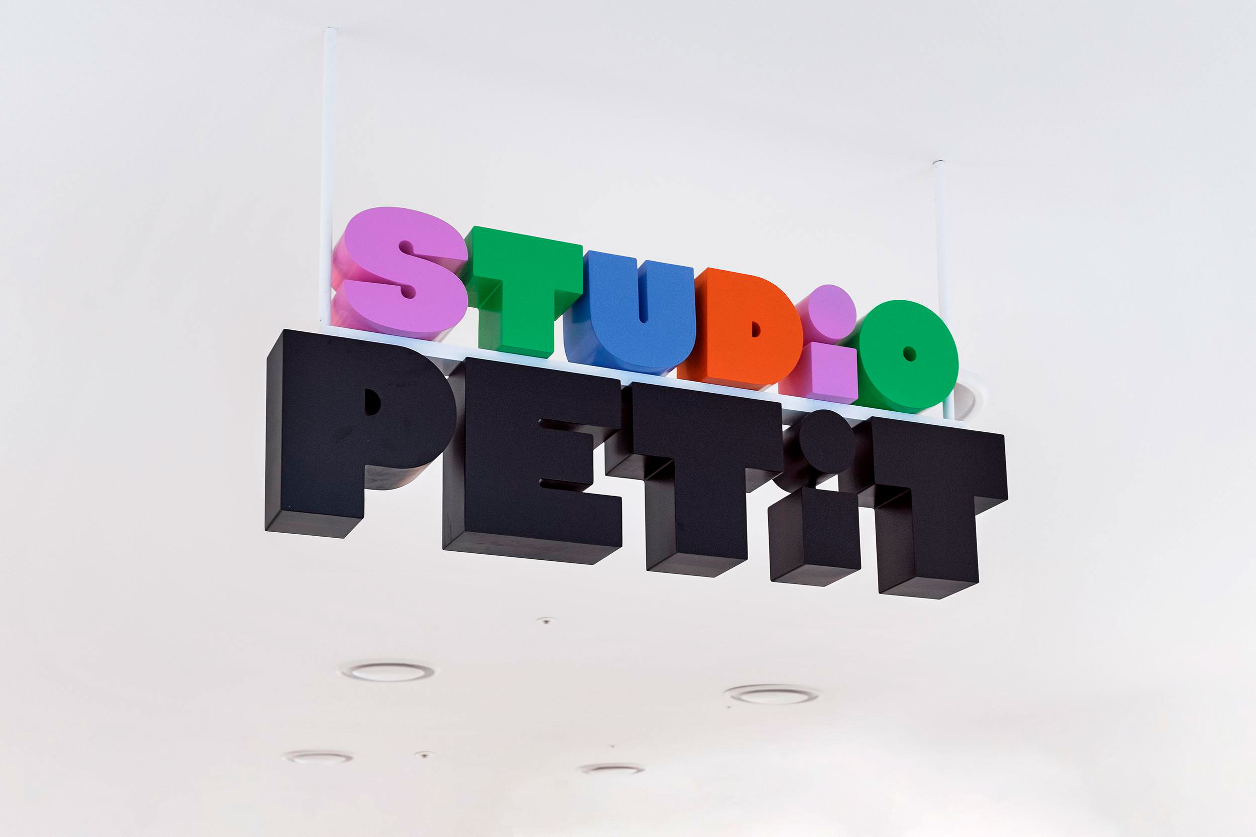
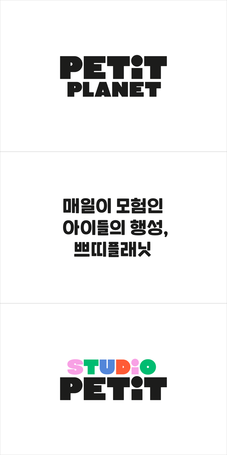
The Hyundai worked with Seoul’s Studio fnt to develop a brand identity for Petit Planet that matches these surroundings. The name evokes childhood experience, with each child at the centre of a self-contained universe, small but full of potential. It also communicates a shift in perspective – like something out of Gulliver’s Travels – to an alternate dimension that revolves around children and their needs.
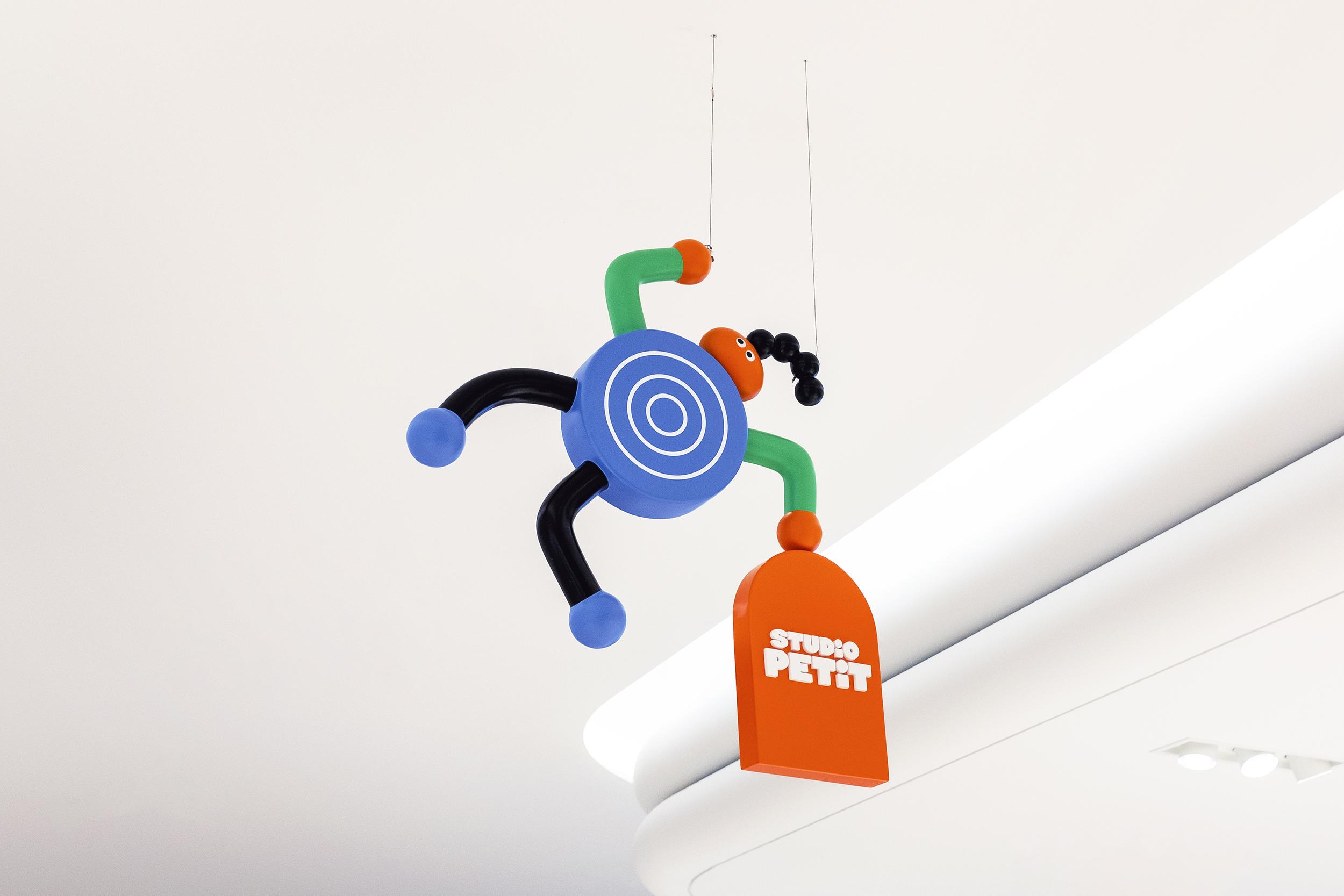
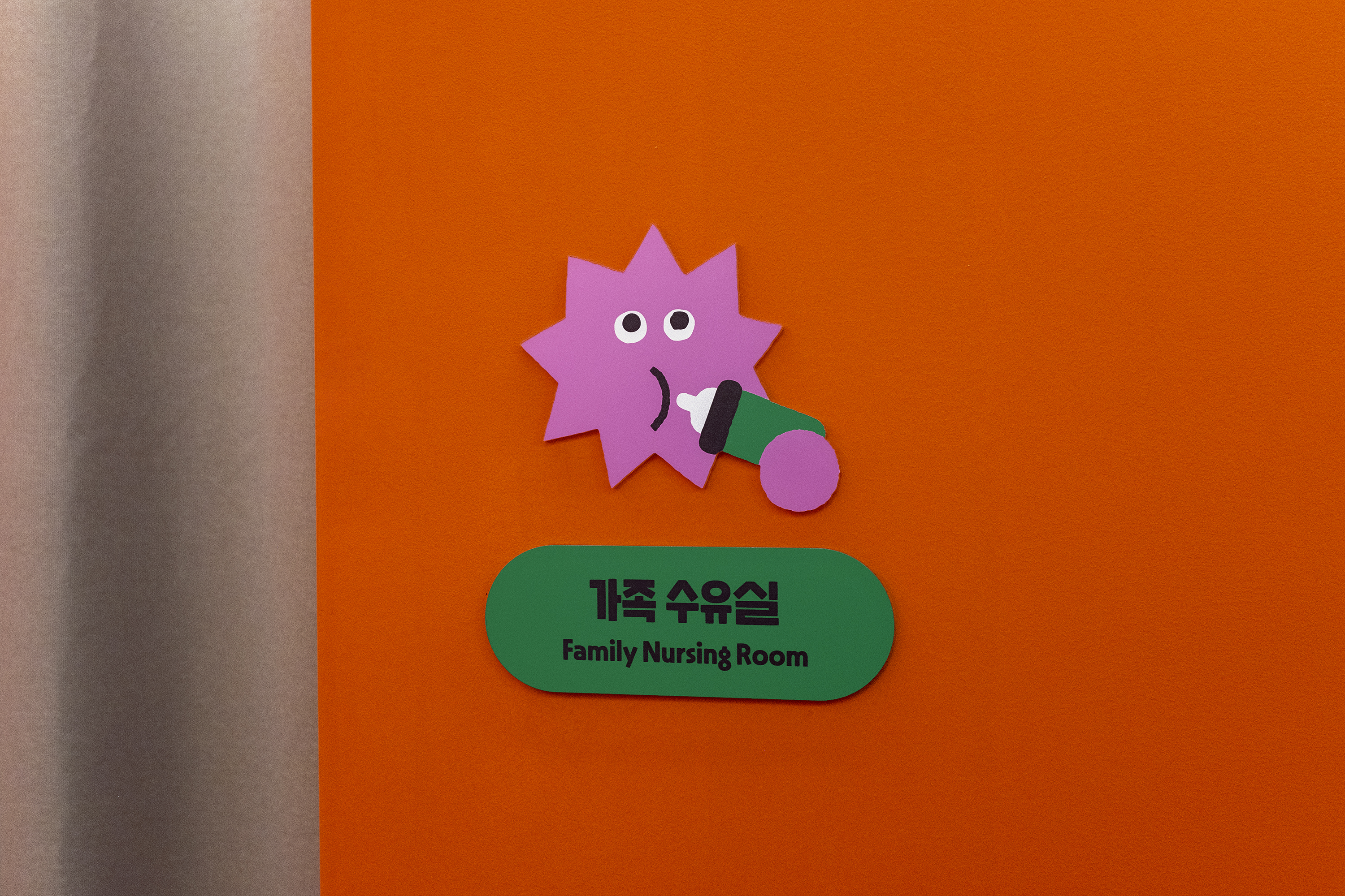
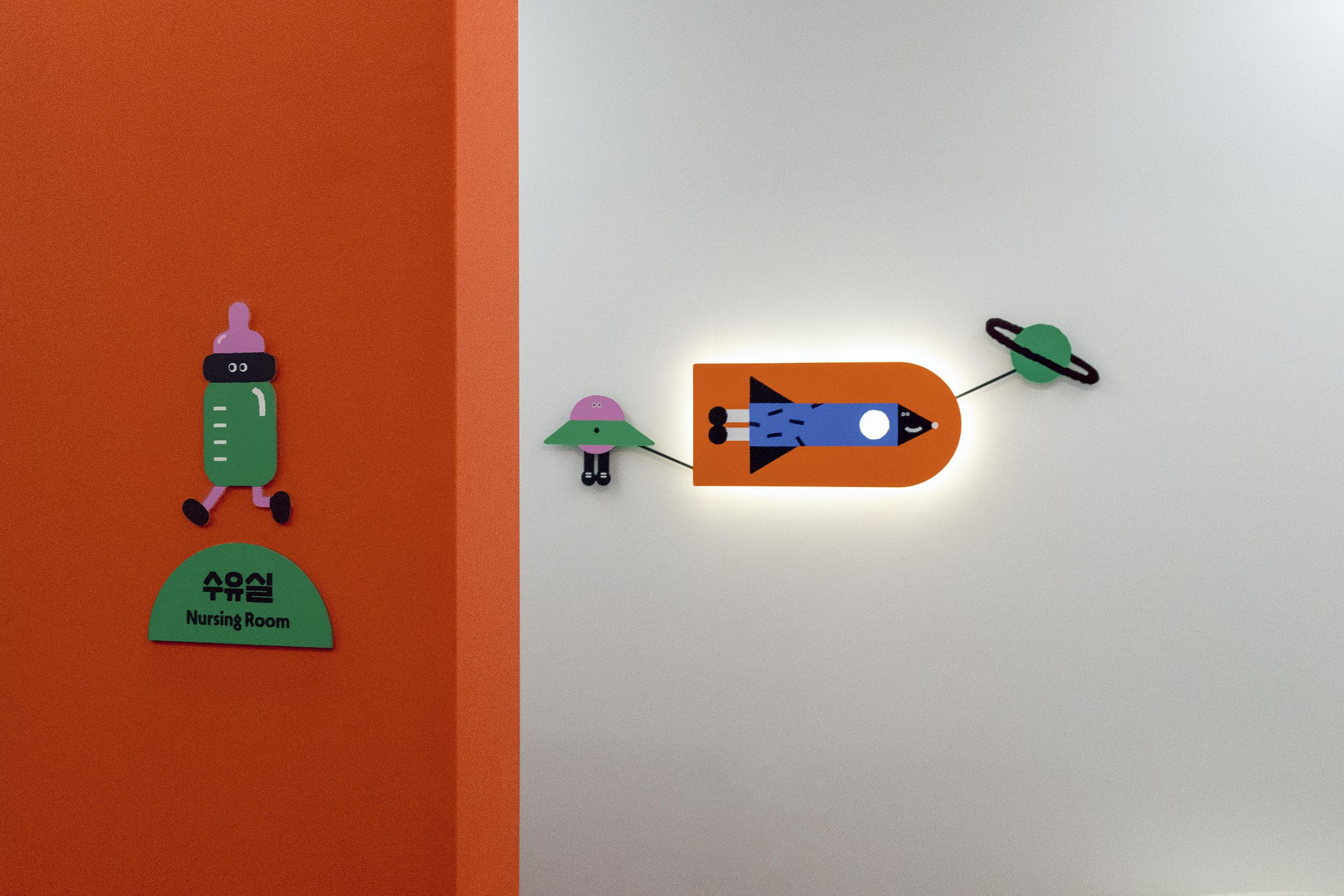
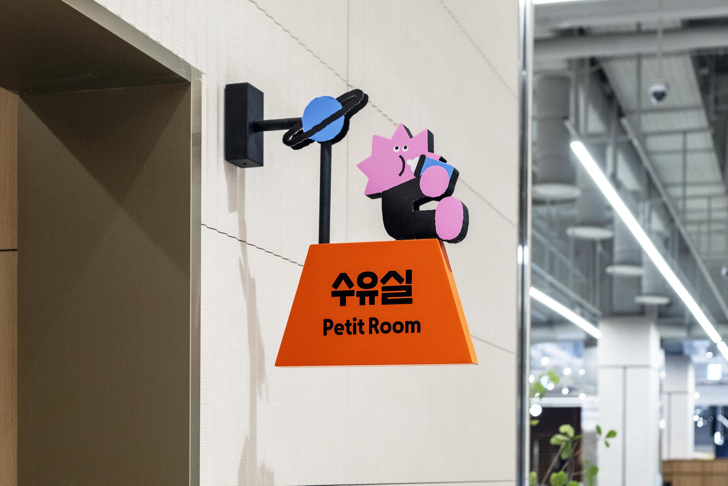
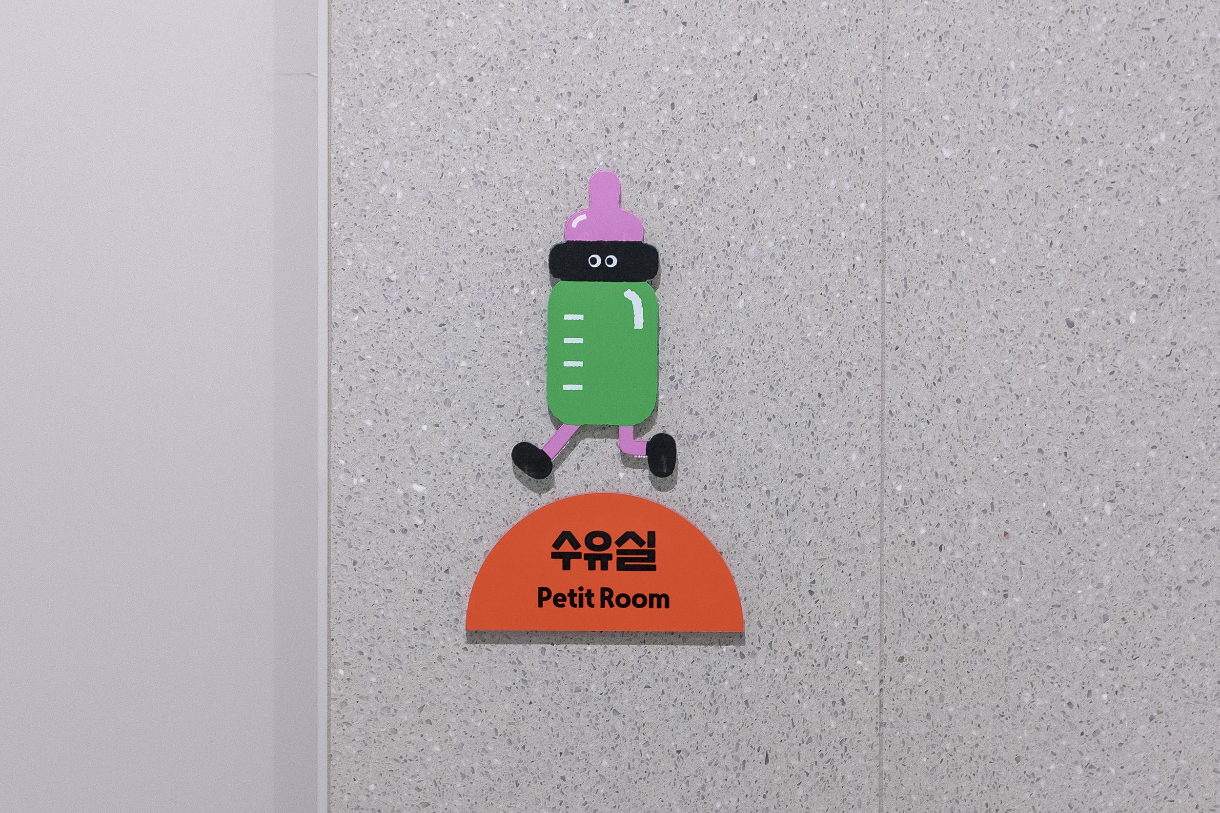
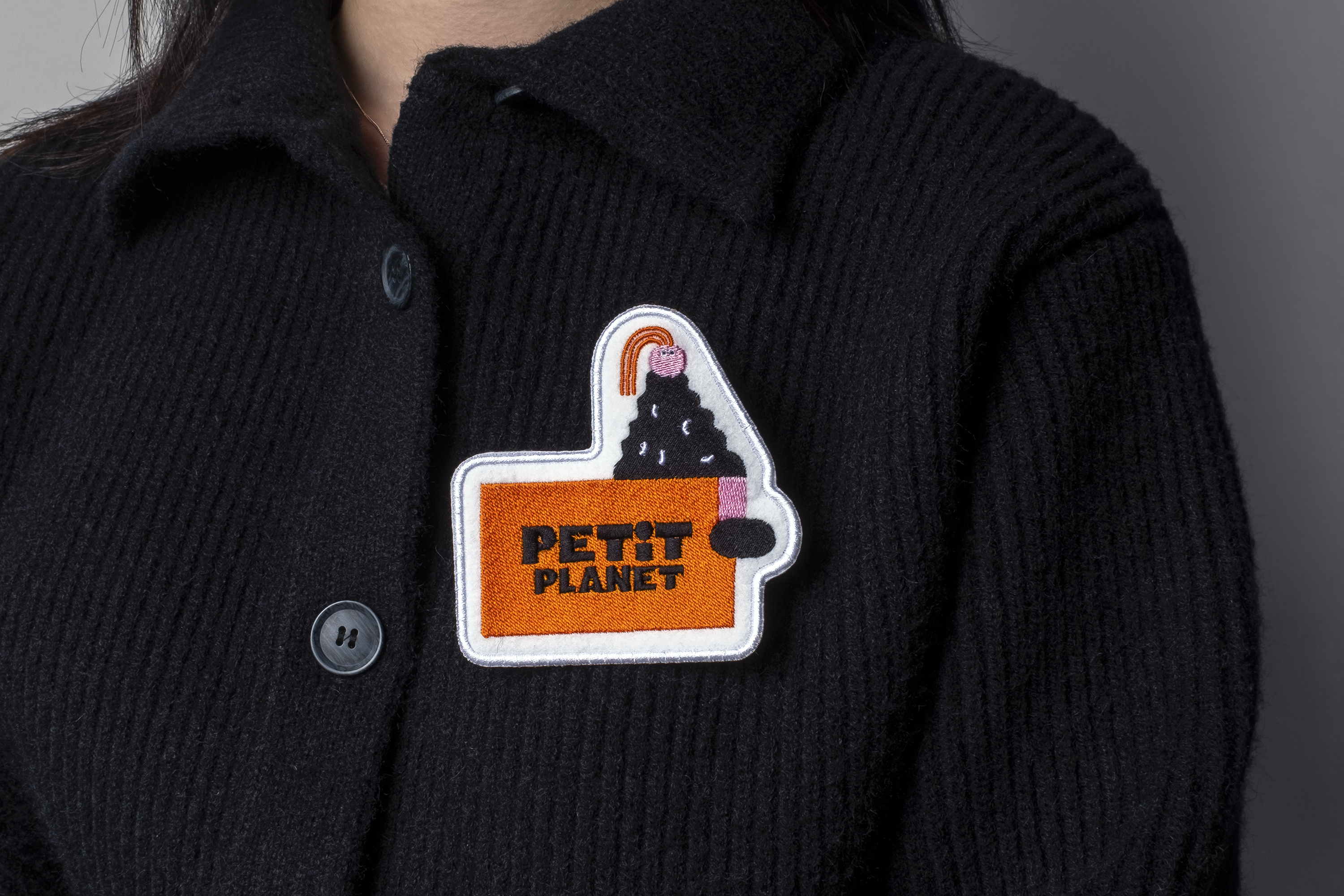
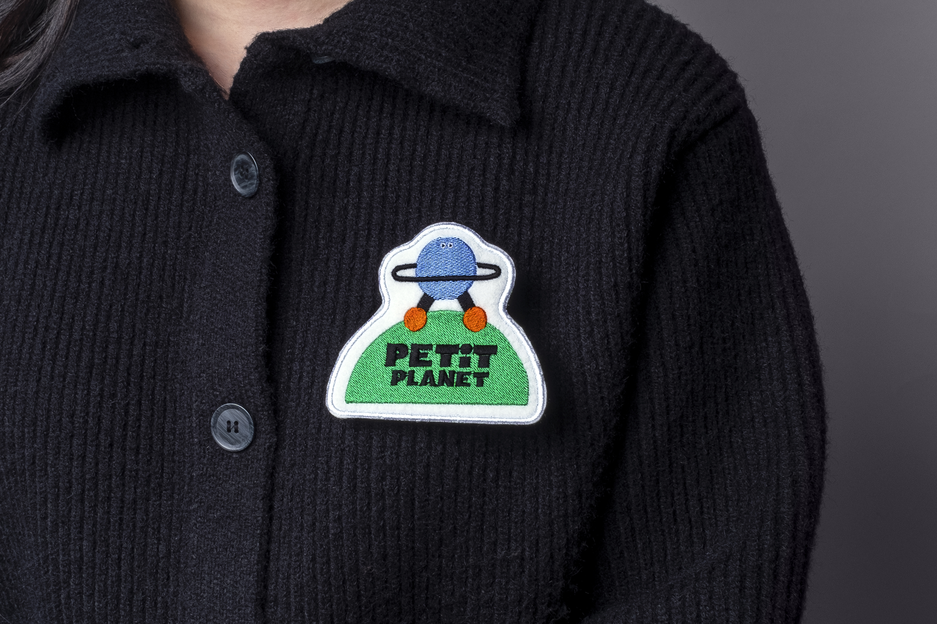
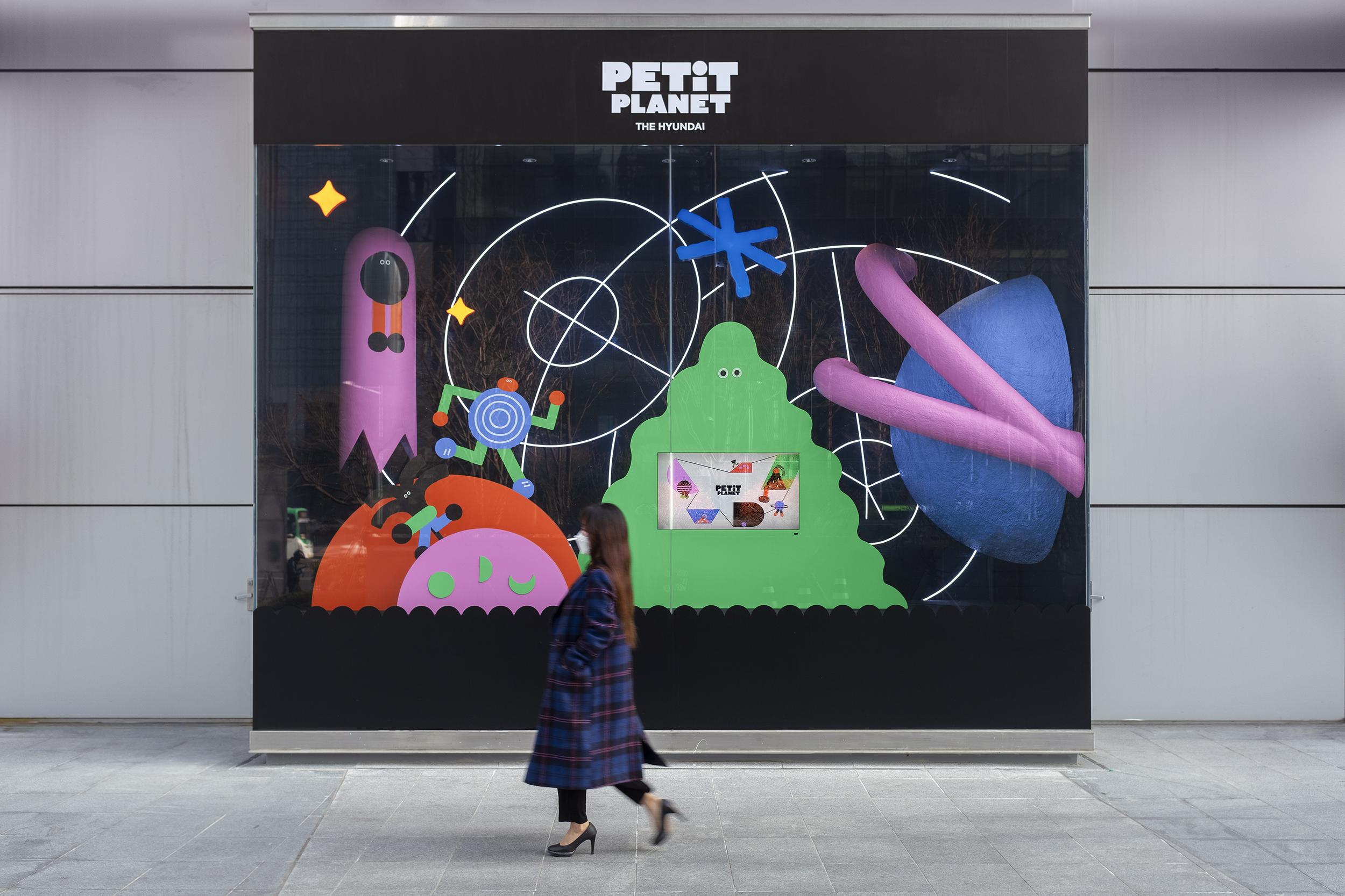
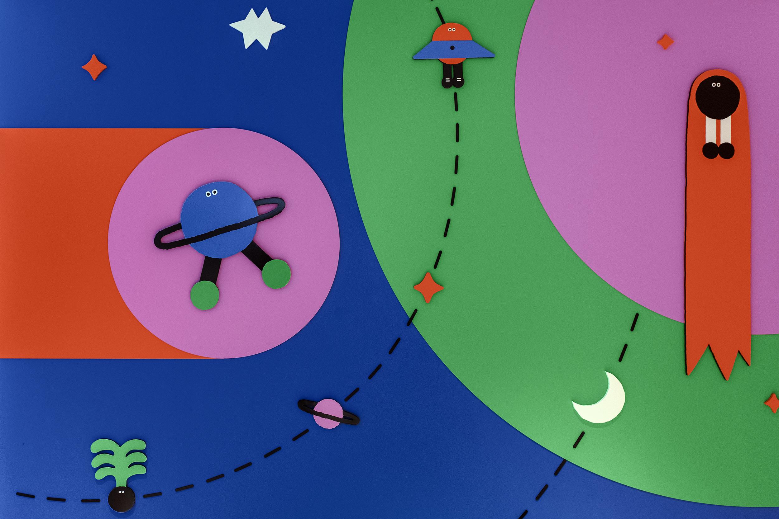
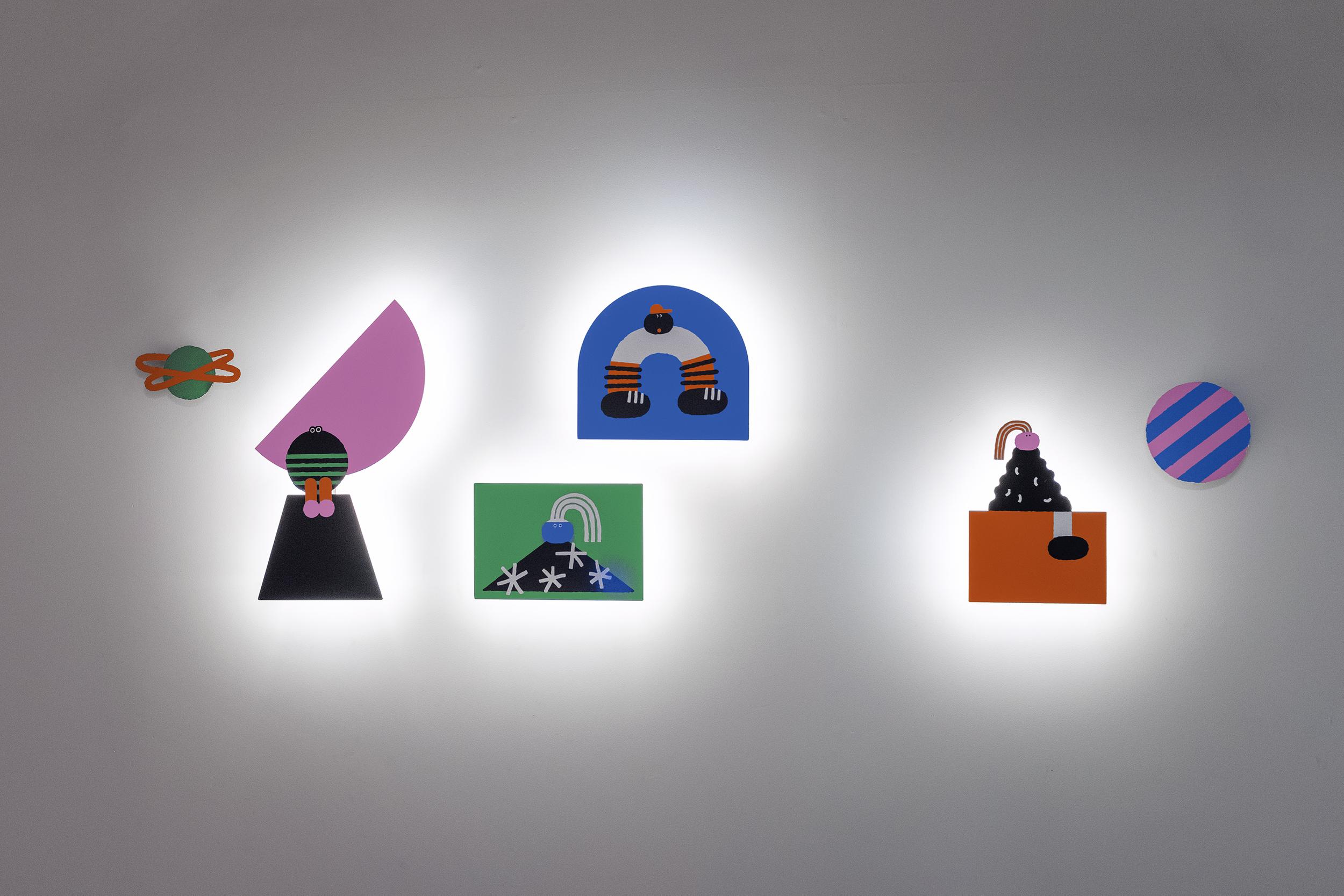
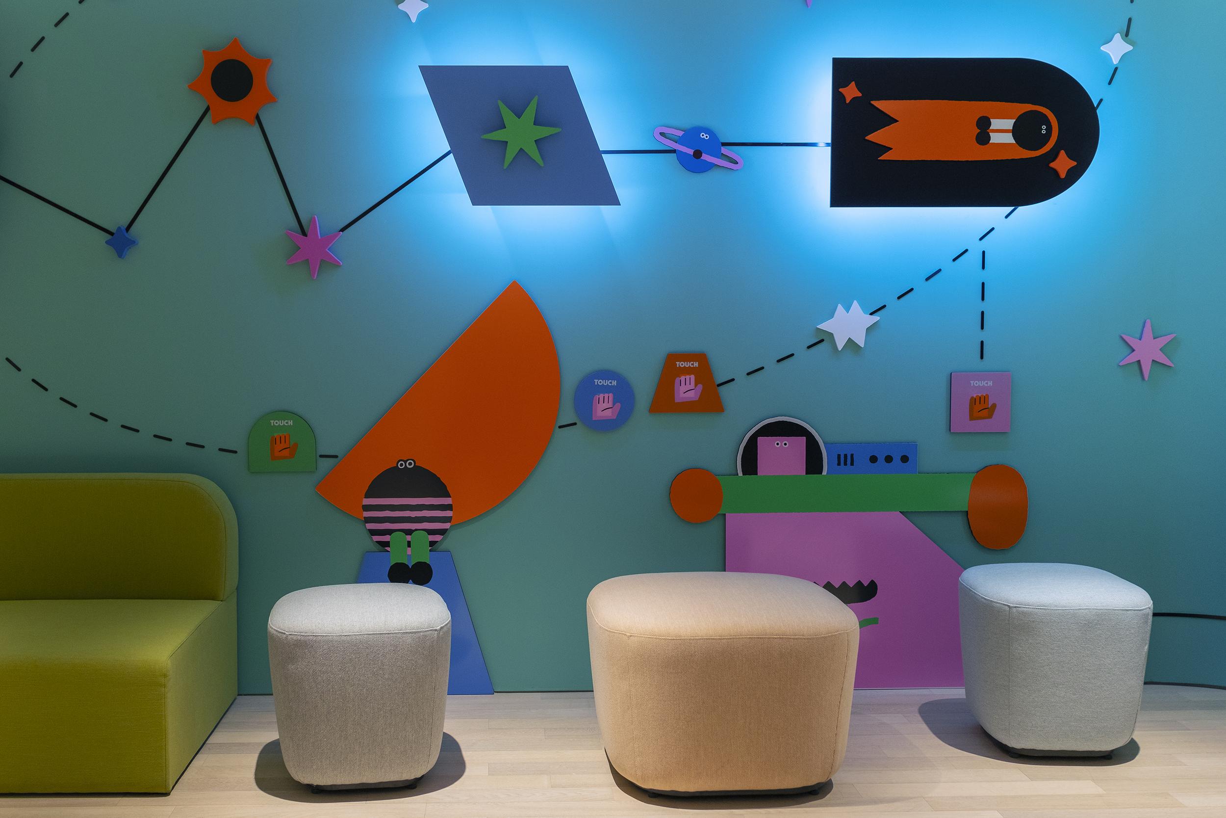
A visit to Petit Planet is an adventure, and the wonderful character design develops this further, drawing on themes including the solar system and signs of the zodiac, as well as imagined creatures, plants and musical notes. The resulting landscape is relatable to children of all ages and cultural backgrounds, and avoids gender stereotypes. It takes kids and their imaginations seriously, with layered storytelling to engage curiosity, and ambiguity, allowing for creative interpretation.
What’s most inspired, however, is that the characters are as attractive to adults as to infants. The charming, uncomplicated style – geometric shapes in intense solid colours with occasional black line work – has the same irresistible appeal as a bag of Liquorice Allsorts. But there’s a sophistication behind the naivety, reminiscent of the abstract work of Joan Miró or Alexander Calder. It’s playful, but far from simple.
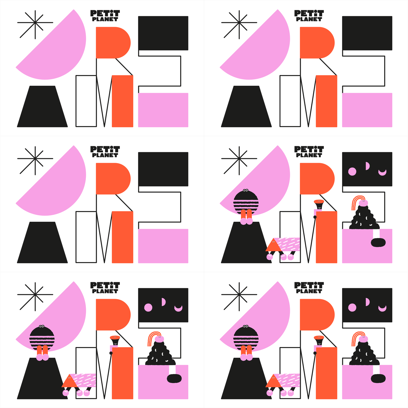
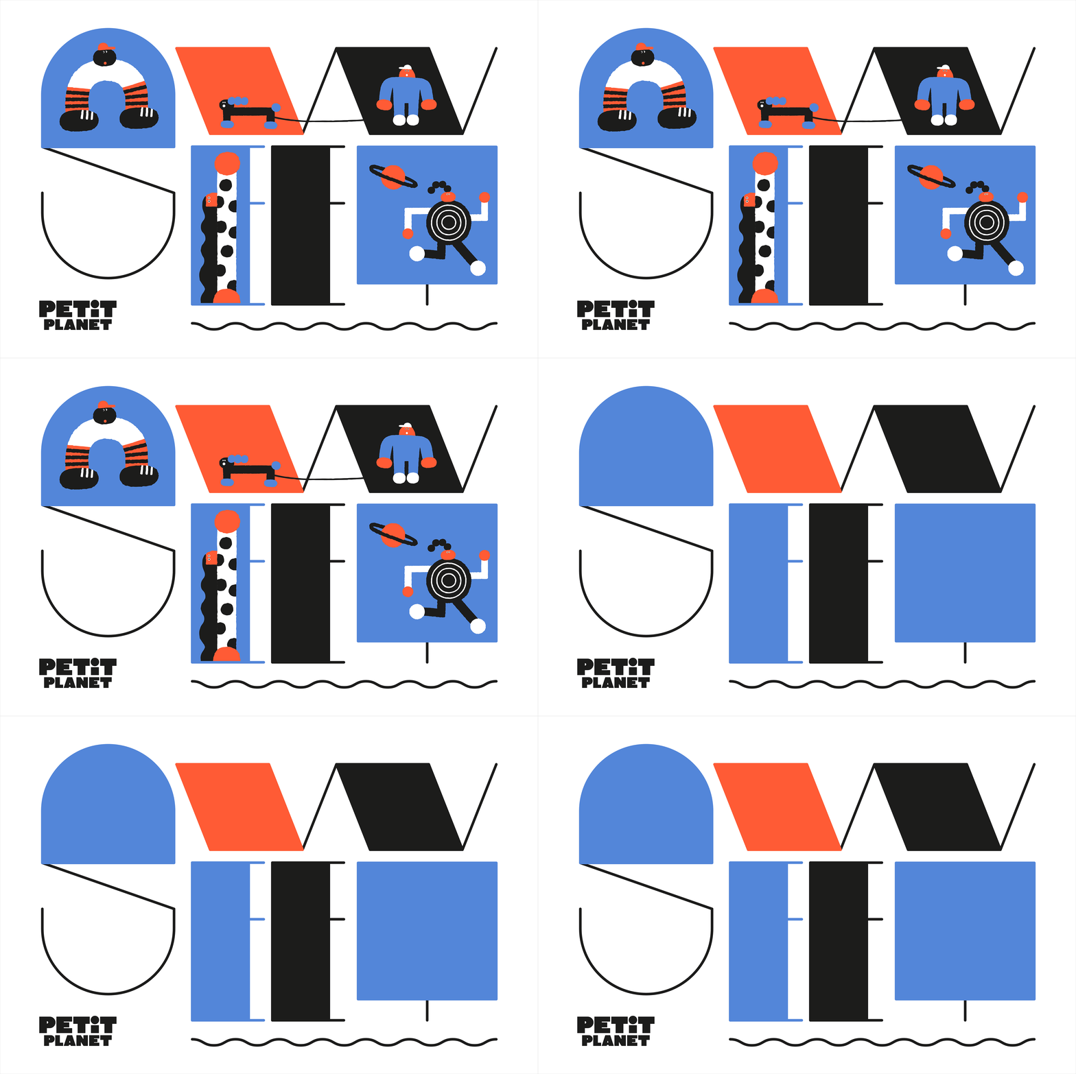
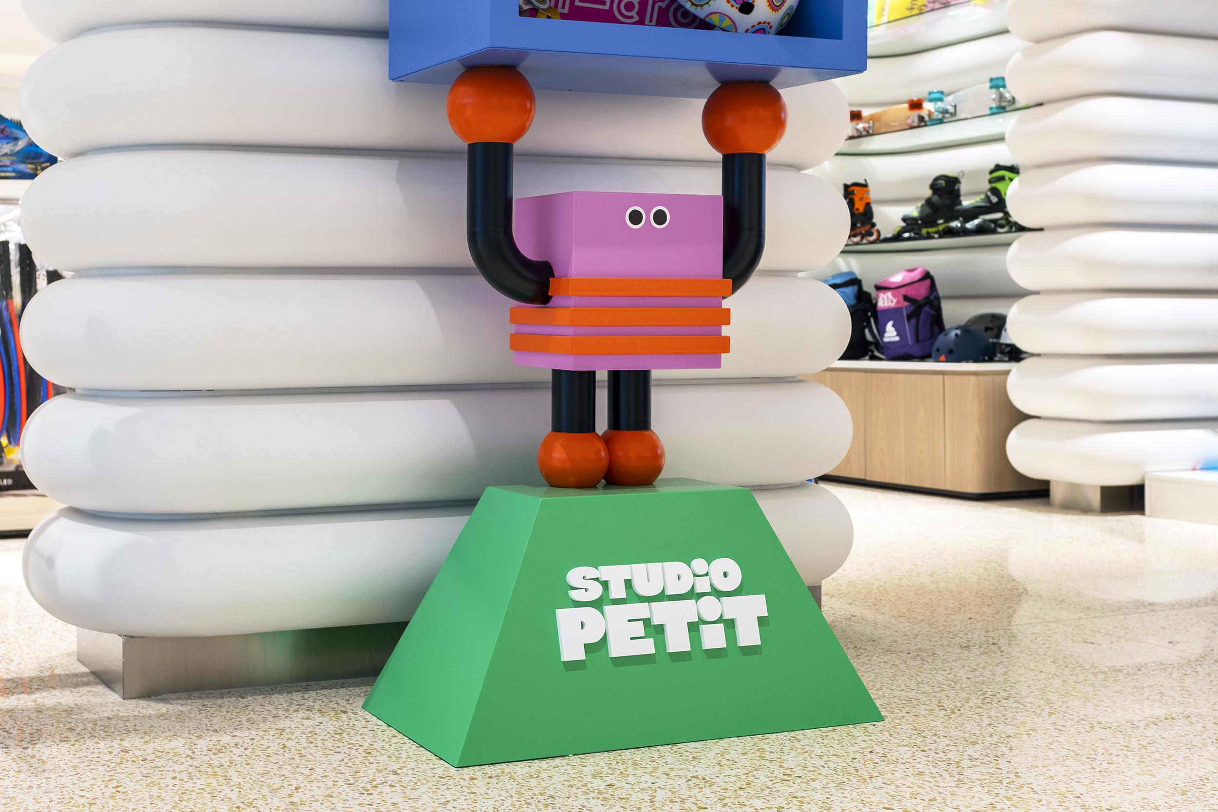
In the extensive 3D applications the similarity to Calder’s mobiles is most pronounced. The in-store displays make use of top-quality materials: chunky painted wooden sculptures, glass orbs and cast iron bring the cast of characters to life in cheeky tableaux that interact with products and retail architecture. Illustrator Daye Kim’s lively Pop Art tones are animated in textures that stimulate and inspire. This is a place to get lost in.
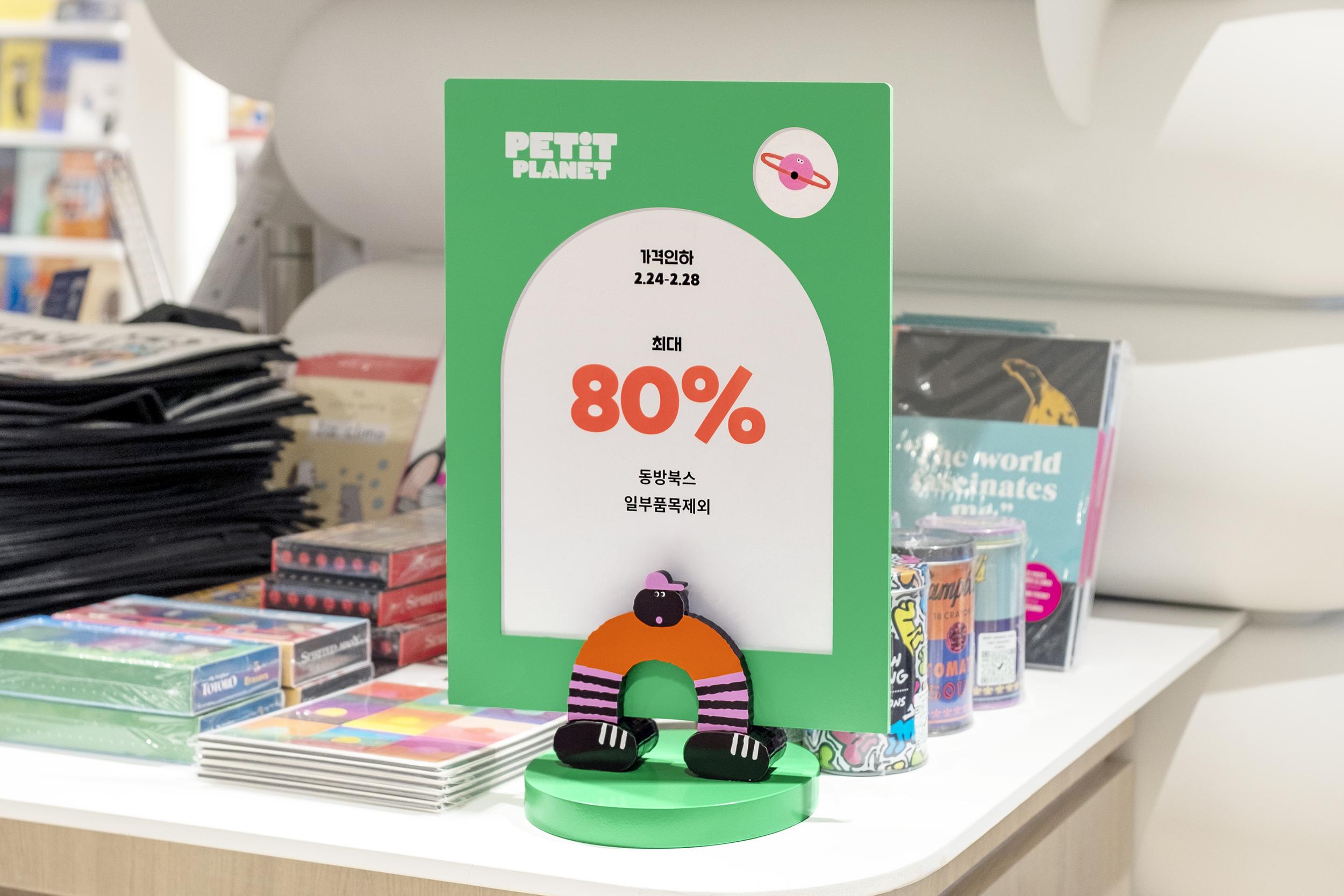
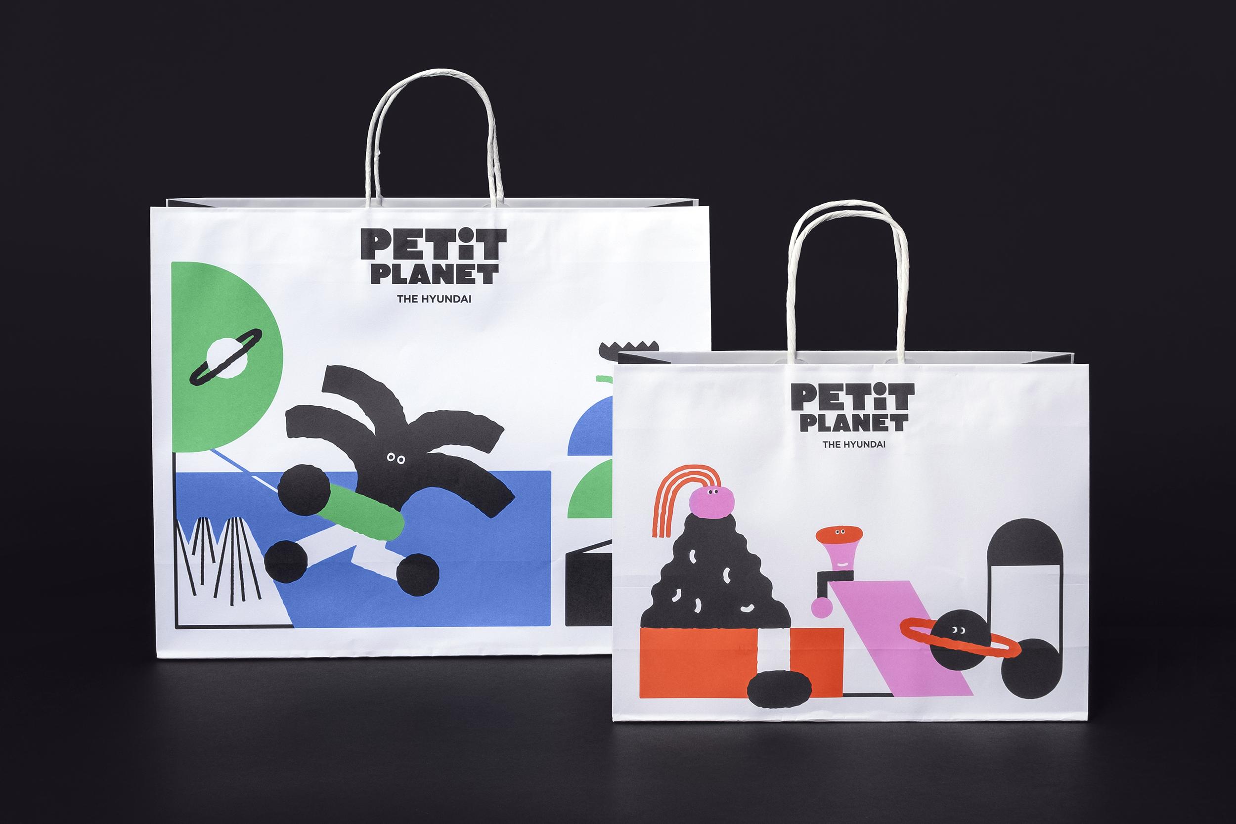
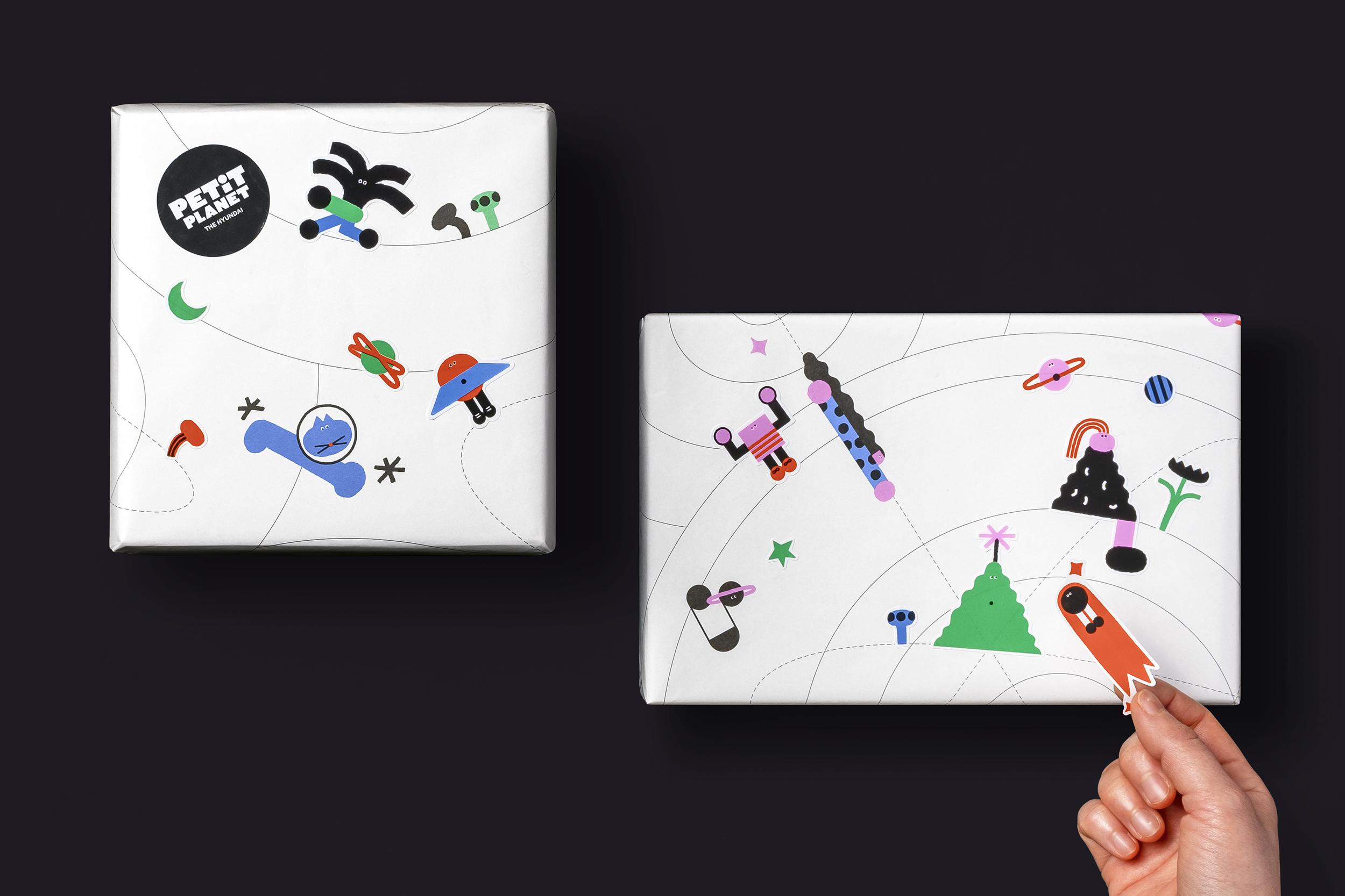
In print materials – such as posters, bags and wrapping paper – there is an interesting interaction between the modular display typeface and illustrations (demonstrated through poetic type specimens like ‘dream sweet forest’). There are sensory crossovers too: sound design integrates with animation in tactile games; wayfinding signage and visual merchandising meet lighting; and at the weekend there are parades of all-singing all-dancing costumed performers
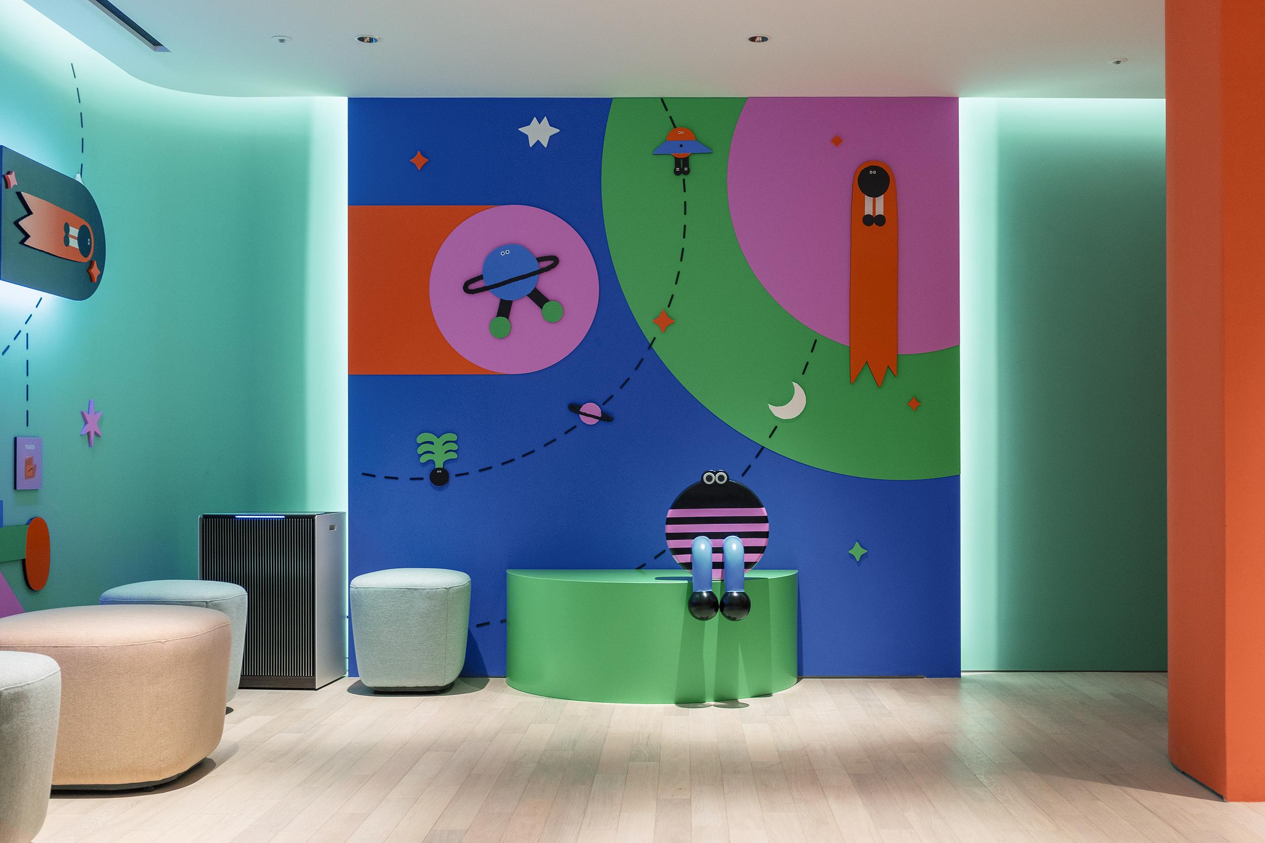
This is an immersive world fit for the luxury market, because in luxury there is freedom for dreams and the money to cultivate them. In mass market branding a functional truth is elevated by association with an emotional one, but high-end products are about aspiration – a brand must persuade consumers to travel from reality to the fantasy it can offer. ‘Anything is possible, if you can afford it’.
From a cynical position, there is something off-putting about a strategy that conflates fantasy and designer goods in an environment targeted at children, where shopping is indistinguishable from play. But studio fnt’s Petit Planet is so delightful that excess is all part of the fun. The work avoids cliché (fairytales, dinosaurs, pirates etc) to explore fundamental themes of childhood such as scale, perspective and relativity. And it glorifies the magic of experience rather than consumerism.
In this way the project represents the best of luxury, as a route to escapism – its ability to imagine and create new concepts, forms and images and to realise these with uncompromising craftsmanship. studio fnt has built a world that is original, distinctive and full of depth to deliver a charismatic piece of brand storytelling.
