Ebb Dunedin by Maud
Opinion by Richard Baird Posted 28 April 2022
Design-savvy duo and father and son team Dylan and Frank worked alongside Gary Todd Architecture and interior design team INDYK Architects to develop Ebb, a contemporary boutique hotel located at the heart of Dunedin, a city on the South Island of New Zealand. Ebb is uniquely situated at the edge of the reclaimed Otago Harbour–a place where Polynesian travellers would have first landed on the exposed tidal flats before stepping foot on land. The hotel offers a modern luxury stay and access to a unique geographical wilderness.
Bringing together aspects of art, contemporary architecture and design with the geography of the area was a critical part of developing a brand identity for the project. This responsibility was placed in the hands of Australian design studio Maud. From the collision of water and land, and the tidal patterns that shape human activity, “ebb and flow” emerged as the central premise for the hotel’s brand identity.
This post includes Extended Insights for BP&O Plus members.
Find out more and sign-up here.


The project began, unusually, with the creation of a 20-metre-long by three-storey high glass facade artwork. This artwork wraps the facade of the hotel. Created by local artist Simon Kaan and commissioned by Dylan and Frank the artwork explores the themes of rhythm and movement through Dunedin’s land, sea and sky scapes. As a photograph, digitally printed across 30 glass panels, the expression becomes one of intersectionality, a liminal space created between four points; art, design, architecture and geography.
The facade is not an isolated nor singular gesture but an articulation of a strategic aspect of the Ebb experience, one of which includes involving and setting the stage for local artists. Maud’s brand identity for the hotel flows from this initial piece of work and the concept of ebb and flow, with landscape photography used a key element across the hotel’s materials.

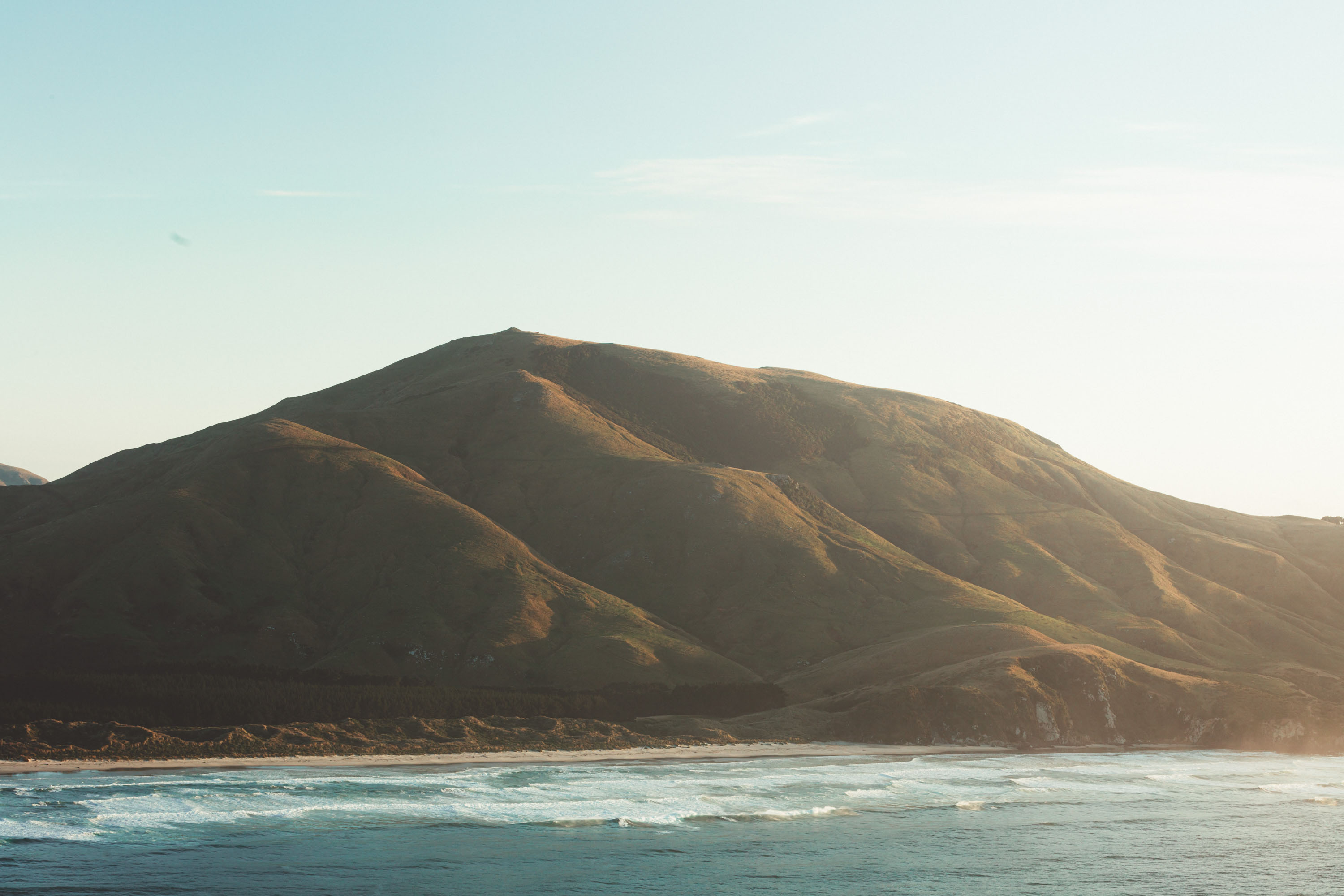
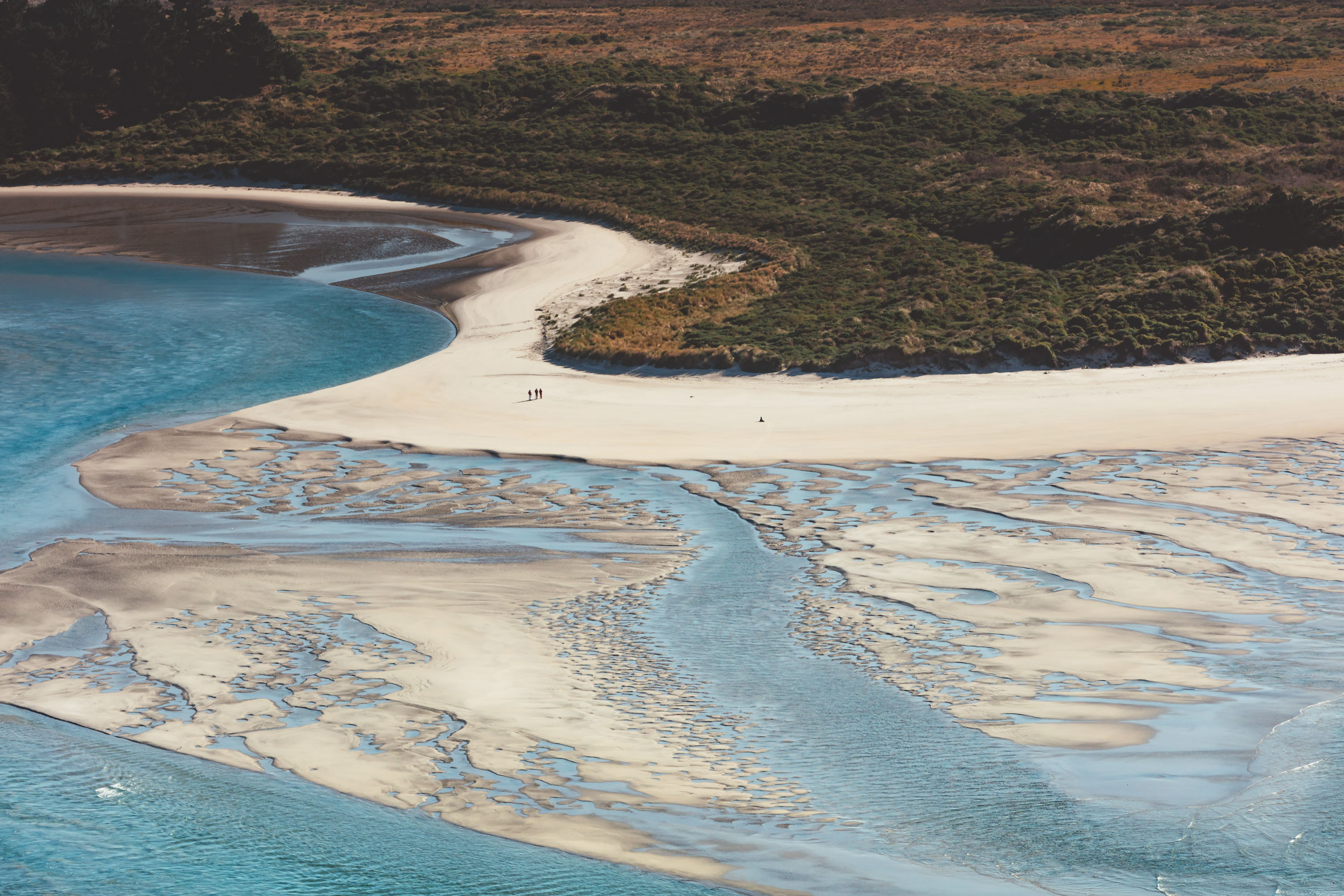
Maud commissioned Irenaeus Herok to shoot aerial, landscape and close-up photography with the intention of capturing Dunedin’s coastline through, what the studio describe as, an ‘ethereal lens’ that adds a sense of movement and wonder. These images have been used to great effect, something stirs inside when viewing these, far more evocative than any graphic element. This is perhaps more crucial as the hotel sits in an urban context, acting as a port, an access point to something far more wild. The framing of images with white borders serves to make a connection with the art world, and the hotel’s involvement with local artists and its presentation of their works within the hotel.
This photo-first approach, within the context of brand identity, which is made up of a multitude of use-cases with a range of limitations, requires further solutions derived from the creative concept. “Do not disturb signs” are not great canvases for photography. So, as an extension of this, the photographs are abstracted into gradations, or extreme close-ups, with flow inherent to the subtle and natural transitions of colour. These gradations are not formal, neither linear or radial, but organic and clearly tied to the landscapes.
Supporting photography is a typographical component. It is this graphical element that delivers a utility alongside the serene, yet it still retaining aspects of the notion of ‘ebb and flow’. This appears, not just in the use of a tidal gauge and motion rising and falling according to where it is placed, but in the unusual character shapes and irregular letter spacing of the typeface Droulers. Formally speaking, some may consider the logotype poorly set, however, it presents something far more sensory and conceptual. Not only does it have within it a rhythm but the extended serifs inherent to the typeface mirror the visual language of the tidal gauge.
Droulers is paired with Unica77, described by Maud as ‘calm and recessive’ and used with other graphic elements, which includes a colour palette inspired by Dunedin’s landscape and a white framing device that draws in an aspect of the gallery component of the hotel. Together, photography, photography abstraction, type and colour, as well as aspects of language are used to develop a form of graphic modulation. This is dialled up and down throughout printed materials and across the website experience.
The notion of ‘ebb and flow’ creates a powerful conceptual focal point. It has a temporality to it, a cadence not governed by the ticking of a clock but the rhythms of the sea. Maud have managed to take this and give this form, weaving it into a number of different visual aspects, orchestrated in a way that disrupts the artificial governance (and imposition) of the urban and settles visitors into an alternate and more natural state, situating them at a point where water meets land.