Forward Majority by Order
Opinion by Richard Baird Posted 7 June 2022
The balance of power in the US isn’t decided in Washington. It’s decided in state capitols where Republicans have gained overwhelming control, asserting systematic bias on voting rights and election processes. Through policies of suppression and gerrymandering, certain priorities and populations are often neglected in election results.
Forward Majority is a political action committee on a mission to accelerate Democratic power in the most consequential state legislatures. The group’s ambition is for a democracy that functions and represents America at every level, built on fair voting practices. To get there, they work to amplify voices and platforms that have been obstructed.
The visual identity was designed and implemented by Brooklyn-based studio Order, known for branding work that often has a political, social or environmental angle (including the core identity system for Hillary Clinton’s 2016 presidential campaign, which was developed together with Pentagram partner Michael Bierut).


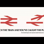
Order deliberately dispensed with classic red/blue colour-coding in favour of a primarily black and white palette to create clarity in the messaging and avoid ‘unwanted political baggage’. The absence of colour in this context also has a sense of urgency – this brand is about impact over ornament.
The monochrome foundation also enhances the expressive typography at the heart of the identity. The font family for display text sizes is Original Sans from Commercial Type. It is a revival of the first typeface to be called ‘sans serif’, released by Vincent Figgins in 1828. Although this progenitor was cast in Britain, it shares the bold, brash confidence of typefaces popular in modern protest on both sides of the Atlantic (you might call them ‘strongly worded letters’).

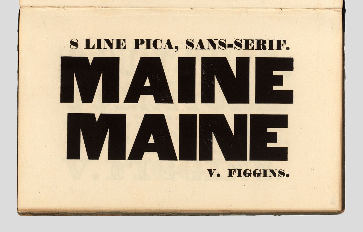
Originally published between 1828 and 1832, in uppercase only, Figgins’ typeface became a popular font in advertising. Its bold weight and geometrically drawn capital letters have a clear, unapologetic presence, while the variable letter widths and modulated strokes can suit a variety of different voices. For the same reason, these unique proportions and contrasts suit political action well. (Interestingly, Figgins entered politics himself in his later years.)


The impressive width of Original Sans makes it challenging in portrait applications since the words occupy more horizontal than vertical space. Order has found a time-honoured yet elegant solution to this design challenge by distorting the perspective. It’s a device that helps carry two key ideas: amplification and progress. In black and white, it is distinctive and powerful.


Order has partnered Original Sans with Graphik – also from Commercial Type – for body copy applications. By the foundry’s own account, this supporting sans serif is ‘vanilla-flavoured’, which makes it ideally suited to whatever style of expression is needed. The paired typefaces have similar geometric proportions, especially in the uppercase letters, which creates a pleasing harmony.

The treatment has similarities with the work of the Russian Constructivists, who tried to move away from the ornamentation that was prevalent in commercial design during the early twentieth-century. In Alexander Rodchenko’s poster ‘Books (Please)! In All Branches of Knowledge’ (1924), for example, a limited colour palette (predominately black, white and red) is combined with an expressive sans serif typographic arrangement. For the Constructivists, angled or distorted letters stood for a sense of progress; a radical departure from old beliefs.

Order’s identity for Forward Majority can also be connected to a more recent trend, with a similar agenda. When Alexandria Ocasio-Cortez was elected to Congress in 2018, the media dissected her campaign. It was refreshing with a slanting, rotated sans serif, the omission of stereotypical political elements and new colours (purple! yellow!).
It marked a clear counterpoint to her Democratic opponent – Joe Crowley – whose campaign relied on a boilerplate serif in predictable red/blue. Here, the choice of typeface showed the difference between the two politicians: a conservative way of doing politics as usual, or AOC’s progressive alternative. It marked a turning point in Democratic design.
In America today, design for political issues (on both sides of the debate) has reached a point where it must reject old tropes to reach new audiences – it can no longer rely on the stars and stripes, bald eagle, or a lurid Wild West style. Order’s work for Forward Majority breaks through the stereotypes to establish its own momentum, mobilise voters and empower under represented voices.