Plenty by &Walsh
Opinion by Kinda Savarino Posted 2 August 2022
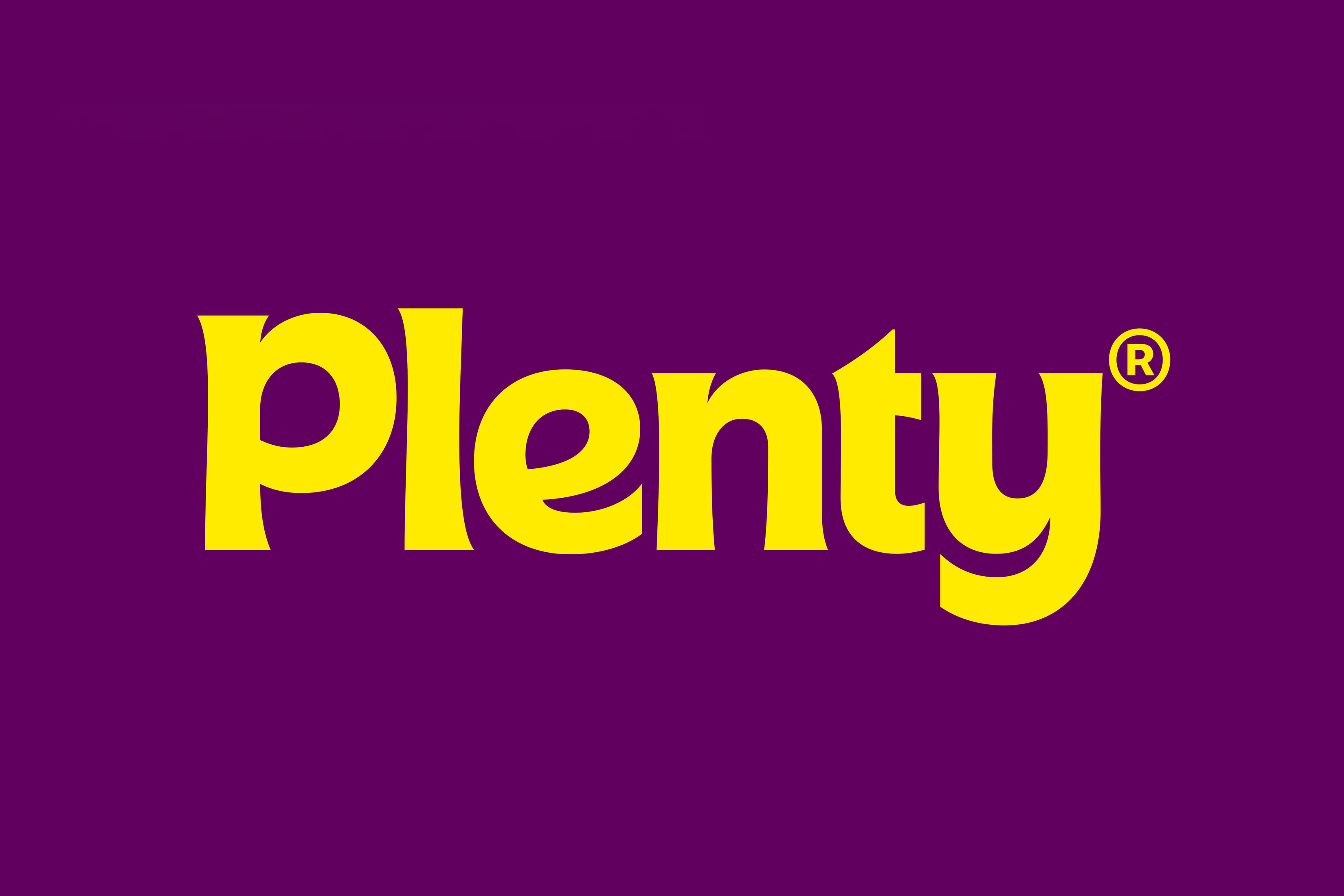
Agricultural practices are constantly changing to provide greater crop yields. In an effort to achieve this goal, modern farming has created a host of ecological side effects. Most notably, overconsumption of water and a reliance on chemical fertilisers, GMOs and pesticides. Plenty is an indoor vertical farm providing green produce to the masses through sustainable practices, using less space and fewer resources than traditional agriculture.
The brand approached NY-based &Walsh for a rebrand with two key aims. The first was to convey the ‘uniquely craveable flavour’ of fruit and veg, and the second was to create a ‘warmer and more approachable’ brand than the existing identity, which had an industrial aesthetic led by an angular logo.
This post includes Extended Insights for BP&O Plus members.
Find out more and sign-up here.
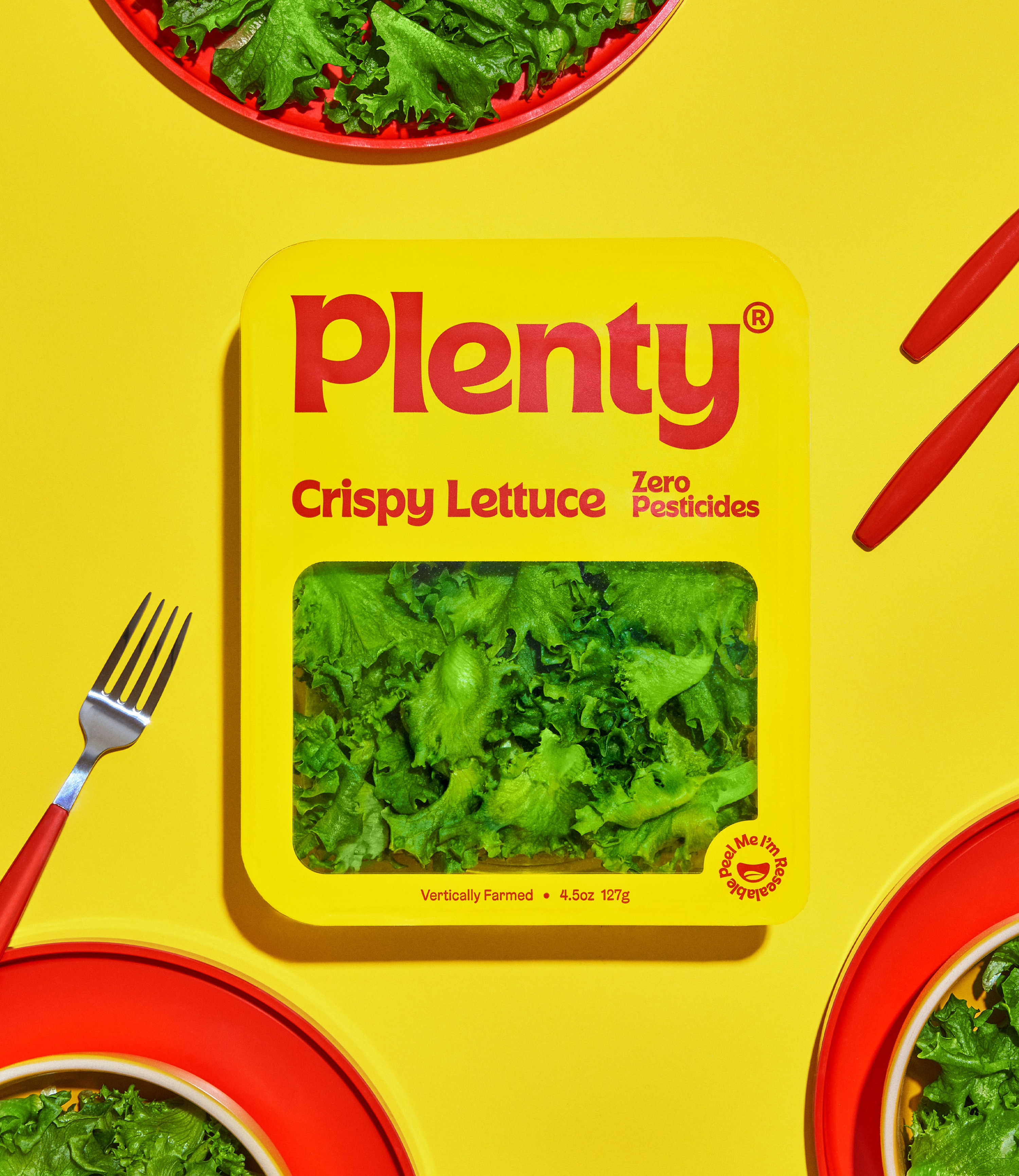
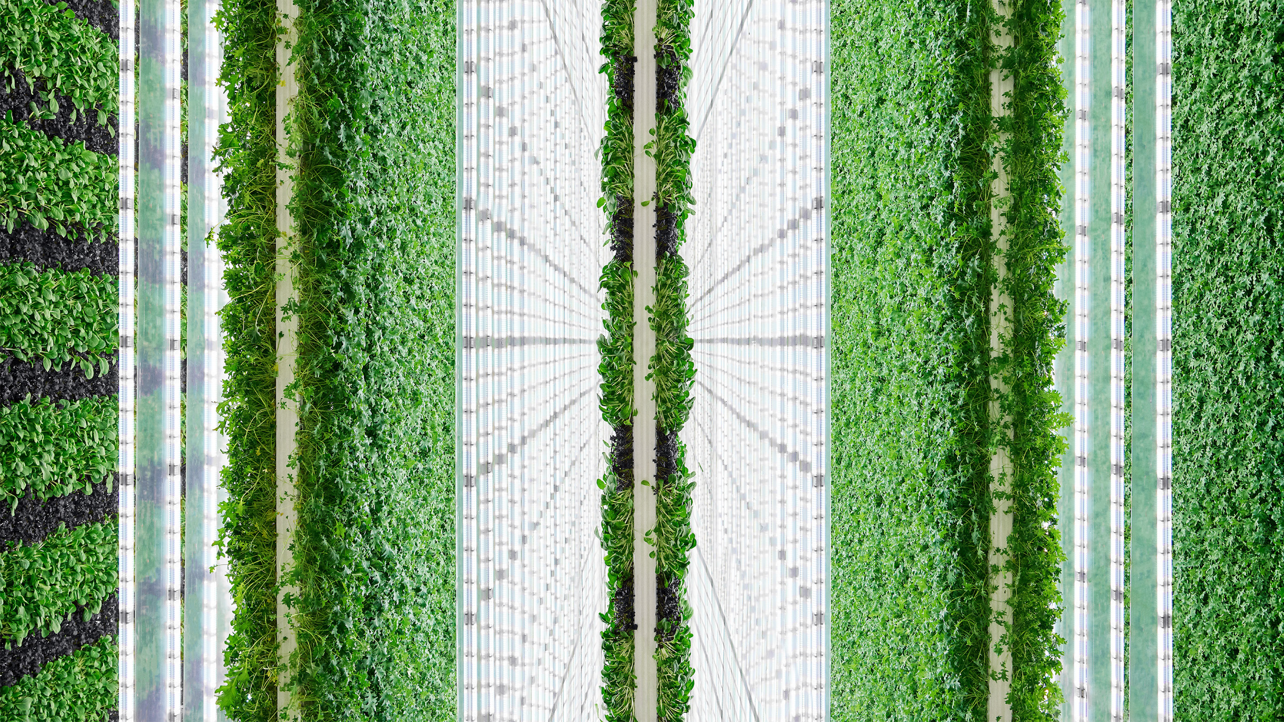
Design for environmentally-conscious brands has long relied on muted green / earthy colour palettes and ample white space, among other familiar archetypes. These include the use of natural textures such as kraft paper, organic shapes and minimal design. &Walsh’s brand development for Plenty inverted expectations when the studio took a completely fresh approach to design in this space.
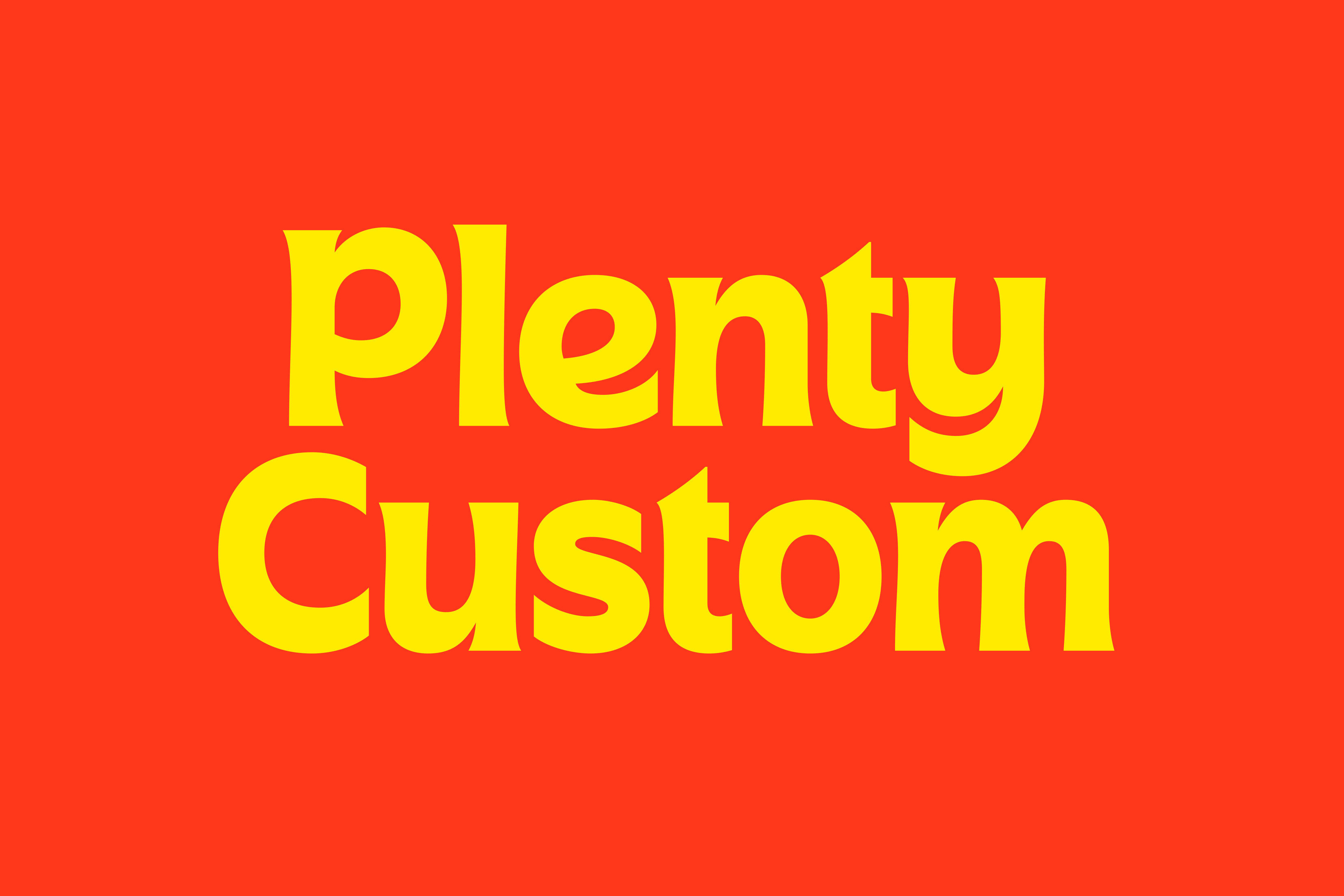
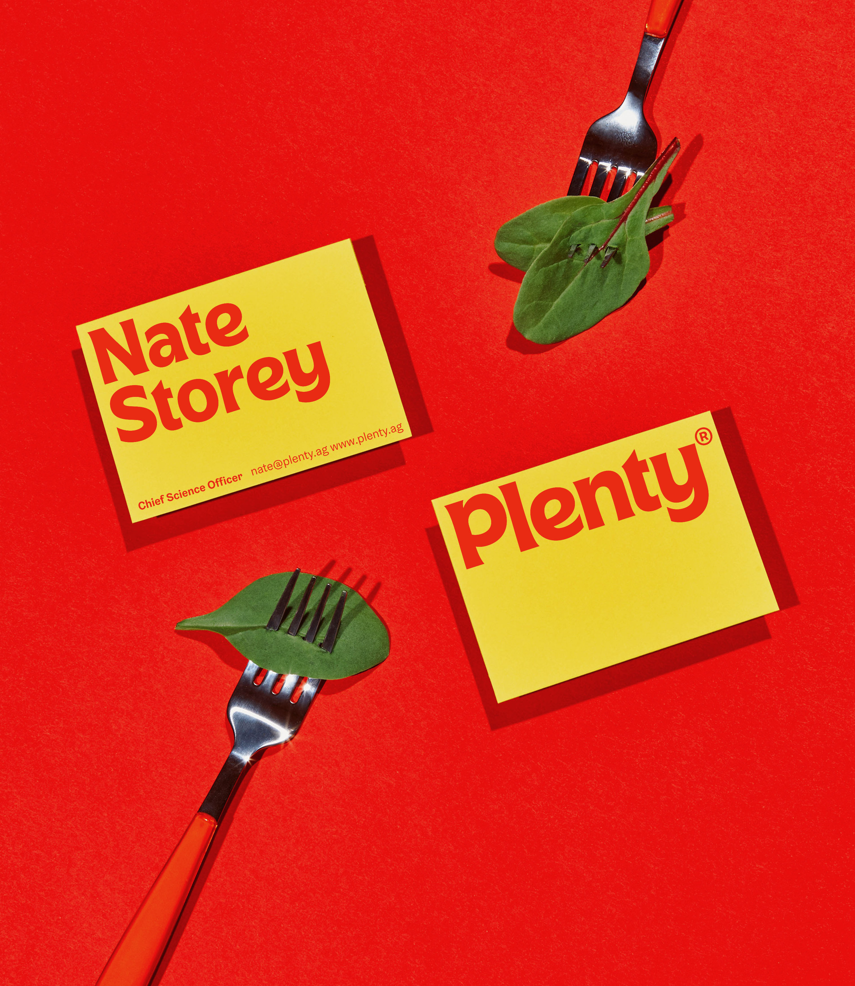
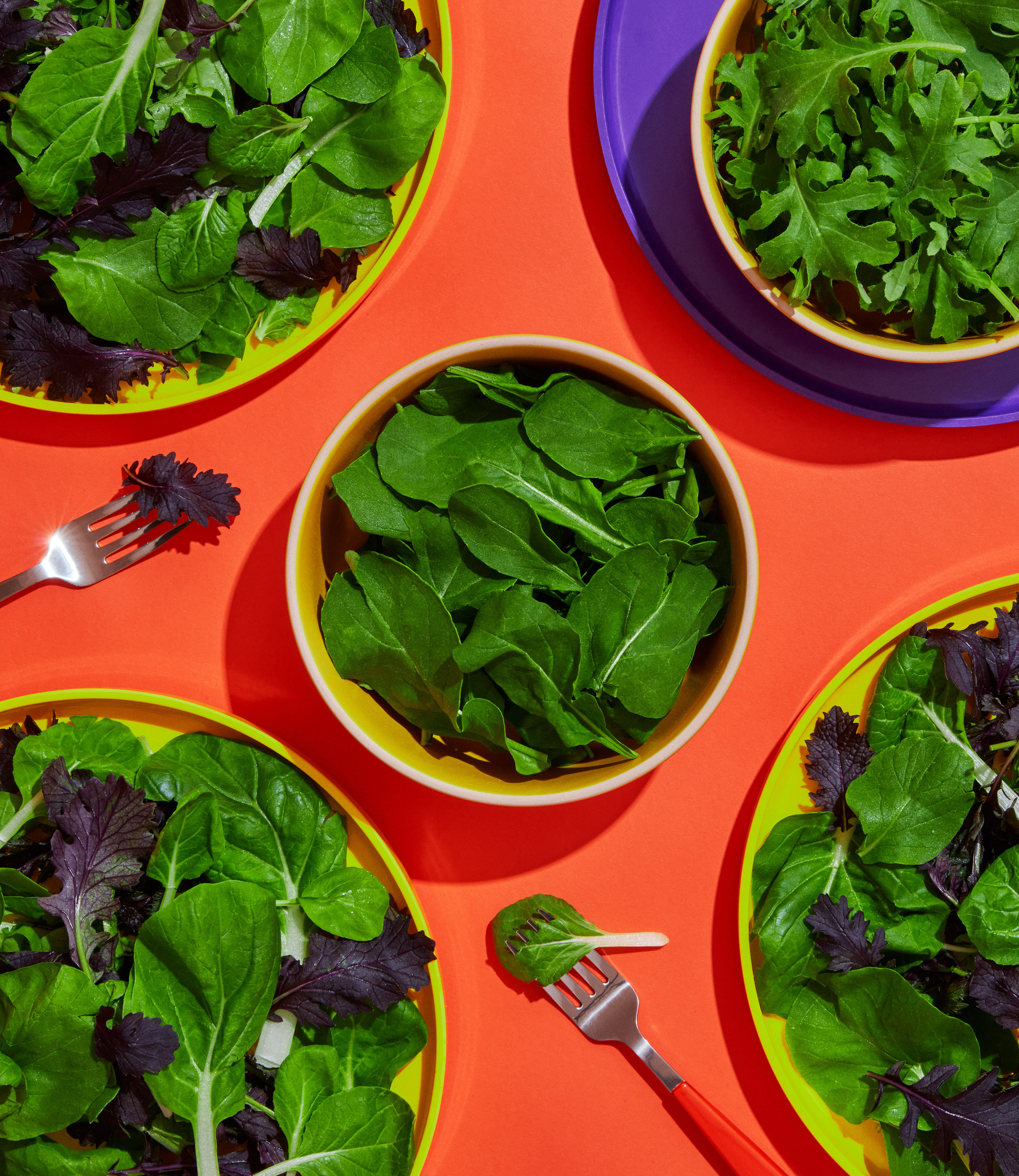
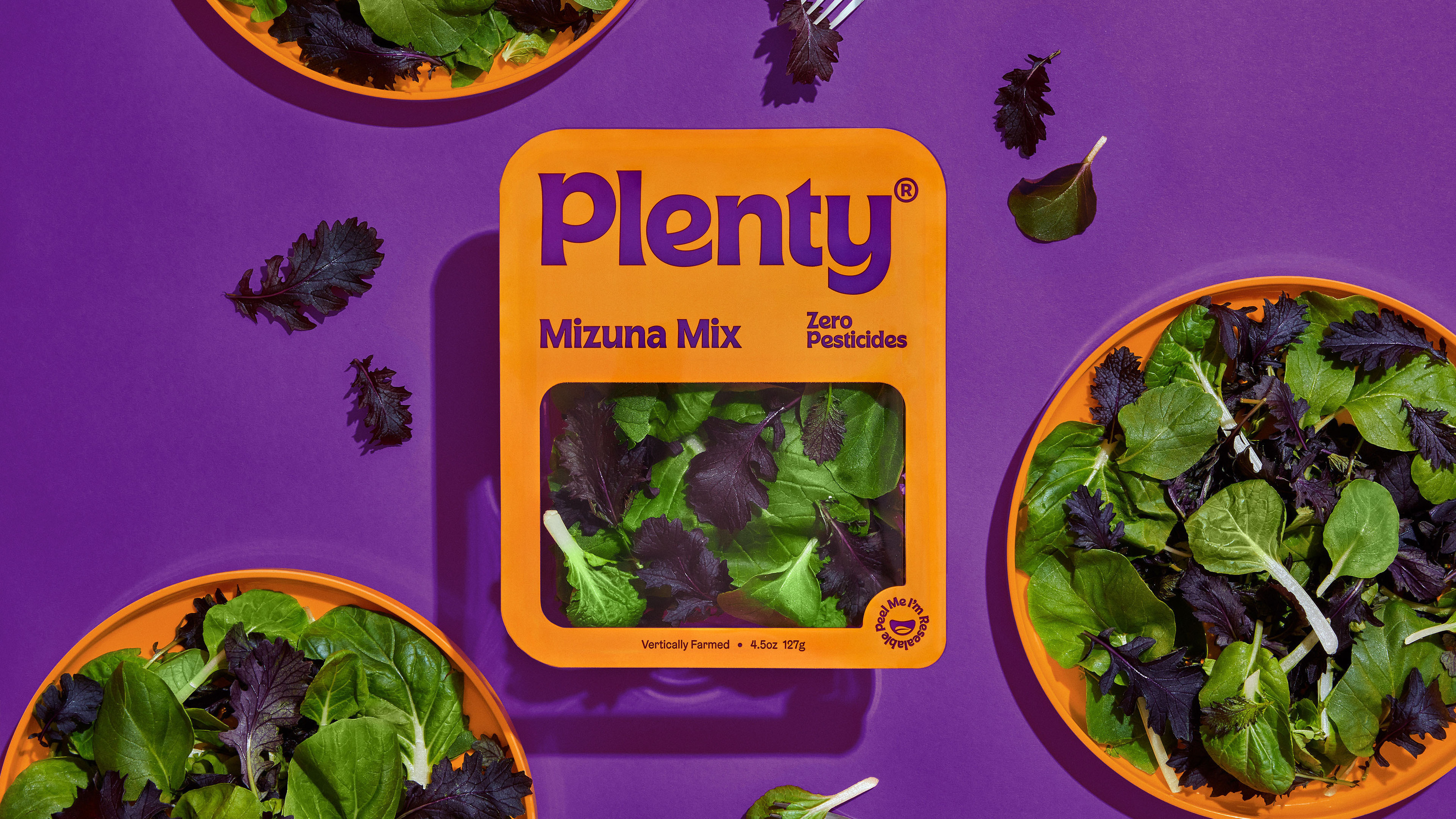
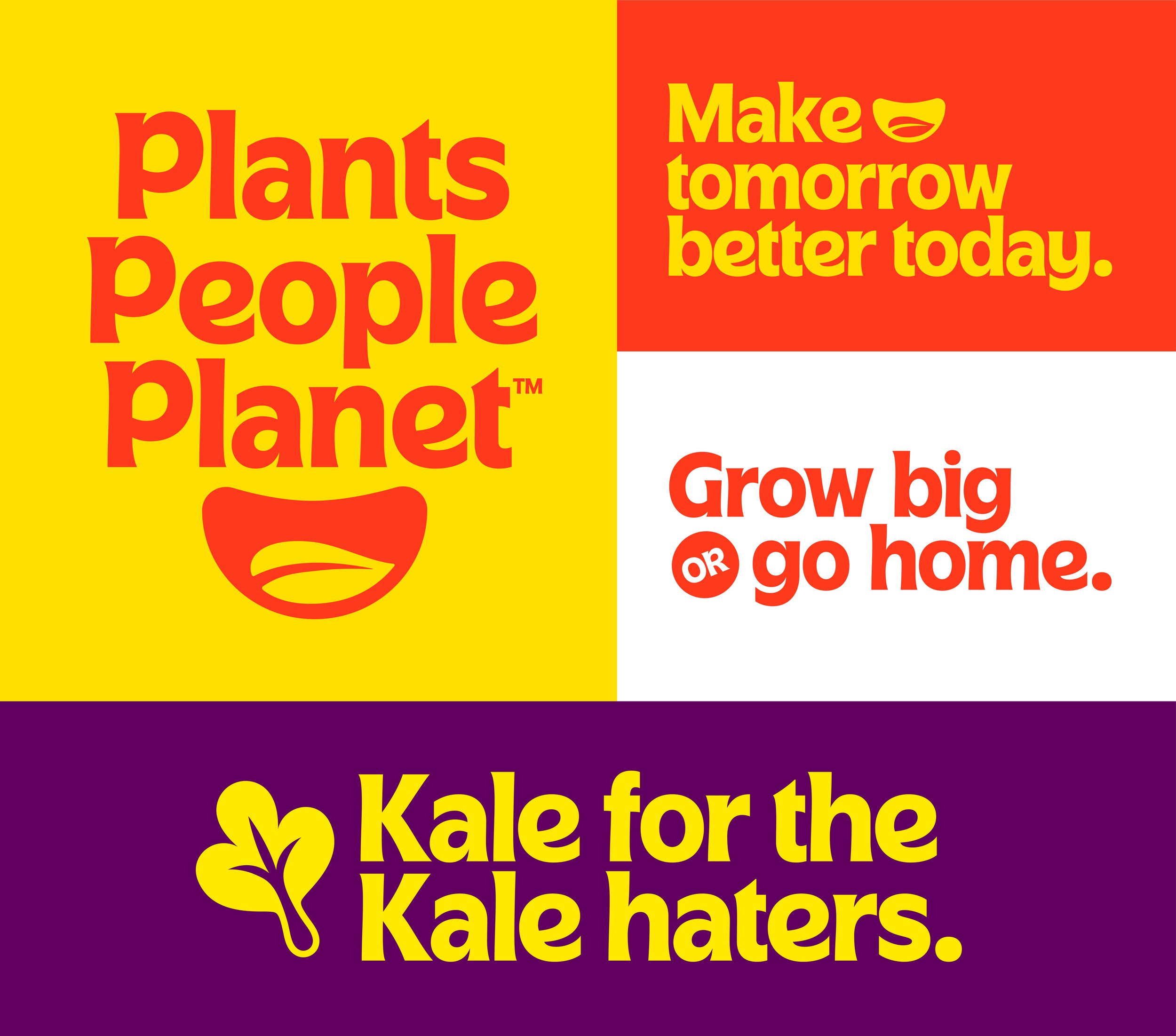
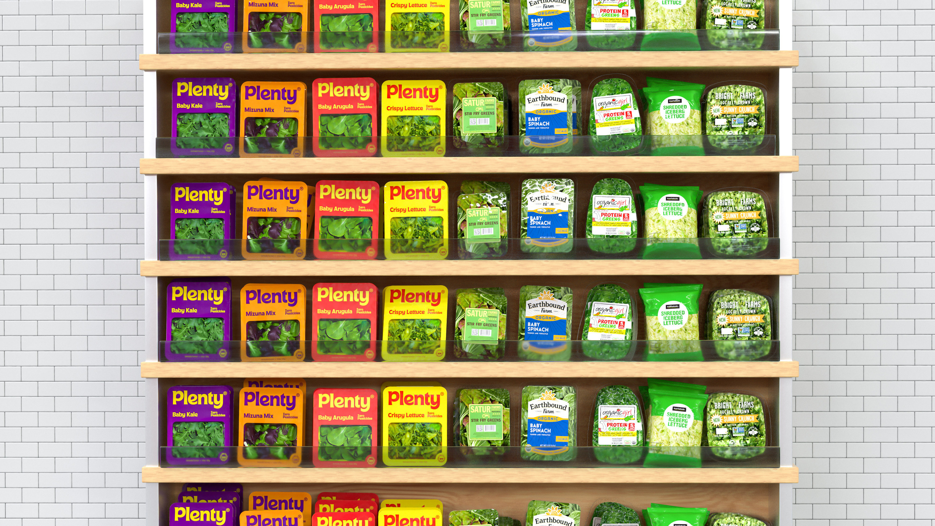
With bold type and a bright complementary palette, you’d be right in thinking that the work draws inspiration from fast food and FMCG products. The colours are the best indicator of this with iconic McDonald’s reds and yellows serving as primary brand colours, supported by impactful purples and oranges. Green is nowhere to be seen, other than product photography.
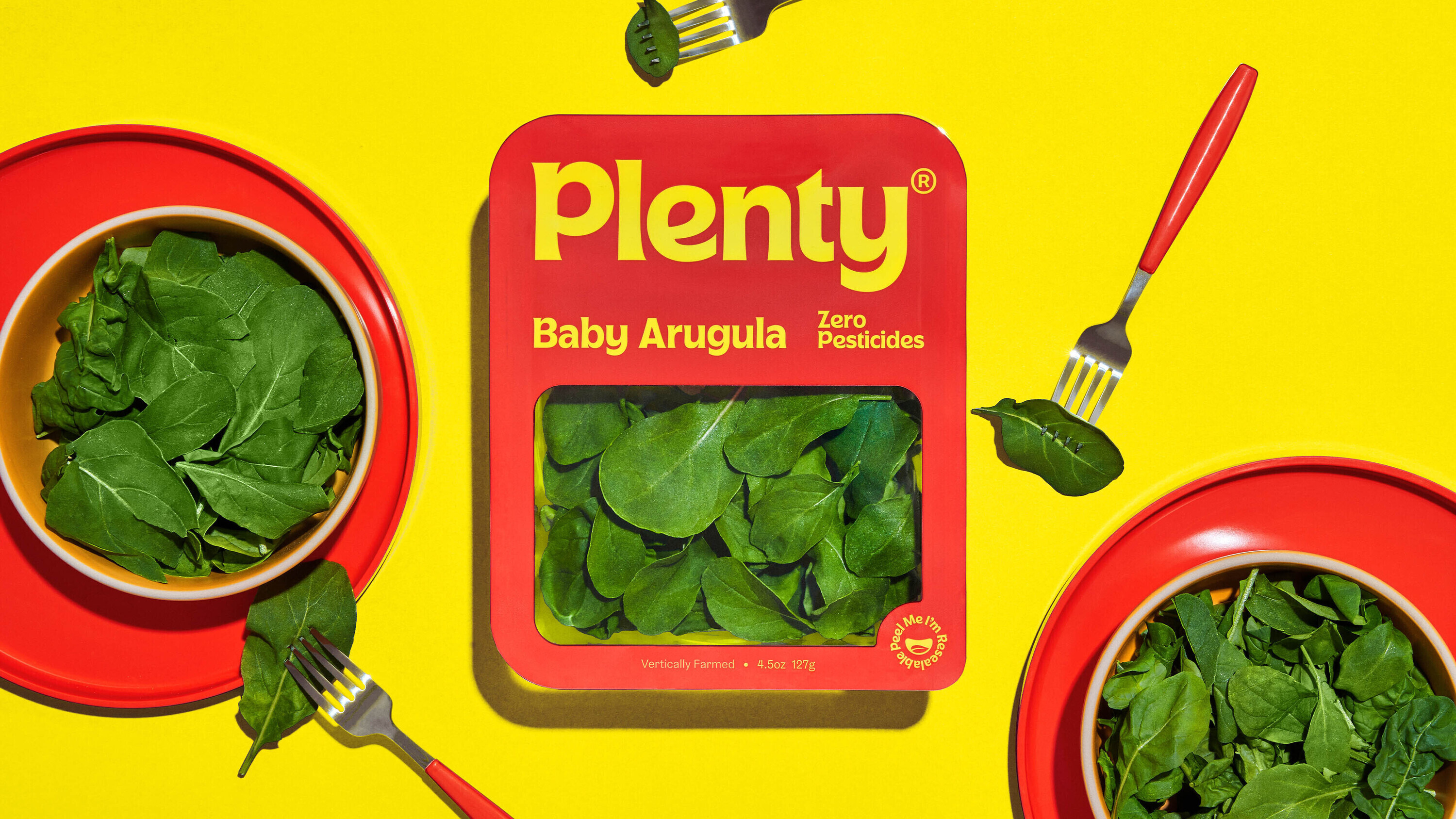
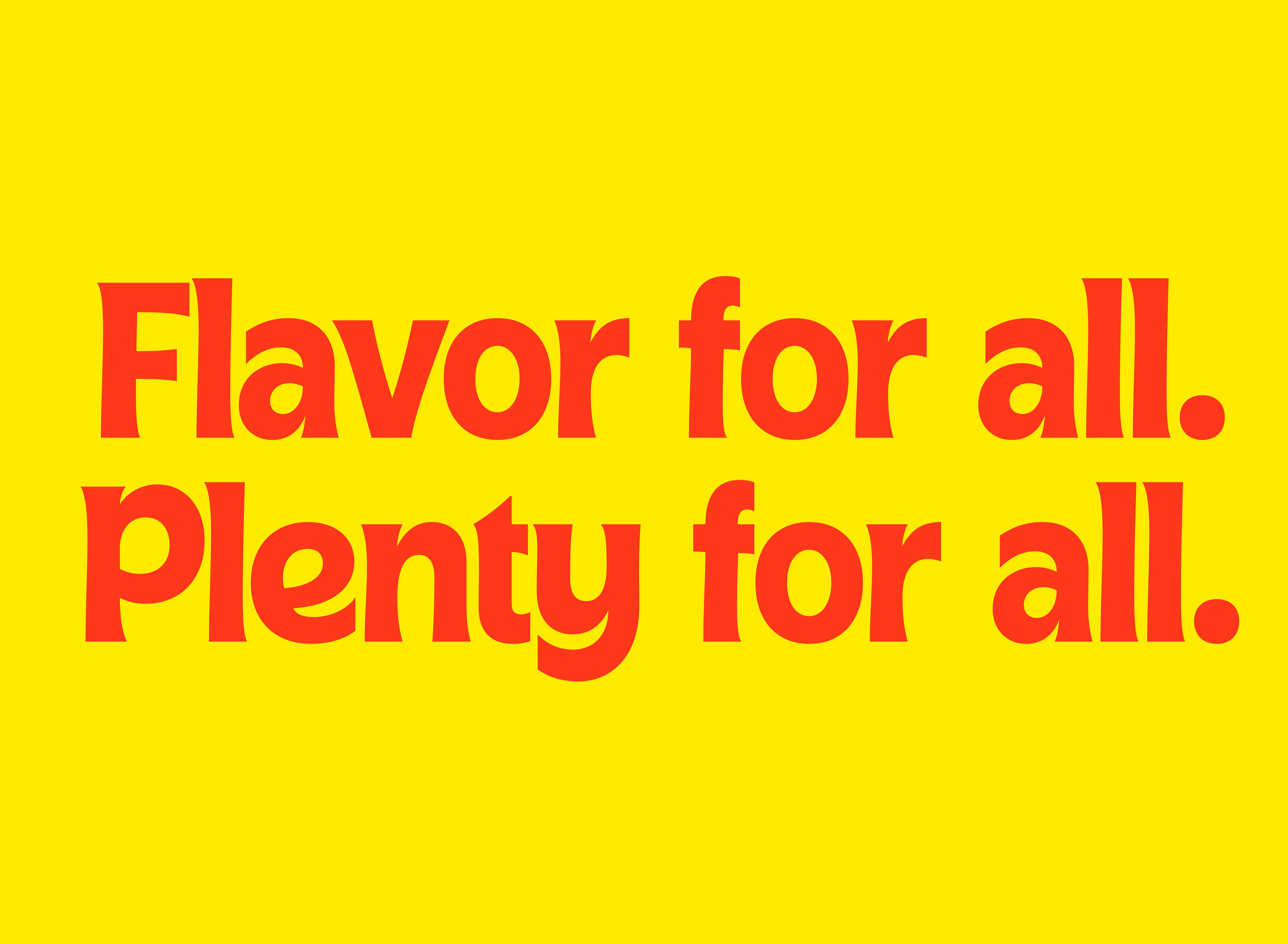
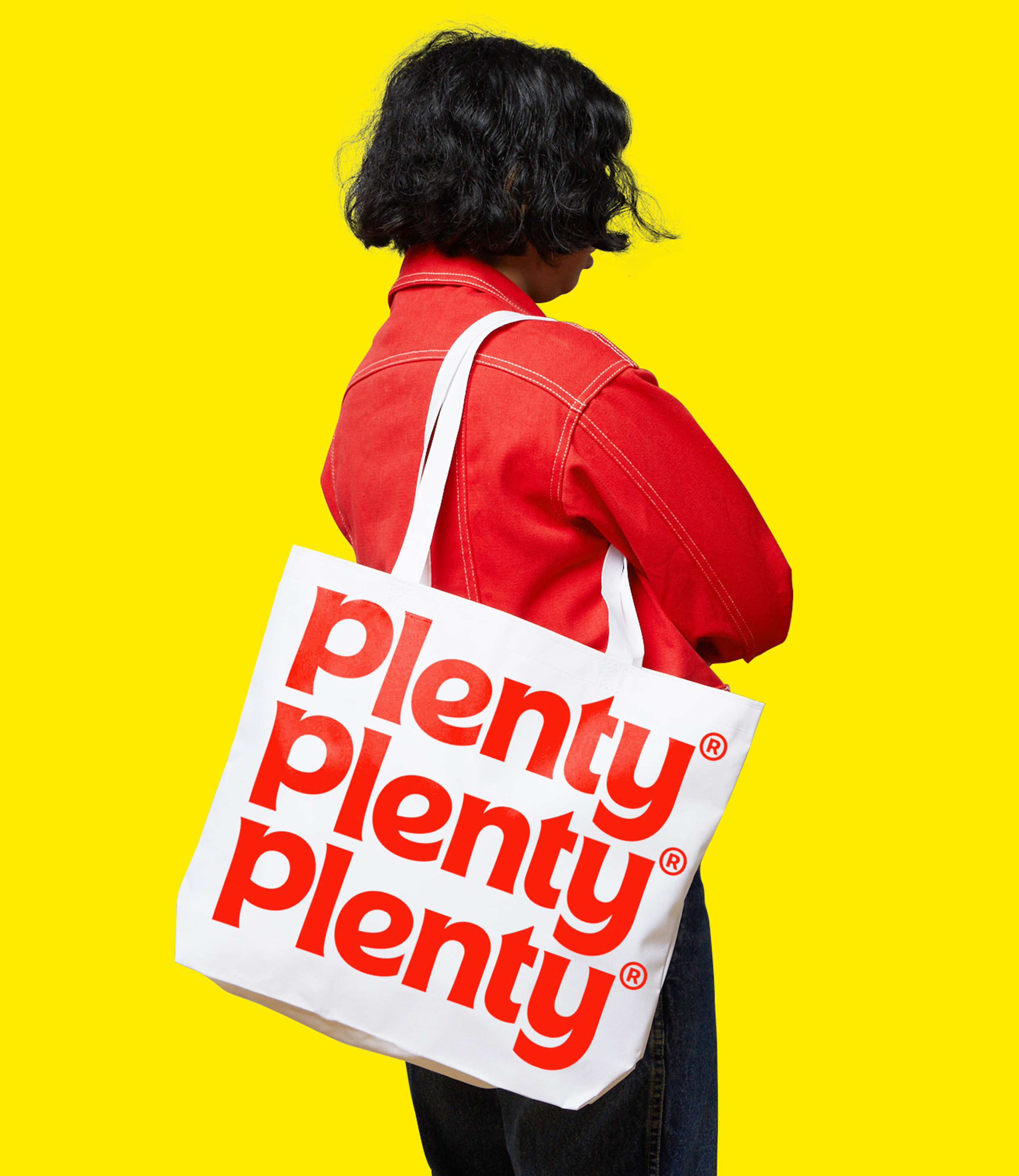
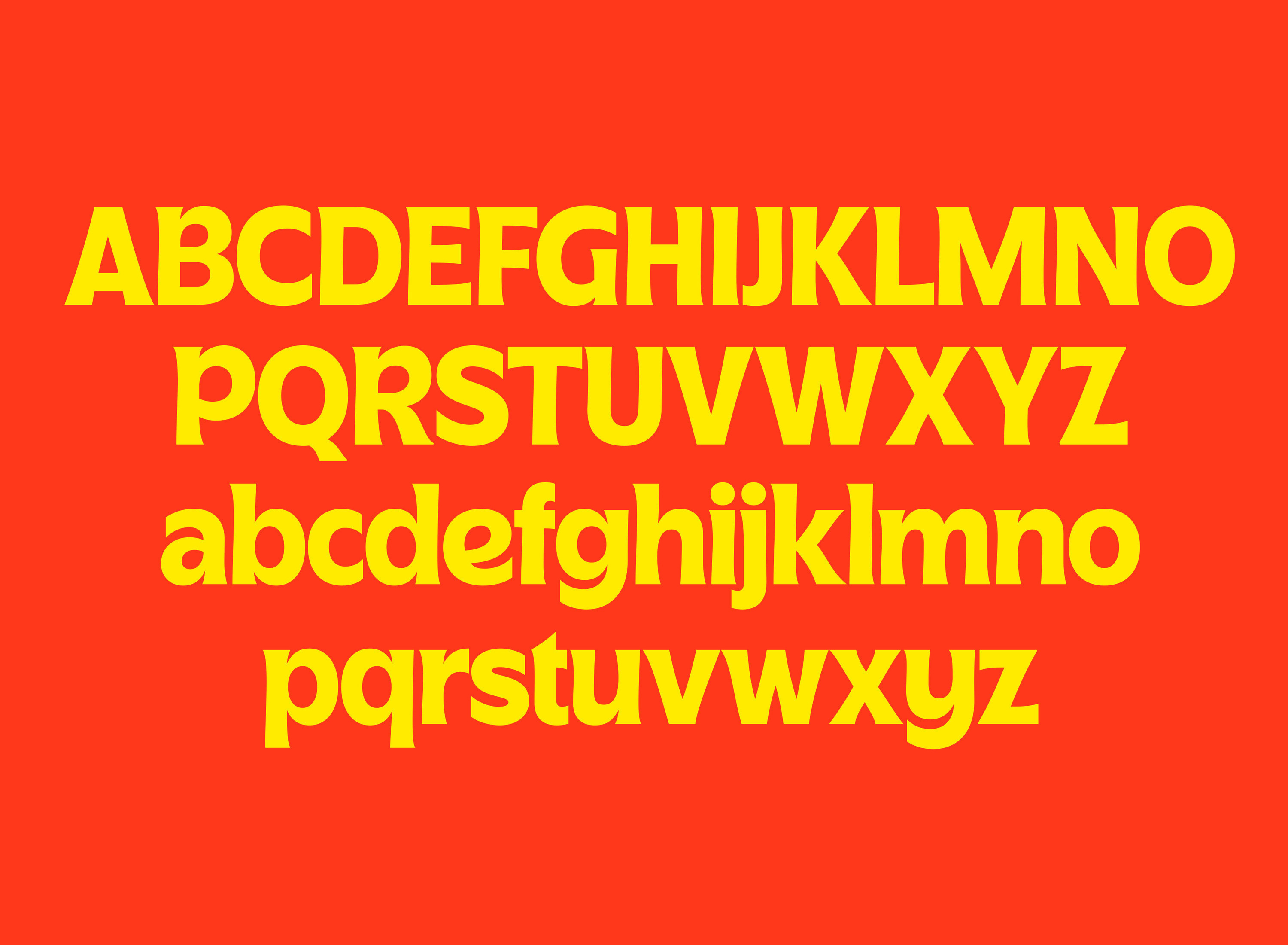
While the colours chosen by &Walsh bring the warmth that Plenty sought, the most striking part of this rebrand is the beautifully-kerned typography. Plenty Custom is a bespoke typeface created by the team at &Walsh. It uses organic forms, avoids straight lines where possible and has been designed for display sizes of 32pt and above. Its curves, corners and terminals draw inspiration from the leaves of lettuce, rocket and watercress. In combination, this distinctive humanist sans serif and flat palette bring consumers the comfort associated with fast foods, while evoking a 70s vibe and the nostalgia that comes with it.
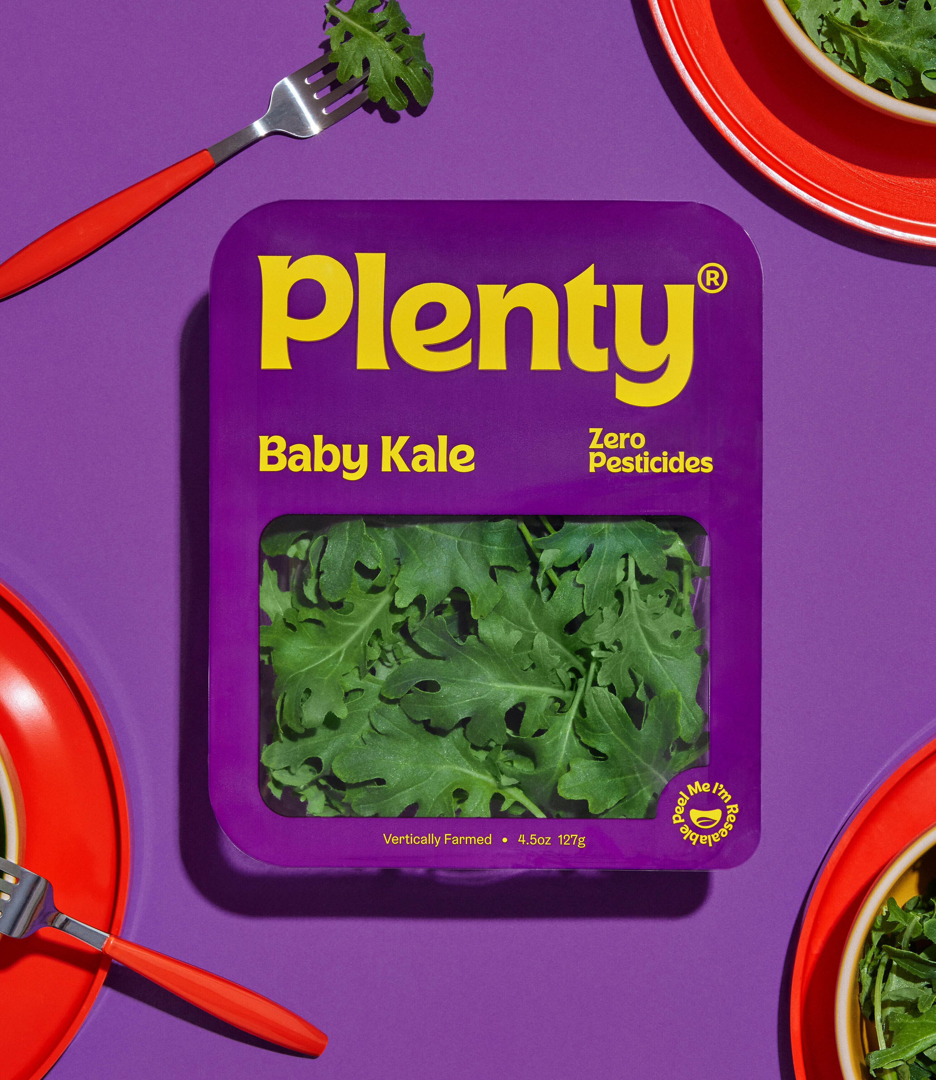
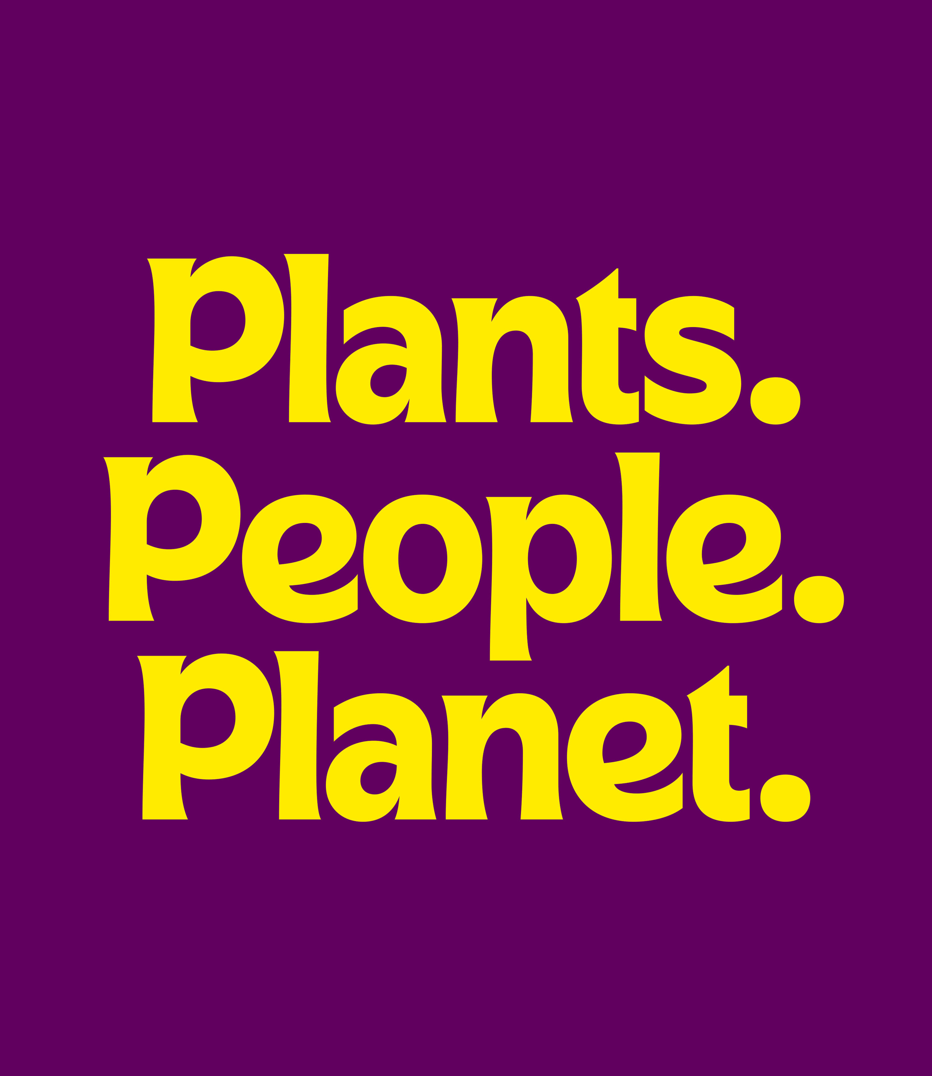
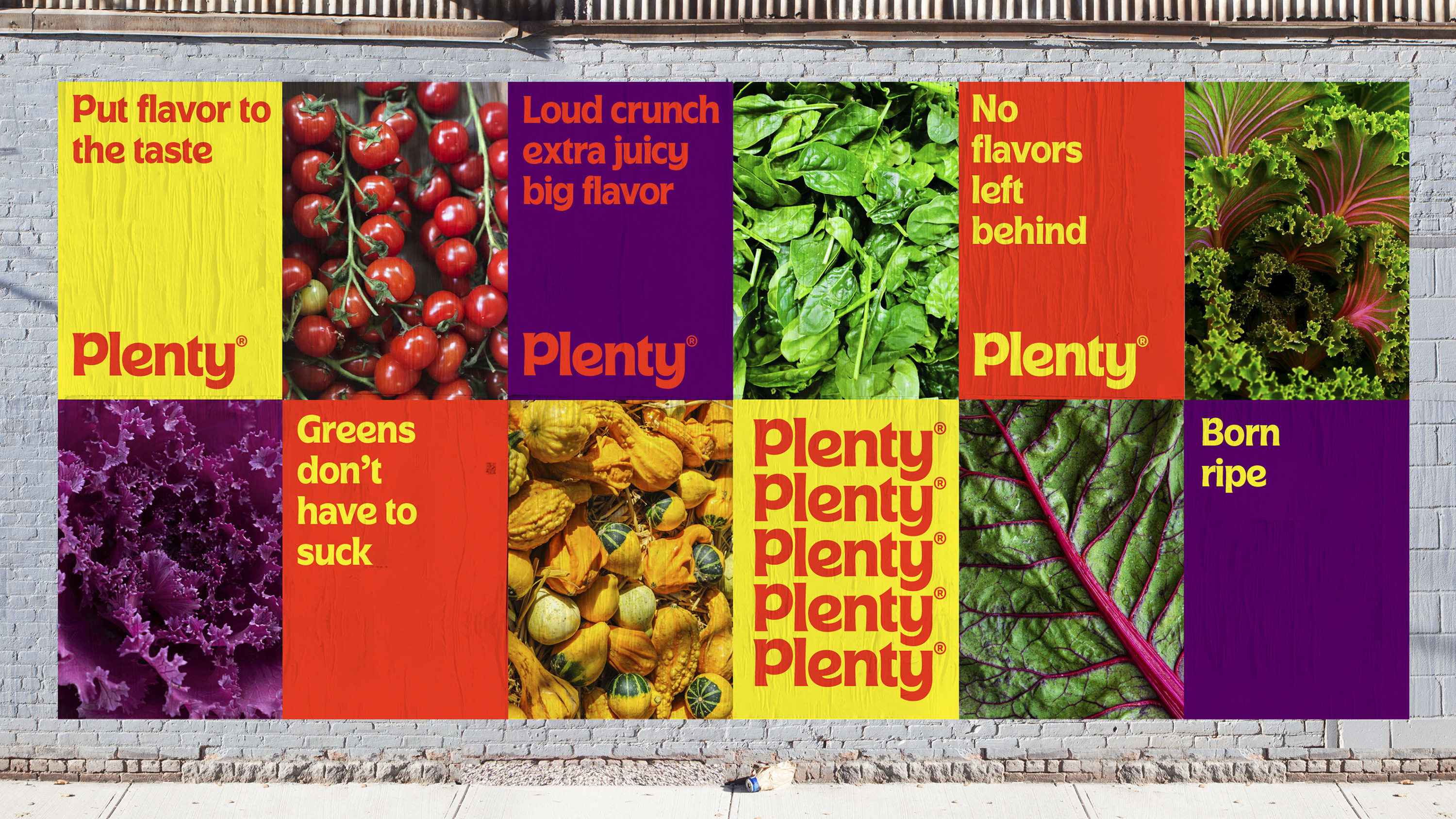
The visual identity alone gives Plenty the tools to stand out from the competition, nods to great flavour and does well to make the brand come across as bouncy and comforting. The copy delivers further on this promise with playful phrases such as ‘let us do you a flavor’, ‘no flavor left behind’ and ‘born ripe ‘. A trip down the veg aisle is enough to demonstrate how much of a sector shift the branding is, and equally how much this helps Plenty stand out from the crowd.
Over the last decade, ‘green’ brands have grown in number and prominence. Designers have approached the visual identity and comms of these brands in a palatable way, drawing upon obvious cues – such as nature – and avoiding colours that could nod to other industries. &Walsh’s rebrand challenges the conventions of its category, perhaps in the bravest way possible, by drawing upon the sector’s antithesis: fast food behemoths.
A change such as this forces us to consider what our preconceived ideas around other industries mean. For example, does luxury always have to look a certain way to convey exclusivity? If &Walsh’s rejection of norms in the eco space are anything to go by, it appears exploration in bending genres and borrowing from other industries is only the beginning. Counter-intuitive is inspiring.
