NN North Sea Jazz Festival by Studio Dumbar/DEPT
Opinion by Richard Baird Posted 1 November 2022
After seeing Collins’ work for the San Francisco Symphony – a pioneering typographic and digital experiment with Swiss foundry Dinamo – I thought it would be some time before I’d be surprised by another visual identity in the music space. Sure, there’s an abundance of styles and artists to be inspired by within an art that has evolved in tandem with human existence. But graphic design practice (and more specifically corporate identity) hasn’t had such a lifespan.
The same graphic tools – colour, type, form and layout – while endlessly reconfigurable – have fallen short in brand building for music, struggling to find a truly powerful synergy between the audio and the systematic programming required of a successful brand scheme. We’ve had some interesting photography (with the Helsinki Philharmonic) and some interesting motion marks (such as the baton for Konserthuset Stockholm), which have moved the industry forward, but still not quite captured the full enveloping force of a live music experience.
Perhaps things began to visibly change in the early 2010s, with DIA’s Mitch Paone, both designer and jazz musician. Paone made a connection, not just conceptually, but in practice, between typography and music – through motion and programming, and by presenting motion as identity, using the way we walk, or the mechanics of a horse in motion as nice examples. Interesting stuff. I’m sure there were others doing similar work at the same time or earlier, but Mitch really drove it right into a commercial sphere with projects for Squarespace and Nike.
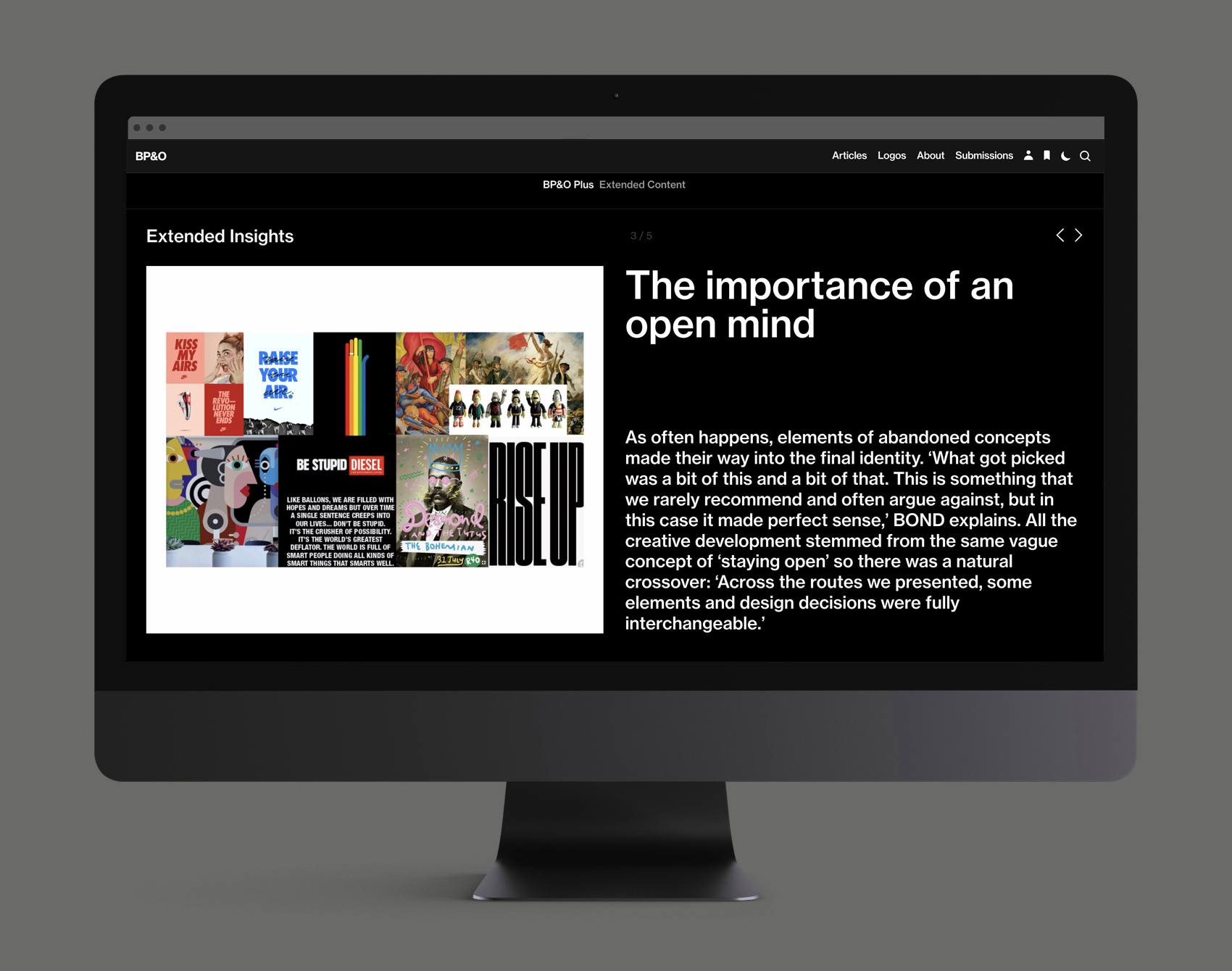
This post includes Extended Insights for BP&O Plus members.
Find out more and sign-up here.
Much motion and commotion has surrounded dynamic type in the years since. As with all new technologies and conceptual leaps, you end up with both great and pointless applications. Collins’ work for the Type Directors Club was a fine example for around 2013, but created for a strictly design audience. It was SF Symphony (SFS), for me, that first represented a fluent articulation of motion as identity in a mainstream context. The work is universal, interesting, easy to get and involving. Tens across the board.
In a recent conversation with ISTD, Brian Collins, founder of Collins, mentioned a chat he’d had the week previously with Liza Enebeis of Studio Dumbar. In the words of Collins, Enebeis and Studio Dumbar, in their work for NN North Sea Jazz, had sought to ‘out do’ SFS. These are quite different projects. One is a brand that has to exist and continually produce interesting work over time; the other, an event that exists in a predetermined time and place on an annual basis, with a limited set of assets. Comparison isn’t necessary, but sure, competition is healthy, and the projects are both music-related.
The set-up…NN North Sea Jazz Festival (NSJF) is said to be one of the world’s largest and most loved jazz events. Each July, over 90,000 fans visit Rotterdam’s Ahoy exhibition and music centre to watch 1300 artists on fifteen stages. Over three days the seaport becomes the jazz capital of the world.
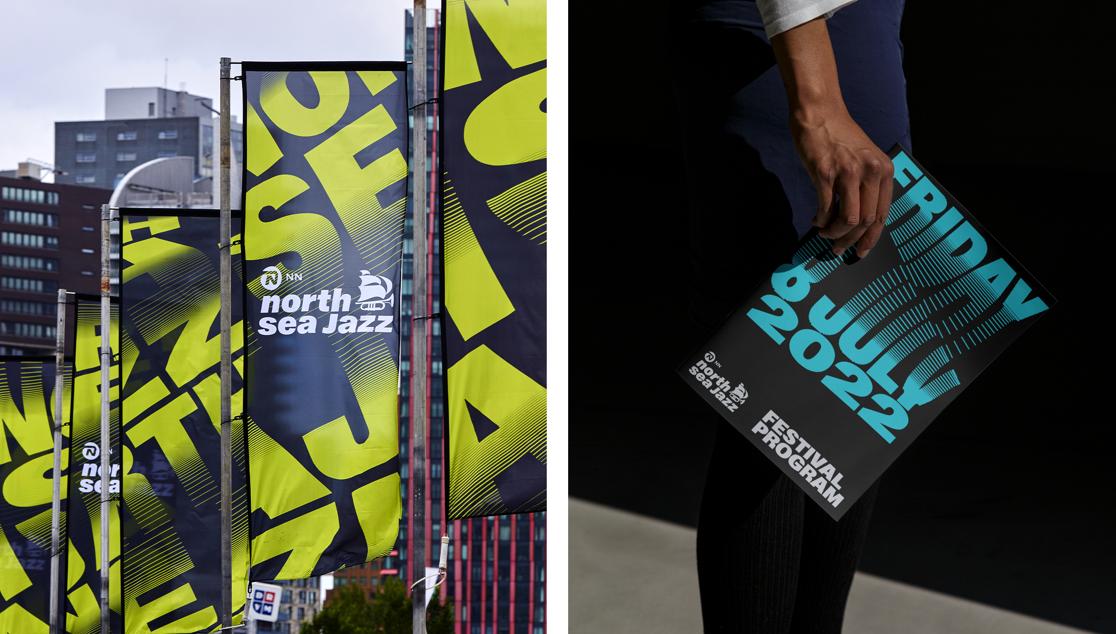
For many brands and businesses, the pandemic presented a unique set of problems, as well as opportunities to rethink and prepare for the future. Wanting to better reflect the diversity of the event’s programming – encompassing everything from jazz and fusion to hip hop, world and R&B – and appeal to a younger audience without alienating recurring visitors, Studio Dumbar worked to develop a new visual identity for the festival. Their response? A dynamic wave of lines and typography driven by the rhythm, movement and energy of live performance and realised through custom code to animate text for both motion and still applications.
Strategically speaking, the festival needed to broaden its appeal and extend its communications to include the spaces and places a new generation of listeners are growing up in (primarily online and through various image-first platforms). Basic engagement has now switched to ‘time watched’, and motion graphics seem to be a necessity at this point. Even BP&O now has its own Motion filter right in the menu (and we hope to build on this). The Netherlands also has an extensive network of outdoor ad screens, run by Exterion Media. Studio Dumbar recently utilised these to develop DEMO, an exhibition of the finest motion work by design studios. Motion graphics are not limited to the computer or phone screen – this is the new frontier of networked outdoor advertising and exhibition. The studio’s work for NSJF is clearly an extension of this knowledge, experience and connections.
What differentiates this work from SFS, in terms of visual language, is the spatial component. SFS exists on X and Y planes, stretching up and down, left and right. Here, there is folding and looping in space, the proximity of lines creating a sense of light, shadow and depth. Combined with this, the slinky-like expanding and contracting type – Gravity (and supported by Monument Grotesk) by Dinamo – flows like waves, capturing the enveloping nature of music, and lending the project an additional dimension. It fills space, flowing from one plane to another. This is important: these behaviours, inherent in the motion of type, are the identity, supported by type choice and colour. Just as with SFS, there is an intersection between communication and identity, without the need for other elements (such as logo etc), this keeps it simple, identifiable and informative.
Another similarity with SFS is that there is a programmatic element to the design work, a custom code to figure out complex spatial equations. What would have taken Italian legend Franco Grignani hours, perhaps days, to draw up – his work shares a similar line-based looping quality – can now be rendered quickly.
If I were to raise one further comparison between SFS and NSJF, it would be contingency. SFS is open to much more in terms of ‘happenstance’, less control over outcome – and it benefits from this. What’s appealing is that type doesn’t always fit the preconception of ‘good typography’ or ‘good design’. Conversely, Studio Dumbar’s project feels far more planned. That’s not to say there wasn’t a lot of experimentation, only that the final results appear less like happenstance and more structured to meet the requirements of key contexts (namely Exterion Media panels). Further, visuals are closely aligned to their audio tracks, and the shapes and paths that type folds around are more rationalised, and there is definitely a pleasant symmetry here with sound waves as well as ocean waves (Rotterdam being a harbour city).
In both cases, SFS and NSJF, technology has been used to deploy an idea rather than shape it. Both benefit from this approach. I look forward to seeing how this develops further in the next few years.
