Sing King by Nomad
Opinion by Richard Baird Posted 24 November 2022
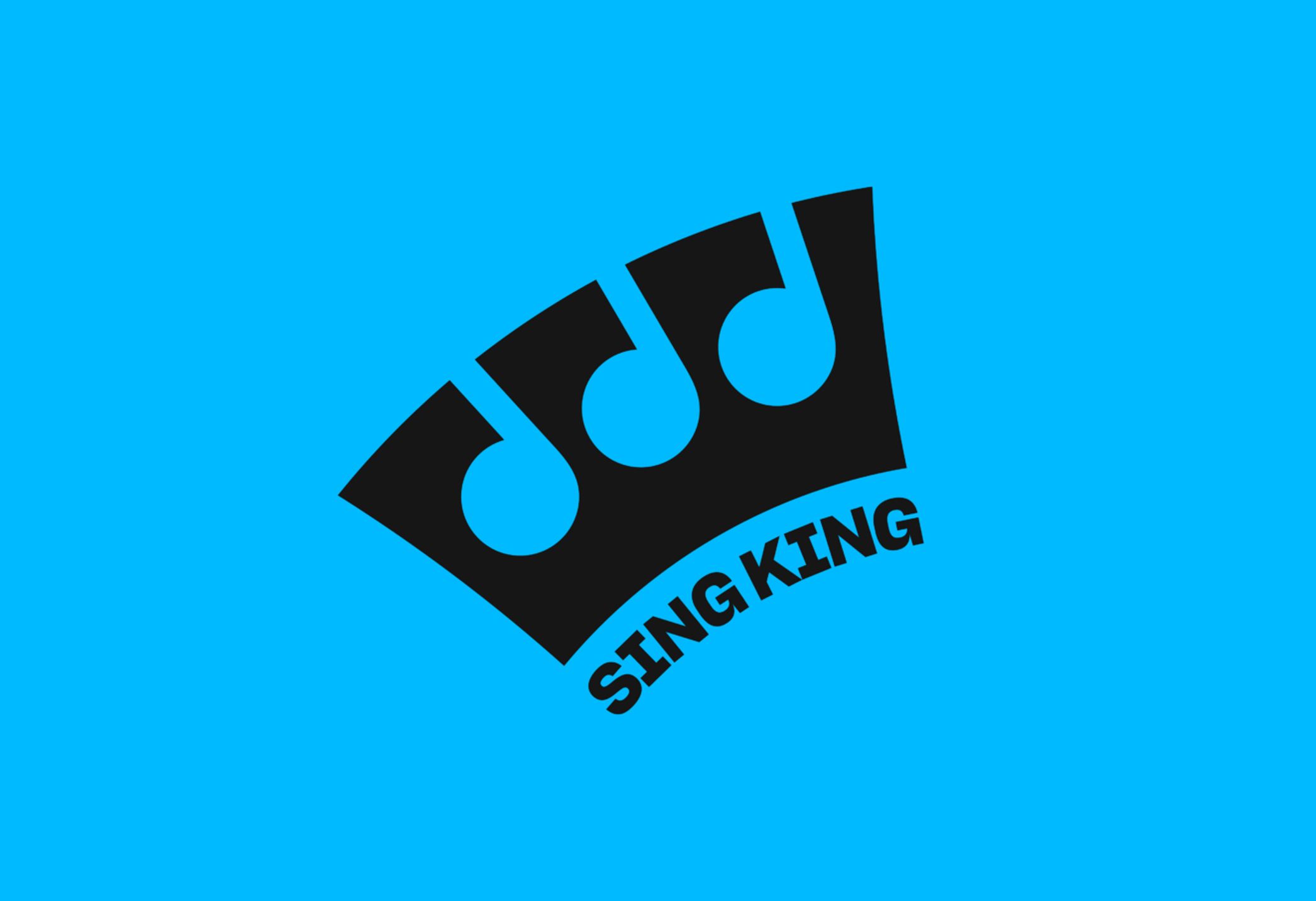
I’m going to break with a decade of convention and jump right in. I love this. I was sold as soon as I saw the logo, it’s in the BP&O Gallery. It’s rare you see this kind of logo today. It’s mostly, and understandably, logotypes that prevail today. Those that are striped down to function well on multiple devices. Blanding? Whatever. Anyway, sometimes you just need a killer logo, and Nomad did just that. Doesn’t need explaining and is certainly memorable. Anyway, that’s out the way, probably best to get on with the set up.
This post includes Extended Insights for BP&O Plus members.
Find out more and sign-up here.
Sing King is, put simply, the world’s most searched karaoke brand and what Nomad describe as the undisputed destination for karaoke lovers online. It’s also the biggest online karaoke community, with 10 million YouTube subscribers. Impressive. Alongside Youtube, Sing King exists as an app, with subscribers able to carry thousands of songs around in their pocket, to sing wherever, whenever, for free. For those unfamiliar with the brand, it essentially has instrumental versions of trending and classic songs, and the words synced up on screen, as you’d expect of karaoke, but done with the slickness that is far removed from the karaoke of the 1990s. In fact, it’s much better than the karaoke place I went too in central London more recently. As expressed by Sing King itself, they are “obsessed with the art of karaoke, delivering the highest quality and latest tracks before anyone else.”
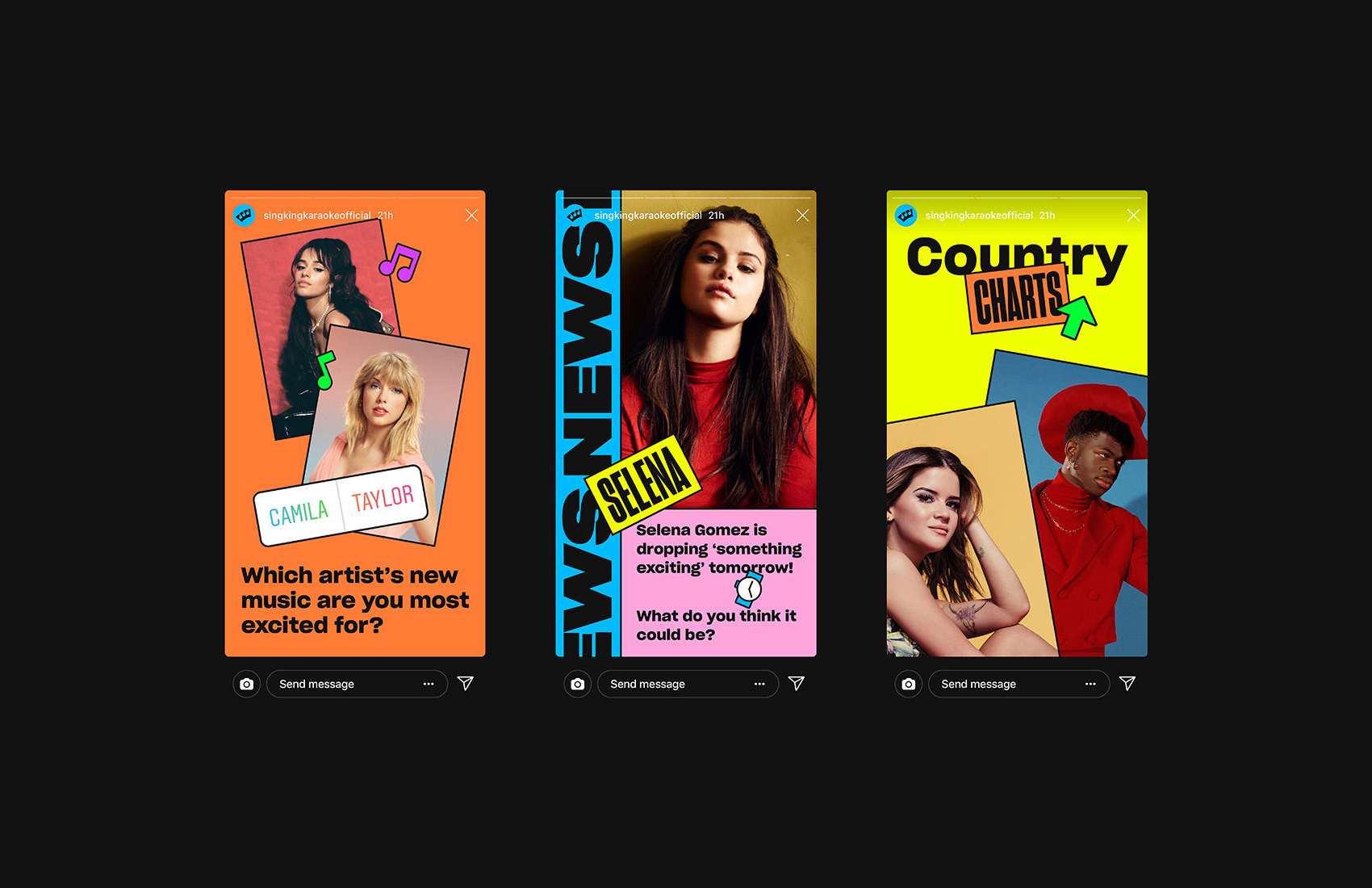
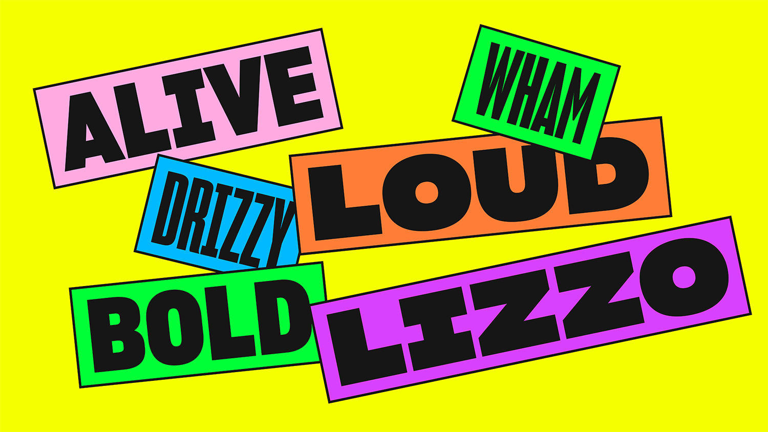
As I began, the logo immediately drew me in, but wow, Nomad went for it on the visual identity. It’s predominantly an online brand, so colours, motion and shape have been dialled up to 11. It’s RGBOMG. It’s eye-catching, a bit off the wall and full, and I mean full, of character. There’s a lot going on but it’s beautifully consistent and systematised, be that through the simple use of thick outlines like a felt pen, the stacking and layering of elements (utilising the material character of stickers, but not the fruit sticker trope we saw sweep the design industry) as well as a broad but consistently applied colour palette and series of motion behaviours.
Nomad mostly handle all their client requirements, rather than handing off guidelines to an in house team. An identity like this needs a steady and experienced hand that can work each detail up. It could have easily become an incoherent mess, a car crash of colour. This is why much of the studio’s work holds up. Remember when client/designer relationships was lasting, and we didn’t just drop off a PDF brand book and leave quicker than they could say Excel, Word or Powerpoint. It’s expensive, but look at this! It’s got to be worth it.
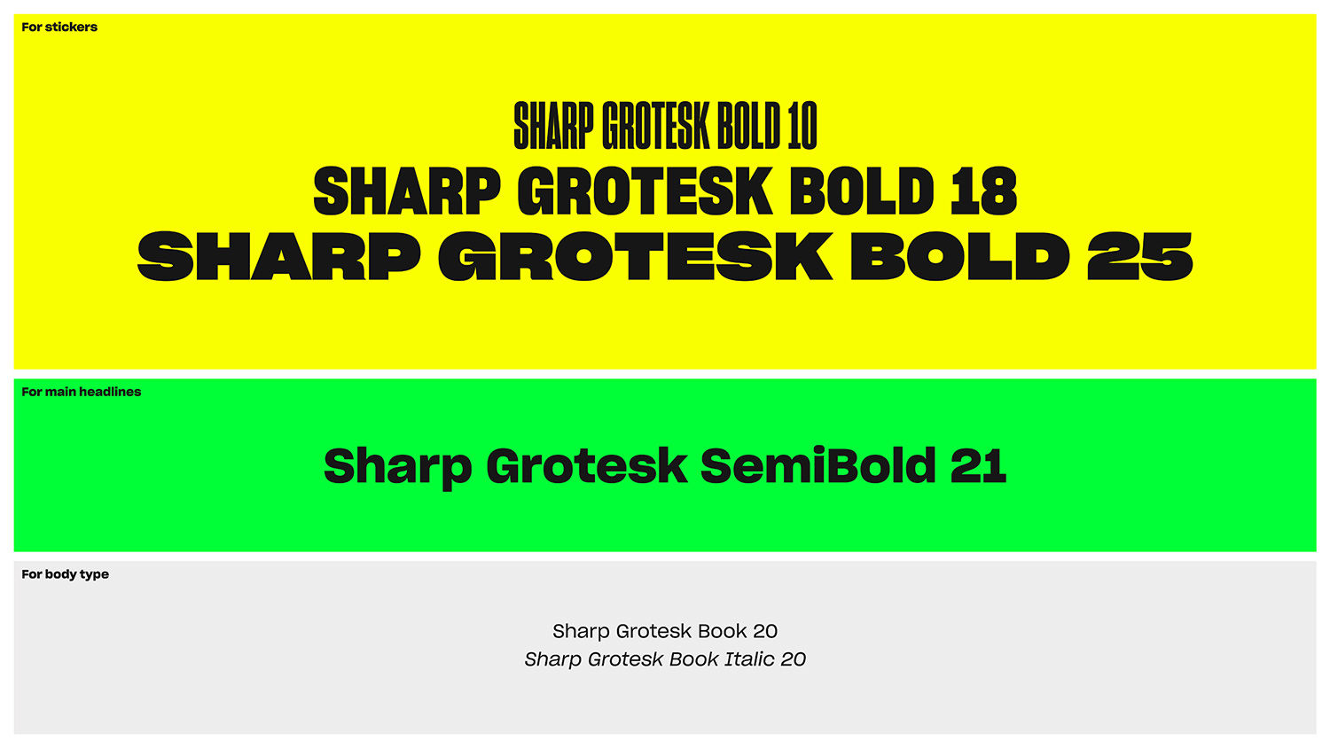
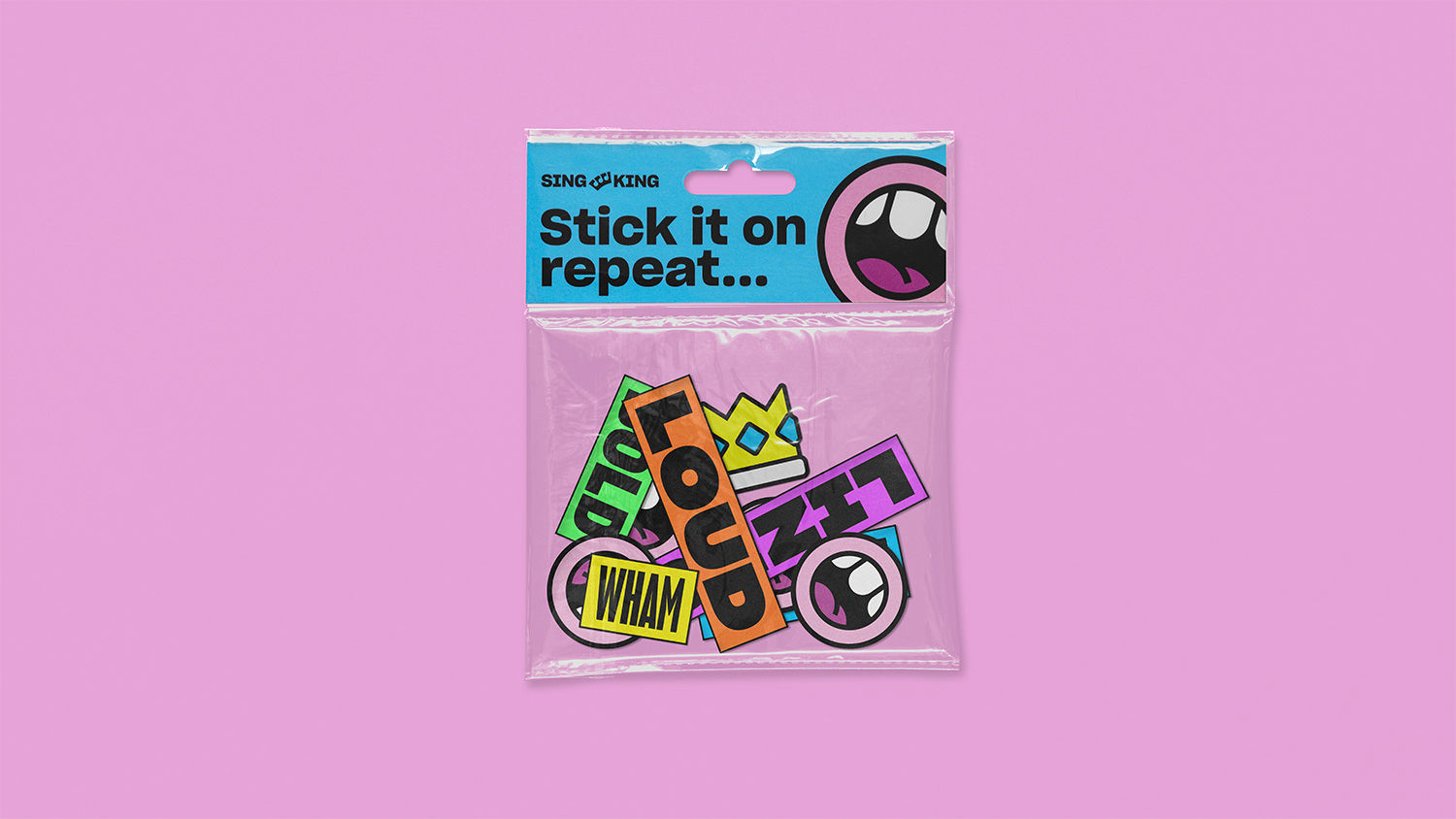
Nomad has given music an involving visual character. It’s fun and energetic, just like karaoke, no matter what set-up you might have going on, on a bus, on the tube, at your friends. “Shameless, silly, bold or brave, this vibrant identity captures the unique spirit of karaoke”. Nomad totally delivers the synergy of visual and musical life here through type (Sharp Grotesk), colour and form, and has the experience to carry it off across app, web and social content. It’s a stratification of contexts (although all screen based) that demands some creativity to avoid repetition. And then be able to hold outside artist imagery without it all breaking down, or relying on the Spotify/Collins duotone colour treatment is fantastic. These remind me of the old cigarette cards, and tie in well with the material language of stickers, things are layered up and well-composed.
It’s incredibly difficult to keep reinventing what MTV lay the foundations for in the early days of streaming music videos. The more character you have the quicker things seem to date. Perhaps it’ll require a bit of an evolution over time to stay relevant, but which digital business can avoid that? And who knows whether karaoke will be a things in ten, five or a year’s time?!
