Eadem by Lotta Nieminen
Opinion by Kinda Savarino Posted 20 December 2022

The skincare industry is a varied visual landscape. At one end of the spectrum, brands like Glossier and Soft Services (reviewed July 2022) have found balance in softness and understated minimalism. At the other Dr.Jart+ (reviewed Jan. 2018) and Malin+Goetz bring pharmacy-chic with functional, type-led packaging. And then we have our classic, heritage brands – like Kiehl’s and Elizabeth Arden – which keep doing what they’ve always done. But while it may look like there’s something for everyone, in truth the beauty giants have only recently embraced diversity and there is a still a shortfall in products for different skin tones and types.
Enter Eadem, a beauty brand for the BIPOC community tackling concerns including hyperpigmentation with ‘smart melanin’ technology that targets dark spots without ‘brightening’ or ‘lightening’ the rest of the skin. Since launching, the brand has been quickly recognised by publications, from Vogue to The Cut, and received funding from Glossier’s Grant Initiative for black-owned beauty businesses as well as Sephora’s Accelerate program.


So how does a brand seeking to redefine beauty standards and create products specifically for women of colour stand out in this space? Let’s start with the name. Eadem (pronounced ‘ee-dem’) is a Latin word, meaning ‘the same’ or ‘all’, referring to the invisible bonds and stories that bind women of colour together, promoting inclusivity. The wordmark is bold and unapologetic, taking up space across product packaging, which serves as an important reminder to consumers: take up space, be confident, this product is for you.


Studio Lotta Nieminen, based between Paris and New York, is behind the Eadem brand and powerful art direction. The logotype is angular on first glance, but on closer inspection it becomes clear that the type has curved crossbars. This juxtaposition between sharp angles and round shapes represents the dualities within the multifaceted Eadem woman, simultaneously strong and soft, holding her own unique self without losing sight of her heritage. Carefully hand-drawn and optically tweaked, there are some nice details that help to create harmony and balance – the curved crossbars take their shape from the bowl of the letter D, for instance.


While the full logotype is used proudly across packaging, an abbreviated monogram (using only the letter E) has found various uses across brand rollout, especially digital and OOH advertising. It works well as a container for photography or video, which can also be placed on top of another image to further enhance the idea of juxtaposition and duality. The photography is impactful but not over-styled, with women of colour featuring first and foremost and displaying natural ‘bare skin confidence’. When combined with an inlayed monogram, the imagery has a collage feel that serves to provide a level of authenticity and community.


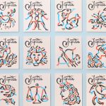
The Eadem woman balances the existing dichotomies within her – her own sense of self and her heritage, her strength and her softness. These contrasts are honoured through the type selection, which consists of Mabry (a quirky sans serif from Colophon) and ITC Galliard (based on an oldstyle 16th-century serif) balancing playfulness and sophistication across centuries. The theme of multiplicity is also explored in the energetic colour palette, which features bright oranges and reds opposite khakis and neutral tones. This is a welcome move away from the beauty industry’s reliance on minimal and neutral palettes, and provides a subtle nod to other cultures and influences.


Contrast in design is a beautiful thing, and Eadem is a strong example of this. The company exists for a wide spectrum of people across cultures, ethnicities, and skin colours, and Lotta Nieminen has woven these multitudes into every detail of the visual identity and its implementations to draw upon Eadem’s own relationship with dualities and that of its consumers too. Everything from logo to colour to casting pushes against preconceived cultural stereotypes – this is a brand that the marketplace needed, building a movement where women of colour’s untold stories can be shared and heard.