Jupiter by Triboro
Opinion by Richard Baird Posted 15 December 2022

Triboro worked on its first restaurant branding project over a decade ago, at a time when the folklore was that if you were a restaurant serving traditional food the visual language should evoke the region and time period of the cuisine. This was intuitive and, as Triboro founder David Heasty recounts, led to some well-crafted and beautiful results but often leaned heavily on nostalgia. Since then, the studio has served up, if not helped define, a creative era of New York hospitality branding with stunning and unusual visual identities for the likes of Narcissa and Sauvage (reviewed Oct. 2016), injecting a playfulness to a space that had become familiar, if not trite. Of course, even if you help define an era, sooner or later, others catch-up, and the challenge then becomes, what next? Well, you reach for the stars. That’s when Jupiter, a new restaurant located in the Rockefeller Center, came to Triboro and presented them with an opportunity to search for a new aesthetic delight, one that had the right spirit, a sense of craft and would find a place within the zeitgeist.

Jupiter opened in November, and is the work of Jess Shadbolt, Clare de Boer and Annie Shi. Together, they have channelled and combined their experience developing SoHo’s well-reviewed King restaurant, creating a ‘colourful’ and ‘energetic’ restaurant and bar delivering a casual Italian dining experience of simple regional classics, Venetian seafood and wine. Jupiter is also part of a larger programme to revitalise Rockefeller Center and draw people back to mid-town.

The interior deserves its own review, and if this was an interior design / architecture magazine I would indulge myself. For the sake of brevity, it’s colourful, bold, linear and precise. For those that love references, the interior draws its inspiration from the colour blocking of Montessori playrooms, Italian Futurism, the lines and textures of Luca Guadagnino and the Art Deco details of the restaurant’s landmark surroundings. It’s a lot. Without context, you’d imagine it as a visual cacophony, a sensory overload, but much of it is subtle, not overbearing or literal. For a design studio, it’s a playground of ideas that surely provoked many lines of enquiry.


Where do you start with so many references? For Triboro, it was the name and iconic location, near the ice skating rink at Rockefeller Plaza. The magic of Home Alone 2: Lost In New York immediately situates me in a place I’ve never been. Before Rockefeller, the location housed the first Botanic Garden in America, and today the rink is watched over by a giant golden statue of Prometheus. It is also the site of the famous holiday tree lighting. This formed a conceptual route towards the elemental; the fire that Prometheus stole from the gods, the ice of the rink and the astrological association of the name Jupiter.

Triboro has found itself in an enviable position as a leader in the city’s restaurant scene, and by extension, has developed a point of view when it comes to restaurant branding, often treading a fine line between artful expression, visual system and the programming required by a hospitality space. That is to say that Triboro’s work is often characterised by the practical considerations of standard application (menus, signage, coasters), and the sensory and emotional aspects of the dining experience. Here, the outcome is a collection of related artworks, rather than, say, just a formula of logo, colour palette and typeface. Although these exist and are formalised, the thinking is not led or defined these.

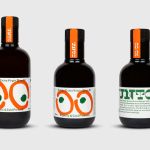
The concept is simple: expanding on the celestial theme, Triboro has created a beautiful collection of zodiac artworks. These are unified by colour (fire, ice and a Promethean gold) their composition of short line strokes and a sense of movement. These inhabit a liminal space between the antiquarian and the current. Used at scale, much of the surfaces – be that a takeaway bag, coasters or coffee cups – become canvases of creative expression. It’s quite a bold approach, shooting for character and immediacy, rather than evoking any of the interior’s qualities. These surfaces aren’t mobile articulations of an interior experience, but used as they’re supposed to be, catch the eye and intrigue on the streets, perhaps encourage a social snap. The identity furthers the interior, the story of the restaurant, and this is really what distinguishes Triboro from other studios. Whether its the painterly strokes here, or the paper-like cutouts of Sauvage, these elements require experience to corral and work with confidently, but it pays off when done well.

To zoom in a bit, the logotype, much like Triboro’s work for Narcissa and Sauvage, conjures up care and craft, the personable, and a personality through cursive hand lettering. It’s immaculate. The flourish of the ‘t’ like celestial rays, the emphatic loops of the ‘J’ and the varying line weight of the brush as it travels through straights and curves really give it character and momentum, and ties neatly with the qualities of the illustrations.

There’s a lot of variety here thank to the twelve zodiac signages, the patterns and other details such as the map. It’s hugely appealing. Running LogoArchive and Logo Histories, two design history projects, I started to see that there are somethings with specific qualities that tie them to a particular time or spirit, the zeitgeist. This quality often makes the disposable become treasures in time. It could be a United Airlines ticket sleeve, a Blue Circle matchbook or a WHSmith paper bag. I believe that that spirit also resides in this work too. Look at those matchbooks, who wouldn’t want the complete set?