Eager by Ragged Edge
Opinion by Richard Baird Posted 10 January 2023
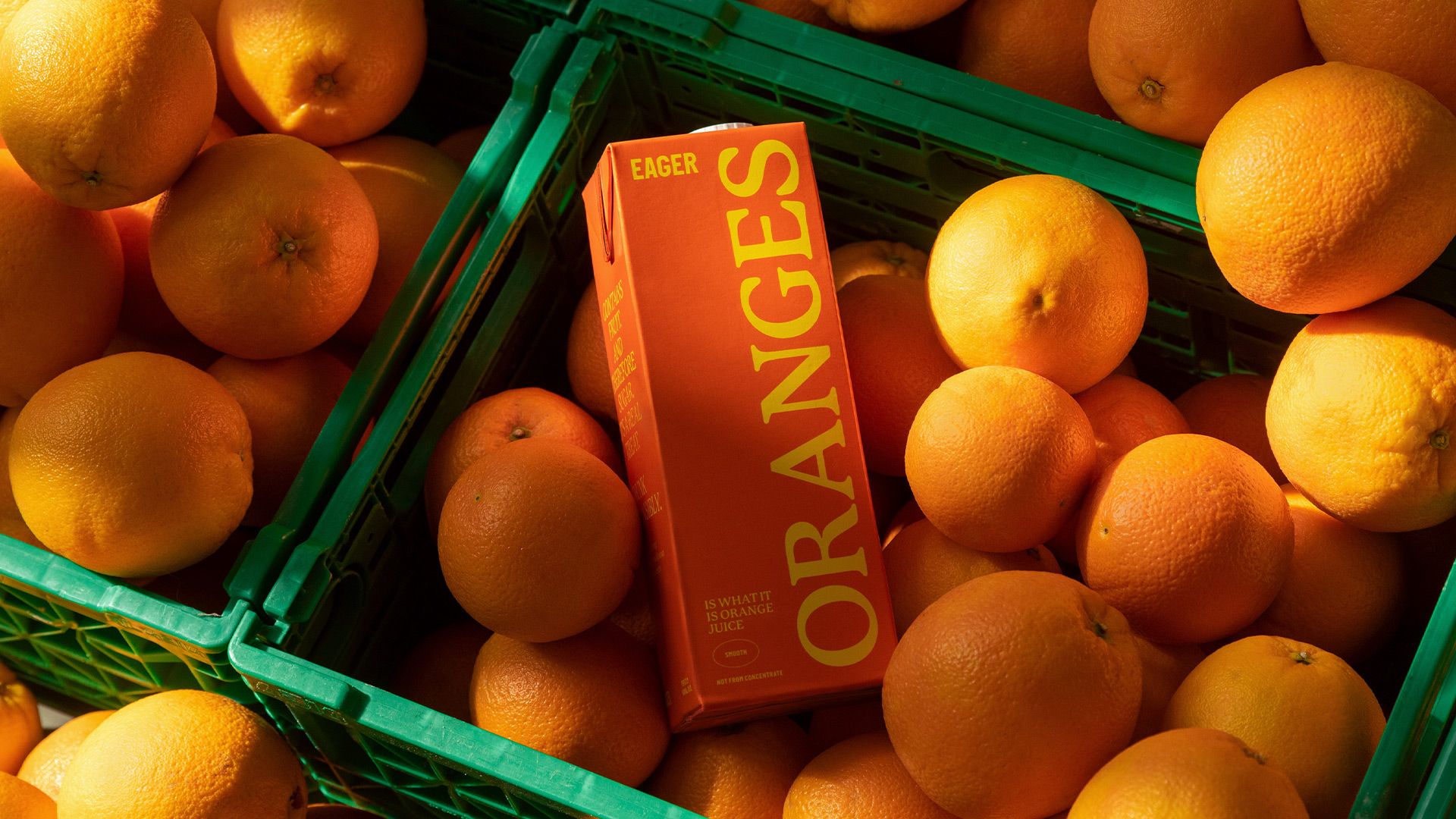
The visual ‘territories’ of design and the strategic routes of marketing and advertising run in cycles, parallel to consumer culture. Ideas that fall by the wayside one decade are rediscovered, remixed or recycled in another. Challenger brands grow, take on the established and are either acquired, expire or, sometimes, find a sweet spot for growth that allows them to remain true to their ‘outsider’ identity. Of course, the integrity of claims and ambitions – Beyond the conventional! Intent to bring change to industry! – can only really be measured across years. Remember Innocent? That’s not to say that acquisition is a bad thing, only that at this point it is difficult to imagine any start-up, no matter how disruptive, doesn’t have a big brand ‘exit’ in mind.
At the same time, being a big brand is difficult. Challengers today are bolder in their accusations of monopolistic attitudes, outright dishonesty, or – and especially in the case of purpose-driven brands – called out for ideological exploitation (environmental, human, sometimes both). In some ways, challenger brands function much like a shadow government, holding brand leaders to account with fewer responsibilities than an in-power government. There is a symbiotic relationship here that shouldn’t be forgotten, they form an important discourse.
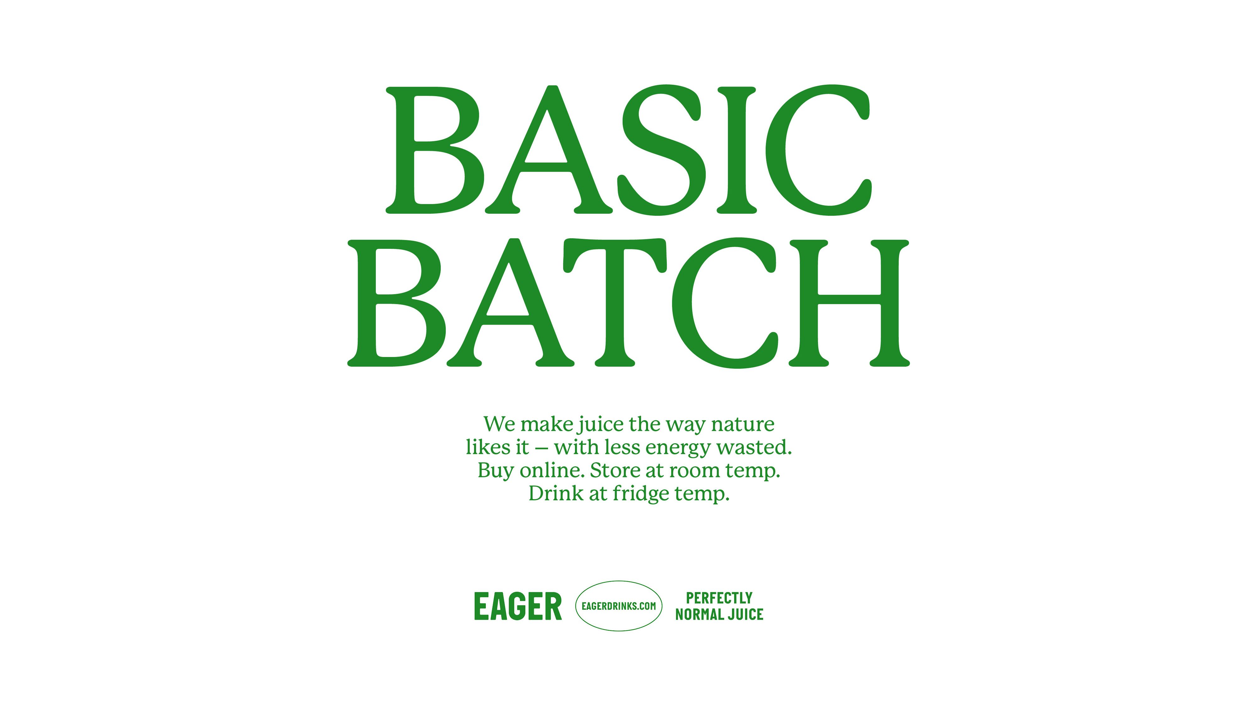
It’s interesting to see that what was once a category defined by the big retailers (know in the UK as ‘no frills’), has found itself reimagined as the go-to visual language for challenger brands like Eager, designed by Ragged Edge. For those unfamiliar with the value supermarket lines, we’re talking own-brand products pushed out at a low price point, often as loss leaders. The packaging is typically characterised by austerity: stripped down to few, if any, embellishments, an economical use of colour/ink, standard off-the-shelf packaging structures and direct use of language.
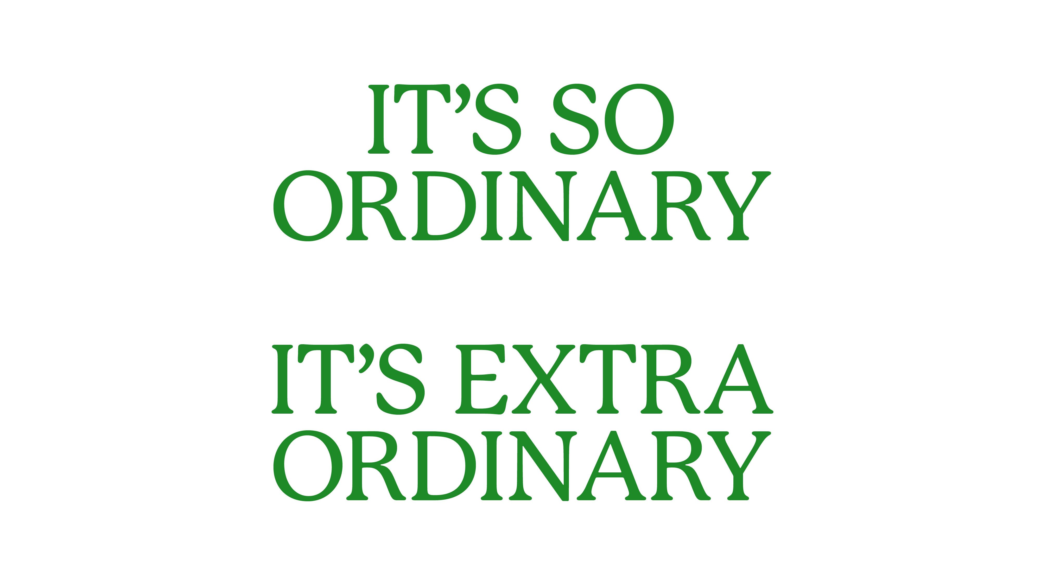
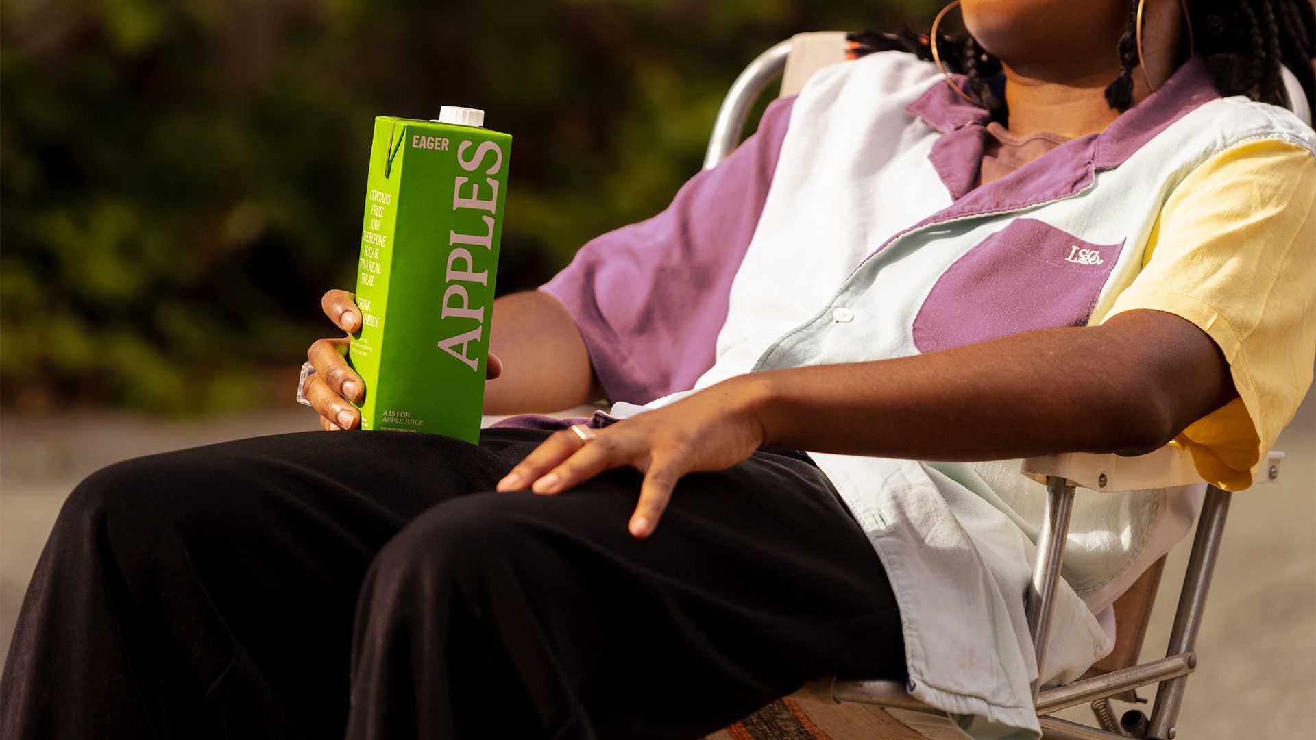
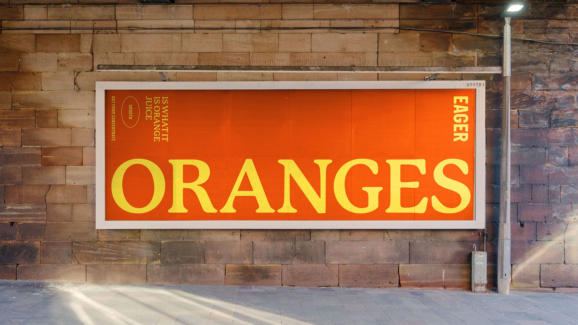
In the spirit of Ronseal’s 1994 campaign, ‘it does exactly what it says on the tin’, Eager could be described as ‘it is what it says on the carton’. It’s a turn that repositions ‘no frills’ as an anti-marketing message, rather than an expression of ‘budget’. You pay for the counter-movement, the design language makes this counter movement quickly identifiable. The big supermarkets have had their own idea turned against them, refined and made ready for the DTC (subscription!) market of today.
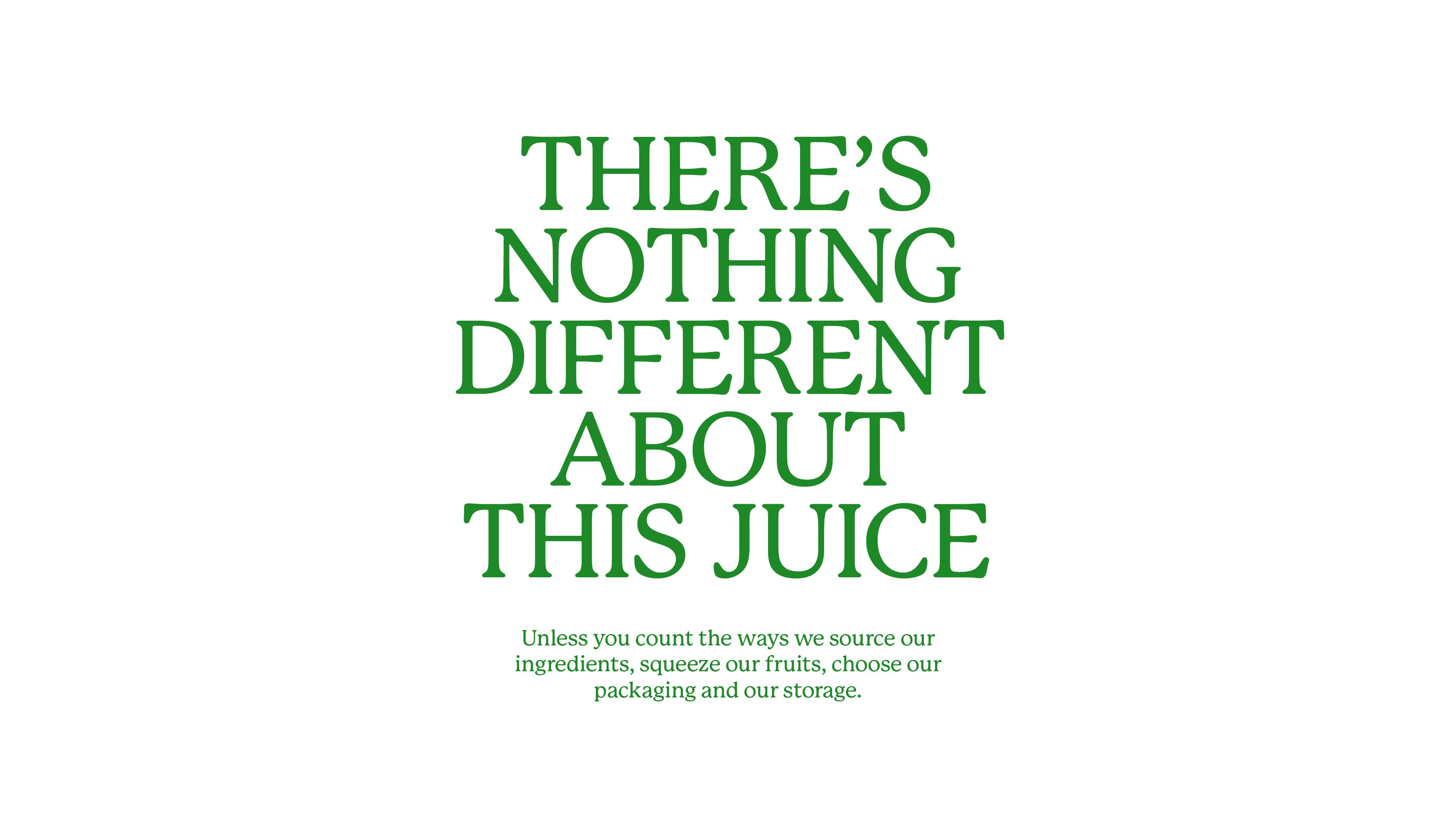
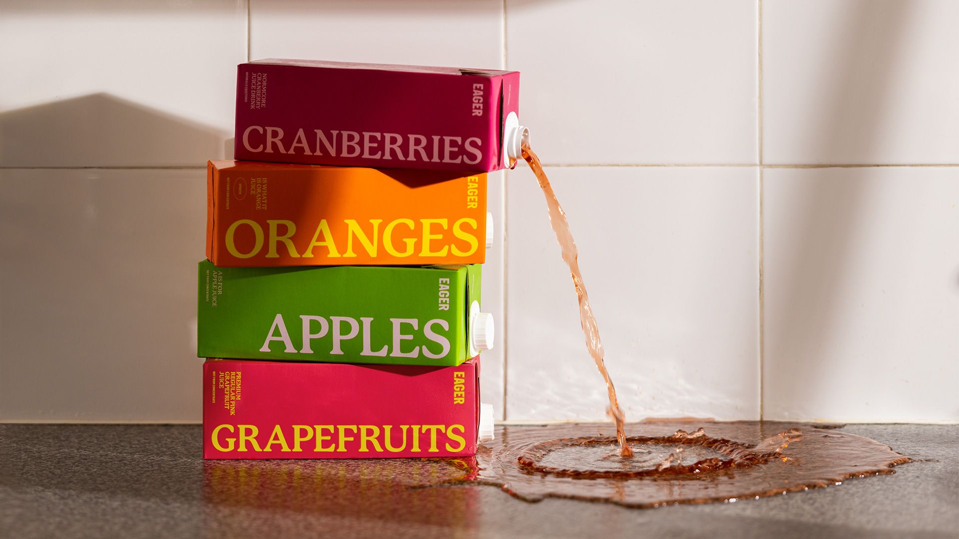
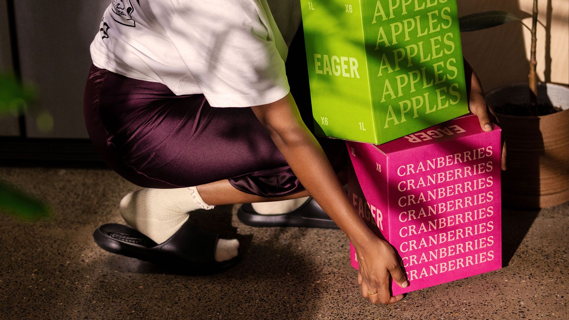
What differentiates Eager from own brand products is suitable, and powerful. The principles are the same – two colours and matter-of-fact mandatory labelling – however, the contemporary colour palette, bold colour blocking, current serif P22 Macinak (rather than a sans) and the repetition of product names are cues that are familiar to a design-literate market. Where visual elements are stripped back to the essential (describe and identify), language is used effectively as a rallying cry across the brand’s online platforms. And this is where the studio, and its writers have had a lot of fun.
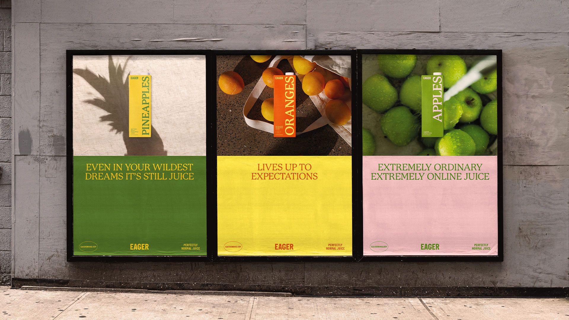
The premise might be described as ‘a return to simpler times’, a time when brands just made products, not promises. But it’s a little more sophisticated. Although not explicitly purpose-led, language does position the brand in opposition to other things, which is a position in itself. It is in opposition to those who promise to ‘disrupt’. In opposition to those who promise to be more than what they are. And, perhaps more boldly, in opposition to claims that it isn’t all that different from any other juice brand.
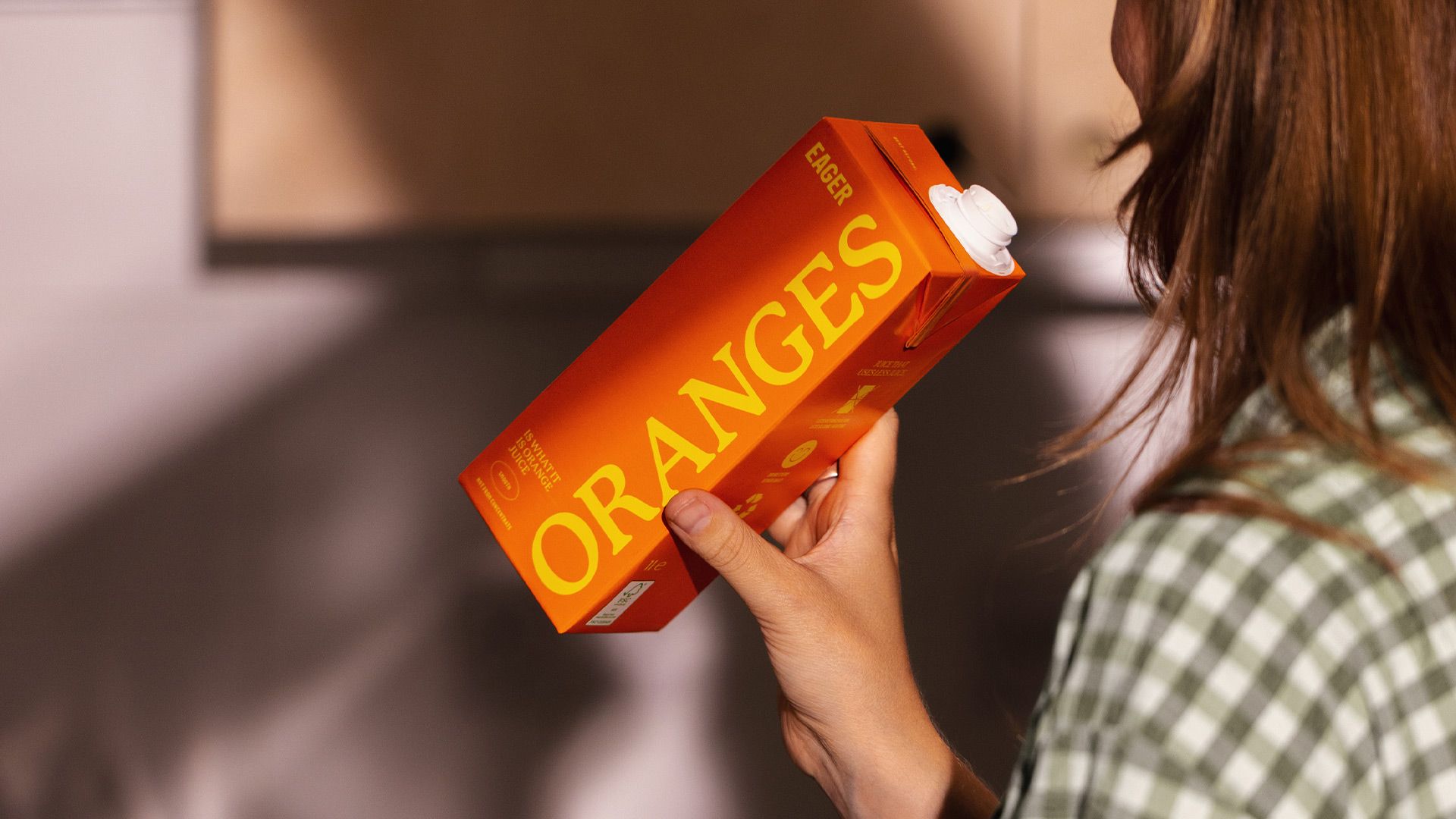
So what does Eager have? Just as ‘no frills’ sought to cater for the budget-conscious, Eager positions itself squarely at those who choose to present their ‘anti-stance’ through the products they buy and services they engage with. Just like political placards, packaging becomes an ideological expression. Here it is the awakening from the groggy haze of late-stage capitalism.
