BrewBird by Mucho
Opinion by Emily Gosling Posted 31 January 2023
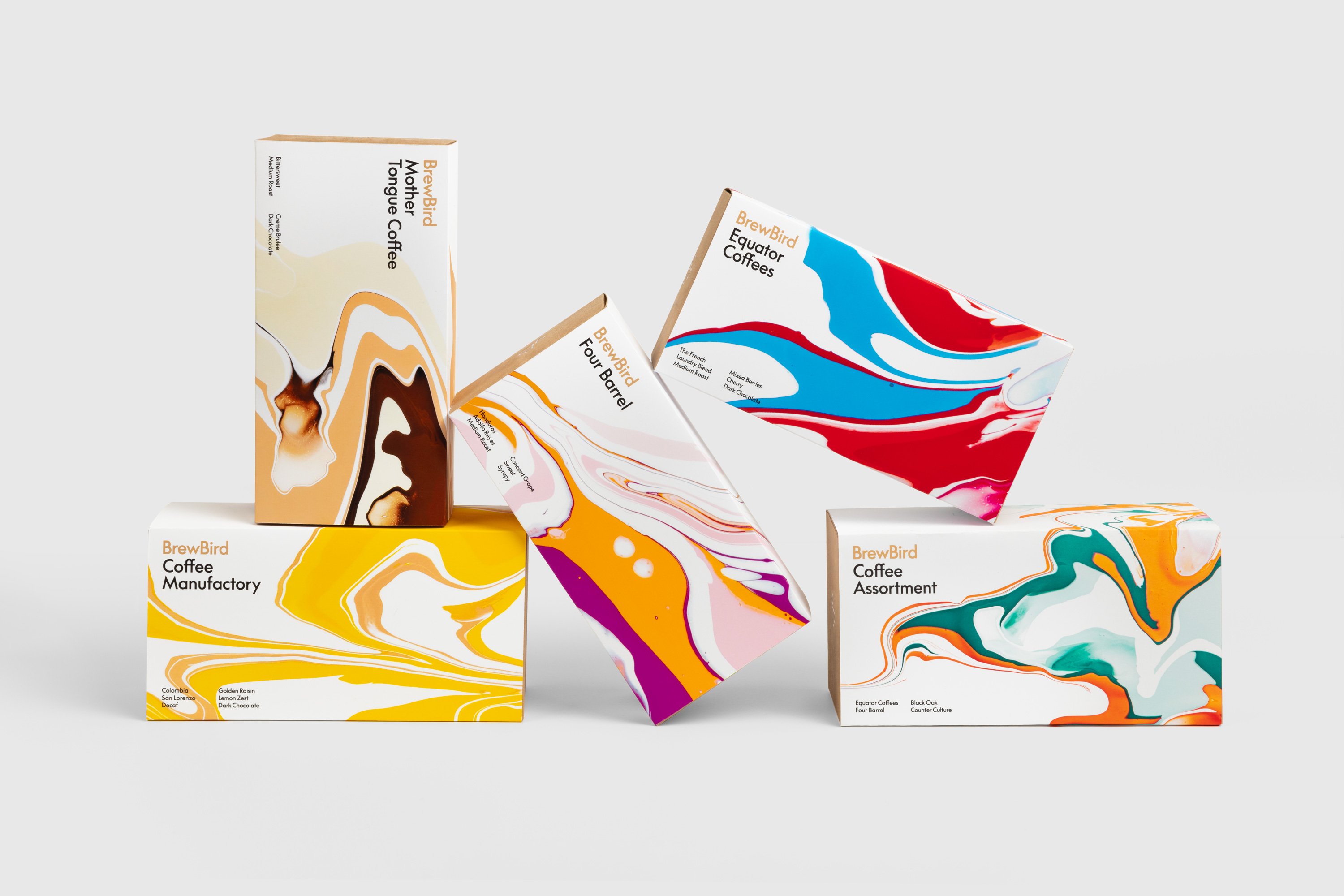
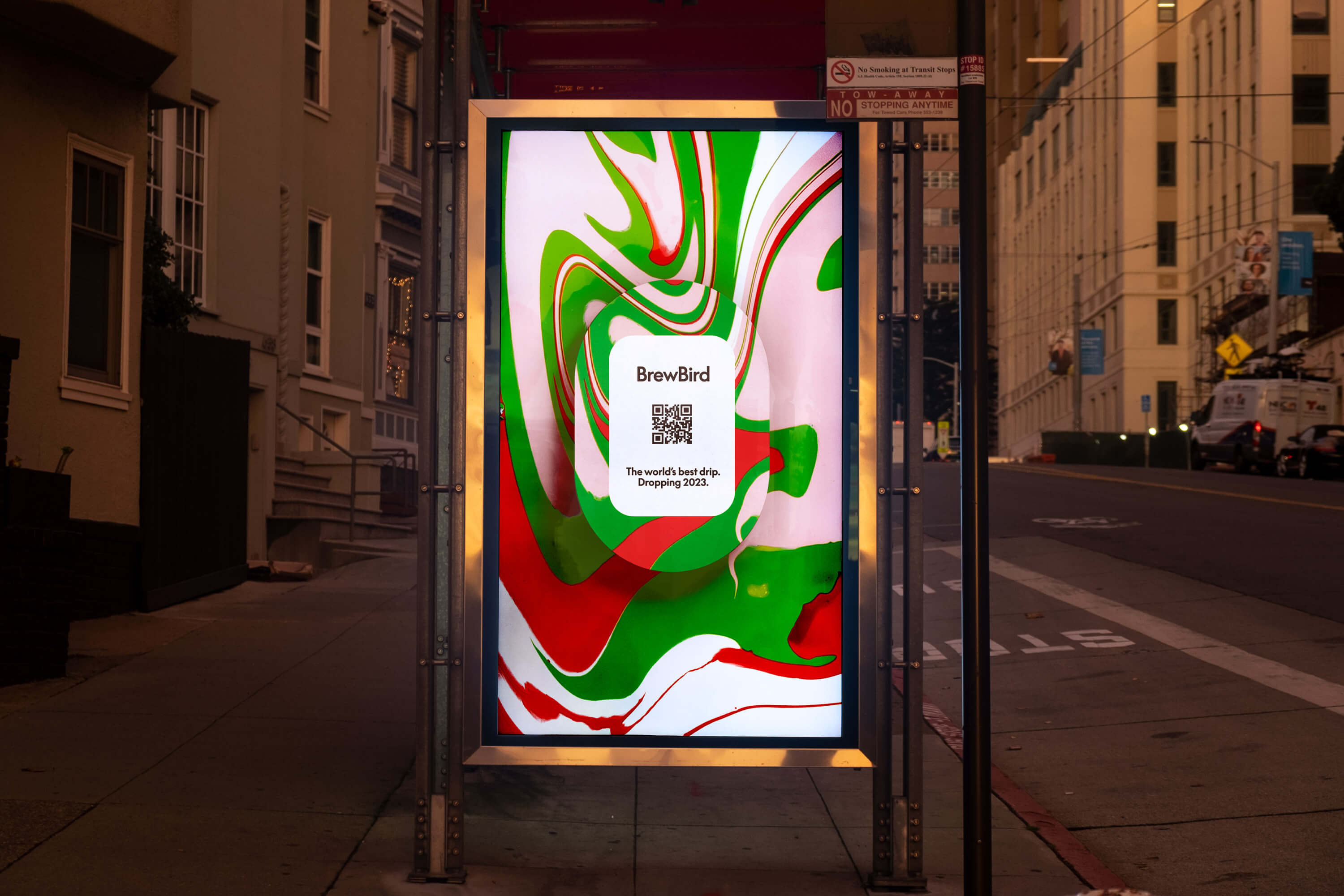
Global strategy, branding, packaging, and graphic design studio Mucho created this colourful new identity for coffee tech startup BrewBird, working with Scottish artist Craig Black.
Mucho was appointed to create a new brand identity and ‘memorable’ packaging system to help BrewBird communicate its story around uniting cutting-edge tech, taste, and ‘the artisanal craft of coffee roasters’.
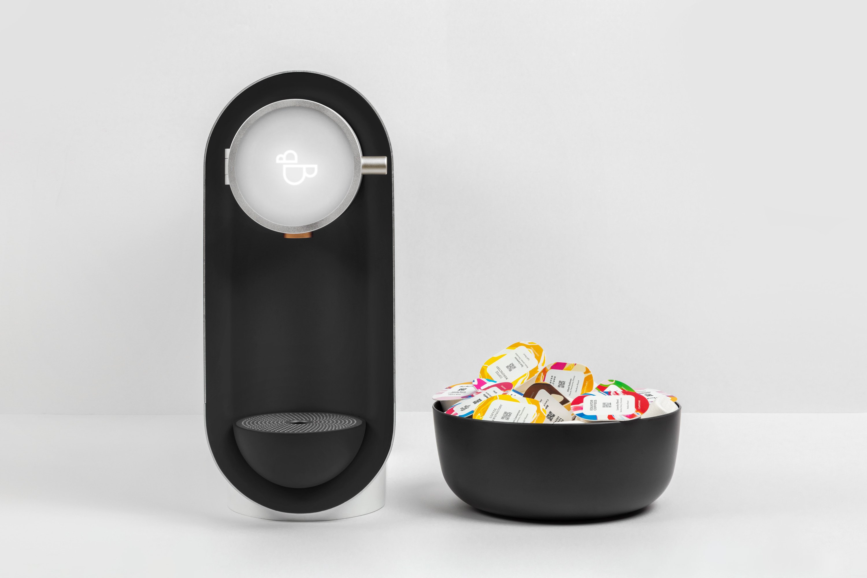
According to Mucho, drip coffee specialists BrewBird have designed ‘the world’s most technologically advanced coffee brewing platform’; using whole beans in compostable pods. BrewBird works by partnering with world-leading coffee roasters to deliver drip coffee to people’s doors just after it’s been roasted, aiming to ensure customers ‘get the freshest cup of coffee ground-to-order with a touch of a button’.
This post includes Extended Insights for BP&O Plus members.
Find out more and sign-up here.
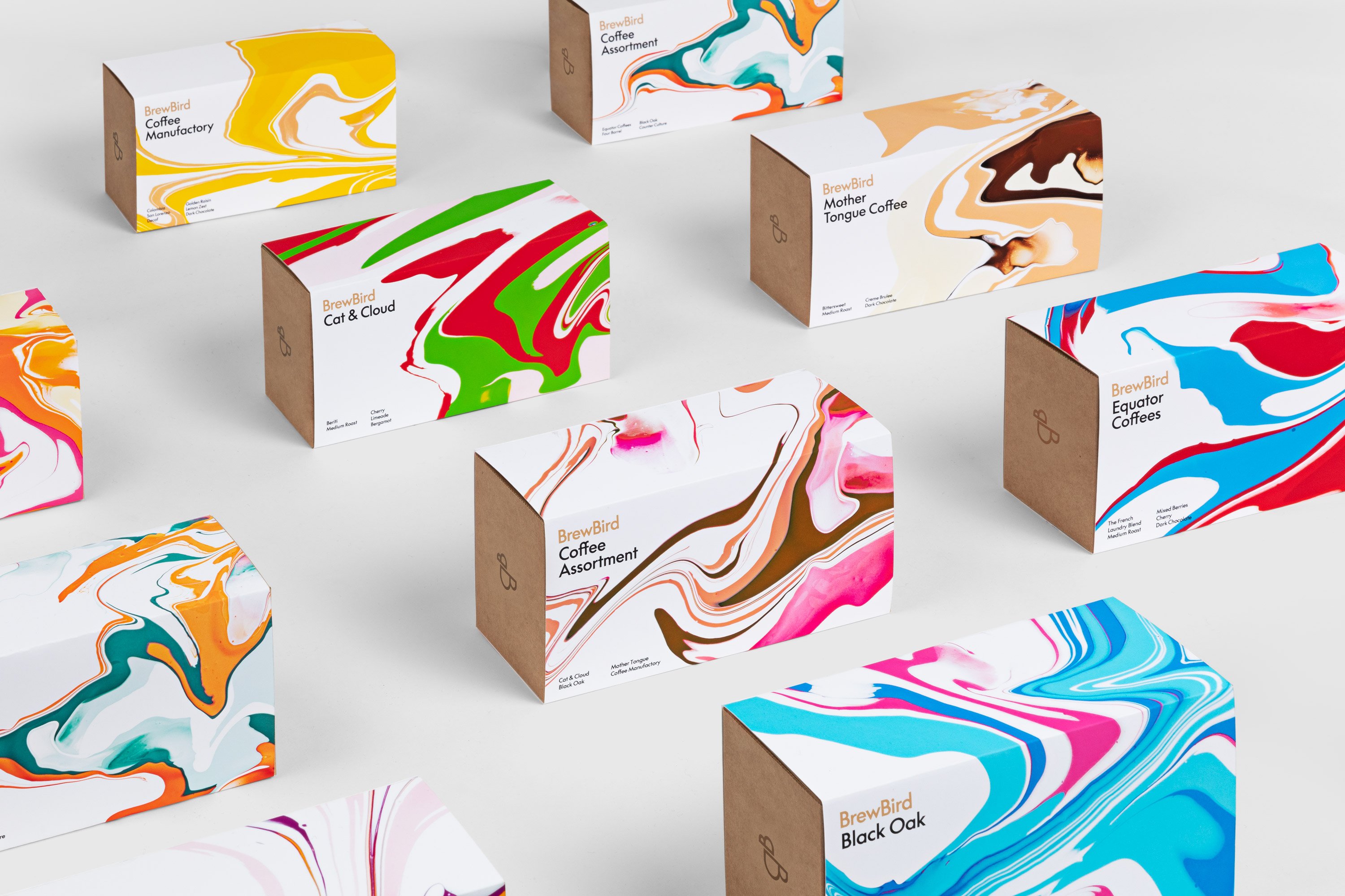
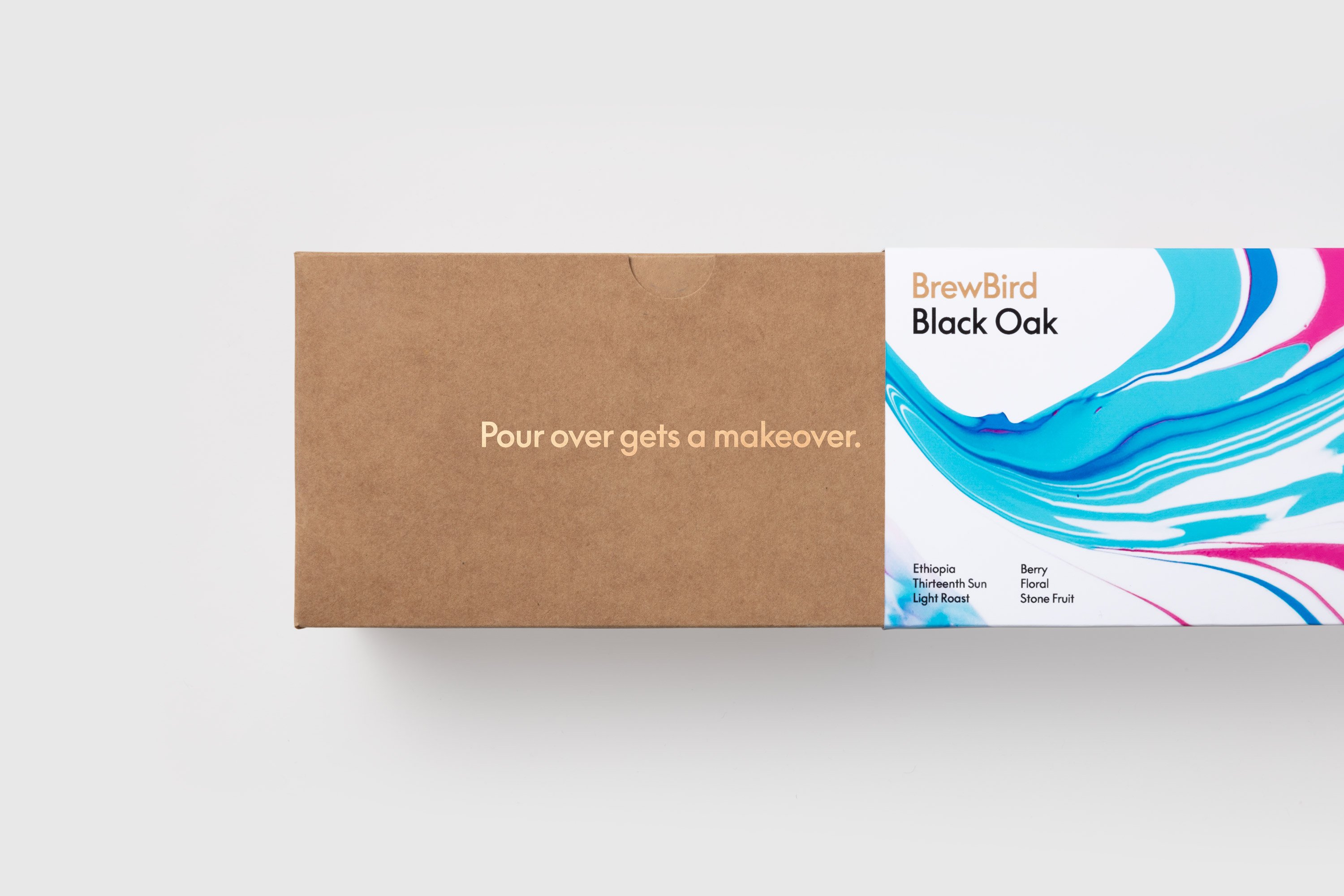
For the most part, the BrewBird look and feel centres on vibrant splashes of colour, the result of Mucho’s partnership with Craig Black. Black was flown over to San Francisco for the project, tasked with using paint pours to ‘represent the flavour profiles of individual coffees’. Black experimented with different colour palettes using his signature ‘Acrylic Fusion’ approach – an analogue process of hand pouring layers of acrylic paint.
Outside of these flashes of patterning, Mucho deliberately kept the rest of the identity simple in terms of its colour; primarily using black, white and bronze in order to further help the bold paint pours pop.
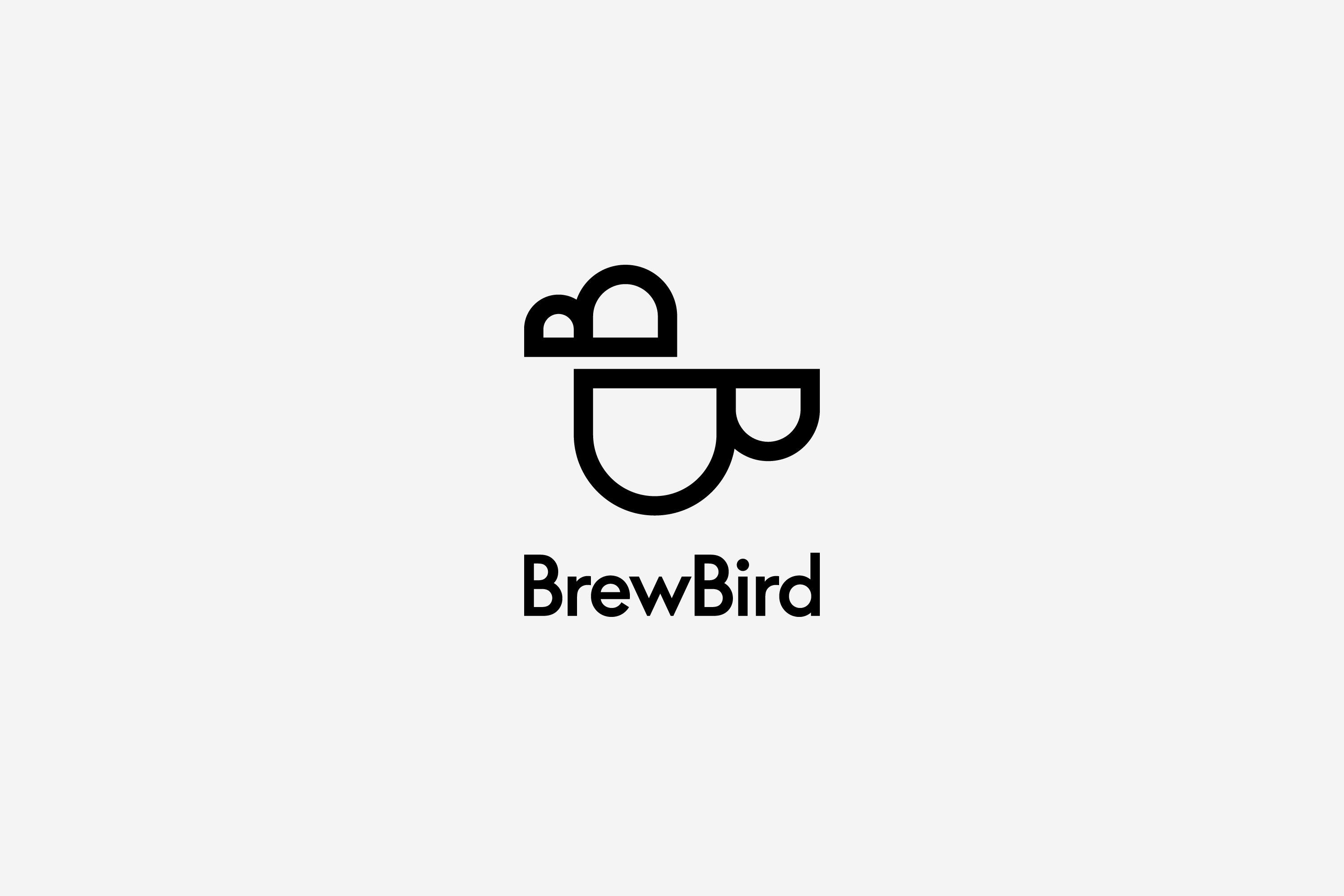
The new logo is built from combining the two letter ‘Bs’ in BrewBird, positioned horizontally with the flat B lines against each other, the bottom one mirrored and flipped. According to Mucho, that play on the letter B – and the fact the shape forms both ‘a bird, and coffee cups’ results in ‘three hidden easter eggs’ that ‘play up the joy that comes with brewing a delicious cup of coffee with BrewBird’.
The naming is cute, and has a nice ring to it; but to British ears, possibly has different connotations to those intended by its San Francisco creators – there’s a certain resonance of ‘1970s Northern club comedian’ doing a gag about a woman making tea in there. Though saying that, there’s a Brewbird cafe in Peckham, south London; and – slightly confusingly – a D2C eco-roast coffee company called Brewbird (with a small second ‘b’) hailing from Greater Manchester. So maybe that’s just us, and it’s (again, slightly confusingly), simply a play on ‘bluebird’.
The name is one element that’s ultimately good; but takes a while (at least for these British eyes and ears) to land. Maybe being able to spot the ‘easter egg’ elements of the logo is a little like that young woman/old witch optical illusion (once you see it, you see it – but that might take a while); but it took a little while for the bird to become evident in the two capital Bs. The coffee cup is perhaps more obvious, but falls slightly flat in that the comparison only really works for the lower ‘B’.
However, the identity is very striking in its simplicity, and clearly sets the brand apart from competitors. For the vast majority of the brand’s type Mucho opted to use the font family LL Supreme – a new take on the Paul Renner-designed modernist classic Futura. It’s a smart move for a number of reasons: for one, it’s both inoffensive and stylish, with a sophistication born of its geometric construction from straight lines and circular curves; yet it’s got a hint of playfulness, too. This seems to chime with BrewBird’s attitude – serious about, say, coffee and tech; but with a friendly West Coast chirpiness.
It’s also smart because each cut of LL Supreme was ‘drawn separately and, as a consequence, has its own identity,’ as Lineto puts it; meaning that it works across the BrewBird logotype, site copy, packaging text and more, appearing in different weights and with variations in the letter spacing. The only notable exception to using the font seems to be on the pods themselves: while the blend and flavour descriptions follow the rule, the name of the roaster retains its own brand type.
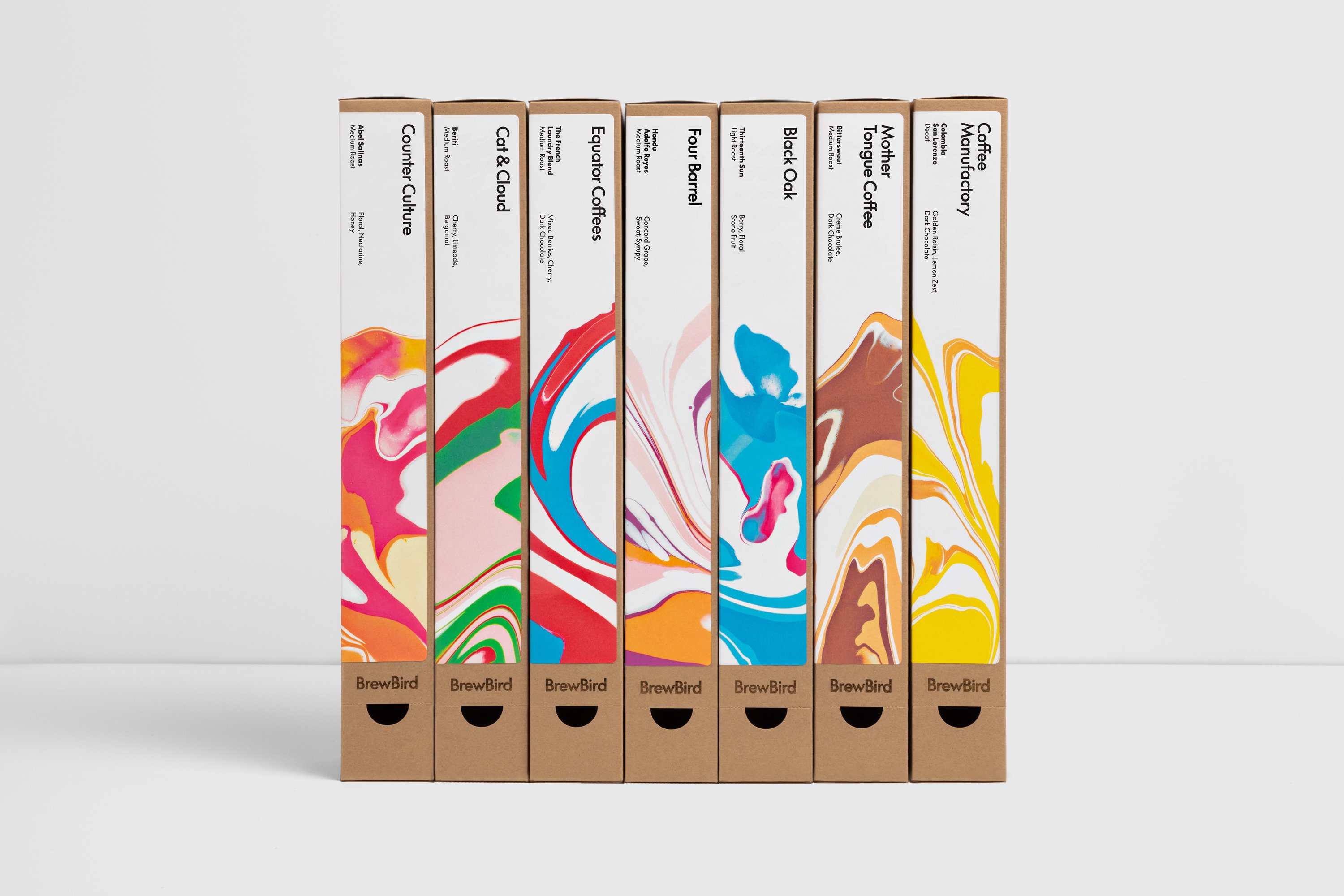
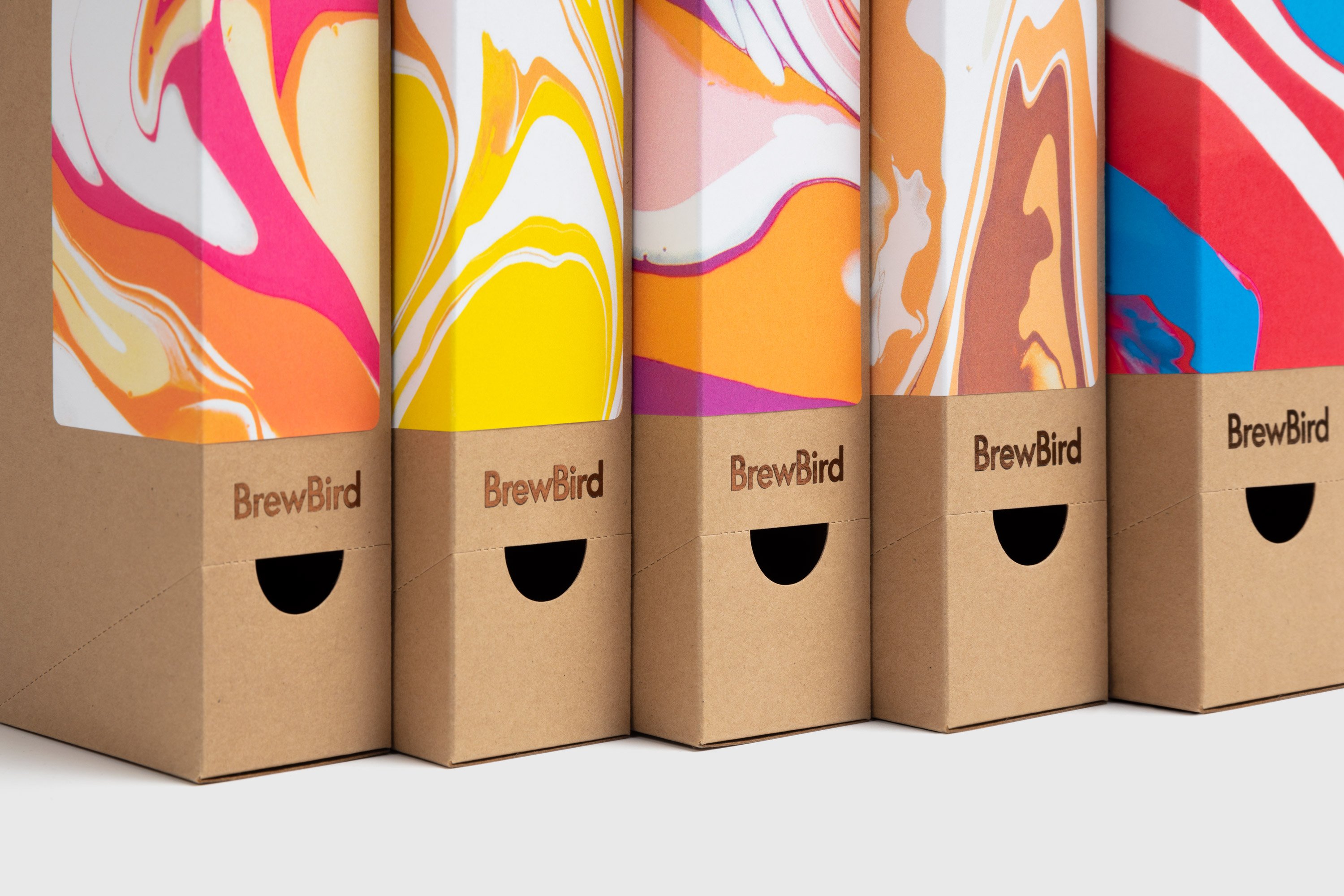
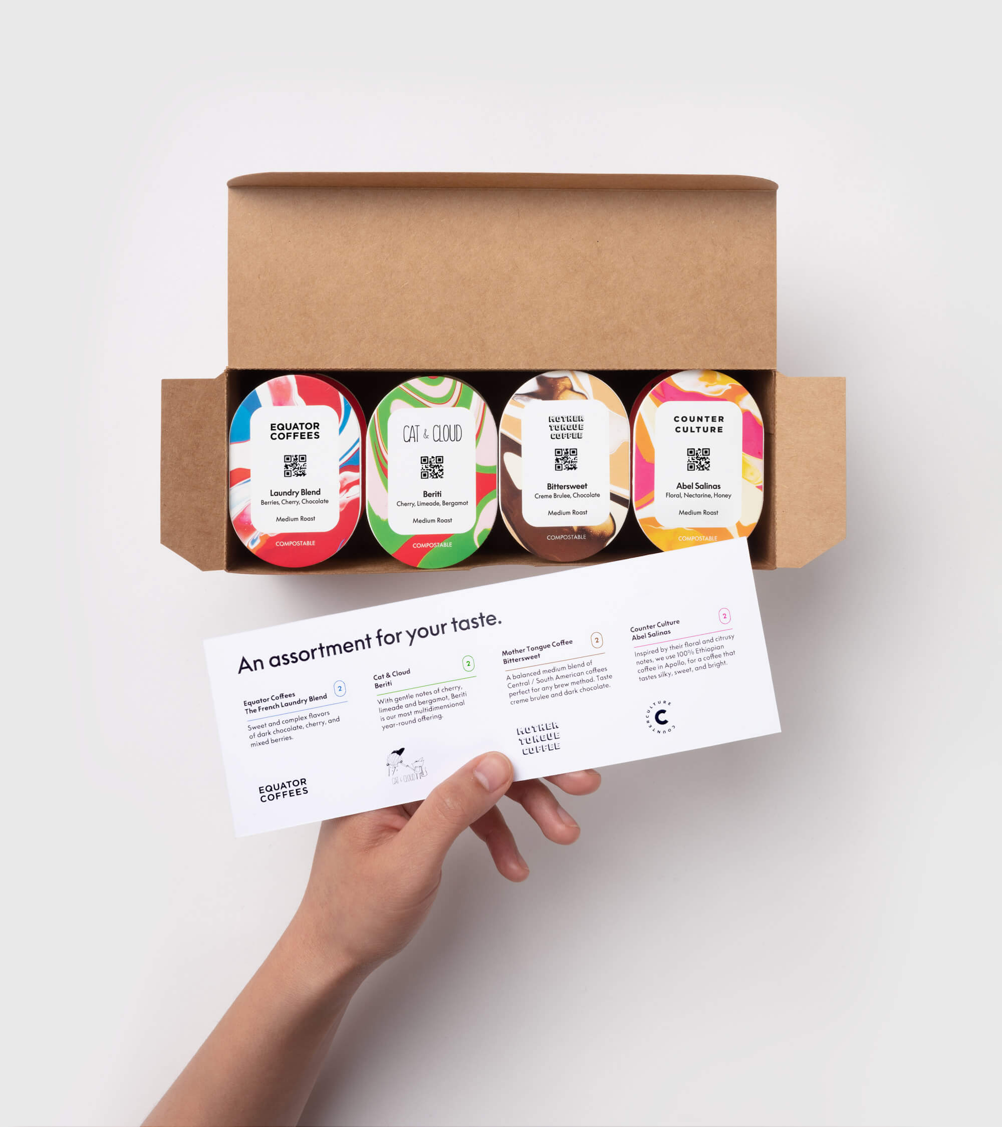
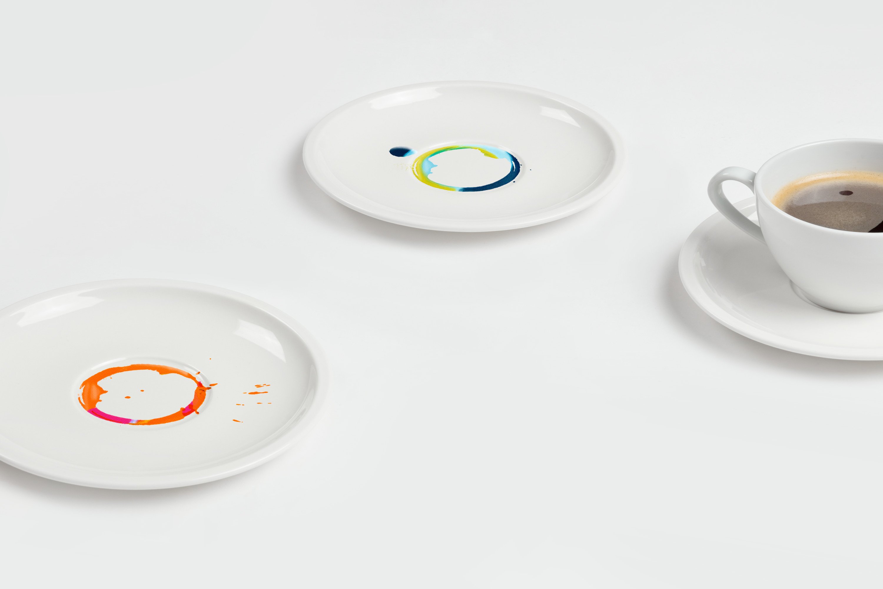
While the coffee pod boxes have a faint whiff of ‘hipsterish sustainable tampon startup brand’ about them; overall, the identity is certainly unique and memorable. ‘Potential customers are attracted to the packaging when they see it at BrewBird pop-up locations,’ says Mucho creative director Rob Duncan. ‘They expect it to be some sort of art installation and are surprised to find it’s actually packaging for coffee.’ Ultimately then, its lively, joyful aesthetic does what it needs to do: draw in customers, and intrigue them.
Get more with BP&O Plus
Read Extended Insights, start bookmarking, switch between light/dark modes, article and ‘Gallery View’ and support our writers. Become a member by subscribing here.
