Agency: Saatchi & Saatchi. Year: 1992. Art Director: Alexandra Taylor. Writer: James Lowther. Photographer: Michael Kenna. Typographer: Jeff Merrells.
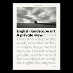
Many of my favourire ads do not look like ads.
As demonstrated here by Saatchi & Saatchi for Intercity trains. We have exactly the same ingredients that make up your average ad — picture, headline, copy and logo — but they are arranged in a way that you’ve never seen before. No mean feat. So it’s more likely to get noticed. And remembered. And be effective. Yes, interesting art direction really is a no-brainer isn’t it. But to achieve it you’ve got to give a damn.
James Lowther, one of the people behind this ad once said ‘The best copywriters are not the ones with the highest ability but the ones with the highest standards’.
And you have to respect a writer prepared to endure the pain of creating persuasive copy in nine lines at a consistent point size with the added torture of just 20—24 characters per line.
But it’s worth it. I love this campaign. Even though it’s almost attempting the impossible. For me, the typography is pushed and pulled a little too much. Maybe the punctuation should hang out a bit more. And lines three and four could possibly each do with another character. But I’m splitting hairs (as usual). Let’s face it, it very nearly gets there. Incredibly impressive.
You’ve also got to admire the choice of photographer. If your strategy is to dramatise the single-minded benefit that you can stare out of the window and actually think on a train, then it makes sense to work with Michael Kenna, one of the world’s best landscape photographers. And the black and white image perfectly complements the black and grey type. Great art direction.
Now the last piece in the jigsaw, something that could easily throw the whole thing off balance. Yes, here we go again, the logo. Does it really need to be any bigger than that?
Perhaps when a client demands a massive logo, it’s actually just an admission that the ad isn’t interesting enough to hold the viewer’s attention. The solution to that problem is not a bigger logo, it’s a better ad. Like this one.
Source: Paul Belford | @paul_belford_ltd