Seedsman by Here Design
Opinion by Emily Gosling Posted 14 February 2023

Water masquerading as an edgelord-baiting energy drink (Blackletter fonts, skulls, and a name straight out of the heavy rock canon); running shoes aping a chesty cough remedy; olive oil bottles that owe more to the science lab than the Mediterranean. Packaging at the moment, it seems, is frequently playing fancy dress.
That’s no bad thing, of course: brands borrowing aesthetics from wildly different sectors to their own can breed originality, playfulness, standout, and for the lucky ones, a cult following. But it can also mean that it’s tricky at first to know exactly what a product is – a high-end lipstick or a sex toy.
Here Design’s new branding for Seedsman, a cannabis seedbank, deftly straddles both camps: an identity that’s so joyfully expansive that it could be for anything (skateboards, bubblegum, motorbikes, a metal band, a psytrance festival – the list is long), but which is firmly rooted in the culture of the product itself. Crucially, it’s a bold and innovative approach for the cannabis sector – one that’s rapidly become saturated with design cliches.
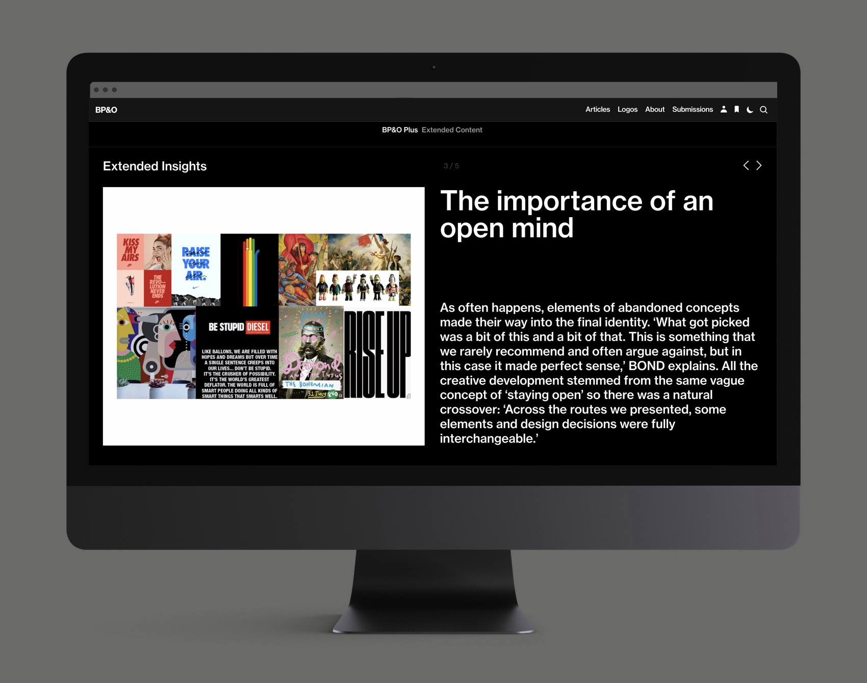
This post includes Extended Insights for BP&O Plus members.
Find out more and sign-up here.
Founded in 2002 by two cousins ‘with a deep love for the genetic heritage of cannabis and a vision to connect the world’s greatest breeders’, Seedsman prides itself on having ‘sat at the forefront of cannabis innovation’ for the past 20 years. In simple terms, Seedsman sells its own cannabis strain seeds and those from ‘cultivars’ around the world, as well as products like rolling papers, plant labels, ziplock bags, t-shirts and other merch through its online store.
Seedsman brought in Here Design to create a brand refresh that better conveyed the brand’s expertise and authority, ‘while also maintaining its light-hearted personality,’ according to the London-based studio.
Here Design started the project with a ‘deep dive into cannabis culture’ to inform the new visual identity and packaging design system. The look and feel had to balance playfulness and ‘subversive flair’ with a sense of professionalism and technical expertise that positions and celebrates the brand as ‘a higher plane of horticulture,’ says Here (pun more than likely intended).
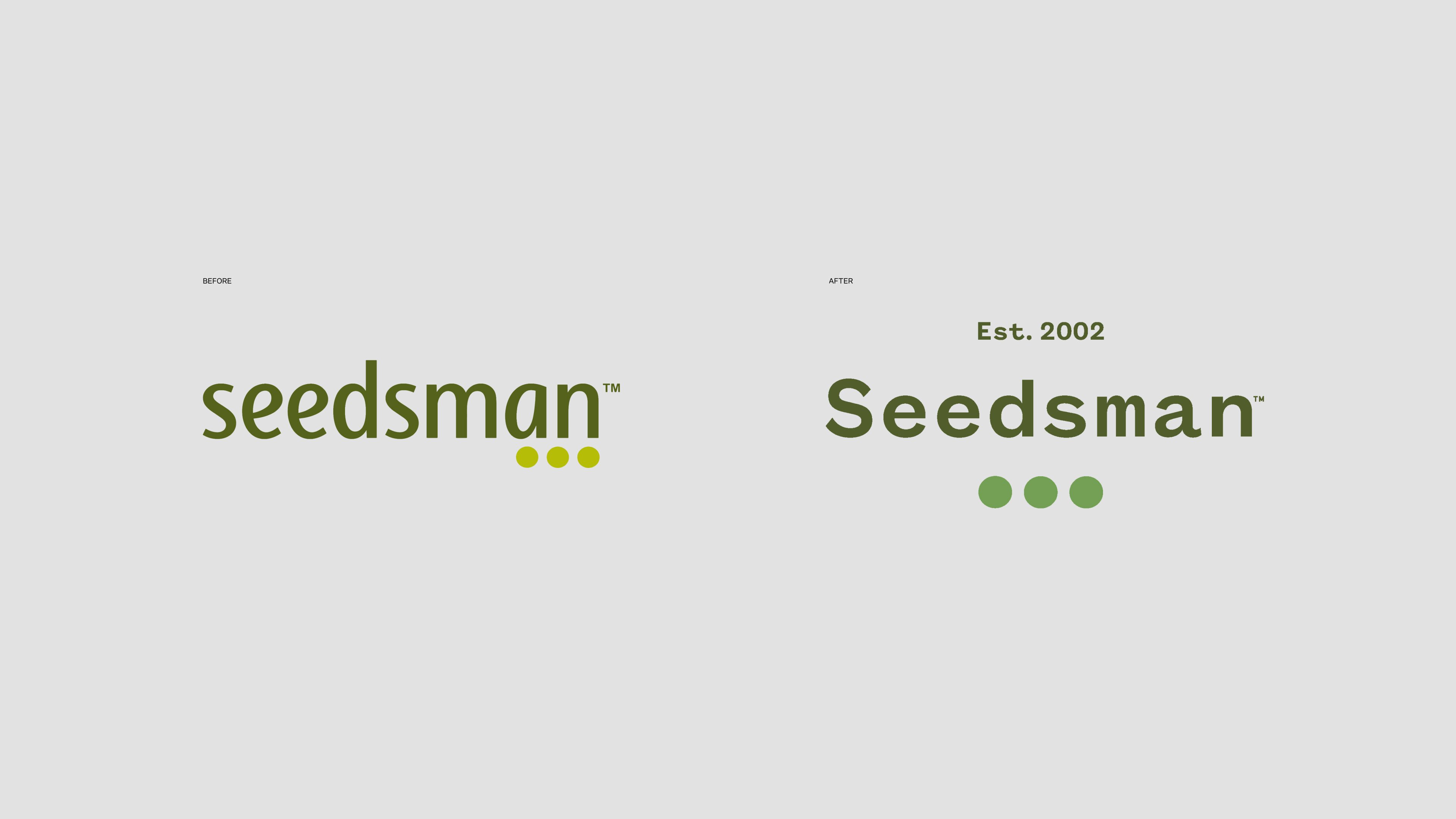
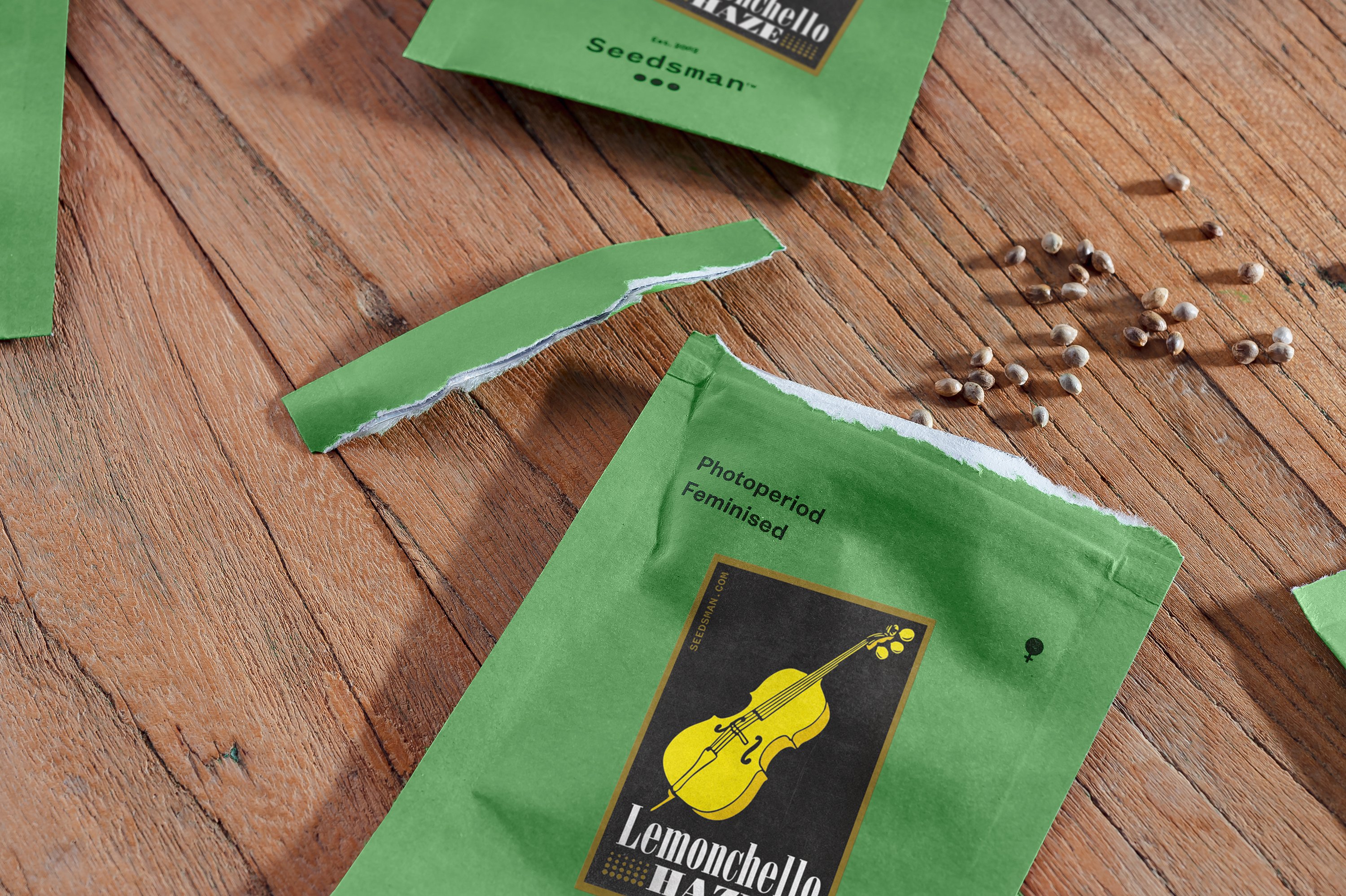
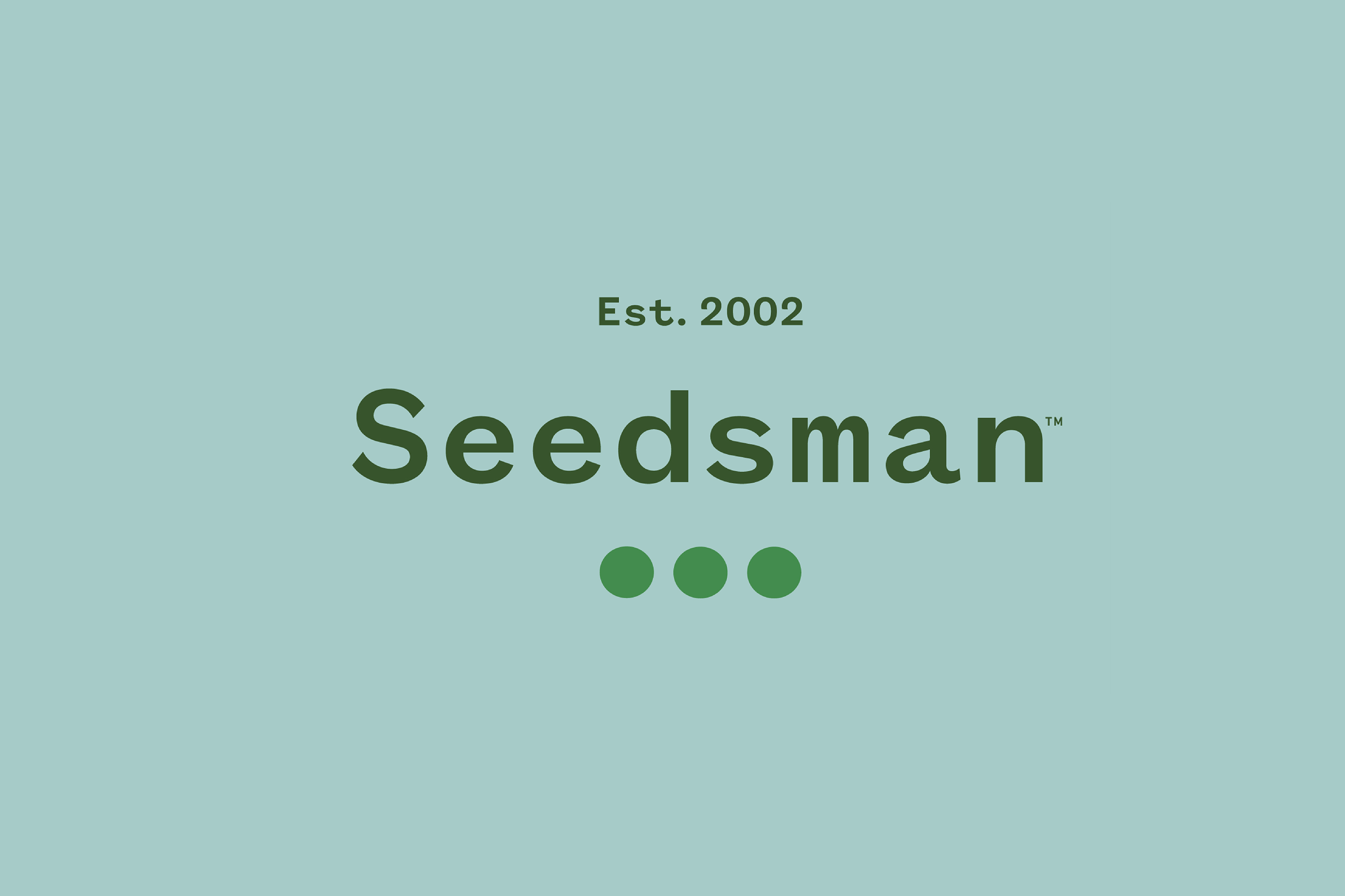
The Seedsman logotype has been given a gentle refresh, moving on from its former rather IT-company-like, all-lower-case wordmark. The new version isn’t a huge departure, taking on the same murkyish, pond green colour with a very subtle shift. Here Design also retained the three dots icon, though again, slightly tweaked – they’re bigger, in a new pea green, and sit centrally beneath the word mark.
While the former wordmark felt rather dated and somewhat like a Microsoft Word-crafted afterthought, it now uses Founders Grotesk Mono Medium from New Zealand foundry Klim Type – a striking font with open counters and charming variations in stroke weight which feels a lot more fittingly contemporary. Its siblings Founders Grotesk Regular and Founders Grotesk Medium are used for body copy; while elsewhere Here Design chose Clarendon Regular as a ‘statement typeface’ for quotes and ‘brand statements where we want to emphasise the brand’s tone of voice’. This classic slab serif was chosen thanks to the fact it’s ‘full of personality and character’, says Here, adding that it has ‘distinctive round terminals which recall the form of the cannabis seed’.
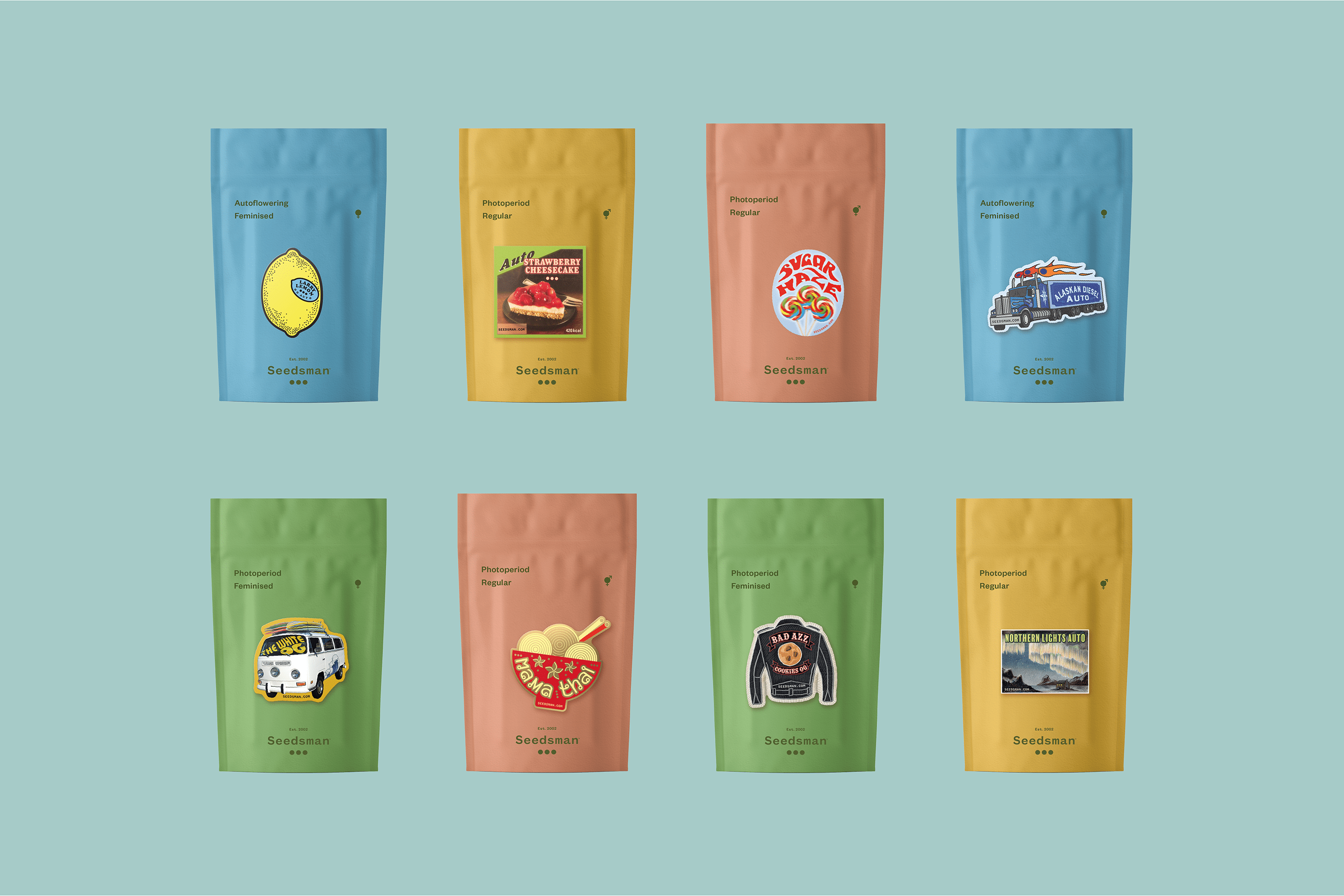
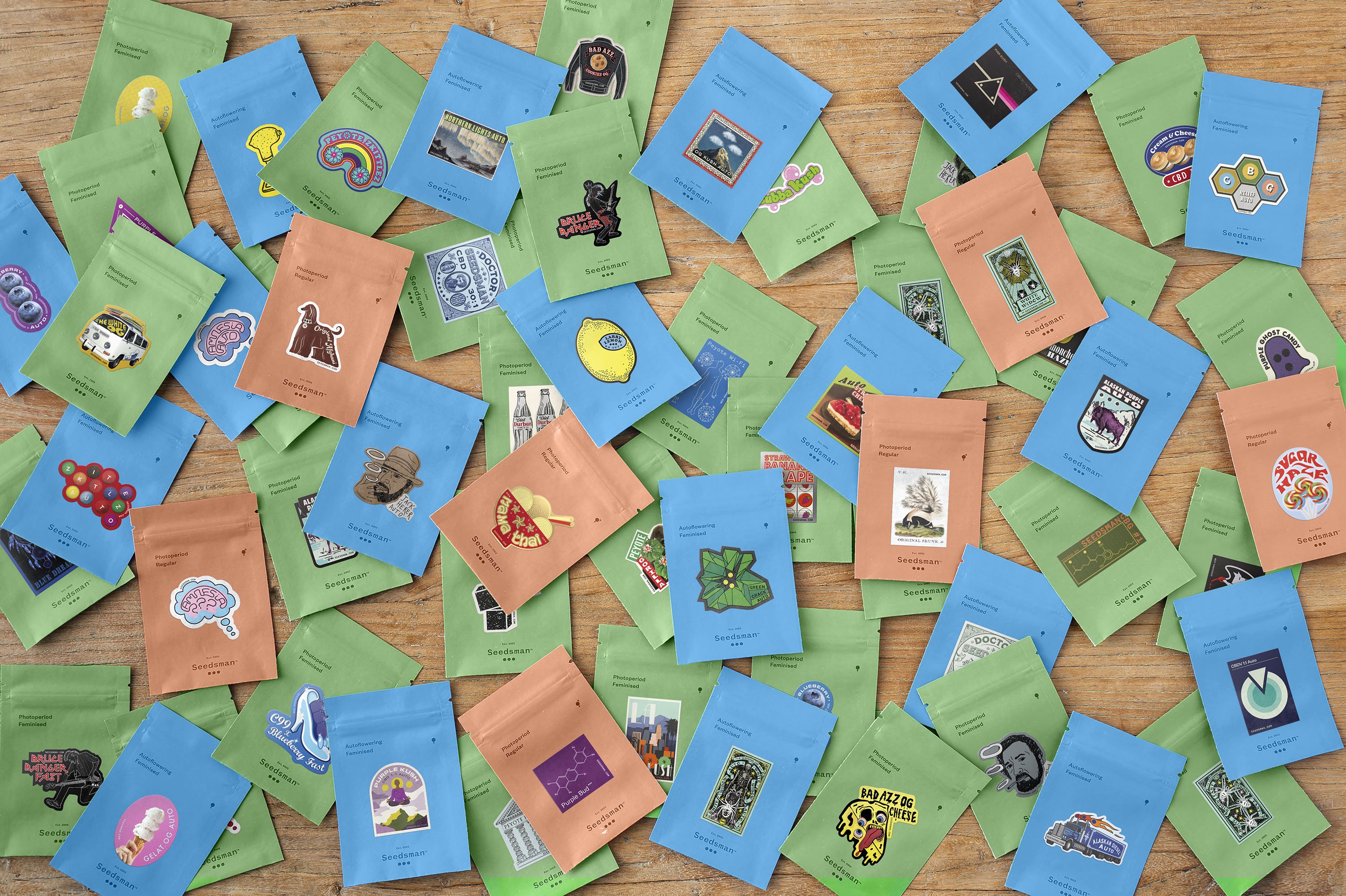
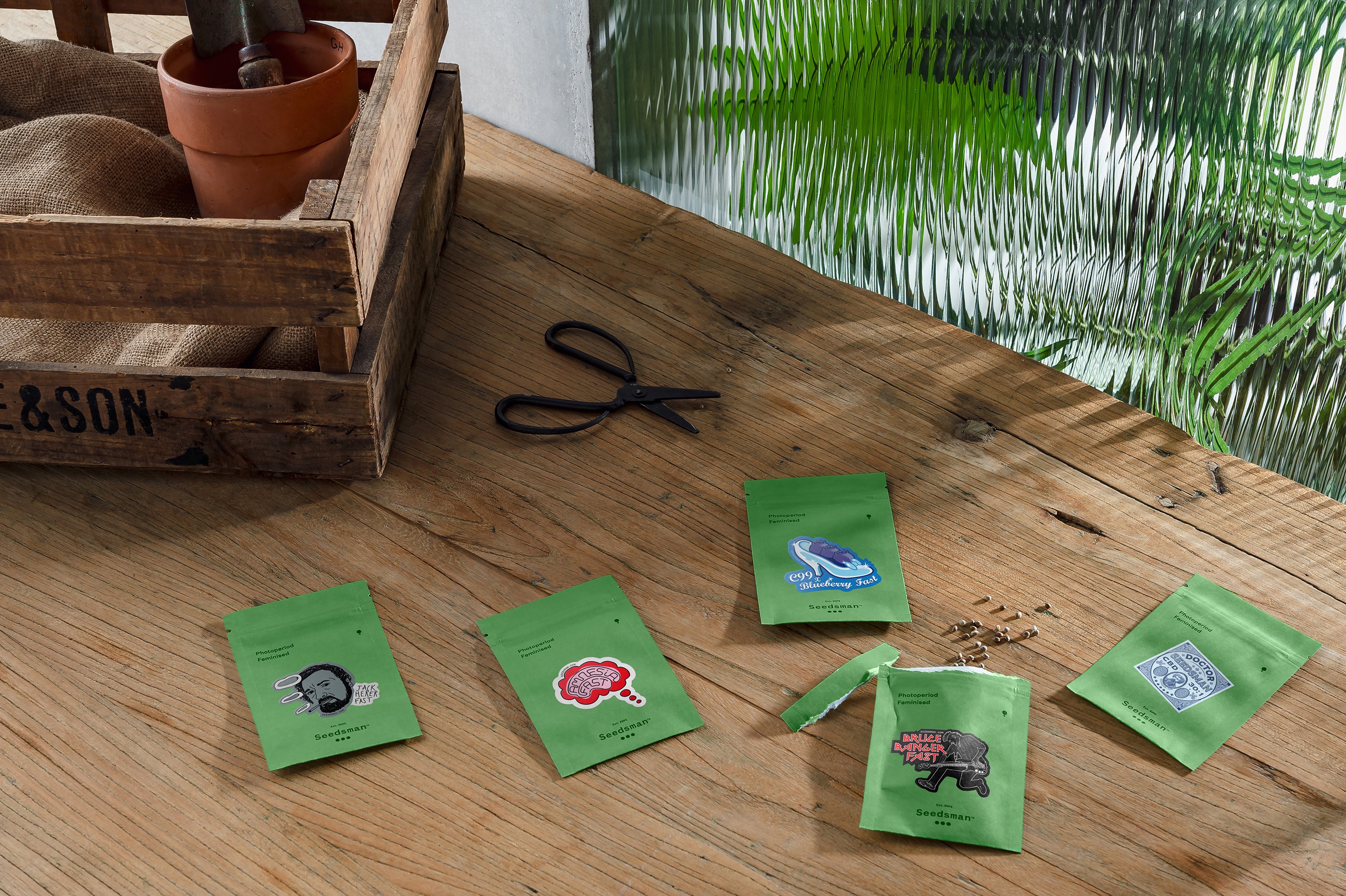
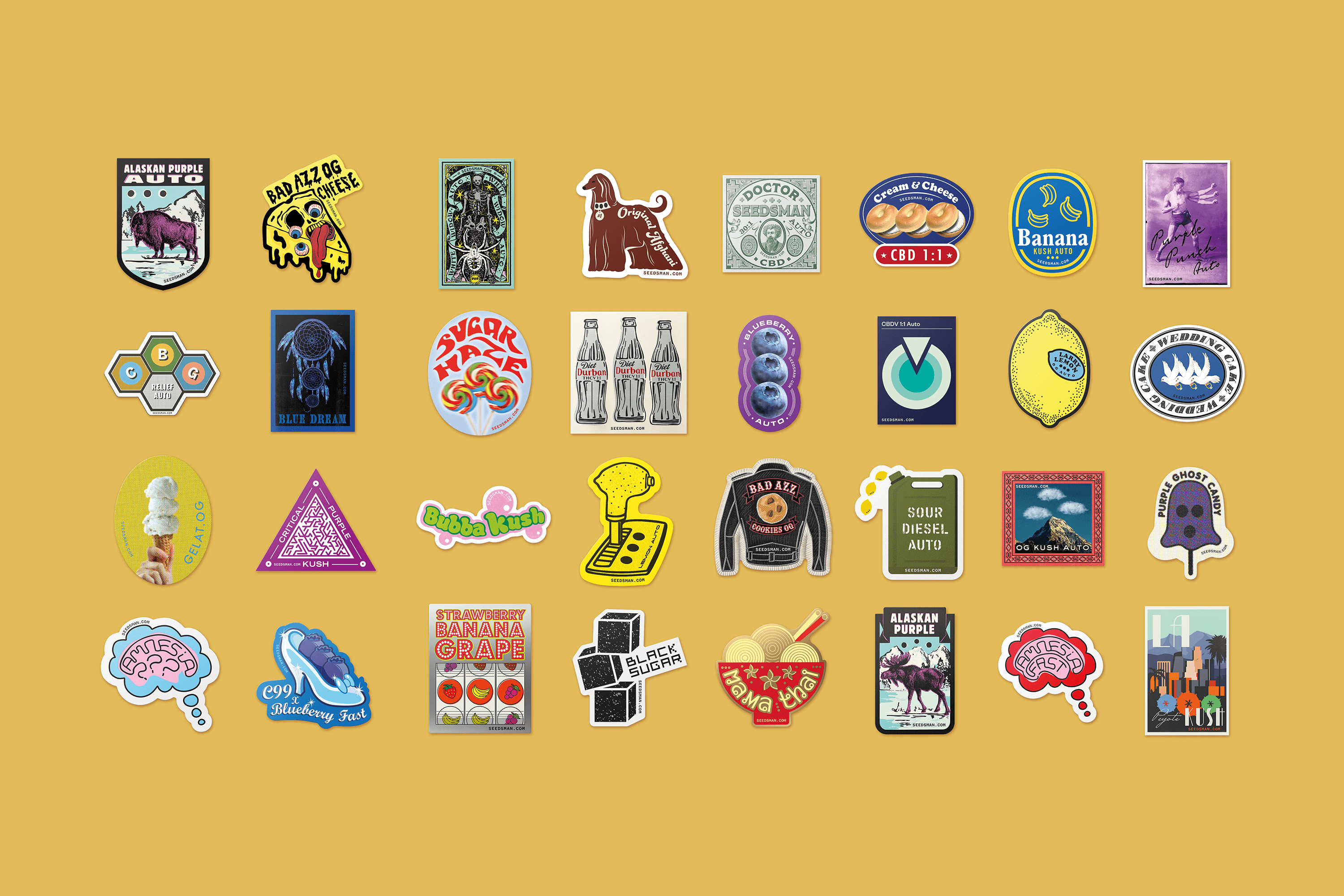
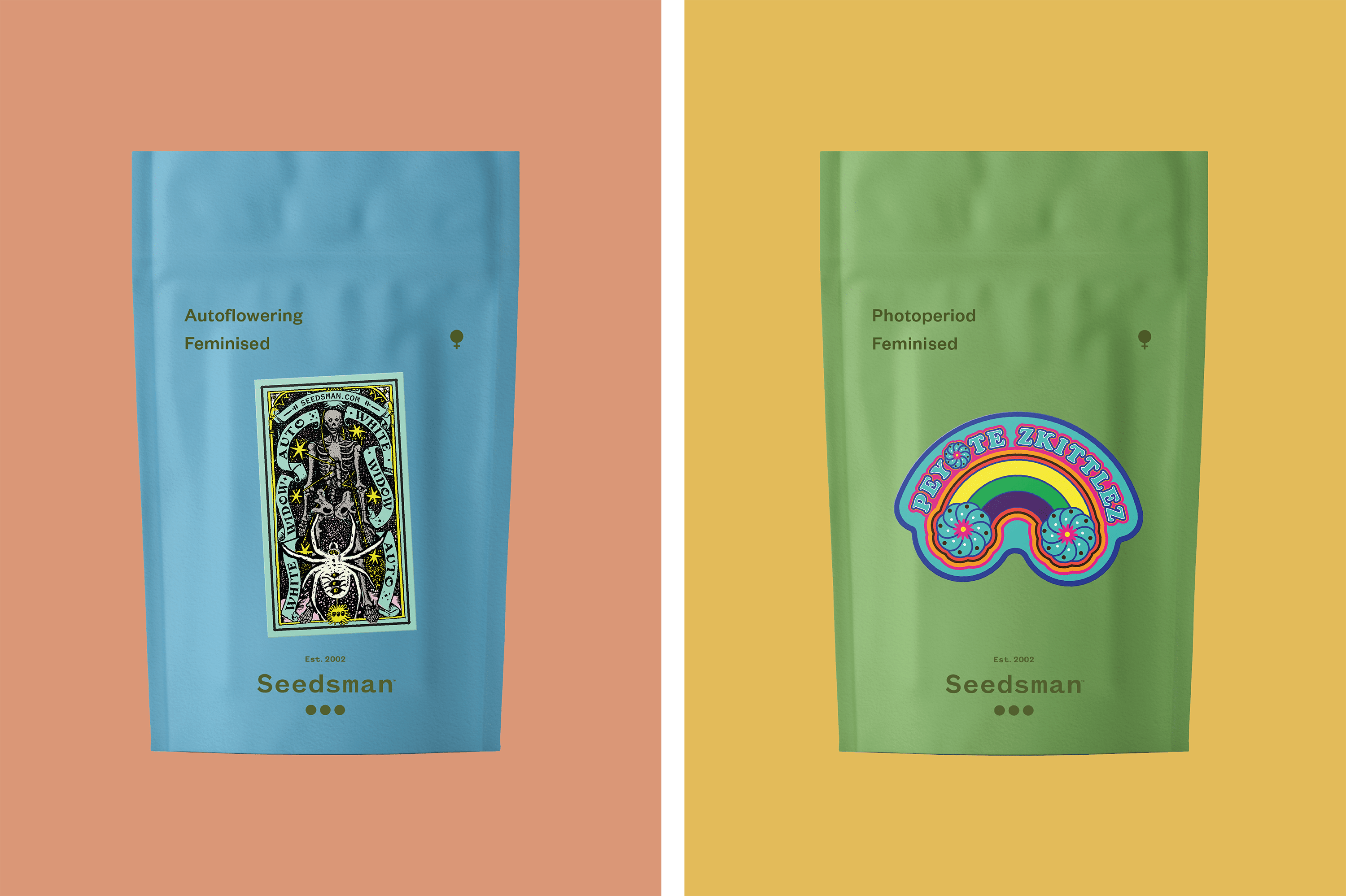
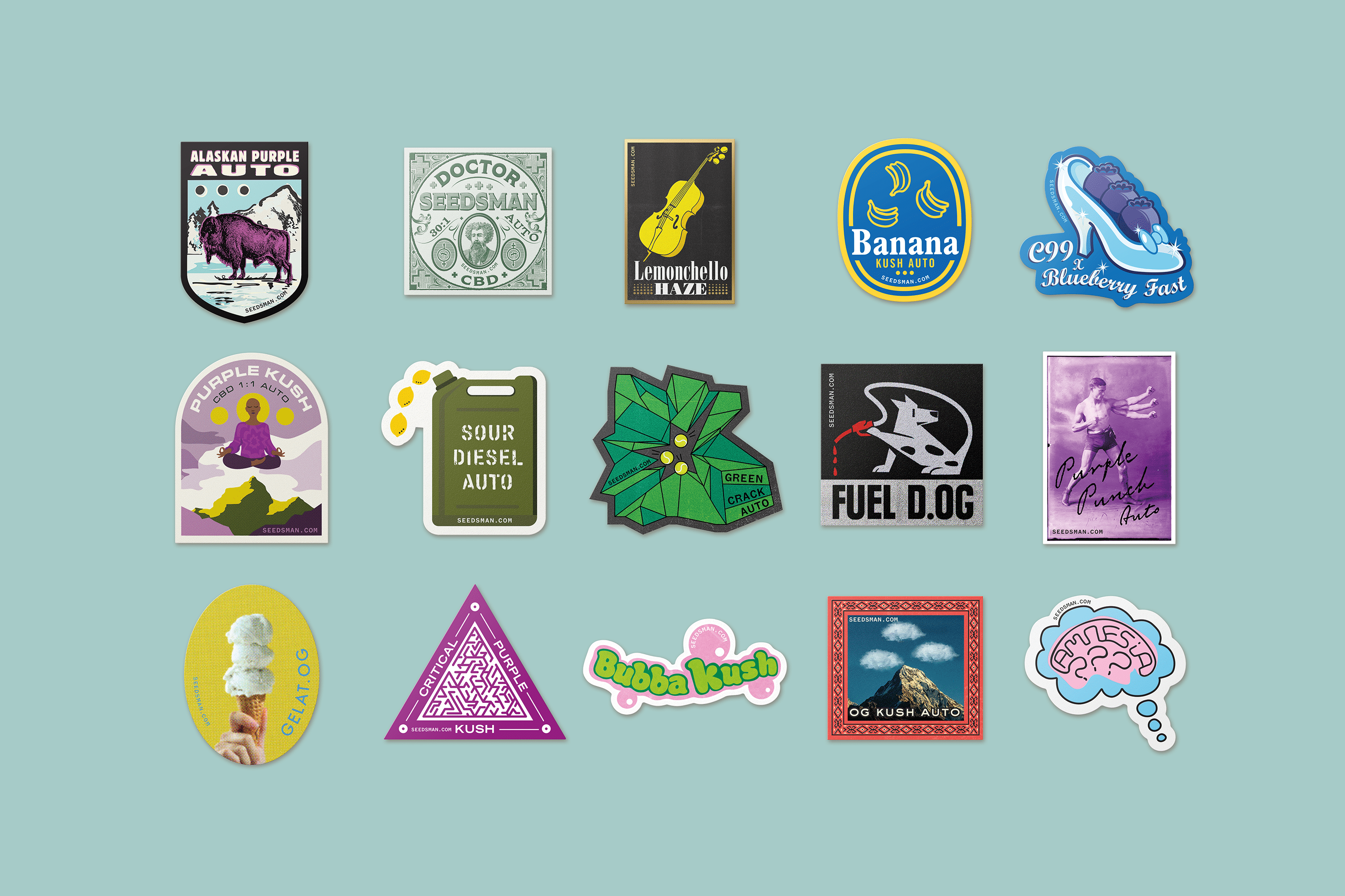
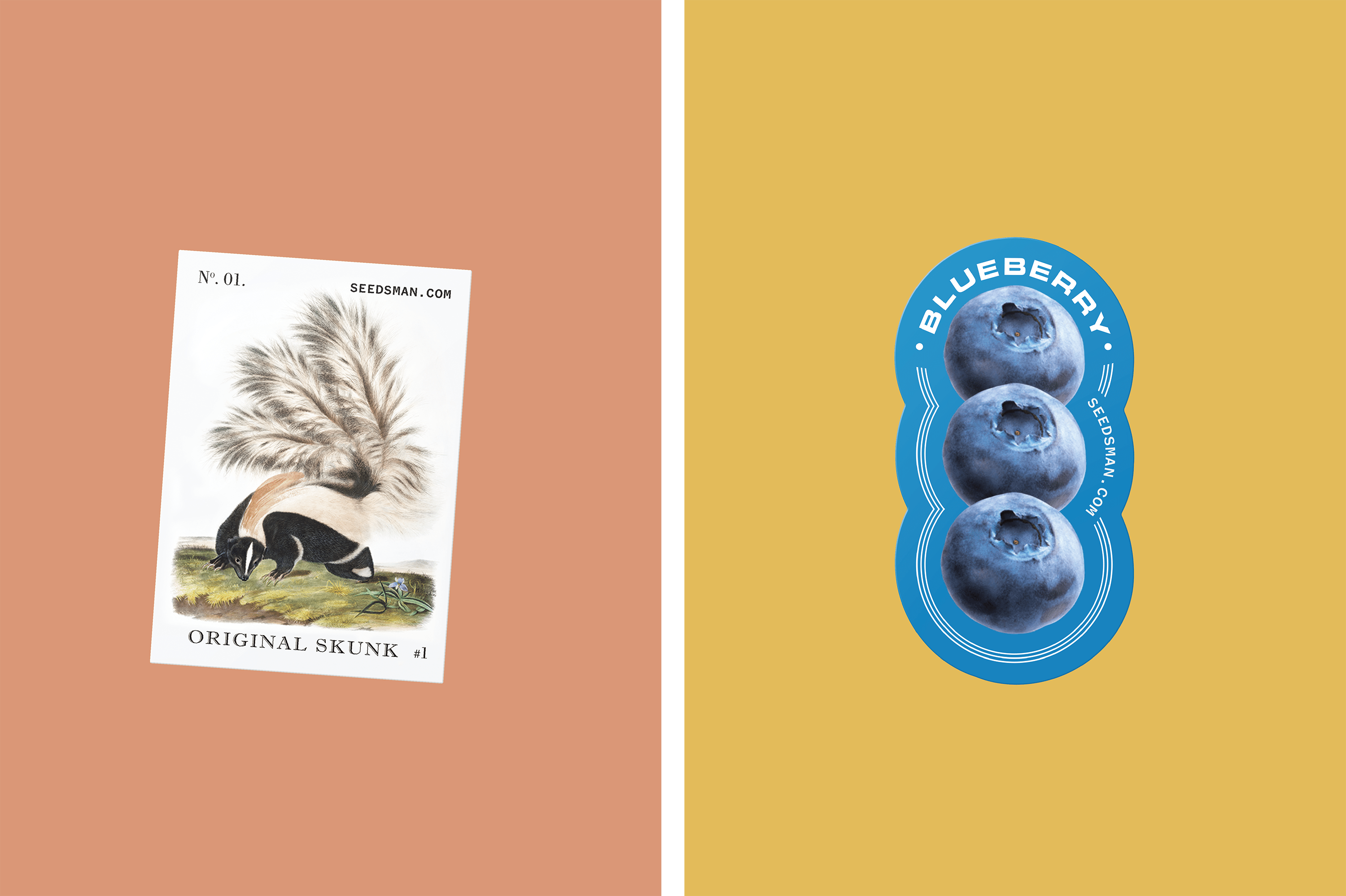
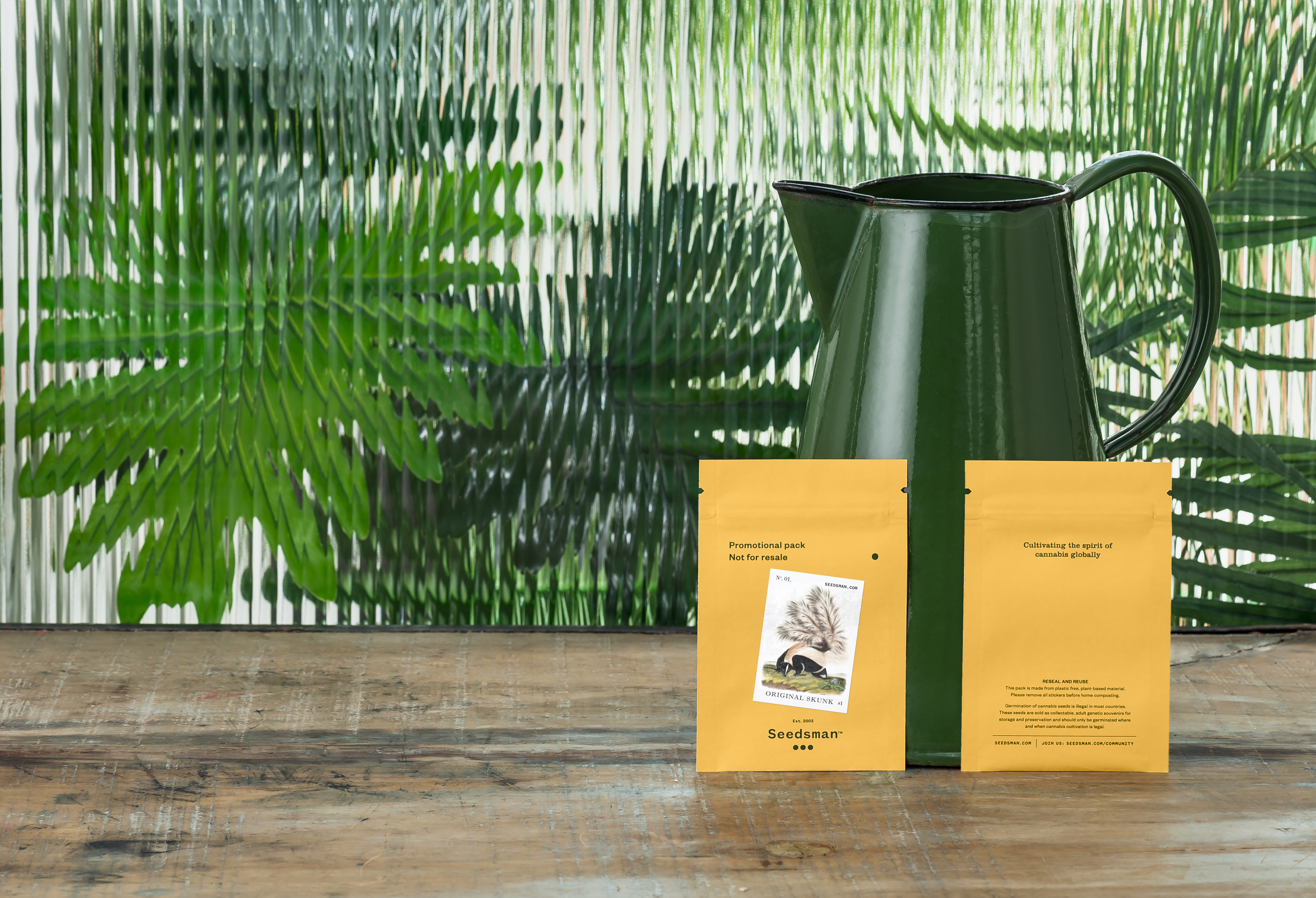
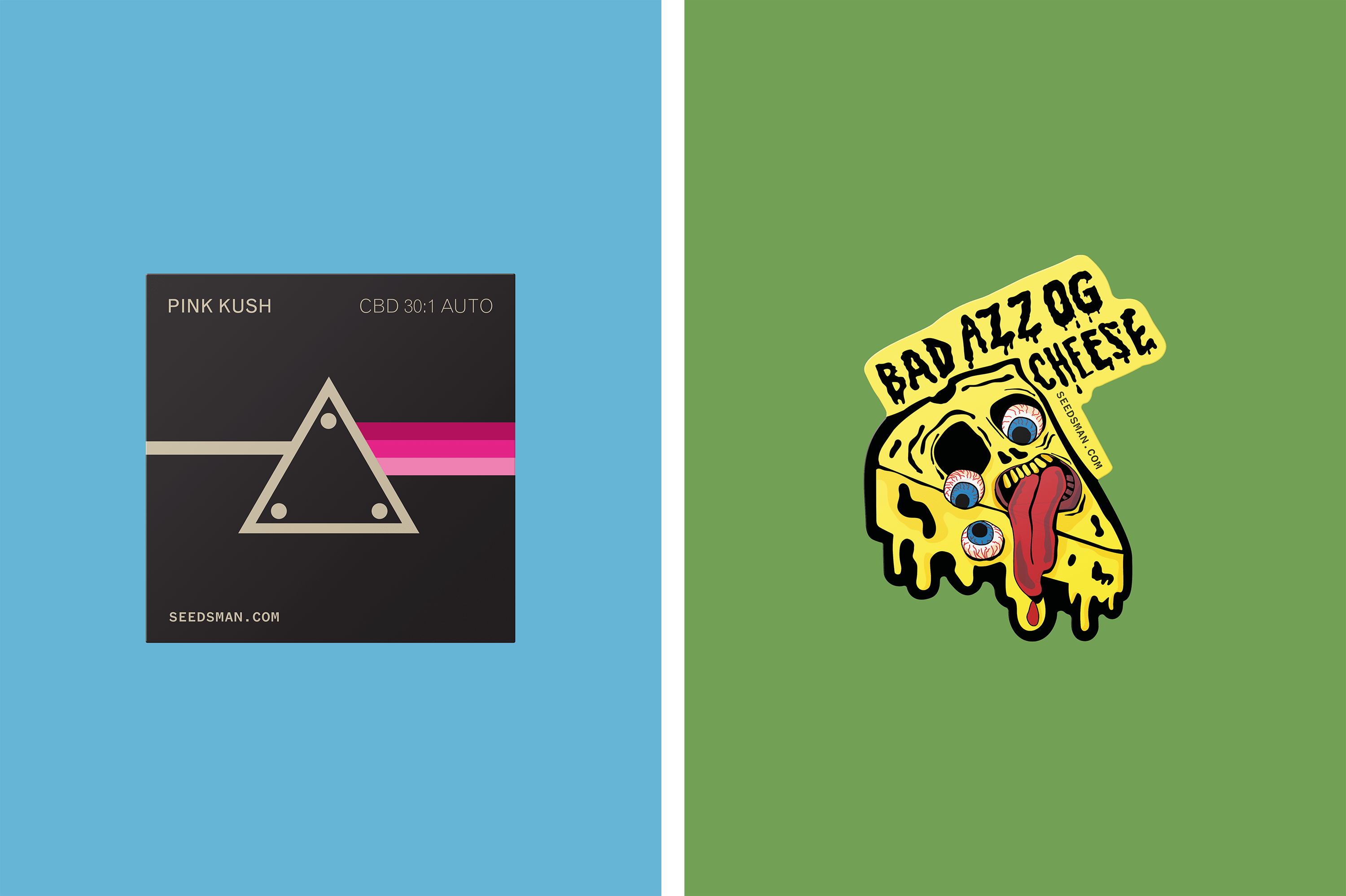
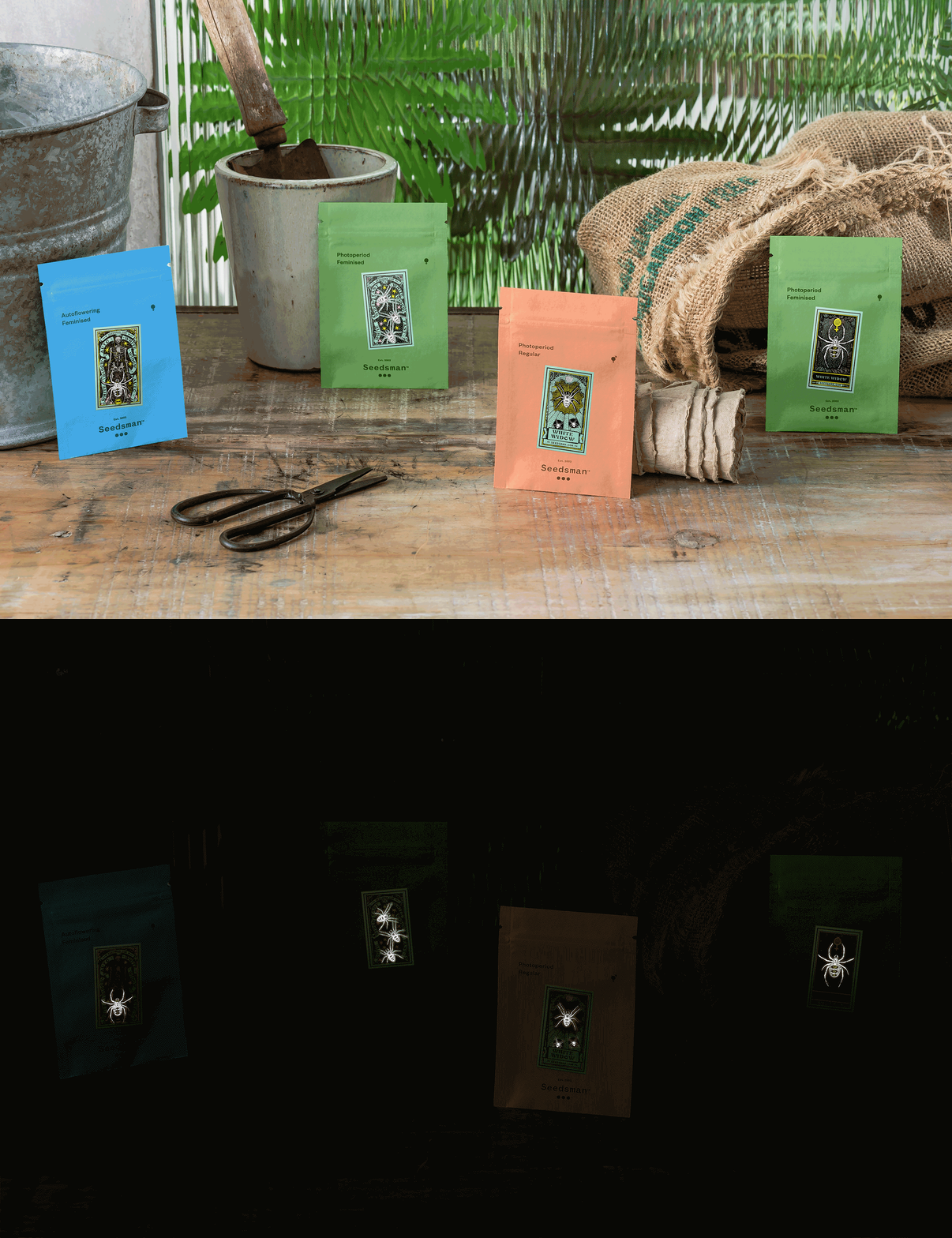
The new identity isn’t really about the logo though: the star of the show is the suite of 60 bespoke illustrations (one for each seed strain) that were created to use across Seedman-sold products as stickers and applied to a range of branded and sustainable packing pouches. Each illustration uses an ‘element of three’ – such as a trio of spiders, three eyes, a triple ice cream scoop – as a call-back to the three seeds in the Seedsman logo. It’s a smart device that means that no matter how wide-ranging and diverse the illustrations are, they all firmly sit in the bespoke, personality-packed Seedsman brand world.
The identity is impressive not only in its scope and breadth, but in the wit and humour shown across the range of illustrations. Each is a master at mimicry, taking on the appearance of everything from Iron Maiden’s logo (in Seedman’s version, this becomes ‘Bruce Banger Fast’ – a not-so-subtle reference to Iron Maiden frontman Bruce Dickinson); to Skittles (for the Zkittlez Auto seeds); to Victorian apothecary ephemera; to classic stoner aesthetics (goofy, cartoonish, garish colours, anthropomorphised cheese).
Here also created a series of icons for Seedsman that are used in the brand’s website navigation (like a simplified symbol for ‘Account’ and ‘Search’) and on seed packs to clearly communicate the nature of the product, such as whether the seeds are Feminised (feminised seeds are generally more potent; have higher levels of THC, CBD, and other cannabinoids; and tend to produce higher yields), how they should be grown (outdoors, indoors or in a greenhouse); and if the seeds have a notably high CBD or THC content (both are active cannabis ingredients, but only THC produces a high).
With the modern, smart icons and deliciously playful illustrations, the logo might seem slightly out of place in the branding due to its restrained, rather sensible appearance. However, when you consider Seedsman’s stated missions, the logo’s erring on the more conservative side makes sense. Striving for a ‘more inclusive cannabis industry while simultaneously raising seed quality,’ the founders passionately support ‘common-sense drug policies’, they say. Ultimately, Seedsman says it’s working to ‘unlock the full positive potential of the cannabis genome… paving the way towards a new world in which cannabis is no longer vilified and misunderstood but celebrated, respected, and nurtured’.
As such, this isn’t just a brand that needs to be visible to and respected by growers and weed-nuts – there’s an undercurrent of having to engage with potentially more conservative audiences to truly demonstrate the validity of cannabis use.
‘The cannabis category has deep counter-cultural roots, but is quickly becoming more professional and scientific,’ as Here Design points out. Its Seedsman branding deftly responds to both sides of that coin; playing into wit, humour, a dazzling array of ‘if you know you know’ reference points – but united in an identity that stands up as an authority on all things cannabis. For all the subtle stoner gags, Seedsman takes itself seriously – and the new branding demonstrates that beautifully.
