LCBA by Studio Bergini
Opinion by Emily Gosling Posted 7 March 2023
Not a new project, but a lovely one nonetheless; it seems there couldn’t have been a more perfect fit for London Centre for Book Arts than Studio Bergini when it was looking for a design team to task with creating its new visual identity.
Formed by two Central Saint Martins grads – Norwegian Kristian Hjorth Berge and Italian Francesco Corsini (hence Berg-ini) – the studio has long been interested in the craft and artistry of print, having founded The Royal Duplication Centre, the risograph printing lab at the Royal College of Art, in 2016.
Studio Bergini’s work across identities, publications, exhibitions, websites, wayfinding, packaging, and more is forged from a ‘conceptual… content-oriented’ approach that’s ‘often rooted in typography’, according to the studio. This approach firmly seems to align with that of the London Centre for Book Arts, which was founded in 2012 with the goal of creating ‘a place where people could affordably access equipment, resources and expertise to create and edition books and publications,’ according to its founders Simon Goode and Ira Yonemura.
They add, ‘From the start, we took a pragmatic and somewhat anti-institutional approach to running the studio: keeping things small, staying independent, and prioritising community and friendships.’ There’s a nice alignment between studio and client in the sense of community, too; with the London Centre for Book Arts space in Fish Island, Hackney Wick, a stone’s throw from Studio Bergini – also in Hackney Wick, east London.
Goode and Yonemura’s interests in founding the LCBA space were, respectively, emphasising a ‘practical and craft-based approach to “book arts”’; and a view of books and publishing as an extension of artists, musicians and queer activists practices ‘and self-organisation and collaboration as their de facto model of working’. The pair sees the marriage of these interests as integral to the personality of the London Centre for Book Arts, and Studio Bergini’s identity for the space – simple, accessible, and impactful; yet contemporary, fresh and professional reflects that beautifully.
Studio Bergini developed the identity over the course of a year, describing the process as ‘dialogic’. Working in this way meant that the studio was able to ‘shape how the designs are taken up and used in real time, to give LCBA a tailored and functional identity,’ it adds.
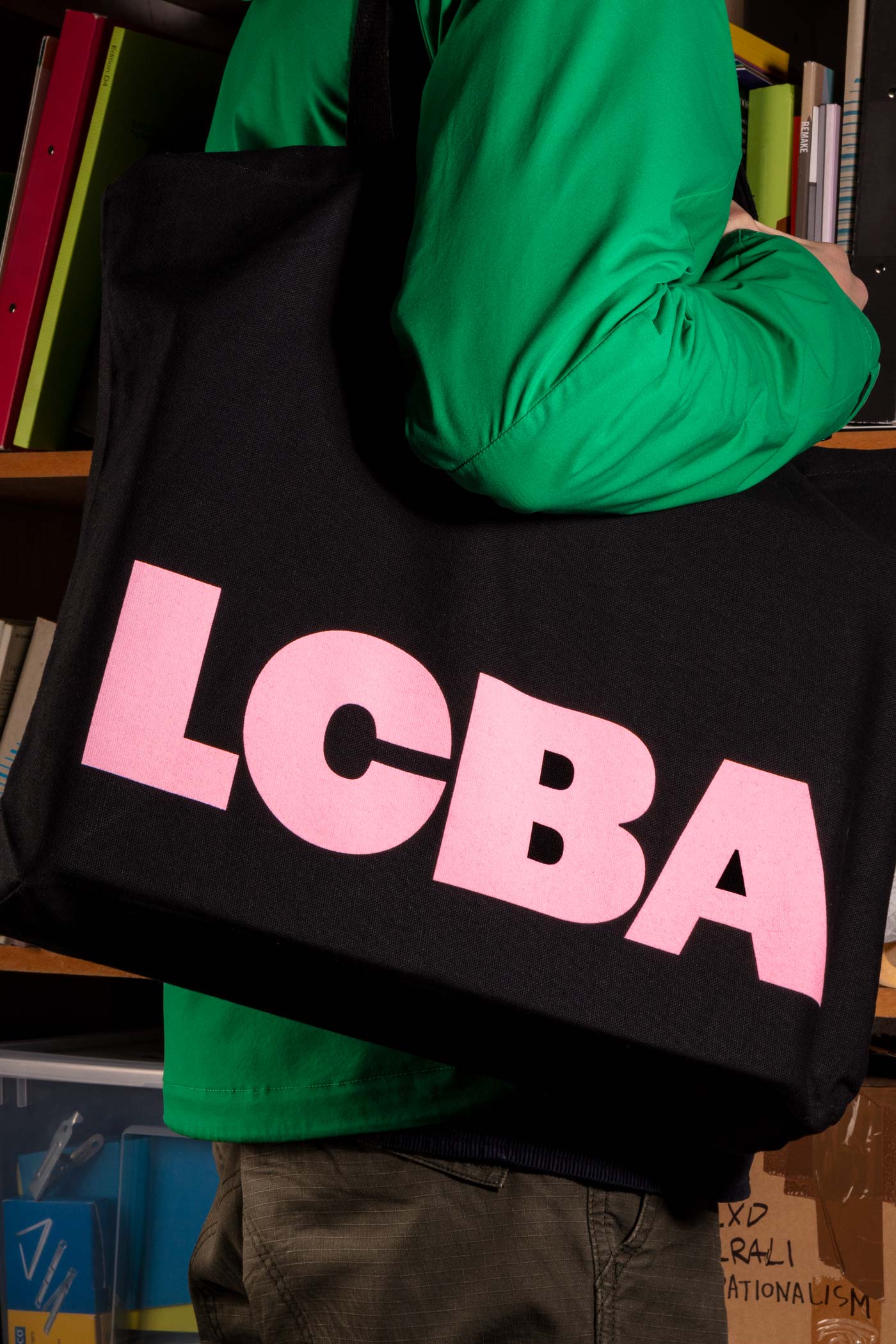
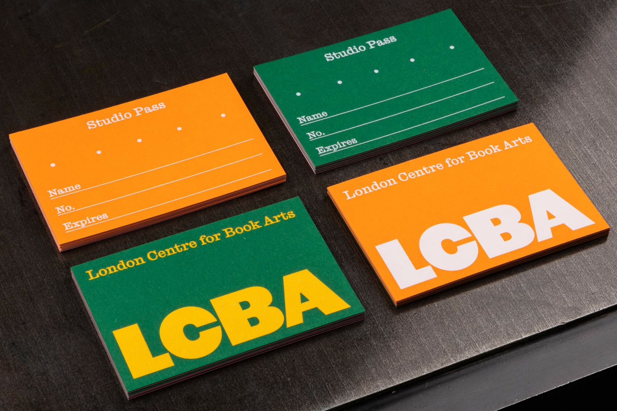
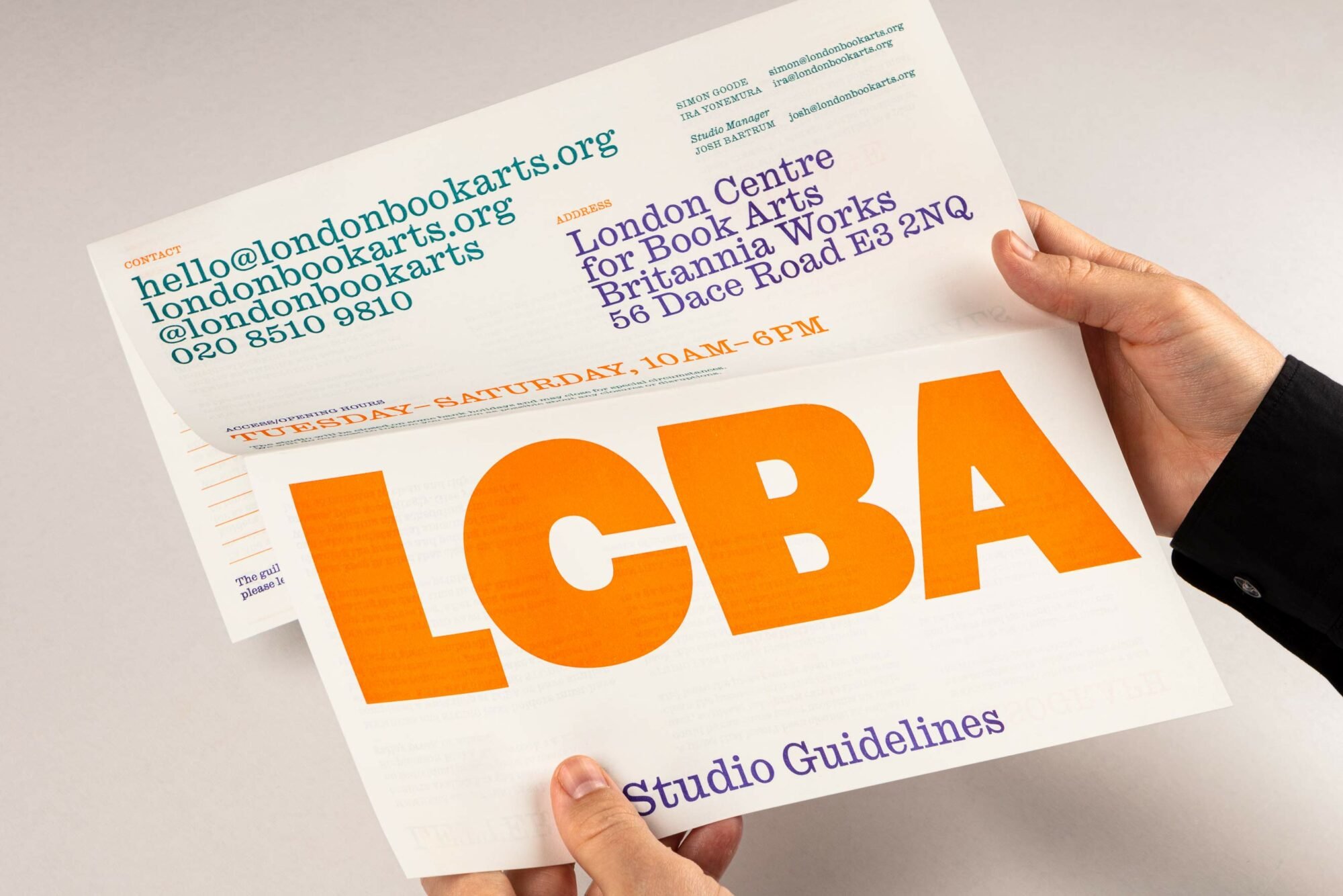
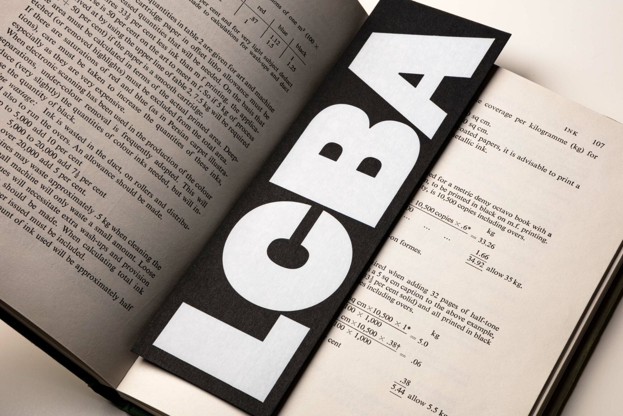
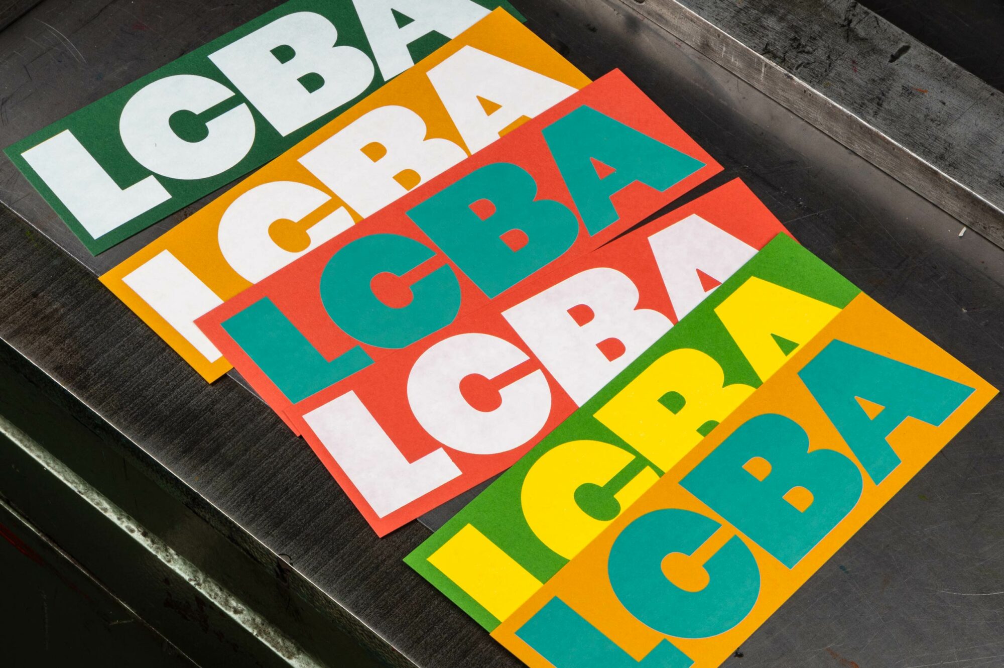
The area where both LCBA and Studio Bergini sits has a storied history in printing, and this too is reflected in the look and feel. The identity is firmly centred on what’s described as a ‘fat logo’ set in Original Sans. Billed as ‘bold and brash’ by Commercial Classics, Original Sans was released by Vincent Figgins in 1828 as the second sans serif ever cut. Heavy in both personality and form, it’s an ideal choice for the no-nonsense all-caps logotype, with a heavy slab cut resonant of similar typefaces at the time it was first created.
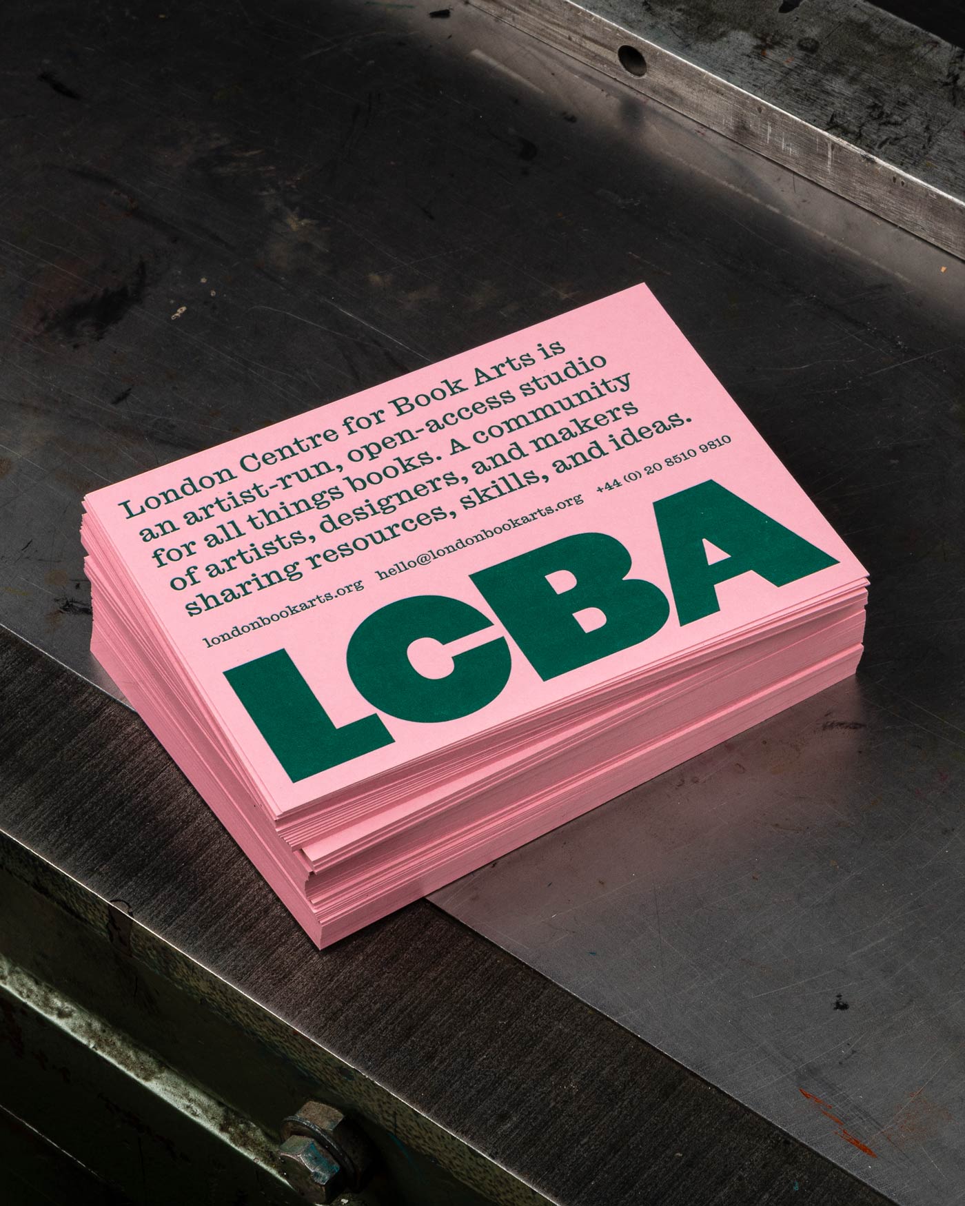
Elsewhere in the identity Studio Bergini opted for Caslon Ionic, another font that marries serious, practical usage and legibility with playful touches like bracketed serifs and a healthy, robust charm.
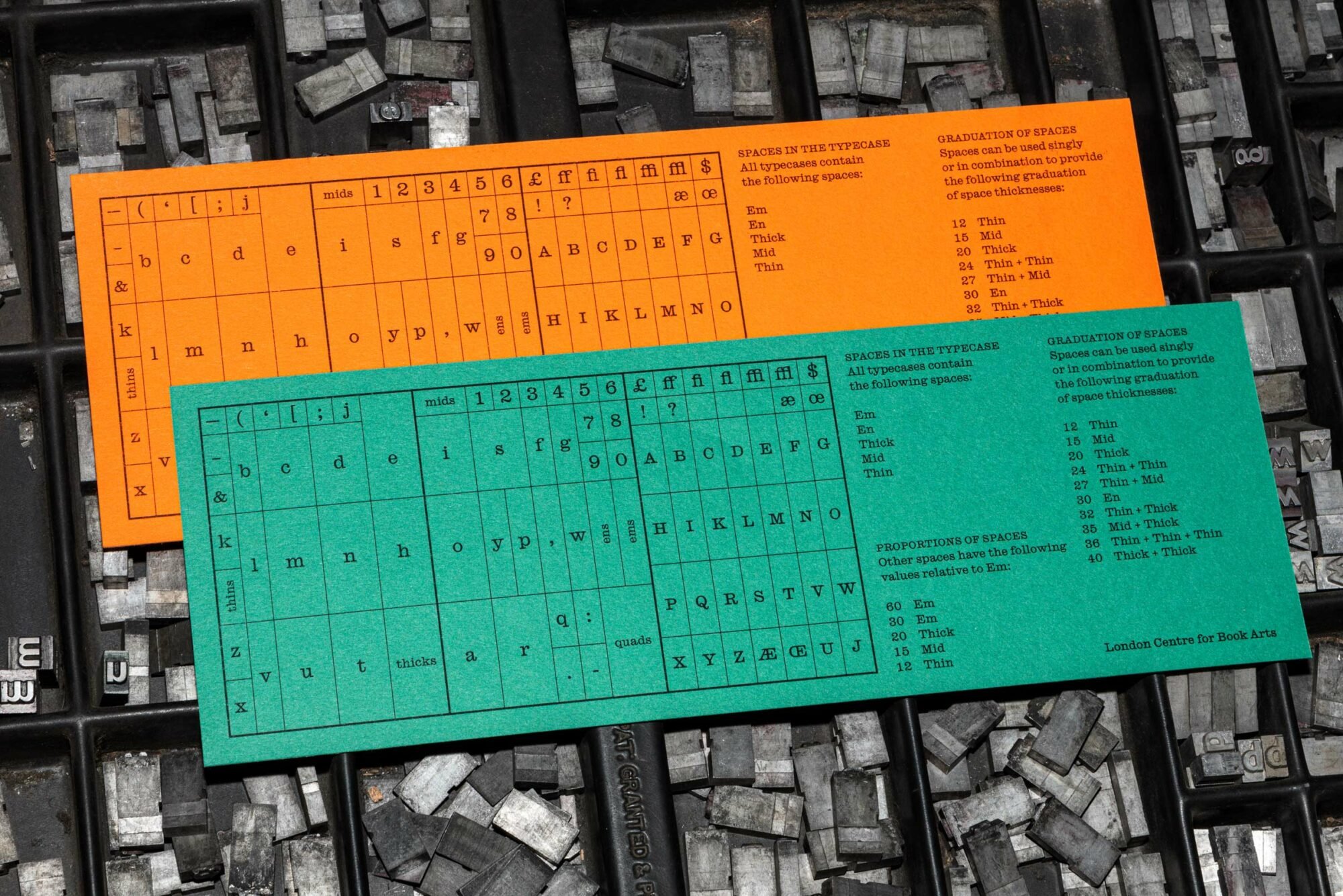
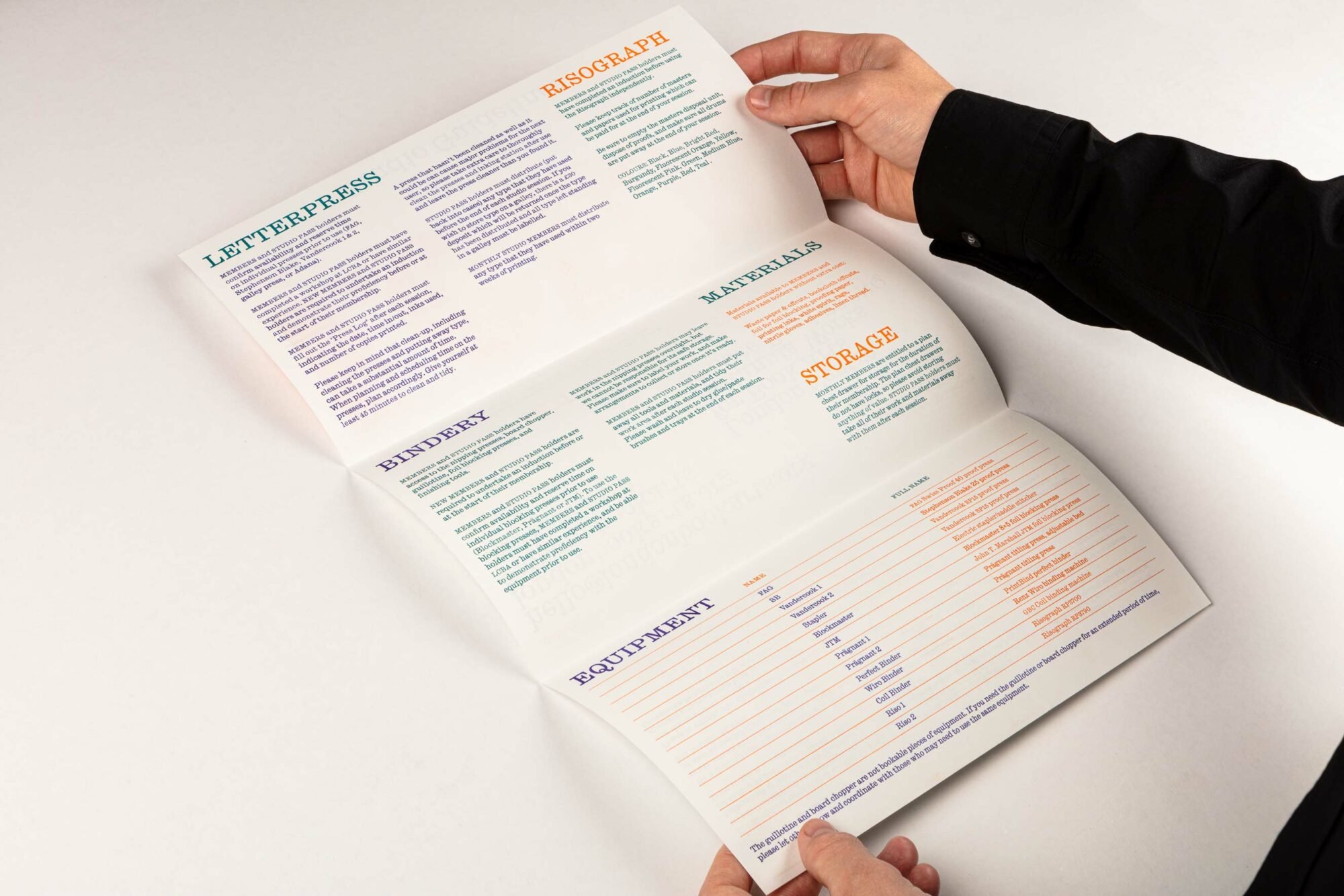
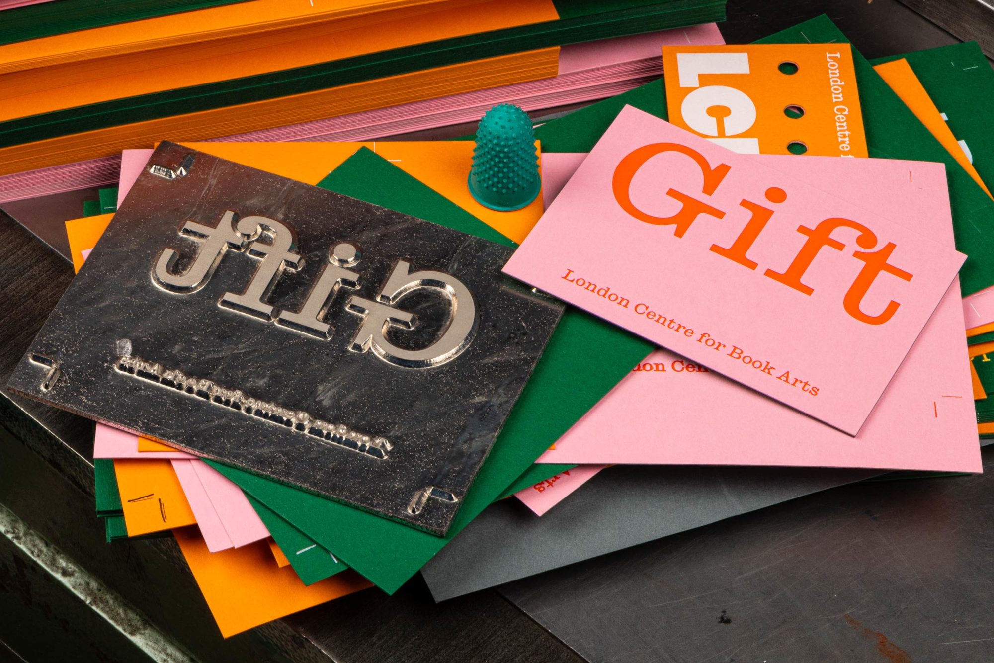
Basing the LCBA identity on these typefaces was no accident: both reference the area’s local history as the last site of the Caslon foundry, which sat not far south west of Hackney Wick on Chiswell Street until it closed in 1936. ‘Placed together, the pair create a striking and utilitarian identity which emphasises and complements the in-house printing processes, be it letterpress, foil blocking or Risograph,’ says Studio Bergini, which (somewhat self-effacingly) describes the branding approach as ‘slightly heavy-handed’.
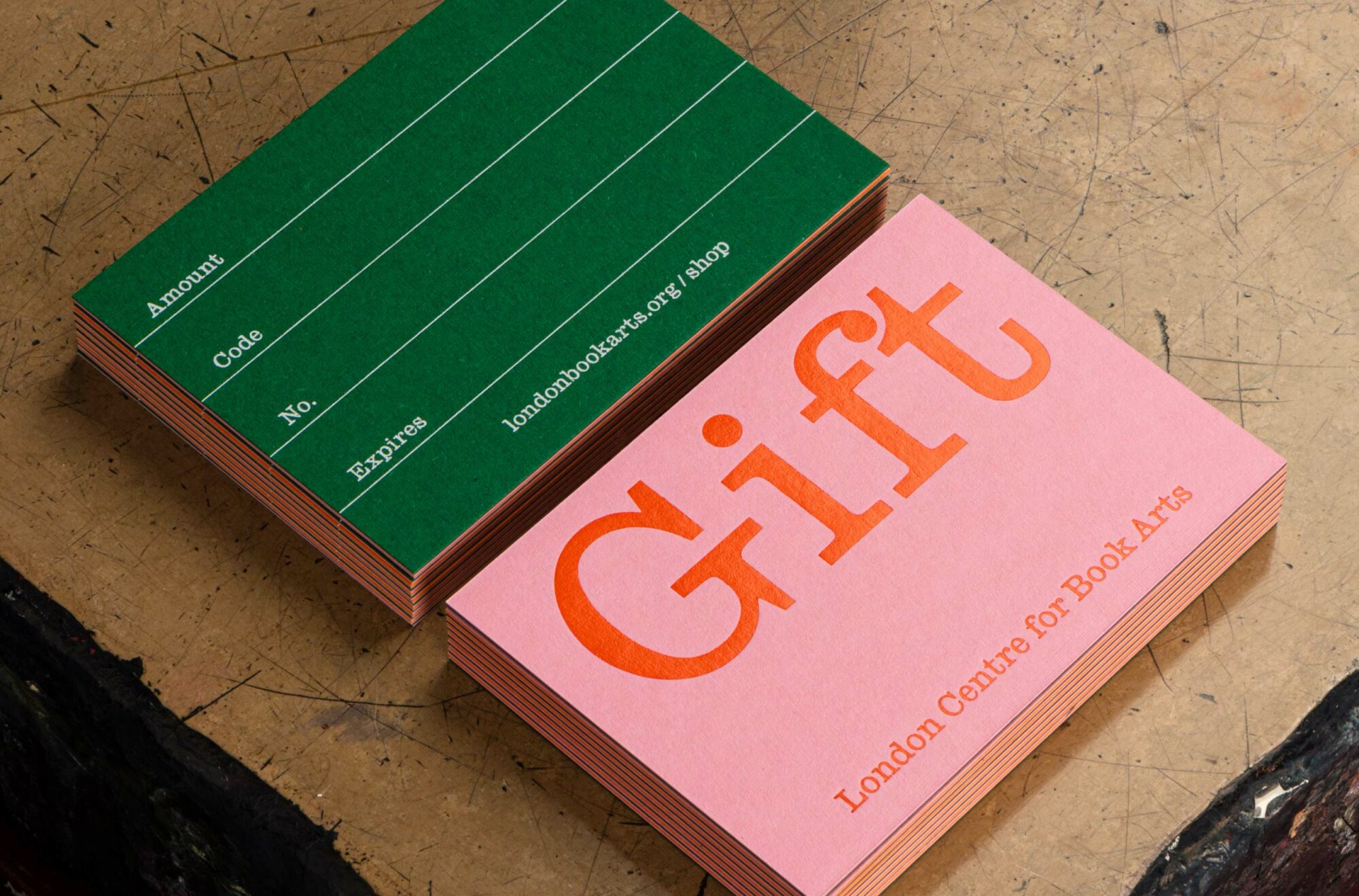
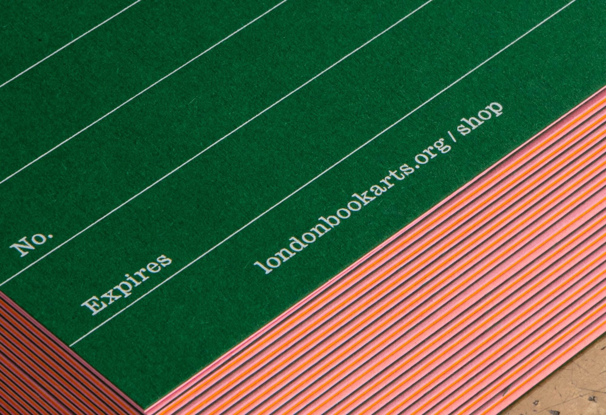
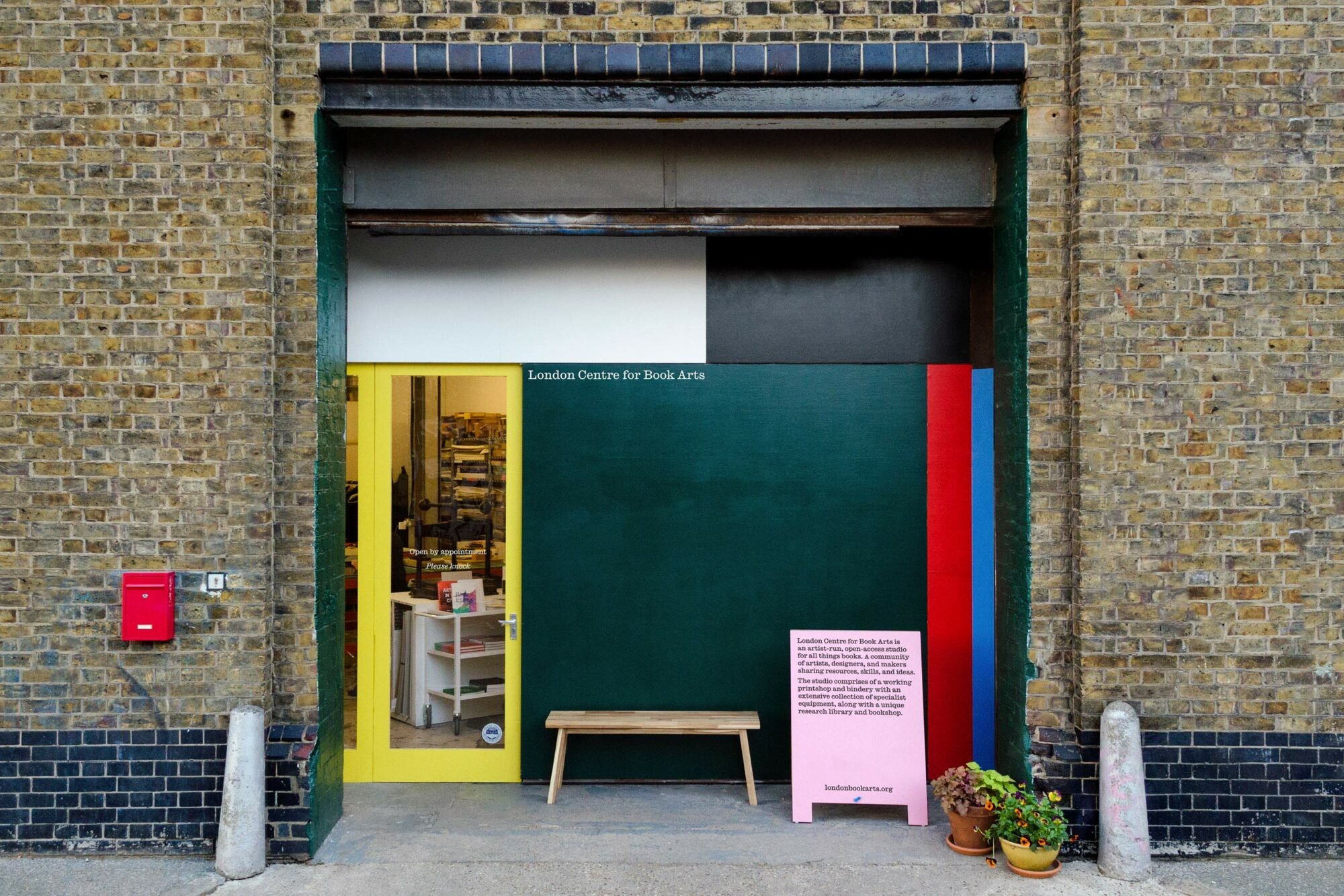
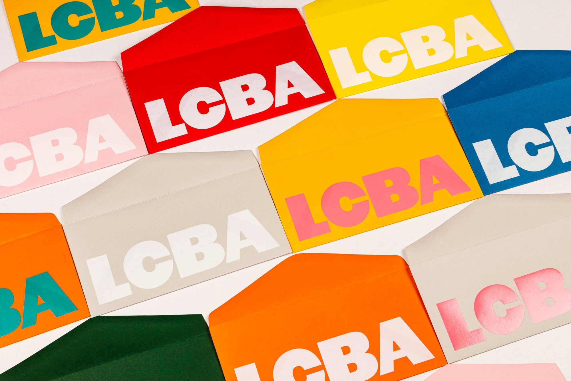
Aside from its firmly typographic roots, the identity uses a vibrant colour palette of bright yellow, dark green, blue, red and a gorgeous baby pink that sits across everything from stationery to the website to the building’s otherwise-unassuming facade. The bold use of colour aims to ‘reflect the multicultural, LGBTQ+ friendly, alternative scene around the workshop.’
And while the identity works beautifully on a two-dimensional level, to truly underscore the nature of LCBA and what it does, when applied to three-dimensional touchpoints it delights in bringing a sense of physicality to life. By ‘playing with materials and processes as much as possible,’ says the studio, ‘every flyer, bookmark, leaflet, and membership card automatically advertises the possibilities the workshop has to offer to its members’. A superb take on form exemplifying function.
