Time by For The People
Opinion by Sarah Malik Posted 23 March 2023
‘The story of the internet is the story of life’. Understood in this way, rebranding Malaysia’s challenger internet service provider Time presented the appropriately existentially titled For the People with a daunting task. As legislation in Malaysia shifted, requiring companies like Time to share their infrastructure with other ISPs, competition has grown. As such, Time needed to evolve its brand. What is time? And what we do with it? The eclectic and humanist reality of the internet, and the multitude of possibilities forms the basis of how Time now talks to its customers.
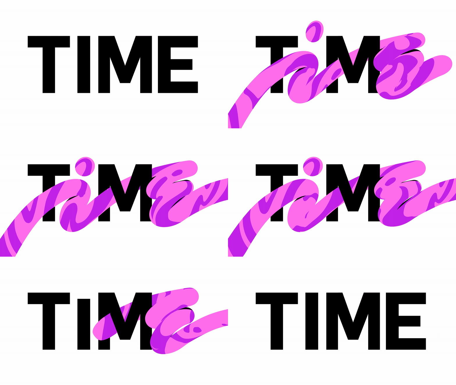
Rather than ripping out everything that had previously made Time recognisable, the colour palette forms a valuable continuity, before launching into an energetic world of illustration, custom typography and motion in the same spirit of the ‘razor–sharp’ and ‘irreverent’ communications and campaigns Time had become known for.
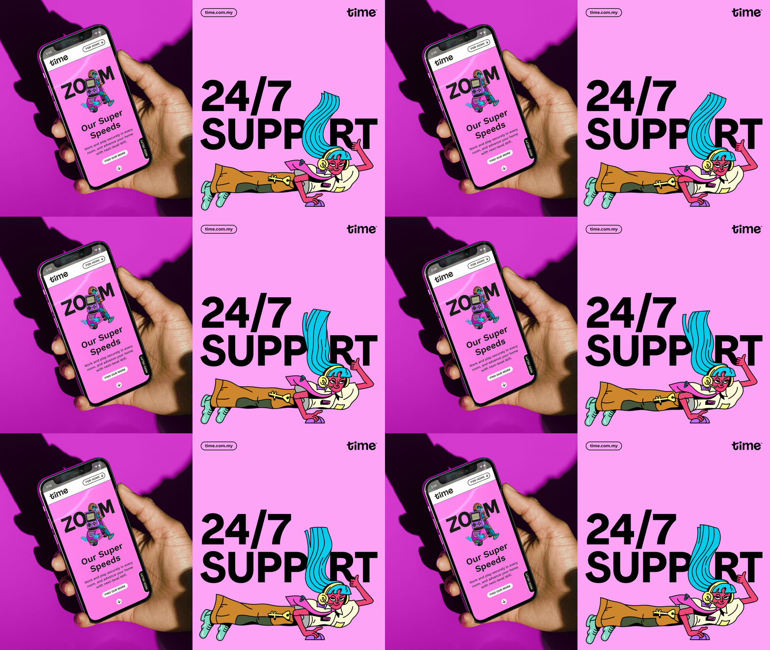
Time operates in a marketplace that attempts to offer all things to all people, often resulting in a generic visual language of stock imagery, a “more-is-more” attitude and flow of endless deals. Cutting through this with a radical new attitude that didn’t lose the ‘specificity and charm that makes Malaysian culture so rich’ was a central challenge. For the People doubled down, developing an idiosyncratic personality, which manifests itself immediately and fully in the approach to type.

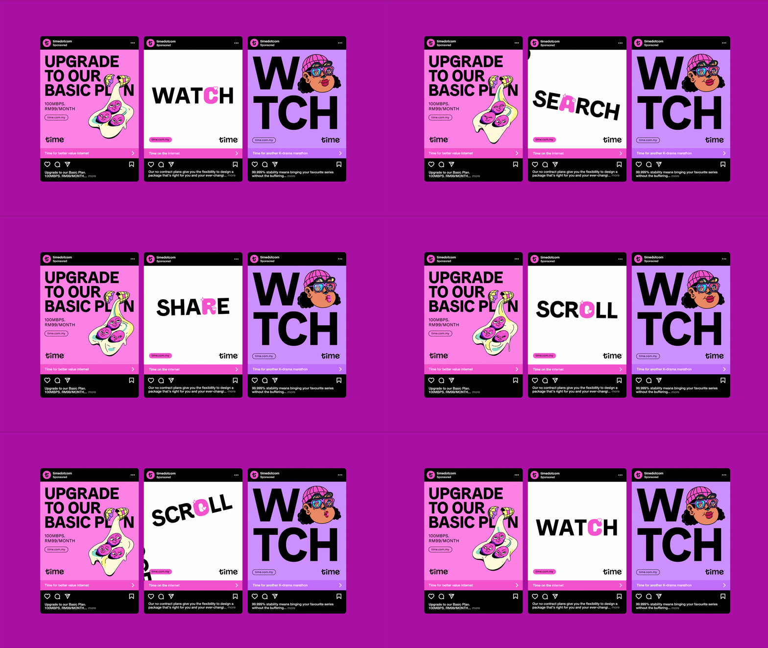
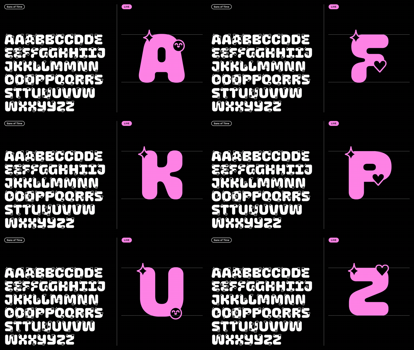
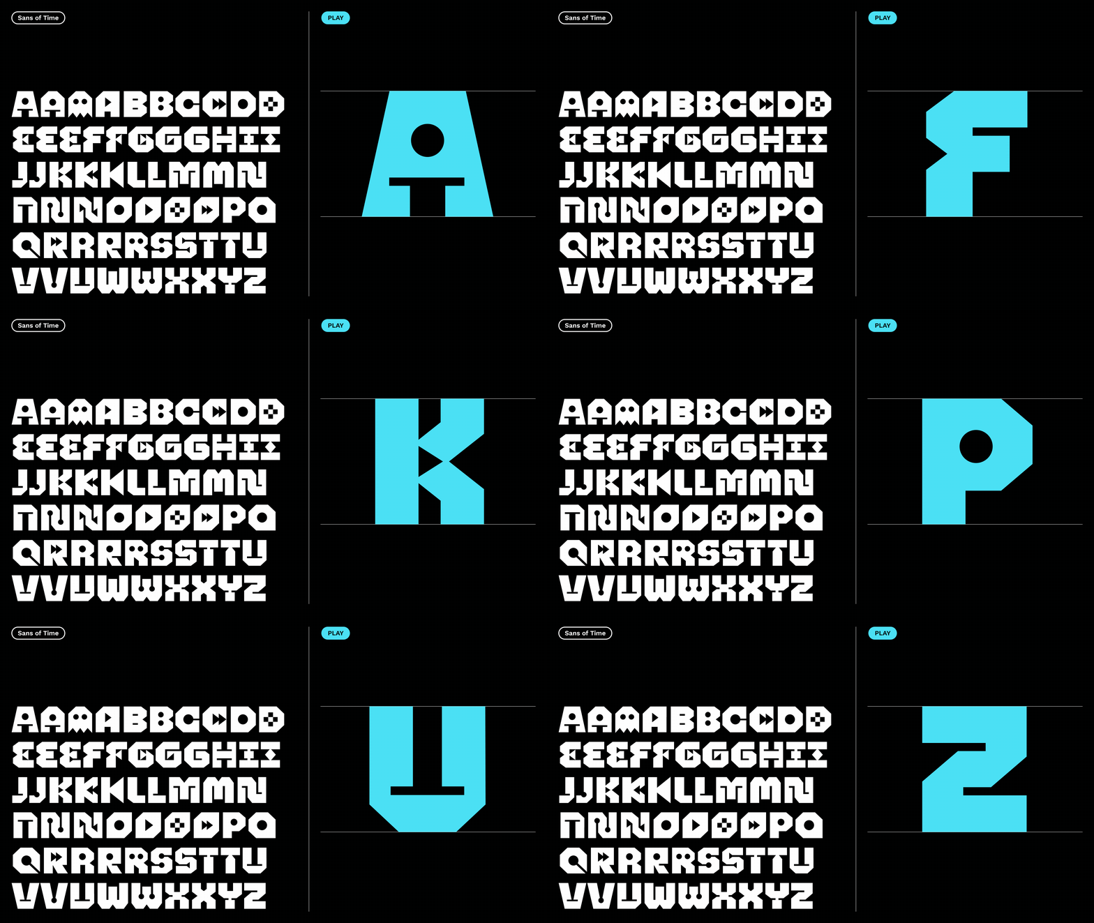
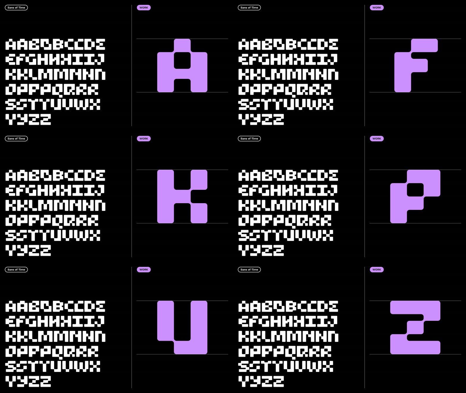
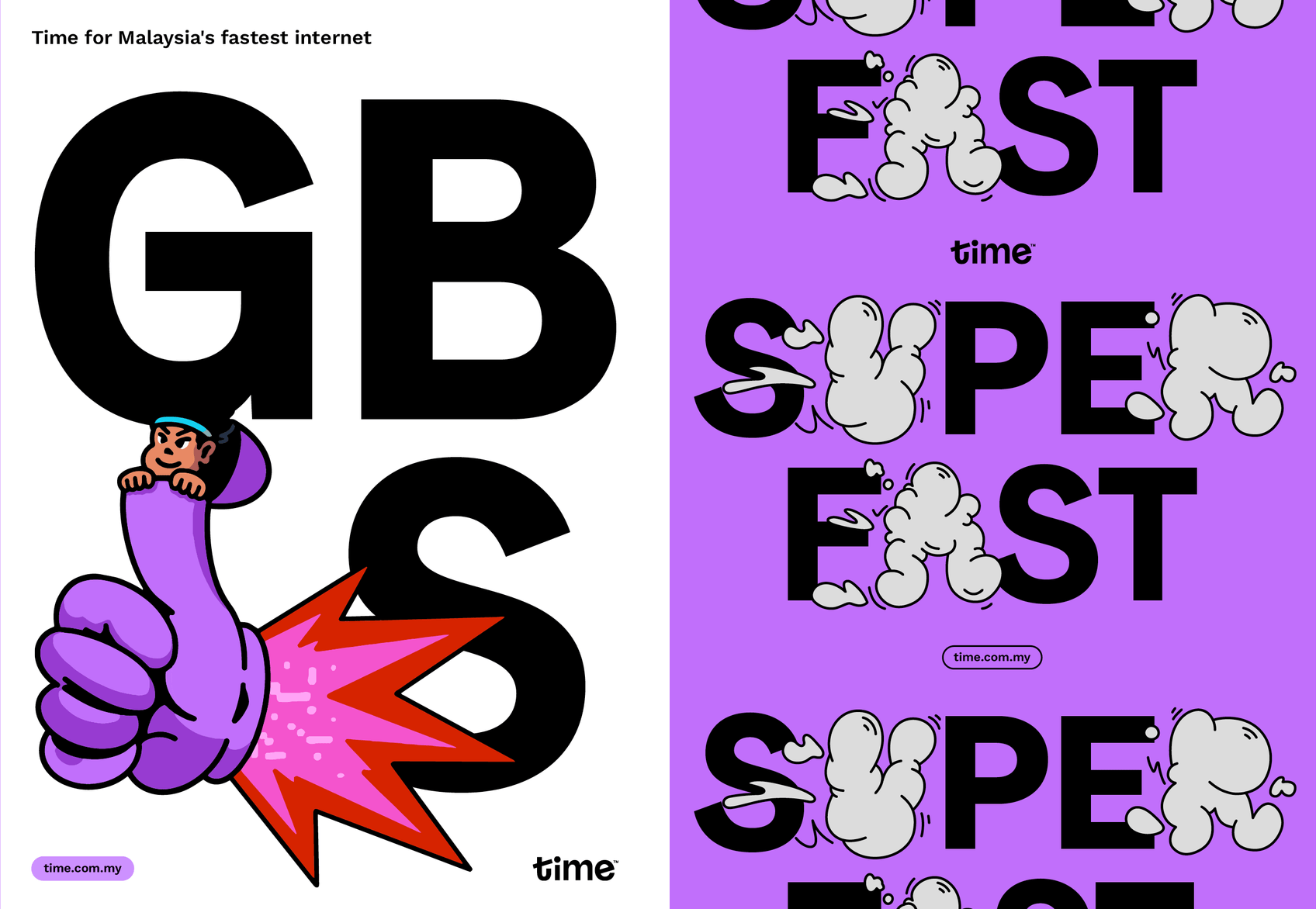
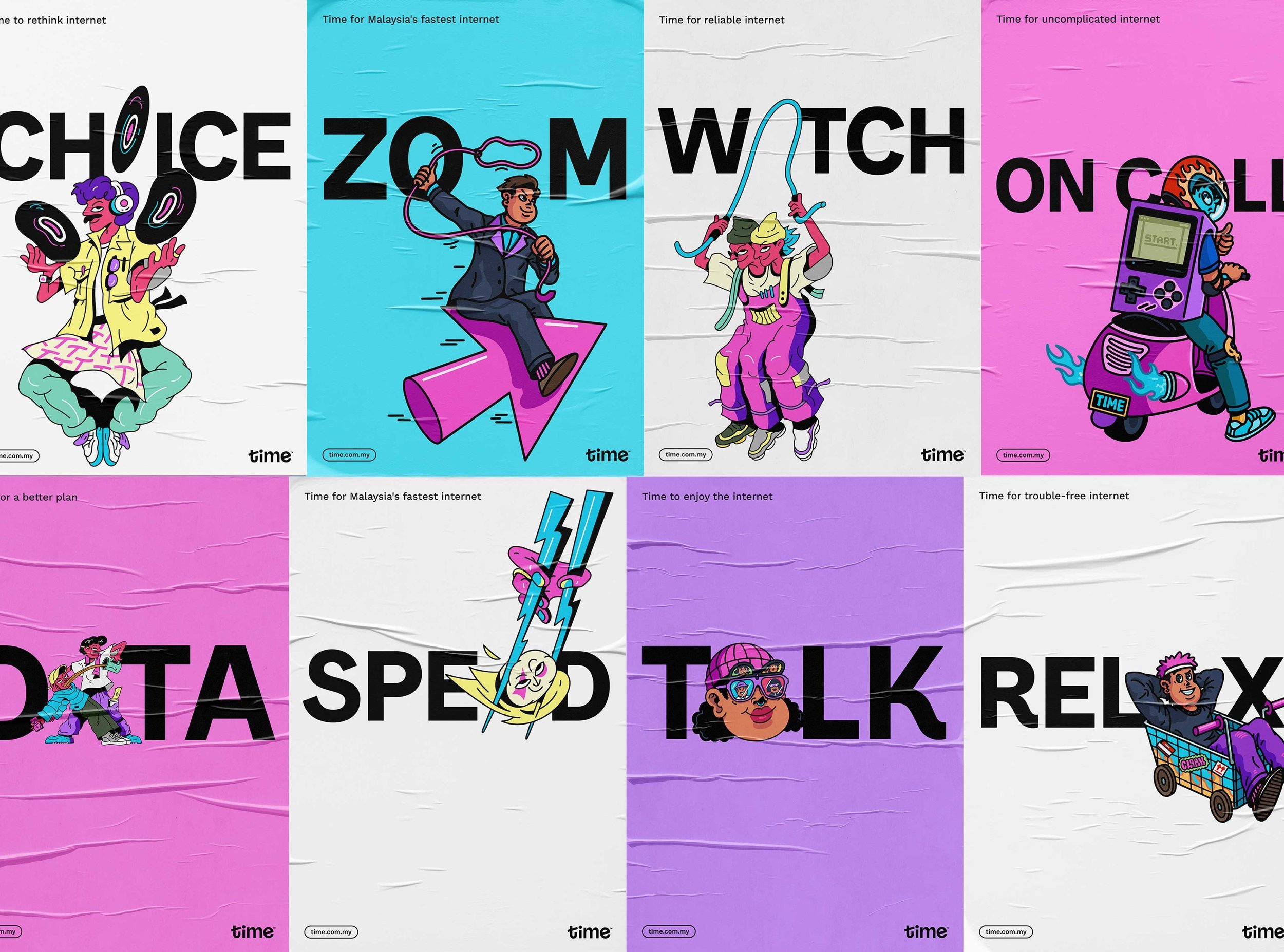
The studio worked with typographer Mathieu Regeur to create ‘Sans of Time’. Departing from the traditional light, medium and bold format, the three expressive character weights are different in tone and aptly called Live, Work and Play. This typeface has been built to accommodate illustrated letters, inserted directly into headline words, replacing one or more letters.
In the age of the internet (and indeed the age of the meme), For The People and Mathieu recognised and understood that messaging and imagery are inextricably linked. And after all, why fight your audience? Embracing meme subculture and legitimising this through corporate branding felt true to the brand values of Time.
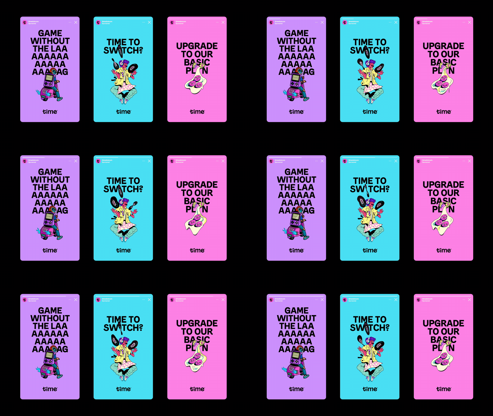
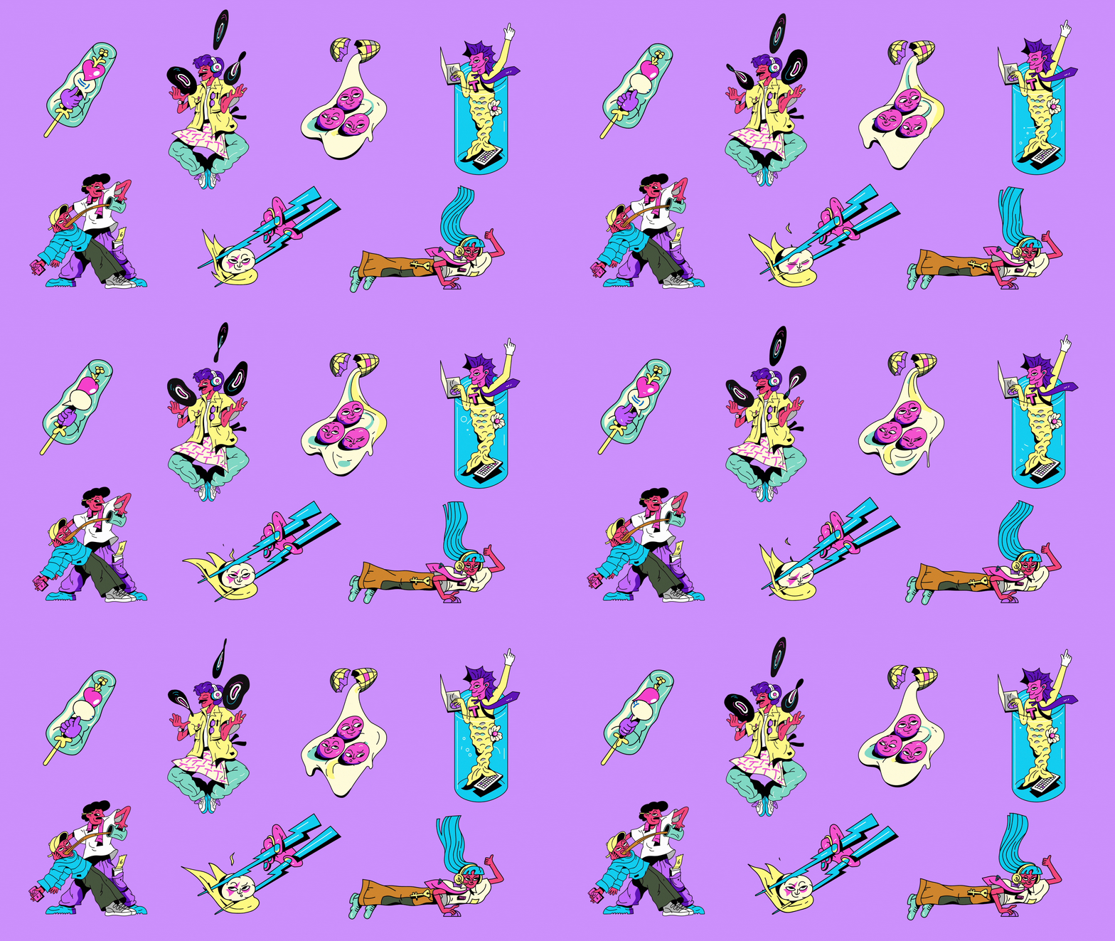
The rebrand of Time has also taken a marked step away from the generic stock imagery, instead commissioning bespoke animation and illustration from Malaysian artists Cloackwork (coincidence?) and Shu Yee. Supporting local talent has been an ongoing effort of Time and part of its ethos and identity. These artists bring a signature style and cultural expression that allows for a ‘song of the masses’ to be reflected in all the weird and wonderful ways people may want to use the internet. It feels fresh and far from patronising (there are no pictures of people smiling at their laptops). And the system allows for new and distinct artists to be featured in the future, always anchored by the brand architecture. This combination of vibrant colour and animation allows Time to still speak very loudly indeed, while being clearly differentiated from the competitor landscape.

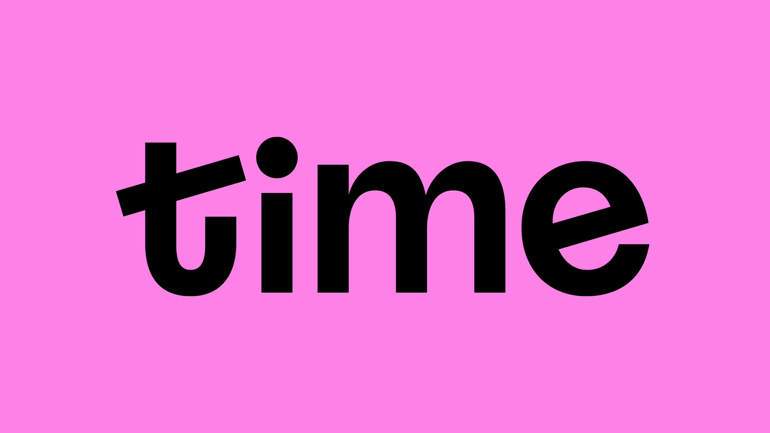
After the motion and personality of illustration, and the dynamic and vocal character of type, the logo offers a refreshingly straightforward but ‘smile in the mind’ take on the name with a nod to the hands of a clock in the lilt of the ‘t’, and again in the bar of the ‘e’. This device is seamlessly demonstrated in motion; not ticking and jerking to the beat of seconds (as if ominously counting down to something), but rather smooth and playful, dancing around the clock face. The treatment reflects that Time, the service, is for play, when ever and for however long you want.
