Ortto by Christopher Doyle & Co.
Opinion by Richard Baird Posted 21 March 2023
All systems grow. What a fun line. Setting up and positioning Ortto, formerly Autopilot, as the leading marketing automation solution for business. The name is great, a wonderful move forward for the company, and sufficiently taking something technical and inhuman-sounding and giving it a somewhat anthropomorphised quality, easy to remember and providing room for growth into other technologies and services.
What was once inapproachable to many and could have been perceived as thoroughly confusing and daunting to use, has now become mainstream, and sufficiently accessible to SME down to the individual. Ortto helps these to unify their marketing process, segment their audiences and leverage analytics. The alien becomes cogent, necessary even.
Making automations, customer journeys and analytics look easy came down to Christopher Doyle & Co., who, alongside renaming, have also developed a sufficiently appealing visual language of forward momentum and progress through a motion-based and modular identity system.
This post includes Extended Insights for BP&O Plus members.
Find out more and sign-up here.

Colour blocking, a simple (if a little familiar) form language of transitioning geometric shapes delivers an immediate sense of let’s go! let’s grow! And develops the functions of segmentation and connecting elements (insights and data to keep things moving) into a playful gesture. Motion behaviours play a role in giving the simple forms a lot of ownable character and is well-realised. Industriousness and scalability is well-channelled in a selection like Neue Haas Grotesk as a supporting (tertiary not secondary) typeface. It’s efficient, flexible impersonal and balances out the fun factor of forms. CD&Co. could, of course, have stopped there, however, the studio weave in a number of extras that advance the story Ortto is telling and develop its positioning further.


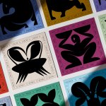
The secondary typeface and a wonderfully illustrated set of icons delivers a somewhat literary dimensionality thanks to the illustration work of Dave Coleman and the use of Romek, a serif by The Designers Foundry. This lends the work a further visual and conceptual dimension that kicks this way beyond some moving geometric forms that convey progress. This is where the more ‘human’ comes in, and the general approachability of the brand, supported by some well-shot images of people and strong copywriting (more on that further down) that makes the whole analytics, custom journey, and automation thing seem a doddle. Centra No. 1 from Sharp Type supports this, finding a balance between the efficient qualities set by Neue Haas Grotesk and the literary sensibilities of Romek.

Colour and shape catches the eye. Functioning well in decorative and eye catching contexts such as tote bags and other branded items and also drawing the eye when severely scaled to static billboards and large format OOH advertising, but also right down into social posts in motion.

Tone of voice by Cat Wall is playful in the headlines ‘Ready, set, grow’ and ‘Just grow with it’ and delivering clarity through longer copy, supported by elegant typesetting. Flow, know and grow is a beautiful articulation of the customer journey, knowledge gathering and business development, and neatly fits within the visual language that together provide a broader sense of approachability. It’s a new era and everyone is welcome. This interplay of form and words, colour, type and illustration (many would have stoped at just the shapes) afford the brand a flexibility and modulation in its communication that clearly create a cohesive and interesting world whether its static and in print, or motion and online, flowing from a great new name, new positioning well expressed through words. Automation isn’t supposed to add complication. It’s supposed to unburden and multiply the power of business, it should be easy, and sure, could be fun. The identity reflects this. Oh, and the logotype, beautifully refined by Dave Foster. Lovely forms, great little ligature that carries the letters and the brand forward.