Stereoscope by Olssøn Barbieri
Opinion by Emily Gosling Posted 12 April 2023
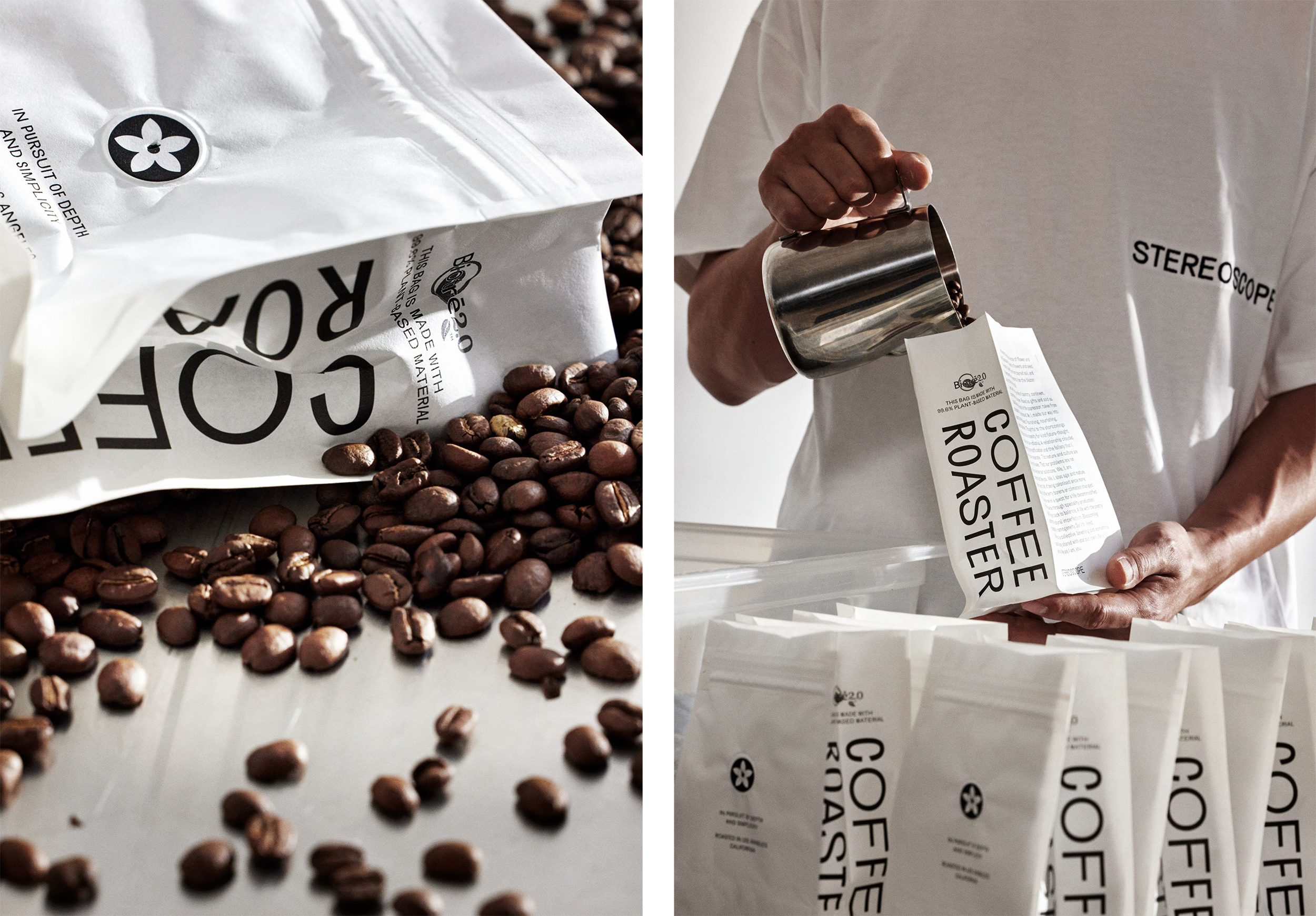
Oslo-based multi-disciplinary design studio Olssøn Barbieri has created the brand identity for Los Angeles-based speciality coffee roastery Stereoscope, working across its packaging design and printed materials with a typography-led approach that celebrates tactility.
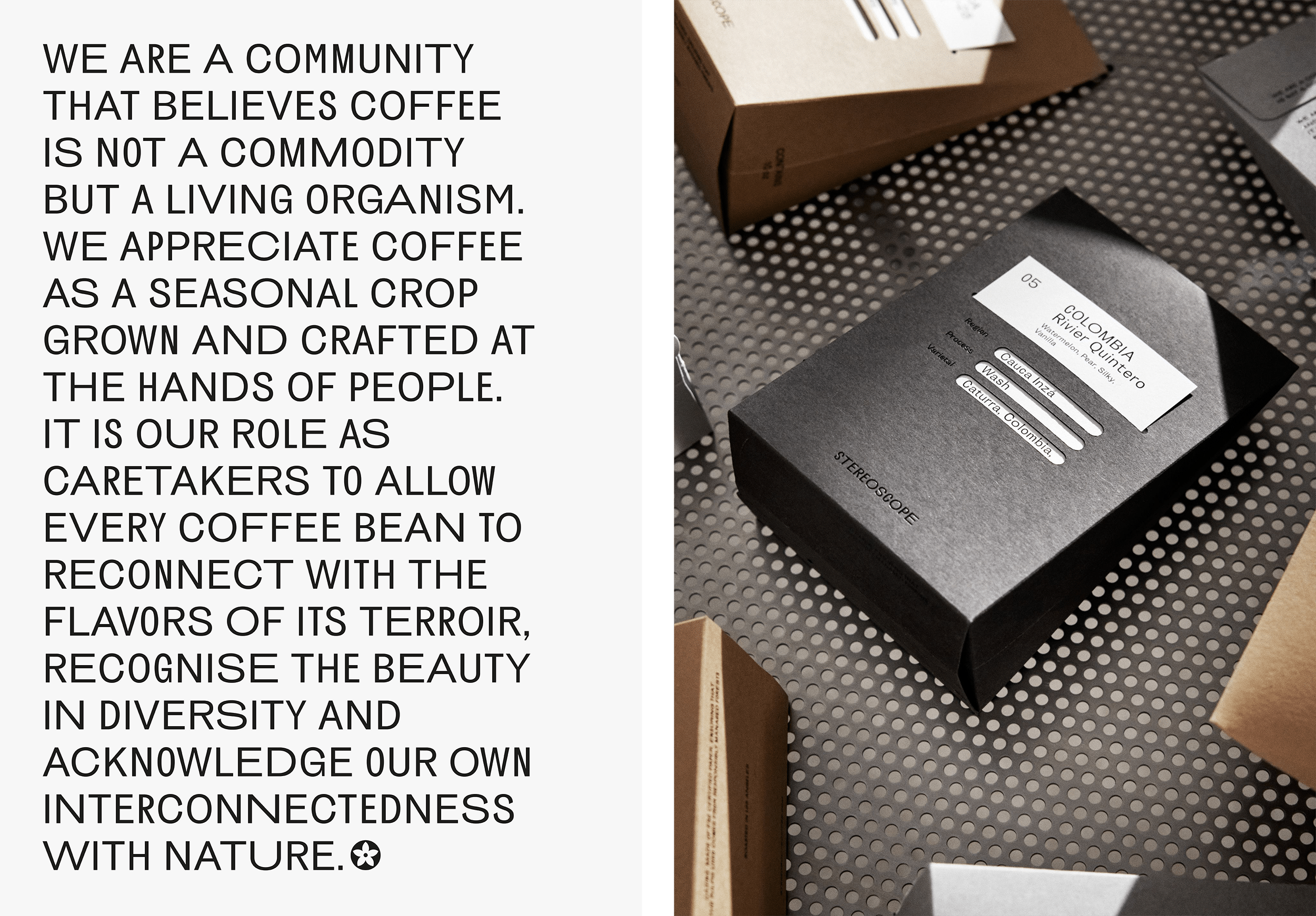
According to Olssøn Barbieri, Stereoscope is underpinned by a philosophy that sees coffee as a living organism rather than a commodity, and which takes its responsibility to the plant itself and the workers farming it very seriously.
As such, in its work across the identity, storytelling, packaging, tone of voice, art direction, commerce and more; Olssøn Barbieri needed to ensure that the brand’s unique philosophy and perspective shone through, demonstrating Stereoscope’s positive impact on local farms and communities.
The studio’s work began with a hard look at the wider issues surrounding coffee, like climate crisis and ecological issues (the Coffee Arabica plant has been declared an endangered species), as well as its intrinsic links with colonialism and role in upholding capitalism through the commodification of nature.
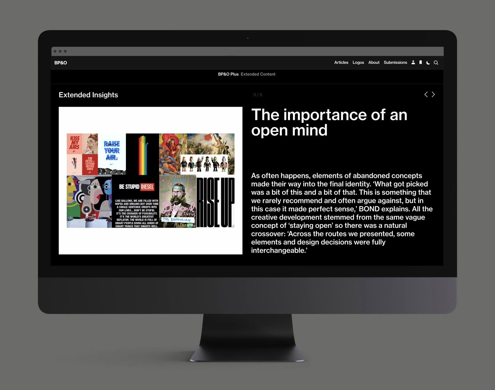
This post includes Extended Insights for BP&O Plus members.
Find out more and sign-up here.
The start of the process saw the studio focus on the etymology of the brand’s name: ‘Stereoscope’ refers to the viewing instrument which allows you to see left-eye and right-eye views of the same scene in a single 3D image – in other words, it ‘offers the user multiple perspectives, deepening their perception’ (as Olssøn Barbieri puts it).
The brand maxim ‘In pursuit of depth and simplicity,’ created by Stereoscope founder Leif An, perfectly chimes with its naming; summarising the way ‘seemingly opposite forces are complementary and interdependent in the natural world – a feat Stereoscope sought to live up to,’ says Olssøn Barbieri.
The idea of the duality of depth and simplicity led to the studio thinking about the idea of the ‘void’, denoting the space before anything existed; leading them to consider the yin yang, a Chinese cosmology symbol representing harmony and balance and which represents the formation of the universe.
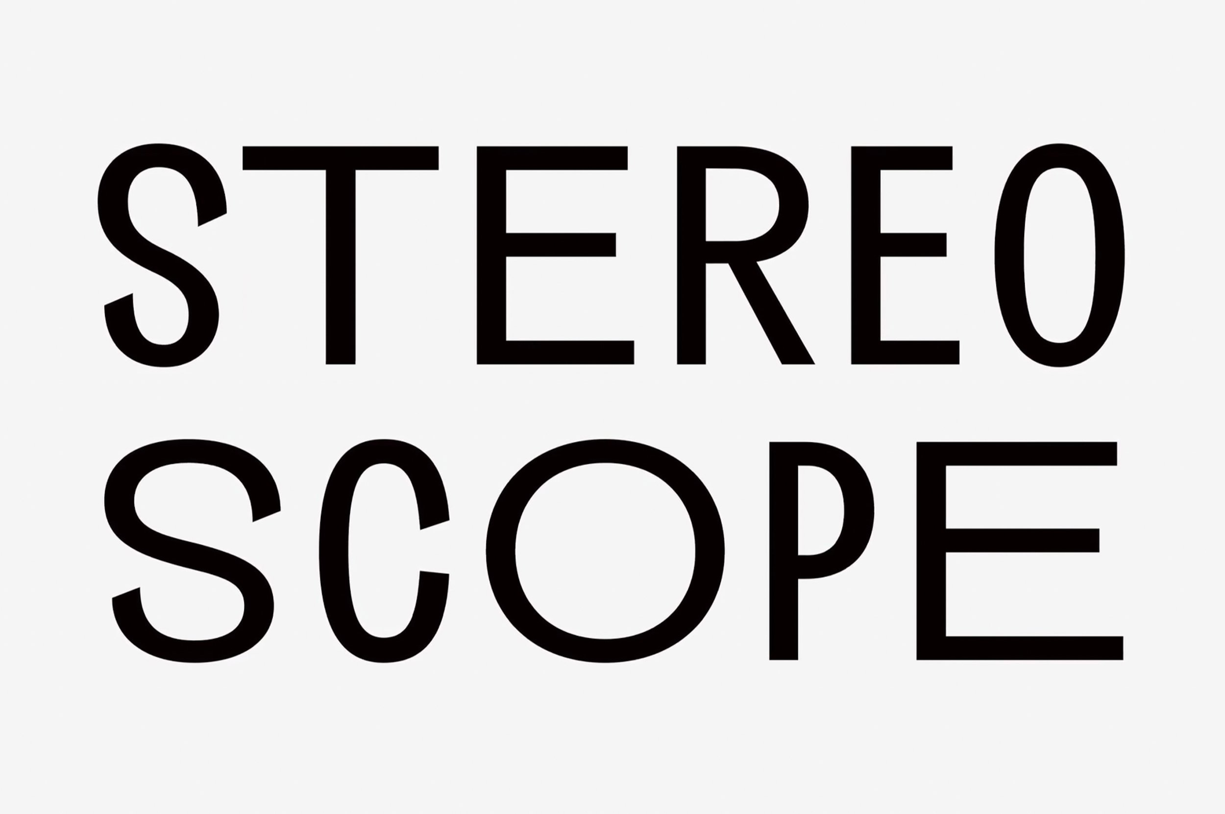
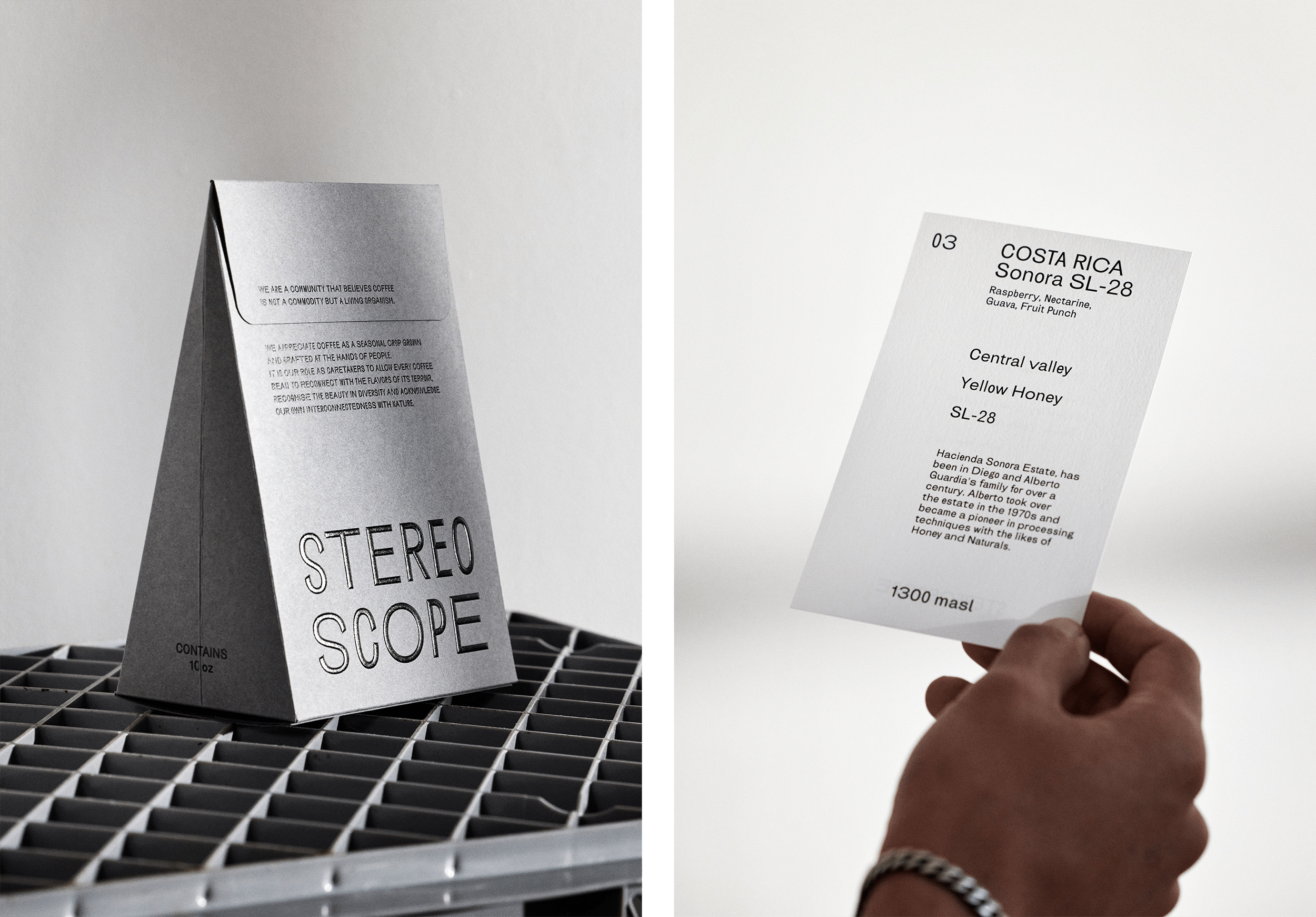
The yin yang’s inherent connections to nature and the Earth’s seasons seemed to chime with Stereoscope’s philosophy; and so Olssøn Barbieri aimed to reflect this in the brand’s typography. The designers chose a grotesque sans serif with five distinct widths, which are used in random combinations across the branding. The typeface, Brunswick Grotesque by Dennis Grauel, was selected as one that felt suitably free from historical connotations in order to avoid imposing any external ‘cultural and historical heritage’ on the brand. ‘Instead, we wanted the typography to feel alive, open and in constant flux, capturing the interconnectedness of things,’ Olssøn Barbieri explains.
The random width combinations look to give the identity ‘an air of charming, contemplative irreverence, emblematic of the five elements theory, the five petals of the coffee flower, the ever-changing nature and the five principles considered to make each coffee unique,’ it continues.
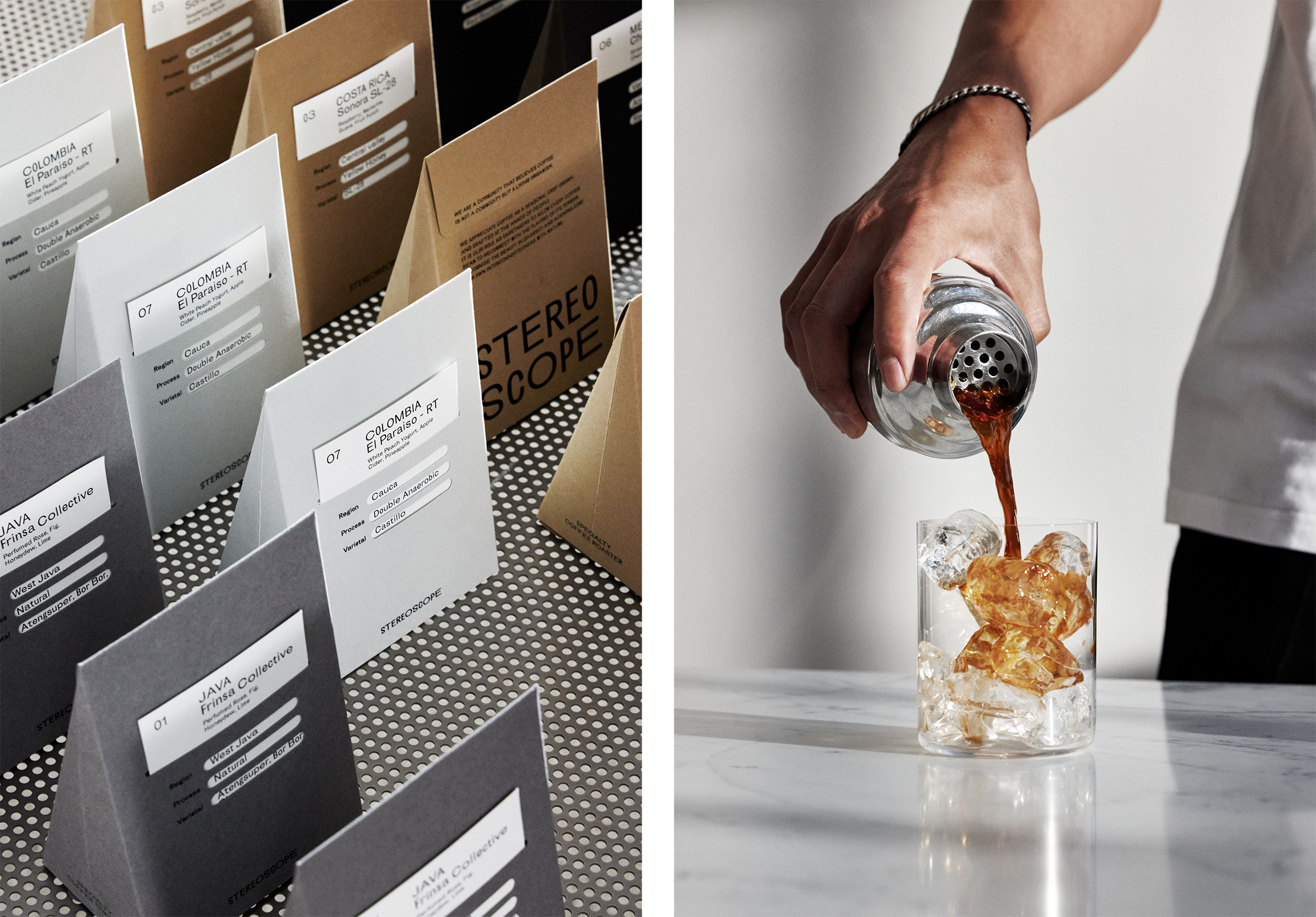
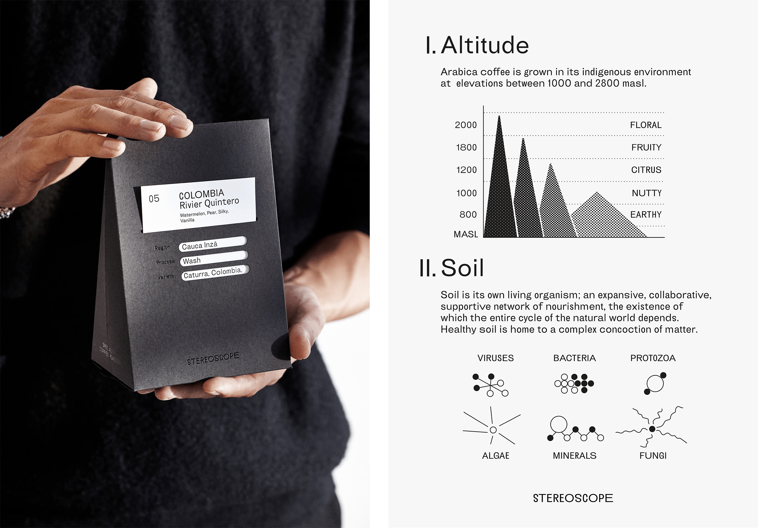
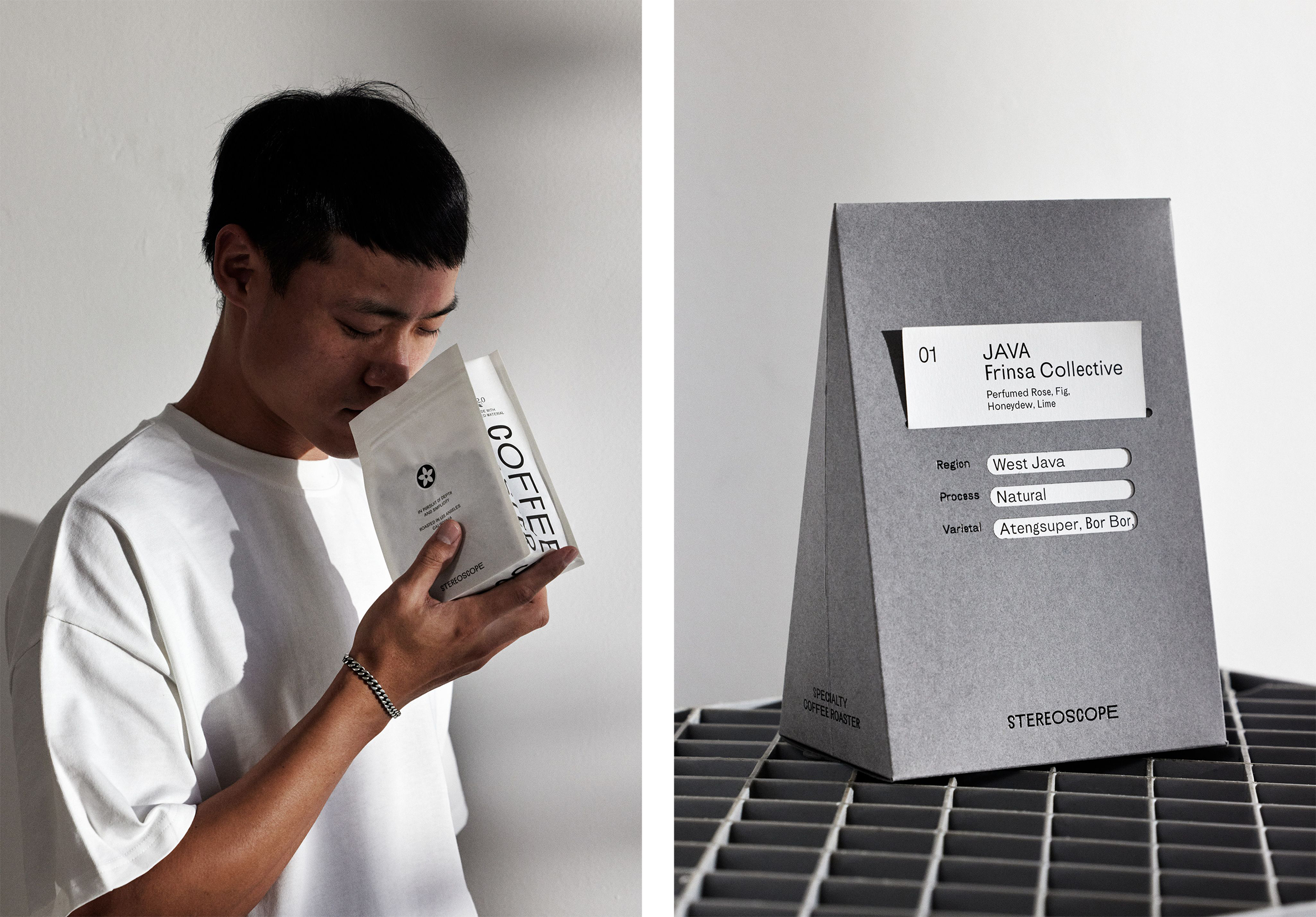
That idea of duality carries throughout the identity as the roastery’s own ‘Stereoscope Cosmology’, as Olssøn Barbieri puts it. The packaging features a card-based labelling system; with highlighted details such as those outlining the fermentation process, are revealed through a ‘trigram’ shaped cut-out. This trigram is inspired by Bagua iconography, a set of symbols that originated in China which are used in Taoist cosmology to represent the fundamental principles of reality, seen as a range of eight interrelated concepts each with a unique icon. The box’s sides also feature a more detailed printed narrative.
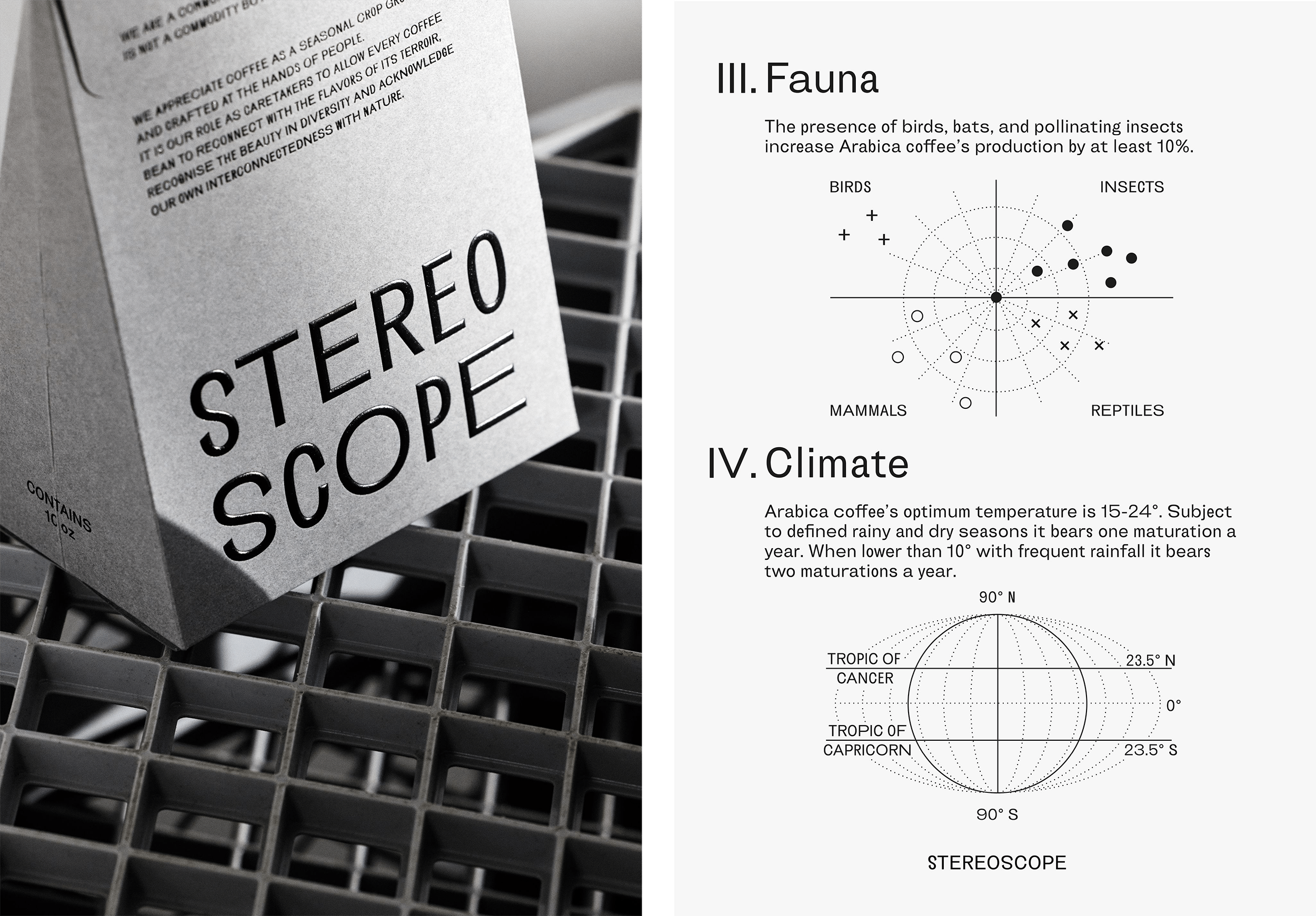
The tone of voice looks to underscore the idea of coffee as a living organism, so some text on the coffee bags personifies the Coffee Arabica seeds by having them speak in the first person.
This ‘cosmology’ is not only manifested visually, but also across the brand’s packaging in terms of its materials and productions (the bags are made from material that’s 99.6% plant-based, for instance).
The bespoke box designs are inspired by the shapes of the high-altitude mountains where the beans are grown, and are produced in four colours, printed on FSC-certified paper embellished by a rounded foil blocking. The tear-off opening on the boxes looks to introduce ‘a sense of ritual to your day-to-day coffee routine,’ Olssøn Barbieri adds.
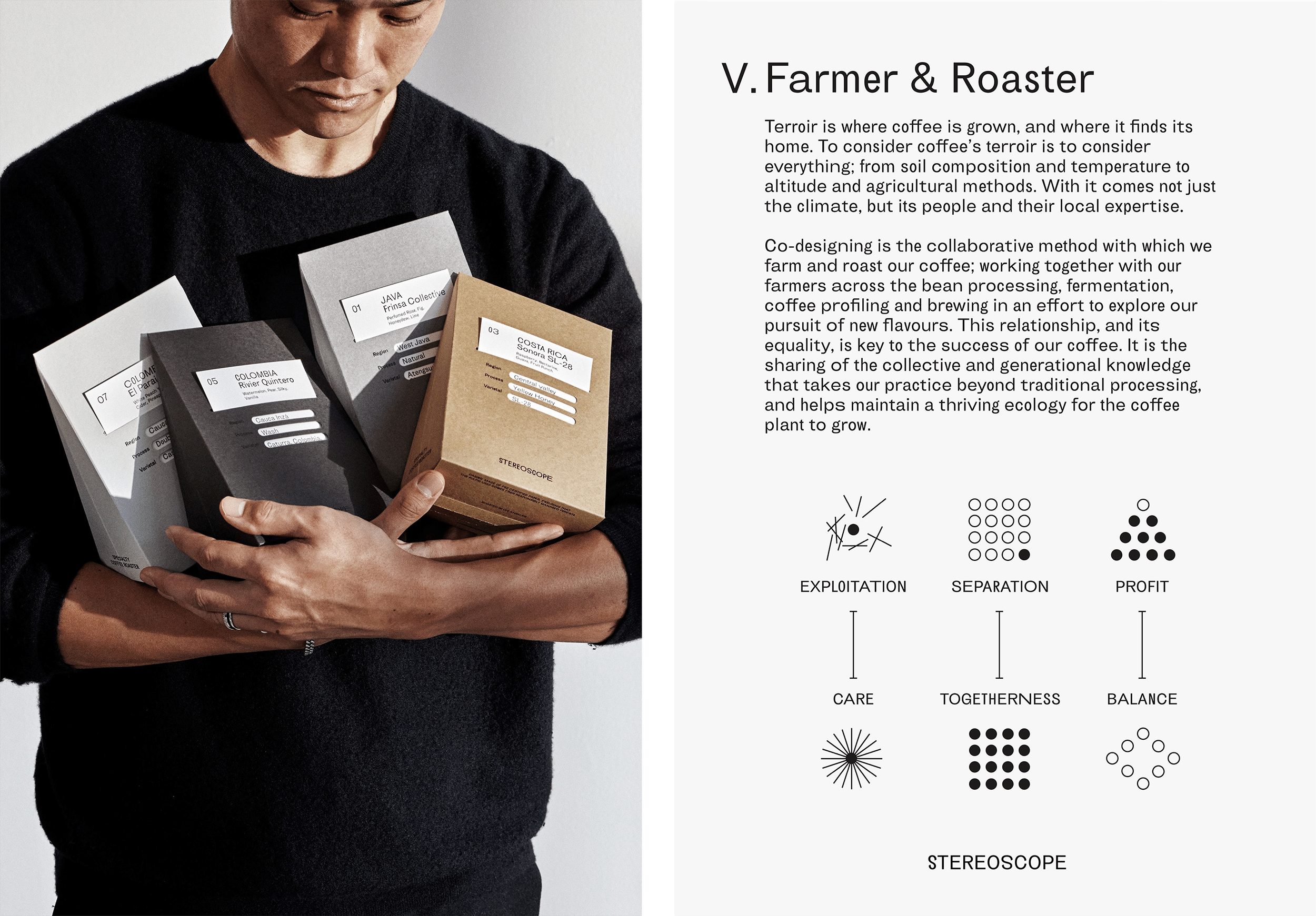
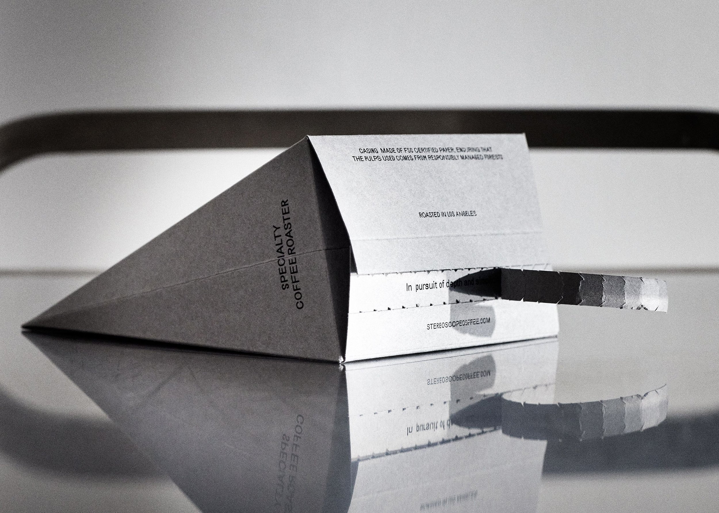
The mountain shape is continued on the Stereoscope single-pack subscription boxes; while dual packs use a skewed rectangular prism shape. This was chosen for the way it uses space efficiently, a benefit that’s both eco-friendly and which ‘challenges the standard shipping format,’ says the studio. It adds, ‘Together, Stereoscope’s dedication to philosophy, perspective, shape, and story combine to reveal the importance of Coffee Arabica, as well as the eclectic, flavoursome history of its beans’.
Overall, the brand’s slightly off-kilter type and minimalist approach underscores Stereoscope’s premium positioning and its devotion to quality. Crucially, Olssøn Barbieri has avoided resorting to well-worn cliches in expressing the brand’s ethical underpinnings; instead utilising symbolism and copy that not only chimes with its philosophy but looks beautiful, too.
Get more with BP&O Plus
Read Extended Insights, start bookmarking, switch between light/dark modes, article and ‘Gallery View’ and support our writers. Become a member by subscribing here.
