Chelan Beauty by Olssøn Barbieri
Opinion by Emily Gosling Posted 18 April 2023
Olssøn Barbieri certainly seems to be on form this year: we recently reviewed the Oslo-based multi-disciplinary design studio’s work for Stereoscope coffee, and now, we’re delving into its smart designs for Chelan Beauty.
Marrying clarity, functionality and a decent smattering of the unexpected, the surprises land early with this one: Chelan Beauty isn’t actually a ‘beauty brand’ – as in it’s not peddling eye-serums, exfoliants et al – it’s a range of fruit products hailing from an organic farm by Lake Chelan in Washington.
Chelan Beauty effectively began life in 1991, when Bill and Angell Clark decided to start leasing orchards in Washington State to make a living. Bill was an ‘early proponent of organic farming,’ according to Olssøn Barbieri, and believed it was ‘a better way to operate for the soil and those who worked it’.
This post includes Extended Insights for BP&O Plus members.
Find out more and sign-up here.
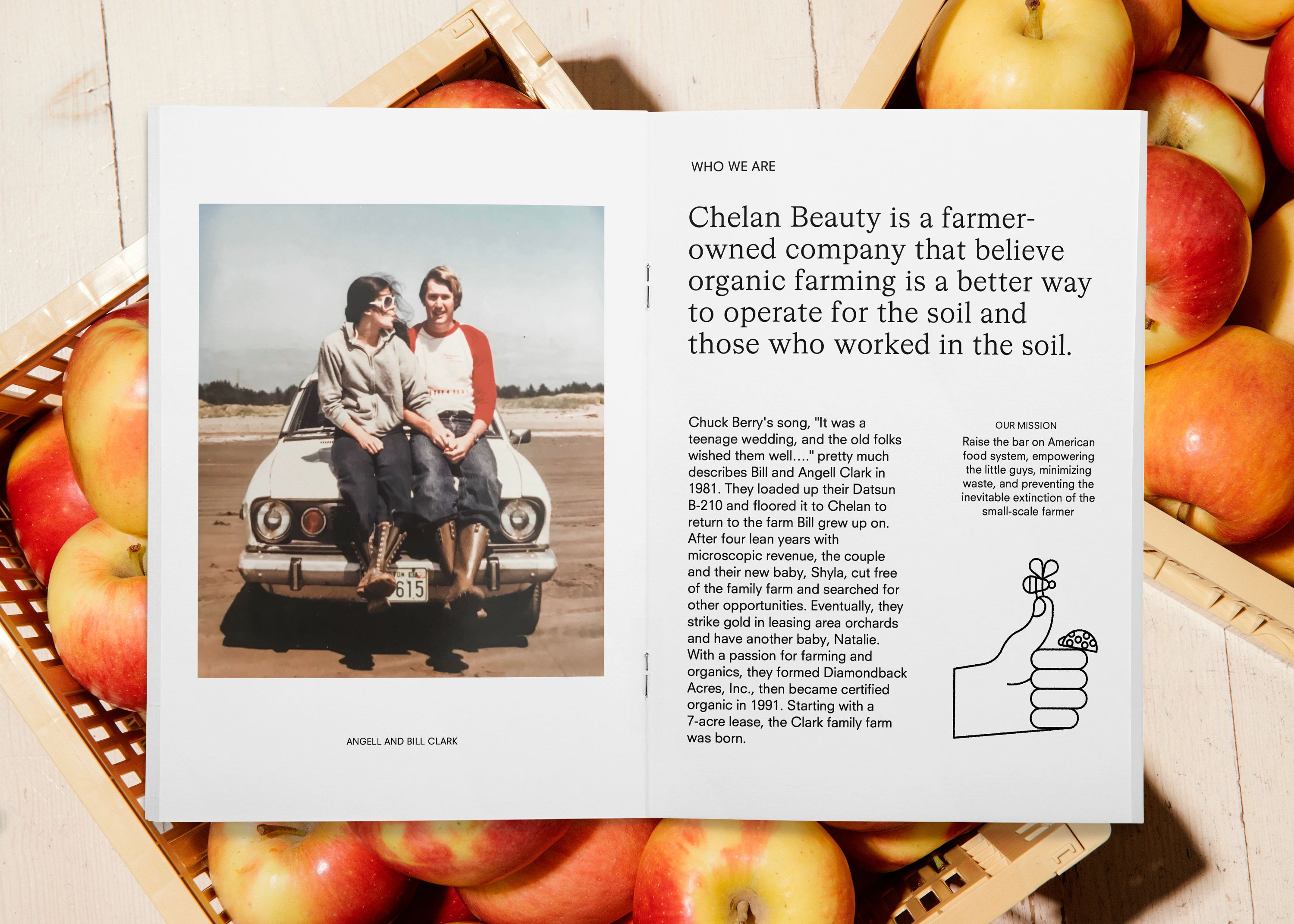
The relatively small farm of Chelan Beauty spans less than 200 acres, and over the years has made a name for itself through its devotion to ‘quality over quantity.’ But rather than seeing the farm as a small beacon of high-quality, organically farmed produce; Chelan Beauty has broader aims: to ‘raise the bar on the American food system and make healthy food more fun and educational.’
Ultimately, Chelan Beauty looks to push back on intensive industrial agricultural methods of food production that exploit and abuse animals, destroy natural habitats, and generate pollution and climate-changing emissions; sitting as part of the mere 8% of agricultural land stewarded by independent or family-run farms in the US.
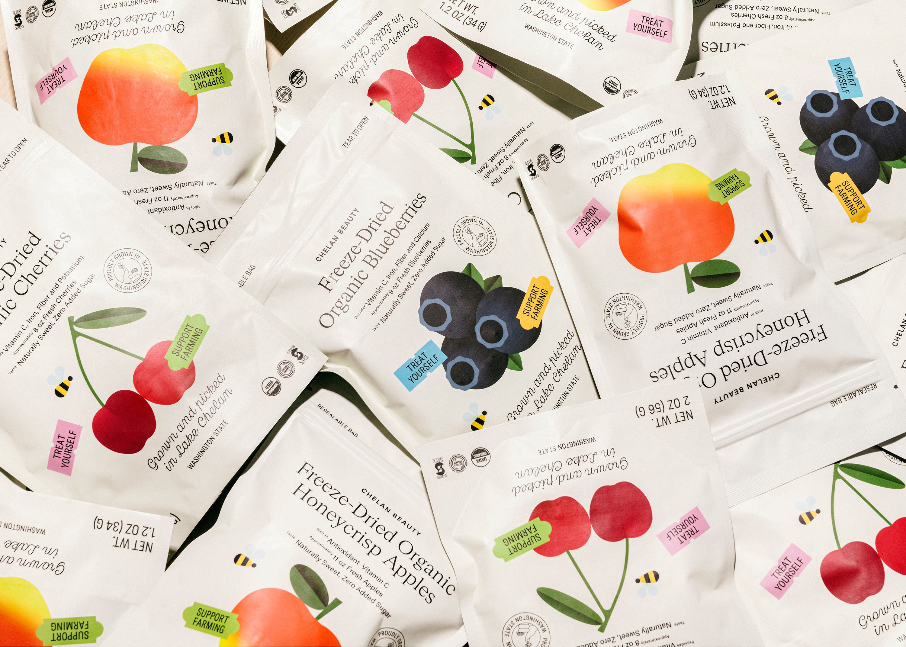
Olssøn Barbieri was brought in to develop a new identity for the company, including new designs for its packaging and subscription system, as well as some cute animations and illustrations that carry throughout the branding. In order to work towards the brand’s goal of encouraging healthier eating habits, it was vital that the new identity went hard on taste, ‘articulating a new idea of deliciousness that merge nourishment with pleasure’.
As is befitting of a brand that celebrates simple, natural methods but with a serious message to get across, the identity and packaging system isn’t exactly disruptive – organic fruit is inherently straightforward after all – just as messages around healthy eating should be. While the branding feels fresh and effortlessly current, its imagery nods to familiar tropes such as fruit stickers and simplified produce forms, like an apple with a cheeky bite taken out, and the bright red double stemmed cherries perhaps more familiar to most from their starring roles in fruit machine graphics.
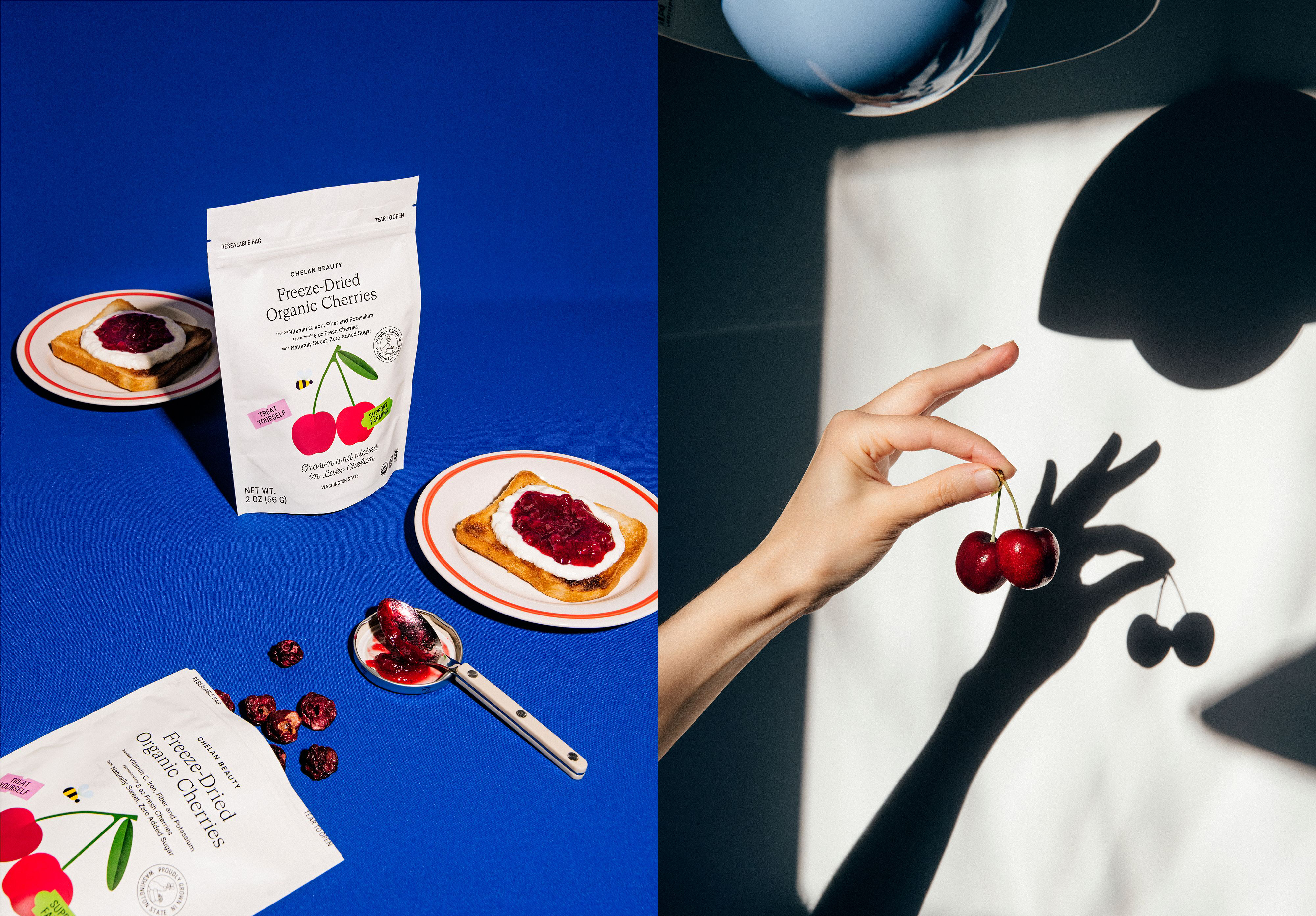
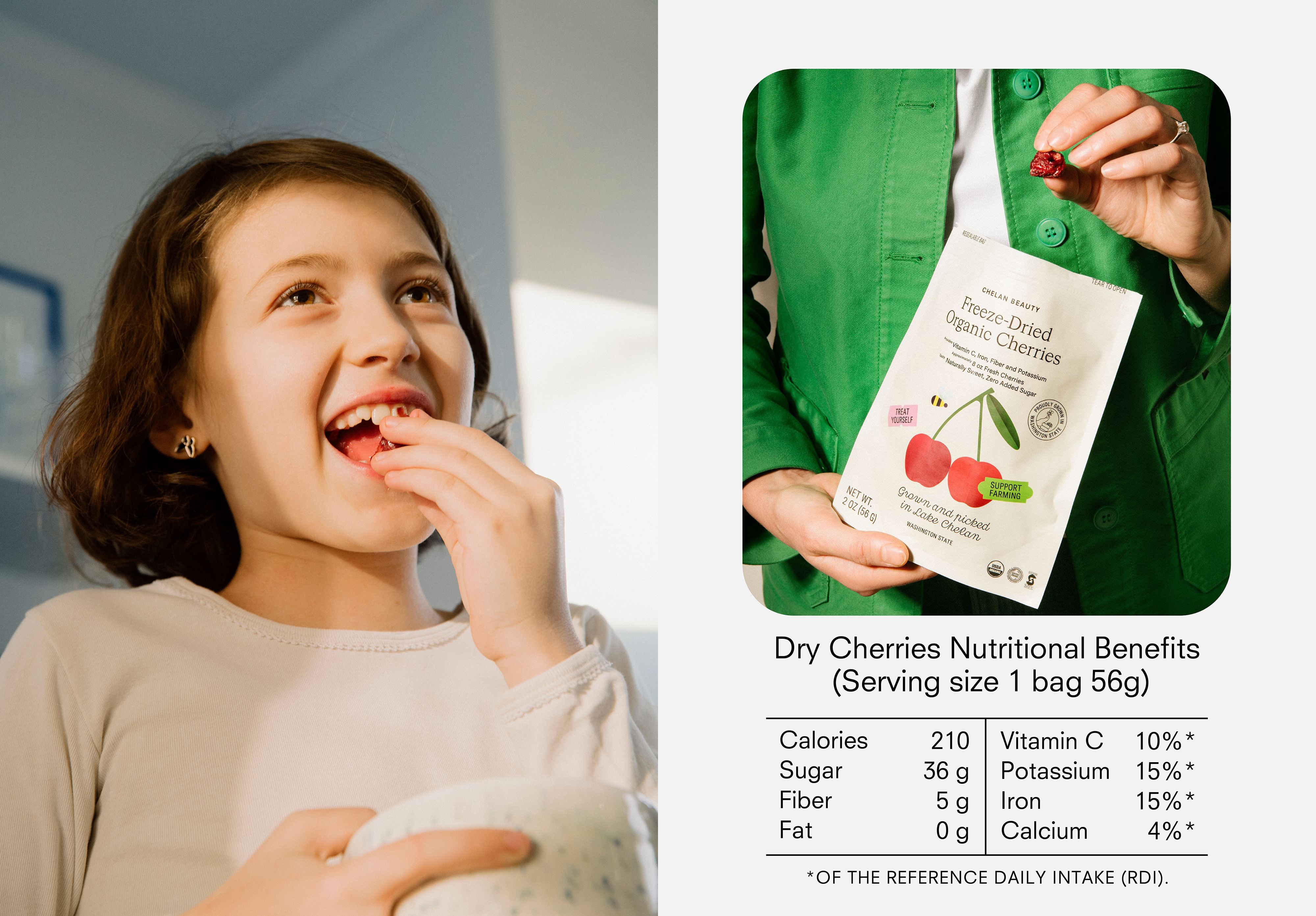
While the product illustrations on packs are vibrant and playful, the rest of the branding is neutral in tone and confidently pared back. The wordmark and brand copy across packs rely on a slick combination of serif (Cigars from Heavyweight), sans serif (Neuzeit) and script (Cucina from Bretagne) which lends Chelan Beauty a distinctively contemporary feel without ever looking as though it’s trying too hard.
Olssøn Barbieri describes the identity as an updated take on ‘the language of fruit, and an inclusive image of the “new farm” — a place that aims to inspire change through healthy habits — by balancing seriousness and fun, science and pleasure’.
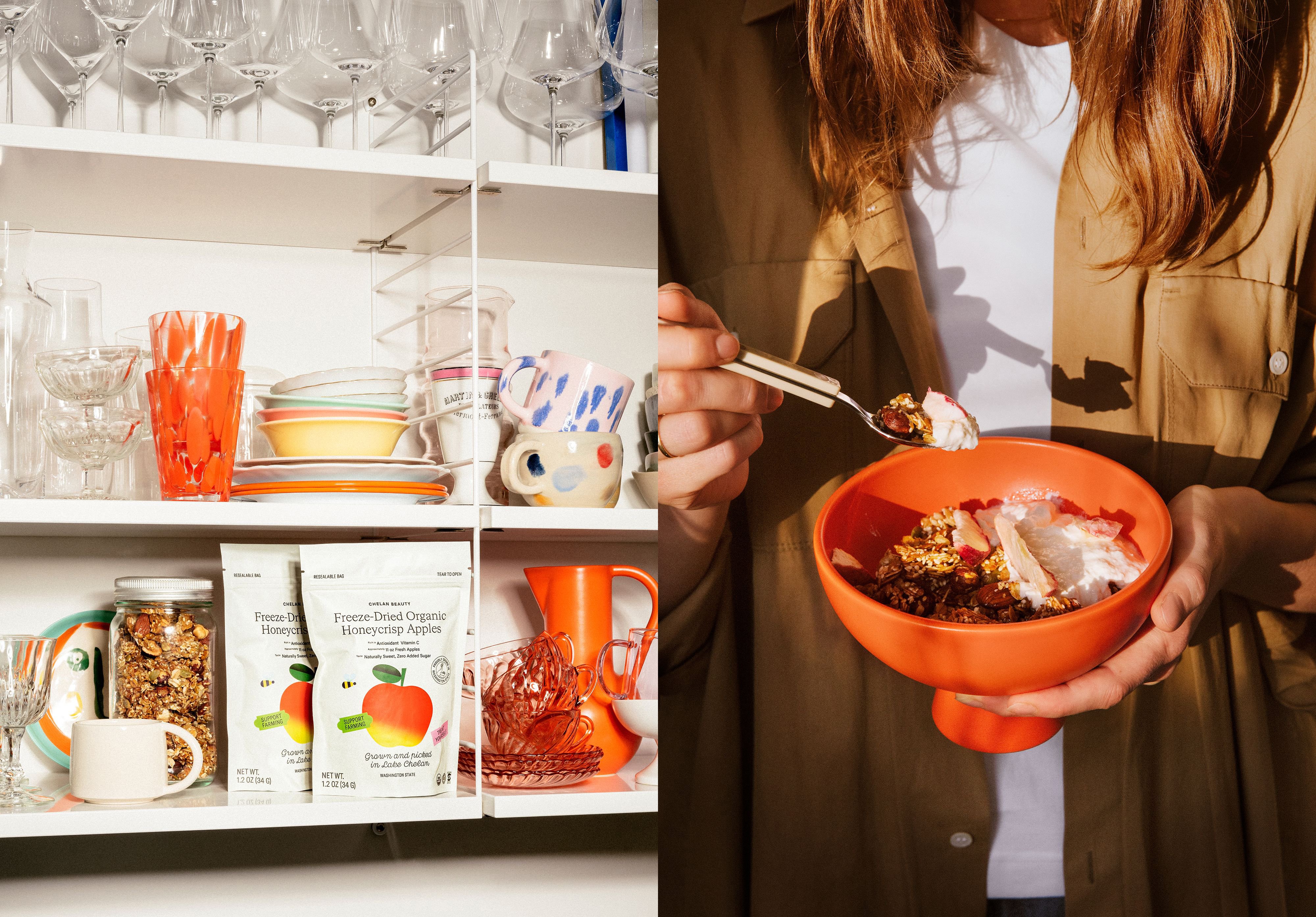
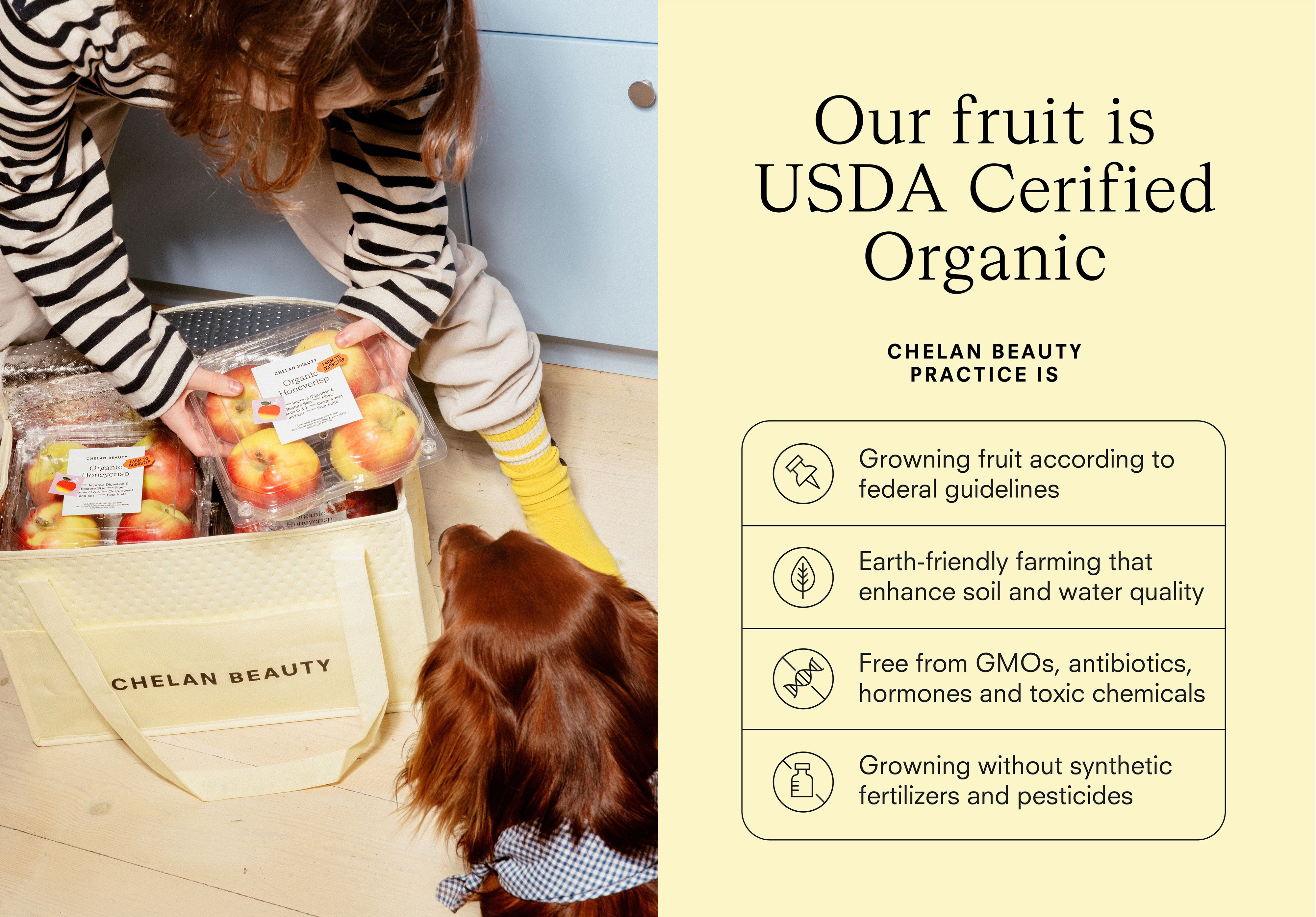
A new tailored experience was created for the Chelan Beauty subscription service, which offers customers home delivery and – crucially – a direct link to the farmers and growers. The new subscription boxes use a monotone neutral beige hue but allow for personalisation with stickers, messages, and fruit drawings to offer a sense of uniqueness and a sense of organic happenstance to each delivery. Olssøn Barbieri also developed a retail packaging system for Chelan Beauty’s freeze-dried fruits, an offer that enables the farm to sell produce outside of its natural harvest cycles.
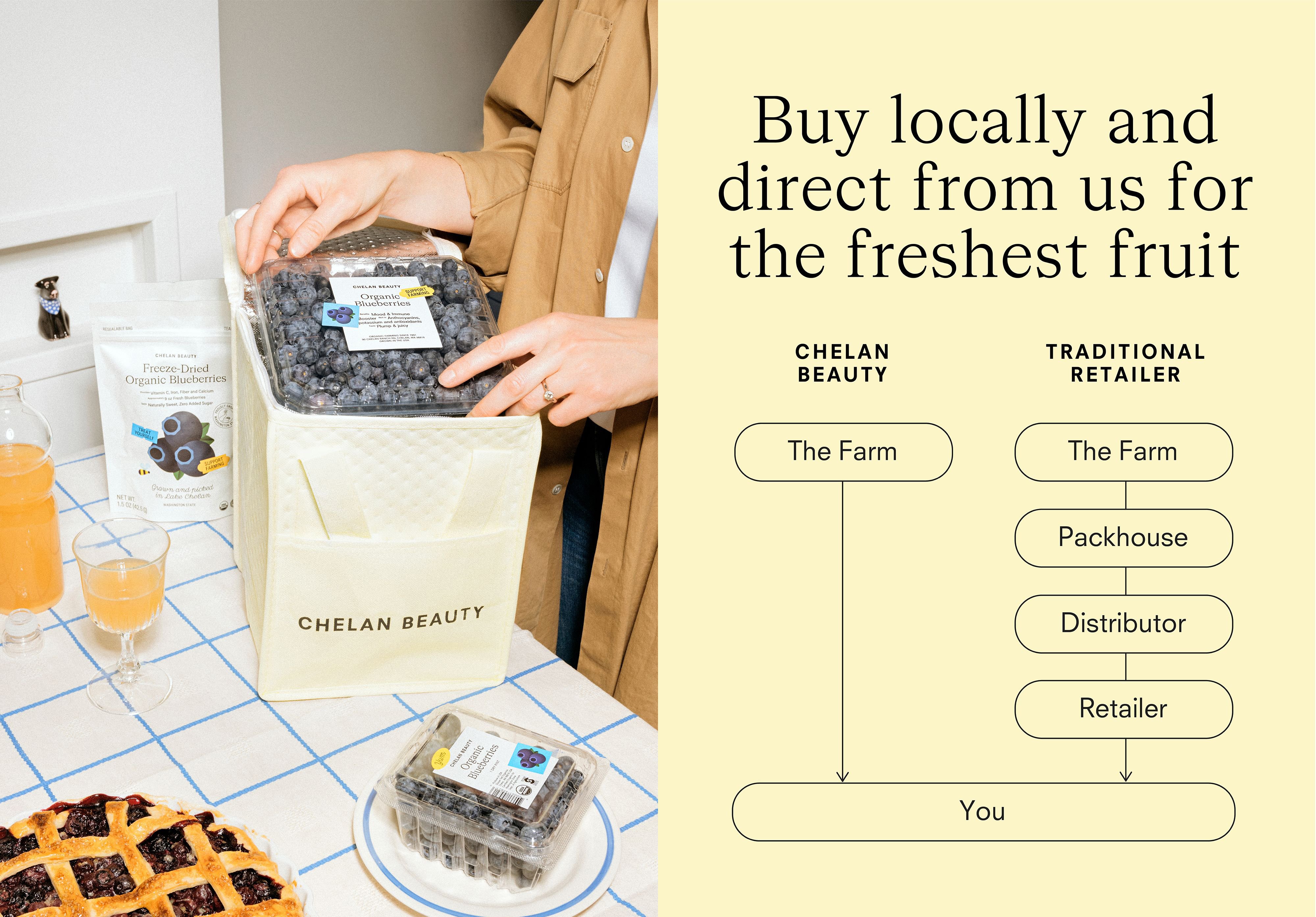
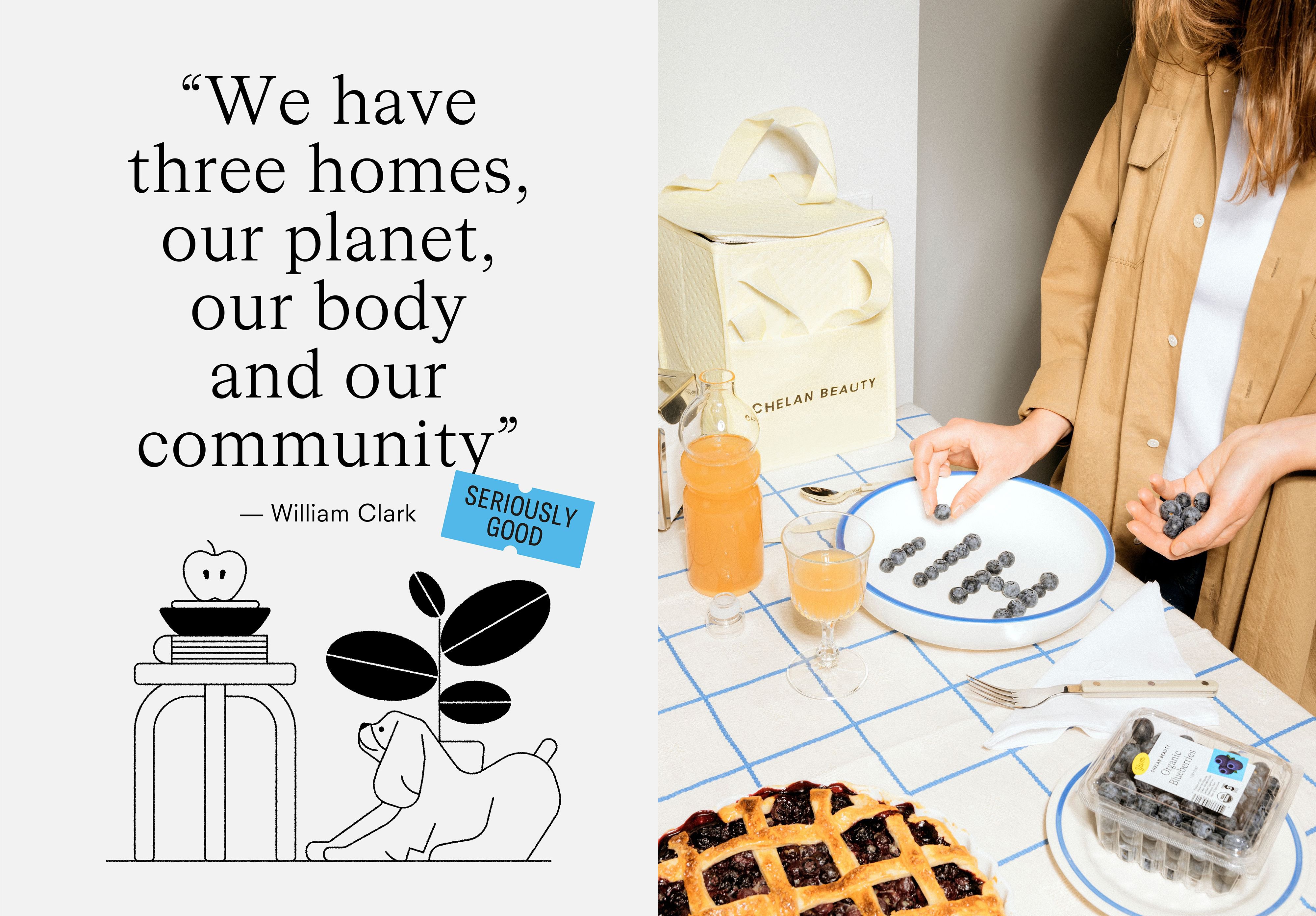
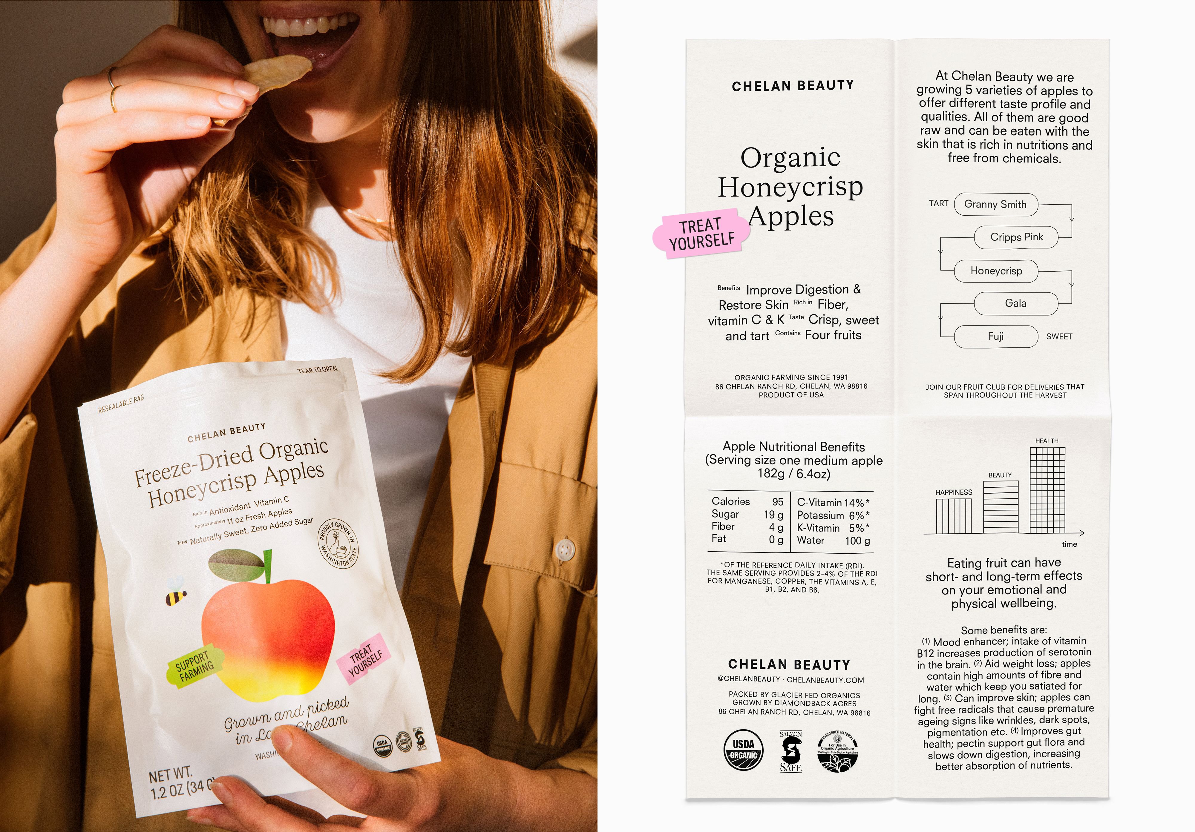
The art direction across branding and product imagery deftly dances the fine line between higher-end trendy and straightforwardly eye catching: the unusual crops and vibrant, saturated hues occasionally feel as though they’re veering into Toiletpaper magazine territory (no bad thing of course); but the simple, wholesomely no nonsense feel of the branding firmly grounds Chelan Beauty in its (ethically toiled) earth.
Despite the slightly confusing name, Chelan Beauty’s branding is all about simplicity, clarity, and very healthy dose of joy: it delivers fruit, but also healthy eating messages in a way that’s direct, but never patronising or childish, both across its visual identity and the tone of voice of the brand copy. Olssøn Barbieri did an excellent job of using restraint: doing just enough ‘design’ to work hard for the brand, but not so much that it would either alienate people or obfuscate what should be a very simple product, simply produced – fruit.
Get more with BP&O Plus
Read Extended Insights, start bookmarking, switch between light/dark modes, article and ‘Gallery View’ and support our writers. Become a member by subscribing here.
