SCIC by Franco M. Ricci, 1963
Written by Richard Baird Posted 1 May 2023
This article is a guest post from Logo Histories, a weekly Substack newsletter from the team behind BP&O. Each week, Logo Histories uncovers and unravels the stories behind some of the most interesting corporate identity design programes of the past. Read about FHK Henrion’s work for London Electricity Board, Saul Bass’ identity for Minolta, and Armin Vogt’s modular design system for Fiat. Sign-up here.
The modern ‘American kitchens’ that existed in Italy in the early 1960s were somewhat modest, typically using cheap laminated plastics and imitation wood. Renzo Fornari, a building contractor from Parma, was determined to produce something quite different. His vision would combine functionalism, beauty and an ‘aesthetic dignity’ to offer a cheerful, brightly coloured and high-quality alternative that was elegant and technologically advanced.
In 1963, Fornari transformed a small workshop (and a family-run business) into a factory that would bring to life his new vision for Italian kitchens. He named the company Super Cucine Italiane Componili (Super Modular Italian Kitchens) ‘SCIC’ for short and an Italian derivative of the more universal word ‘Chic’.
Seeking an corporate identity, SCIC employed the services of Franco Ricci, a young designer from the same city. This would be one of his earliest clients and mark the beginnings of a decades long relationship.
Ricci, commissioned to develop the logo for SCIC, would go on to define the style of the kitchen-maker’s early campaigns, with a disruptive approach quite different to others, and what had comes before, utilising vibrant colour striking silhouettes and later, images from renowned illustrators.
![]()
Much of the SCIC corporate character, as it was expressed throughout the late 1960s and 1970s, came from its colourful campaigns, however, prior to this Ricci designed the SCIC logo. This is derived from the ‘super-modular’ part of the name, with six tessellating equilateral triangles coming together to form a hexagon. It was compact and easy to use within a grid system, and suggested the idea of components, modularity and modernity, and at the same time evoked the shape of a flower, suggesting an aspect of femininity. It was simple, modern and striking for the time. This was then paired with a logotype, a customised version of Helvetica, with the apertures of the ‘C’ opened up to meet the terminals of the ’S’. While breaking a typographical rule, this advanced the theme of unifromity, from logo to letterforms.
Just as Irving Harper didn’t have any Herman Miller products to launch with in 1946, Ricci began devising an advertising campaign for the SCIC products without actually showing them. The intention was to ‘arouse’ interest around the name, so that the brand was already familiar to prospective customers when the products appeared on the market.
The first series of campaigns took their inspirations from the pop art world of Warhol. However, rather than stressing the banal aspect of reality Ricci sought to ‘reevaluate reality’ and present a warm, cheerful and optimistic vision of middle-class domesticity.
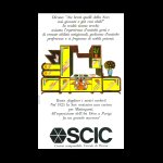
The overall theme was ‘the world of the kitchen’, and reimagined the most ordinary utensils: the knife, the fork, the cheese grater and the chopping board, and reduced these to colourful photographic silhouettes. The ancient became exciting and new, loaded with possibility and creativity.
These silhouettes were arranged as typography, as though they were letters of the alphabet. The balance and cohesion of the posters was achieved through the ‘plurality of the objects’.
Later on, utensils were accompanied by stylised images of hearts, stars and cars: evocative symbols of happiness and modernity. In other instances, a purely typographical route was taken, and other items were added such as nature and food products.
Whether kitchen utensils, symbols or type, or a combination, these were held together in the same modular spirit as the kitchens through rationalised grid structures. Alongside colour, these brought a sense of wonder to the kitchens and, by extension, to the home. The logotype was rarely hidden, or positioned as a small footnote, rather, it was used at scale and as an important compositional element, associating itself closely with the creativity of the posters.
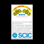
A later promotional campaign was then based on the irony of the company’s (future) antiquity. In the pages of the newspapers, SCIC explored what it might say about itself fifty or sixty years into the future (2015!). These adverts showed medals being awarded to SCICI for the excellence of its products and captions with old style type.
Later, developing an idea by André Breton, Ricci designed pages, illustrated by Piero Crida, a talented young painter from Piedmont, that drew the viewer in with an amusing sequence of images. These were presented with gestural and phonetic movements necessary to say, cucine SCIC (SCIC kitchens). The style was described as ‘inflated, marked, hyperbolical, typical of comic strips’ from which there was an irony.
After the success of campaigns of the 60s and early 70s, Ricci returned to the idea of the company’s future antiquity in order to underscore its corporate character, one that was “young in age but old in skill”. This new campaign imagined SCIC kitchen’s were designed for historical figures and in specific styles. Drawn again by Piero Crida, the set included imagined kitchens for King Assurbanipal in an Assyrian style, an Art Nouveau kitchen for French actress Sarah Bernhardt, and an Art Deco concept for singer Mistinguett.
Ricci’s work for SCIC extended across decades. It was as intelligent as it was visually striking, often loaded with both a cultural awareness and humour. Although much of that has been lost today, the logo and logotype remain in use.
Logo Histories is a weekly Substack newsletter. To instantly access an archive of over 80 Logo Histories, just like this one, and receive weekly stories straight to your inbox, subscribe here.